

Medium duck nails have become one of the most universally flattering nail shapes, striking that perfect balance between elegance and practicality. Unlike longer versions that demand careful maintenance, medium-length duck nails offer the dramatic curved silhouette with workable length that actually fits real life. The beauty of this shape is that it suits nearly every skin tone, hand shape, and personal style—which means the design possibilities are genuinely endless.
The thing about medium duck nails is that they have natural visual drama built in. That distinctive downward curve and the wider nail bed create a canvas that photographs beautifully and catches light in really satisfying ways. But with that versatility comes the question every nail enthusiast faces: what design actually looks good on medium-length ducks? Not every trend translates well, and not every color flatters every person wearing it. The difference between a design that looks stunning and one that looks flat or poorly balanced often comes down to understanding proportions and knowing which specific looks have been proven winners across different skin tones and hand shapes.
This guide walks through 20 medium duck nail designs that genuinely work—designs that have staying power, translate well across different aesthetics, and deliver that wow factor without being overdone or trendy in a way that feels dated within months. Each design here works specifically because of how it plays with the medium length and curved shape of duck nails, not despite it.
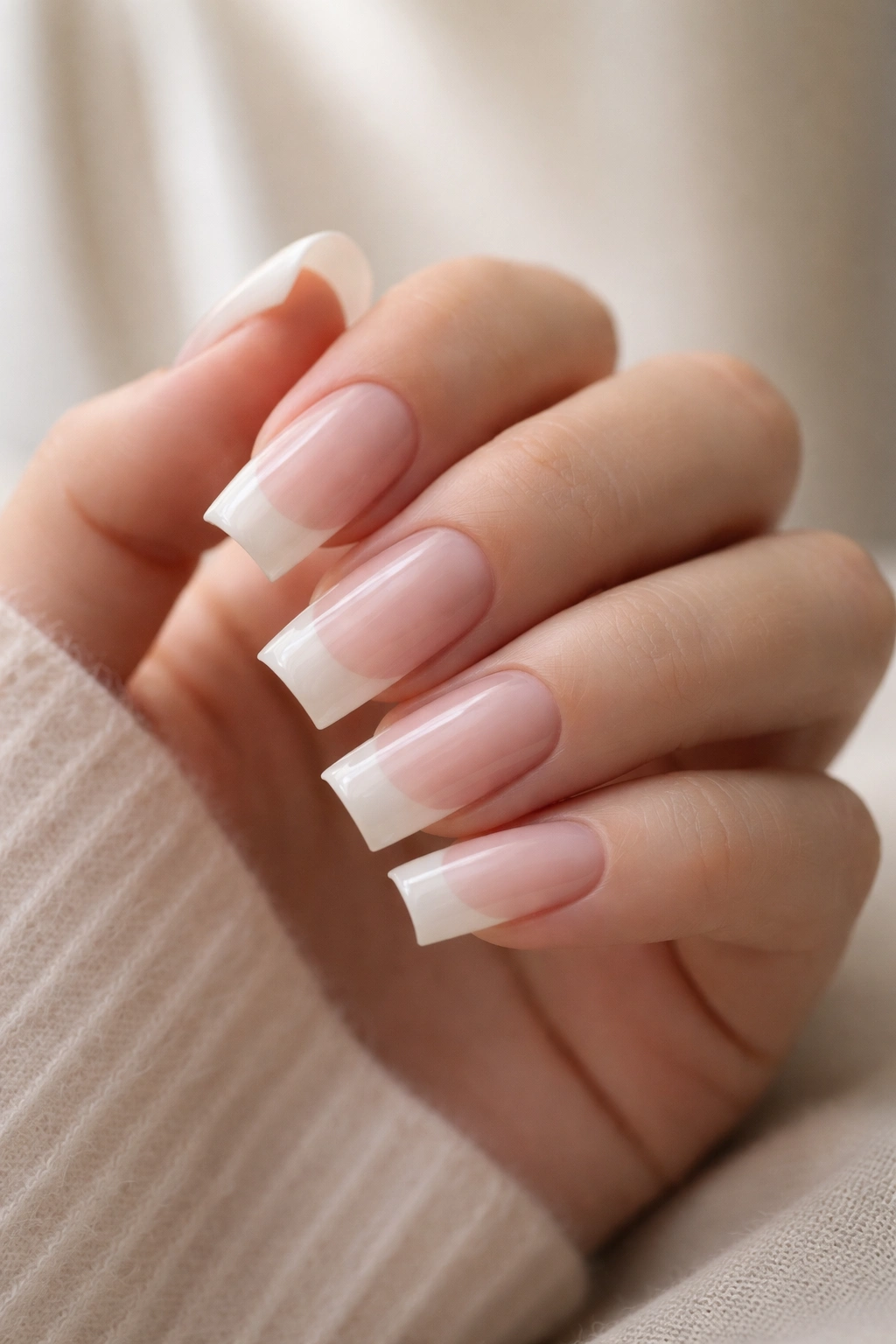
1. Creamy French Ombré with Soft Fade
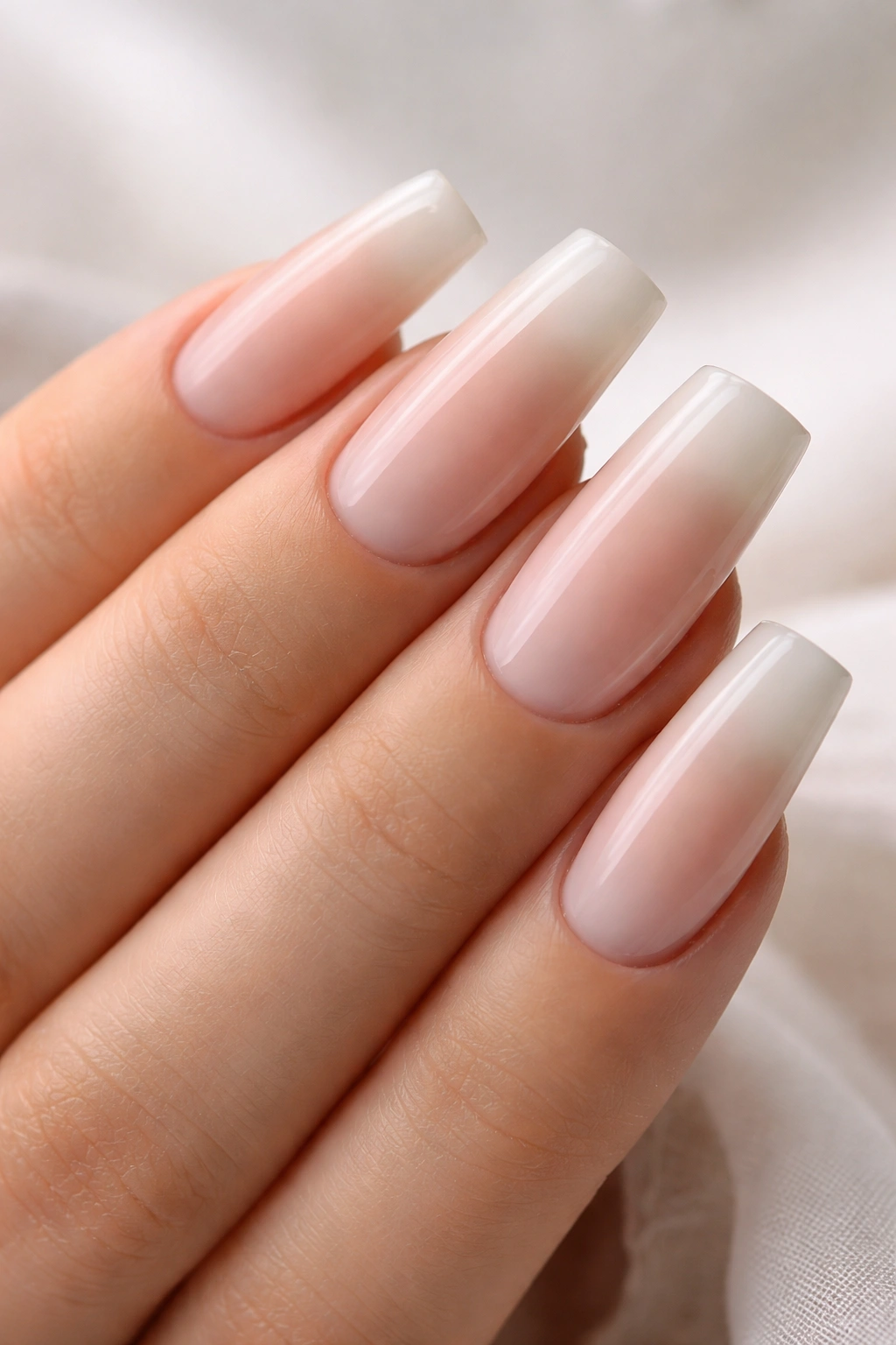
The French ombre on medium duck nails creates an incredibly sophisticated look that feels both modern and timeless. Instead of a hard line at the tip, this design features a gradual fade from a rich cream base into a sheer white or champagne tip that melts seamlessly into the nail. The curved shape of duck nails actually enhances this effect—the ombré follows the natural contour of the nail, making the gradient look like a deliberate design feature rather than a blending accident.
Why This Design Works So Well
The soft fade approach works beautifully on medium length because it doesn’t overwhelm the nail bed or make fingers look shorter. The cream base is universally flattering and the gradual fade adds visual interest without requiring nail art skills. This design works equally well for understated elegance or as a foundation for additional embellishment. The neutral color palette means you can wear it year-round with any outfit.
Application Tips and Details
- Use a makeup sponge or special ombré tool to blend cream and white polishes at the tip area
- Apply thin, light layers rather than one thick coat to keep the gradient smooth and natural-looking
- The fade should start around three-quarters of the way up the nail, giving plenty of space for the blend
- A glossy top coat will make the ombré appear more seamless and polished
Pro tip: Seal the ombré with gel top coat if you have it—the glossy finish makes the fade look more professional and the color lasts longer.
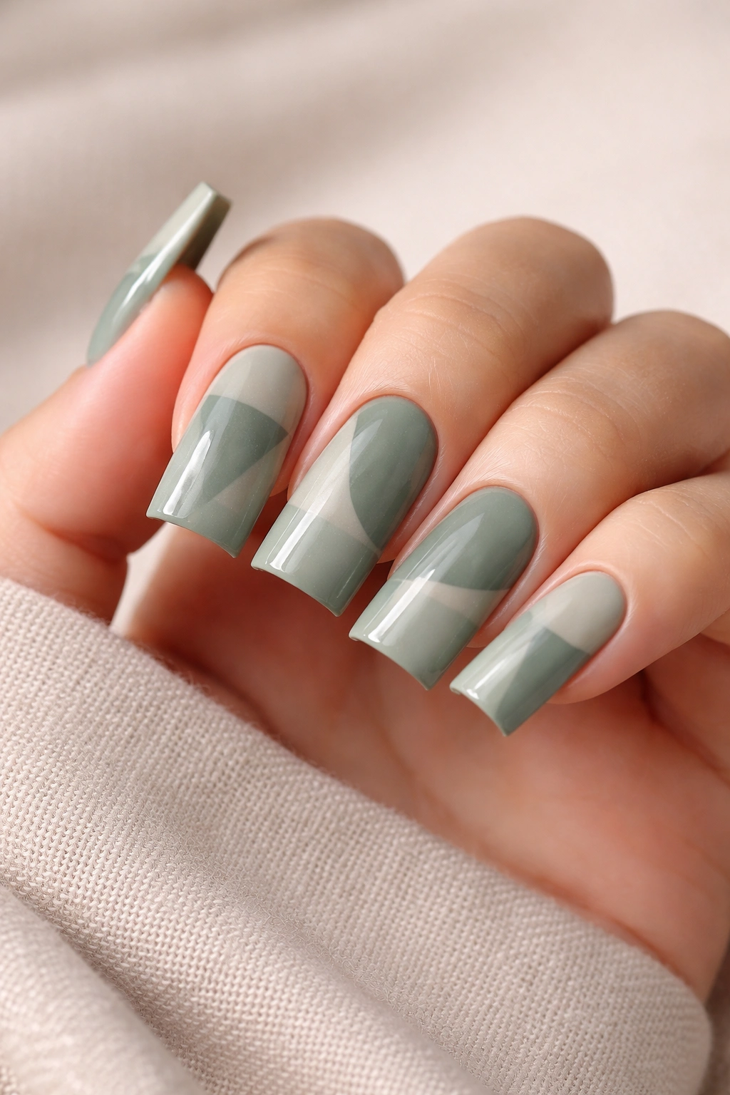
2. Sage Green with Brushstroke Gold Accents
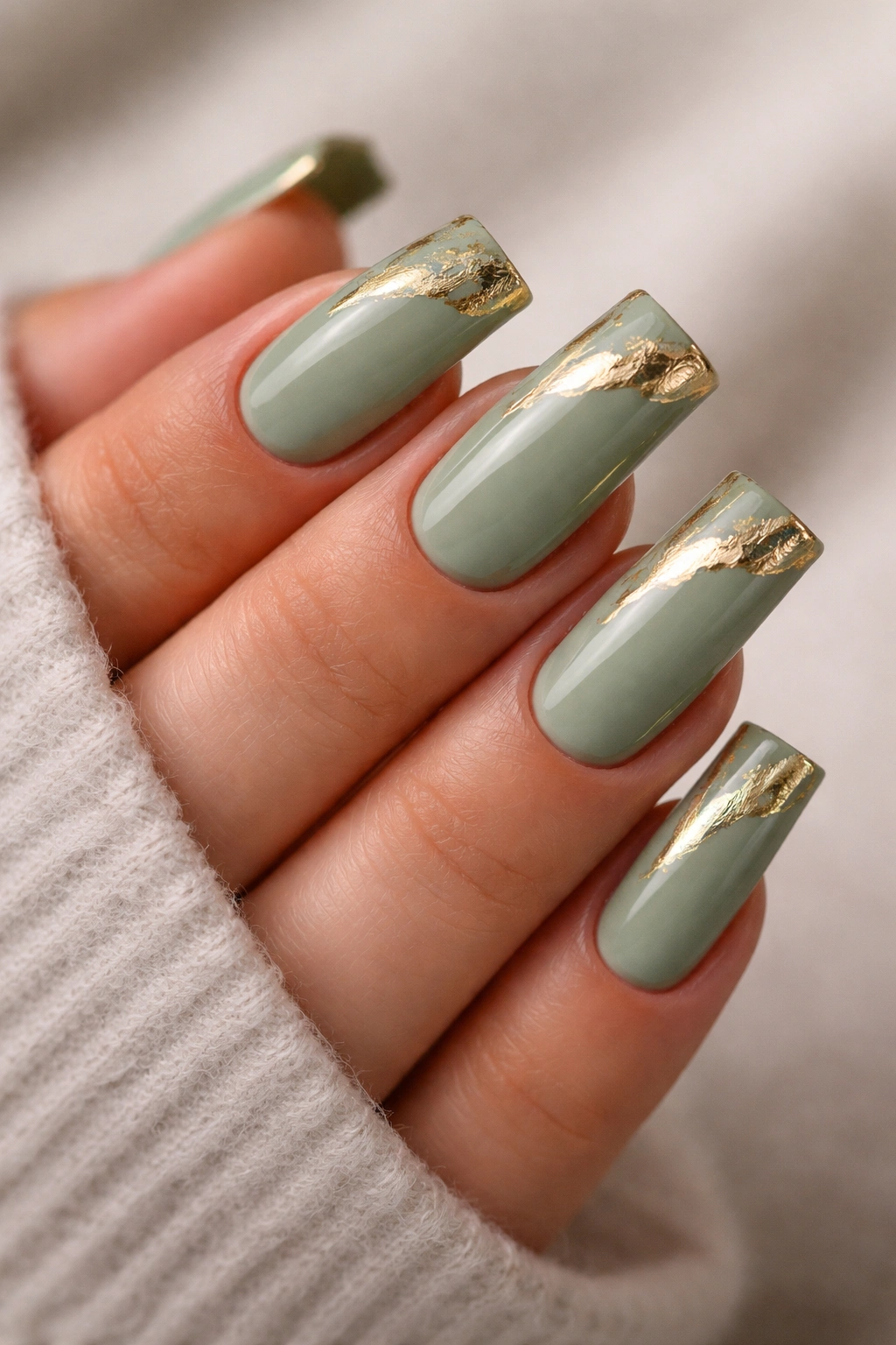
Sage green is having a major moment, and on medium duck nails, it’s a color that reads as both sophisticated and approachable. Pair a muted, dusty sage with irregular gold brushstrokes that don’t follow traditional nail art rules, and you’ve got a design that feels intentionally artistic rather than overly decorated. The brushstrokes can be placed however feels right to you—some at the tips, some along the sides, clustering near the cuticle—the imperfection is the whole point.
What Makes Sage Green Stand Out
Sage green skews toward the calming, refined side of the color spectrum, which means it doesn’t fight with your skin tone the way true neon greens might. The muted undertones make it work beautifully on warm, cool, and neutral skin undertones. Gold accents add just enough visual weight and luxury without tipping into costume jewelry territory. The design stays interesting through simplicity rather than complexity.
How to Achieve This Look
- Start with 2-3 coats of your sage green base for full, even coverage
- Use a thin art brush and metallic gold polish to create loose, intentional brushstrokes
- Don’t aim for perfection—slight irregularity looks deliberately artistic
- Keep brushstrokes relatively thin so they don’t dominate the overall design
- Seal everything with a matte or glossy top coat depending on your preference
Worth knowing: Sage green might need one extra base coat compared to lighter colors because the undertones can sometimes appear patchy with standard coverage.
3. Milky White with Subtle Marble Veining
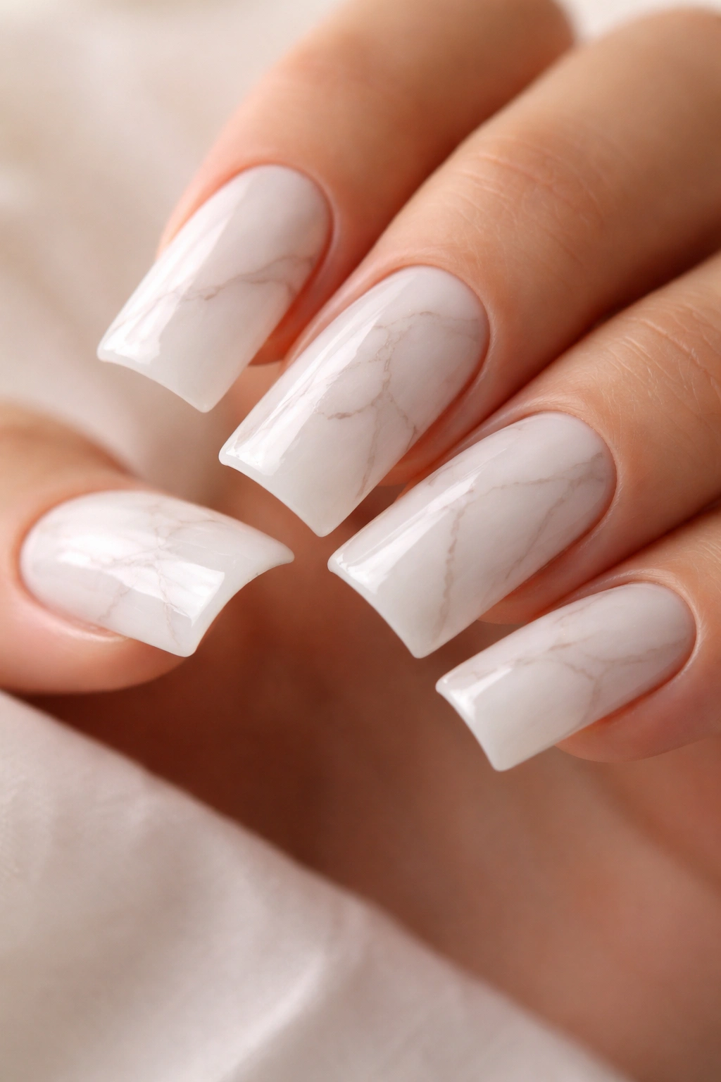
This design hits that sweet spot between minimalist and visually interesting. A creamy milky white base (not pure white, but something with a touch of warmth) gets thin, delicate marble-style veining in soft gray or taupe. The veining should feel like it’s barely there—just enough to create texture and interest without making the nails look busy. On medium duck nails, this approach feels elevated because it’s understated but undeniably intentional.
Why Marble Veining Elevates Simple Designs
Marble instantly signals luxury and sophistication because of its natural connection to high-end aesthetics. By keeping the veining minimal and soft-toned, you get that luxury association without the nails looking heavy or overdone. The effect is particularly striking on medium duck nails because the curved shape naturally draws the eye to the nail surface—a simple base color might feel flat by comparison, but subtle veining adds just enough visual movement.
Technique for Perfect Subtle Marble
- Apply 2-3 coats of milky white base for a smooth, opaque finish
- Mix soft gray and taupe polish or use diluted versions with a drop of liquid medium
- Using a very thin art brush or the pointed end of a dotting tool, create thin, irregular lines rather than thick veins
- Keep veining concentrated in certain areas rather than covering the entire nail—perhaps focusing on one corner or a section down the middle
- The effect should look like you’ve barely touched the surface, not like you’ve decorated it heavily
Pro tip: Use a matte top coat over this design instead of glossy—it emphasizes the stone-like quality of the marble effect and makes the whole thing feel more authentic.
4. Warm Taupe with Delicate White Striping
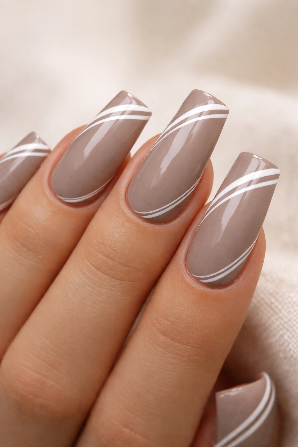
Warm taupe is one of those colors that genuinely works on every single person. Medium duck nails in warm taupe feel sophisticated and contemporary without requiring any special occasion to justify wearing them. Add thin, delicate white stripes placed thoughtfully around the nail—maybe a thin stripe near the tip, another along the side, or one following the curve of the duck—and you’ve transformed a simple color into a designed look that feels intentional and polished.
The Universal Appeal of Taupe
Taupe sits perfectly neutral while still having warmth—it doesn’t lean too cool or too warm, which is why it’s basically foolproof. On medium duck nails, taupe creates a sense of understated elegance that photographs beautifully and pairs with any style. The neutral base means your hands look elongated and refined without looking bare or boring.
Creating Balanced White Striping
- Use a thin striping brush (0 or 000 size) and white gel or regular polish for the lines
- Keep stripes thin and intentional—thick lines look less refined on this muted base
- Placement matters: try one stripe along the tip edge, one down the side, or follow the natural curves of the duck shape
- The white should be bright enough to show contrast against taupe but not so bright it looks jarring
- Space stripes asymmetrically rather than placing them identically on each nail—that imperfection reads as more intentional
Worth knowing: Warm taupe can sometimes appear gray instead of warm if your base polish leans too cool. Test your specific shade on a nail wheel or swatch first if you’re unsure.
5. Peachy Nude with Metallic Copper Tips
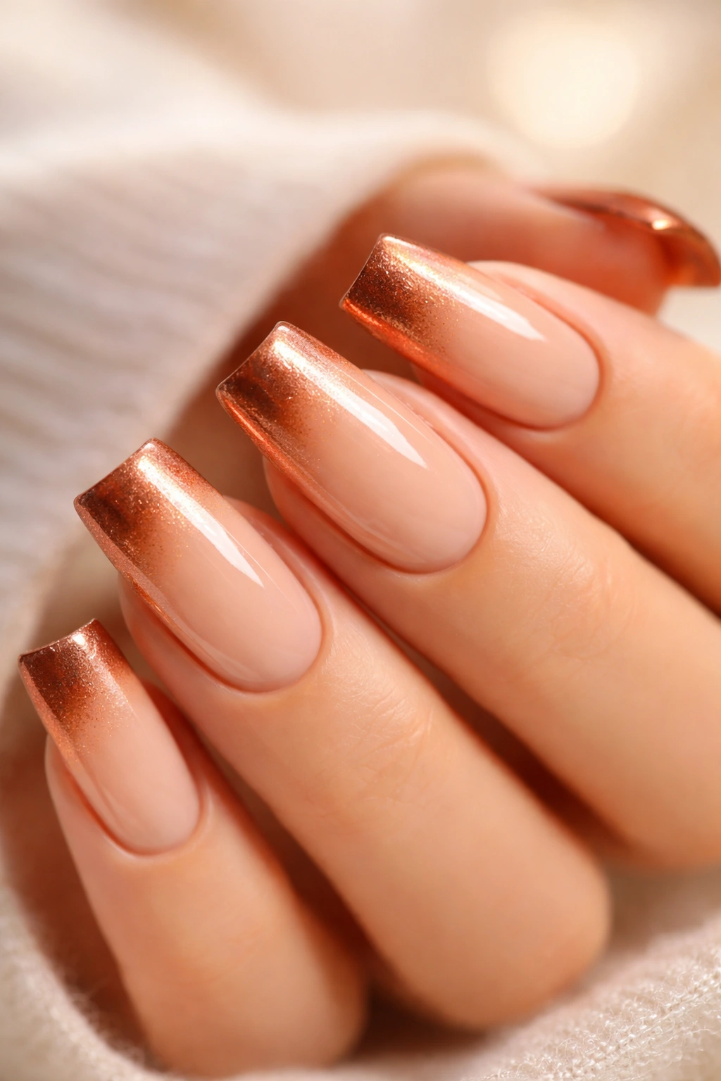
This design combines the universally flattering neutral base with just enough sparkle to feel special. A soft peachy nude (not orange, but with warm undertones) gets a metallic copper gradient at the tip that catches light beautifully. The copper acts as both a tip accent and a subtle accent color that brings out warmth in skin. On medium duck nails, this design feels balanced—the copper isn’t overwhelming because it’s just at the tips, but it’s definitely noticeable and striking.
Why This Combination Works Across Skin Tones
Peachy nude flatters warm skin tones by echoing natural undertones, and it looks equally sophisticated on cool and neutral skin tones because it reads as a classic neutral rather than a temperature-specific color. The copper accent adds a touch of richness and luxury without feeling overdone. The combination of matte peachy with metallic copper creates visual interest through texture and light-reflection rather than through contrast.
How to Build This Design
- Start with 2-3 coats of peachy nude as your base—this should feel like an extension of your skin tone
- Create a copper gradient starting at the free edge and fading back toward the nail bed
- You can use a traditional copper polish, a copper gel, or even metallic nail powder mixed with clear gel
- The gradient should be strongest at the very tip and fade naturally as you move toward the base
- Use a glossy top coat to enhance the metallic effect—it reflects light and makes the copper shimmer
Pro tip: If you want more control over the copper gradient, use a sponge method instead of a brush—dab copper onto a makeup sponge and press it onto the tip area, then blend the edges with a clean sponge.
6. Pure White with Delicate Black Line Work
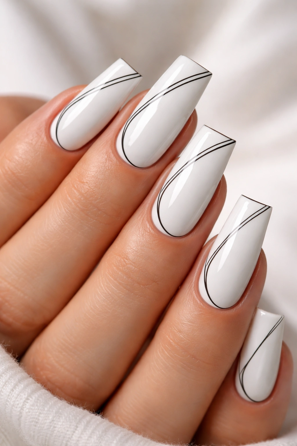
There’s something undeniably chic about pure white nails with minimal black line work. This design is sophisticated without being fussy, and it works particularly well on medium duck nails because the curved shape provides plenty of surface area for subtle line work. Black lines might trace the edge of the tip, create a thin geometric pattern, outline a simple shape, or run along the side of the nail—the placement and meaning matter less than the restraint and precision of the design.
The Power of Minimalist Black and White
The white-and-black combination is endlessly versatile because those colors work with every outfit, season, and aesthetic. There’s something inherently polished about black line work on white—it feels intentional, artistic, and professionally executed. On medium duck nails, even the simplest line placement looks like it required real skill because the curved shape makes precision line work more challenging.
Executing Clean Black Line Work
- Apply 2-3 coats of bright white base for a smooth, opaque finish
- Use a very thin striping brush (0 or 000) and black gel or polish for your line work
- Thin lines read as more refined than thick ones—keep your lines delicate and controlled
- Consider using a stabilizer or resting your arm against something solid to help keep lines steady
- Black should be truly black, not diluted or grayed—use pure black polish or gel for maximum contrast
- Seal with a glossy top coat to keep lines sharp and pristine
Worth knowing: Pure white on nails can sometimes appear slightly yellow under certain lighting unless you use a cool-toned white. Test your white shade in different lighting if you’re particular about the tone.
7. Soft Blush Pink with Pearl Finish
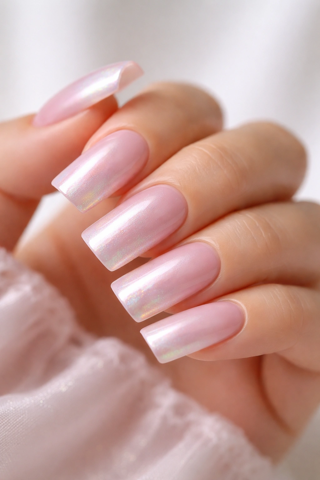
Soft blush pink on medium duck nails feels innately romantic and feminine without reading as immature or overly girly. A pearl or opalescent finish elevates blush pink from simple to luxurious—the way light reflects and shifts across the nail creates movement and interest that solid color can’t achieve. This design works because the blush base is muted enough to feel sophisticated, and the pearl effect adds just enough visual complexity without requiring any actual nail art.
What Makes Pearl Finish Elevated
Pearl or opalescent finishes create the illusion of depth and dimension. Light bounces differently across the nail, which makes the design feel dynamic and expensive-looking. On medium duck nails, this pearl effect is especially striking because the curved shape catches and reflects light beautifully. The soft blush color ensures the nails still feel elegant and paired-down despite the shimmer.
Achieving a Beautiful Pearl Effect
- Look for a pearl or opalescent nail polish specifically formulated with pearl pigments
- Apply 1-2 coats—pearl polishes often have good coverage and don’t require heavy application
- The finish should look soft and iridescent, not chunky or overly glittery
- Consider a top coat labeled as “shine sealer” designed specifically for pearl finishes to preserve the effect
- Some pearl polishes work better with gel systems than traditional polish, so choose your formula based on your preferred application method
Pro tip: Pearl finishes often look even more beautiful under UV or natural light. If you’re wearing these nails somewhere indoors under fluorescent lights, the effect might be less dramatic than you expect.
8. Neutral Beige with Minimal Gold Foil Accents
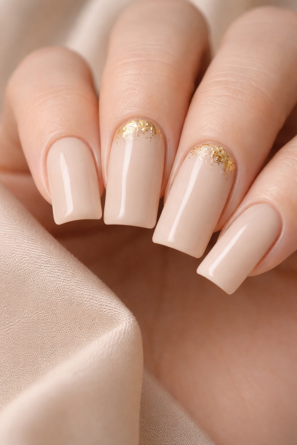
This design takes restraint seriously. A neutral beige base gets just one or two small pieces of gold foil placed strategically—perhaps a tiny triangle at the cuticle area on just two fingers, or a small geometric shape on the accent nail. The gold foil adds luxury and intentionality without making the design feel heavy or overly decorated. On medium duck nails, this approach works because the curves and size of the nail give you enough surface area to place a small foil accent without it looking lost or overwhelming.
Why Less Really Is More
The minimalist approach to embellishment actually communicates luxury more effectively than heavy decoration. Gold foil, because of its reflective properties and inherent luxury associations, doesn’t need much surface area to make an impact. By placing it sparingly, you create a design that feels intentional, artistic, and carefully considered rather than decorated-for-the-sake-of-decoration.
Placing Gold Foil Strategically
- Choose 2-3 nails on each hand for foil placement rather than applying it to every nail
- Small geometric shapes (thin triangles, small rectangles, tiny squares) work beautifully
- Place foil at the cuticle area, along the side, or at the very tip depending on the shape you choose
- Use gel or a strong adhesive polish to apply foil so it stays put through hand washing and daily wear
- One small accent per nail is enough—resist the urge to add more or the effect becomes decoration rather than accent
Worth knowing: Gold foil looks best on warmer base colors (beige, nude, peachy) rather than cool-toned bases, where it can look disconnected from the overall design.
9. Cool-Toned Gray with Rose Gold Shimmer
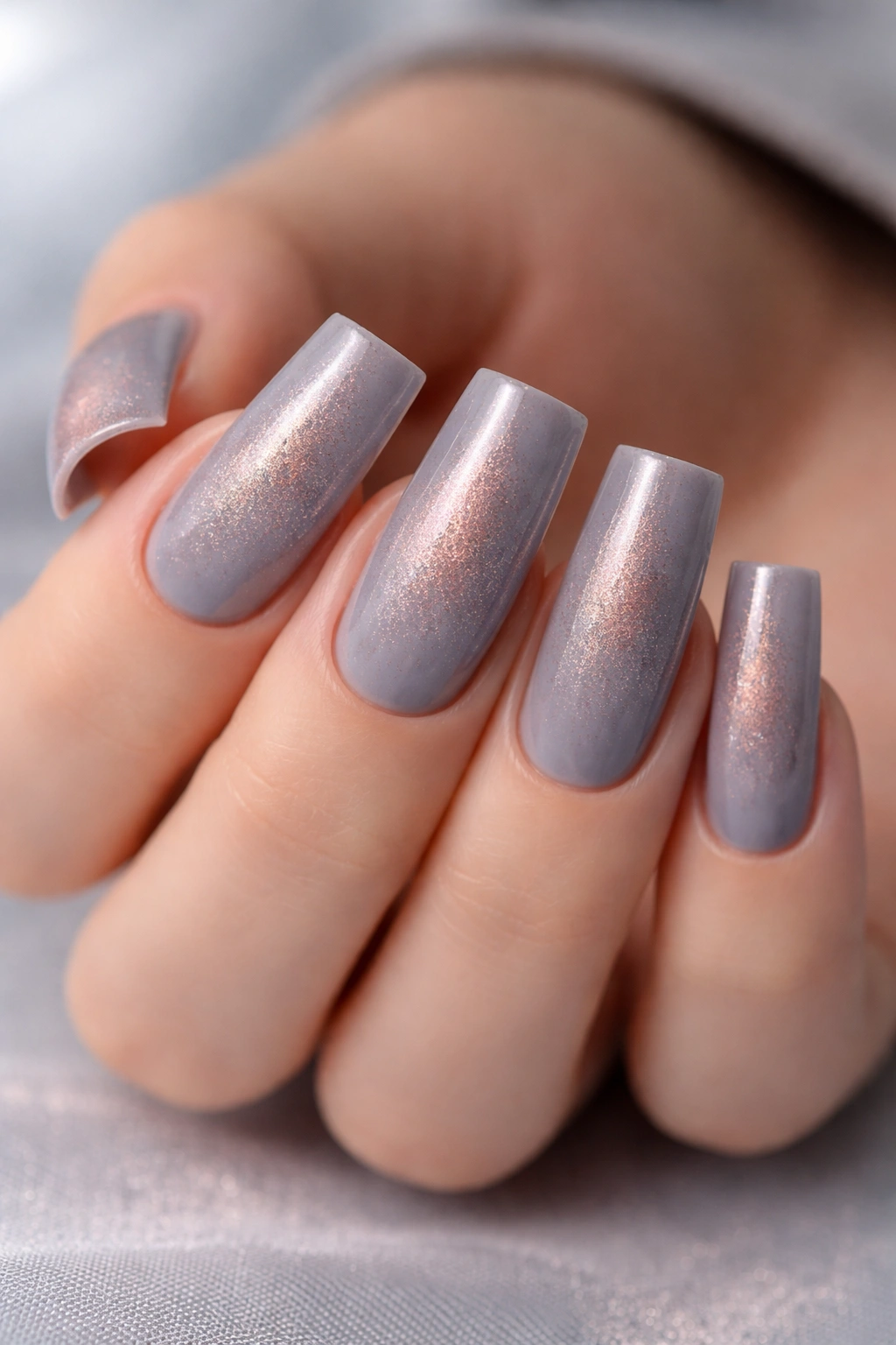
Gray on nails is having a major resurgence, and for good reason. A cool-toned gray base with rose gold shimmer woven throughout creates a sophisticated, contemporary look that feels current without being overly trendy. The gray provides a cool, refined backdrop, while the rose gold adds warmth and just enough glimmer to keep the design from feeling austere. On medium duck nails, this combination looks particularly polished because the cool-gray base elongates the nails while the rose gold keeps them from feeling cold or harsh.
The Rise of Gray Nail Aesthetics
Gray has moved past “sad” or “boring” into genuinely chic territory. A well-chosen gray (not too warm, not too cool) reads as intentional and sophisticated. The addition of rose gold—which bridges warm and cool tones—creates a design that works across different aesthetics and skin tones. The shimmer catches light without being over-the-top sparkly.
Building a Gray Base with Rose Gold Shimmer
- Use a gray that leans slightly cool but still has subtle warmth—pure cool gray can look harsh
- Choose a rose gold shimmer polish or a combination of gray base with rose gold powder
- Mix rose gold shimmer directly into your gray base, or apply it as a delicate, scattered accent
- 1-2 coats usually provides enough shimmer visibility without making the polish look overly glittery
- A glossy top coat will enhance the shimmer and make it catch light more dramatically
Pro tip: Test your gray shade on your nail wheel under the lighting where you’ll wear it most often. Gray can read completely differently under fluorescent versus natural light.
10. Cream Base with Thin Gold Striping at Tips
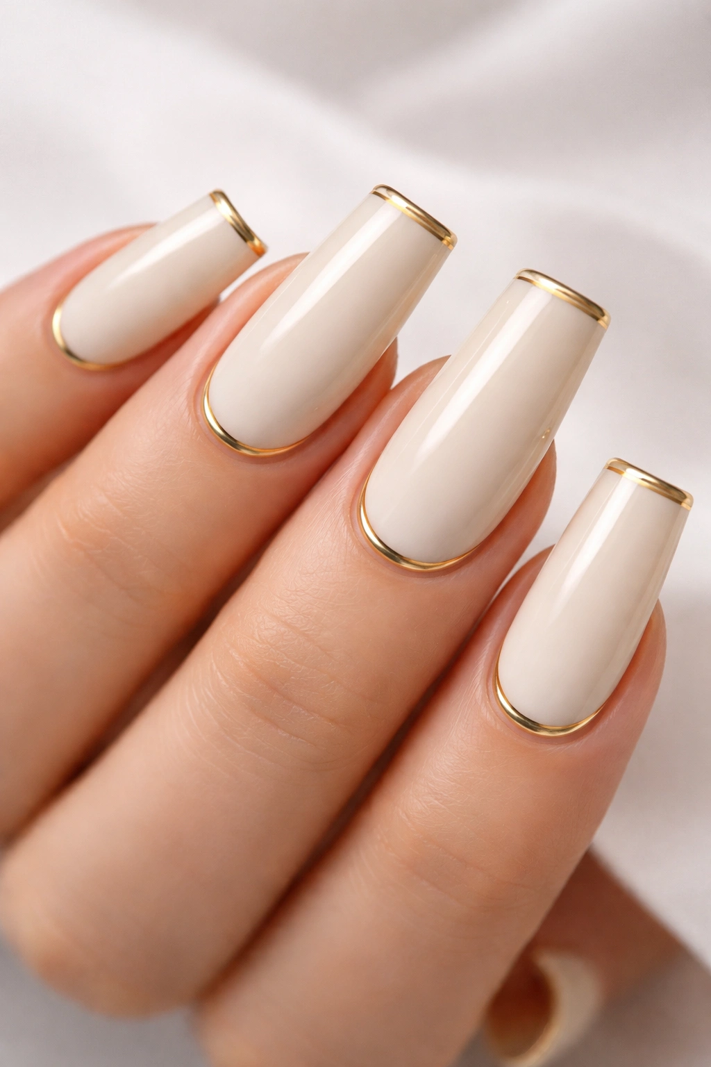
This design is classic, understated, and works because of its simplicity. A creamy ivory or off-white base gets thin gold lines placed at the tip edge, creating the effect of gold-tipped nails without the bulk of a full chrome or metallic tip. The lines should be delicate and precise—the real beauty of this design is in the execution. On medium duck nails, this approach feels elegant because the curved tip provides just enough canvas for thin line work to look intentional and polished.
Why Thin Striping Reads as More Refined
Thick stripes look graphic and bold; thin stripes look intentional and artistic. The difference is meaningful. Thin gold lines on cream read as luxury and restraint rather than decoration. The gold reflects light without overwhelming the overall neutral palette. The design works because it adds visual interest through precision and line weight, not through color or pattern.
Perfecting Thin Gold Striping
- Use a very thin striping brush (0 or 000 size) for maximum control
- Gold polish should be bright enough to show clearly against cream but not so bright it looks artificial
- Place lines at the very edge of the tip, running parallel to the nail edge
- Keep lines perfectly straight—use a ruler or edge guide if needed to help with placement
- Seal with a glossy top coat to make gold lines shine and protect them from chipping
Worth knowing: Gold striping works better on cream or ivory bases than on pure white, where the contrast can sometimes look too graphic or stark.
11. Warm Champagne with Scattered Glitter
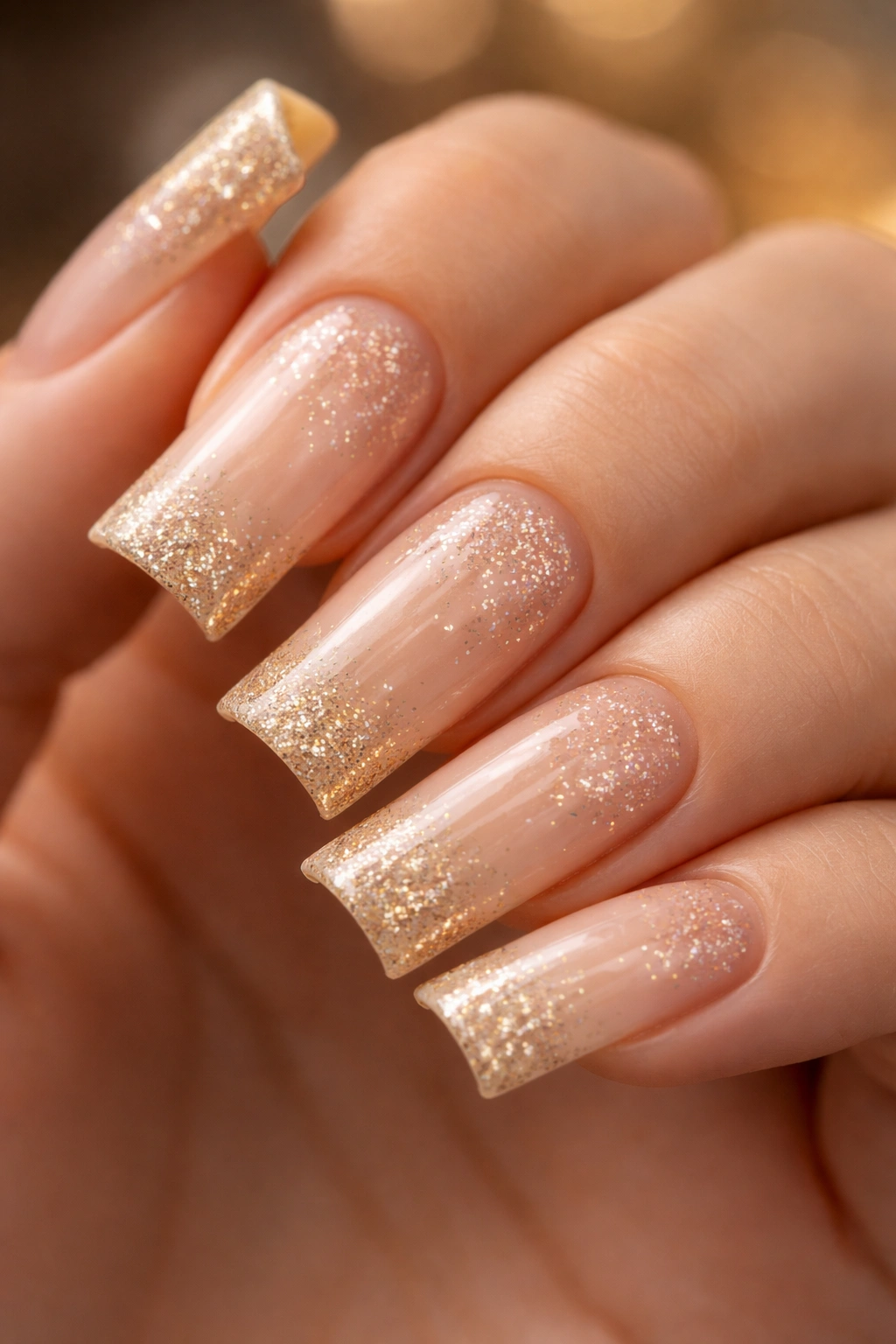
Warm champagne (that perfect blend of neutral beige with golden undertones) feels luxurious and universally flattering on medium duck nails. Add scattered glitter in coordinating champagne or gold tones, and you’ve created a design that sparkles without being overly sparkly. The scattered placement means you can control how much glitter is visible—fewer pieces for understated elegance, more pieces for a dressier occasion. The warm champagne base ensures the glitter reads as luxe rather than costume-y.
Why Scattered Glitter Reads as Intentional
There’s a difference between nails covered in glitter (which can feel overwhelming) and nails with glitter scattered across the surface (which feels curated and artistic). By placing glitter intentionally rather than covering the entire nail, you create movement and visual interest while keeping the overall design feeling sophisticated. Warm champagne as the base color ensures the glitter adds sparkle rather than changing the base color.
Applying Scattered Glitter Effectively
- Start with 2-3 coats of warm champagne base for full coverage
- Use a glitter gel or apply loose glitter mixed with gel—both work well
- Drop or place individual glitter pieces scattered across the nail rather than filling the entire surface
- Use a damp brush or glitter applicator stick to position pieces exactly where you want them
- You can create more or less density by adjusting the number of pieces—fewer for understated, more for dramatic
- Seal with a thick top coat designed for glitter to keep pieces secure
Pro tip: Save the most glitter for your accent nail (usually your ring finger) to create visual hierarchy and give the design extra polish.
12. Soft Lavender with Brushstroke Gradient to White
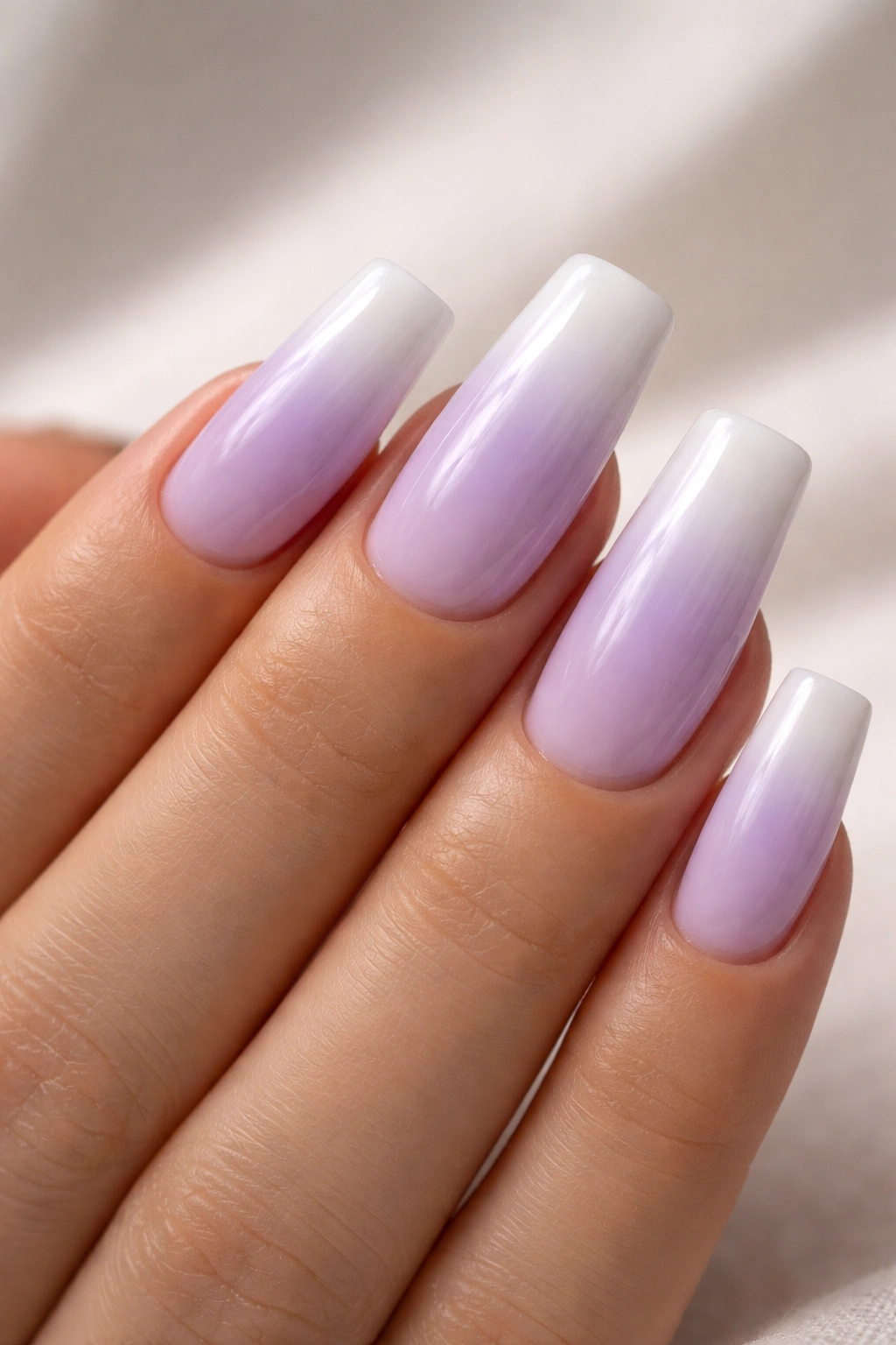
This design captures all the elegance of a gradient without requiring perfect technical execution. Soft lavender (not purple, but that gentle, gray-toned lilac shade) gradually becomes lighter and lighter as you move toward the tips, eventually fading into white at the free edge. The transition should feel organic and painterly rather than harsh or perfectly blended. On medium duck nails, this gradient works beautifully because the curved shape naturally supports the fading effect—it looks intentional rather than accidental.
Why Soft Lavender Works on Multiple Skin Tones
Lavender with gray undertones (rather than purple undertones) reads as cool and sophisticated across different skin tones. The color has enough depth to feel intentional but enough softness to feel refined. Adding white at the tips keeps the overall design from feeling heavy—it’s a color that could lean toward dated or trendy, but the gradient to white keeps it modern and flexible.
Building a Lavender-to-White Gradient
- Choose a soft, gray-toned lavender rather than a bright or saturated purple
- Apply 2-3 coats of your lavender base to the lower portion of the nail (about halfway up)
- Create a lighter version of lavender (mix with white) for the middle section
- Use nearly white or pure white at the tips for maximum contrast
- Blend sections using a makeup sponge, working from one color to the next with light dabbing motions
- The blend should be soft and gradual—you should barely see where one color transitions to the next
Worth knowing: Soft lavender can sometimes appear more purple or more gray depending on the specific undertones of your chosen polish. Test on a swatch or nail wheel first to verify the shade.
13. Deep Taupe with Negative Space Design
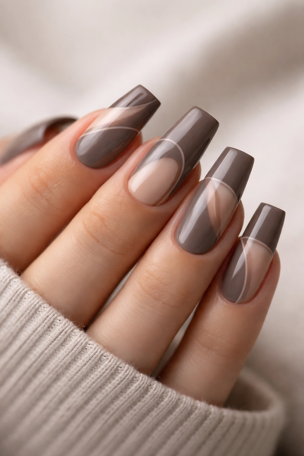
Negative space designs—where you deliberately leave areas of bare nail or nail base showing—feel incredibly modern and artistic on medium duck nails. A deep, sophisticated taupe base with strategic areas of bare nail or a contrasting lighter shade creates a design that’s visually interesting and requires just the right amount of intentionality. The negative space might follow the curves of the duck shape, create geometric patterns, or outline specific areas of the nail. The key is that every part of the design—both the painted and unpainted sections—works together as a cohesive whole.
The Appeal of Negative Space Design
Negative space design reads as artistic and intentional because it requires planning and restraint. Instead of filling the entire nail with color, you’re creating a composition that includes both color and emptiness. On medium duck nails, this approach is particularly striking because the curved shape naturally creates interesting negative space possibilities—the sides of the nail, the areas along the curve, and the tip all offer design opportunities.
Creating Intentional Negative Space
- Plan your design before starting—sketch it out or find reference images
- Use liquid latex, striping tape, or a stencil to create clean edges between painted and unpainted sections
- Deep taupe works better than lighter colors for negative space because the contrast is more dramatic
- Negative space can be pure bare nail or a lighter contrasting color—both work beautifully
- Geometric shapes, curved sections, or asymmetrical designs all work well with negative space
- Seal your design carefully to make sure the edges between sections stay crisp and clean
Pro tip: If you’re using negative space on your natural nails, remember that the bare nail area will show growth much more visibly than painted areas—this design works best if you plan to maintain it regularly.
14. Classic Nude with Thin Rose Gold Stripes
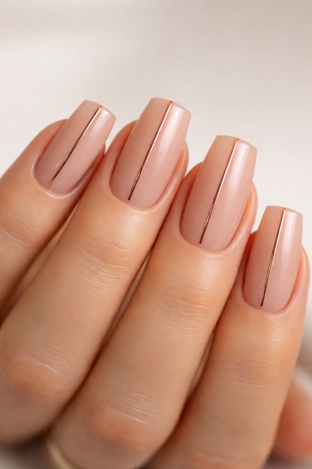
This is the design that works when you need something completely professional, refined, and appropriate for any occasion. A classic nude (the shade that matches your skin tone exactly) gets thin rose gold stripes placed vertically down the center of each nail. The rose gold adds just enough visual interest to keep the design from appearing completely bare, while still maintaining absolute professional polish. On medium duck nails, this design communicates quiet confidence and understated elegance.
Why This Combination Is Always Appropriate
Nude matched to your skin tone is the most universally flattering and appropriate choice for any professional setting, formal occasion, or situation where you want hands to feel elevated without drawing attention. Rose gold (which is warmer and softer than yellow gold) adds a touch of luxury and personality without looking overdone. Thin stripes maintain the refined aesthetic—they’re visible enough to be intentional but not so bold they distract from your hands’ overall elegance.
Executing Perfect Nude with Rose Gold Stripes
- Match your nude shade to your actual skin tone as closely as possible—this might require trying multiple shades
- Apply 2-3 coats for full, opaque coverage that truly matches skin
- Use a thin striping brush and rose gold polish to create vertical stripes down the center of each nail
- Keep stripes perfectly straight and evenly spaced—this design’s beauty is in its precision
- Stripes should be thin enough that they look delicate, not so thin they disappear
- Use a glossy top coat to keep everything pristine and make the rose gold shine
Worth knowing: Finding a nude that matches your specific skin tone is personal and might require swatching multiple brands. What matches someone else perfectly might be too warm, too cool, or too light for you.
15. Soft Pink with Minimalist White Dot Pattern
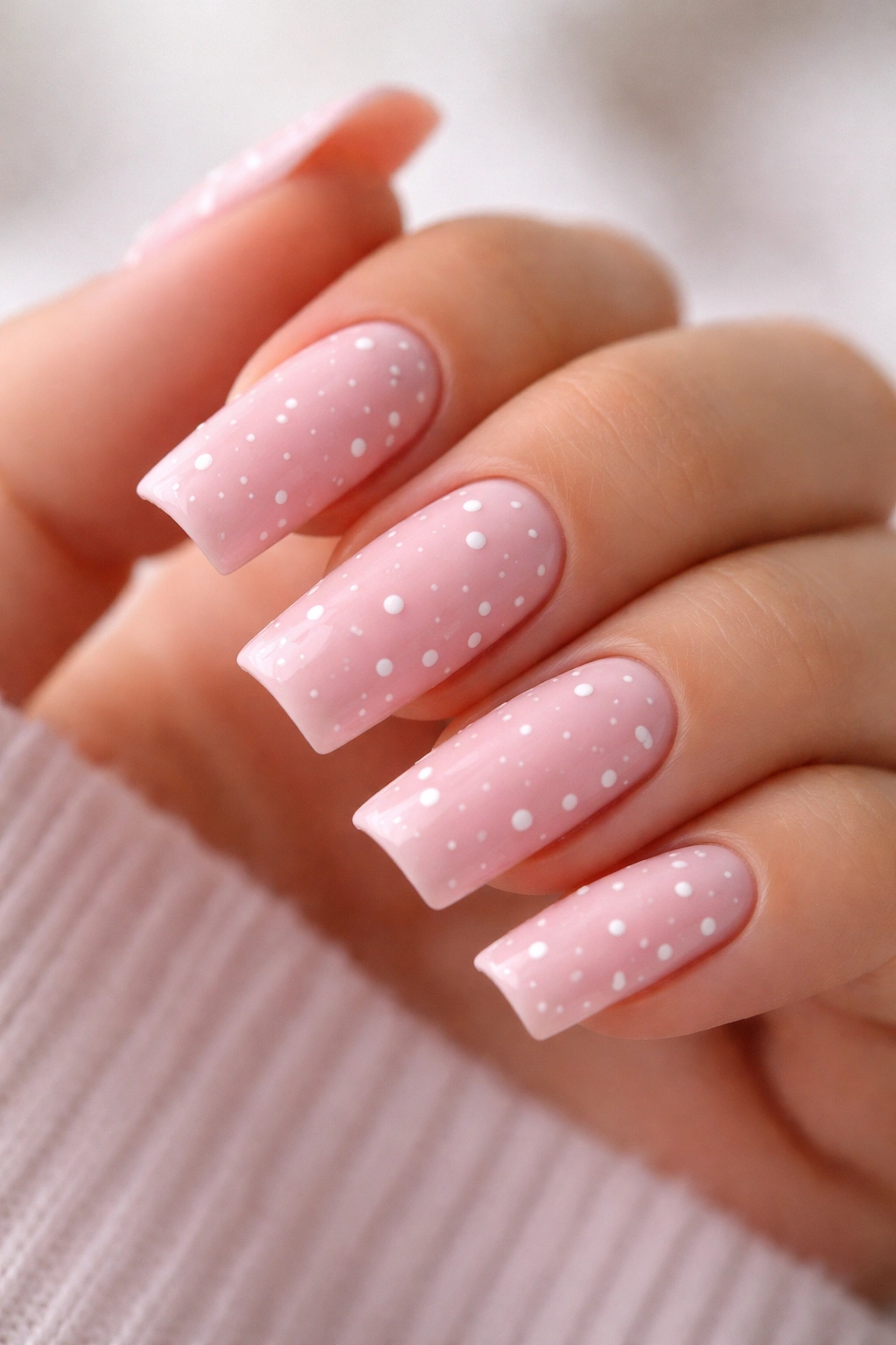
This design is charming and modern without being cutesy or juvenile. Soft pink (a gentle shade, not hot pink or baby pink) gets a pattern of tiny white dots scattered across the nail—irregular placement, varying sizes slightly, creating a design that’s more interesting than solid color but still minimal. On medium duck nails, the scattered dots work beautifully because the larger surface area gives you room to place dots thoughtfully without overcrowding. The design reads as intentional and artistic rather than decorated.
Why Dot Patterns Feel Contemporary
Polka dot designs on nails can feel retro or overly cute, but when you use soft, muted colors and scattered rather than perfectly regular placement, the design feels modern and artistic. The irregularity signals that this is deliberate minimalism rather than accidental spottiness. Soft pink combined with white dots creates contrast while maintaining an overall sense of softness and refinement.
Creating a Scattered Dot Pattern
- Use a dotting tool or toothpick to apply white dots—this gives you more control than a brush
- Load a tiny amount of white polish on your tool and place dots across the nail surface
- Vary the size slightly (barely noticeable size differences) to make the pattern feel organic
- Cluster some dots closer together and space others further apart—irregular placement reads as more intentional
- Place more dots on some nails than others to create visual variation across your hand
- Make sure dots are fully dry before applying top coat to prevent them from blurring
Pro tip: If you’re worried about creating even dots, practice on a piece of paper or nail wheel first—dotting is more forgiving than you might think once you get the hang of controlling the tool.
16. Warm Peachy Base with Bronze Metallic Gradient
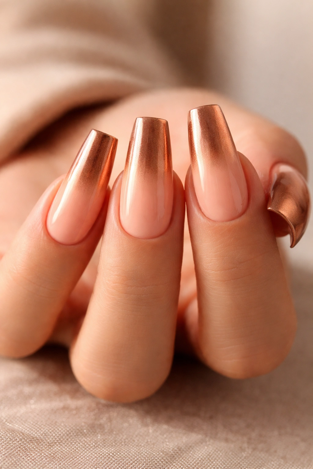
This design combines a warm, universally flattering base with a rich metallic gradient that feels luxurious and expensive-looking. Warm peachy (slightly more saturated than peachy nude, but not orange) gets a bronze metallic gradient that starts at about the middle of the nail and intensifies toward the tips. The gradient creates dimension and catches light beautifully. On medium duck nails, the peachy base feels summery and fresh while the bronze adds richness and sophistication—it’s a combination that works year-round while feeling seasonally appropriate.
Why Bronze Metallics Feel Luxurious
Bronze is the most sophisticated metallic undertone because it bridges warm and cool, works across skin tones, and reads as intentionally luxe rather than overly shiny. The gradient approach (rather than full coverage) keeps the design from feeling costume-y while ensuring the bronze remains a strong design element. The peachy base ensures skin looks warm and healthy while the bronze adds visual interest and light-reflection.
Building a Peachy-to-Bronze Gradient
- Start with 2-3 coats of warm peachy base for full coverage
- Create your bronze gradient using bronze gel, bronze polish, or bronze powder mixed with clear medium
- Begin the gradient about midway down the nail, keeping the lower portion pure peachy
- Use a makeup sponge or blending brush to create a smooth transition from peachy to bronze
- The bronze should be strongest at the very tip and fade gradually as you move toward the base
- A glossy top coat will make the bronze shimmer and enhance the metallic effect
Worth knowing: Bronze metallics can sometimes appear orange-tinted depending on the specific formula. Test your bronze shade before committing to ensure it reads as bronze rather than orange-metallic.
17. Crisp White with Thin Black Outline
This is minimalist nail art at its finest. Pure white nails get a thin black outline around the entire perimeter of each nail—just enough definition to make the shape feel intentional and polished, without creating an actual design. The outline traces the edge of the nail, following the natural contour of the duck shape. On medium duck nails, the outline emphasizes the curved shape and creates a framing effect that makes hands look sculptural and refined.
The Power of Definition Through Outline
An outline serves as a frame, making whatever’s inside—in this case, pure white—feel more intentional and designed. The black outline draws attention to nail shape without adding color or complexity to the surface. This approach works especially well on duck nails because the curved, distinctive shape is already beautiful—the outline simply emphasizes something that’s already there.
Creating a Perfect Thin Outline
- Paint nails in 2-3 coats of pure white, ensuring completely opaque coverage
- Use a very thin striping brush (0 or 000) and pure black polish or gel
- Hold the brush at an angle and trace around the entire perimeter of the nail
- Keep the line consistent in width all the way around—this is what makes it polished
- The outline should sit at the very edge of the nail, following the natural shape
- Use a glossy top coat to protect the outline and keep it crisp
Pro tip: If you struggle with steady hands, use a stabilizer or rest your arm against something solid while you apply the outline. Taking your time is more important than speed.
18. Muted Sage Green with Glossy and Matte Texture Blocking
This design plays with texture contrast in a way that feels sophisticated and contemporary. Muted sage green serves as the base, with specific sections finished in a high-gloss top coat while other sections remain matte. The texture blocking might follow geometric patterns (matte top half, glossy bottom half, or alternating sections) or more organic shapes. The interplay between glossy and matte surfaces catches light differently and creates visual interest without adding color or patterns. On medium duck nails, the texture contrast is particularly striking because it’s subtle enough to feel refined but obvious enough to make the design feel intentional.
Why Texture Contrast Feels Contemporary
Texture is one of the most underrated design elements in nail art. By playing with glossy versus matte finishes, you create visual movement and interest without adding colors, patterns, or embellishments. The contrast is sophisticated and feels modern rather than trendy. Sage green is muted enough that texture contrast becomes the star of the design rather than being overshadowed by color.
Creating Intentional Texture Blocking
- Apply 2-3 coats of sage green base to all nails
- Determine your texture blocking pattern (geometric, organic, or alternating)
- Use painter’s tape or liquid latex to create clean edges between sections
- Apply glossy top coat to designated sections and matte top coat to others
- Remove tape or latex carefully once the top coats are dry to reveal clean edges
- The contrast between finishes should be obvious but not jarring
Worth knowing: Matte top coats can sometimes appear slightly different in tone than the glossy version of the same color. Test both finishes on a nail wheel to verify they coordinate well.
19. Pale Yellow with Delicate Floral Line Work
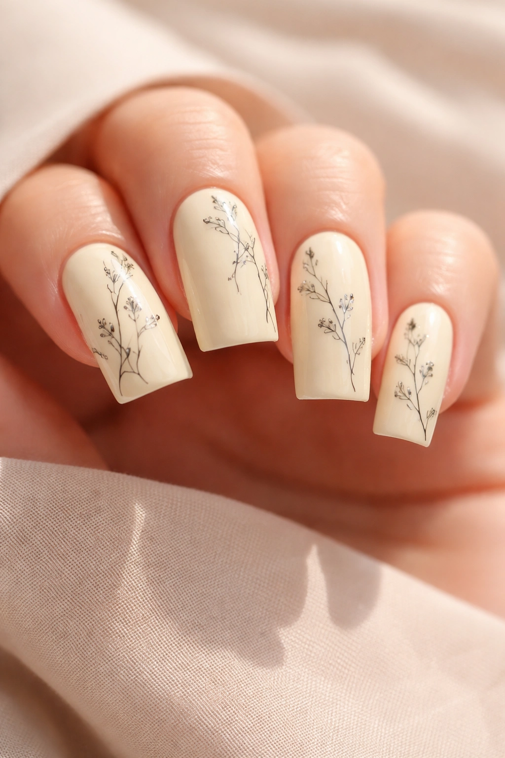
Pale yellow is having a quiet moment in the nail world, and on medium duck nails, it’s unexpectedly sophisticated. A soft, buttery pale yellow (not bright or neon, but creamy and warm) becomes the canvas for delicate floral line work in thin black lines. The florals might be simple botanical line drawings—a few flowers, some leaves, minimal stem work—placed thoughtfully across the nails rather than covering the entire surface. On medium duck nails, the floral design works beautifully because the curved shape naturally complements organic floral elements.
Why Pale Yellow Feels Understated Yet Intentional
Pale yellow is unusual enough on nails to feel intentional and artistic without being loud or attention-demanding. The creamy warmth of pale yellow makes skin look healthy and glowing. When paired with delicate line work rather than bold designs, the overall effect is sophisticated and artistic. The combination reads as someone with actual taste and aesthetic consideration rather than someone following trends.
Executing Delicate Floral Line Work
- Use a pale yellow that leans creamy rather than bright—this is crucial for the refined aesthetic
- Apply 2-3 coats for full, opaque coverage
- Use a thin art brush (0 or 000) and black polish or gel for your floral designs
- Sketch light outlines with a pencil before committing to black line work if you’re nervous
- Keep florals simple—a flower outline, a few leaves, delicate stems—rather than elaborate botanical drawings
- Place florals on fewer nails rather than covering all ten with designs
- Seal with a glossy top coat to protect the line work
Pro tip: Pale yellow shows every tiny detail, so make sure your brush and tools are completely clean and your lines are as precise as possible.
20. Warm Nude with Subtle Pearl-Finish Ombre
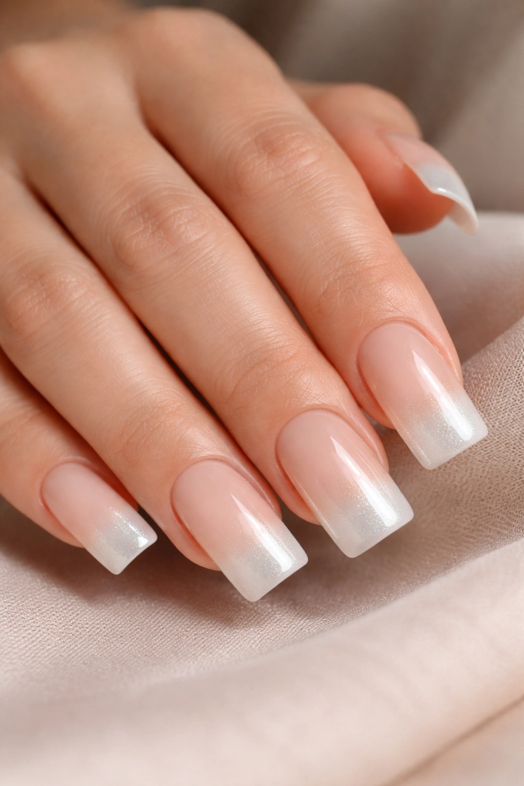
This closing design brings together everything sophisticated about medium duck nails. A warm nude that matches skin tone serves as the base, gradually transitioning into a subtle pearl or opalescent finish that becomes more obvious at the tips. The pearl effect is understated—you should barely notice it until light hits the nail, at which point it catches and creates beautiful shimmer. On medium duck nails, this design feels both complete and understated, elegant and approachable.
Why Pearl Ombre Feels Luxurious and Subtle
Pearl and opalescent finishes are inherently luxurious because they create the perception of depth and dimension without requiring any actual design work. By keeping the pearl subtle and limiting the most obvious shimmer to the tips, you create a design that reads as sophisticated from most angles but reveals its luxury when light hits just right. The ombre format ensures you get both the warmth and approachability of a nude base and the subtle luxury of the pearl finish.
Creating a Subtle Pearl Ombre
- Start with 2-3 coats of warm nude base for full coverage
- Create a transition zone starting at about the midpoint of the nail
- Gradually increase pearl or opalescent pigment intensity as you move toward the tips
- The tips should have the most visible pearl shimmer while the base remains pure warm nude
- Use a makeup sponge for blending if you want an extra-subtle transition
- A matte or satin top coat over the pearl ombre can actually enhance the effect—it calms the shimmer slightly
Worth knowing: Pearl finishes sometimes look different under artificial versus natural light. These nails will look different at work under fluorescent lights than they will in natural sunlight, which is part of their charm.
Final Thoughts
Medium duck nails have earned their place as one of the most universally wearable nail shapes precisely because they work with such an enormous range of designs. What these 20 looks have in common is restraint, intention, and recognition that truly beautiful nail design doesn’t require complexity or heavy embellishment. The best medium duck nail designs use the shape’s natural advantages—the curved silhouette, the ideal length for daily life, the distinctive appearance—and pair them with color, finish, and line work that feels intentional rather than overdone.
The most useful takeaway isn’t that any one of these 20 designs is objectively the best. Instead, it’s that the best design is one that matches how you actually want your hands to feel and look. Some of these designs feel most beautiful to you in person, others in photographs. Some will feel perfect for your aesthetic and lifestyle, while others might inspire you to adapt the concept in your own direction. The design you’ll love most is the one you choose not because it’s trending or because someone recommended it, but because it speaks to how you want to present yourself.
