

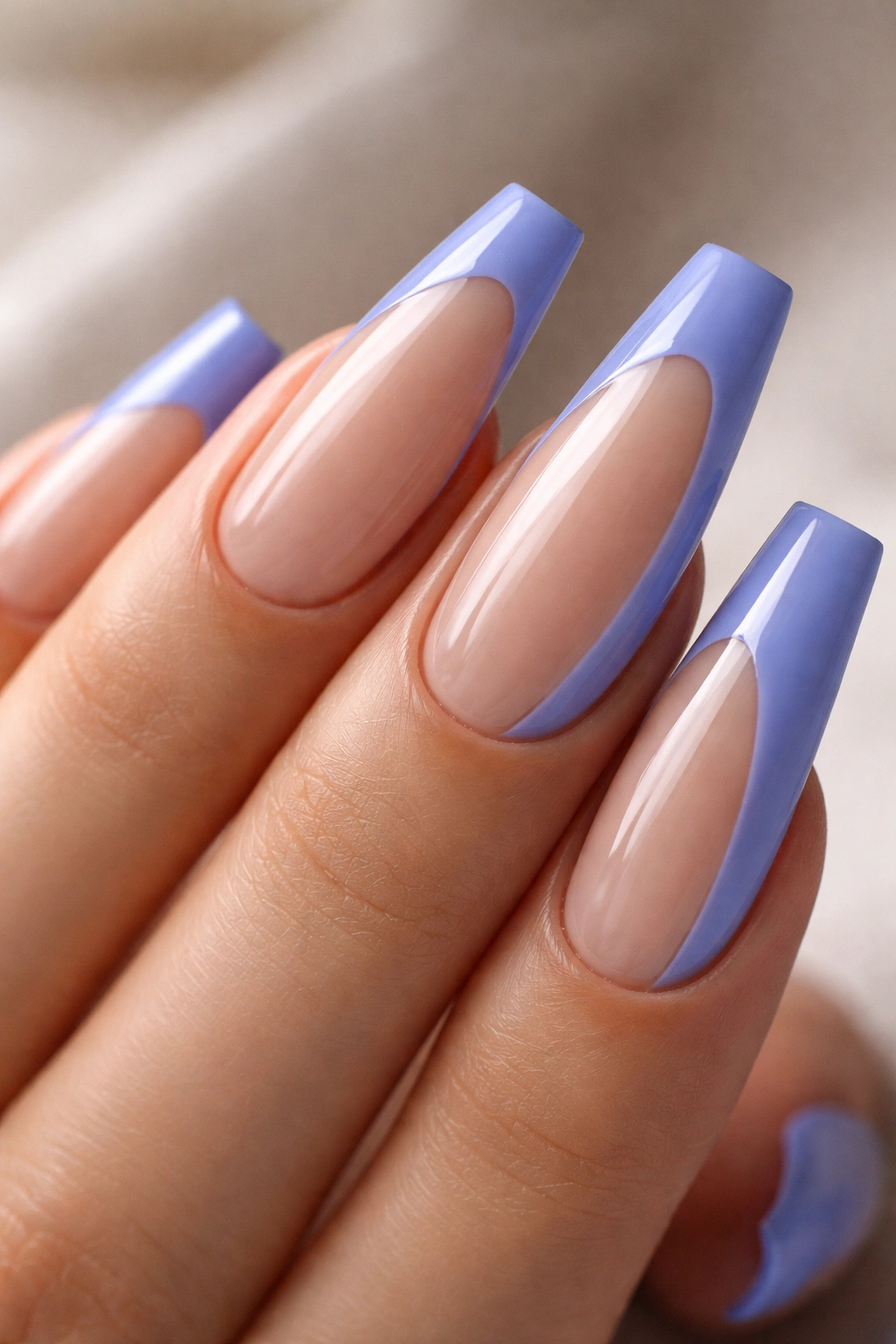
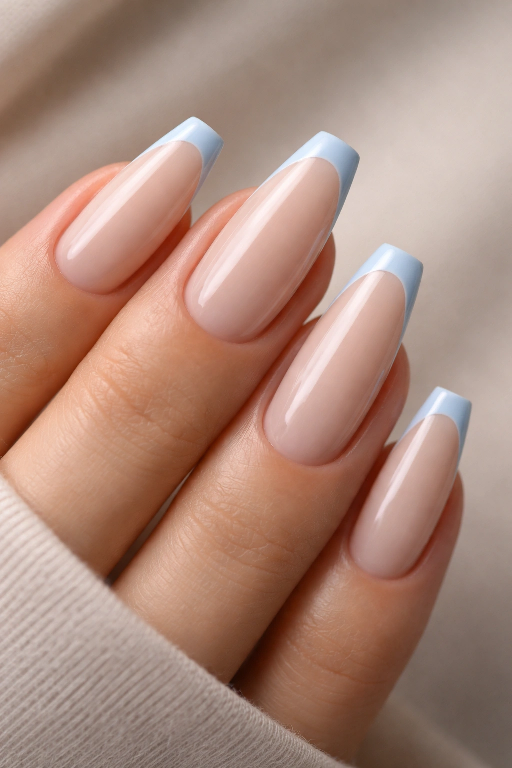
A blue tip can make a standard ballerina set look sharper in ten seconds. Blue French tip ballerina nails have a different pull than white ones do: they draw your eye straight to the tapered edge, which makes the shape look longer, cleaner, and more intentional.
That effect depends on details people often skip. On a ballerina shape—coffin nails, if your salon uses that name—the width of the tip, the curve of the smile line, and the finish matter as much as the color itself. A 1 mm pastel edge can make the nail look elegant. A thick 4 mm band on the same hand can make it look blocky.
Blue gives you room to play. Powder blue reads soft and fresh against a sheer pink base. Navy looks polished and a little strict. Cobalt turns graphic fast. Jelly blue, when it’s done well, has that glass-candy look that makes people stare at your hands a second longer than they meant to.
The designs below aren’t tiny variations of the same manicure. Each one stands out for a different reason—placement, shine, texture, contrast, or the way it changes the ballerina shape itself.
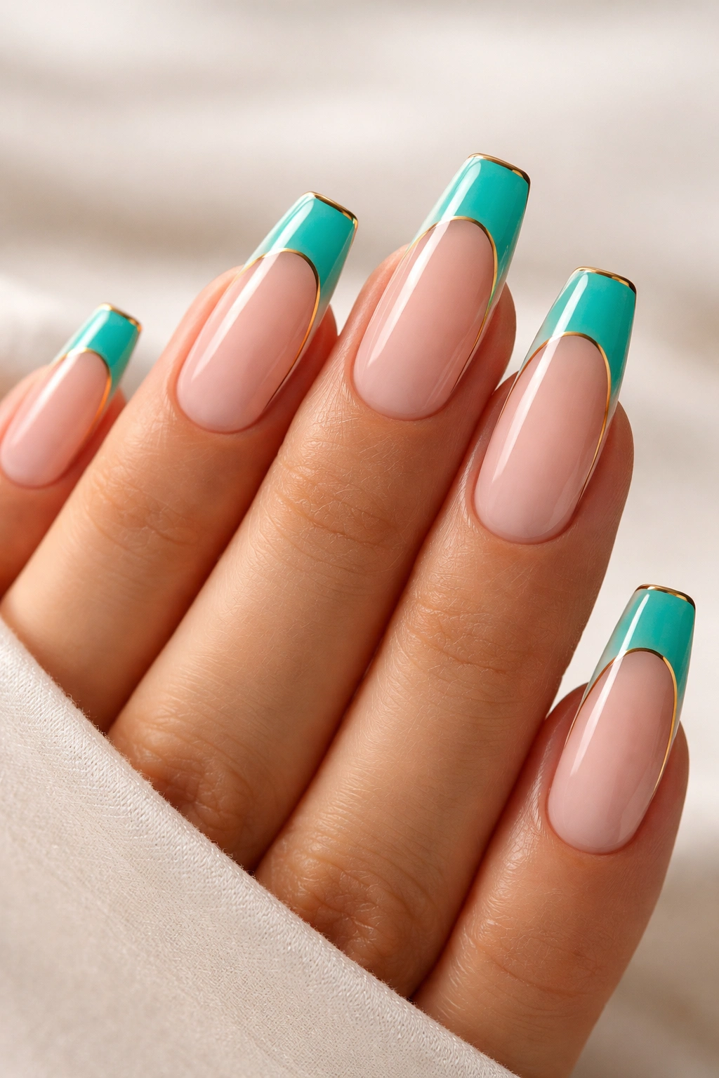
1. Powder Blue Micro Tips for Soft Blue French Tip Ballerina Nails
Thin is better here.
A powder blue micro tip on a milky nude base is one of the cleanest ways to wear blue without making the set feel loud. The color sits right at the edge, usually around 1 to 1.5 mm thick, so the ballerina shape still does most of the visual work. You notice the crisp finish first, then the color.
Why the skinny line works
A thick pastel tip can flatten the tapered end of a ballerina nail. A micro tip does the opposite. Because the band stays narrow and follows the natural curve of the free edge, the nail keeps that slim, elongated look that makes this shape flattering in the first place.
This style works especially well on medium-length sets, where you may only have 6 to 8 mm of free edge to play with. On that length, a narrow French line reads refined. Anything chunkier starts eating the nail.
Nail tech notes worth asking for
- Best base: A sheer pink or milky beige with about 80 percent opacity gives the blue enough contrast without making the set look harsh.
- Best blue: Ask for a powder or baby blue with a drop of gray in it, not a neon sky blue. The muted tone looks cleaner against nude bases.
- Best finish: Glossy top coat. Matte can make pale blue tips look chalky.
- Best line shape: A slightly deep smile line helps the nail look longer than a flat, straight-across tip.
Best move: bring a reference photo that shows the thickness of the tip, not only the color. That one detail changes the whole manicure.
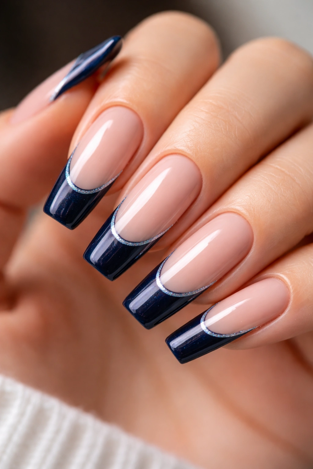
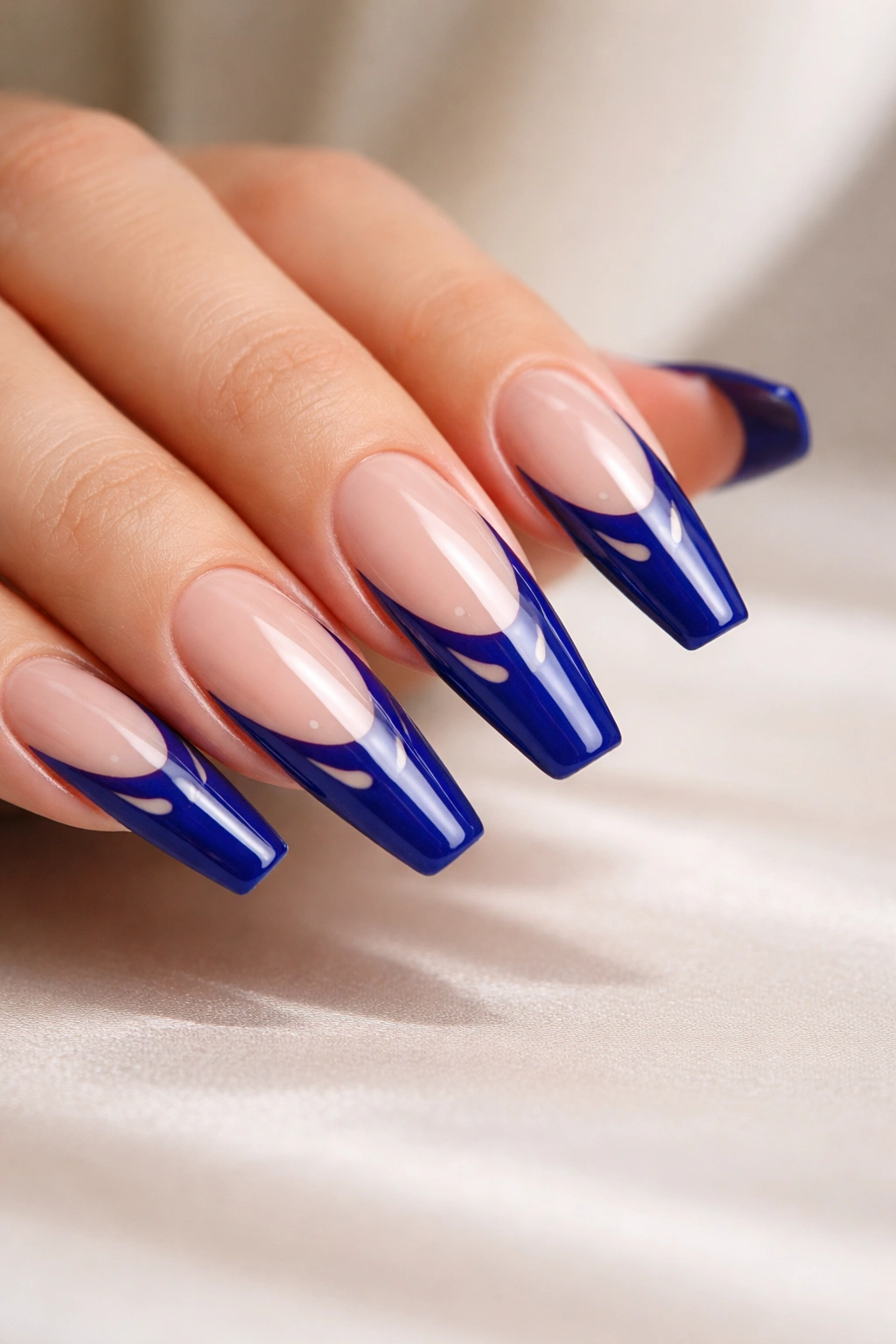
2. Glossy Navy Smile Lines on a Sheer Pink Base
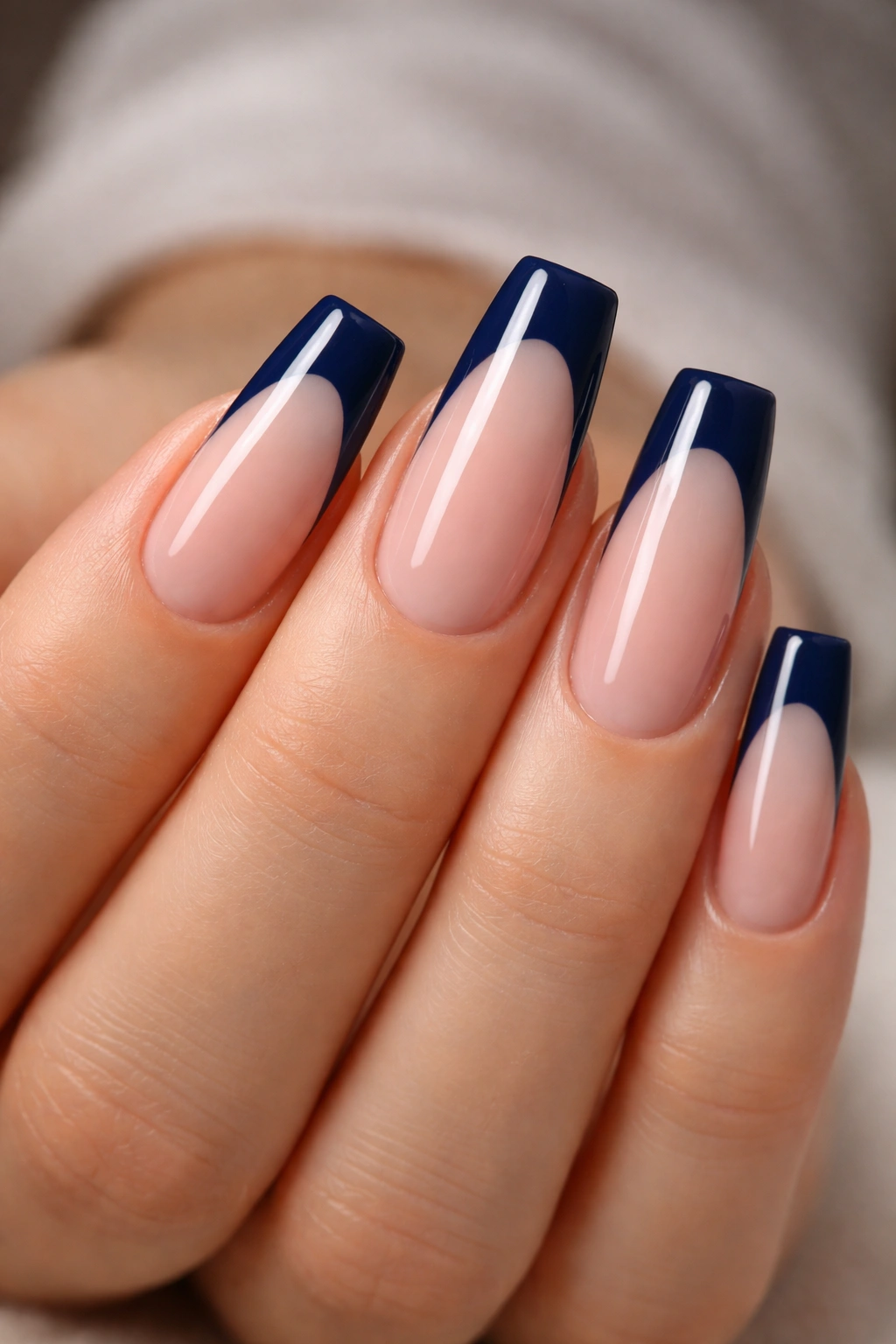
Navy is the grown-up blue tip.
If pale blue feels too sweet and cobalt feels too sharp, navy lands in a strong middle zone. It has depth, it looks expensive on a sheer pink base, and it holds up well under indoor light where lighter blues can fade into the background. On ballerina nails, navy French tips look crisp in a way that shorter round nails rarely pull off.
The smile line matters more with navy because dark color shows every wobble. Ask for a clean, symmetrical arc that dips a little lower at the center than you’d use with a white French. That extra curve keeps the tip from reading like a blunt block of color.
Gloss makes this look. A lot of it. Navy under a high-shine top coat has an inky surface that catches light across the flat edge of the ballerina shape, and that reflection keeps the dark tip from feeling heavy. Matte navy can work, though it loses some of the depth that gives this version its edge.
Medium to long lengths wear this design best. Short ballerina nails can still carry it, though I’d keep the tip narrow—around 2 mm—so the dark band doesn’t shorten the nail plate by eye. Skip chunky crystals here. Navy already has enough authority on its own.
3. Icy Blue Chrome Tips With a Glass Finish
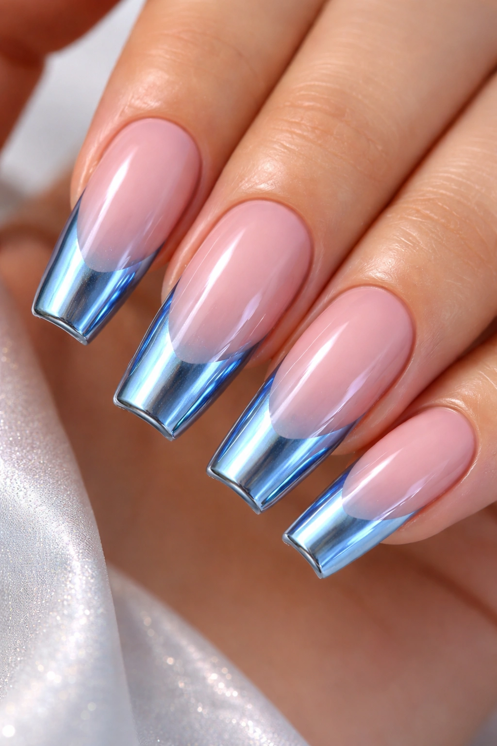
Want your tips to flash silver-blue when your hand moves? This is the set.
Icy blue chrome takes a normal French tip and gives it a mirrored surface that shifts between pale sapphire, silver, and frost depending on the light. On a ballerina shape, that flat squared-off end acts like a tiny reflective panel. You see the flicker every time you pick up a glass, type, or turn a page.
Chrome works best when the base stays quiet. A sheer pink, cool nude, or milky blush keeps the focus on the tip and lets the mirror effect look clean instead of busy. If the base is too peachy, the blue can start fighting with it.
Ask for a sealed edge
Chrome chips first at the free edge when it isn’t sealed well. A careful nail tech will usually apply the pale blue gel tip, cure it, rub chrome powder over a no-wipe top coat, then seal the design with another coat while wrapping the very edge of the nail. That last step matters more than people think.
A few practical notes:
- Chrome French tips look sharpest on hard gel or structured gel overlays, where the surface is smooth and even.
- A cooler chrome powder gives a cleaner icy result than one with a rainbow shift.
- Keep the cuticle area plain. Too much shimmer across the full nail can make the set feel crowded.
Skip this one if you hate visible wear. Chrome is gorgeous, though when it chips, you’ll spot it fast.
4. White-to-Blue Airbrush Fade at the Free Edge
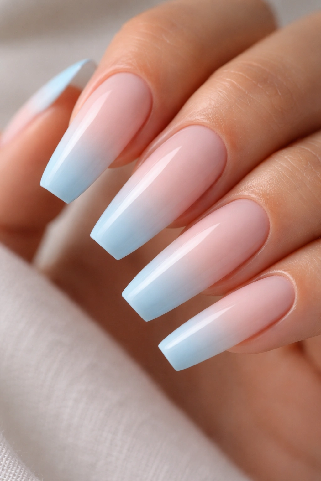
Picture the end of the nail fading from milky white into washed blue, almost like sea glass held up to a window. That soft transition gives you the French-tip look without a hard line, and on ballerina nails it can look airy instead of strict.
An airbrushed fade is the cleanest version, though a good sponge blend or blooming-gel blend can get close. The effect starts with a translucent or milky base, then the nail tech blends white near the smile line into pale blue toward the outer edge. When the blend is smooth, the blue feels like it’s floating.
This design earns extra points on longer ballerina nails because you have enough space for the fade to breathe. On shorter sets, the ombré can still work, though the transition has to be tighter and more controlled.
What makes this one stand out
- No hard border: The soft fade reads gentler than a sharp French line.
- Better for uneven nail beds: If your natural smile line differs from finger to finger, the blend hides that better than a crisp tip.
- Looks strong in photos and in person: The shift in color shows from arm’s length, not only up close.
- Pairs well with gloss: A glassy top coat makes the fade look deeper and smoother.
A matte version can be nice, though gloss is what gives the colors that wet, layered look. I’d save matte for denim or dusty blues, not this one.
5. Cobalt V-Tips That Lengthen Mid-Length Ballerina Nails
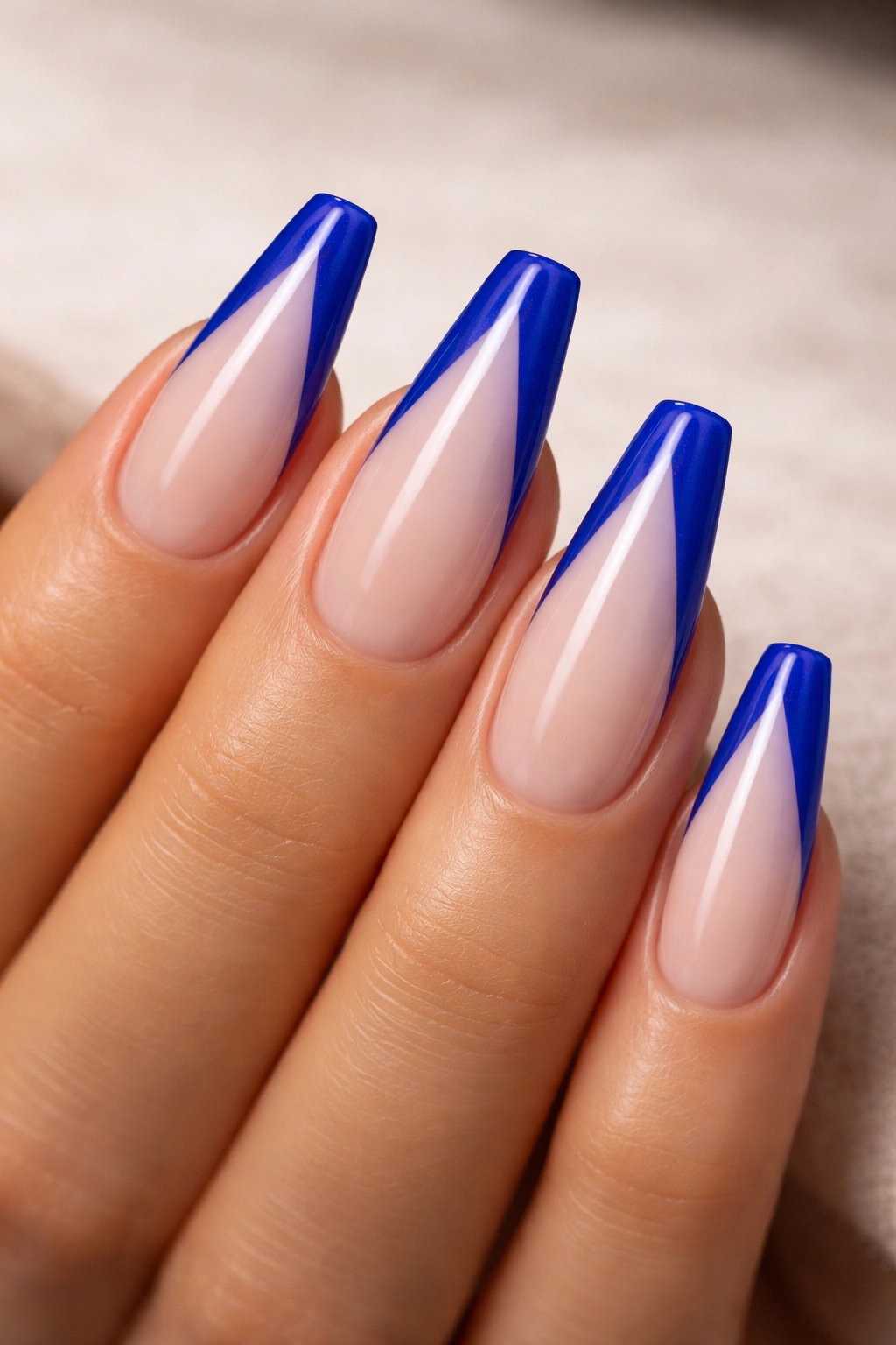
Rounded French lines are not always the answer. On a medium ballerina set, a cobalt V-tip can do more for length than a classic curved smile line ever will.
The trick is geometry. Instead of following a full arc across the nail, the blue comes in from both sidewalls and meets lower toward the center, forming a soft V. That inward pull makes the nail look slimmer and longer, which is useful when the set has some taper but not a lot of free-edge length.
Cobalt is the right blue for this shape because it has enough saturation to stay crisp from a distance. Pale blue V-tips can fade away. Navy V-tips can look dense. Cobalt lands right in that sweet spot where the line stays vivid without swallowing the whole tip.
Placement matters more than color here. If the point drops too low, the nail can start looking costume-y. I like the meeting point to sit 2 to 3 mm below the center of the free edge, not halfway down the nail bed. Sharp, though controlled.
A clear, glossy top coat keeps the V-tip looking graphic. Add rhinestones and you lose the whole point. This design is already doing something structural with the shape, and that is why it stands out.
6. Denim Blue French Tips With a Velvet Matte Top Coat
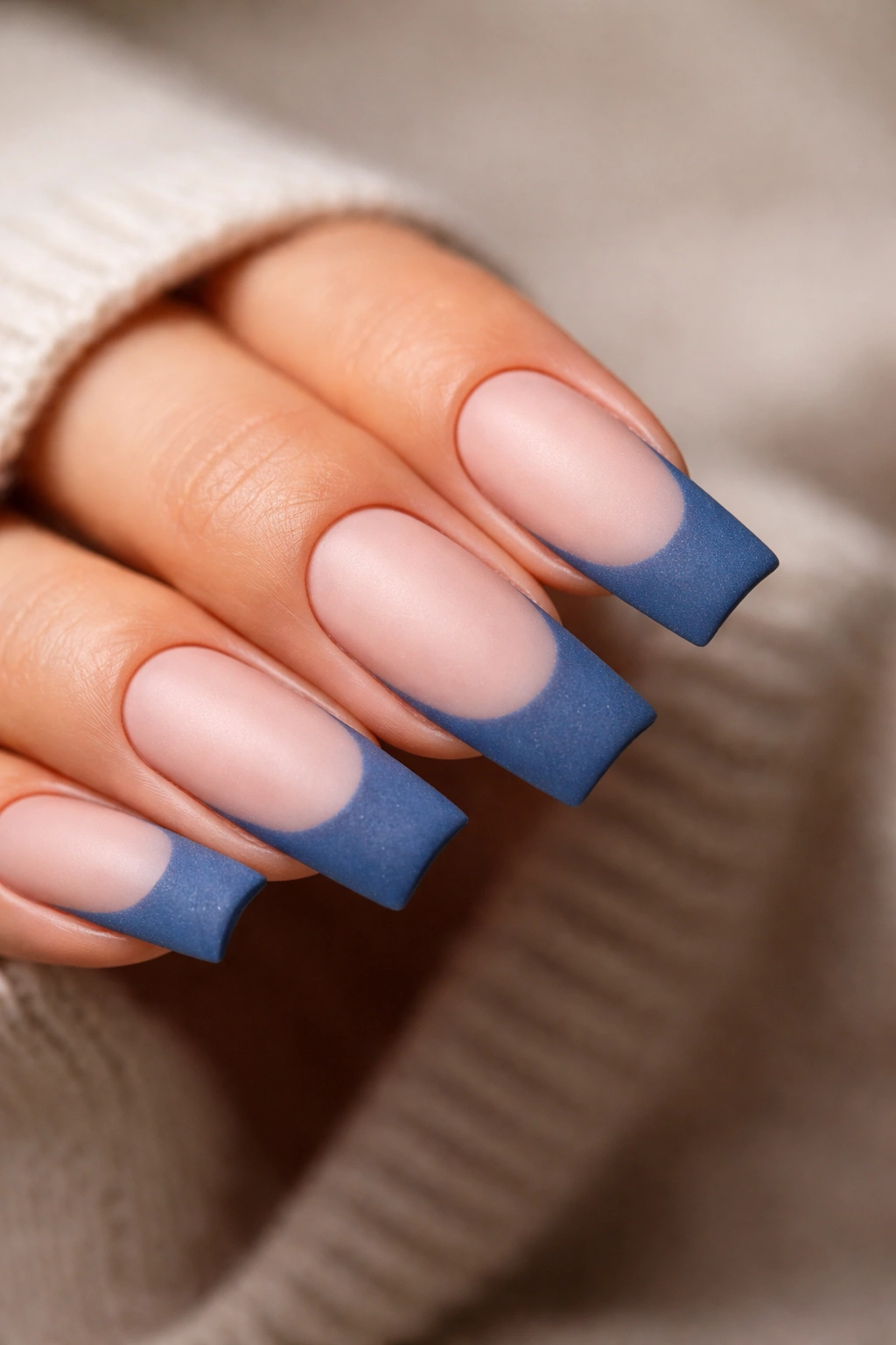
Unlike chrome or glitter, denim blue matte tips feel quiet at first glance. Then you notice the texture.
Denim blue has a dusty, slightly gray cast that softens the ballerina shape, which can lean severe when the tips are dark and glossy. Put a matte top coat over that blue and the manicure takes on a suede-like finish. The color looks cushioned, almost powdery, and the squared tip feels less sharp without losing definition.
Where this look lands best
A denim matte French works well when you want a blue set that doesn’t read formal or icy. It pairs nicely with medium lengths, structured gel overlays, and a base color that stays neutral rather than pink-heavy. Strong peach bases can make the denim look muddy.
Matte comes with maintenance. Hand cream, cuticle oil, and natural skin oils will put shine back on the tip after a few days. That does not ruin the set, though it changes the look. Wipe the nails with a little alcohol on a lint-free pad and the matte surface usually comes back.
Who should pick this one
Choose this design if you like fashion blues—washed chambray, faded indigo, old denim seams—more than jewel tones. Choose something else if you want maximum light reflection. Matte never gives you that hard-gloss snap, and that is the point.
A thin tip looks polished. A thicker matte tip can work too, though I’d keep it under 3 mm so the nail still reads long.
7. Sapphire Double French Lines With Bare Negative Space
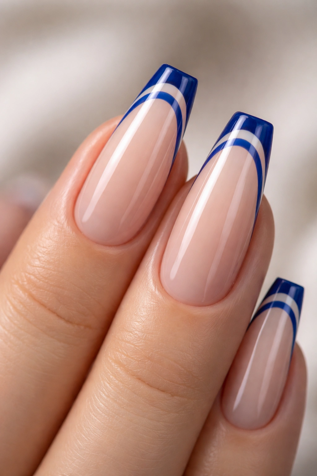
Two thin lines can look sharper than one thick band.
A sapphire double French uses two separate blue arcs near the tip with a narrow strip of negative space between them. One line traces the usual French edge. The second sits a little higher, echoing the first. Because neither line is bulky, the ballerina shape stays light and elongated.
Spacing matters more than color here
The gap between the lines should usually sit around 1 to 1.5 mm. Any wider and the design starts looking disconnected. Any narrower and the two lines blur together after top coat. On long nails, you can push the spacing a hair wider. Medium-length sets need more restraint.
The color choice matters too. Sapphire works because it has enough darkness to define the two lines cleanly against a nude base, yet it still shows a touch of brightness under direct light. Black would feel harsher. Baby blue would lose some of the graphic punch.
Tiny details that make or break it
- Keep the base sheer. Opaque pink competes with the negative-space strip.
- Use a fine liner brush, not the bottle brush, for the cleanest arcs.
- Ask for the second line to mirror the first exactly—same curve, same tension, same sidewall height.
- Stay away from chunky glitter top coats. They blur the crisp spacing.
This is one of those sets nail people notice right away because the control has to be there. Wobbly lines show. Clean lines impress.
8. Baby Blue Angled Tips That Sharpen Blue French Tip Ballerina Nails
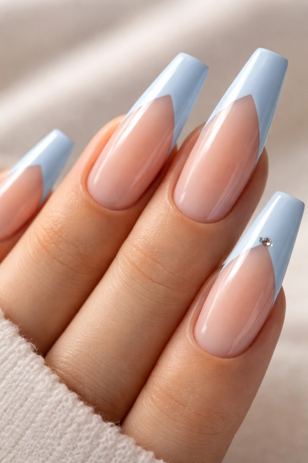
A single metal stud can throw this whole design off if it lands in the wrong spot.
The base idea is strong already: a baby blue angled French tip that cuts diagonally across the edge rather than following a classic smile line. That slant gives the ballerina shape more motion. Add one tiny silver stud—usually 1.5 to 2 mm—near the higher corner of the angle, and the set gets a little flash without turning into full nail jewelry.
This works best on medium or long ballerina nails because the diagonal line needs space. A short set can wear it, though the angle has to be subtle or the nail starts looking uneven. I like a soft slant from one sidewall to the opposite corner, not a steep slash through the whole tip.
The stud placement is what separates polished from messy. Put it too far into the center and it looks random. Place it right where the angled tip begins or ends, and it looks intentional—almost like punctuation.
Use flat-back studs, not rounded craft rhinestones. Then seal around the base with builder gel or thick top coat so hair doesn’t snag. Tiny detail. Huge difference.
9. Ocean Blue Marble Tips on Long Blue French Tip Ballerina Nails
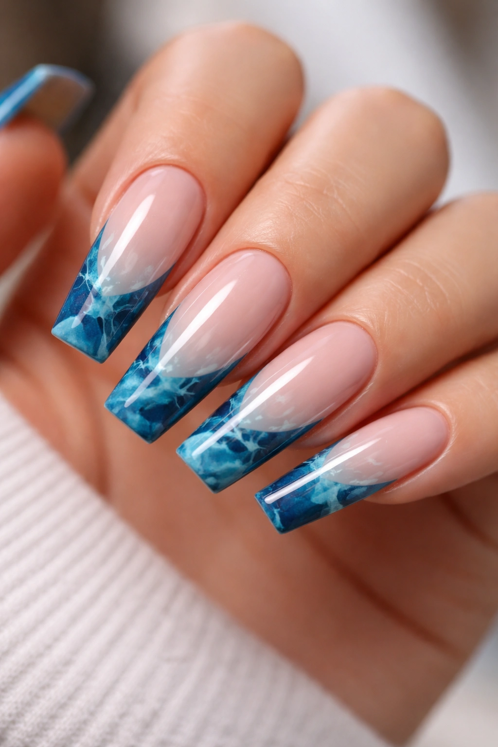
Why does marble look better on long ballerina nails than on shorter square sets? Space. You need room for the pattern to unfold.
Ocean-blue marble tips mix two or three shades—usually a deep teal-blue, a brighter blue, and a touch of white—across the French area only. On a longer ballerina shape, that flat tip gives you a tidy canvas, while the taper keeps the design from feeling blocky. The result can look like polished stone, deep water, or glazed ceramic depending on the shades you pick.
Keep the base quiet
A busy base kills this manicure fast. Stick with a sheer nude, clear pink, or milky neutral so the marbling stays at the edge and feels framed rather than scattered. The tip itself can be built with blooming gel, a fine detail brush, or a drag-marble technique while the polish is still mobile.
A few choices matter here:
- Use 2 or 3 blues, not 5. Too many tones turn the tip murky.
- Add white sparingly. Thin veins work better than cloudy patches.
- Choose long lengths. Marble needs more than a sliver of tip to read well.
- Seal with gloss. Shine gives the swirls that stone-like depth.
This one can go wrong fast in the wrong hands. Ask your tech to keep each nail related, not identical. Real marble never repeats line for line, and the set looks better when the pattern shifts a little across the hand.
10. Periwinkle Side-French Tips With Negative Space
Not centered. Better.
A side-French places the color along one side of the tip rather than straight across the full edge. On ballerina nails, that diagonal sweep changes the whole silhouette. Your eye follows the line sideways and upward, which makes fingers look longer and the shape feel slimmer.
Periwinkle is a smart pick for this layout because it sits between blue and violet. That slight softness keeps the asymmetry from looking hard. Cobalt side-French tips can get sharp fast. Periwinkle still has color, though it feels lighter and less strict.
The negative space is what gives this design its bite. You need a clean nude or translucent base so the unpainted section reads as part of the design, not as a gap. A skilled tech will map the side line first, then fill the tip angle with color while keeping the edge crisp where it meets the bare section.
Gloss suits this design best, though a satin top coat can be interesting if you want the blue to look a little softer. I’d skip gems, decals, and heavy accent nails. The side placement already does enough visual work. Let the line lead.
11. Midnight Blue French Tips With a Fine Glitter Rim
If you like sparkle but hate chunky glitter, this is where I’d point you.
A midnight blue French tip with a fine glitter outline gives you light play without losing the clean structure of a French manicure. The main tip stays deep, glossy, and almost black-blue in low light. Right above or along the edge of that tip sits a whisper-thin rim of silver-blue shimmer, usually no thicker than 0.5 to 1 mm.
That tiny strip matters. It catches light at the edge of the nail and sharpens the French line instead of flooding the whole set with sparkle. Chunky glitter top coats can make ballerina nails look bulky, especially once two layers of top coat go over them. Fine shimmer stays tidy.
Choose reflective glitter with a cool tone. Warm champagne glitter against midnight blue can work, though it changes the manicure more than people expect. Silver-blue or icy shimmer keeps the look cohesive.
This design wears well for evening events, though it doesn’t need a special occasion to make sense. The deep tip still reads polished in daylight. Then, under dim restaurant lighting or against a phone flash, that little rim comes alive. Nice trick. No chaos.
12. Blue Jelly Tips for Glassy Blue French Tip Ballerina Nails
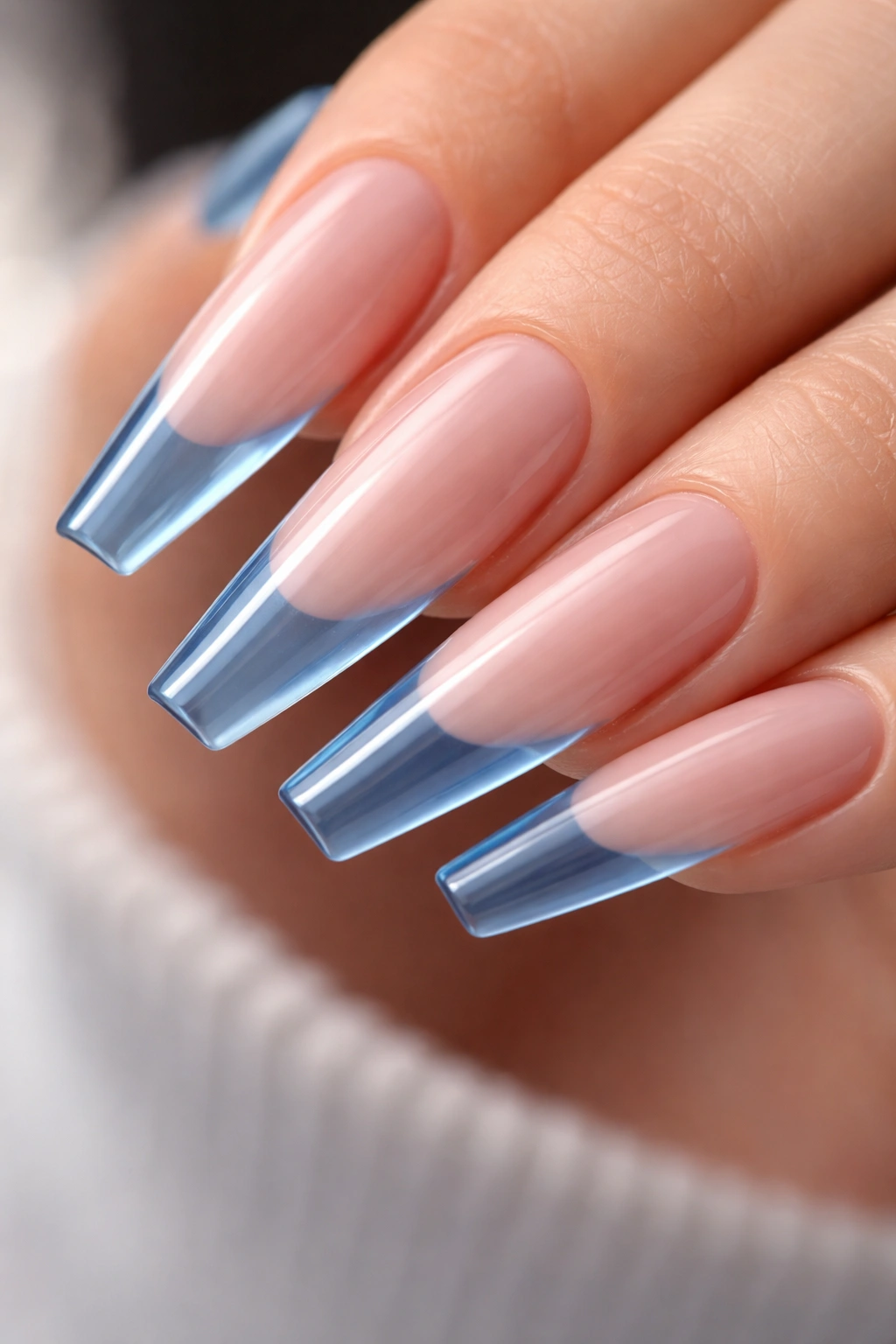
Blue jelly tips look like hard candy poured over glass. When they’re done well, you can still see light moving through the color.
A jelly French tip uses translucent blue rather than opaque gel polish. On ballerina nails, that transparency shows off the clean edge and gives the tip a lighter feel, even when the shade is a rich ocean blue. The effect is strongest on extensions or structured gel sets where the free edge is smooth and the underside of the nail looks neat.
How to keep jelly blue clean-looking
The underside matters. More than usual. If the free edge underneath is cloudy, uneven, or stained, jelly color will show every bit of it. Ask your tech to refine the underside and use a milky builder base on the nail plate so the contrast between solid base and transparent tip looks intentional.
A few good rules:
- Use one translucent blue, not a mixed marbled jelly, if you want the glass effect to stay crisp.
- Keep the tip medium in depth so the sheer color has room to show.
- Choose gloss only. Matte cancels the whole jelly idea.
- Long ballerina lengths show this off best because the transparent section has more space to glow.
This is one of my favorite blue French tip ballerina nails when someone wants color without the dense look of opaque polish. Clean, glossy, a little playful—and it still feels adult.
13. Porcelain Blue Floral French Tips
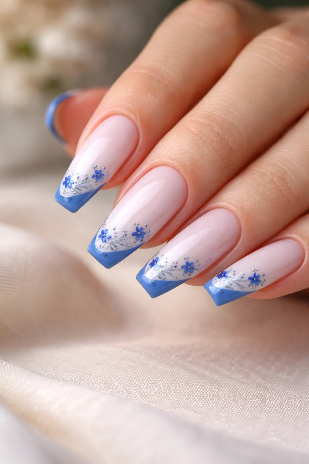
Hand-painted florals can turn tacky fast. Scale is the whole game.
A porcelain blue floral French takes its cue from cobalt-on-white ceramics: tiny blue petals, leaf strokes, and curved linework painted over a milky or soft white French area. On ballerina nails, the flat tip gives you a stable little panel for that art, almost like a miniature tile. Done with restraint, it looks intricate. Done too large, it looks crowded.
Keep the art near the tips. That’s the safest move. A full-nail floral pattern on all ten fingers can swallow the shape, while small painted motifs clustered near the French area keep the manicure readable from a distance.
What makes porcelain florals look expensive
- Use a milky white or translucent ivory base, not stark correction-fluid white.
- Stick with one cobalt blue, maybe with a second lighter tint for tiny highlights.
- Keep the brushwork fine. Petals and vines should look like strokes, not blobs.
- Space the art unevenly. Two fuller nails and three lighter ones on each hand often looks better than identical flower placement on every finger.
A tiny curved petal at the corner of the tip can say more than a full bouquet in the center. That restraint is where the manicure gets its polish.
14. Turquoise Tips Paired With a Thin Gold Outline
Turquoise and gold can go wrong in a hurry if the gold is thick. Then it starts reading costume jewelry.
When the gold stays razor-thin, though—about 0.5 mm tracing the edge where the turquoise meets the base—you get a sharp color contrast that flatters the ballerina shape. The cool blue-green gives the set energy. The gold adds warmth and a little definition without turning the manicure heavy.
This pairing works especially well on warmer or olive skin because the gold picks up warmth already present in the skin, while turquoise gives enough contrast to stay bright. On cooler skin, I’d steer the turquoise a bit bluer and keep the gold pale rather than yellow.
Technique matters. The cleanest version uses a turquoise French tip first, then a metallic gel paint or chrome liner added as a border once the color is cured. Trying to paint both at once usually leads to wobble. Two steps. Better line.
I also like this set on vacation nails, though it is not limited to that mood. Against a white shirt, a tan sweater, or a black dress, that blue-green edge still lands. Strong color. Fine line. Good balance.
15. Deep Royal Blue Cut-Out Tips With a High-Gloss Finish
A standard French paints the whole tip. A cut-out French leaves part of that area bare, and that small absence is what makes the design hit harder.
Deep royal blue works well for this because it has brightness and depth at the same time. The tip might have a small crescent of negative space near the center, a side cut-out near one corner, or a narrow window shape framed by blue along the outer edge. On ballerina nails, those open sections keep a dark color from looking too dense.
Longer lengths carry this design best. You need enough tip to carve out negative space without making the remaining blue bands look accidental. Short ballerina nails can wear a cut-out French too, though I’d use one small center gap rather than a complex shape.
Gloss is non-negotiable for me here. Royal blue under a thick, clear top coat looks almost lacquered, and the shine helps the cut-out look sharp rather than unfinished. Matte would flatten the contrast too much.
Bring a clear reference photo if you ask for this one. “Cut-out tip” can mean five different things from one tech to the next. Show the shape of the empty space, the depth of the blue, and how thick you want the remaining bands. Precision makes the manicure.
Final Thoughts
The best blue French tip isn’t always the boldest shade in the drawer. On ballerina nails, placement does half the work: thin bands stretch the shape, diagonal lines slim it, jelly finishes lighten it, and darker blues need more shine to avoid looking heavy.
Bring more than a color name to your appointment. Bring line thickness, finish, and the mood you want the set to carry—soft, graphic, glossy, moody, airy. Those details sound small on paper, though they decide whether your nails look forgettable or look like you thought them through.
Blue has range. Pick the version that fits your hands, your length, and your tolerance for upkeep, and the shape will do the rest.
