

A black nail and a white nail can look crisp on a sample card and oddly heavy on a real hand. The gap between those two outcomes is usually shape, not color. On ballerina nails, a line that sits 2 millimeters too low or a tip that’s filed too wide can throw off the whole set.
That’s why black and white ballerina nails are harder than they look. High contrast is unforgiving. White polish shows every ridge, black polish makes uneven sidewalls stand out, and the flat tapered tip leaves nowhere for sloppy linework to hide.
Still, when this color pair is done with control, it hits in a way softer palettes often don’t. The structure of a ballerina shape gives black and white nail art a built-in frame, and that frame can make even a minimal design look deliberate.
I keep coming back to these combinations because they solve the usual problem: they don’t just look good in a photo. They hold up on actual hands, in salon chairs, on press-ons, and in the kind of everyday wear where chips, growth gaps, and awkward line placement start to matter.
Why Black and White Looks Sharp on a Ballerina Shape
Ballerina nails give graphic nail art a built-in edge. The tapered sidewalls slim the nail, and the straight tip gives you a clean stopping point for French lines, frames, diagonals, and split-color designs. On almond nails, some of these ideas soften too much. On square nails, they can look blocky. Ballerina sits right in the middle.
The flat tip does half the work
A good ballerina shape has enough width at the free edge to show contrast, but not so much that the tip looks blunt. That matters with black and white. A black French tip, a center split, or a checker accent reads faster when the end of the nail has a straight line to echo.
There’s a small technical point salon clients rarely hear: the sidewalls need to taper evenly from both sides. If one side is pinched tighter than the other, white polish makes it obvious and black polish makes it worse. You can spot this before color goes on by looking straight at the nail from the tip.
Coffin and ballerina are close, but not identical
Some nail techs use coffin and ballerina as the same term. Others save ballerina for a softer taper with a slightly lighter, less boxy tip. That difference sounds minor. On black and white sets, it changes the mood a lot.
A harder coffin shape pushes graphic art in a stricter direction. A softer ballerina shape gives swirls, marble, and fine lines a little more movement. Neither is wrong. You just want the art to match the silhouette.
- Straight lines look strongest on a sharper coffin-style taper.
- Swirls, smoke, and brushstroke art tend to sit better on a softer ballerina taper.
- Heavy black tips need enough tip width to avoid looking pinched.
- White frames and outlines need smooth sidewalls, or every wobble shows.
That shape-color pairing is the whole reason black and white can look expensive here and clumsy somewhere else.
Choosing the Right Length and Taper for Black and White Ballerina Nails
Short or long? For this color combo, medium length usually gives you the best balance.
If your free edge is around 6 to 10 millimeters past the fingertip, you have enough room for contrast without pushing the nail into costume territory. That length handles French tips, side stripes, split designs, and checker accents with less visual crowding. Longer nails can carry bigger patterns, but they ask for tighter execution.
Typing matters more than people admit.
Once you push past 10 to 12 millimeters of free edge, the flat corners take more impact from keyboards, zippers, and car doors. Black polish hides tiny dents better than white, but corner wear still shows up first on a ballerina shape. If you know you’re rough on your hands, keep the taper crisp and the length moderate.
A quick length guide that saves guesswork
- Short ballerina: best for side stripes, solid colors, reverse French, small dots
- Medium ballerina: best for V tips, center splits, diagonal blocks, swirls
- Long ballerina: best for outline nails, tuxedo panels, marble, smoke fades
Press-ons deserve a quick mention here. A lot of ready-made ballerina press-ons are filed too aggressively at the sidewalls, which makes black-heavy designs look squeezed. Look for a straighter side profile and a tip that still has a little width left. If the nail already looks needle-like before polish, black and white will not rescue it.
Matte, Gloss, and Mixed Top Coats Change the Whole Set
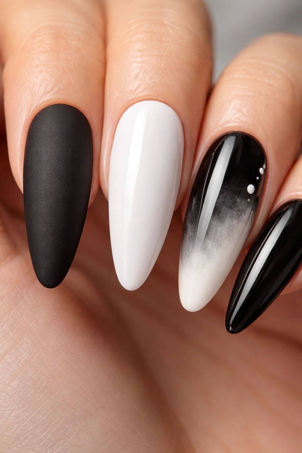
Run a finger over a matte black nail and a glossy black nail back to back. Same color. Different mood.
Finish changes black and white more than most people expect. Gloss deepens black and makes white look cleaner. Matte softens glare, which can make a loud design feel calmer, but it also shows skin oil, hand cream, and makeup transfer faster—especially on black.
What gloss does well
Gloss is the safer pick for crisp lines, French tips, marble, and checkerboard work. It sharpens contrast and helps the white stay bright instead of chalky. If a salon is using gel, thin layers cured for the brand’s set time—often 30 to 60 seconds under LED—keep the surface smoother, which matters a lot under a glossy top coat.
Where matte earns its spot
Matte works best when the art has movement: brushstrokes, smoky fades, swirls, scattered dots. It also helps thick black areas feel less heavy. A matte top on white can look soft and velvety, but only if the base underneath is smooth. Any lump or ridge is easier to see once shine is gone.
Mixed finishes are smarter than they sound
A set with matte black nails and one glossy white line, or glossy black with matte smoke, has more depth than a flat finish across all ten nails. You don’t need extra color to build contrast when texture can do part of the job.
One warning, though. Matte top coat over hand-painted white details can dull the crisp edge if the art is raised. If the linework feels thick before top coat, ask for thinner paint layers rather than trying to blur the issue under finish.
Clean Prep Keeps White Polish Bright and Black Polish Crisp
Contrary to what most people think, the hardest part of a black and white set often happens before color.
White polish grabs attention for the wrong reason if the nail plate is uneven, and black polish makes lint, dust, and rough cuticle work stand out. Good prep is boring. It also decides whether the set looks salon-clean on day one or tired by day three.
A nail tech who uses a 180-grit file for shaping and a gentler buffer to smooth the surface is usually on the right track. Over-buffing thins the nail. Under-buffing leaves ridges that white polish loves to spotlight. For gel or builder sets, thin color layers matter more than extra coats. Two thin white layers almost always beat one thick one.
A non-yellowing top coat helps white stay bright longer. That’s not marketing fluff; some top coats do cast a warm tint over time, and it’s easier to spot on a white-heavy set than on pink or nude nails.
Dermatologists have pointed out for ages that acetone strips oil from the nail plate and surrounding skin fast. So if your removal prep involves acetone, finish with cuticle oil. Not because it feels fancy. Because dry skin next to a stark black-and-white manicure makes the whole hand look rough.
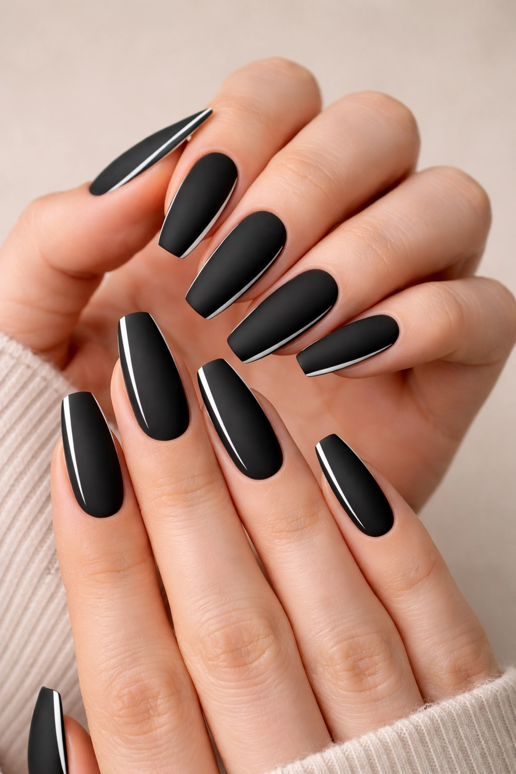
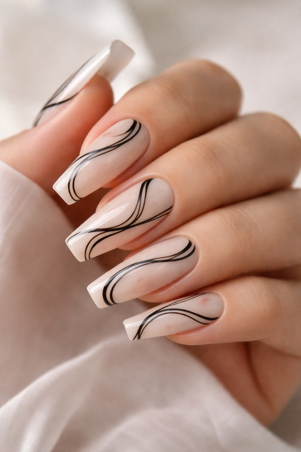
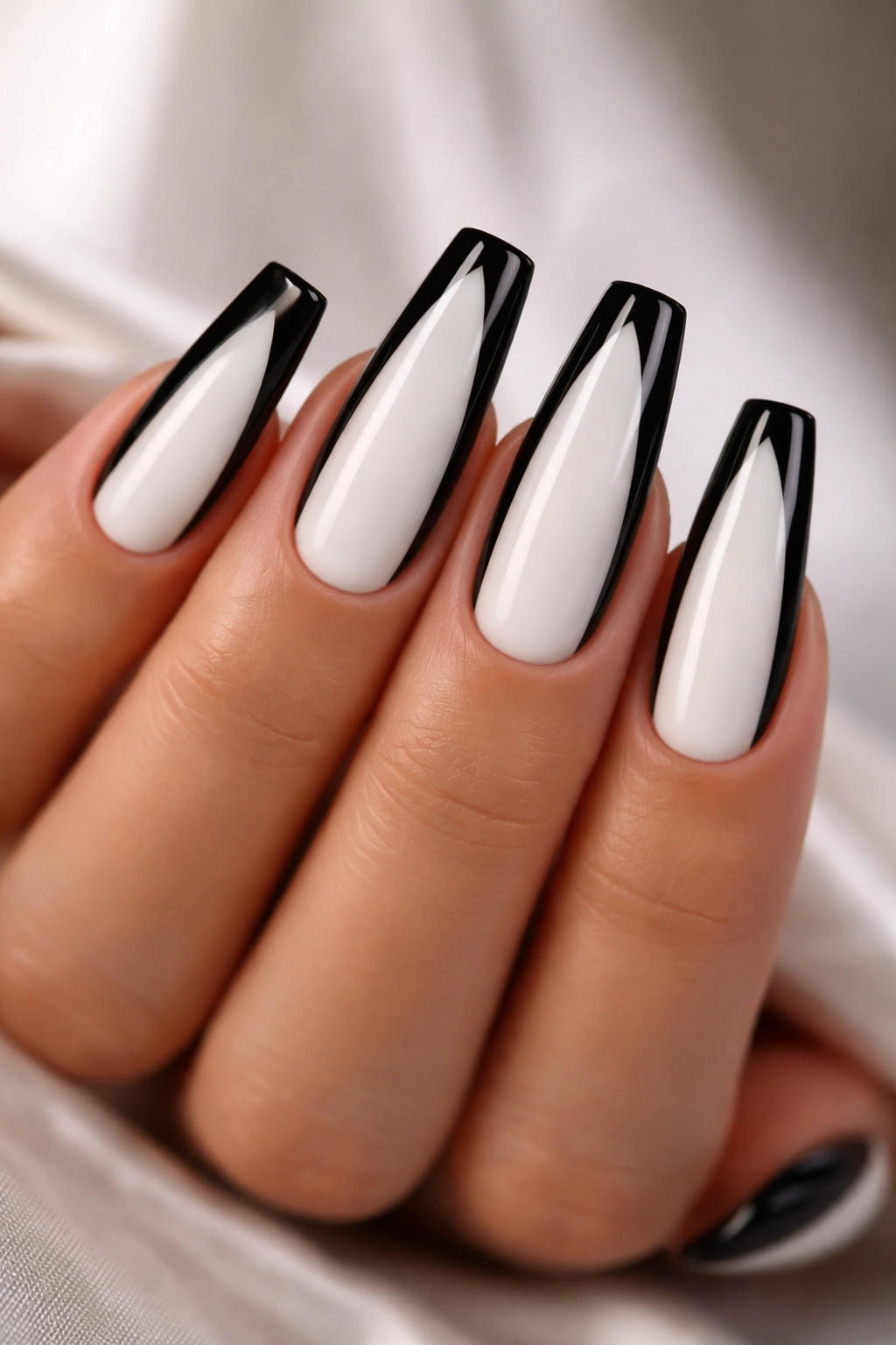
1. Thin Black French Tips on a Milky White Base
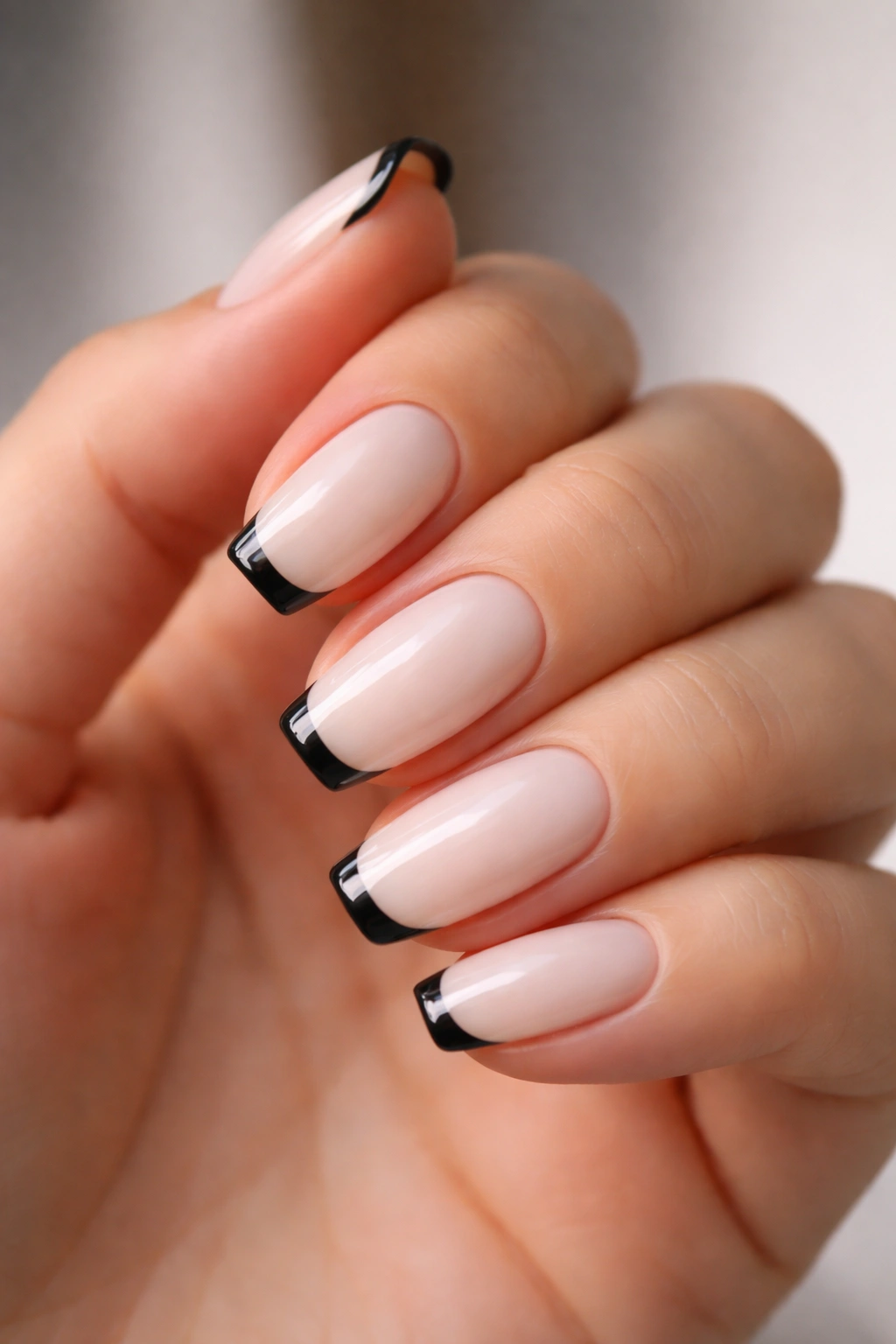
This one works because it respects the shape instead of fighting it. A thin black French tip, painted over a milky white base, follows the straight ballerina edge and gives the nail definition without swallowing the length.
Why this design holds together so well
The trick is keeping the black tip narrow—around 1.5 to 2 millimeters on medium nails. Once that line gets chunky, the nail starts looking shorter and heavier. A soft milky white base gives the contrast enough room to breathe, and the straight free edge keeps the French line looking intentional rather than curved and random.
A good tech will slightly deepen the smile line at the sidewalls instead of drawing one flat stripe straight across. That tiny dip helps the tip look fitted to the nail rather than stamped on top of it.
Quick details that matter
- Best length: short to medium ballerina
- Best finish: gloss
- Salon note: ask for a soft white base, not an opaque chalk white
- Common mistake: making the tip as thick as a square French on a square nail
Use this when you want something clean that still has bite. It goes with work clothes, denim, black tailoring, and doesn’t scream for attention from across the room.
2. Glossy Black Nails with a Razor-White V Tip
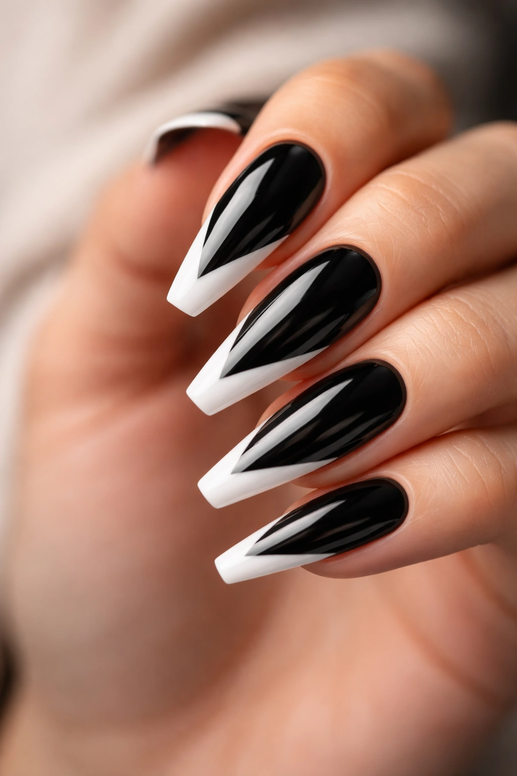
A white V tip on black looks sharper than a standard French because the angle pulls the eye forward. On ballerina nails, that matters. The silhouette is already tapered, so the V repeats the shape and makes the nail look longer.
Keep the V narrow and centered. If the point drops too deep toward the middle of the nail, the look turns costume-fast. The sweet spot is usually a tip that reaches about one-quarter to one-third of the nail length, depending on how long the extension is.
Black needs to be dense here. Any patchiness kills the contrast. White needs the opposite kind of care: thin paint, clean edges, no flooding into the sidewalls. If you’re wearing this on natural nails or shorter Gel-X tips, use the V on all ten. If the nails are long, breaking it up with two or three solid black nails keeps the set from feeling stiff.
A glossy top coat is the move. Matte can flatten the geometry too much.
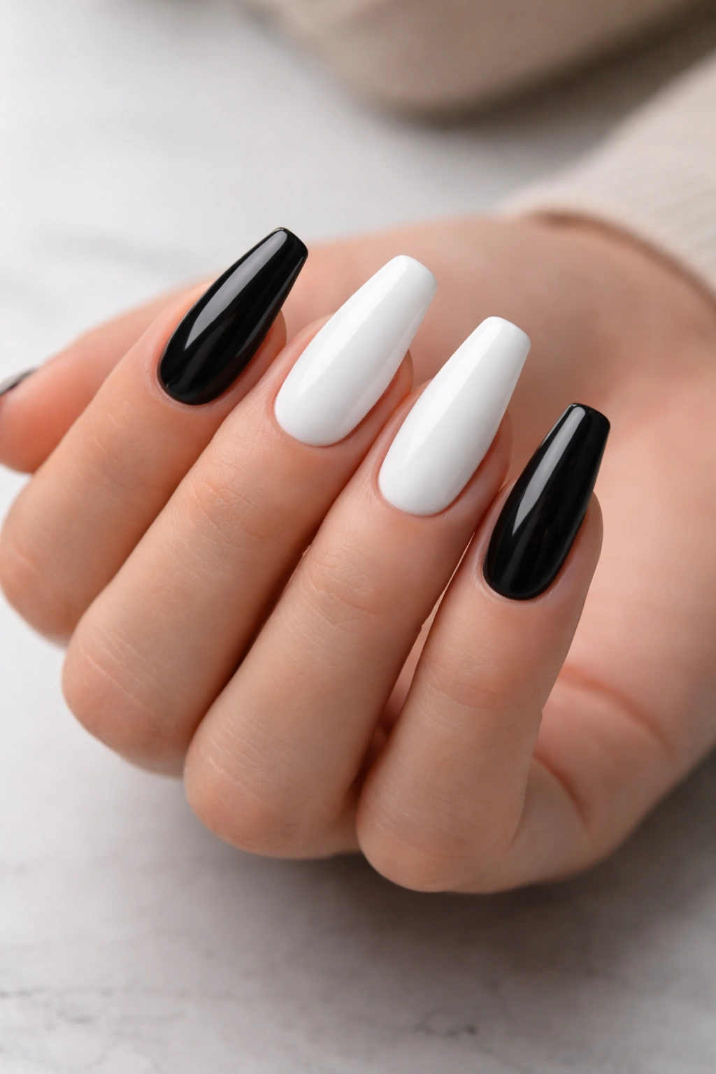
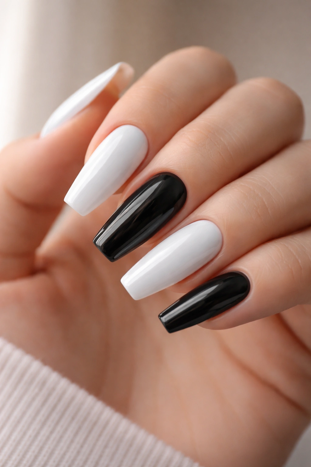
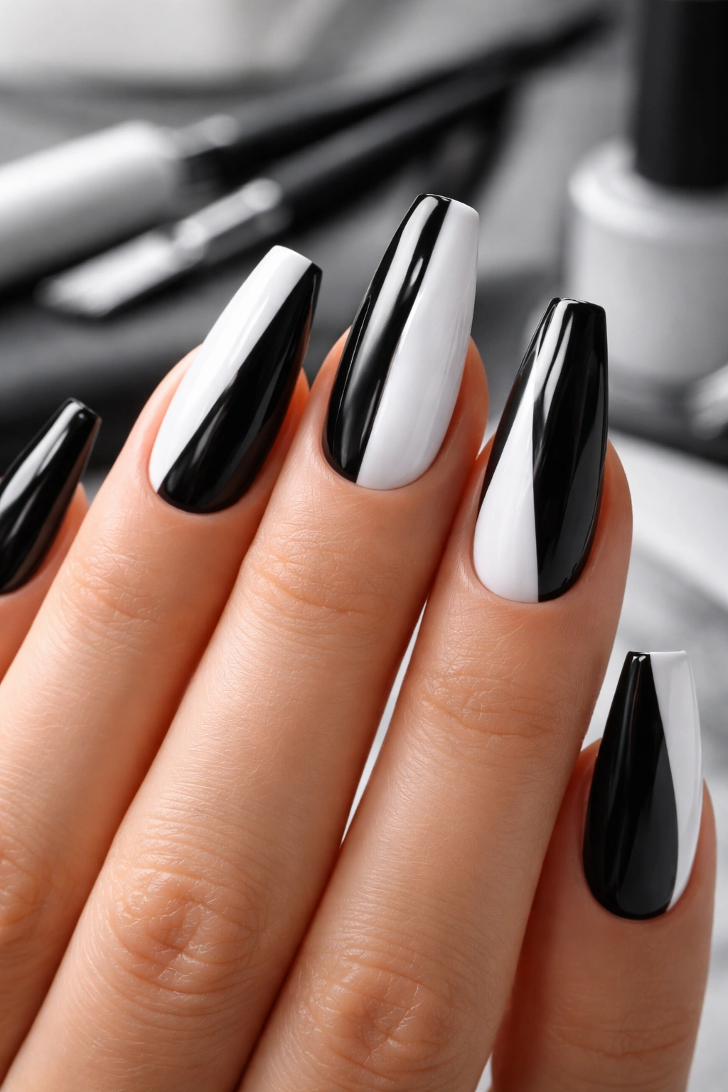
3. Alternating Solid Black and Solid White with Matching Shape
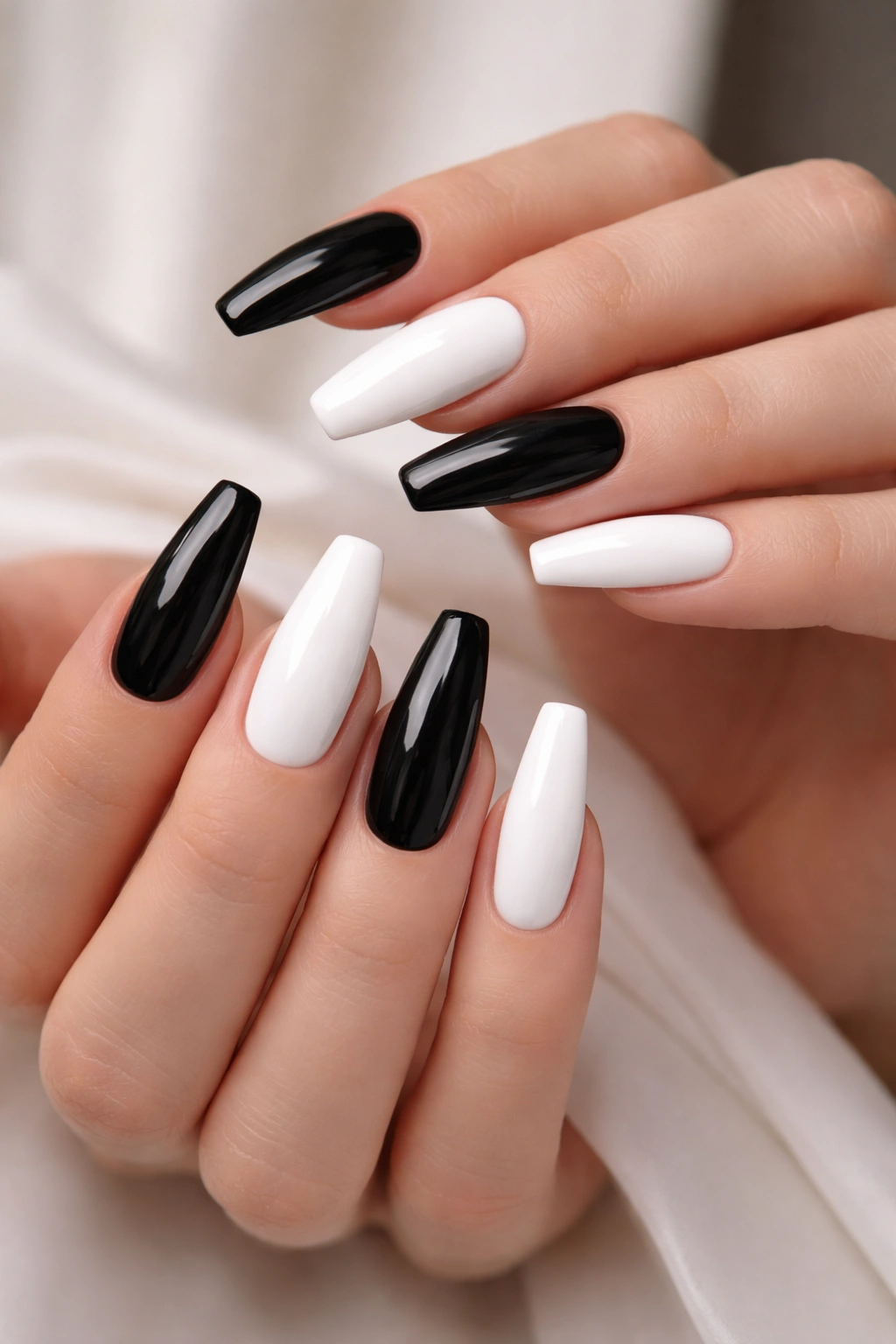
Can a plain alternating set still look thought-through? Yes—if every nail is shaped like it belongs to the same hand.
This is where cheap-looking sets usually fall apart. The color idea is fine. The issue is that one white nail ends up wider, one black nail gets filed shorter, and the contrast makes every mismatch jump out. On alternating black and white ballerina nails, shape consistency is the whole design.
A cleaner way to wear it is to avoid random placement. Try thumb, middle, and pinky in black, with index and ring in white, then mirror that pattern on the other hand. Or flip one hand and keep the other identical. Either works if the distribution looks deliberate.
How to keep it from looking flat
Use the same finish on every nail. Gloss all over gives you a crisp, vinyl-like result. Matte all over feels quieter and a little softer. Mixing matte black and glossy white can work, but then finish becomes part of the design, and that changes the whole set.
Also, pick your white carefully. A bright paper white can look stark next to warm skin and make the black seem harsher. A creamy white or soft white usually sits better unless you want a hard graphic contrast.
No art. No accents. Just discipline.
4. Center-Split Nails with a Dead-Straight Vertical Line
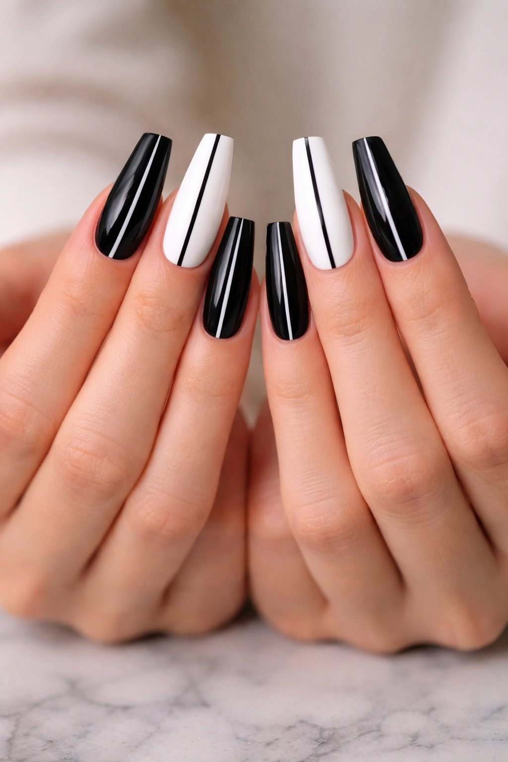
I’ve watched this design save more than one indecisive salon appointment. You get both colors on every nail, but the set still reads neat because the split is so controlled.
A vertical half-black, half-white nail works on ballerina shapes because the line runs with the length, not across it. Horizontal blocks chop the nail up. A center split stretches it.
What matters is placement. The line should sit either exactly down the center or slightly off-center on every nail in the same direction. Wobbly “almost centered” splits look accidental.
- Use this on medium to long ballerina nails
- Keep the split line pin-straight from cuticle to tip
- Ask for one dominant hand mirror, not random left-right flips
- Seal the center seam well with top coat so it doesn’t catch hair
A tiny trick makes this design better: file and inspect the tip straight on before color. If the free edge leans even a little, the vertical split exaggerates it. When it’s done right, though, the effect is crisp in a way few two-tone sets manage.
5. Diagonal Color-Block Tips That Mirror Across Both Hands
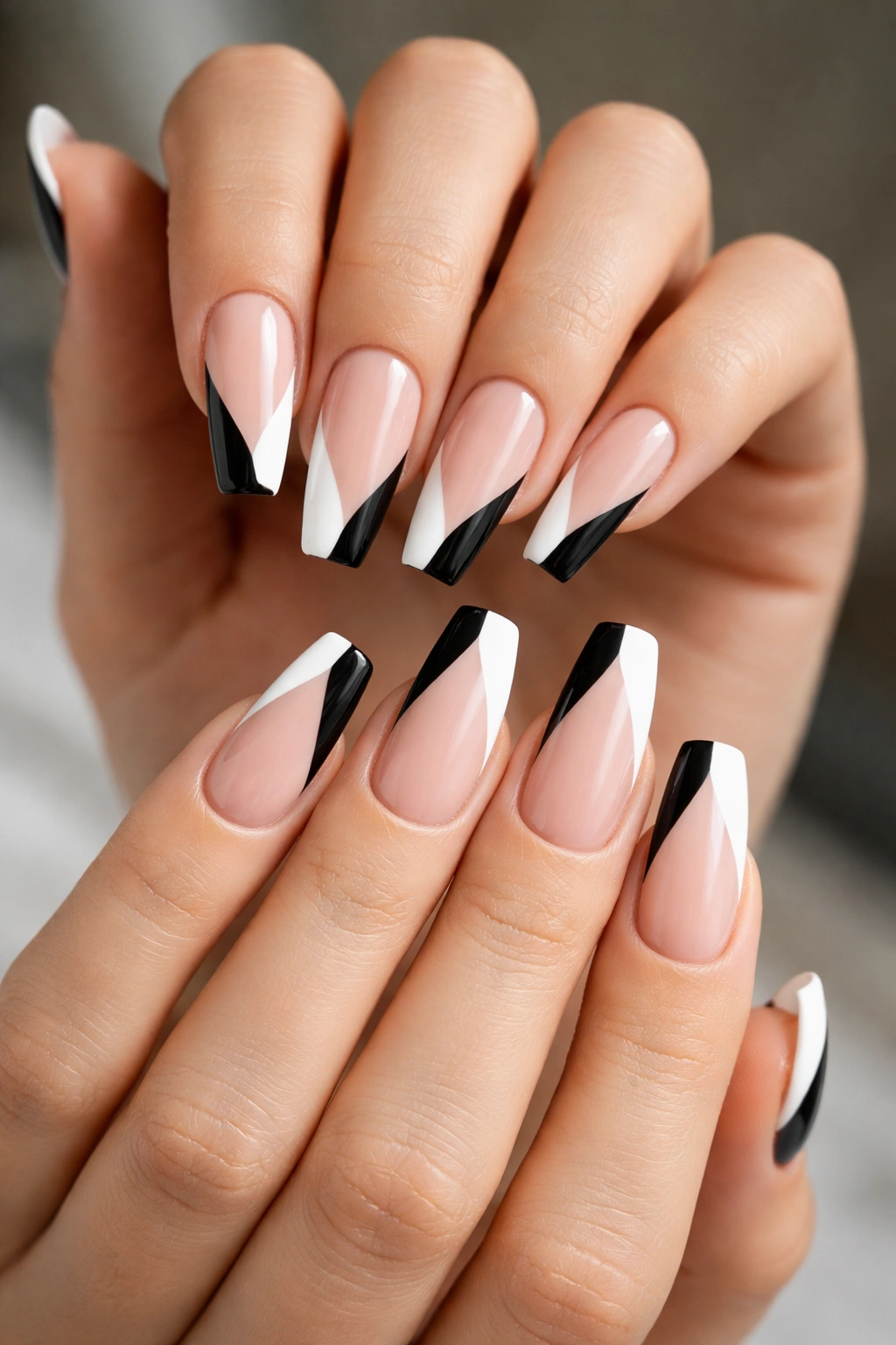
Diagonal black and white tips have movement, which is why they suit ballerina nails so well. A straight French tip can sometimes feel predictable. A diagonal tip keeps the same clean edge but adds a sense of direction.
Mirror the angle from hand to hand. That’s the part that makes the set feel pulled together. If the left hand angles inward and the right hand also angles inward, the design looks thought-out. Random diagonals turn messy fast.
You do not need a deep slash of color here. A tip block taking up about 20 to 30 percent of the nail is enough. More than that, and the design starts eating the shape. Less than that, and the angle disappears once your hands are moving.
White-over-black gives a colder, sharper finish. Black-over-white feels a little easier to wear. Mixed across the set can work, but only if the angles stay consistent.
This is also one of the better ideas for clients who want nail art that hides growth a bit longer. Because the detail sits toward the tip, the regrowth line near the cuticle feels less obvious in the first week or two. Small point, but on real hands that matters.
6. Matte Black Nails with a Single White Side Stripe
Unlike a centered stripe, which can look sporty or even a little stiff, a side stripe shifts the weight of the nail without cutting the shape in half. On a ballerina silhouette, that off-center line makes the nail look slimmer.
Keep the stripe thin—around 1 to 2 millimeters—and place it along the same side on every nail. Running it too close to the edge can make it look accidental, like the brush slipped. Give it a sliver of black beside the sidewall so the stripe feels placed, not squeezed in.
Matte black is what makes this design work. A glossy black base with a glossy white stripe can feel flat. Matte creates a dark field, and the glossy or semi-gloss white line sits on top with more separation.
This one is strong on shorter ballerina nails because it doesn’t need much space. If your nails are medium length and you want something clean, graphic, and low-fuss, this is one of the safest picks in the whole list.
Ask for the stripe on all ten nails, or do it on index, middle, and ring with black thumbs and pinkies for a little more breathing room.
7. Reverse French Moons on a Deep Black Base
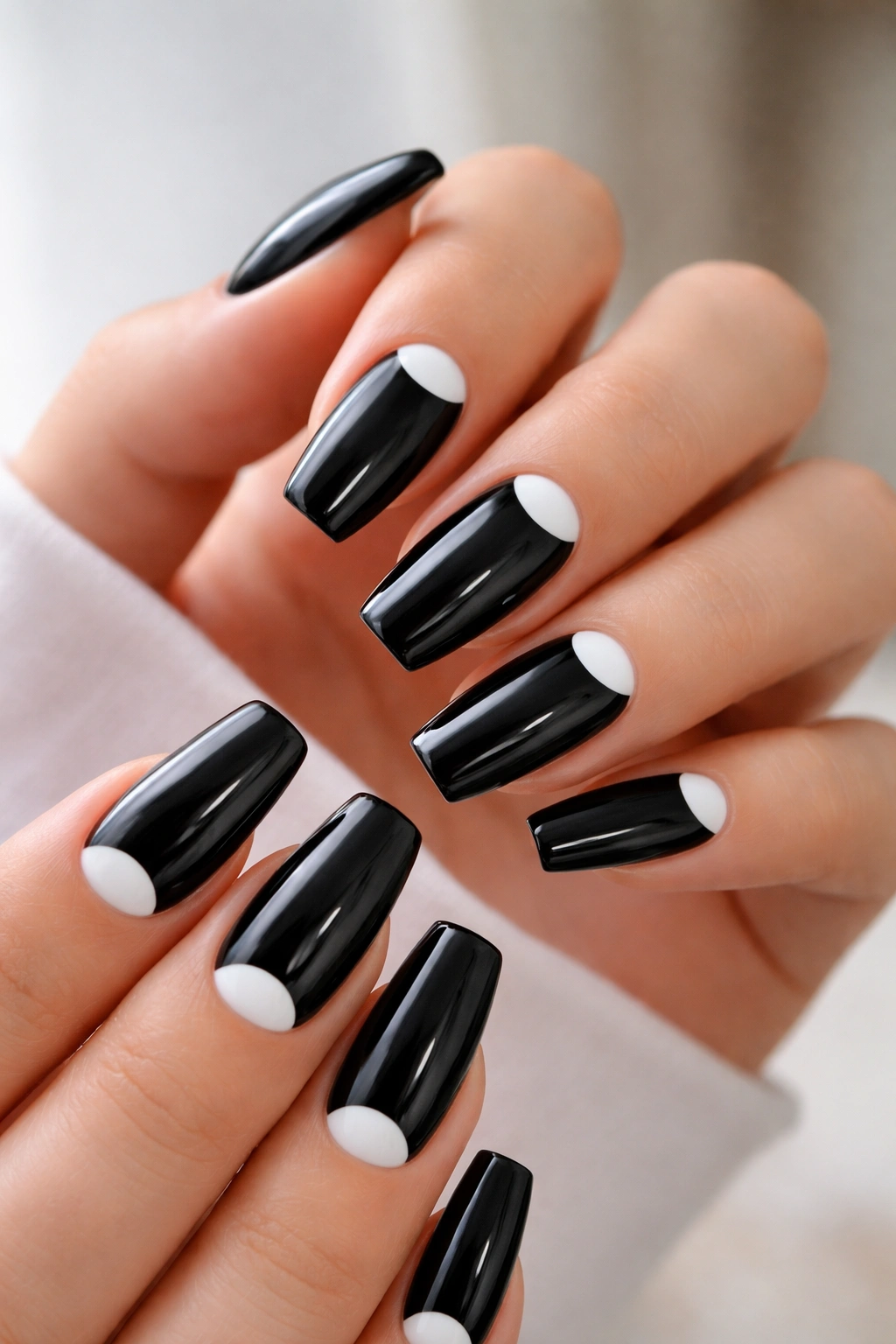
A reverse French is one of those designs that looks easy until you realize the curve near the cuticle has to be smooth on every single nail. Get that part right and the result is sharp.
What makes the cuticle moon work
Painting a small white half-moon at the base of a black nail creates contrast where the nail naturally curves. On ballerina shapes, that contrast balances the straight tip nicely. You’re getting softness at the cuticle and structure at the free edge.
Keep the moon modest. Around 3 to 4 millimeters deep is enough on medium nails. Oversized moons start crowding the nail bed and can make fingers look shorter.
Where this set looks best
- On medium lengths where the cuticle detail has room to show
- With a gloss top coat, because gloss makes the crescent edge look cleaner
- On clients who want art that still reads polished from a distance
- Paired with one or two full white accent nails if you want more contrast
Black near the cuticle can show grow-out more quickly than a sheer base would. That is the tradeoff. Still worth it if you want a set that feels dressy without using glitter, stones, or extra color.
8. White Outline Nails with a Soft Black Frame
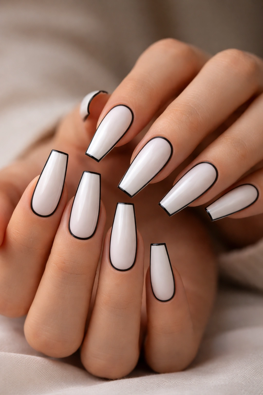
Frame nails can look expensive or clumsy, and the difference is line weight. On a ballerina shape, a black outline around a white center should be thin—usually 0.5 to 1 millimeter—so it echoes the taper rather than thickening it.
This design is strongest on longer nails. Short ballerina shapes often don’t leave enough room for the white center to breathe once the black border goes on. On a medium-long set, though, the frame follows the silhouette in a way that makes the whole nail look custom-fitted.
The line should not sit right on the sidewall. A tiny bit of space between the border and the edge keeps the frame looking deliberate. That small buffer matters more than you’d think, especially near the tip corners where black can bunch up visually.
White choice matters too. A soft cream white gives the border a little warmth. A bright optic white turns the set colder and stricter. Neither is wrong. They just tell different stories.
If a nail tech can’t pull a clean outline in one pass with a liner brush, this is not the design to force. It lives or dies on control.
9. Checkerboard Accent Nails with Solid Black and White Companions
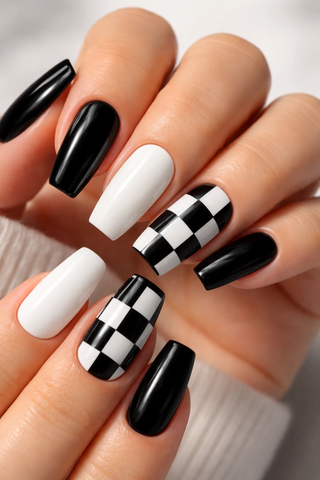
Why does checkerboard work better as an accent than a full set? Because the pattern is already loud enough on its own. On ballerina nails, a full ten-finger checker set can fight the shape. Two accent nails let the pattern talk without turning the whole hand into a flag.
Use checkerboard on the ring finger and thumb, or on middle and ring, then keep the rest solid black or solid white. The strongest version uses larger squares—usually two columns by three or four rows, depending on nail length. Tiny little boxes blur the second your hand moves.
How to place it so it still feels clean
Put the checkerboard on the nails with the flattest surface. Ring fingers usually take it well. Pinkies often don’t have enough width. Thumbs can look strong if the squares are scaled up to fit the wider nail.
A glossy finish helps here because it sharpens the edges between squares. Matte checkerboard can turn muddy unless the painting is immaculate.
And yes, you can cheat a little with decals or stamped guides on this one. Nobody gets bonus points for hand-painting perfect micro-squares if the final result is crooked.
10. Black Swirl Lines Over a Sheer Milky Base
This set has more movement than the stricter graphic options, which is why it suits people who want black and white without the harder edge of color blocking. A sheer milky base keeps the look light, and black swirls add shape without filling the whole nail.
The lines should vary. One thicker curve, one thinner echo line, maybe a short hook near the sidewall. If every swirl has the same width and same bend, the design starts looking stamped and flat.
How to place the swirls so the shape still shows
Let at least one curve follow the taper of the nail rather than crossing it. That keeps the ballerina silhouette visible. You can sweep from the lower sidewall toward the center, or start near the tip and pull upward in a loose S shape.
A good trick for gel art: cure each nail after the linework goes on. Thin black gel liner can spread on a slick milky base if all five fingers sit uncured at once, and then the pretty airy swirl turns into a fuzzy ribbon.
This set also grows out better than you’d expect because the base isn’t dense at the cuticle. That small practical point makes it a smart salon choice, not just a pretty one.
11. White Marble Veins Across Glossy Black Nails
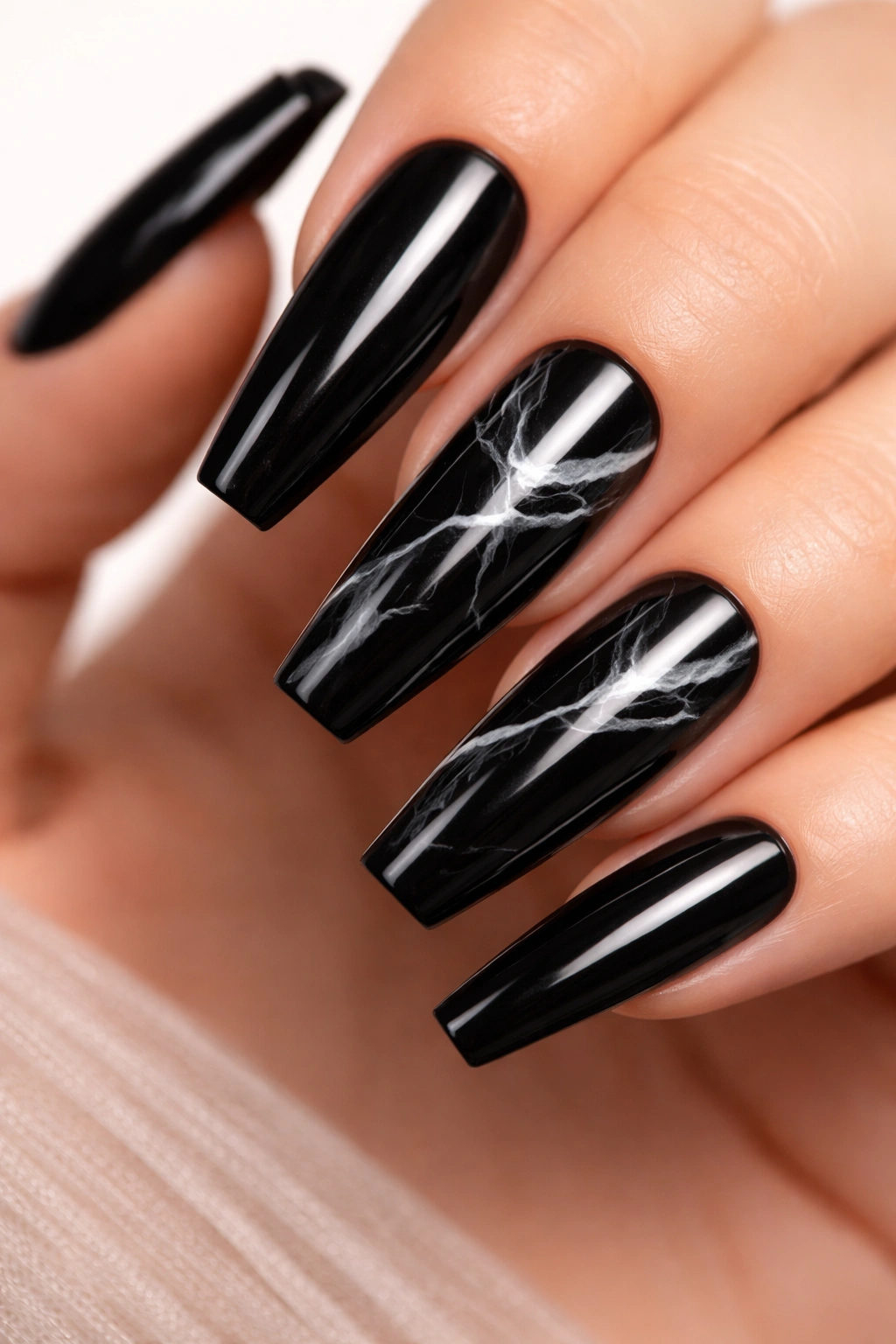
Marble on black is easy to overdo. Too many white veins and the nail starts looking cracked. Too little and the effect disappears.
The version that works on ballerina nails uses sparse white veining over a glossy black base, often with one or two nails carrying more detail than the rest. The marble lines should branch a little, fade in places, and never run as thick ropes from cuticle to tip.
A blooming gel base can help if your tech uses it well. So can a fine brush dragged through soft white gel before curing. Both methods create that slightly diffused vein edge marble needs. Hard painted white zigzags are not marble. They’re just squiggles on black.
Longer ballerina nails wear this design better because the pattern needs room to breathe. On shorter nails, keep the marble to one or two accents and leave the rest solid black or solid white.
Gloss is non-negotiable here in my book. Marble wants depth, and a shiny top coat gives it that glassy stone look that matte can’t fake.
12. Matte White Nails with Loose Black Ink Brushstrokes
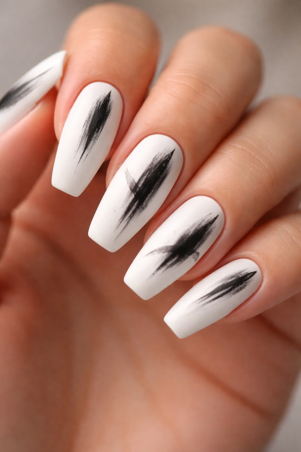
Unlike marble, which tries to mimic stone, ink brushstrokes should look hand-done. A little dryness at the edge, a little fade through the center, a brush mark that thins as it lifts off the nail—that’s the whole charm.
Matte white is the right base because it turns the nail into paper. Black brushstrokes on gloss white can feel too polished for the effect. Matte softens the background and lets the black marks look a bit more raw.
Placement matters. One longer vertical swipe near the side, a short broken stroke near the tip, maybe a small second mark to balance the first. You’re painting composition here, not wallpaper. Cover too much of the nail and the set loses air.
This design works on medium and long ballerina nails and looks strongest when each nail is a little different from the next. Not random. Just not cloned. If all ten nails carry the same exact brush mark, you lose the human touch that makes the style worth doing.
A final thin matte top coat helps. Thick matte can make the surface look cloudy.
13. Tiny White Dot Patterns on Black with One Inverted Accent
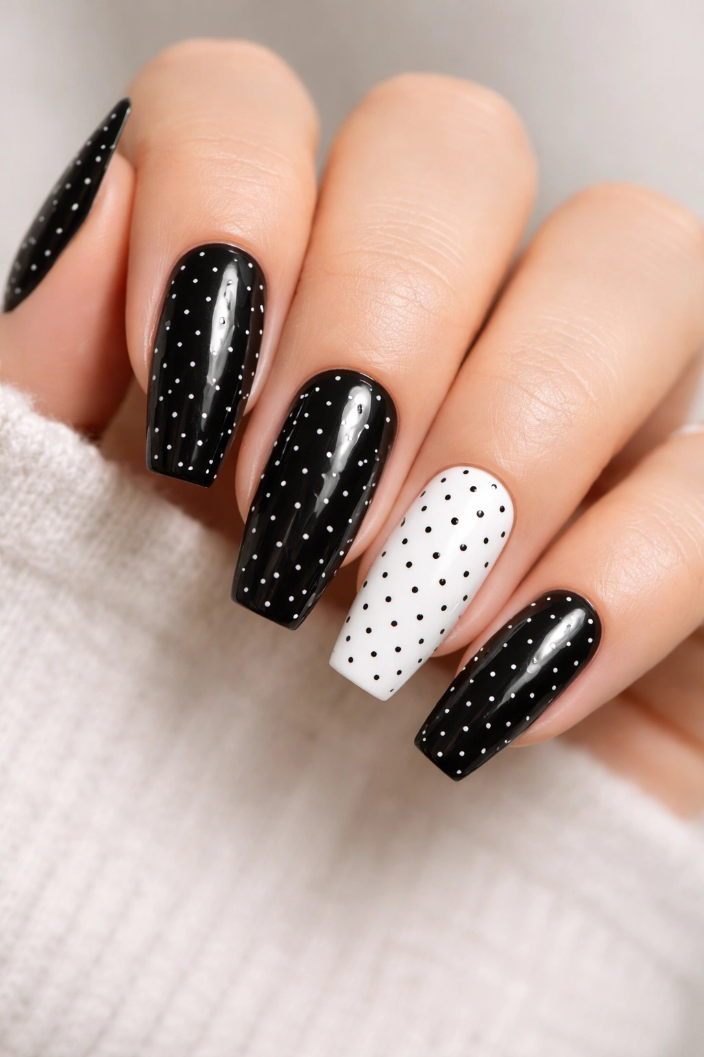
Dots can go juvenile fast if they’re too big or too evenly spaced. Keep them small and controlled, and they turn into one of the cleanest black and white nail ideas around.
The trick is scale
Use a small dotting tool, not the bigger round ones used for flower centers. On black ballerina nails, tiny white dots lined near the cuticle, down one side, or in a loose diagonal feel refined. Giant polka dots feel retro in a way that doesn’t always suit the shape.
One inverted accent nail—white base, black dots—gives the set a small flip that keeps it from getting sleepy.
- Try three to five dots per nail, not a full scatter
- Place dots off-center for a leaner look
- Use gloss if you want the dots sharp, matte if you want them softer
- Keep the accent nail on ring or thumb, not every other finger
This is an easy set to wear and an easy one to maintain. Small dots chip less noticeably than heavy tip art, and touch-ups are straightforward if you’re doing your own press-ons.
14. Tuxedo Side Panels with a Crisp White Center
This design is smarter than it sounds. Think of a white nail bed running down the middle, with black side panels hugging both edges. On a ballerina shape, those dark side panels slim the nail, and the white center line adds length.
The proportions matter a lot. The black on each side should take up about 20 to 25 percent of the width, leaving the center white panel dominant. If the side blocks get too wide, the nail looks boxed in. If they’re too skinny, the effect disappears and you’re back to outline territory.
A rounded start near the cuticle keeps the look smoother than a hard rectangular block. Near the tip, though, let the lines follow the straight free edge so the shape still reads strong.
This one has a dressed-up feel that works for events, but it doesn’t need rhinestones or metallic linework to get there. That’s the appeal. You’re using geometry, not extras.
On shorter nails, use this as an accent. On long ballerina sets, it can carry all ten.
15. Mixed-Finish Black and White Smoke Ombré
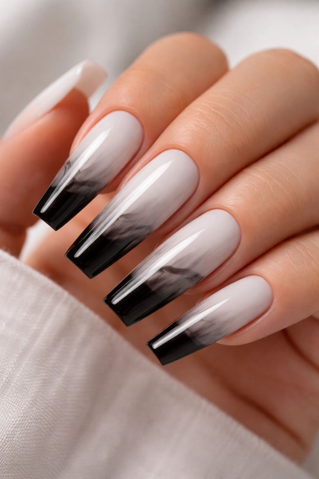
A straight black-to-white fade sounds easy. In practice, it often turns into a muddy gray mess. The version that works uses soft smoke placement and finish contrast, not a blunt sponge ombré across the whole nail.
What makes this ombré look intentional
Keep the base mostly white or mostly black, then feather the opposite color in as a translucent haze. On a white base, a smoky black cloud near the tip or sidewall looks cleaner than a full midpoint fade. On black, a soft white mist near the center can look almost airbrushed if the layers are thin.
Best way to wear it
- Use this on long ballerina nails where the fade has room to breathe
- Ask for matte over the smoky area and gloss over the rest if your tech can isolate finishes cleanly
- Avoid thick sponge texture; gel-blurred layers usually look cleaner
- Keep the fade narrow so the nail still reads black-and-white, not plain gray
This is the most advanced set on the list, and it’s not the one I’d choose for a rushed appointment. But when the blend is soft and the finish contrast is done well, it gives black and white more depth than a hard split ever could.
Final Thoughts
The black and white sets that hold up best on ballerina nails usually have one thing in common: they respect the shape. The flat tip, the taper, the sidewalls, the finish—those pieces decide whether the contrast looks crisp or clumsy long before the art gets all the credit.
If you’re picking from this list for a salon visit, narrow it down by mood first. Go graphic with V tips, center splits, or tuxedo panels. Go softer with swirls, marble, or smoke. Go clean and easy to wear with alternating solids, side stripes, or reverse French moons.
And if you only remember one practical detail, make it this: ask for thinner lines than you think you need. On black and white ballerina nails, restraint does more work than extra design ever will.
