

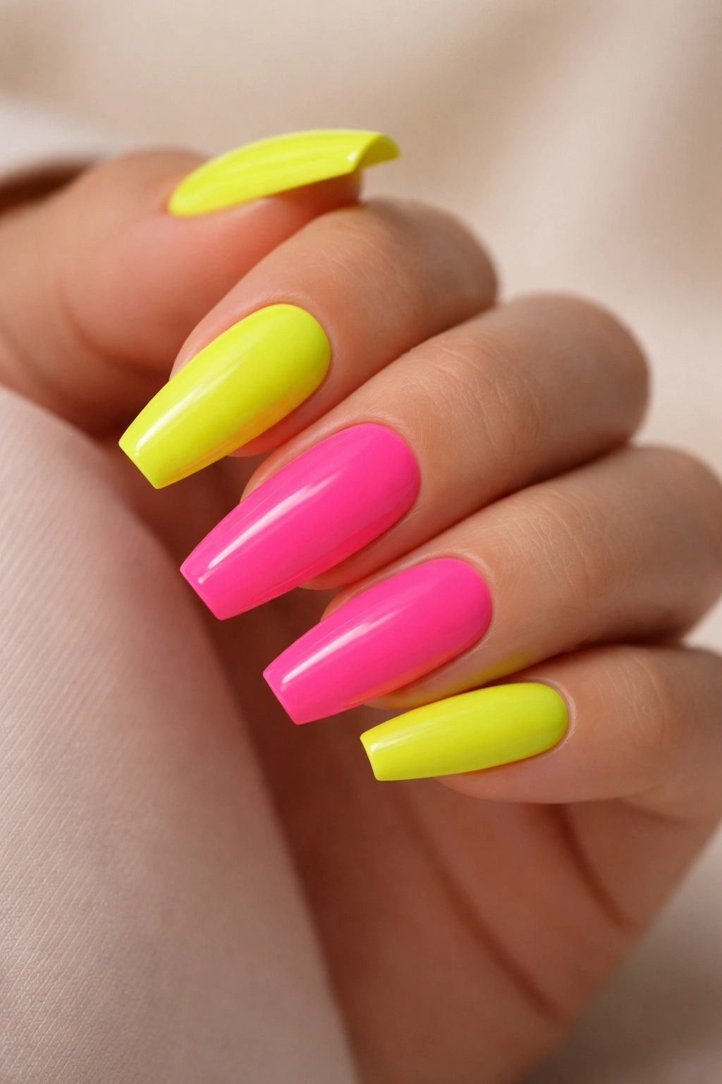
Neon can look cheap fast when the shape underneath it is wrong. Put highlighter yellow or acid pink on a short, wide square nail, and the color can feel heavy. Put that same shade on a ballerina shape—with tapered sidewalls and a flat tip—and it suddenly looks cleaner, sharper, and far more deliberate.
That’s why neon ballerina nails have such staying power. The shape does half the styling work for you. It slims the finger, gives French tips and color blocks a crisp edge, and makes loud pigment look like a choice instead of an accident.
There’s also a technical reason neon nails either sing or flop. Fluorescent shades are less forgiving than deep reds, browns, or milky nudes. A streaky base, uneven apex, or top coat that shrinks at the sidewalls will show up right away—especially with yellow, lime, and orange. Nail techs usually lay down a thin coat of white or milky nude under the brightest colors for a reason.
And the best part? Neon does not need to mean chaos. Some of the strongest sets use one sharp detail, one bold color, and a clean shape. Others go louder, sure, but they still feel pulled together because the lines are tight and the placement makes sense. That’s where these 15 ideas earn their place.
Why the Ballerina Shape Makes Neon Look Sharper
Ballerina nails give bright color somewhere to land. That flat tip matters more than most people expect. On an almond shape, neon can drift soft and hazy unless that’s the look you want. On ballerina nails, the edge creates a stop point, so French tips, outlines, flames, and side swipes look more graphic.
Length matters here.
A ballerina shape usually looks strongest when you have at least 6 to 10 millimeters of free edge beyond the fingertip, whether that length comes from natural nail, hard gel, or tips. Go shorter than that and the taper can start to eat into the sidewalls, making the nail look pinched. Go much longer and the neon becomes the star whether you wanted that or not.
Where the shape earns its keep
The reason this shape flatters neon is simple: it controls spread. Bright polish has visual weight. The taper narrows that weight through the body of the nail, and the squared-off tip stops it from drifting into something too sweet or too soft. You get edge without the brick-like look that sometimes happens with a blunt square.
If your nail beds are wider, ballerina is especially helpful. A nude side panel, slanted tip, or negative-space design has more room to slim the nail without stealing all the brightness. That’s hard to pull off on a rounded shape.
I also think ballerina handles mixed finishes better than most shapes. Matte neon with a glossy stripe. Chrome over a bright base. A jelly finish with crisp line work. The shape keeps those choices looking intentional—even when the color itself is loud.
Prep Work That Keeps Neon Ballerina Nails Smooth and Bright
Neon is unforgiving.
A deep berry polish can hide a ridge or two. Fluorescent lime will not. Before you even get to the fun part, the prep has to be clean, especially on a long tapered shape where the eye tracks every sidewall and every reflection down the center of the nail.
Here’s the salon-level checklist that helps neon read crisp instead of patchy:
- File with a 180-grit file and make both sidewalls mirror each other before color goes on. Neon exaggerates uneven shape.
- Build a small apex about one-third of the way down the nail if you’re using gel or acrylic. Flat ballerina nails tend to look flimsy under bright color.
- Use a milky white, pale pink, or soft nude base under yellow, orange, lime, and coral so the pigment doesn’t go dull.
- Cap the free edge on every layer, especially with matte top coat, or the tip can wear pale within a few days.
- Float the top coat instead of pressing the brush hard. Neon streaks can reopen if the brush drags too much.
- Cure dark neons and thick art layers fully. A chrome powder or layered aura effect needs a properly cured surface or it wrinkles later.
Finish matters more than color count
Gloss makes neon look wetter and denser. Matte gives it a chalkier, editorial edge. Chrome throws light back at you and makes the shade feel colder or more metallic depending on the powder. None of those finishes is better across the board. They just create different moods.
Take screenshots with the finish visible when you save nail inspiration. I cannot say this enough. Two sets can use the same hot pink and look nothing alike because one has a velvety matte top and the other has a glassy gel shine.
1. Electric Lime French Tips With a Milky Nude Base
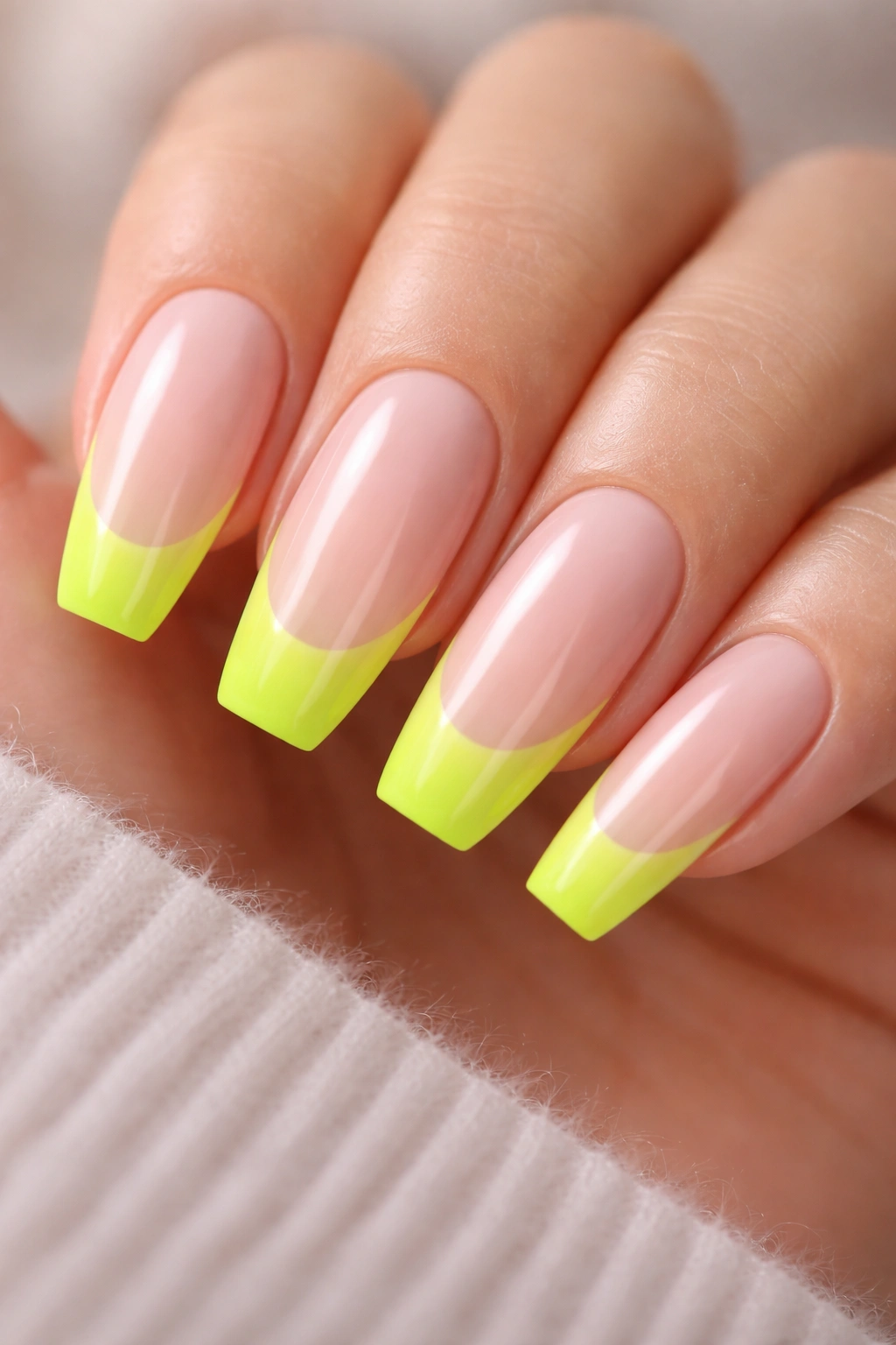
Electric lime French tips are one of the cleanest ways to wear neon if you like sharp color but do not want ten fully painted nails shouting at once. The milky nude base softens the contrast, and the ballerina tip keeps the lime line looking crisp rather than sporty.
The trick is proportion. On a medium-length ballerina nail, the lime tip usually looks best at 3 to 5 millimeters deep. Go thinner and the neon disappears from arm’s length. Go thicker and the set starts reading half-green instead of French.
Why the smile line matters
A deep curved smile line can look too traditional for neon. I prefer a straighter French edge with only a slight dip at the center, which matches the flatness of the ballerina tip. It feels cleaner and more modern. A nail tech can map this with a liner brush before filling in the tip, which helps keep every nail even.
Quick design notes
- A milky nude base looks better than a fully sheer one because it hides the natural nail line under the neon.
- Lime reads brightest over one thin white coat under the tip area.
- A glossy top coat keeps the color looking juicy; matte lime can go chalky if the pigment is weak.
- This design looks strongest on medium to long ballerina lengths, where the tip has room to show.
Best tweak: add a hair-thin silver stripe where the nude meets the lime if you want the French line to look more custom without making the set busy.
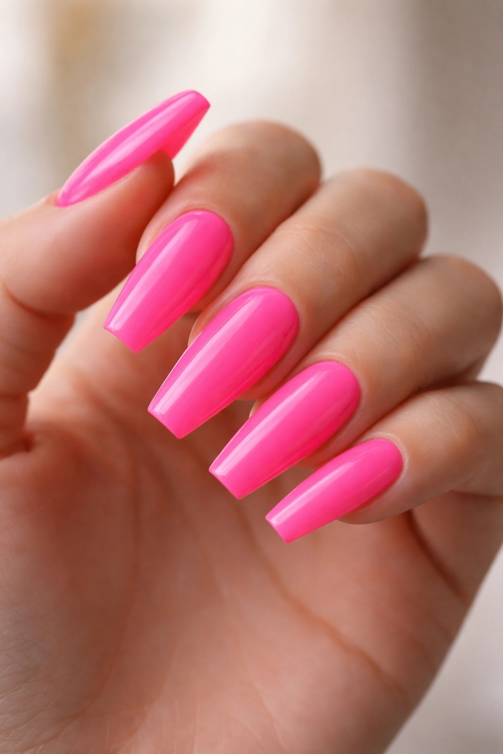
2. Hot Pink Ombré Neon Ballerina Nails
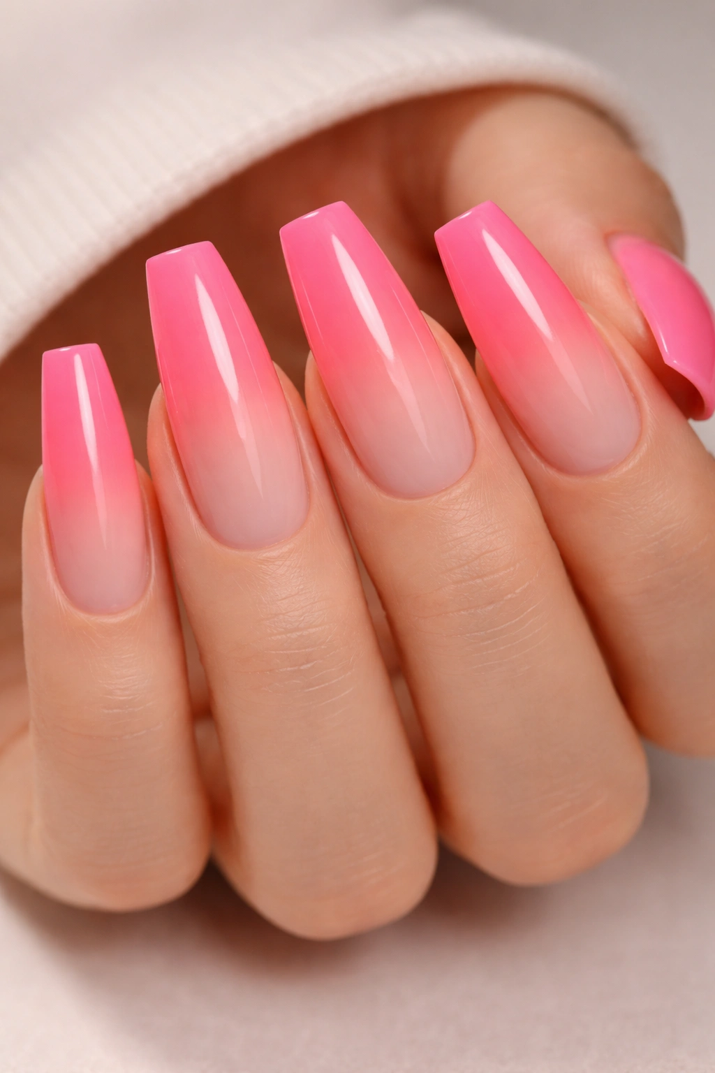
Hot pink ombré is one of the easiest neon looks to wear for a full week and still enjoy on day six. Full hot pink from cuticle to tip can be a lot on a long set. Fade that same shade from dense at the tip to soft near the base, and the whole thing feels more flattering.
The ballerina shape makes the fade look longer. Your eye starts at the soft cuticle area, moves through the color wash, and lands on the flat edge where the pigment is strongest. On an almond, the fade can drift. Here, it has a clear finish line.
What I like about this design is how much room it gives for tone control. A cooler neon pink with a blue base looks sharp and almost sporty. A warmer pink that leans fuchsia feels punchier and a little dressier. Either way, the fade should stay smooth. A makeup sponge, ombré brush, or airbrush tool can do the job, though the airbrush finish is usually the cleanest.
Maintenance is easier than people expect. A soft cuticle area means tiny growth at the base is less obvious, which buys you a little grace before your next fill. Ask for the color to be packed hardest into the last one-third of the nail, not spread evenly top to bottom. That placement gives the design its shape.
3. Neon Orange Outline Nails With Negative Space
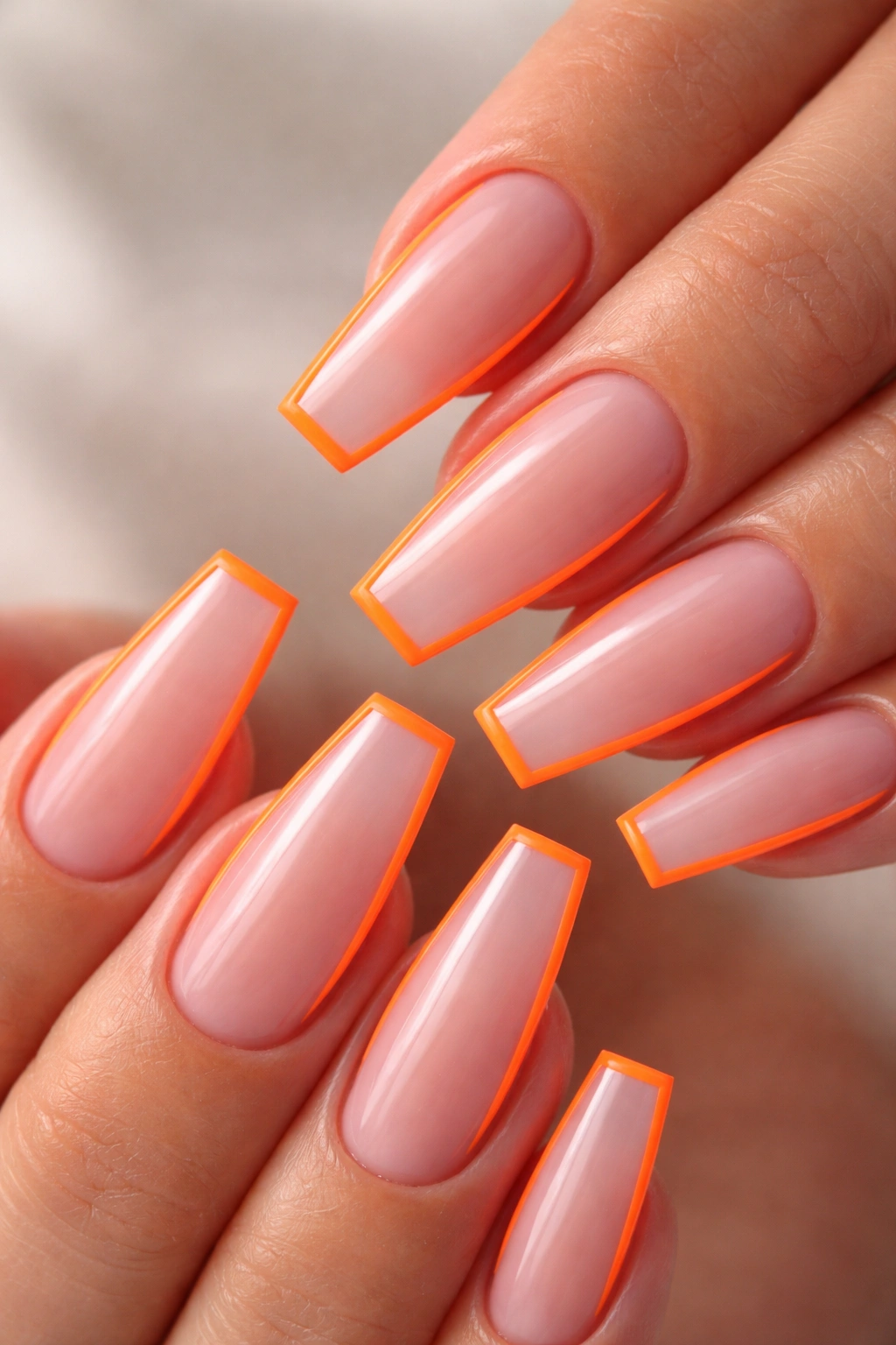
Why does a 1-millimeter neon orange outline often look more expensive than a full orange nail?
Because negative space gives the eye a break. Instead of taking in one solid block of bright color, you see structure: the perimeter line, the tapered sidewalls, the flat tip. On ballerina nails, that outline almost acts like a frame, which is why this design looks so sharp in photos and even better in motion.
A clear or sheer pink base keeps the look airy. Neon orange has enough punch on its own; it does not need help. The outline can hug the entire nail, or it can leave a tiny gap near the cuticle for a floating effect. I like the second option more. It keeps regrowth looking cleaner and avoids the heavy “boxed in” look.
How to keep the gaps from looking messy
The outline has to be even. That means consistent thickness at the sidewalls and a crisp squared-off edge at the tip. If one side is 1 millimeter and the other is 2, you’ll see it right away. A striping brush and slow rotation of the finger—not big sweeping hand motions—usually gives the best control.
This one also benefits from restraint. One accent nail with a tiny orange dot or micro line is enough. Pile on decals, gems, and chrome, and the whole point of the clean outline disappears.
4. Highlighter Yellow Matte Nails With a Glossy Cuticle Crescent
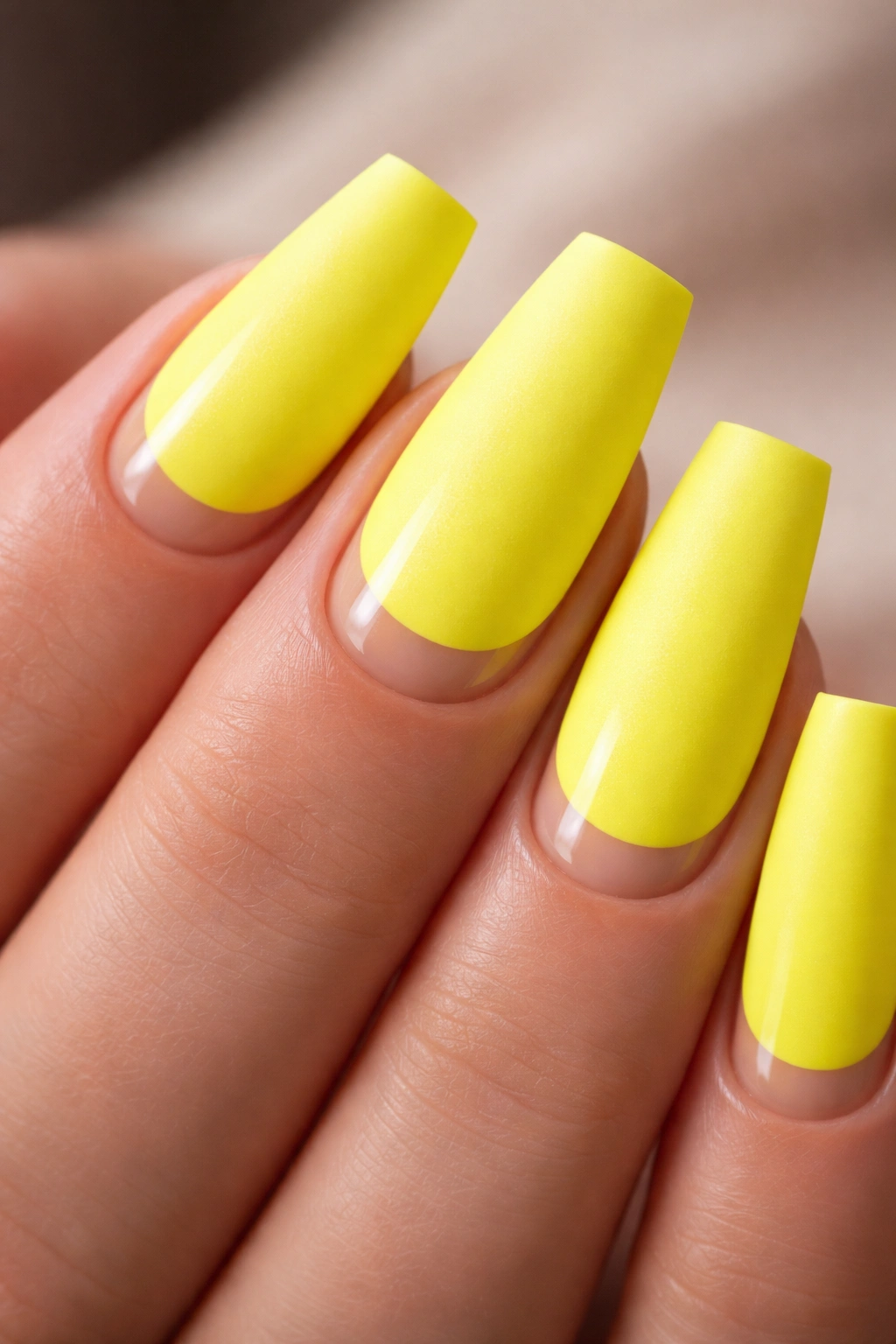
Across the room, this set looks like straight matte yellow. Then your hand moves, light hits the base of the nail, and that glossy crescent near the cuticle changes the whole read.
That contrast is the appeal.
Highlighter yellow is already blunt and hard to ignore, so texture does the heavy lifting here. A matte top coat turns the color velvety and almost powdery. A 2 to 3 millimeter glossy half-moon near the cuticle gives the eye one reflective detail without dragging the set into full nail art territory.
The effect works best when the yellow is fully opaque. Thin yellow polish can look chalky under matte top coat, which ruins the clean surface you want. A white undercoat helps, and so does choosing a gel formula known for dense pigment.
What makes this set click
- The matte finish should cover the whole nail except the cuticle crescent.
- The glossy crescent needs a clean curve that mirrors the cuticle line.
- Longer ballerina nails carry this look better than short ones because the matte field has room to breathe.
- Yellow looks strongest with minimal jewelry on the nail itself—skip crystals here.
This design has a slight editorial feel, almost like fabric on the nail. If you want neon without glitter, chrome, flames, or swirl art, this is a strong left turn.
5. Acid Green and Nude Color-Block Panels
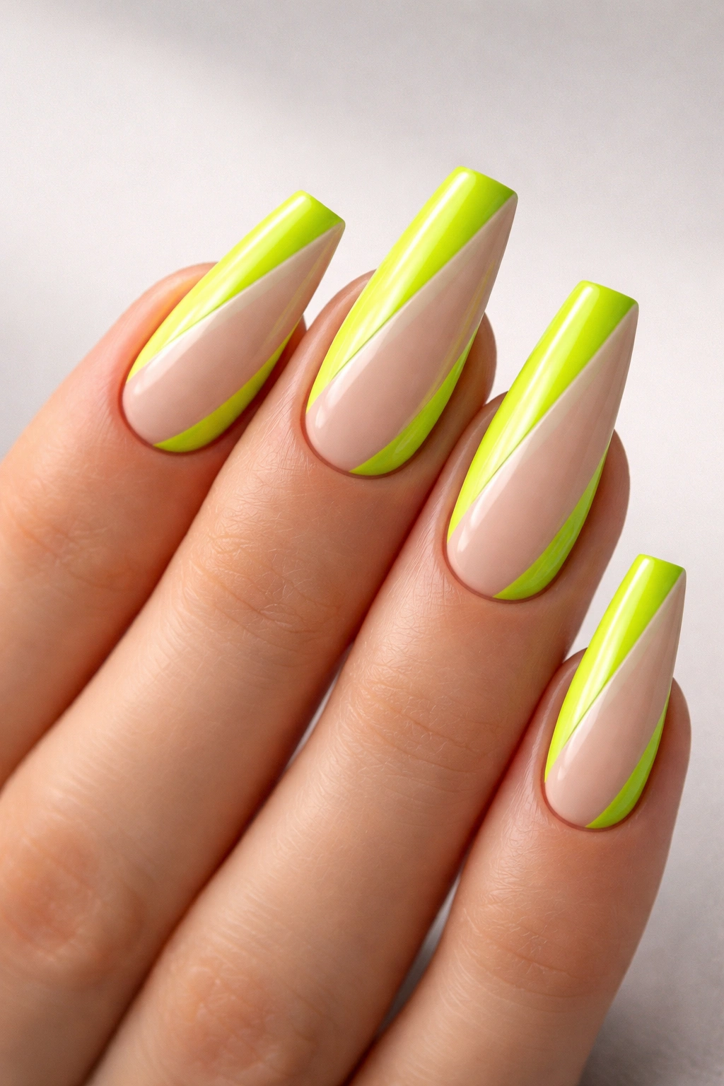
Acid green and nude color blocking does something smart: it uses neutral space to slim the nail while letting the neon stay bright. That matters on ballerina nails because the shape already narrows toward the tip. A good panel design leans into that line instead of fighting it.
One clean layout is a diagonal nude strip running from one side of the cuticle down to the opposite corner of the tip, leaving the rest of the nail coated in acid green. Another is a central nude panel bordered by green on both sides, though that one needs a longer nail bed to look intentional. On shorter extensions, the diagonal version is safer.
The nude should not match your skin exactly. If it does, the panel can vanish. A sheer beige-pink or soft latte nude usually gives enough separation while still calming the neon.
I also like this set because it wears well. Tiny chips are less obvious when the design already has segmentation built in. And if one nail breaks, it’s easier to rebuild a clean blocked pattern than a complex swirl or aura blend.
You do need tidy line work. Sloppy color blocking has no place to hide. Use one neon, one nude, one finish—gloss is the strongest here—and let the geometry carry the set.
6. Neon Coral Flame Tips on a Soft Peach Base
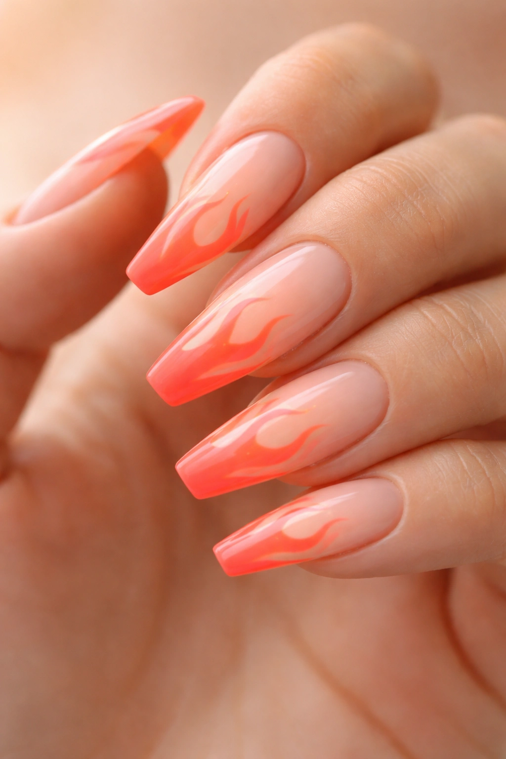
Unlike black-and-red flames, neon coral flames keep the energy without pulling the set into costume territory. They still feel hot. They still have movement. They’re just lighter, fresher, and easier to wear with everyday clothes.
A soft peach or sheer apricot base helps the coral glow. The flame tips should start near the free edge and rise about 4 to 6 millimeters into the nail, with a mix of skinny tongues and broader curves. If every flame is the same width, the art looks stamped on. Slight irregularity makes it feel hand-drawn in the right way.
This design suits medium to long ballerina nails because the taper gives the flames somewhere to climb. On a square nail, the same art can look blocky. On a sharp stiletto, it turns aggressive fast. Ballerina keeps it balanced—there’s some edge, some softness, enough structure.
Who wears this best? Someone who wants nail art with motion but doesn’t want stones, decals, or heavy line work. It’s playful without feeling childish.
My recommendation: keep two nails per hand in full flame art and let the others wear a coral French tip or a plain peach base. Ten full flame nails can get noisy. A mixed layout keeps the focus.
7. Electric Blue Side-Swipe Tips With Fine Silver Striping
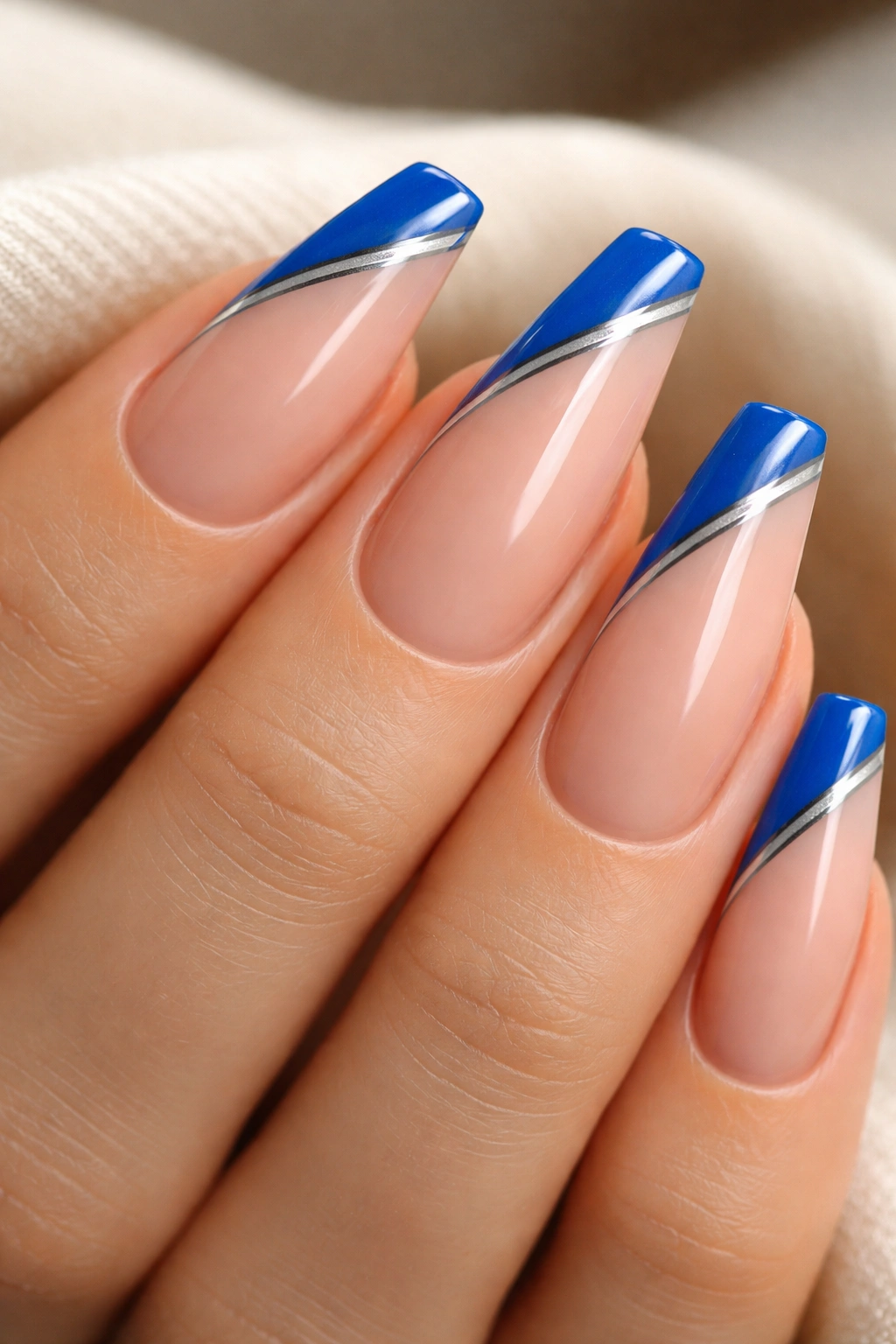
Electric blue side-swipe tips feel sporty in the best way. Instead of painting the free edge straight across, the tip color cuts diagonally from one sidewall toward the opposite corner, creating a slash of blue that makes the nail look longer.
The silver stripe is what makes the design look deliberate instead of rushed. A thin metallic line—about half a millimeter—sits between the nude base and the blue sweep, sharpening the contrast and giving the angle a clean boundary.
The line that holds the whole design together
Without the silver, the blue can still look good. With it, the whole set tightens up. The metallic detail also helps if the nude base is close to your skin tone, since it keeps the edge from disappearing at a glance.
Quick layout notes
- Ask for the blue sweep to angle in the same direction on every nail unless you want a mirrored effect.
- A cool nude or translucent pink base keeps electric blue looking crisp.
- Silver striping tape can work for a quick set, though hand-painted gel line work lasts better.
- Shorter ballerina nails can wear this one if the diagonal is kept shallow.
Best tweak: put the side swipe only on the middle, ring, and thumb, then leave the index and pinky in solid electric blue. The mix looks cleaner than five identical diagonals.
8. Rainbow Skittles Neon Ballerina Nails
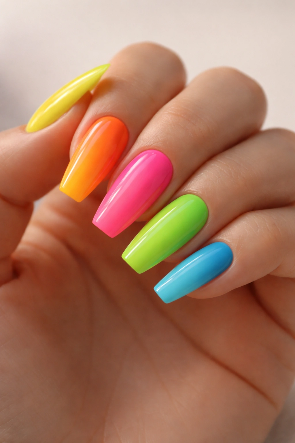
Rainbow skittles neon ballerina nails are loud, yes, but they don’t have to feel random. The trick is giving the colors a system. One shade per nail works when the tones share a similar intensity and finish. A fluorescent lime next to a muted peach will clash. A fluorescent lime next to hot pink, orange, yellow, and blue can look tight if the saturation stays high across the whole hand.
Order matters. I like a warm-to-cool flow from thumb to pinky, or the reverse, rather than a shuffled mix. The hand looks more intentional that way. It also photographs better because your eye reads the set as a sequence instead of five separate decisions.
The ballerina shape is helpful here because it unifies the chaos. Same length. Same taper. Same top coat. Same sidewall structure. Once those pieces match, you can get away with far more color than you could on mixed shapes or mixed lengths.
One extra thought: do not crowd a rainbow skittles set with heavy art on every nail. If you want a detail, use one consistent accent across all five—tiny silver dots near the cuticle, a micro French line, or a matte finish on two nails only. Otherwise the set starts pulling in five directions at once.
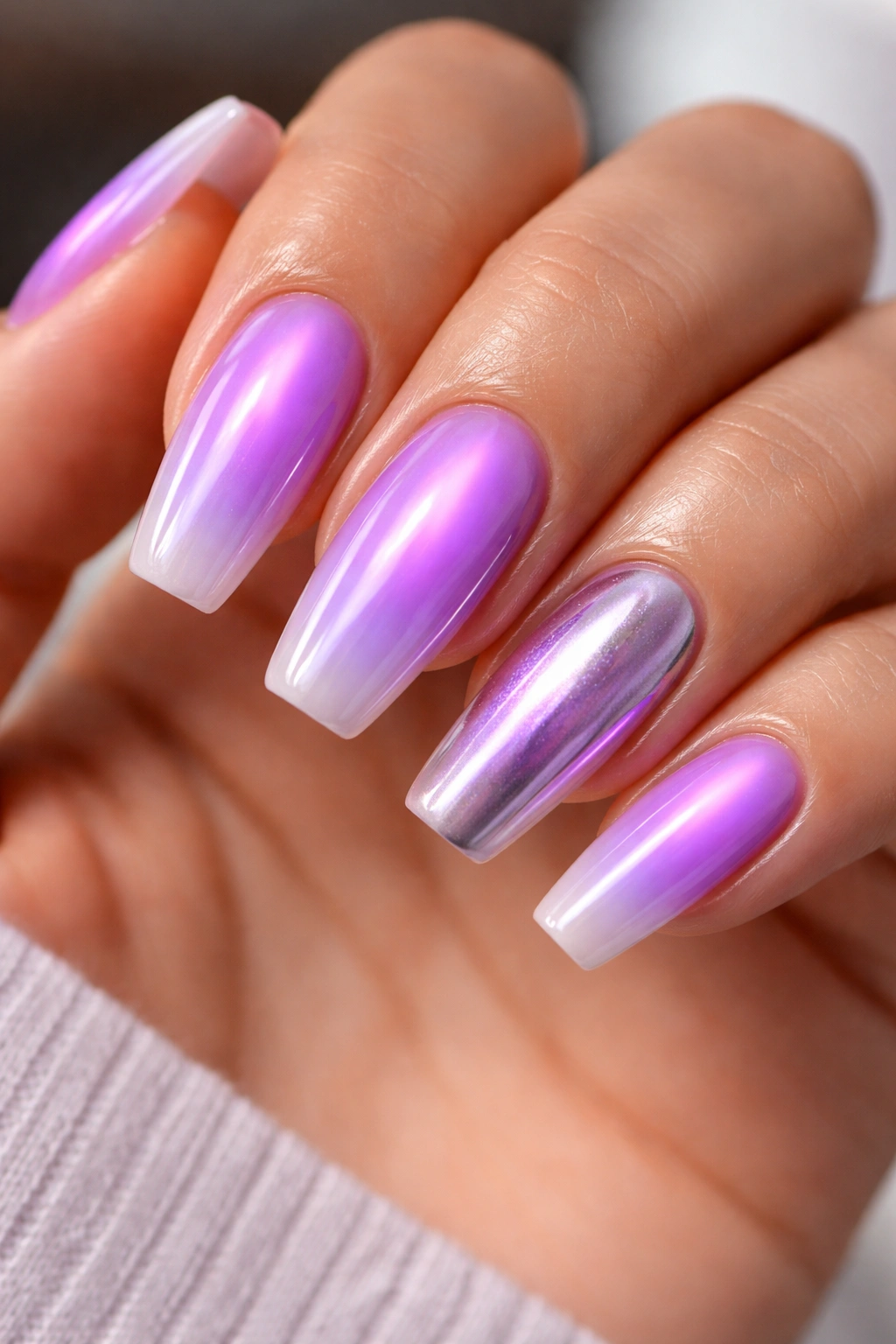
9. Fuchsia Chrome Overlay on a Bright Pink Base
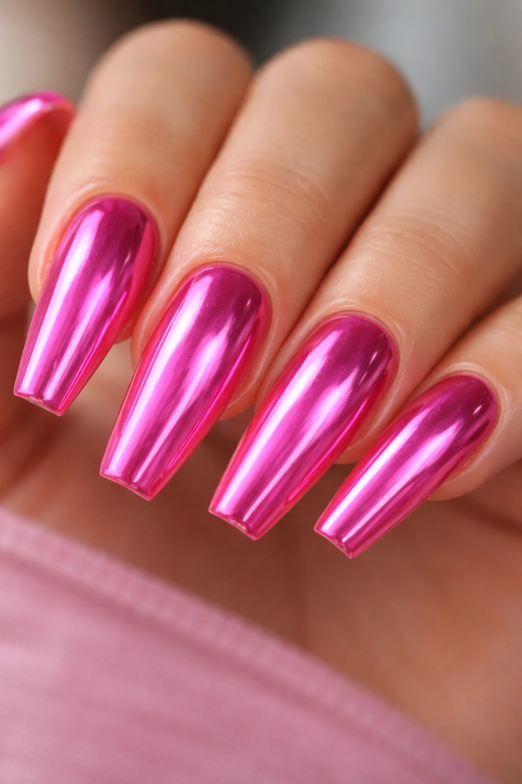
Can chrome and neon sit on the same nail without tipping into plastic-looking shine?
Yes—if the base stays bright and the chrome stays sheer. The mistake people make is reaching for a heavy silver mirror powder over already loud pink. That crushes the color and turns the set cold. A better move is a pink, magenta, or soft violet chrome powder buffed lightly over a cured fuchsia base so the neon still shows through.
The ballerina shape makes this combo feel cleaner because the reflections run in long straight lines down the nail. Chrome on a rounded shape can look bubble-like. On ballerina, it looks sleek.
What to ask for at the salon
Ask for a translucent chrome finish, not full mirror coverage. That one phrase changes the entire result. The powder should tint and glaze the fuchsia, not smother it. A no-wipe gel top coat under the chrome also matters, because texture underneath chrome shows every bump.
This set looks strongest with minimal extra art. No gems. No black line work. No marble. Let the color and reflection do the talking.
10. Sheer Neon Peach Jelly Nails
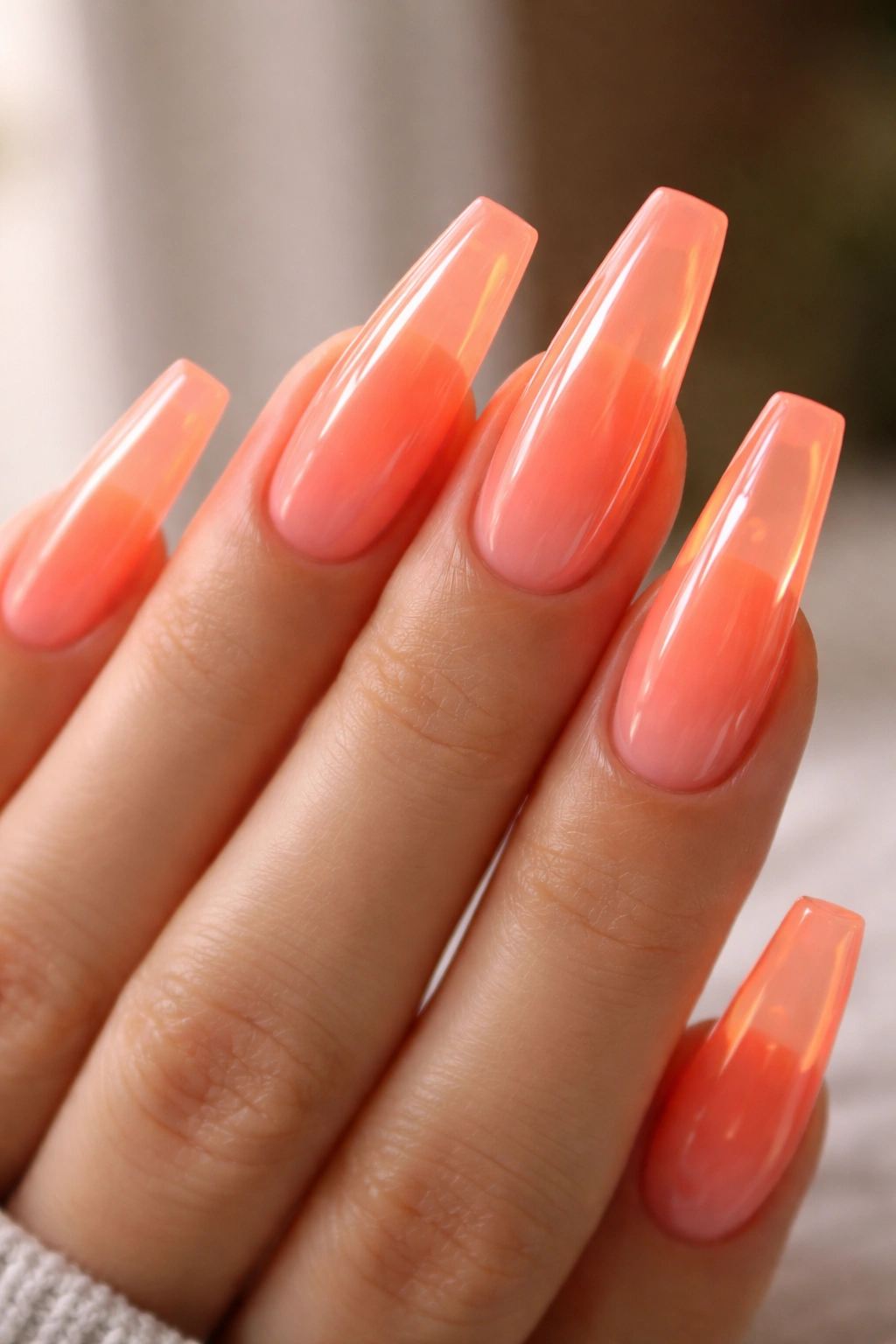
Under indoor light, jelly neon peach can look almost soft. Step outside and the tips start glowing like hard candy.
That shifting look is why this design stays interesting.
Jelly finishes let light move through the color, which makes ballerina nails look a little lighter and glassier than full-opacity gel. Neon peach is a smart pick because it sits between orange and pink without committing too hard to either. On a long clear extension or a builder gel overlay, the transparency gives the tip a floating effect.
You need enough structure under it, though. A jelly neon on a weak, flat extension can look flimsy. Builder gel with a tidy apex keeps the nail from feeling toy-like, and a glossy top coat is non-negotiable. Matte would kill the whole point.
The details that make jelly neon look intentional
- Use two thin coats, not one thick one, so the color stays translucent.
- A clear or sheer peach base works better than white undercoat for this look.
- Longer ballerina nails show the jelly effect best because the free edge has room to glow.
- Tiny embedded glitter can work here, though only if it’s sparse and fine.
There’s a beachy mood to this one, sure, but it also looks sharp against black, cream, denim, or gray. It’s less sugary than bubblegum pink and less blunt than full neon orange.
11. Lime and Black Graphic Grid Lines
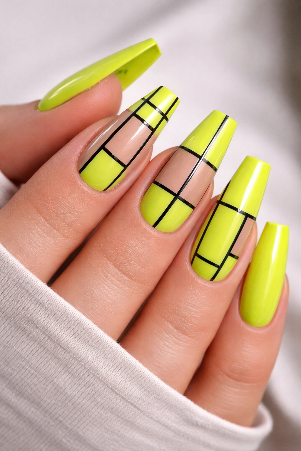
This is the set for people who think neon can look too sweet. Lime and black grid art cuts all that softness right out.
A black grid over a lime base gives the nail structure and contrast in one stroke. Thin verticals and horizontals—usually 0.5 to 1 millimeter thick—break the neon into panels so the color feels controlled. The design can cover every nail, though I prefer a mixed set with two full lime nails, two nude-and-grid nails, and one accent that combines both.
The reason this works on ballerina nails comes down to geometry. The sidewalls are already tapering, so a few straight lines create tension against that shape. You get narrow lines meeting slanted edges and a flat tip. It feels graphic, almost architectural.
This one is less forgiving than a swirl or ombré set. Crooked lines jump out right away, and black polish has no mercy. Use gel paint or a high-pigment liner gel, not standard black polish dragged thin with a worn brush. A glossy finish looks cleaner here than matte because it keeps the black from turning dusty.
I would skip stones and charms on this design. They interrupt the grid and pull the eye off the line work.
12. Purple Aura Neon Ballerina Nails
Unlike a full neon purple coat, purple aura neon ballerina nails keep the intensity in one focused area. The glow sits in the center or upper middle of the nail, while the edges fade into milky lavender, sheer pink, or translucent nude. That soft border keeps the color from feeling too flat.
Aura placement matters. A centered blur about 6 to 8 millimeters wide usually looks best on medium-length ballerina nails. Push it too close to the cuticle and the nail can look bruised. Push it too close to the tip and it starts reading like a failed ombré. Centered or slightly higher gives the best balance.
This design suits people who like neon but want softness around it. You still get that electric purple punch, though it’s framed by haze rather than hard edges. Airbrushing gives the smoothest aura. A sponge can work, though the fade needs patience or it turns patchy.
My pick is a glossy finish with maybe one chrome accent nail at most. Purple aura already has enough atmosphere. It does not need three other effects fighting for space.
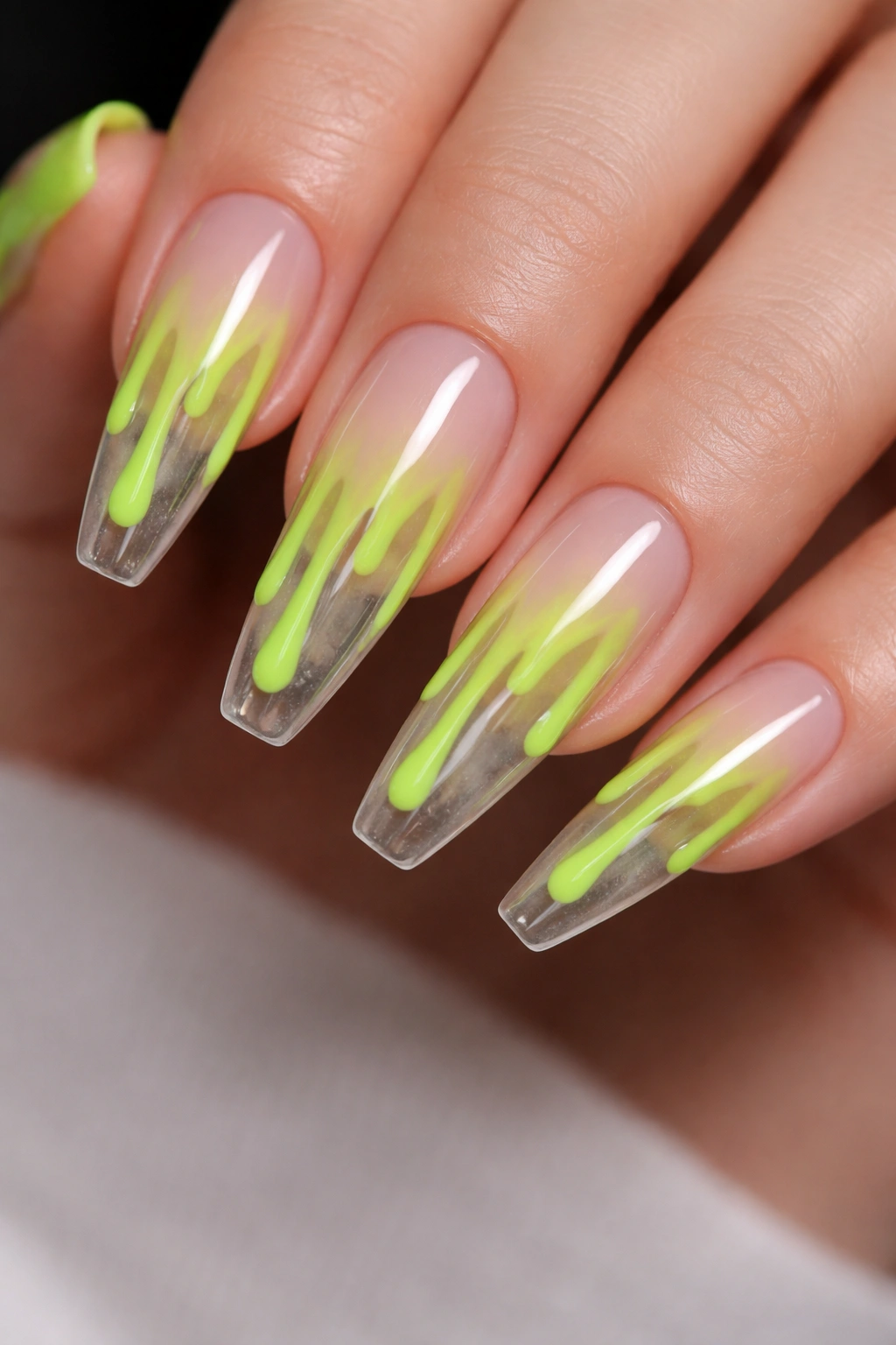
13. Neon Green Drip Art Over a Clear Base
Drip art can go novelty fast, which is exactly why a clear base saves it. When the nail bed stays clean and the drips are placed with control, the look feels sharp instead of costume-heavy.
Neon green is a strong choice because it has that toxic, high-voltage feel people usually want from drip designs. On ballerina nails, the drips can start at the tip and fall downward, or begin near the cuticle and slide toward the center. I prefer tip drips. They echo the flat edge and look more stable on the nail.
Where the drips should start
A good drip line sits along the free edge, then drops in three or four uneven trails per nail. Mix one long drip, one short one, one medium. If every trail hits the same length, it looks stamped. Give each drop a rounded end so it reads like liquid, not fringe.
Quick design notes
- A clear, milky-clear, or sheer nude base keeps the drips readable.
- Gloss top coat is the move here. Matte kills the wet effect.
- Drips look strongest on middle and ring fingers, where you usually have the most nail real estate.
- Limit extra accents to one black outline or one tiny crystal near the cuticle on a single nail.
Best tweak: pair two drip nails with three simple neon green French tips so the set keeps its point without turning gimmicky.
14. Orange-to-Pink Sunset Airbrush Fade
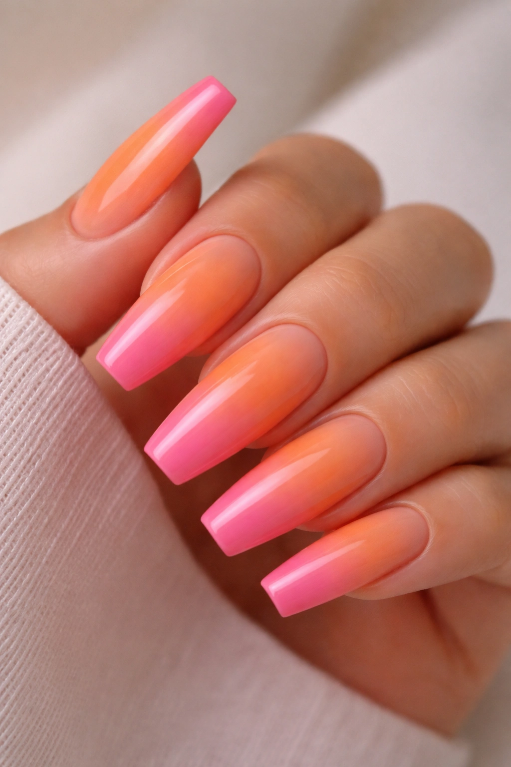
Some gradients look muddy because the two shades are too close in depth or too dull in finish. Orange to hot pink avoids that problem. You get one shade with citrus warmth and one with punch, and when the fade is soft enough, the meeting point glows instead of going brown.
Airbrush gives this look its best version. The pigment lands in an even mist, which matters because orange and pink can stripe when sponged carelessly. If you’re doing it by hand, work in thin layers and keep the center blend soft rather than trying to force one heavy coat to do the job.
This set loves length. A ballerina tip gives the gradient a runway, and the flat edge lets one color end decisively. You can run orange from cuticle to mid-nail and pink to the tip, or flip it. I like orange near the base and pink at the edge because the pink finish line makes the shape pop.
A glossy top coat keeps the fade looking juicy. Tiny palm-tree decals or little black silhouettes are tempting here. Skip them. The gradient already carries enough mood on its own.
15. Mixed Neon Abstract Swirls With a Gloss Top Coat
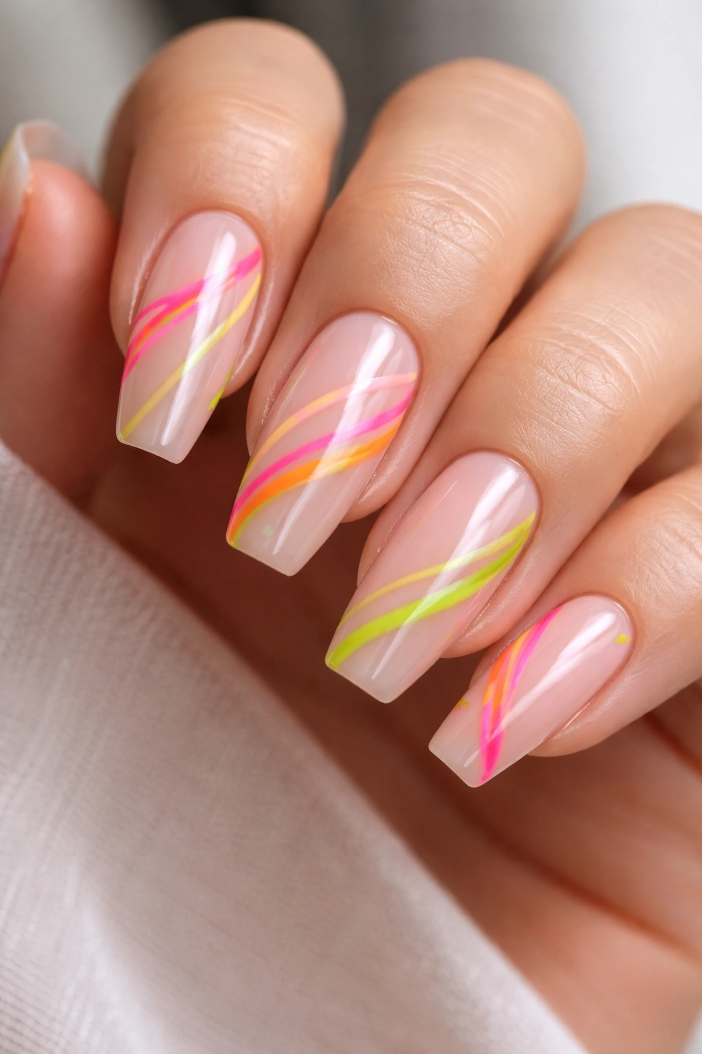
What if you want lime, orange, pink, and purple on one set without sliding into full rainbow skittles? Abstract swirls are the answer—though only if you leave enough breathing room.
The strongest version uses a milky nude or sheer blush base with two or three neon ribbons crossing each nail. One line should be thicker, around 2 millimeters. Another can stay hair-thin. Change the curve direction from nail to nail so the set does not look copy-pasted. The ballerina shape helps because the lines can follow the taper, cross it, or wrap toward the tip.
How to stop abstract swirls from looking crowded
Leave 30 to 40 percent of the base visible. That negative space is what makes the design feel polished. Once the whole nail is flooded with loops and crossings, the eye has nowhere to rest. I also prefer no more than three neon shades on a single nail, even if the full set uses four or five.
Gloss is the better top coat for this look because it makes the lines look fluid. Matte swirl art can work, though it loses some of that painted-on movement. If you want one extra detail, use a tiny silver dot at the intersection of two swirls on one accent nail and stop there.
This design is playful, a little artsy, and far easier to customize than people think. Change one shade, change the whole mood.
Final Thoughts
The smartest neon sets do not rely on volume. They rely on shape, placement, and finish. Get those three right, and even a single stripe of lime or a tiny orange outline can land harder than ten overloaded nails packed with color and extras.
If you’re taking one of these ideas to a salon, bring more than a screenshot. Note the finish you want, whether the base should be sheer or milky, and how thick the art lines need to be. A tech can match “hot pink” in six different ways. “Hot pink ombré with a soft cuticle fade and dense color on the last third of the nail” is a much clearer brief.
And if you’re doing your own set, start with the cleanest version first. Neon rewards control. Once you see how sharp ballerina shape and bright pigment can look together, it gets a lot easier to know when to stop—and that’s where the best nail sets usually live.
