

Red and black ballerina nails do not whisper. They arrive with a point of view, and on the right hand they look less like a color combo and more like a decision.
That’s why this pairing works so well on the ballerina shape. The long taper and flat tip give red and black clean edges to push against, which matters more than people think. Soft shades can blur a shape. Dark pigment exposes every line, every sidewall, every tiny wobble in the file job.
I’ve always thought this is one of the few nail looks that can swing from sleek to dangerous with one small change. Switch gloss to matte, and the mood changes. Move black from the base to the tip, and suddenly the set looks sharper, longer, leaner. Even the red matters: a blue-red reads crisp beside black, while a warmer tomato red can turn the whole set louder than you meant.
If you’ve been staring at salon photos and thinking they all blur together after the fifth swipe, the difference usually comes down to placement, finish, and restraint. Some red and black ballerina nails look expensive. Some look busy. The details below are where that split happens.
Why Red and Black Ballerina Nails Hit Harder on a Flat-Tipped Shape
Ballerina nails give dark colors architecture. That’s the shortest way I can say it.
A rounded square or short almond can still wear red and black well, but the ballerina shape adds a little tension. The sides narrow in, the tip cuts off flat, and the color has a longer runway to travel across. That extra length makes ombré fades smoother, French tips cleaner, and negative-space designs easier to read from a few feet away.
There’s also a small salon nuance worth knowing. Plenty of techs use coffin and ballerina like they mean the same thing. Close enough, sure. Still, a true ballerina shape often has a slightly softer taper and a more balanced flat tip, while coffin nails can run boxier or more severe. With red and black, that softer taper tends to look cleaner because the contrast is already doing enough heavy lifting.
Dark shades also expose bad shaping fast. If one sidewall is thinner than the other, black polish will show it. If the tip is too wide, red French lines start looking clunky. That’s why these sets look best when the shape is filed first, checked from every angle, then painted—never the other way around.
The shape does half the styling work before the art even starts.
The Small Design Choices That Make a Bold Set Look Clean
Pick the wrong red, add one extra line, and a strong set can slide into costume territory in a hurry.
The fix is not to make the design boring. It’s to control three pressure points: color temperature, finish, and spacing. Once those are right, even dramatic art—flames, chrome, lace, stones—has room to breathe.
Here’s what I’d decide before choosing any of the looks below:
- Choose a blue-based red if you want a sharper finish. Cherry, crimson, and oxblood sit better beside black than orange-red shades.
- Match the finish to the design. Gloss works well for French tips, split-color sets, and foil. Matte suits moons, lace, and gemstone details.
- Watch line weight. On medium ballerina nails, black striping lines often look best at about 1 millimeter. Thicker than that, and detail work can crowd the shape.
- Use accent nails on purpose. Two statement nails per hand is often enough for lace, gems, or corset art.
- Think about grow-out. Dark cuticle-heavy designs show regrowth faster than tip-focused art.
One more thing. If your nails are on the shorter side—say, under 8 millimeters of free edge—designs that pull color toward the tip tend to flatter the shape more than heavy blocks of black at the base.
1. Glossy Black Nails With Deep Red French Tips
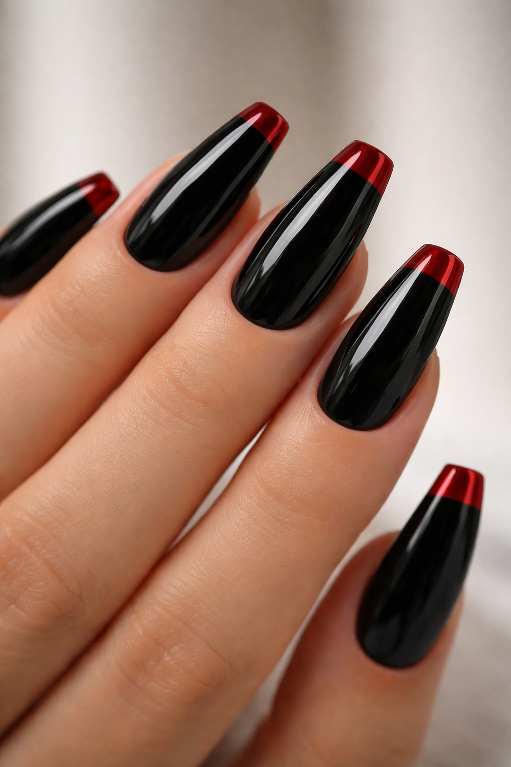
There’s something almost patent-leather about a glossy black base capped with a dark red French tip. It looks polished, sharp, and a little severe in the best way.
This design works because it flips the usual French mood on its head. Instead of soft pink and white, you get black doing the heavy work and red acting like a blade at the edge. On a medium or long ballerina shape, that red tip should be wide enough to read from arm’s length—around 3 to 4 millimeters is the sweet spot on most hands.
Why the Contrast Lands So Well
The black base shortens visual clutter. Your eye sees one smooth field of color, then hits that red tip right at the flat edge. That placement makes the ballerina silhouette look more deliberate, almost cleaner than a full red nail.
It also helps that the tip color doesn’t need glitter, gems, or striping tape. The built-in contrast is already carrying the design.
Quick details that matter
- Best length: medium to long ballerina nails with at least 8 millimeters of free edge
- Best finish: high-gloss gel top coat, capped at the tip
- Red tone: deep cherry, wine, or oxblood
- Skill note: the smile line needs to stay crisp and even across all ten nails
Small tweak: ask for a slightly deeper French curve on the index and pinky nails. Those two fingers often look flatter if the tip line sits too straight.
2. Matte Crimson Nails With Glossy Black Half Moons
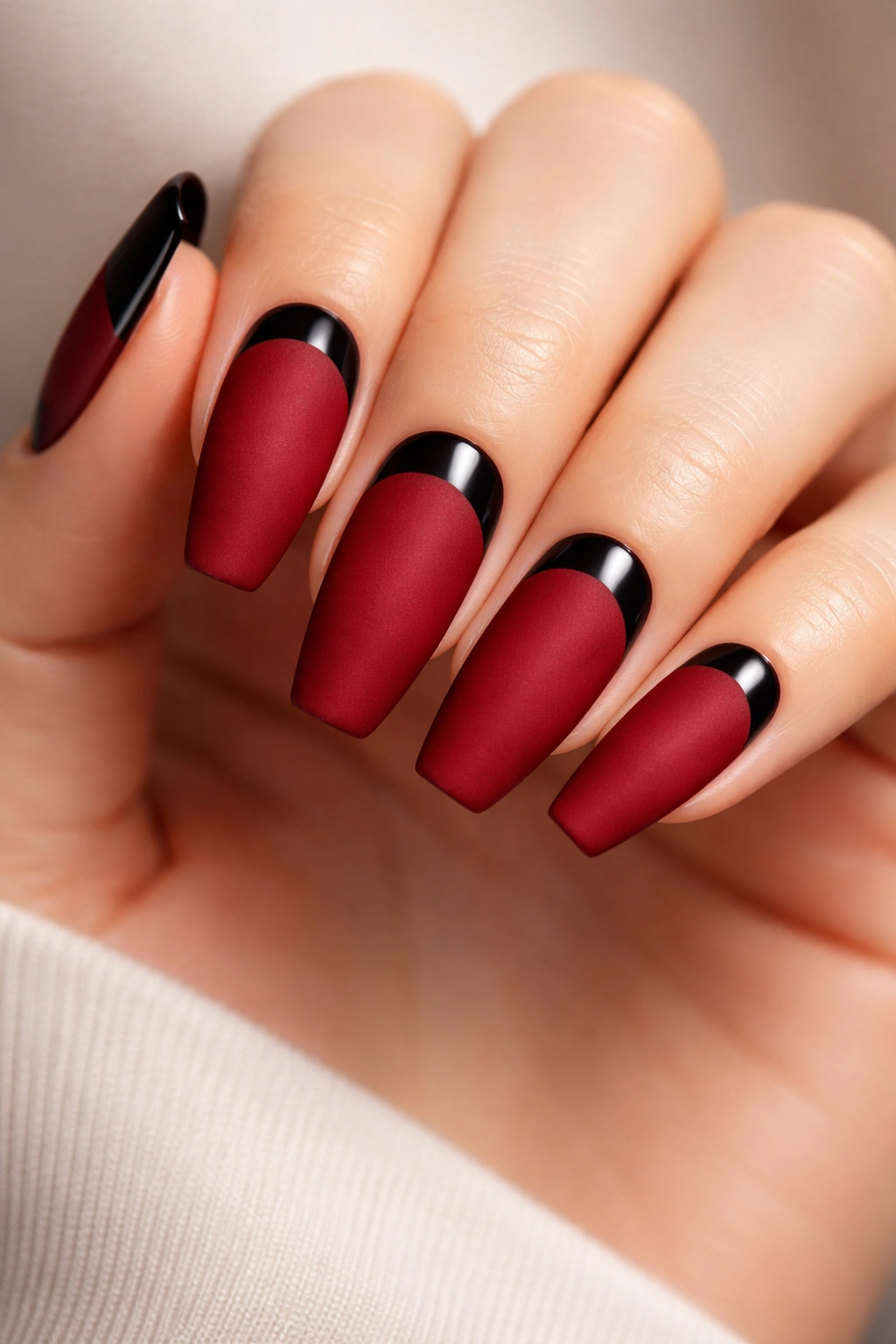
Matte crimson has more depth than glossy crimson on this shape, and the black half moon at the cuticle gives it an old-film edge that never looks sleepy.
The finish contrast is the whole trick here. When the red surface goes velvety and the black moon stays reflective, your eye catches the cuticle detail first, then the long taper of the nail. That moves attention upward, which can make fingers look longer even if the nails are only medium length.
A lot of matte sets die because the texture swallows the design. Not this one. Red still has enough body to hold the shape, and the glossy black moon gives the set one hard, slick note. I like the moon kept narrow—around 2 millimeters deep—because anything larger can make grow-out look rough too soon.
There’s a downside. Matte top coat picks up oil from cuticle cream, sunscreen, hair products, and makeup faster than gloss. If you wear this set, wipe the nail surface with a little alcohol on a lint-free pad when it starts looking dull. That tiny fix brings the finish back without another full appointment.
This one feels dressed up even with a plain outfit.
3. Diagonal Split Red-and-Black Ballerina Nails
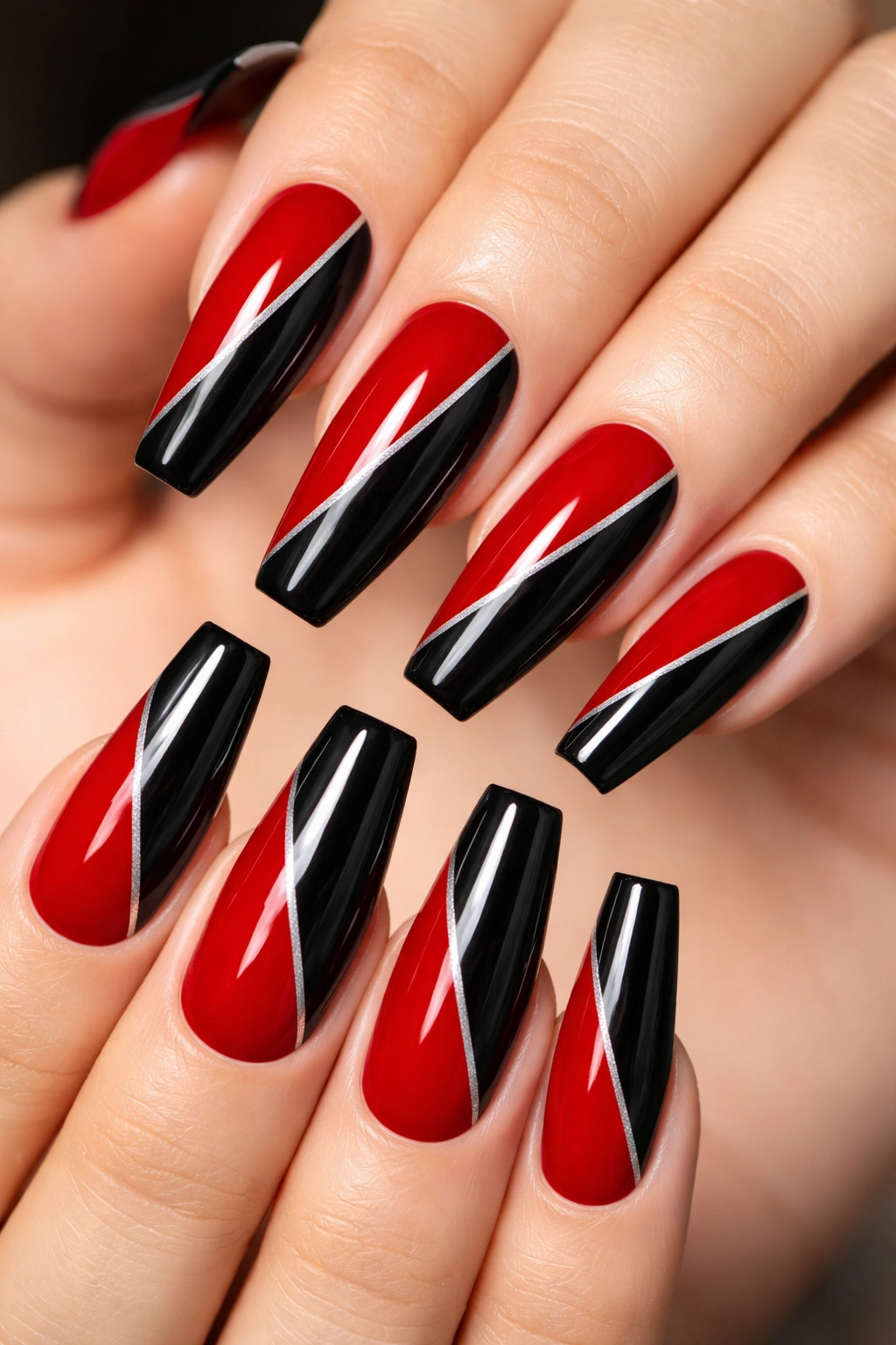
Why do diagonal splits look sharper than a straight red-black divide? Because the line moves with the shape instead of fighting it.
A vertical half-and-half nail can look stiff on ballerina tips. A diagonal split—from one side of the cuticle down toward the opposite corner of the tip—adds movement. The nail looks longer, and the design feels less blocky. If you want a set that has graphic energy without gems or texture, this is one of the cleanest ways to get there.
Try keeping the split angle between 30 and 45 degrees. Too flat and the nail looks chopped in half. Too steep and the color placement starts reading random.
Placement That Flatters the Shape
On shorter ballerina nails, let black take the slimmer diagonal section and red fill the larger side. Black is visually heavier, so using less of it keeps the set balanced.
On longer nails, you can reverse that ratio or even alternate directions from nail to nail. I prefer the diagonals to mirror across each hand rather than change at random. That gives the set rhythm without looking rigid.
A thin metallic silver strip can sit between the two colors if you want extra definition, though I’d only add that on one or two nails. Past that, the design starts trying too hard.
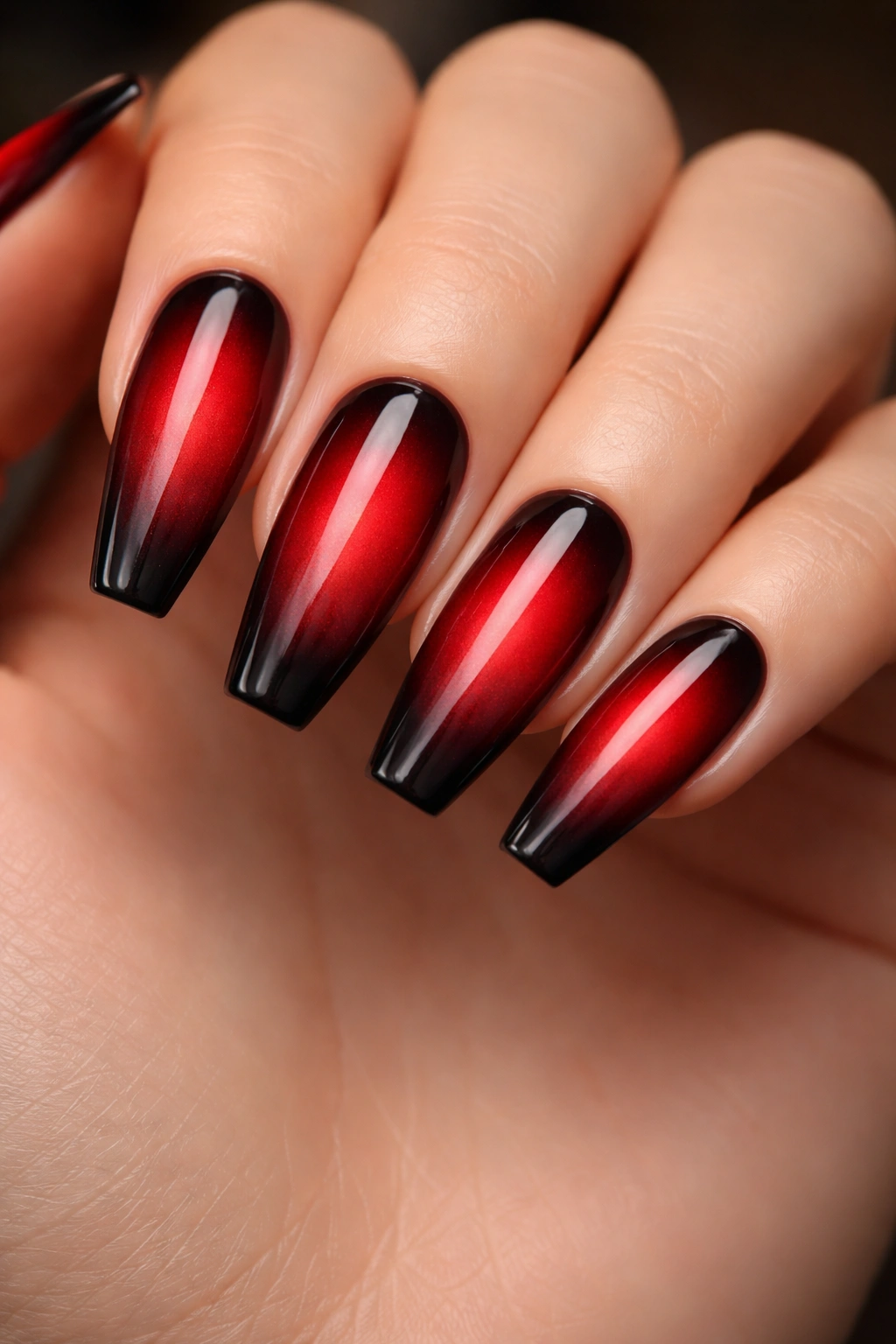
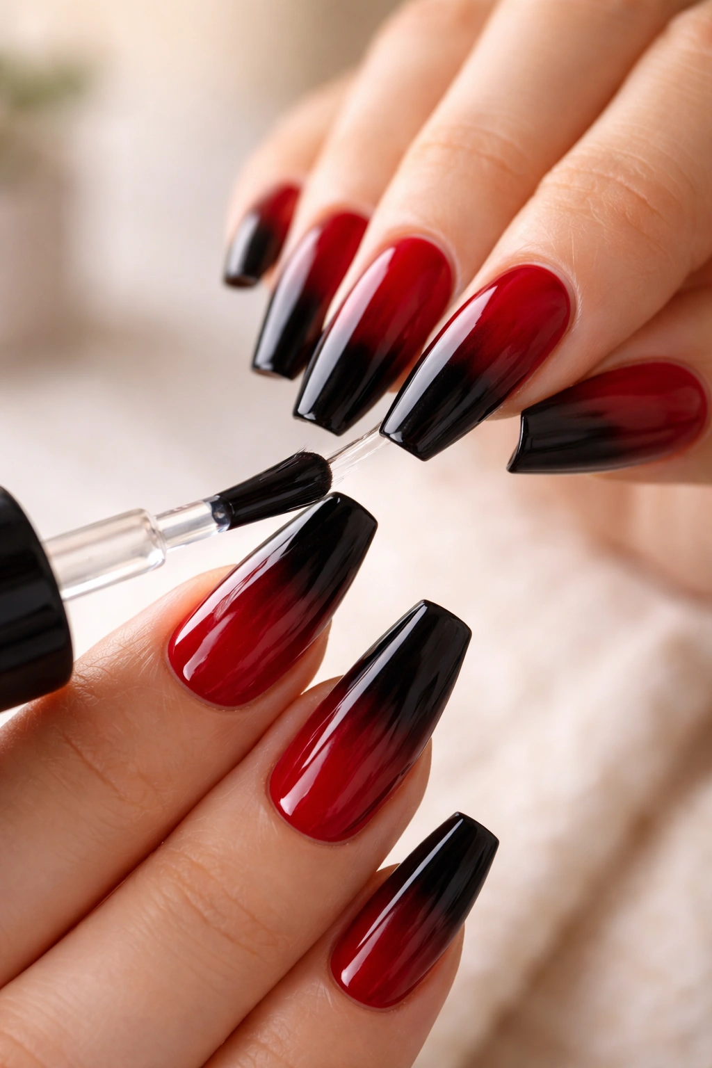
4. Black-to-Red Smoke Ombré Ballerina Nails
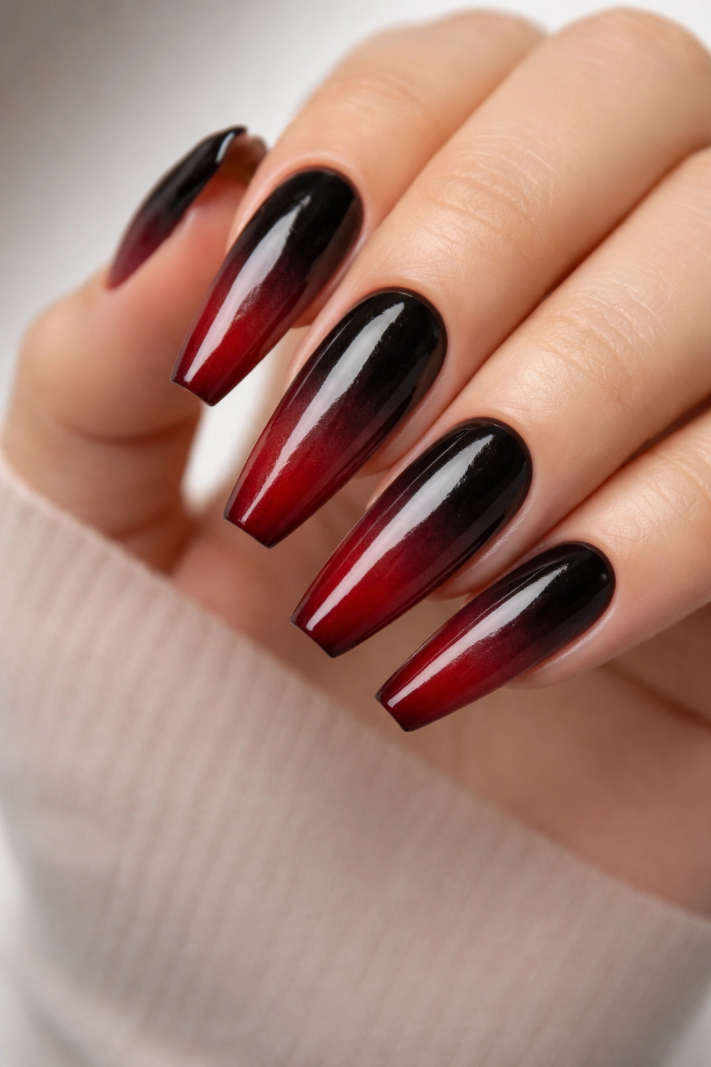
When this look is done well, the fade looks like red heat moving through black glass. When it’s rushed, it turns muddy.
That’s the whole challenge with a smoke ombré. Red and black are both dense pigments, so they can swallow each other fast if the blend is overworked. The prettiest version leaves a touch of transparency in the middle transition—enough that the fade feels airy rather than slapped together.
I like this design most on longer ballerina nails, where the color has enough room to shift. Start darker at the cuticle with black, then bleed into a wine or ruby red toward the tip. Going the other direction can work too, though it tends to look heavier.
Details worth paying attention to
- Use sheer or jelly layers instead of two fully opaque colors if you want a smoky finish
- Airbrush or sponge blending gives a softer transition than dragging a flat brush through wet gel
- Keep the center blend narrower than you think; wide transitions can look brown from a distance
- Top with gloss, not matte, unless you want a charcoal haze instead of a glowing fade
This design is dramatic without needing extra art. The color movement does the talking.
5. Red Nails With Fine Black Corset Lines
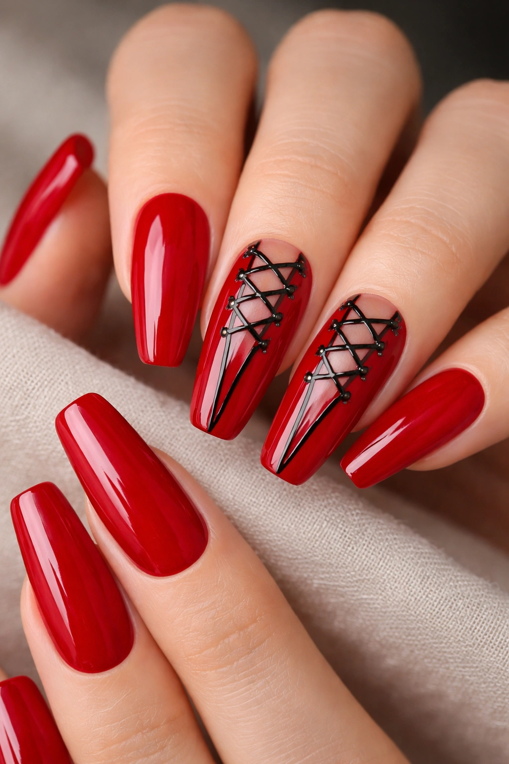
Not every dramatic set needs chrome, flames, or stones. Sometimes a thin black line does more.
A crimson base with delicate black corset lacing has a fashion feel that suits ballerina nails almost too well. The long taper gives those lines room to climb up the center of the nail, and the flat tip keeps the design from turning sugary. You want it to look tailored, not cute.
The mistake people make here is putting corset art on all ten nails. Don’t. Two accent nails—middle and ring, or ring and pinky—usually carry enough detail. Let the rest stay solid red or maybe add thin black side stripes to tie the set together. Once every nail has X-shapes and dots, the eye gets tired fast.
A striping brush around 7 to 9 millimeters long helps. So does a thick enough gel paint that the lines stay raised and crisp. If they spread while curing, the design loses that lace-up look and starts reading like a scribble.
Small studs can sit where the lines begin near the cuticle, though I’d skip bows. The shape already has edge. Bows take it somewhere else.
And yes, this set looks best when the red is rich, almost blood-red, with a glossy finish. Matte drains some of the tension out of it.
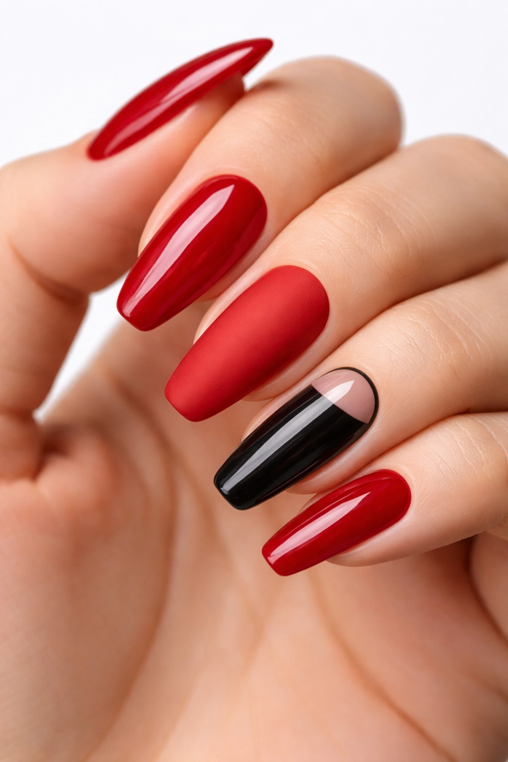
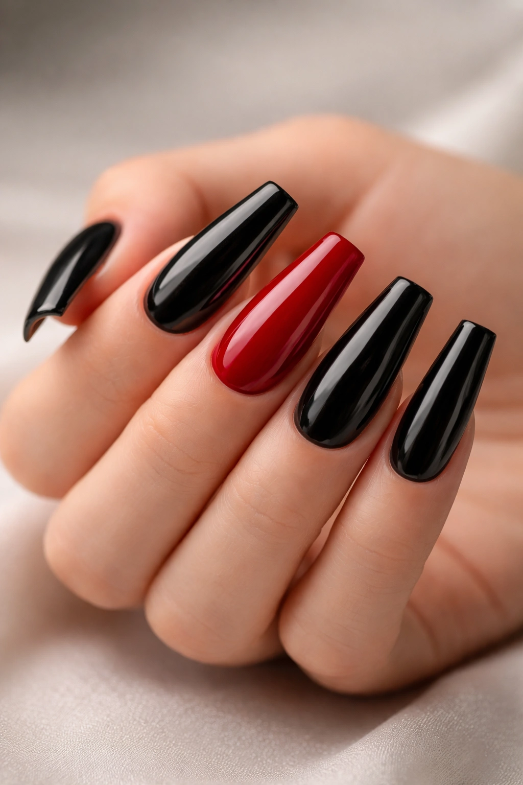
6. Glossy Black Set With One Ruby Chrome Accent Nail
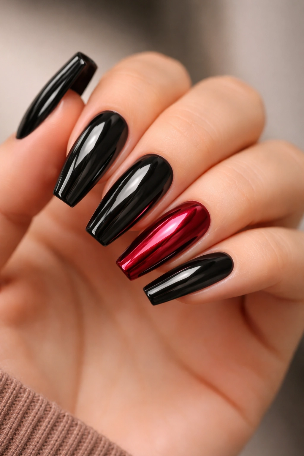
Unlike a full red chrome set, one ruby chrome accent nail gives you shine without turning the whole manicure reflective and loud.
This is one of the smartest options on the list if you want red and black ballerina nails that feel bold but still easy to wear across workdays, dinners, and weekend plans without changing your whole style around them. Nine black nails. One ruby chrome accent. That’s it.
Placement matters more than people think. A ring-finger accent is classic because it breaks the hand at a natural point. A thumb accent also works, especially if you talk with your hands or spend half the day holding a phone, mug, steering wheel, whatever is in reach. I’d skip putting chrome on the index finger unless you want the shine to dominate every gesture.
The black needs a rich top coat here—smooth, glassy, no texture. Ruby chrome works best when the base underneath leans red rather than silver, which gives it that lacquered jewel look instead of a mirror finish. The combo feels expensive because the contrast is controlled: one reflective nail against nine dark ones.
If you want a little more tension, add a hair-thin black outline around the chrome accent. Not necessary. Clean, though.
7. Red Jelly Ballerina Nails With Black Flame Tips
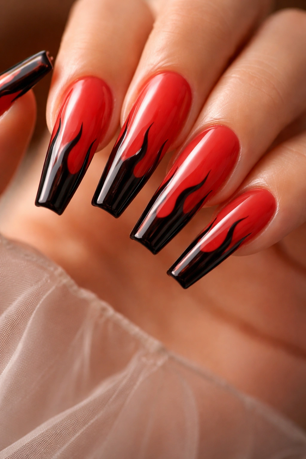
Hotter, lighter, a little unruly.
A translucent red jelly base with black flame tips has more movement than a solid-color set, and the see-through finish keeps the design from feeling heavy even on long nails. That balance is why it works. The art is loud; the base is airy.
Black flames should stay near the tip and sides rather than crawl halfway down the nail. Once the flames take over too much surface area, the ballerina shape disappears under the art. I like them tapered and uneven, with two taller tongues of flame and one shorter shape on each nail. Uniform flames look stamped. Hand-drawn variation looks alive.
Where this set earns its keep
- Warm-weather wear: the jelly base feels lighter than opaque crimson
- Longer nails: the flame points have room to stretch without crowding the cuticle
- Gloss finish: it gives the red that syrupy, glass-candy look
- Accent option: flame art on four nails and solid jelly red on the rest looks cleaner than ten full flame nails
Best move: ask for the flame tips to start with a thin black border before filling them in. That first outline keeps the shapes crisp.
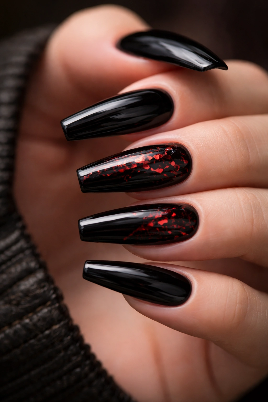
8. Velvet Matte Black Nails With Tiny Red Gem Clusters
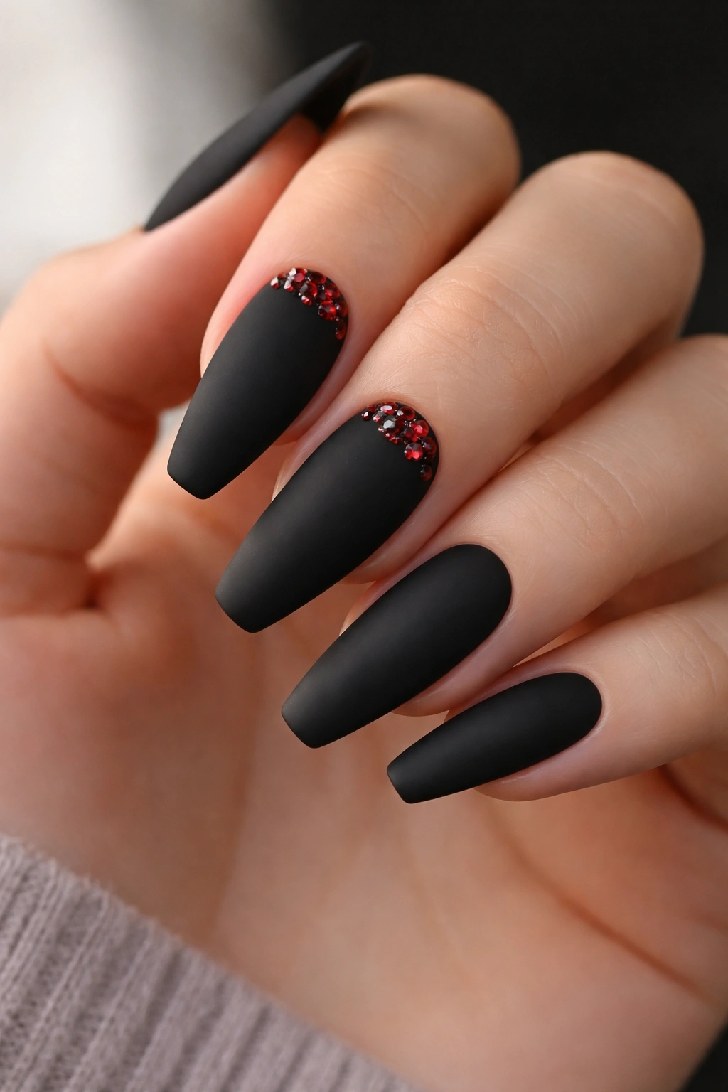
Three small stones can do more than a full rhinestone border. I will stand by that.
A matte black ballerina set with tiny red gem clusters near the cuticle has a dark, dressed-up feel that works best when the stones stay small and low-profile. Think three to five flat-backed crystals on two nails, maybe arranged like a little burst or crescent. Anything bigger starts snagging on sweaters, hair, pockets, and the inside of your sanity.
What makes this design strong is the surface contrast. Matte black reads soft to the eye but still hard in shape, and the gems cut through it with pinpoint color. Because the shine is concentrated in one spot, the set feels planned instead of overloaded.
This design also suits medium lengths better than people expect. You do not need extra-long extensions to make it work. Shorter ballerina nails can carry gem clusters well because the stones are acting like jewelry, not full-scale art.
One note from experience: ask for stones to be tucked into a bead of clear builder gel rather than glued flat on top with only top coat around them. That extra support buys you more wear, especially near the cuticle where hands get bumped all day long.
9. Checkerboard Red-and-Black Racing Tips
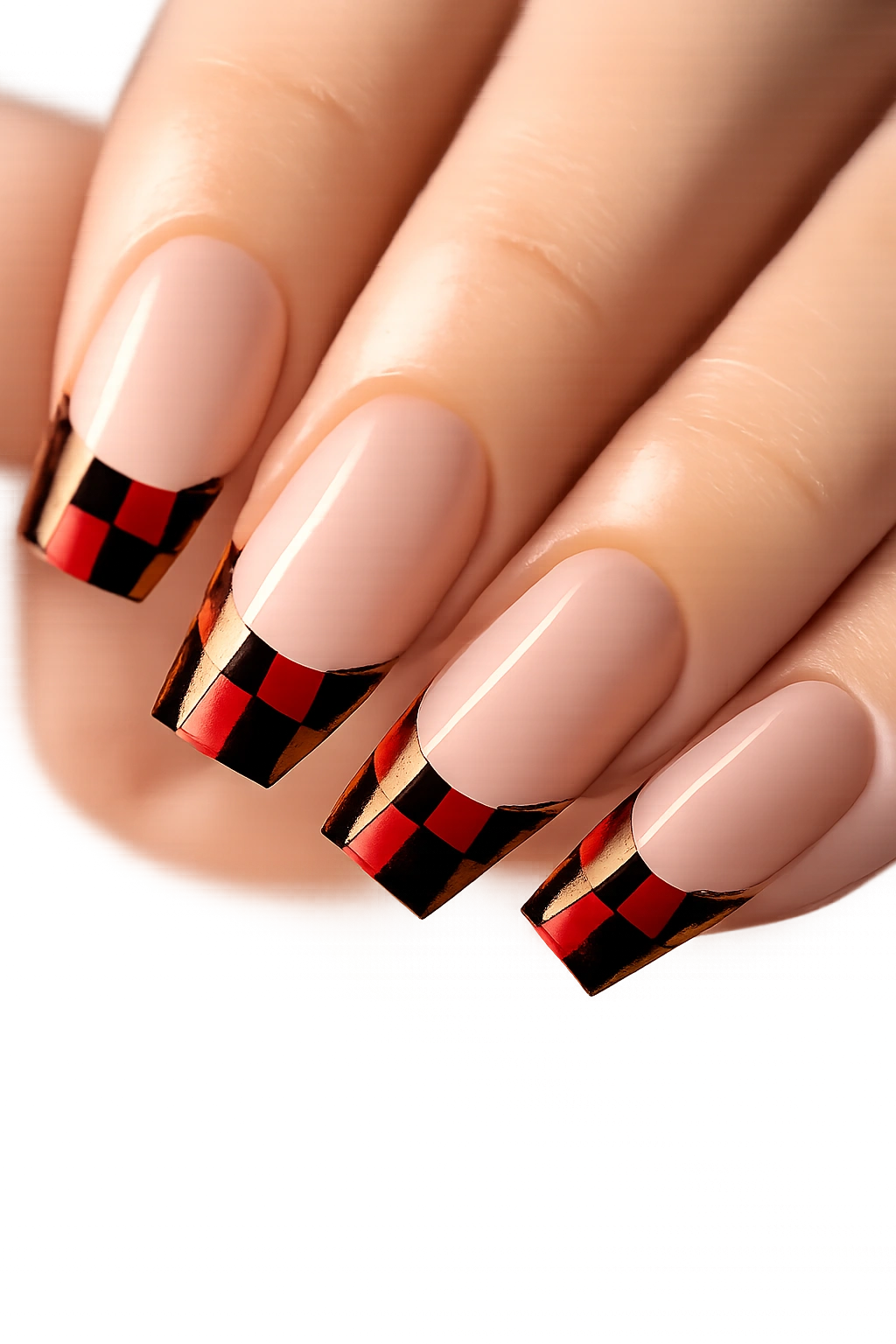
Can a checkered pattern look clean on ballerina nails? Yes—if you stop before the whole nail turns into a tiny flag.
The winning version keeps the checkerboard at the tip only, leaving the rest of the nail sheer nude, translucent red, or pale pink. That negative space gives the eye somewhere to rest, and it lets the flat ballerina edge do the styling work. Cover the full nail in checks and the shape gets lost.
I like a 4-by-2 or 5-by-2 grid across the tip, depending on nail width. Smaller squares blur from a distance. Larger ones feel clunky. Red-and-black checks look sharper than black-and-white on this shape because the red softens the pattern without making it sweet.
How to Wear It Without Visual Noise
Mix the checkered tips with solid black nails, or use checks on two fingers per hand and a thin red French line on the others. That gives you a set that nods to the pattern rather than drowning in it.
This design also looks better with a glossy top coat. Matte can flatten the little squares and make the whole thing feel dusty. Crisp lines, high shine, and restraint—that’s the formula here.
10. Negative-Space Black Frames With Red Center Panels
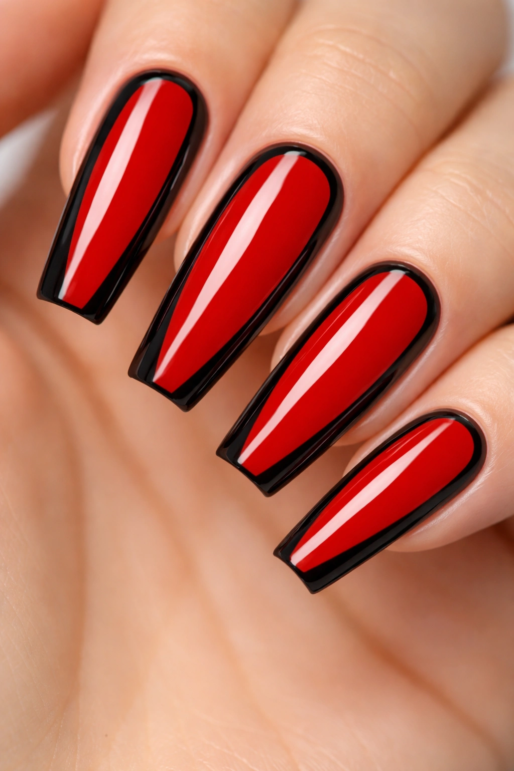
Picture the nail outlined in black like a thin picture frame, with a rich red panel floating in the middle. That’s the look, and on ballerina nails it’s sharp as a tailored jacket.
This design depends on precision. The black border should be slim and even along both sidewalls, then track the flat tip without getting chunky at the corners. The red center panel sits inside that outline, often leaving a narrow clear or nude gap that makes the colors look suspended rather than stacked.
The reason it works so well is architectural. Framing the outer edges reinforces the ballerina silhouette, while the red center draws the eye down the length of the nail. If you want fingers to look longer, this is one of the most effective tricks on the list.
The lines that matter most
- Border width: around 1 millimeter on medium nails, a touch more on longer sets
- Center panel shape: mirror the taper of the nail rather than staying straight like a rectangle
- Base color: sheer nude, clear builder base, or translucent pink
- Finish: gloss almost always looks better than matte here
This one takes a steady hand. The payoff is worth the extra chair time.
11. Sheer Red Base With Black Lace Overlay
A sheer red base under black lace has a moody softness that opaque polish can’t fake. You get color, pattern, and a little skin-tone glow under the art, which keeps the manicure from looking flat.
I like this design most when the lace sits on two or three nails rather than all ten. Accent placement lets the detail breathe. Try lace over the ring and middle fingers, then use solid black or syrupy red on the rest. The set feels connected without becoming busy.
There are two ways to do it well. One is stamping, which gives you a clean repeat pattern with less chair time. The other is hand-painted lace with tiny scallops, netting, and dot work. Hand painting has more charm when the tech knows what they’re doing, though a shaky lace pattern is worse than no lace at all. This is not the set for rushed detail work.
The red base should stay translucent, not watery. You want a stained-glass effect, not a washed-out tint. A black lace overlay on top of that looks rich, almost like fabric pulled over light. Gloss seals it best. Matte turns lace muddy on darker colors.
This design is one of the moodier options here, and I mean that as praise.
12. Crimson Aura Fade With Sharp Black Edge Contour
Full ombré is not the same thing as an aura nail, and the difference matters.
An ombré moves from one color to another across the whole nail. An aura design keeps the strongest color concentrated in the center—like a glow—while the edges stay softer. Add a thin black contour around that glow on a ballerina shape, and the whole manicure looks more sculpted than painted.
This works especially well when the center red is bright crimson and the outer area fades into smoky charcoal or muted black. The contour line should be thin and clean, sitting near the perimeter without swallowing the aura. Too much black and the glow dies. Too little and the shape loses that sharp frame.
I like this set on medium-long nails because the extra length gives the airbrushed center room to bloom. A short nail can wear it, though the aura needs to stay small—about the size of a lentil to a small bean shape in the center—so the sides do not close in too fast.
If you want red and black ballerina nails that feel modern without turning metallic, this is a strong pick. Airbrushed color, crisp outline, no clutter. Hard to beat.
13. Micro Red French Tips With a Thin Black Outline
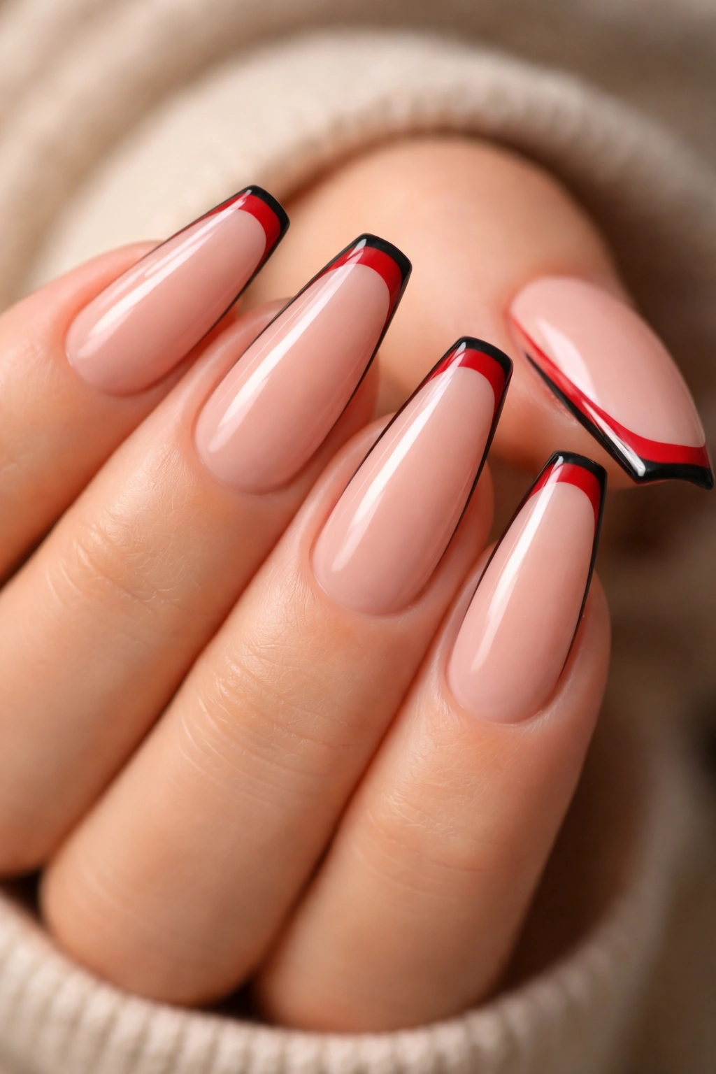
A nude or sheer pink base with a micro red French tip traced in black looks lean, fast, and far more striking than it sounds on paper.
This is not the same as the full black base with red tips from earlier. That design is bold head-on. This one is detail-driven. You notice it when the hand turns and the flat tip catches the eye. The black outline gives the red tip extra definition, almost like an inked edge, and that little shadow can make the nail look sharper and longer.
Why the outline matters
Without the black border, a thin red tip can disappear from a distance. With it, the tip reads cleanly even when the line is only 1 to 2 millimeters thick.
The base should stay sheer and polished. Milky nude works well. Warm beige can work too, though cooler pink-nude often makes the red pop harder.
Fast reference points
- Best on: medium ballerina nails and tidy natural nail beds
- Tool note: a long liner brush helps keep the outline from wobbling
- Finish: glossy top coat keeps the micro line from looking chalky
- Extra detail: a black sidewall line on one accent nail can tie the set together without crowding it
Smart choice: if you wear shorter ballerina nails, ask for the red tip to sit slightly deeper at the corners. That keeps the shape from looking too square.
14. Patent Black Nails With Red Foil Cracks
This one has attitude.
A glossy black base with torn pieces of red foil peeking through—or layered over the black in sharp fractured lines—creates a cracked patent effect that looks rawer than chrome and less fussy than hand-painted marbling. The finish matters here. You want that slick, wet black top coat so the red foil looks trapped under glass.
I prefer foil used with restraint: two full accent nails or broken crackle detail across four nails, not all ten. Spread everywhere, it can start reading messy. Concentrated in flashes and fault lines, it looks intentional and a little dangerous.
There are a couple of ways to build it. Red transfer foil over a tacky layer can create random shattered texture fast. Encapsulated red foil under sheer black jelly gives a deeper, moodier result. The second option looks richer because the black softens the foil and makes it feel buried. More work, better payoff.
This design wears best when the nails are not filed too wide. A slimmer ballerina shape gives those foil cracks a longer path to travel, which helps the pattern feel stretched and elegant rather than chunky.
Gloss only. Anything else misses the point.
15. Alternating Red and Black Nails With One Mixed Statement Nail
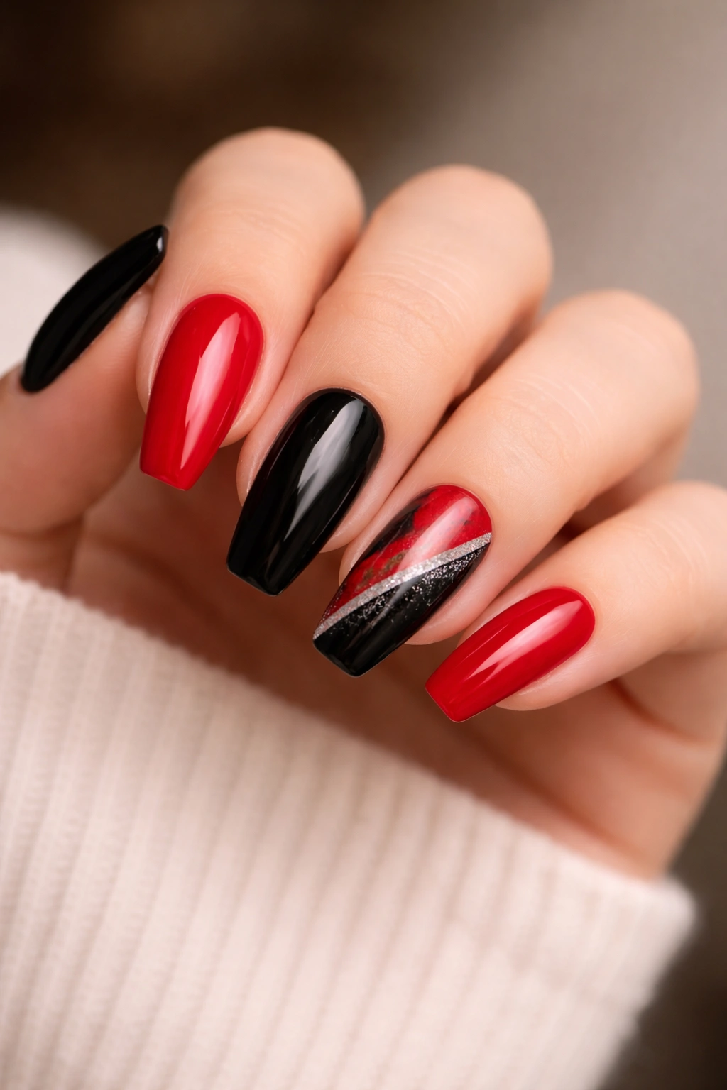
Want something bold without paying for intricate art on every finger? Alternating solids still hit hard, especially when one nail mixes both shades in a deliberate way.
There’s a reason this layout keeps coming back. Five red nails and five black nails already create tension. Add one statement nail—maybe a diagonal split, a marbled swirl, a black heart on red, or a thin framed design—and the set gains personality without drifting into clutter.
This option also makes sense if you’re trying red and black ballerina nails for the first time. You get the drama of the palette, you keep the appointment easier, and grow-out looks less harsh than heavy cuticle art. A solid-color layout hides a lot, which is good news if your day includes keyboards, grocery bags, hand sanitizer, and all the little things that wear a manicure down.
Where balance matters most
Put the mixed statement nail on the ring finger if you want the design to feel centered. Use the middle finger if you want the hand to look stronger and a touch more fashion-forward.
I’d also pick one red family and stick with it. Mixing bright scarlet on one nail and dark wine on another weakens the set. Alternate with purpose, then let that one statement nail carry the twist.
How to Make Red and Black Ballerina Nails Last Longer
Dark manicures are unforgiving. Chips show. Regrowth shows. A warped tip shows even faster.
That doesn’t mean they’re hard to wear. It means prep and aftercare matter more than they do with pale pink or sheer nude sets. If you’re paying for detail work, you want the shape and color to hold up past the first few days.
A few habits make a big difference:
- Cap the free edge with top coat, especially on black French lines and dark tips
- Use cuticle oil daily, but wipe matte surfaces if the finish starts looking greasy
- Wear gloves for cleaning and long dish sessions; hot water plus detergent can dull top coat fast
- Do not use your nails as tools for cans, boxes, labels, or seat belts
- Book fills a little earlier for dark sets if the design starts at the cuticle
Ballerina shape also needs respect. The flat tip is part of the look, so if you feel one corner snagging, file both corners lightly to rebalance the edge instead of hacking at one side and hoping for the best. A fine 180-grit file is enough for that small maintenance job.
If you’re doing this set at home with press-ons, measure each nail carefully and file the sidewalls before painting. Most cheap press-ons are too wide out of the box, and black polish makes that mistake obvious from across a room.
Final Thoughts
Red and black work on ballerina nails because the shape gives the colors discipline. The taper keeps the design moving forward. The flat tip gives every line somewhere to land.
If I had to narrow the field, I’d put glossy black with red French tips, negative-space black frames with red center panels, and matte crimson with glossy black moons at the top for pure style payoff. They look strong, they wear well, and they do not need ten extra elements to feel finished.
Still, the loudest set is not always the best one for your hand. Sometimes the smartest move is a cleaner layout, a sharper red, a thinner black line—and that tiny adjustment is what makes the whole manicure click.
