

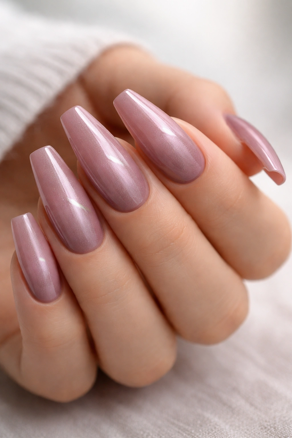
Mauve is the shade I reach for when plain pink feels too sugary and beige makes the hand look tired. On mauve ballerina nails, that muted mix of rose, gray, and a hint of lilac has room to breathe, especially on a tapered shape that gives color a longer, cleaner canvas. The result lands in a rare place: soft, grown-up, and flattering without slipping into dull.
Shape does half the work.
Ballerina nails—sometimes called coffin nails in salon menus—pull the eye inward with slim sidewalls and then stop with a flat, squared tip. That little architectural detail matters more than people think. A round or almond nail makes mauve feel sweeter. A square tip makes it look sharper, cooler, and more edited.
The shade matters too, and this is where plenty of manicures miss. A mauve that leans too purple can read bruised against warm skin. One that swings too beige can disappear into the nail bed and look dusty in the wrong way. The best versions keep muted pink tone front and center, then layer in gray, taupe, or a trace of plum so the color still has shape under daylight, office lighting, and dim dinner lighting.
You do not need wild nail art to make mauve work, though a few details—a velvet finish, a micro French edge, a thin gold line—can turn a quiet shade into something people notice when you lift a coffee cup or reach for your keys.
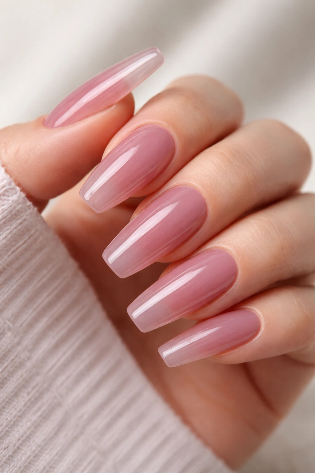
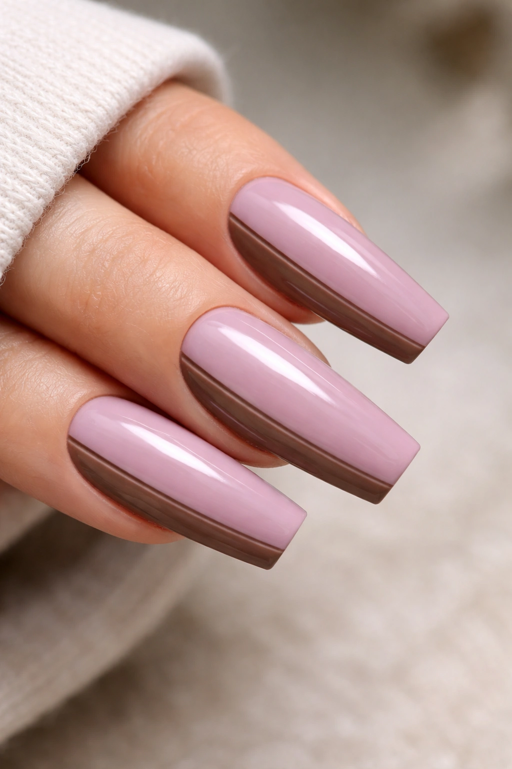
1. Classic Mauve Ballerina Nails in a Glossy Cream Finish
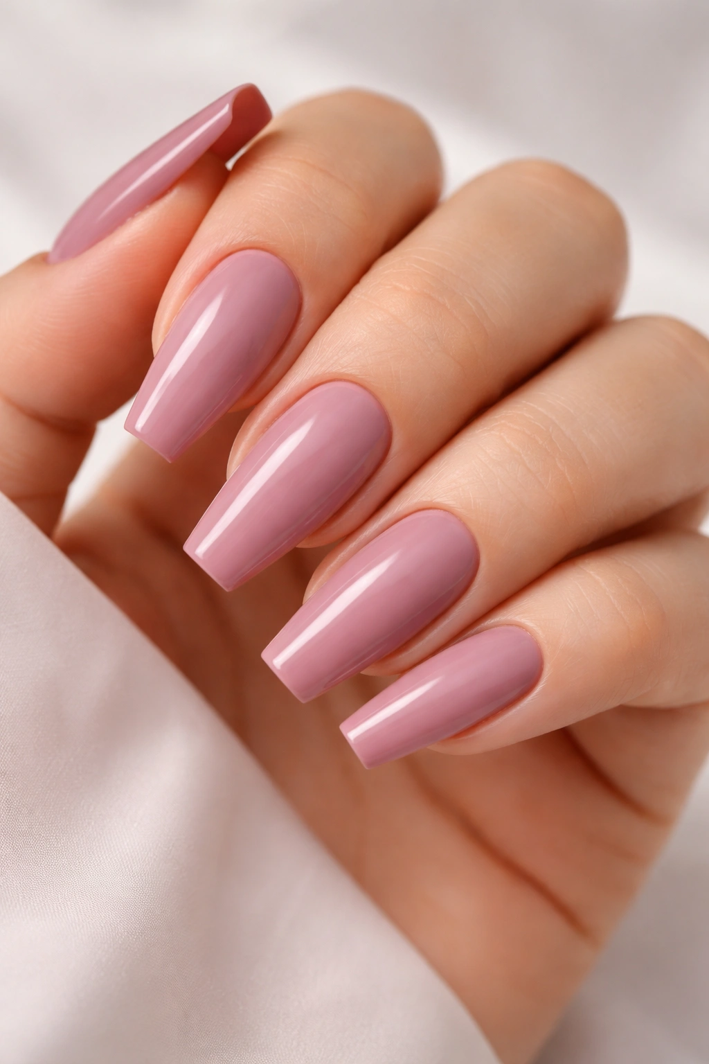
Start here if you want the cleanest version of the look. A glossy cream mauve on a medium or long ballerina shape is the manicure equivalent of a tailored coat: no fuss, no gimmick, no need to explain it. The color does the talking, and the shape gives it structure.
What makes this one work is opacity. You want two thin coats that cover the smile line without becoming thick near the sidewalls. When the polish gets bulky, ballerina nails lose that crisp taper and start to look heavy at the tip. A ridge-filling base coat helps more than people expect, because mauve creams show every dent and bump.
Where the color should sit
The best cream mauve sits between dusty rose and soft taupe. If you hold the bottle next to a peachy nude and a lavender polish, the right one should look closer to the nude, with a cool cast.
Quick fit check
- A free edge of 12 to 18 mm gives the color enough space to read as intentional without turning the shape into a claw.
- A high-gloss top coat keeps gray undertones from going flat.
- Cuticle cleanup matters more with mauve than with red, because muted shades show ragged edges fast.
- Regular polish needs the edge capped every 2 to 3 days if you type all day or open cans with your nails—please do not do that second one.
Tip: Ask for the sidewalls to be filed straight before the tip is squared. When that order gets reversed, the nail can flare outward and the whole manicure loses its ballerina line.
2. Matte Dusty Mauve With a Soft Suede Finish
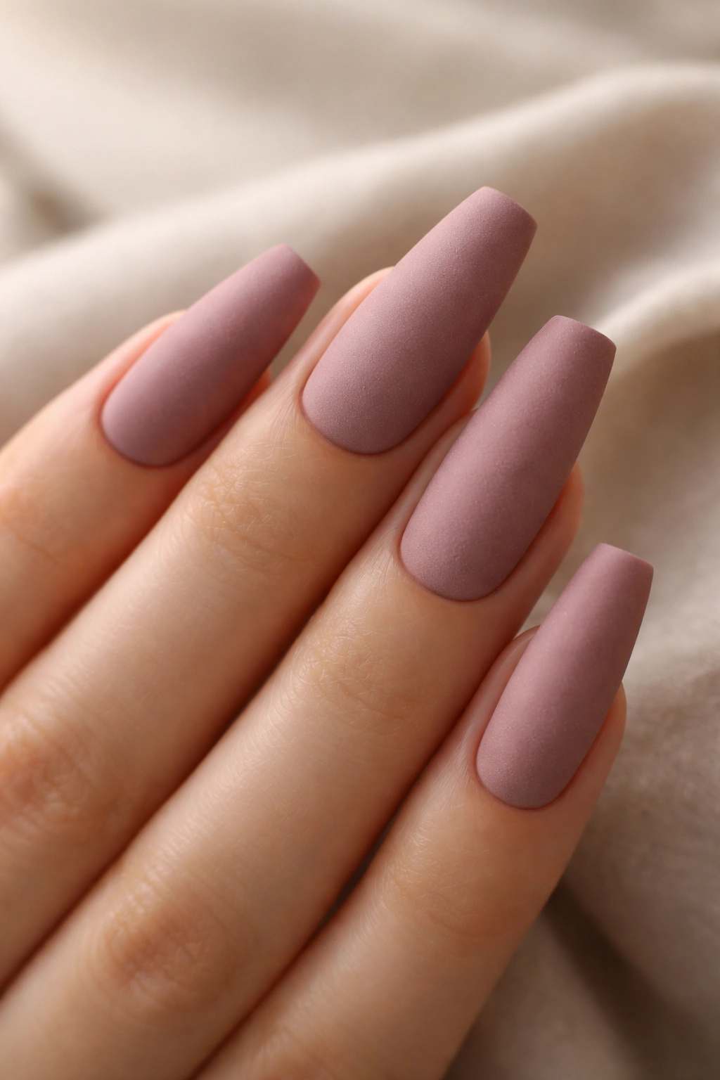
Why does matte mauve look so expensive when glossy mauve can look sweet? Light. A matte top coat dulls the reflective surface, which lets the dusty pink and gray notes come forward. The color looks denser, almost velvety, and the ballerina shape suddenly feels more fashion-forward.
There is a catch, though. Matte shows dry skin. If your cuticles are cracked or the sidewalls are rough, the manicure will broadcast that from across the room. I would not pick this finish the night before an event and ignore prep. A cuticle oil with jojoba, plus a fine buffer across the nail plate before color, changes the final look by a mile.
Best length for this finish
Longer ballerina nails wear matte better than shorter ones. On a short nail, matte can make the shape look stubby. On a longer nail, it turns the tip into a clean block of color, and that flat edge looks deliberate rather than accidental.
Rubber base gel helps here because it smooths tiny dips in the nail. Then go with two coats of dusty mauve gel, cure fully, and seal with a matte top coat that does not leave a chalky cast. Some matte coats pull cool shades too blue. Test one swatch first if you can.
And skip chunky rings the same day. Matte mauve already has texture; it does not need competition.
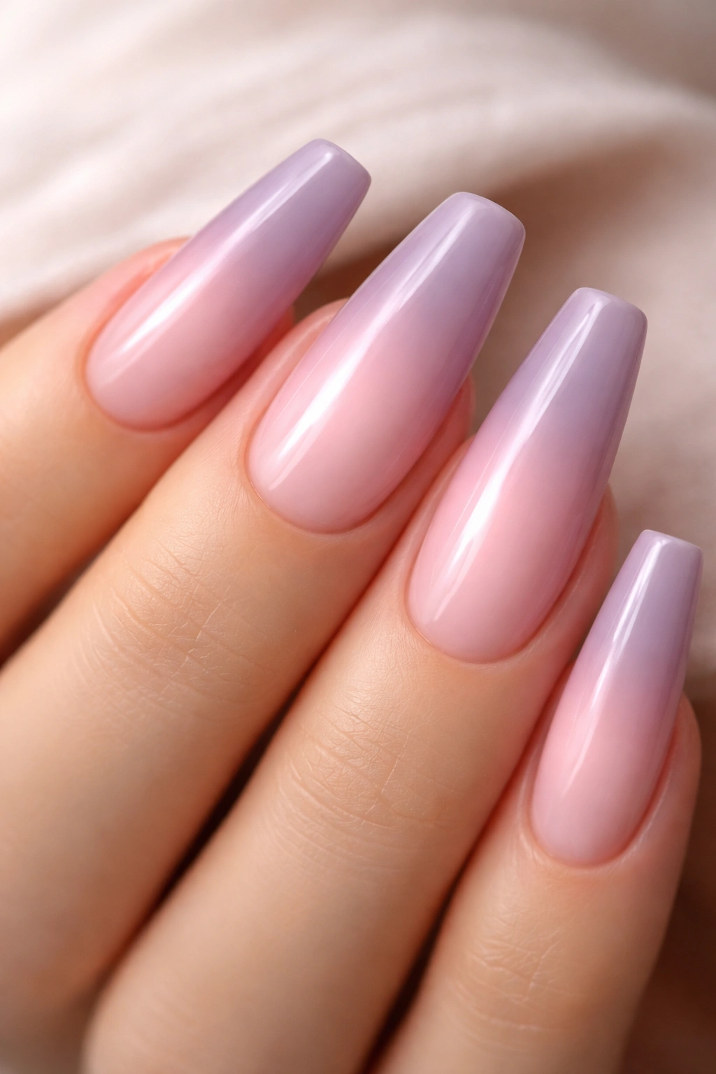
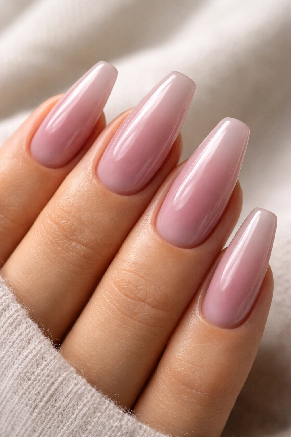
3. Milky Mauve Ombré That Fades From Pink to Rose-Taupe
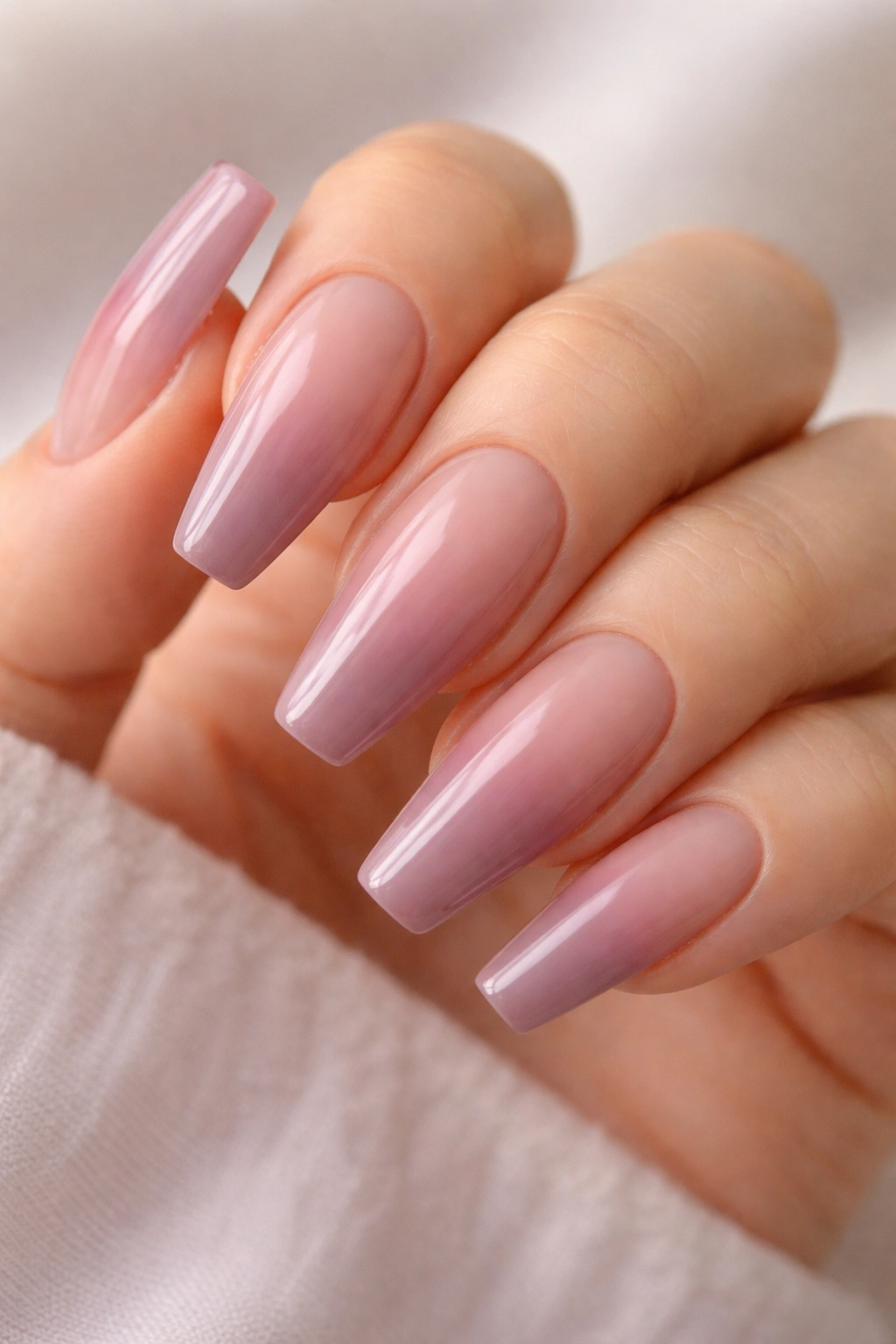
Picture the look of steamed milk with a drop of berry tea in it—that soft clouded color shift is the whole point of a milky mauve ombré. This design starts with a sheer pink-beige near the cuticle and deepens into mauve toward the tip, which makes grow-out less obvious and softens the squareness of the ballerina edge.
I like this style on people who want length but do not want a harsh, blocky color from cuticle to tip. The fade gives the hand a lighter look. It also buys you time between appointments, because the natural nail blends into the base instead of fighting it.
How the blend should be built
Use a sheer milky pink base, then sponge or airbrush a muted mauve from the middle of the nail downward. The center third should stay hazy, not striped. If you can point to where one color ends and the next begins, the blend needs another pass.
A builder gel overlay on top seals that foggy transition and keeps the surface glass-smooth. Without it, sponged pigment can look grainy up close.
This is also one of the few ballerina designs that flatters a shorter length, around 10 to 14 mm past the fingertip, because the fade creates length even when the free edge is modest.
The quiet payoff is how your hands look in motion. You notice it while typing, reaching, turning a page. No hard lines, no loud contrast—just a clean wash of muted pink and mauve that shifts with the angle.
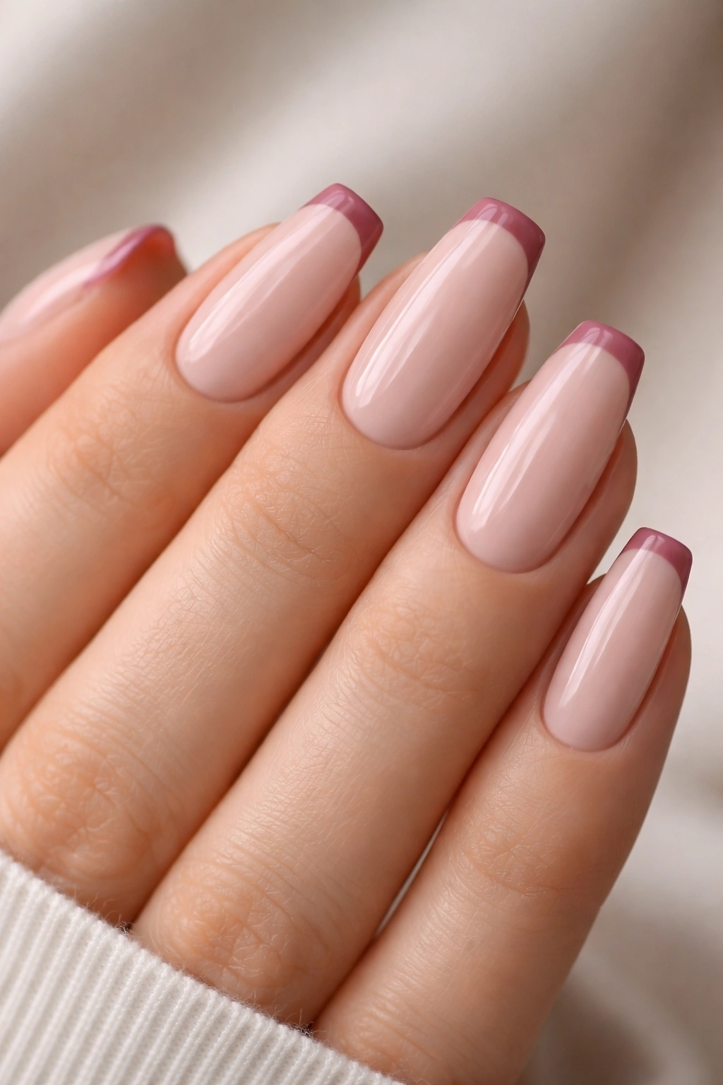
4. Rose-Mauve Micro French Tips on a Nude Base
A French manicure does not need a white stripe.
Swap that bright edge for a 1 to 1.5 mm line of rose-mauve, and the whole design changes mood. It looks cleaner than full-color nails, lighter than a dark tip, and far more wearable than people expect if you spend your days on a keyboard or in a setting where neon nails would look out of place.
The base matters more than the tip here. Pick a nude with a pink-beige cast, not a peach base. Peach pulls the mauve toward orange and the contrast gets muddy. A pink-beige base keeps the line cool and crisp.
Small details that make this one sing
- A liner brush with bristles around 7 mm long gives better control than the short stubby ones that come in some gel kits.
- The tip should hug the flat edge, then curve upward by a hair at the corners so the nail still looks tapered.
- Short ballerina shapes wear this well, which makes it a strong pick if long enhancements are not your thing.
- One accent nail with a double tip line can work, though I would stop there.
This design is for people who like restraint. It does not hit the room before you do. It looks polished, neat, and intentional—and if you are the kind of person who gets bored by a single solid shade after four days, the negative space keeps things interesting longer.
5. Taupe-Mauve Nails With a Fine Gold Cuticle Arc
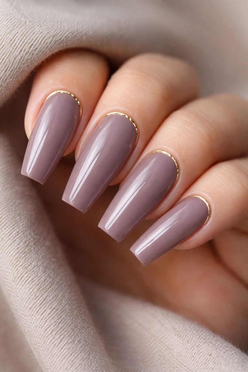
Under warm indoor light, taupe-mauve can look almost smoky. Add a hairline gold arc at the cuticle, and the shade wakes up without turning glittery. That narrow metallic crescent catches enough light to frame the nail, while the muted body color keeps the whole look grounded.
This is one of those designs that photographs better on the hand than in the bottle. In the bottle, taupe-mauve can seem sleepy. On a filed ballerina shape with a slim reflective line at the base, it looks measured and sharp. A lot depends on scale. The gold line should be under 1 mm wide. Wider than that, and the manicure starts drifting into holiday territory.
A striping brush loaded with metallic gel works better than loose foil here. Foil can tear near the sidewalls and creates tiny breaks in the curve. Gel gives you one continuous arc, which is the whole appeal.
There is a downside. Regrowth shows earlier because the metallic line calls attention to the base of the nail. If you usually stretch fills or infills past the two-and-a-half-week mark, this one may annoy you.
Still, on longer ballerina nails, the effect is hard to beat. It feels tailored. Not flashy. Not timid either.
6. Sheer Jelly Mauve With Glassy Depth
Three coats can be too much for some colors. For jelly mauve, three thin coats are often the point.
Unlike an opaque cream, a jelly finish lets light move through the color and bounce back from the nail underneath. That translucence gives mauve a stained-glass look—soft, syrupy, a little moody—and it pairs beautifully with the clean lines of a ballerina shape. The tip looks less blocky because the edge has depth rather than one flat slab of pigment.
Who is this best for? Anyone who likes their manicure to feel lighter and a touch more modern than a standard cream, but still easy to wear with neutral clothes, silver jewelry, or bare makeup.
A few practical notes help:
- Smooth the natural nail first. Jelly polishes show ridges, patches, and repair lines with zero mercy.
- Use a milky pink or neutralizing base if your natural free edge is stark white; otherwise the tip may peek through unevenly.
- Keep coats whisper-thin. Thick jelly polish bunches near the square edge and cures poorly in gel formulas.
- Gloss is non-negotiable here. Matte kills the glass effect.
I also like jelly mauve on slightly shorter ballerina nails, around 8 to 12 mm past the fingertip, because the translucent finish already gives enough visual length. Go too long with too sheer a polish and the shape can look fragile, like it needs more body.
7. Mauve Ballerina Nails With a Velvet Cat-Eye Glow
Magnetic polish can go tacky fast. Mauve saves it.
A velvet cat-eye effect in a dusty mauve base gives you movement without a loud silver stripe cutting across the nail. Instead of a hard beam, you want a soft central glow, almost like crushed satin under glass. On ballerina nails, that glow stretches down the middle and makes the fingers look longer.
The trick with the magnet
Hold the magnet 2 to 3 mm above the uncured polish for about 10 seconds per nail. Any farther away and the particles shift too softly. Any closer and you risk pulling the shimmer into a narrow line that looks more sci-fi than chic.
This design works best with a mauve that already has some gray in it. Bright orchid bases fight the velvet effect and read loud. Dusty mauve, mushroom-rose, and plum-pink bases keep the shimmer controlled.
You can go two ways with the finish. A glossy top coat gives a liquid look. A velvet-style matte top coat mutes the sparkle and turns the glow into more of a shadowed bloom. I lean glossy for this one because the contrast between soft color and reflective depth is the whole point.
Not an everyday-office manicure for everyone. Still, if you like muted shades and want one design on this list that feels moodier after dark, this is the one I would book.
8. Soft Aura Mauve With a Blush Pink Center
Some nail art looks better on a phone screen than on an actual hand. Aura nails can fall into that trap. Keep the colors muted, though, and the style becomes much easier to wear. A blush-pink center diffused into mauve edges creates a hazy halo that suits the long, tapered ballerina shape in a way a harsh neon aura never will.
This one should look airbrushed. If the center spot reads as a circle stamped on top of the nail, the design has missed the mark. The best versions keep the brightest area around the center third of the nail, then fade outward into dusty mauve at the sidewalls and tip.
Placement changes the whole manicure
A centered glow makes the nail look fuller. Move that glow a little higher, closer to the cuticle, and the nail bed appears longer. That is a handy trick if your natural nail bed runs short and wide.
A sponge can work, though an airbrush or soft-focus blooming gel gives a smoother fade. Layer a thin milky veil over the finished aura if the contrast looks too sharp. That extra step brings the design back into muted territory.
This style shines on medium-long sets. On short ballerina nails, the halo can crowd the shape. Give it enough space and it turns soft pink and mauve into something with more mood than a plain ombré.
9. Marble Mauve With Quartz-Style White Veining
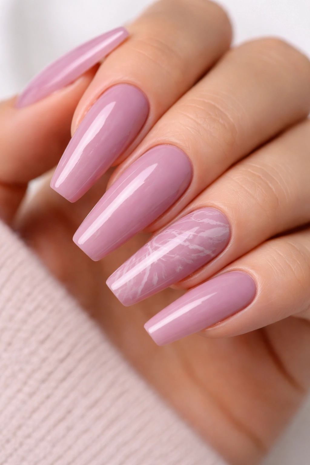
I have seen marble nails ruined by one heavy-handed line. That is all it takes. The secret is restraint: two accent nails, maybe three, and veining fine enough to look accidental.
On a mauve base, white marble veining reads more like rose quartz than bathroom tile, which is a good place to be. Add a whisper of taupe or translucent gray around some of the lines, and the stone effect gains depth without looking muddy.
Build the texture in layers
Start with a sheer mauve or mauve-nude base. While a blooming gel or wet layer is still movable, trail a white gel line with a liner brush, then blur one side with a clean detail brush. That uneven bleed is what makes the design look mineral rather than painted.
Keep these details in check
- Veins should vary in thickness, from hairline strands to slightly thicker breaks.
- Do not mirror the pattern from nail to nail. Natural stone never repeats itself with that much symmetry.
- A touch of gold foil works only in tiny tears, not full strips.
- Gloss beats matte here, because stone looks better with depth.
The rest of the set can stay a plain dusty mauve, which is part of why this design works. The accents get room to breathe. Your hand still looks tidy at a glance, then more detailed up close.
10. Mocha-and-Mauve Side French With a Diagonal Edge
Unlike a classic French tip, a side French shifts the visual weight away from the flat edge and pulls it along one sidewall. That diagonal move does two useful things at once: it lengthens the finger and gives you contrast without slicing the nail straight across.
The pairing I like here is soft mocha with muted mauve. Used in equal amounts, the two colors can fight. Let mauve lead, then bring mocha in as a side panel or slanted tip on two or three nails. Think 70 percent mauve, 30 percent mocha. That ratio keeps the manicure in pink territory while adding enough brown to feel grounded.
A crisp slant line needs a good brush and a steady wrist. Short striping brushes tend to wobble on long nails. A 9 mm liner gives a cleaner diagonal from upper sidewall to lower tip corner. If one side of the hand always comes out messier—my right hand used to betray me every time—use guide tape on the dominant-hand side and freehand the other.
This design suits square-leaning ballerina shapes, where the tip is flat enough to support that diagonal cut. Too much taper, and the line can look pinched.
Wear it glossy. Matte makes the contrast feel heavier than it needs to be.
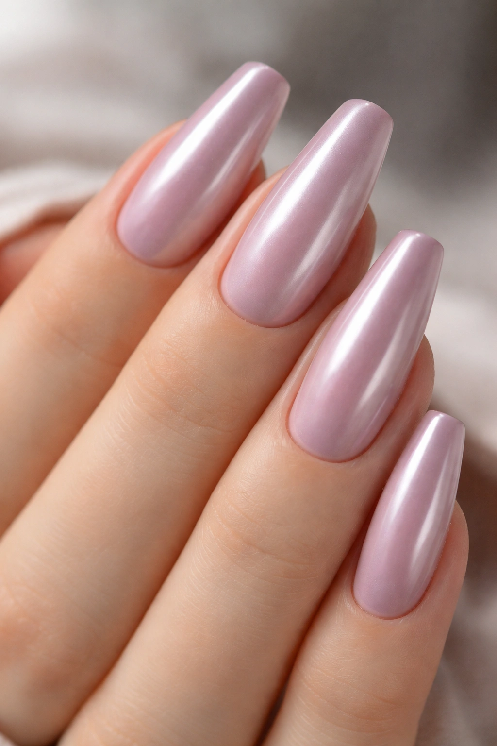
11. Pearl Chrome Over Muted Mauve for a Glazed Finish
A little chrome goes a long way.
The trick with chrome on mauve is to avoid mirror metal. You want a fine pearl or pink-beige powder, buffed over a fully cured no-wipe top coat so the result looks glazed rather than robotic. The base should still read as mauve. Chrome is there to bend the light, not erase the color.
This finish is especially strong on ballerina nails because the flat tip throws a clean reflection. On almond shapes, chrome can feel soft and rounded. On ballerina nails, it gets a sleeker edge.
There are two mistakes I see over and over. First, using a chrome powder with too much blue. That can turn mauve icy and dull out the muted pink tone. Second, applying too much powder near the cuticle, where buildup makes the nail look thick. Use a silicone applicator or a firm eyeshadow sponge, then dust away the excess before the final top coat.
You also need a sealed edge. Chrome lifts at the free edge faster than a plain cream manicure, especially if you wash dishes bare-handed or type with the tips of your nails. Cap the edge well.
When done right, this one looks quiet from far away and far richer up close. That contrast is half the fun.
12. Sheer Mauve Ballerina Nails With a Milky Pink Overlay
Want mauve without the full commitment of an opaque mauve set? Layer it. A sheer mauve base under a milky pink overlay gives the nail a cloudy, expensive-looking softness that flat polish often cannot match on its own.
This is one of my favorite salon asks for people who say they want something “clean” but not plain. The mauve peeks through the milkier top layer and reads as depth instead of color-block. It is subtle, though not bland, and the shape keeps it from fading into the background.
How to layer it without killing the color
Apply one coat of sheer mauve gel, cure, then float a semi-sheer milky pink builder or gel color over the top. The second layer should soften the mauve, not bury it. If you cannot see any mauve tone after curing, the overlay is too dense.
Why this one earns repeat appointments
- Grow-out looks softer because the root area blends with the natural nail bed.
- Minor chips hide better than they do with solid cream shades.
- The manicure flatters cool and warm undertones because the milk overlay tempers both purple and beige notes.
- Short to medium ballerina lengths wear it well, which opens the door for people who cannot keep long extensions.
Use high gloss. This design needs light bouncing through the layers to show what makes it different.
13. Plum-Mauve Gradient Tips Over a Dusty Pink Base
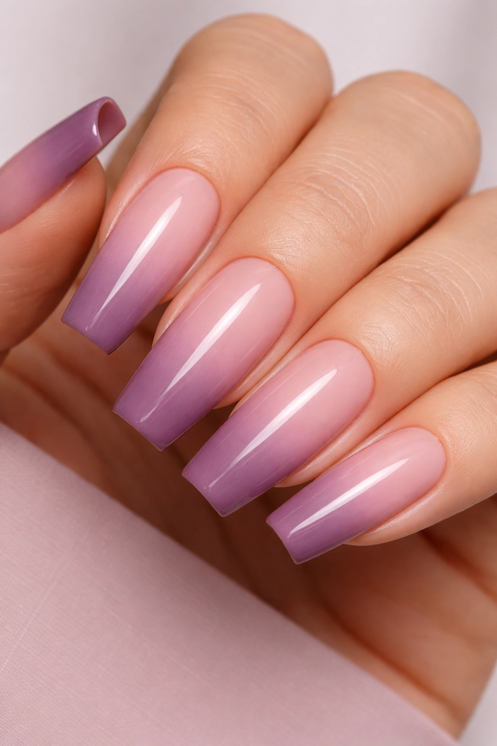
At arm’s length, this looks like a shadow gathering at the tip. Up close, you see three colors working together: dusty pink near the cuticle, soft mauve through the middle, and a plum-mauve concentration at the edge. It is moodier than a plain ombré, though still tied to that muted pink family.
Longer ballerina nails handle this best because the gradient needs room. I would not try it on a short set unless the transition stays broad and the deepest tone remains soft. Pack too much plum onto a short tip and the nail can look chopped off.
A sponge works, though the cleanest versions come from airbrushing or layered gel blending with a flat ombré brush. Think in thirds. Each band should overlap the next by a few millimeters so the fade stays smooth. Harsh sections kill the smokiness.
This design earns its keep in colder months—though honestly, it also looks sharp with summer linen and silver sandals, which tells you it is not trapped in one mood. Mauve is doing that heavy lifting again. It softens plum, keeps pink from going childish, and lets the gradient feel richer without crossing into gothic territory.
No need for glitter here. The color shift is enough.
14. Watercolor Floral Accents on a Muted Mauve Base
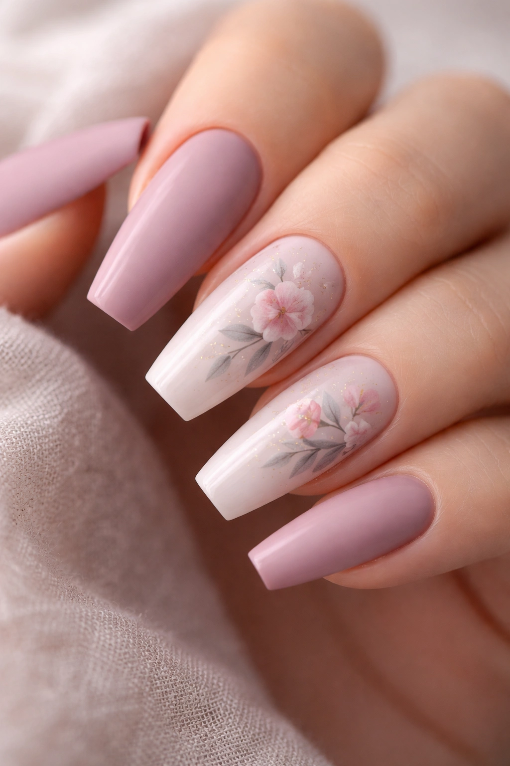
Florals on ballerina nails can turn crafty fast. Keep them tiny, loose, and off most of the nails, and they become a smart accent instead of a theme manicure.
A muted mauve base gives watercolor petals something gentle to sit on. I like rose, blush, or dusty berry petals washed over one or two accent nails, then outlined only in places, not around every edge. Full outlines make the art look sticker-like. Broken edges keep it airy.
Use flowers like punctuation, not wallpaper
- One flower cluster on the ring finger and a smaller bud on the thumb is usually enough.
- A milky mauve base works better than an opaque one if you want the watercolor to look painted into the nail.
- Leaf tones should lean sage-gray, not bright green, or the whole palette jumps off course.
- Matte can work here, though a soft gloss tends to keep the petals from looking chalky.
This design is a good fit for bridal events, showers, dinners, or any setting where you want detail without rhinestones. Still, I would keep the rest of the hand quiet—plain mauve or sheer pink-mauve nails—so the accents read as a choice, not clutter.
And no, every nail does not need a flower. Please resist that urge.
15. Negative-Space Diagonal Ribbons in Dusty Mauve
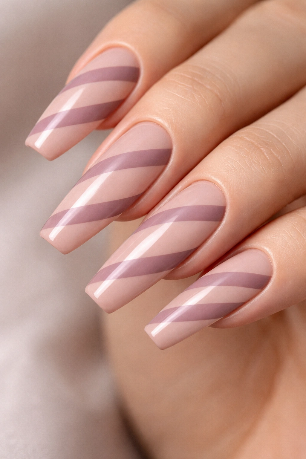
If tip wear drives you mad, move the design away from the edge. A negative-space ribbon layout does exactly that. Instead of painting the whole nail, you leave a slim bare or nude section running diagonally across the plate, then frame it with dusty mauve bands. The ballerina shape makes those diagonal lines look sharper because the sidewalls already taper inward.
This design feels graphic without feeling loud. That is a hard balance to hit, and it is why I keep coming back to it for mauve. The muted pink tone softens the geometry. A brighter pink would look sporty. A dark plum would look severe. Mauve lands right in the middle.
Use striping tape if you want a crisp gap. A clear gap looks cooler and more editorial. A nude-pink gap is easier to wear if you do not like seeing too much natural nail. Either way, keep the bands narrow—around 2 to 3 mm each on a medium-length nail. Thick bands crowd the shape.
There is another practical advantage. Regrowth is less obvious than with a full-coverage set, and minor chips along the free edge do not jump out because the design is not relying on a perfect horizontal tip line.
For someone who wants nail art with some breathing room, this is one of the smartest options on the list.
Final Thoughts
The easiest way to pick from these looks is not by asking which design is the prettiest. Ask how much contrast, texture, and maintenance you want to live with. A glossy cream mauve asks for almost nothing. Marble, chrome, and floral accents ask for more precision and tighter upkeep.
Shade comes next. If your skin pulls warm, look for mauve with taupe or dusty-rose notes. If your skin leans cool, a mauve with a trace of plum or lilac usually reads cleaner. Hold the color near a window before you commit. Salon lighting lies.
And do not overlook shape. A well-filed ballerina nail makes muted pink look deliberate. A sloppy taper makes even the best mauve shade fall flat. Get the architecture right, then let the color do its quiet work.
