

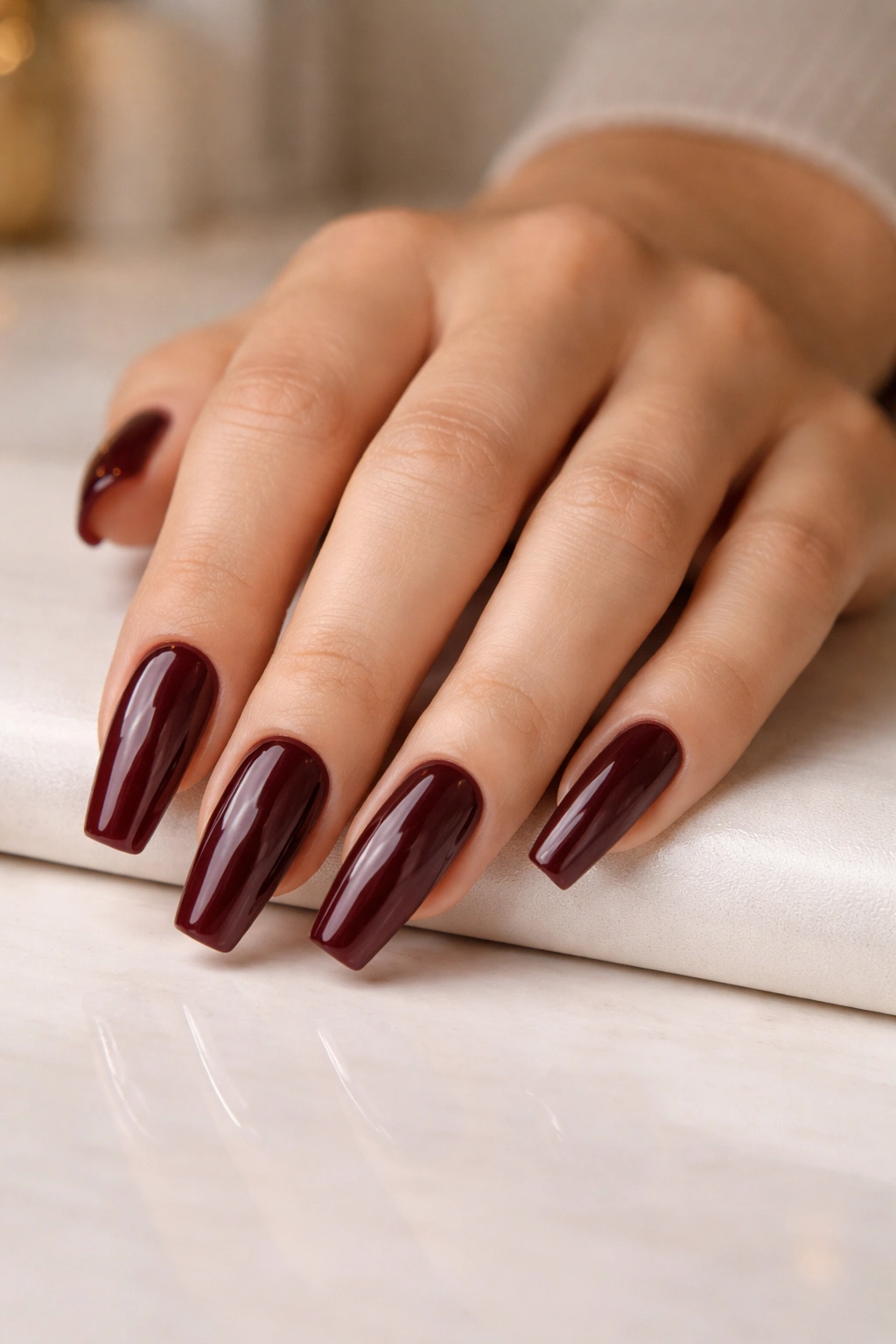
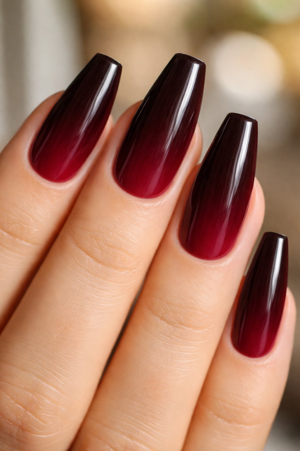
Dark red can look flat on a round nail, but burgundy ballerina nails have a different kind of presence. The tapered sides and squared tip give the color room to stretch out, which lets you see the wine, plum, brown, and oxblood notes instead of reading it as plain red polish. On the right shape, burgundy looks dense, glossy, and a little moody in the best way.
You can also see every mistake.
If the sidewalls are filed too tight, the nail starts to look pinched. If the color leans too black, the set loses warmth and turns muddy under indoor light. And when the free edge gets too wide, the whole ballerina shape stops looking crisp and starts looking like a square nail that got halfway reshaped.
That’s why this color rewards precision more than pastel shades do. A medium-to-long ballerina with a narrow tip—often around 2 to 4 mm across at the edge—shows burgundy at its best, especially when the base under the color stays slightly sheer instead of chalky. One small choice, like using a soft pink builder gel beneath the polish, can keep the nail bed alive and make the red depth look deeper.
Some sets stay clean and tailored. Some lean magnetic, marbled, matte, glossy, foiled, or jelly-like. Burgundy can carry all of it without losing its edge.
The Tapered Shape That Gives Burgundy More Depth
Ballerina nails, often grouped with coffin nails, do one thing better than most shapes: they direct your eye forward. The sidewalls taper in, the tip stays flat, and that geometry makes deep colors look longer and cleaner than they do on a round or squoval shape. Burgundy benefits from that structure because it has more undertone to show than a basic cherry red.
On an almond nail, burgundy can turn soft. On a square nail, it can look heavy. On a ballerina, it lands in the middle—sharp, sleek, and still warm.
Length matters here more than people think. A short ballerina can work, but the taper has to start early and stay soft. Once you hit a free edge of about 10 to 14 mm, the shape starts reading more clearly, and dark shades like merlot, black cherry, and oxblood begin to look intentional instead of compressed.
Finish matters too. Gloss pulls out the syrupy depth in burgundy. Matte turns it velvety and dry-looking, almost like suede. Chrome shifts it cooler. Jelly layers make it look like colored glass. Same color family, totally different mood.
And one more thing—because it’s the part people skip. Deep polish makes filing errors louder. If the left sidewall is straighter than the right, you’ll see it. Burgundy doesn’t hide sloppy shaping. It spotlights it.
Salon Details That Keep the Color Clean Instead of Muddy
Ask for the design you want, sure, but ask for the foundation first. Deep tones show ripples, bulk, and patchiness fast, so the prep under burgundy ballerina nails matters almost as much as the art on top.
A few details make a real difference:
- Choose a base that suits the look. A sheer pink or neutral builder base makes burgundy look warmer and deeper. A flat beige base can dull it.
- Keep product thin at the sidewalls. Dark gel piled along the edges makes the shape look thick from the front.
- Use two thin color coats instead of one heavy coat. Burgundy can wrinkle under the lamp if it goes on too thick.
- Ask for underside cleanup. On medium and long ballerina nails, a stained free edge is visible from below.
- Match the red undertone to your skin tone. Brown-red burgundy reads softer; plum-red burgundy feels cooler and sharper.
If you wear your nails hard—typing, lifting boxes, opening cans, all the glamorous stuff—say that before the set starts. A nail tech can tighten the apex placement, shorten the length by 2 or 3 mm, and keep the corners from getting too fragile. That one conversation saves repairs later.
Cuticle prep matters more than people want to hear. Dark shades show lift near the base almost immediately. If the cuticle line isn’t clean, grow-out looks rough after a few days, even when the rest of the manicure still looks fresh.
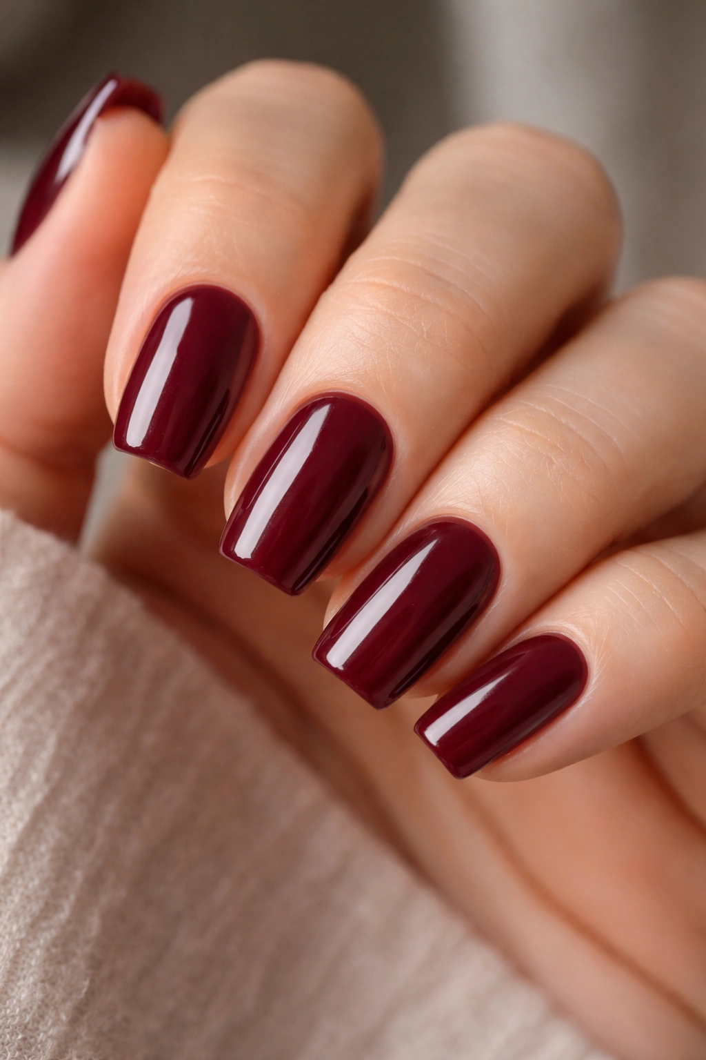
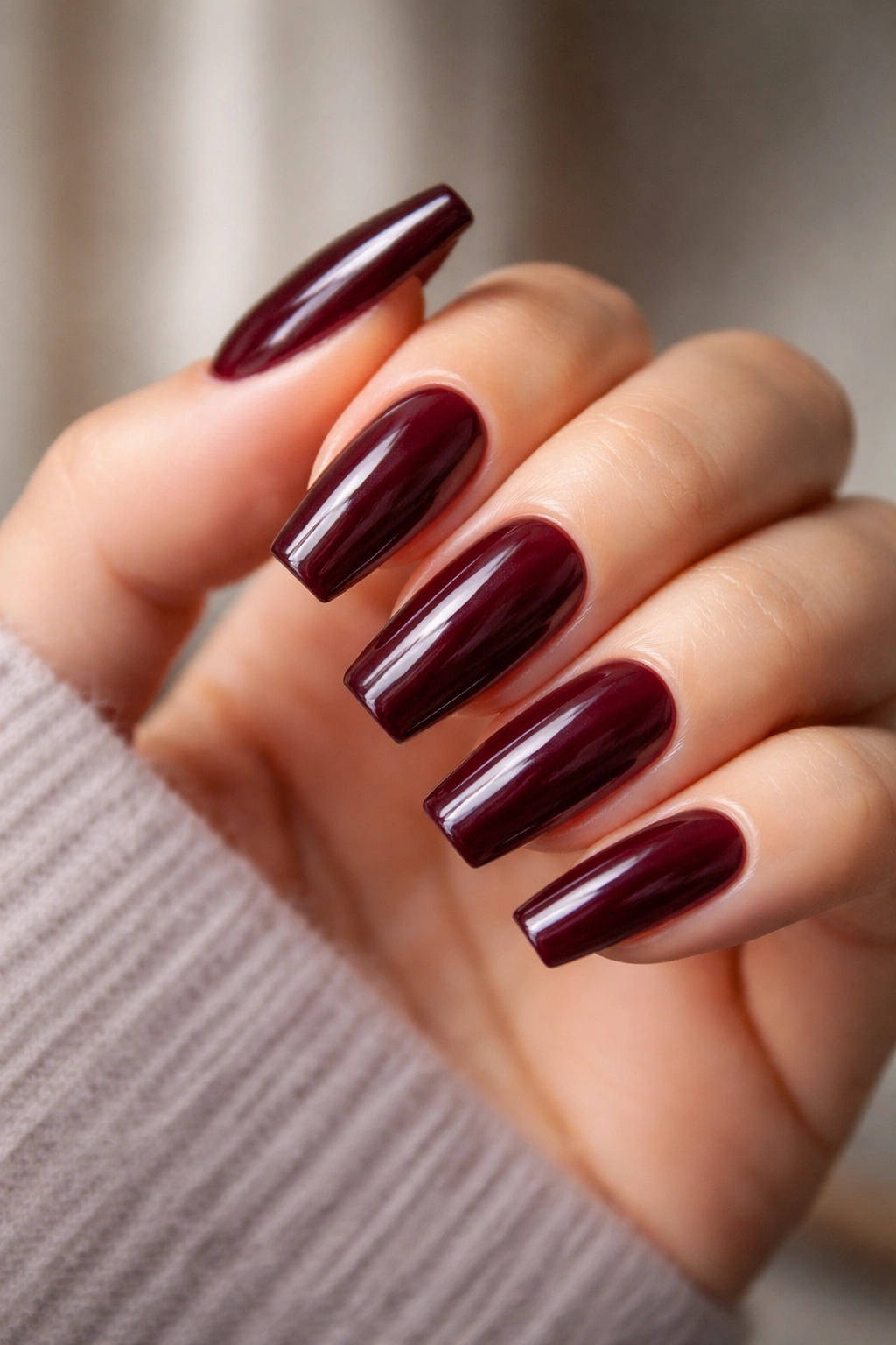
1. Glossy Oxblood Full Set
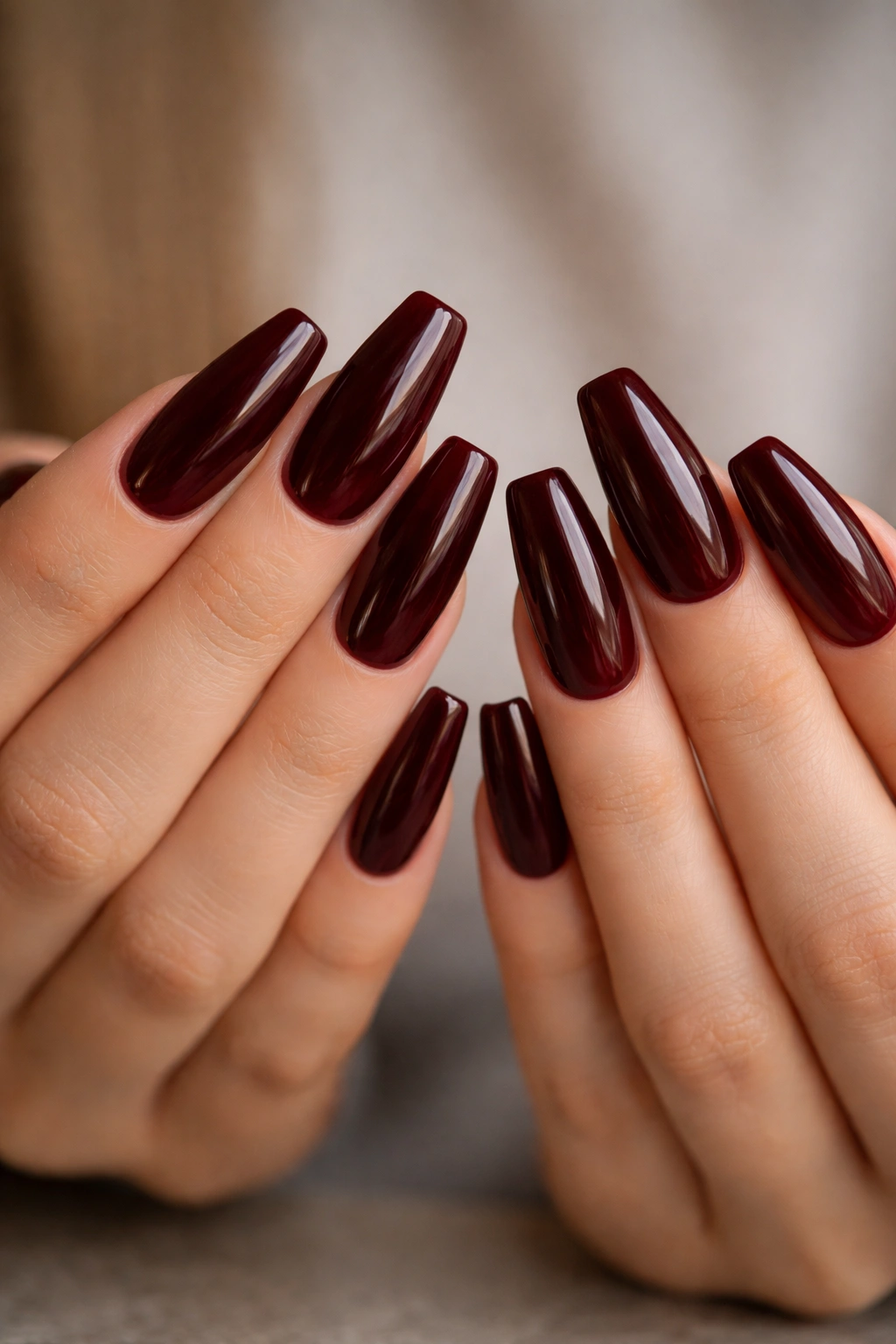
Nothing beats a plain oxblood set when the shape is right. No foil. No crystals. No tiny decals trying to prove a point. A deep, glossy oxblood on a medium ballerina nail already has enough attitude that it doesn’t need backup.
This look works best when the color stays rich but not flat. Ask for an oxblood with a red base rather than one that leans black, because black-heavy shades can swallow the shape under dim light. On a 14 to 18 mm free edge, the color stretches out and shows that wine-dark depth that makes burgundy worth wearing at all.
Application is where this look lives or dies. Two thin coats over a sheer pink or soft neutral builder base usually give the cleanest result. One thick coat can leave darker puddles near the sidewalls, and you’ll see every patch once the top coat goes on. A floated glossy top coat—not brushed on too dry—gives that glassy surface that makes oxblood look almost wet.
Short version: if you want burgundy ballerina nails that never feel overworked, start here.
I also like this option for first-timers because it teaches you whether you actually enjoy wearing a darker manicure before you add chrome, glitter, marbling, or texture. Sometimes the clean version tells you the most.
2. Matte Wine with Micro-Gloss Tips
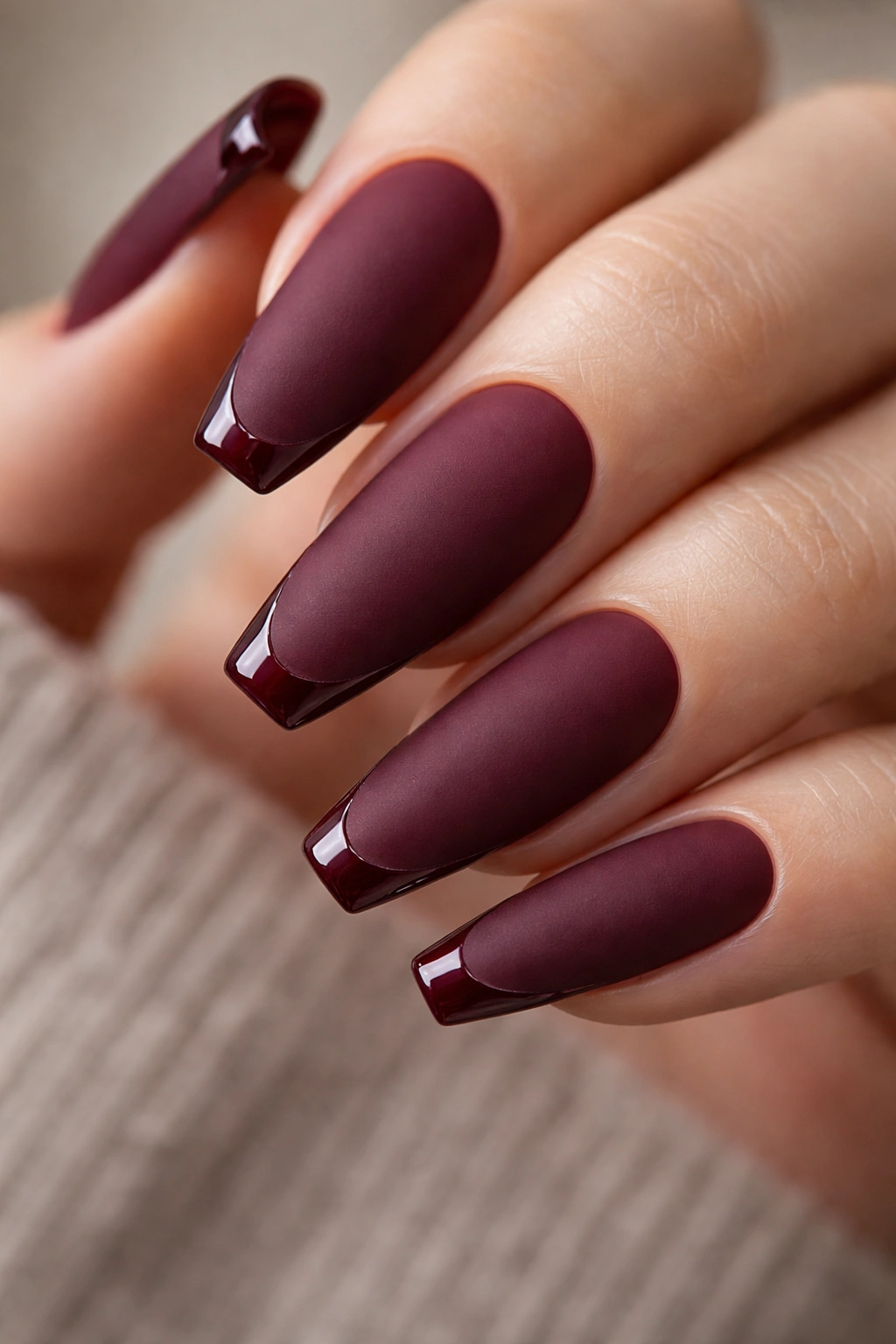
Matte burgundy needs one shiny detail or it can die on the nail.
That’s why a wine-colored matte base with a 1 mm glossy tip line works so well on ballerina nails. You still get that soft, velvety surface across most of the nail, but the tiny strip of shine at the edge sharpens the shape and keeps the finish from looking dusty. It’s a small trick. It changes everything.
The line has to stay thin. Once the glossy band gets too wide, the manicure starts looking like a half-finished French. A fine liner brush and a steady hand matter more here than extra decoration. I’d keep the rest of the set plain and let the contrast do the talking.
This is also one of the best burgundy nail designs for people who want depth without a loud reflection. Matte wine feels restrained from a distance, then the light hits the tip and you catch that clean edge. More subtle than chrome. More polished than flat matte alone.
One warning, though: matte top coat shows wear faster than gloss, especially near the tip. If you wash your hands a lot or work with oils, expect the finish to soften sooner. A refresh around the 5- to 7-day mark keeps it sharp.
3. Burgundy French with a Bare Pink Base
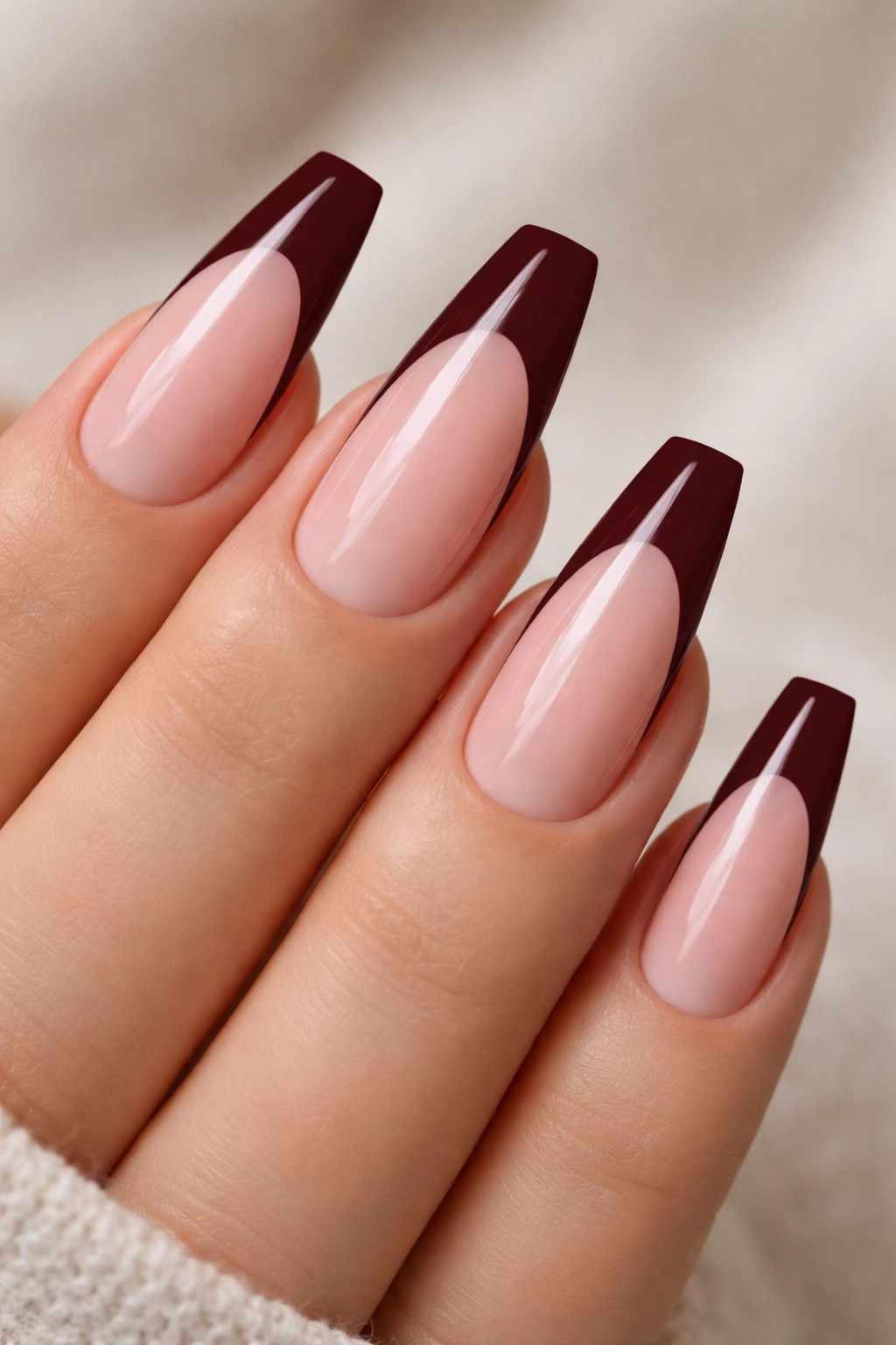
A burgundy French on ballerina nails has more backbone than a white one. The straight tip already gives you a built-in line to work with, so the dark color looks crisp instead of soft, and the sheer pink base keeps the whole set from getting heavy.
Why the contrast lands so well
The best version uses a cool pink or neutral jelly base, not a thick nude that hides the nail bed. You want the natural part of the nail to stay visible. That transparency gives the burgundy tip room to stand out, and it also keeps grow-out less obvious than a full solid color set.
A deeper smile line helps here too. On ballerina nails, a shallow French can look blocky because the tip is flat. Pulling the curve slightly deeper at the sidewalls makes the design look longer and more balanced.
What to ask your nail tech for
- A semi-sheer base, not an opaque nude.
- A burgundy tip width of about 3 to 5 mm on a medium-length set.
- A crisp smile line with slightly deeper corners.
- A high-gloss top coat to sharpen the color break.
You can leave every nail the same, or switch one finger to a full burgundy accent. I’d skip extra rhinestones here. The line is the design. Once you start piling on details, the clean tension between the bare base and the dark tip gets lost.
4. Black Cherry Chrome Fade
Why does black cherry chrome look richer than plain metallic burgundy? Because the metal effect sits over a dark, translucent base, so the nail still reads deep red instead of turning flat silver-red. You get reflection without losing the wine tone underneath, and that’s the whole reason this design works.
The fade is the smartest part. Rather than coating the whole nail in equal chrome, let the dark cherry base stay heavier near the cuticle and deepen toward the tip, then rub chrome powder over the full surface. That gradient gives the color some shape. On ballerina nails, it makes the free edge look longer and leaner.
How to ask for it
Ask for a black cherry gel base, a no-wipe top coat cured fully, and a fine chrome powder rubbed in lightly rather than packed on hard. Too much powder can push the color toward mirror silver or gunmetal, and then the burgundy disappears. I’d also keep the nail length from medium to long, because shorter ballerina nails don’t give the fade much runway.
This one lives under evening light. Indoors, it looks like polished black cherry candy. In daylight, the red comes forward and the chrome shifts with your hand movement. Moody without going dull. Sharp without looking like armor.
5. Deep Red Jelly Layers
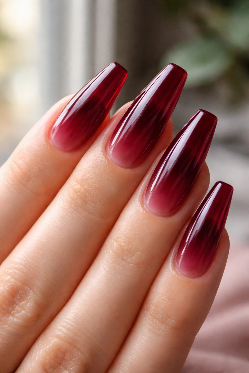
Picture this set near a window: the tips look darker, the center looks translucent, and the whole nail has that syrupy depth you only get from three sheer coats built up slowly. Jelly burgundy hits differently from cream burgundy. It feels deeper, but also lighter on the nail.
That strange mix is why I keep coming back to jelly finishes for ballerina shapes. The taper gives the shade more length, and the translucency stops a dark manicure from feeling too dense. You still get the drama of deep red, but the edges stay softer.
The best jelly burgundy is not brown and not neon red. You want a shade closer to black cherry juice or red wine held up to light.
A few details matter:
- Use a stained-glass or jelly gel, not regular cream color thinned down.
- Build it in 2 to 3 thin coats, curing each one fully.
- Keep the base slightly milky or neutral so the nail bed doesn’t look gray.
- Seal with a glossy top coat only; matte kills the glass effect.
Jelly sets also hide minor grow-out better than opaque dark shades do, which is handy if you stretch appointments. Not forever. Just longer than a flat cream burgundy.
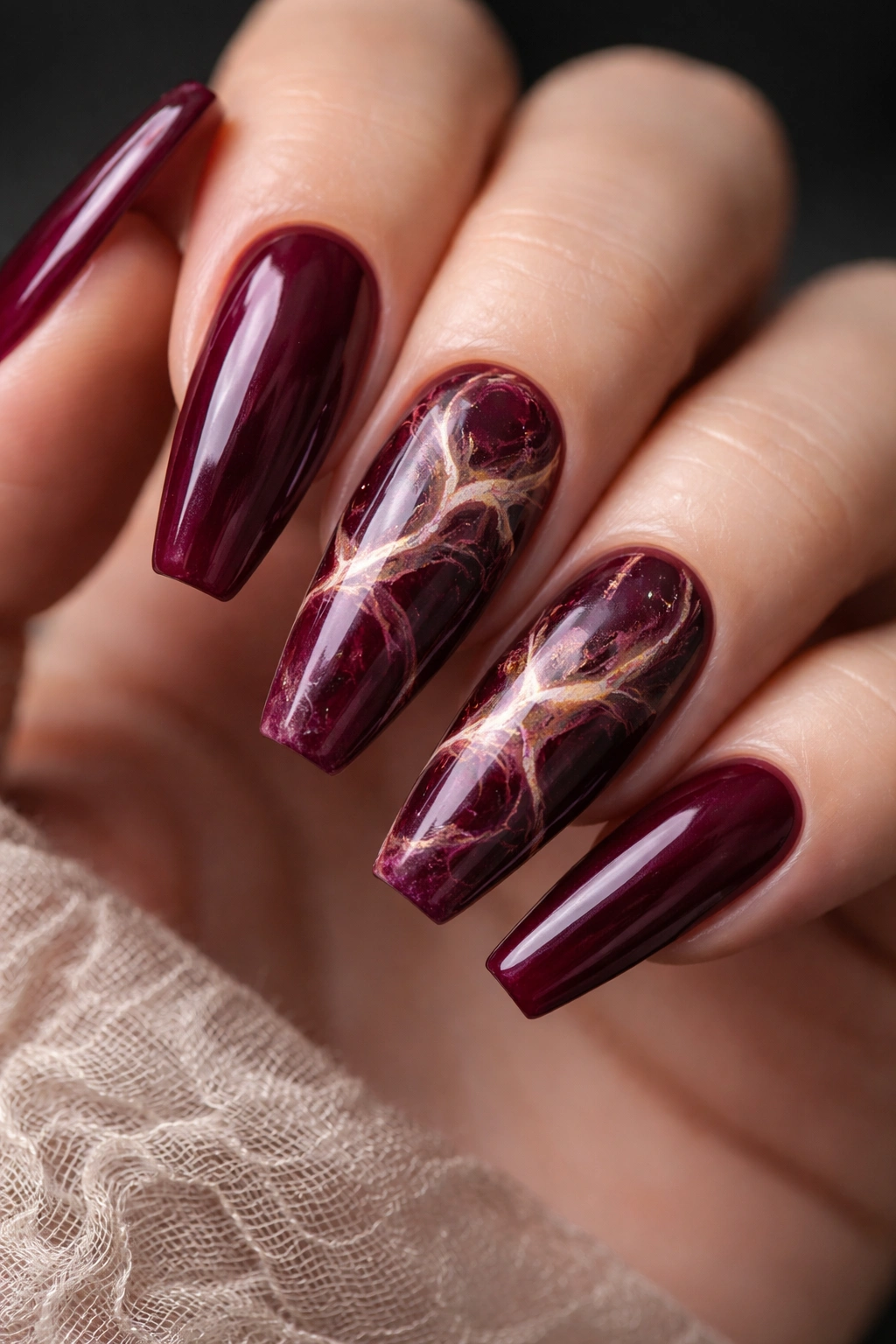
6. Burgundy and Gold Foil Cuticle Detail
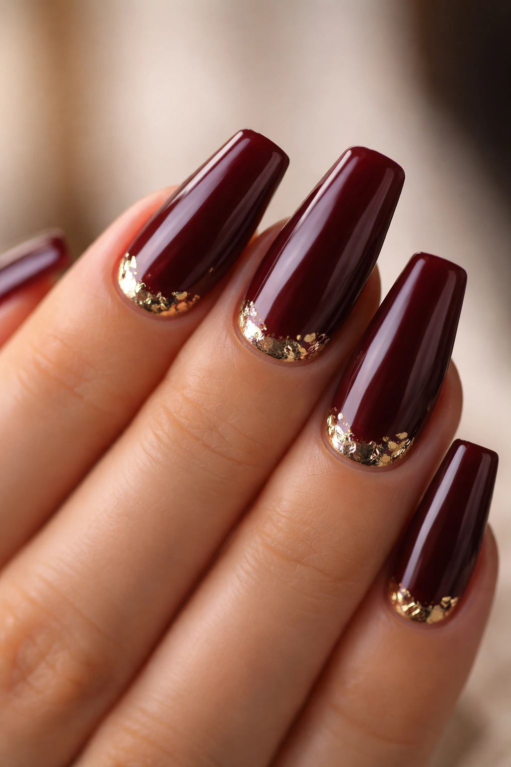
Unlike full glitter, gold foil does not bury burgundy under sparkle. It gives the color a small flash at the base, then lets the rest of the nail stay dark and smooth. That contrast—clean burgundy field, irregular foil near the cuticle—feels more expensive than an all-over shimmer set.
Placement is everything. Keep the foil close to the cuticle arc or pressed slightly off to one side in tiny torn pieces, around 1 to 3 mm wide. Big foil chunks look bulky under top coat and can throw off the clean line of the manicure. Small pieces sit flatter and look more deliberate.
I’d choose a warm oxblood or red-brown burgundy for this design rather than a cooler plum tone. Gold likes warmth. A cooler wine shade can still work, but it shifts the whole manicure into a sharper, icier place. That may be what you want. It just changes the mood.
This design is also easier to maintain than it looks. Because the foil sits at the cuticle instead of the tip, it won’t catch on fabric the way larger glitter pieces sometimes do. The set still needs a smooth encapsulation, though. If the foil edges lift under top coat, you’ll feel it every time you run your fingers through your hair.
7. Tortoiseshell Accent with Burgundy Base
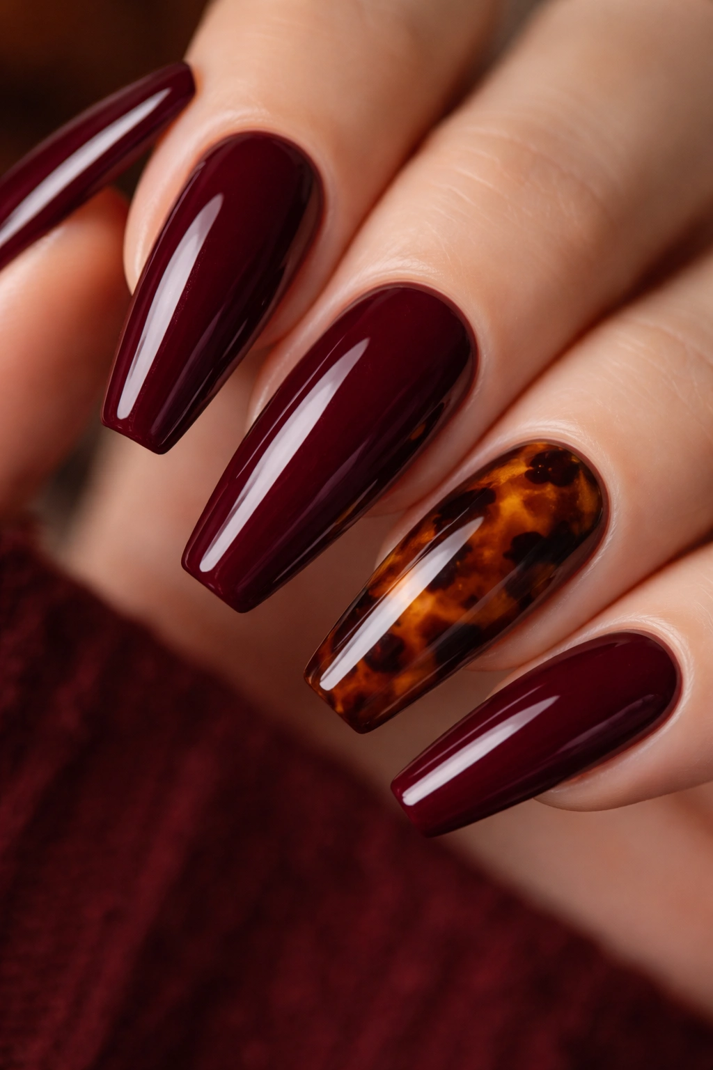
One accent nail is enough.
Burgundy with tortoiseshell accents can go rich and editorial fast, or it can slide into clutter if every nail tries to compete. The cleaner move is a solid burgundy base on most nails, then a tortoiseshell effect on one or two fingers per hand—usually the ring finger and thumb, where the pattern has room to show.
The tortoiseshell itself should stay warm: amber, caramel brown, espresso, a touch of black. Against a wine-red base, those colors feel connected rather than random. A blooming gel technique helps here because it lets the brown and black patches soften into one another instead of sitting as hard dots. That blur is what makes tortoiseshell look like tortoiseshell.
Keep the burgundy glossy. Keep the accent glossy too. Mixing matte and glossy on this particular combo starts to feel fussy.
And please keep the pattern scale small. Oversized tortoiseshell patches can make a ballerina nail look shorter and wider. Fine mottling looks cleaner on a tapered shape, especially if the set is medium length rather than extra long. This design already has texture built into it. It doesn’t need gems, charms, or extra striping trying to join the conversation.
8. Espresso-Burgundy Ombré
Skip black-to-red ombré unless you want the tips to look heavier than the rest of the nail. Espresso fades into burgundy more smoothly, and that softer shift keeps the ballerina shape looking sleek instead of blunt.
Black can be too harsh here. It cuts the nail in half. Espresso still gives depth, but because it has brown warmth inside it, the transition into burgundy feels natural. You get shadow at the tip without losing the red heart of the manicure.
This look does best with a vertical blend from cuticle to free edge, not side to side. On a ballerina nail, horizontal shading can make the nail look wider. A soft fade down the length pulls the eye forward and makes medium nails look a little longer than they are.
Airbrushing gives the cleanest blend, but a sponge gradient can work if the polish is applied in thin passes. I’d ask for the darkest part of the fade to stop short of full blackness. Once the tip turns flat black, the set starts looking less burgundy and more generic dark ombré.
If you like moody nails but don’t want reflective finishes, this is one of the strongest options in the whole lineup. It has depth, shape, and a little danger without relying on glitter or chrome to get there.
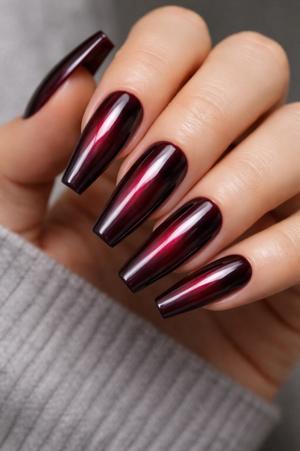
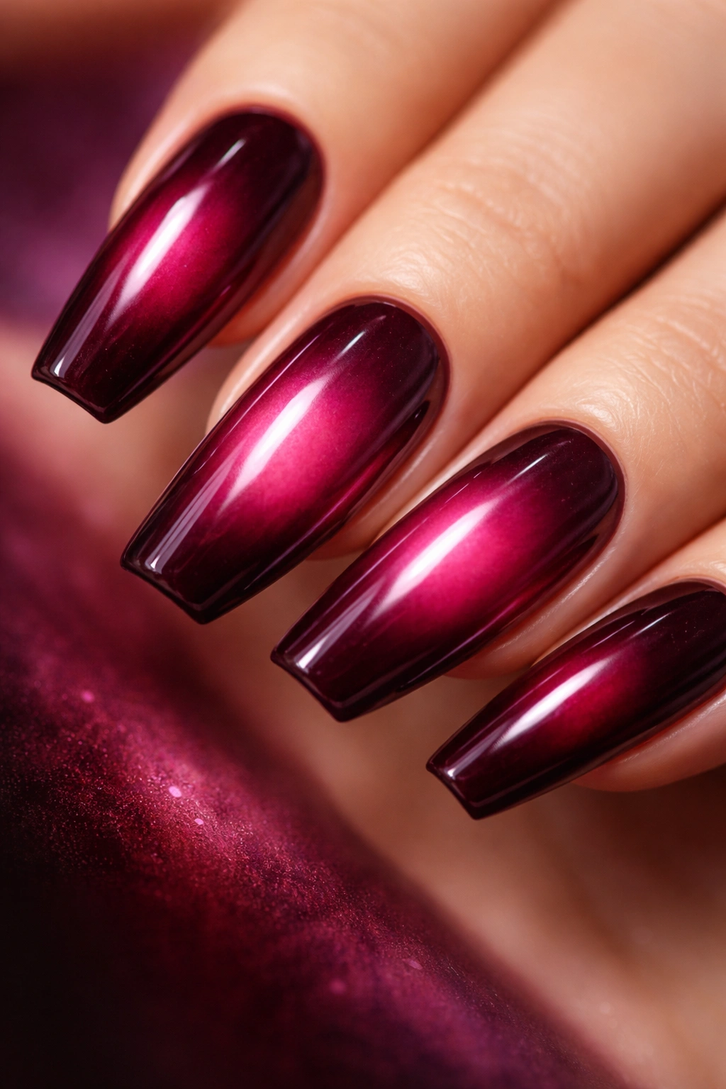
9. Plum-Burgundy Cat-Eye Velvet
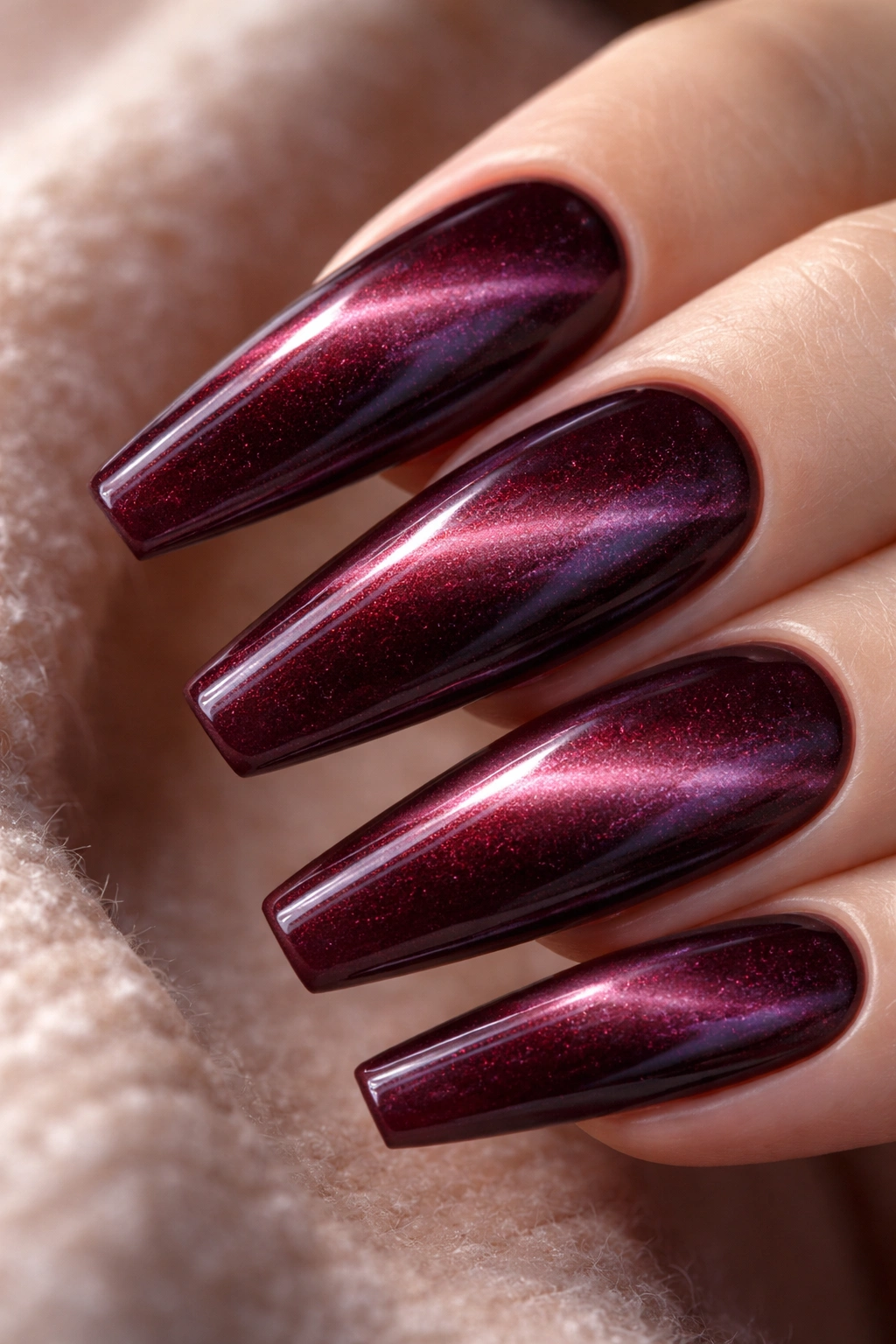
Magnetic polish can look cheap fast. So why does a plum-burgundy cat-eye still work on ballerina nails? Because the shimmer sits inside the color rather than splashed over it, and when the magnet pull is soft, the nail looks like velvet moving under glass.
A cooler plum-burgundy base is the right call here. Straight warm burgundy can fight with the magnetic pigment and turn muddy. That slight plum lean keeps the flash crisp, especially under lower light where cat-eye shades tend to show their best side.
What makes the pull look clean
Use the magnet at a slight diagonal or centered into a tight velvet glow rather than a stark stripe. The old hard-line cat-eye can feel dated on this shape. A softer, diffused pull looks deeper and more refined, especially across a medium-long ballerina with a smooth apex.
Wear notes worth knowing
- Ask for the magnetic effect to be checked on every finger before curing. The pull can shift.
- Keep the top coat glossy. Matte flattens the movement.
- Do not pair this with heavy crystals. The polish already has motion.
- Best on nails with enough length for the light pattern to travel.
This is one of those sets that changes throughout the day. Tilt your hand and the center glows. Hold it straight and it settles back into wine-dark plum. Subtle from one angle, hypnotic from another.
10. Negative-Space Side Swirl in Wine
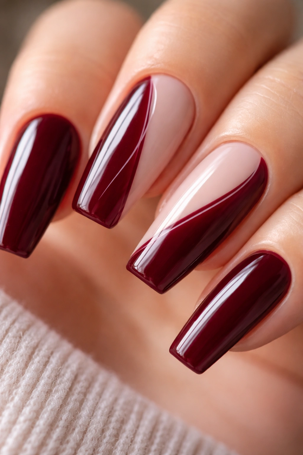
You notice this one when the hand moves. A slim ribbon of negative space running along one side of a burgundy ballerina nail gives the set a little tension, almost like the color has been peeled back by a brushstroke. It’s cleaner than a full abstract pattern and far easier to wear for more than a week.
The trick is restraint. One curved swoop, maybe two if they are thin and follow the taper of the nail. Once the bare sections get too wide, the manicure starts losing that deep burgundy presence you came for in the first place.
A milky pink or neutral base keeps the negative space looking intentional instead of unfinished. Then the wine-colored curve can sweep from the cuticle line toward the tip, usually with a liner brush. A line width of 1 to 2 mm is enough. Thicker swirls can fight the shape.
If you want this at the salon, ask for:
- A sheer nude or pink base
- One side-swept burgundy curve per nail
- Gloss finish
- No extra glitter or stones
That last part matters. This design gets its strength from empty space. Fill every gap and the whole point disappears.
11. Burgundy Croc Texture Accent Set
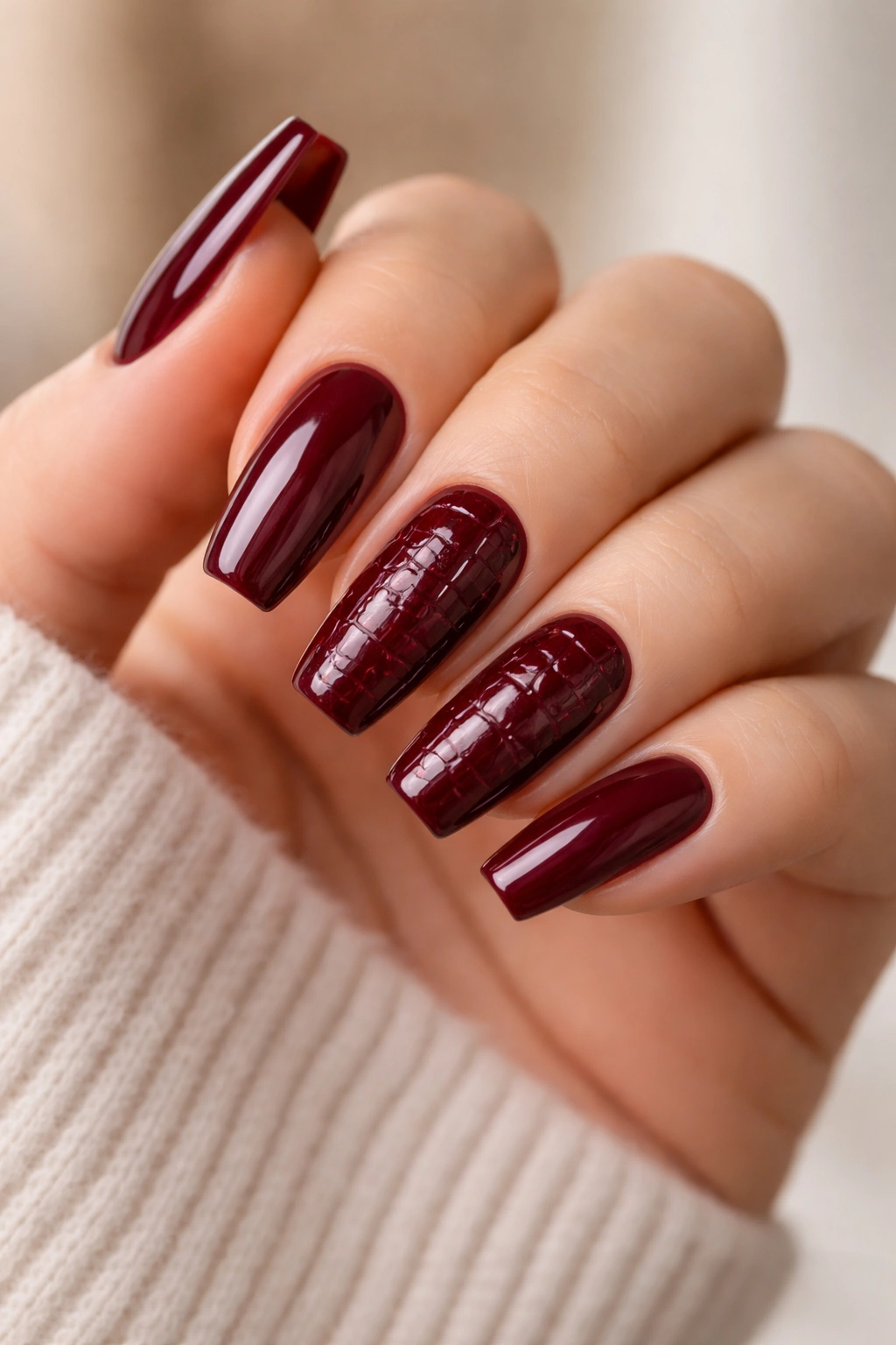
This one goes wrong all the time.
Croc texture can look sharp with burgundy, but only when you keep it on one or two nails and let the rest stay simple. A full croc set in deep red usually reads bulky, and on long ballerina nails it can start feeling costume-heavy. You want texture as a hit, not as a wall.
The cleanest version uses a dark burgundy base with croc texture built in a slightly darker or glossier tone on the accent nails. Some techs create it with blooming gel, others with a thick gel and a mesh trick, and some sculpt the pattern lightly with builder. Any of those can work. What matters is scale. Small to medium cells look better than giant ones on a tapered nail.
I’d keep the accents on the middle and ring fingers, then leave the thumb, index, and pinky in a plain oxblood or wine gloss. That contrast lets the texture feel deliberate. If every nail is textured, your eye stops knowing where to land.
Also, pick your length carefully. Extra-long croc ballerina nails can look fierce in photos, but they are less forgiving in daily life. On a shorter or medium ballerina, the design still has bite while staying easier to wear, cleaner from the side, and less likely to snag if the raised texture is not fully sealed.
12. Berry-to-Wine Aura Center
Unlike a standard ombré that fades from one end of the nail to the other, an aura design puts the glow in the middle. With burgundy ballerina nails, that means a deeper wine edge and a softer berry center, almost like light is trapped under the polish. The center looks lifted, the perimeter looks shadowed, and the shape ends up looking longer.
This design needs a gentle hand. If the center spot is too bright or too large, the manicure starts reading neon. A small diffused berry haze works better than a loud hot-pink circle. Think mulled berry, not candy.
Airbrush gives the smoothest aura. A sponge blend can still work if it stays soft and layered. I’d ask for the center glow to sit slightly above the middle of the nail rather than dead center on every finger. That tiny shift follows the natural line of the nail bed and looks less stamped on.
Gloss is the better finish here. Matte strips out the floating effect and leaves the color looking flat. On a longer ballerina, the aura center has room to breathe. On a shorter set, keep it tiny or skip it.
If you want burgundy with depth but not the heaviness of a full dark coat, this is a smart middle path. It’s still moody. It just has more air in it.
13. Garnet Glitter Fade on a Matte Burgundy Base
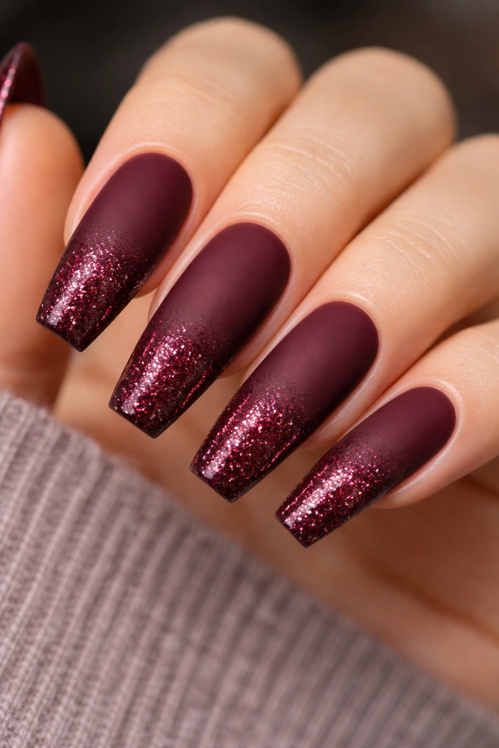
Glitter looks smarter when it has somewhere to stop. A matte burgundy base with a garnet fade rising from the tip gives the shine a clear job: brighten the edge, leave the rest alone. That sharp cutoff between dry matte and dense sparkle makes the set feel controlled instead of busy.
Where the fade should sit
Keep the glitter concentrated on the last 3 to 6 mm of the nail, then feather it upward. On a medium ballerina, that usually means the sparkle reaches about one-third of the nail length at most. Any higher and the glitter takes over the whole manicure.
Use fine and medium garnet particles rather than chunky hex glitter. Fine sparkle sits flatter, seals better under top coat, and gives more of a glowing ember effect at the tip.
Best ways to wear it
- Pair it with a cool wine or garnet base for a darker finish.
- Use the glitter on every nail if the fade is small, or on two accent nails if you want more restraint.
- Refresh the matte top coat when it starts to soften from oils.
- Keep cuticle area clean and plain; glitter belongs at the edge here.
The contrast is what sells this design. If both the base and the glitter are glossy, it loses that tension. Matte below, shimmer above. That split gives it shape.
14. Deep Burgundy Marble with Cream Veins
Can marble look grown-up on ballerina nails? Yes, but only if the veining stays thin and the color palette stays tight. Deep burgundy marble with narrow cream and espresso lines has a stone-like feel without turning into a busy swirl of random shades.
The base should still read as burgundy first. Cream is there to break it up. Espresso is there to add shadow. Too much white, and the whole design starts looking pinker and softer than you wanted. Too much black, and it drifts muddy again—same problem we’ve been dodging the whole time.
Blooming gel makes the easiest marble base because it lets the cream and darker lines feather into the burgundy before curing. A liner brush can sharpen a few veins after that. I’d keep one or two nails fully marbled, then leave the others solid wine or oxblood. Full marble on every nail can be a lot, especially on longer ballerina tips where the pattern gets more room to spread.
This is one of the stronger choices if you like detail but hate obvious glitter. It gives movement without sparkle, depth without chrome, and enough variation that the manicure still feels rich up close. More stone slab than candy apple.
15. Short Soft Ballerina in Mulled Wine
If you want burgundy ballerina nails but you also type for hours, fasten necklaces, carry groceries, and don’t feel like babying your hands all week, go shorter. A soft ballerina in a mulled-wine shade keeps the mood of the shape without the maintenance bill of an extra-long set.
This is not a square nail pretending to be ballerina. The taper still needs to show. It’s just gentler, with a shorter free edge—often around 8 to 11 mm—and corners that are softened enough to hold up better in daily use. That shorter length also keeps dark polish from feeling too dramatic if you’re new to it.
Mulled wine is the right shade for this format because it usually carries a little brown and berry warmth. On a short set, flat black-cherry tones can look too severe. A warmer burgundy keeps the manicure deep but wearable.
I’d leave this design plain and glossy. Maybe a single accent nail if you have the itch for detail. Maybe not. Short burgundy ballerina nails have their own charm when the shaping is clean and the cuticle line is tight. They don’t need rescue art.
For anyone testing the waters, this is the set I’d point to first.
Final Thoughts
Burgundy gives you more range than people assume. It can look glassy, velvety, smoky, magnetic, marbled, or nearly bare depending on what you do with the base and finish. The shape matters just as much as the shade, though. A clean ballerina structure is what makes the color look rich instead of heavy.
If you only take one idea from this list, take this one: pick one main effect and let it breathe. Glossy oxblood. Matte with micro-gloss tips. A cat-eye velvet pull. A marble accent. The sets that read best are rarely the ones trying to do six things at once.
And if you’re torn between drama and practicality, shorten the length by a few millimeters before you cut the design. You’ll keep more of the look than you think, and your hands will thank you by day three.
