

A beige manicure can disappear the second your hand hits daylight; colorful ballerina nails do the opposite. They announce themselves across a coffee cup, a steering wheel, a phone screen, a silver ring. If you want a bold manicure that looks sharp rather than messy, this shape gives you a head start.
There’s a reason nail techs keep coming back to the ballerina silhouette—also called the coffin nail in plenty of salons. The tapered sides slim the finger, and the flat tip gives color a clean stopping point. Bright polish looks more graphic on that squared-off edge than it does on a round or oval nail, where strong color can drift softer than you meant it to.
Color matters, sure. Placement matters more than people think. A 2-millimeter cobalt French tip reads crisp and expensive; the same blue painted wall-to-wall can feel heavier, moodier, maybe even a little stubborn if the rest of the set doesn’t support it. Finish changes things too. Gloss makes color look wetter. Matte pulls some of the sugar out and leaves shape, contrast, and line to do the work.
I like ballerina nails most when they lean into that structure instead of fighting it. Bright shades, split-color layouts, chrome, jelly finishes, tiny floral details, hard-edged checkerboards—this shape can carry all of them. The fun part starts when you decide what kind of loud you want.
Why Colorful Ballerina Nails Have More Visual Punch Than Round Shapes
Flat tips change everything.
On a ballerina nail, the eye follows a narrow sidewall and lands on a straight edge. That gives color a frame. Neon orange, deep teal, acid green, glassy purple—each shade has a place to stop, which makes the manicure look planned instead of random. Round nails can soften bright color in a nice way, but ballerina nails make it look intentional.
Where the shape helps most
The shape shines when your design uses lines, fades, blocks, or tips. A straight French tip looks cleaner on a flat edge. Ombre has more runway to blend. Checkerboards and diagonal splits stay readable because the sides taper gently instead of curving away too fast.
Length matters, though not in the dramatic way social media can make it seem. You do not need claws. A medium ballerina—about 1/8 to 1/4 inch past the fingertip—already gives enough space for bold color work. Longer sets widen your design options, though they also ask more from your day-to-day life. Zipping jeans, typing fast, opening a soda can—you’ll notice.
One more thing. If your natural nails flare at the free edge, builder gel or acrylic often helps the shape hold better. A crisp ballerina outline with weak sidewalls turns blunt fast, and bright polish makes every wobble easier to spot.
How to Plan Colorful Ballerina Nails Without Losing the Shape
Pick the wrong finish and even a smart color combo can flatten out.
Ballerina nails already bring geometry. You do not need every trick at once. When a set has chrome, glitter, foil, rhinestones, ombre, and three neon shades layered on top of each other, the shape disappears under noise. I’d rather see one strong idea handled well than six ideas competing for the same three centimeters of nail.
Start with length, then choose the finish
If you want clean art—French tips, checkerboards, split diagonals—ask for a short or medium ballerina. Longer lengths can still work, but the extra distance shifts the mood from sharp to theatrical. Good when that’s the goal. Less good when you want color to look polished enough for daily wear.
Glossy topcoat gives color more depth. Matte has a flatter, chalkier feel, which can be gorgeous with pastel or graphic designs. Chrome sits in its own lane. Magnetic cat-eye gel does too. Each one changes how the same shade reads, so decide that before you settle on the palette.
Place the brightest shade with purpose
You have three easy routes:
- Full color on every nail when the polish itself is the point
- Tips, edges, or cuticle details when you want brightness without covering the whole set
- One accent technique—aura, marble, foil, or chrome—paired with calmer neighbors
That small decision controls the whole mood. Bright color near the tip feels brisk and sporty. Bright color at the cuticle looks more editorial. All-over color is blunt in the best way.
How to Keep a Bold Ballerina Manicure Sharp for Longer
Bold color shows chips fast.
A pale beige manicure can hide a rough edge for two days. Hot pink, cobalt, or emerald won’t be so generous. If you’re spending money on bright ballerina nails, the wear matters.
A few habits help more than people expect:
- Apply cuticle oil twice a day, especially if you wear gel or acrylic. Dry skin makes a fresh manicure look tired before the polish actually fails.
- Ask your tech to cap the free edge with color and topcoat. On a flat ballerina tip, that thin seal can buy extra days.
- Use gloves for dishes and cleaning. Long soaks in hot water soften product, dull gloss, and make lifting more likely at the corners.
- File tiny snags with a 180-grit file instead of peeling or biting at the edge.
- Book fills or rebalancing before the apex grows out too far. On medium to long ballerina sets, 2 to 3 weeks is a safer window than stretching to four.
Small maintenance. Big payoff.
1. Electric Coral With a Glassy Finish
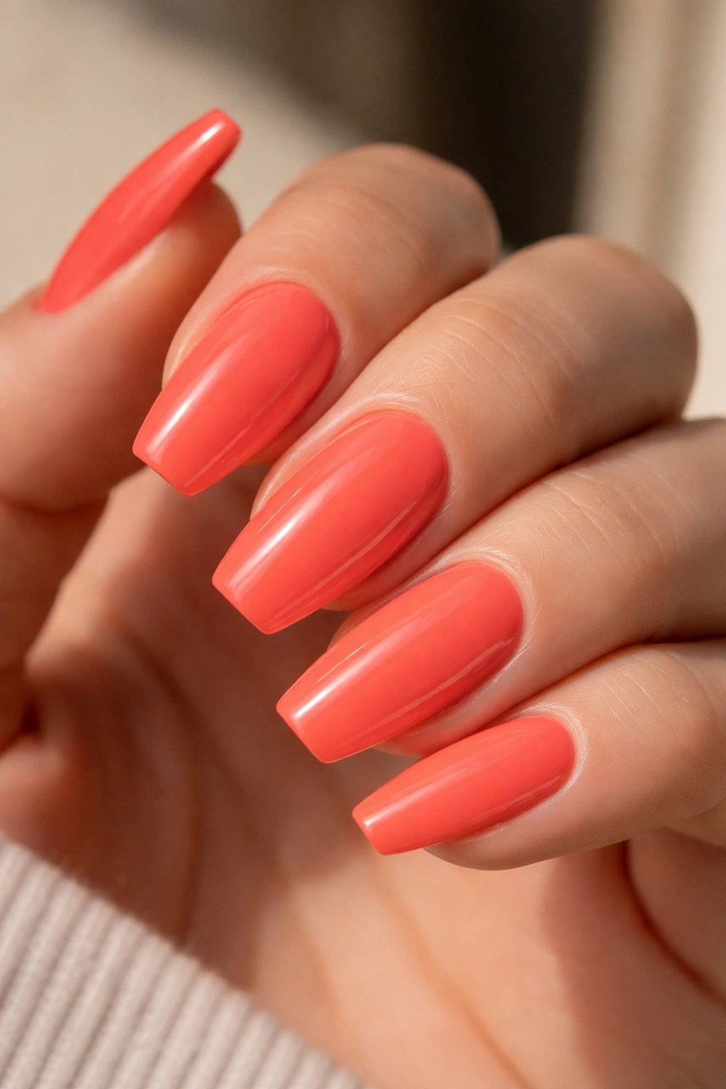
Electric coral is one of those shades that makes ballerina nails look awake. Not cute. Not sugary. Awake. The mix of pink and orange gives it more movement than a straight red, and the flat tip keeps it from wandering into beach-toy territory.
I like this look most as a full-coverage cream with a thick, glassy topcoat. No glitter. No stones. No art competing for attention. Coral already carries warmth, brightness, and contrast on its own, so the smarter move is to let the color and shape speak.
Why the shade lands so well
Coral has a built-in tension that plain orange lacks. There’s heat from the orange side, but the pink softens it and keeps the manicure from feeling harsh. On ballerina nails, that balance reads crisp and lively, especially at medium length.
Quick details that make it stronger:
- Ask for two to three thin coats instead of one heavy coat, which can wrinkle near the sidewalls.
- A high-shine gel topcoat makes coral look juicier and richer.
- Medium length keeps the color bold without turning it costume-like.
- Skip accent nails. One solid block of coral usually looks sharper.
My pick: pair this with gold rings and a bare cuticle line. That little bit of negative space around the nail makes the color hit harder.
2. Cobalt Micro-French on a Milky Nude Base
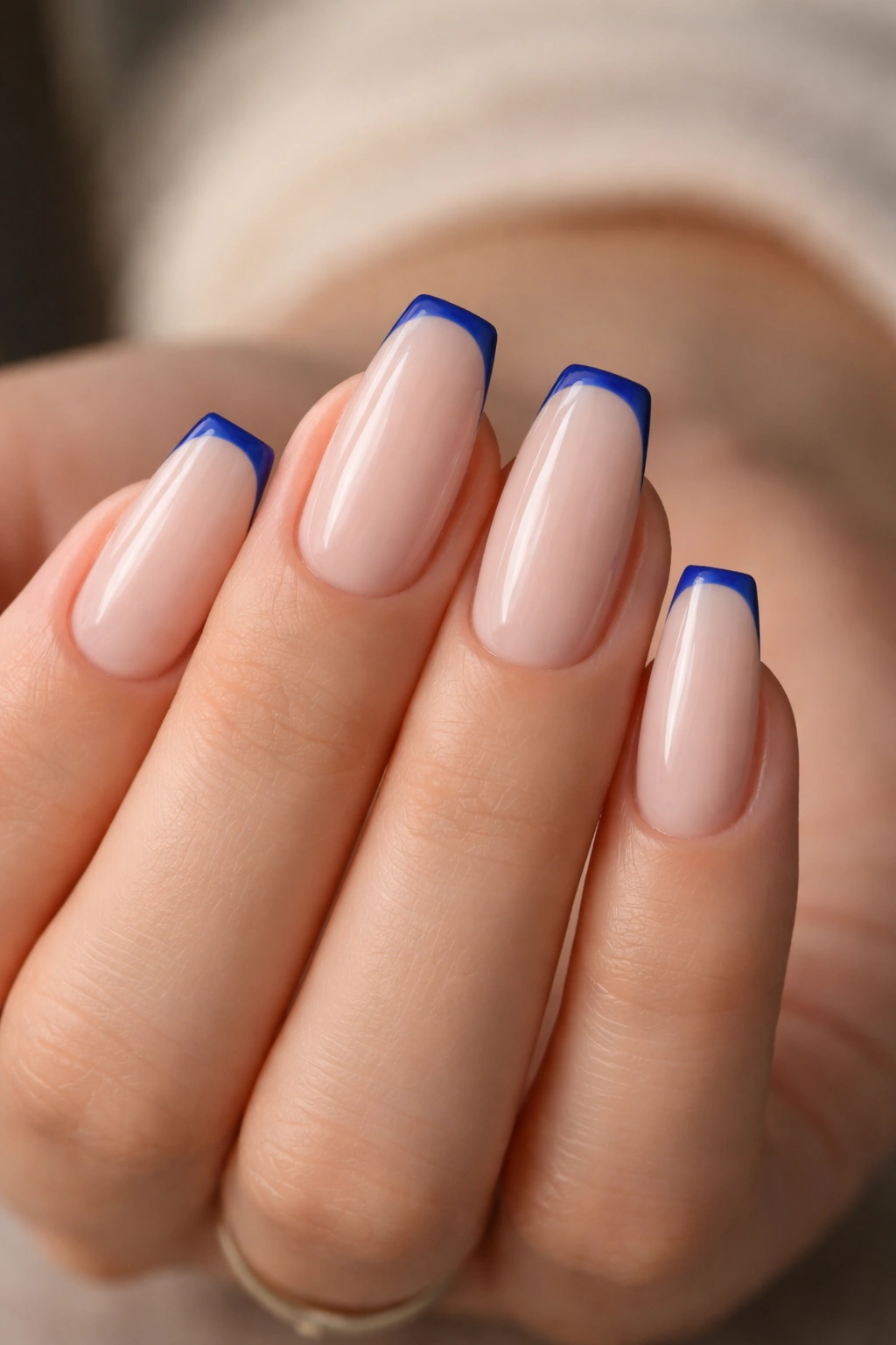
Want blue without making the whole set feel heavy? A cobalt micro-French does that job better than a full cobalt manicure on most hand shapes.
The trick is scale. Keep the nude base soft and slightly milky—something sheer enough to blur the nail line, not a stark beige that fights the blue. Then lay down a 1 to 2 millimeter tip in pure cobalt. On a ballerina shape, that straight edge turns into a tiny graphic stripe, almost like eyeliner for the nail.
I love this look because regrowth stays less obvious. The bright part sits at the free edge, so the manicure still feels neat even after the base has grown out a bit. That matters if you don’t plan salon visits with military precision.
There’s another reason it works. Blue can flatten skin tone when it covers the whole nail plate, especially in a dense cream formula. Using it at the tip keeps the color crisp while the nude base leaves breathing room. Short-to-medium ballerina nails handle this look best. Go too long, make the blue band too thick, and the clean line starts reading blocky.
If your tech has a shaky hand with French placement, ask for the smile line to stay almost straight rather than deeply curved. Ballerina nails prefer structure.
3. Lime and Aqua Color-Block Ballerina Nails
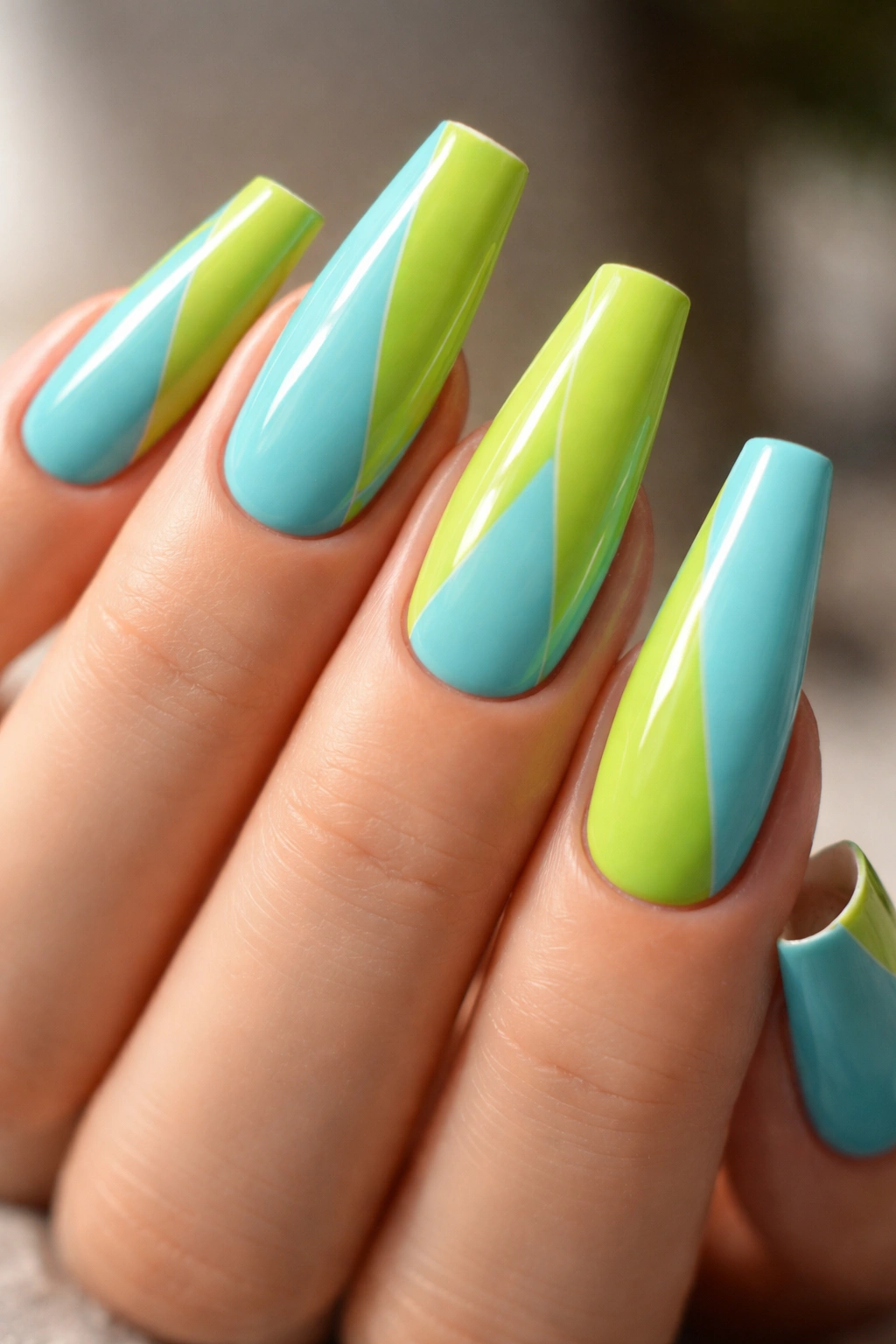
Picture a two-tone set where lime slices across aqua like a sharp panel of lacquered plastic. That’s the mood here—graphic, punchy, a little sporty, and much smarter than a random neon mash-up.
The design works best when the split is diagonal or side-panelled rather than straight down the center. A center split can make the nail look wider. A diagonal line, especially one that starts near the cuticle on one side and finishes near the tip on the other, follows the taper and keeps the finger looking long.
How I’d place the color
You can take this in a few directions:
- Alternating nails: lime on one hand’s index and ring, aqua on the others
- Diagonal split on every nail: same angle across the set for a cleaner feel
- Color-block with a thin silver divider: a tiny metallic stripe between the two shades adds edge
Builder gel or a hard-gel overlay helps here because color-block edges need a smooth surface. Any dip or bump in the apex becomes obvious once two bright creams meet along a single line.
There’s no reason to soften this design with glitter or flowers. It wants to look modern and a little fast. White sandals, a silver watch, denim, black tailoring—it handles all of that without apologizing.
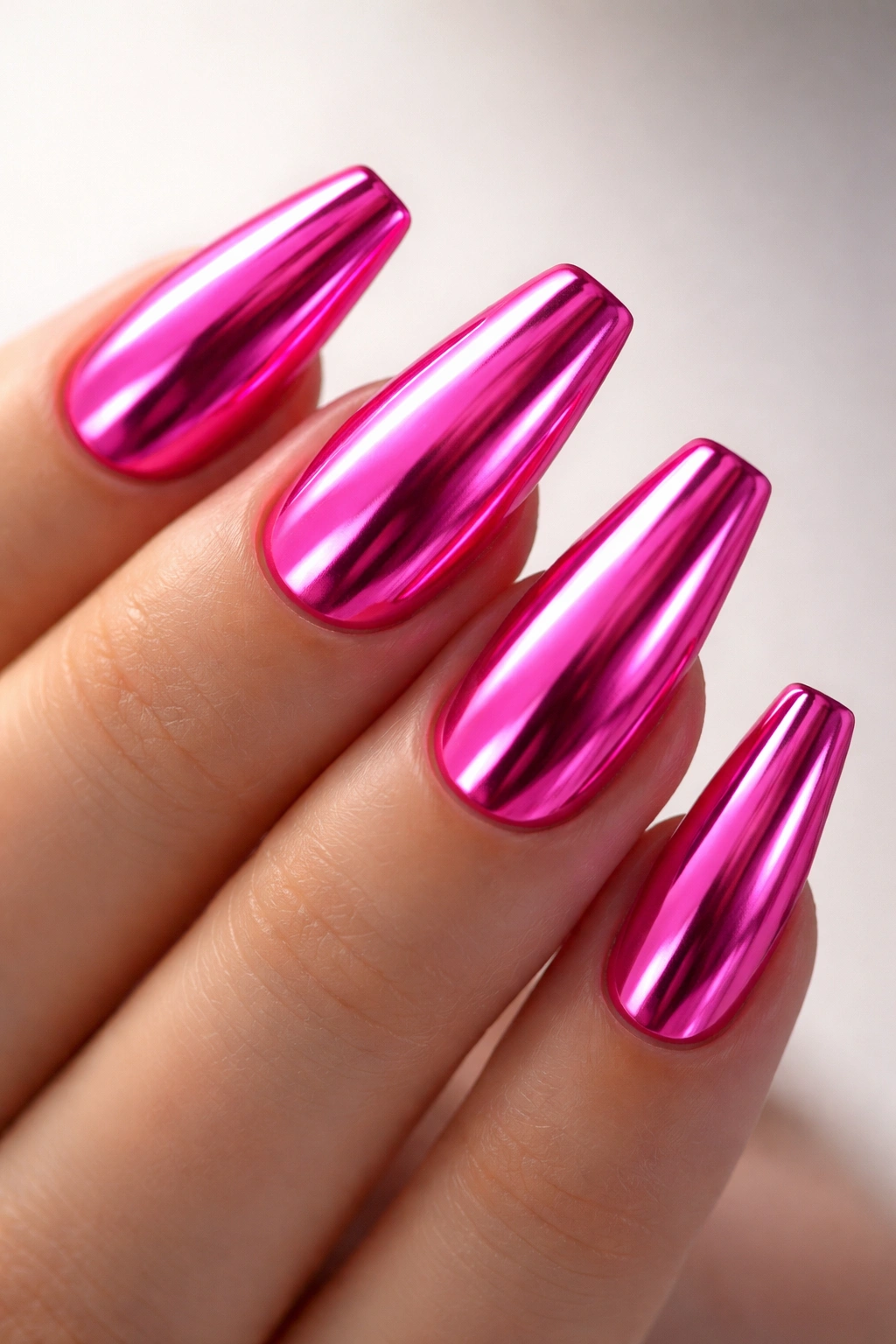
4. Hot Pink Chrome With Mirror Reflection
Chrome gets dismissed as too much, which I find funny, because hot pink chrome often looks cleaner than a cluttered nude set with random gems stuck on top. The shine is the decoration. You do not need extra noise.
A ballerina shape is ideal for chrome because the flat tip makes the reflection look crisp instead of distorted. Start with a saturated pink gel base, cure it, buff chrome powder over a no-wipe top layer, then seal it again. The result has more depth than plain metallic polish. You get that almost-liquid reflection that shifts as the hand moves.
A few practical notes matter here:
- Medium and long lengths show the mirror effect best.
- Ask for a smooth apex and sidewall before the chrome goes on. Chrome highlights every ridge.
- Pink chrome reads stronger over a warm fuchsia base than over pale bubblegum.
- Short lengths can still wear it, though the effect turns punchier and less glamorous.
I would not mix this with heavy nail art. One small crystal near the cuticle on a single finger, maybe. More than that, and the surface starts losing the sleekness that makes chrome worth doing in the first place.
5. Sunset Ombre From Orange to Magenta
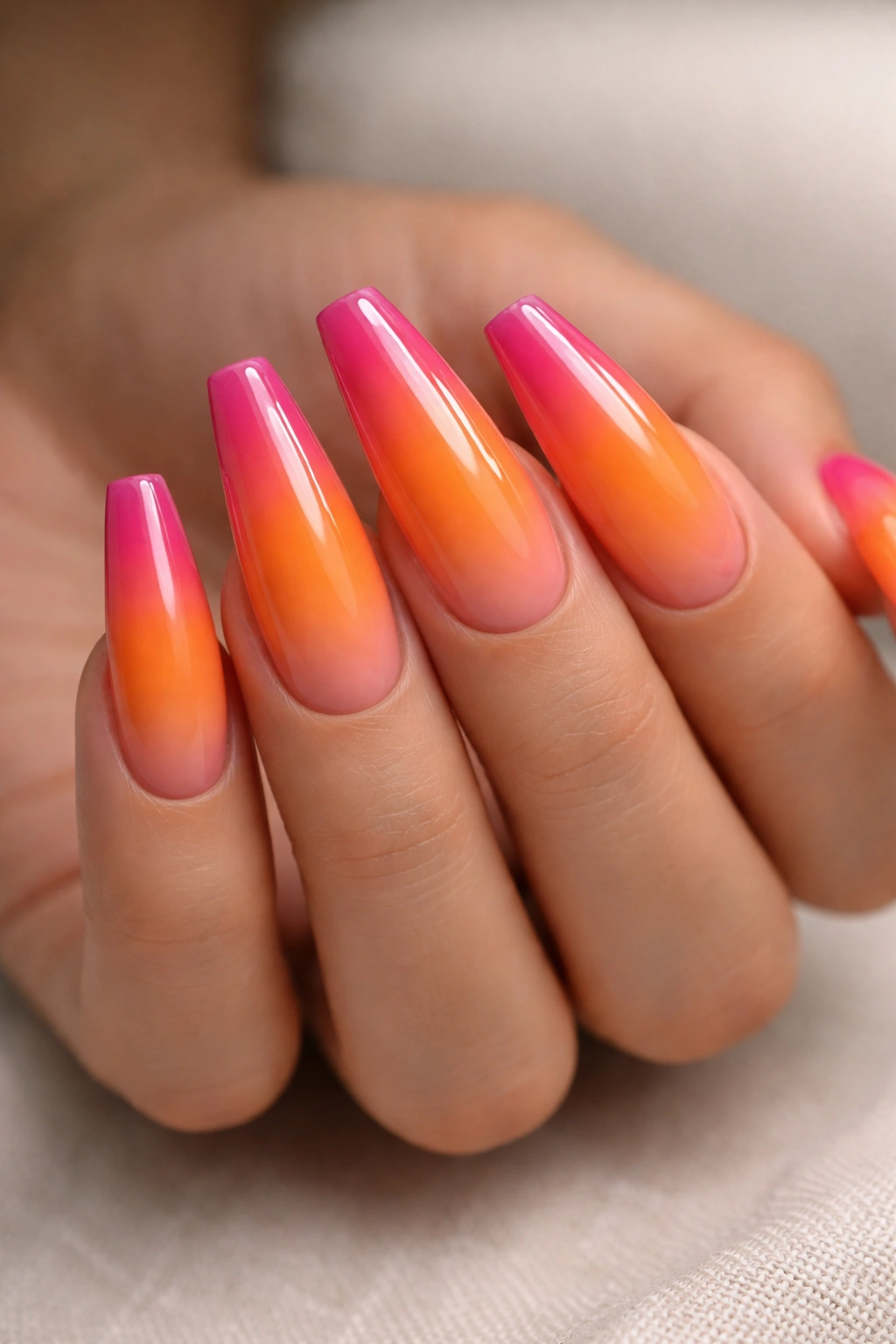
Orange melting into magenta looks like the last ten minutes of daylight. Soft at the center. Brighter near the edges. Hard to ignore.
On ballerina nails, a sunset ombre has room to breathe. The shape gives you enough length for the fade to look smooth rather than chopped into stripes. That matters more than people think. A short square nail can wear ombre, sure, but ballerina nails let the blend stretch out, and the whole set feels richer because of it.
Airbrushed ombre gives the cleanest finish, though a sponge blend still works when the tech has a light hand and patience. What you want is a fade where one color drifts into the next over at least half the nail length. If the transition sits in a tiny band across the middle, the effect loses its softness and starts looking accidental.
Gloss suits this design better than matte. The sheen makes the orange and pink bleed into each other with more depth, almost like stained candy. I’d skip accent art here. No foil. No stones. Maybe one tiny gold star on a ring finger if you need a wink of detail. Even that feels optional.
This set shines during warmer months, though I’d wear it anytime I wanted my manicure to do some of the talking.
6. Lavender Base With a Neon Yellow Cuticle Line
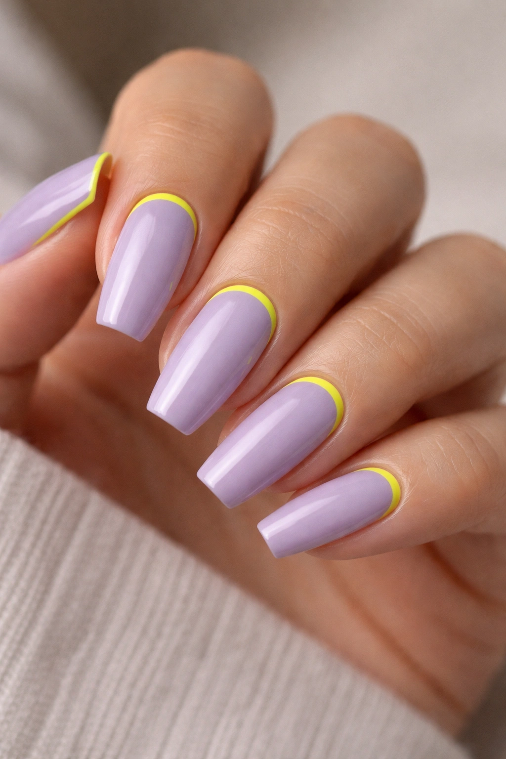
Unlike a full neon manicure, lavender with a thin yellow cuticle line gives your eyes a place to rest. That’s why I keep coming back to this pairing. The base feels cool and calm; the yellow hits like a highlighter stroke.
Placement decides whether this design looks sharp or messy. The yellow should hug the cuticle in a fine crescent, about 1 millimeter wide, not a thick half-moon that swallows the base color. You can also run the line down one sidewall for a slanted frame effect, which looks especially good on medium ballerina nails.
Where the contrast does its best work
Lavender softens the punch of the yellow without muting it. The two colors sit far enough apart in feeling—one airy, one electric—that the manicure looks deliberate. That tension is the whole point.
I’d choose a creamy lavender, not a jelly or shimmer, so the yellow line stays crisp. Matte topcoat can work if you want a more graphic finish, though gloss gives the yellow a stronger edge.
This is a smart choice if you want bright color but still need the set to work with daily clothes, office wear, or a drawer full of black basics. There’s energy here, though it’s controlled energy. Big difference.
7. Cherry Red and Fuchsia Split Diagonal
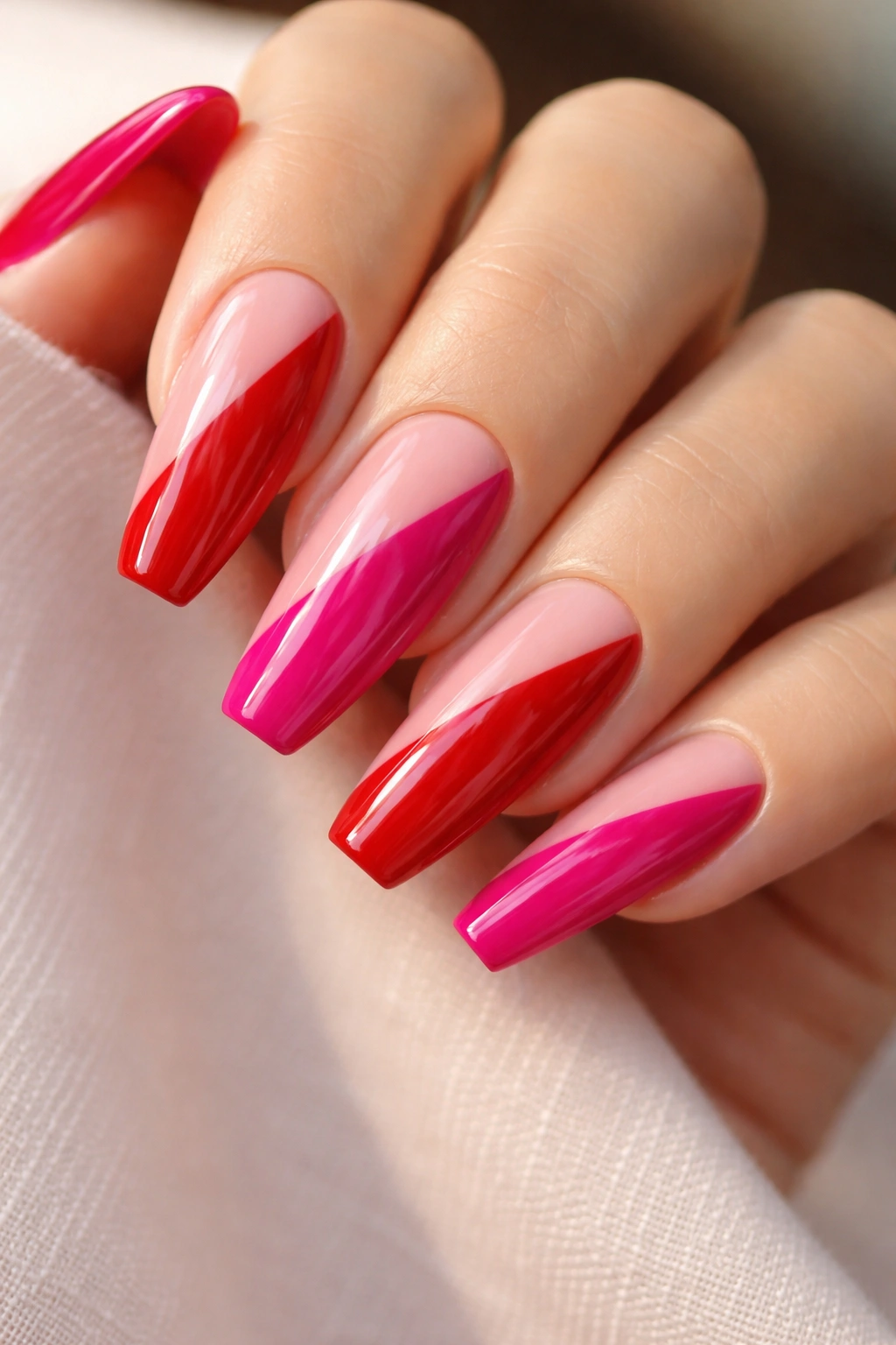
Split-color nails can go wrong fast. The line placement is usually where things fall apart.
A diagonal divide saves this design. Start with cherry red on one lower corner of the nail and sweep fuchsia across the opposite side, letting the line cut upward with the taper. That slant keeps the nail long and makes the two shades feel like they belong together instead of competing for square footage.
Cherry red brings weight. Fuchsia adds lift. Side by side, they read bold and polished, almost like a lipstick wardrobe turned into nail art. I’d keep the finish glossy and the surface clean. Tiny black linework can look cool here, but only if the split itself is razor sharp. A sloppy divider ruins the whole set.
Short-medium ballerina nails wear this one especially well because the design already has strong movement. Long length can make the color split feel louder than the shape can hold.
A lot of red-pink pairings drift sugary. This one doesn’t if you use a deeper cherry rather than a tomato red. That darker note grounds the fuchsia and keeps the manicure from floating away into party-supply territory.
8. Emerald Jelly Nails With Sheer Depth
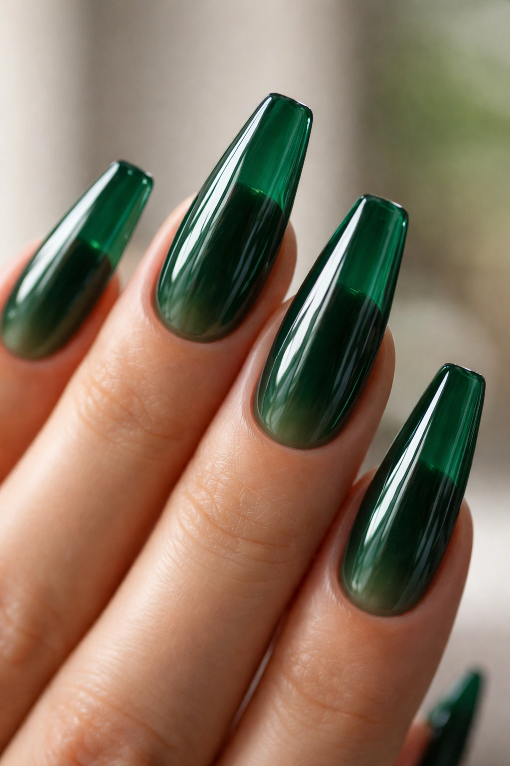
Three coats of translucent green tell a richer story than one opaque bottle ever could. Emerald jelly nails have depth, almost like tinted glass held up to the light.
Jelly finishes are made for ballerina shapes because the length lets the transparency build. You can see where the color deepens near the apex and free edge, and that layered effect gives the manicure movement even when the design is plain.
What jelly polish does better than cream
A cream emerald manicure looks bold. A jelly emerald manicure looks alive. That sheer quality catches small shifts in light and makes the color feel deeper than it actually is.
You can push the look a few ways:
- Use two coats for a lighter bottle-glass feel
- Use three coats for a deeper gemstone finish
- Add a thin layer of fine green glitter under the jelly if you want more sparkle without losing the transparency
- Keep the topcoat extra glossy; matte kills the whole point
One warning: jelly shades show streaks if the application is rushed. Ask for thin, even layers and full curing between each coat. A self-leveling gel formula helps more than regular polish here.
This design has attitude without shouting. Dark enough to feel moody, sheer enough to stay interesting.
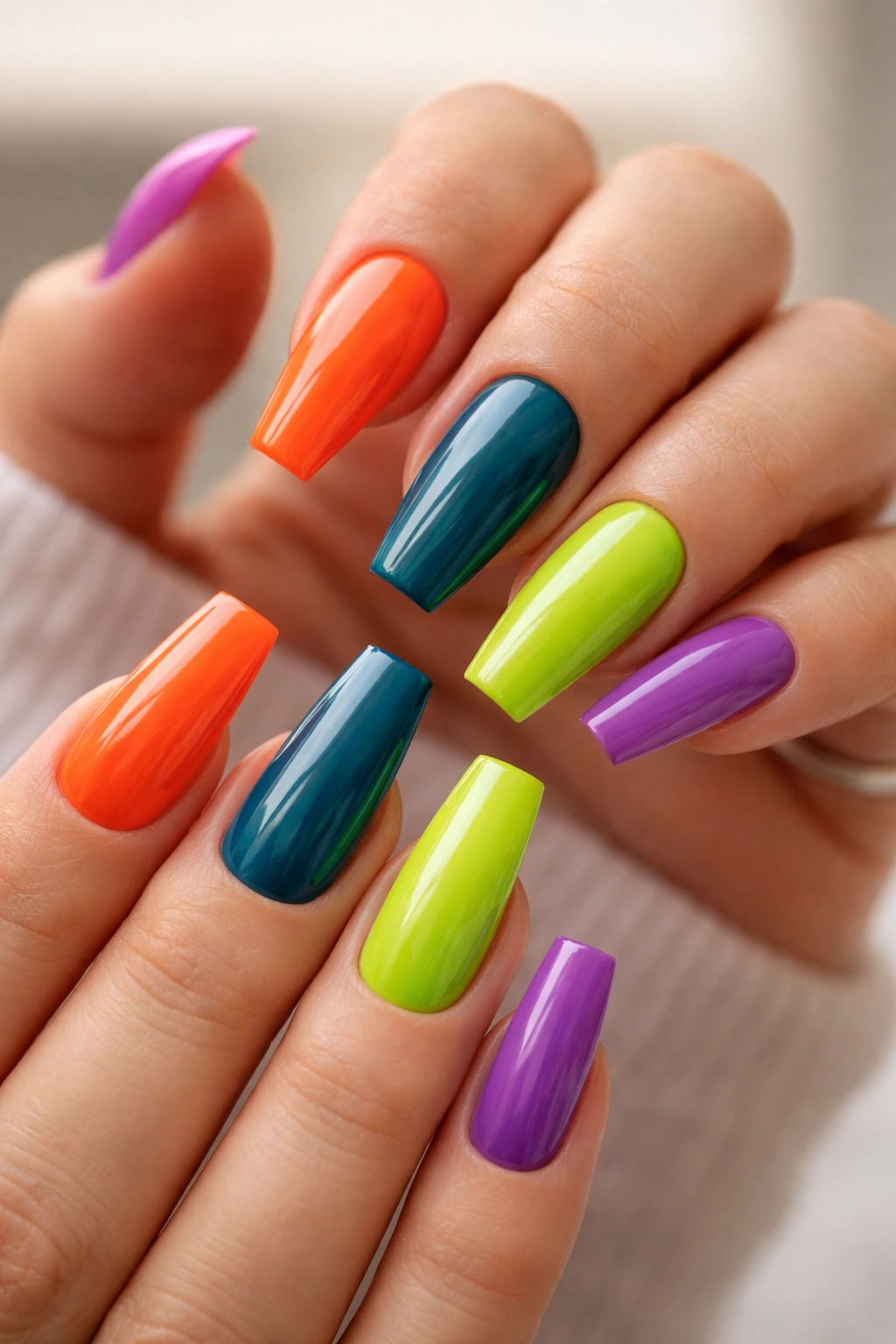
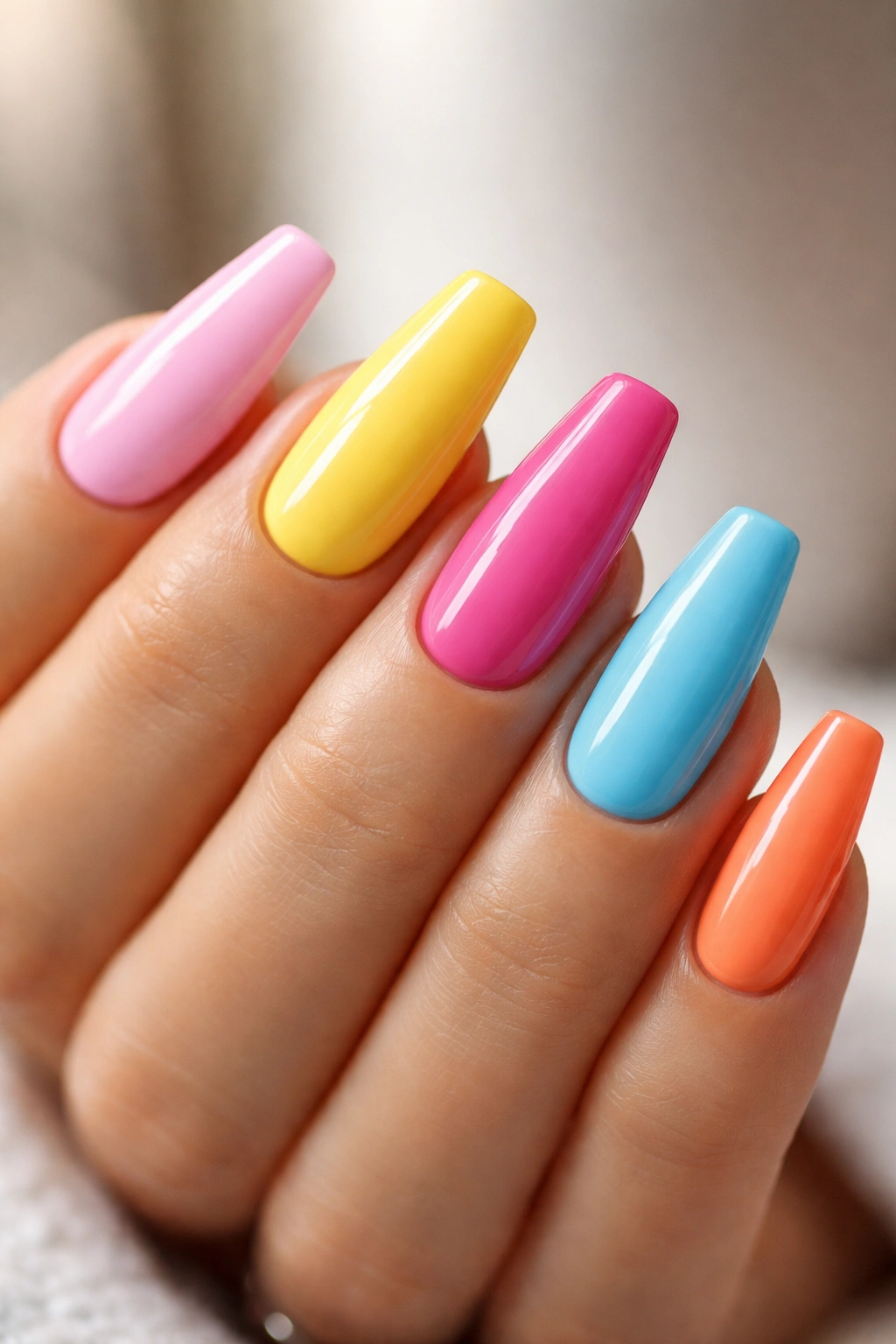
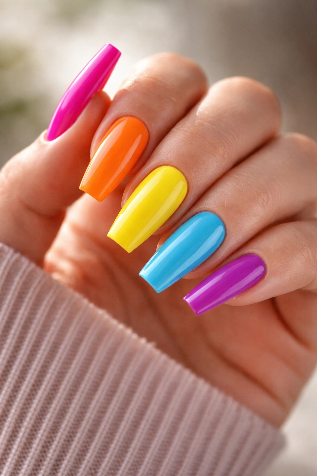
9. Rainbow Skittle Ballerina Nails With One Shade Per Finger
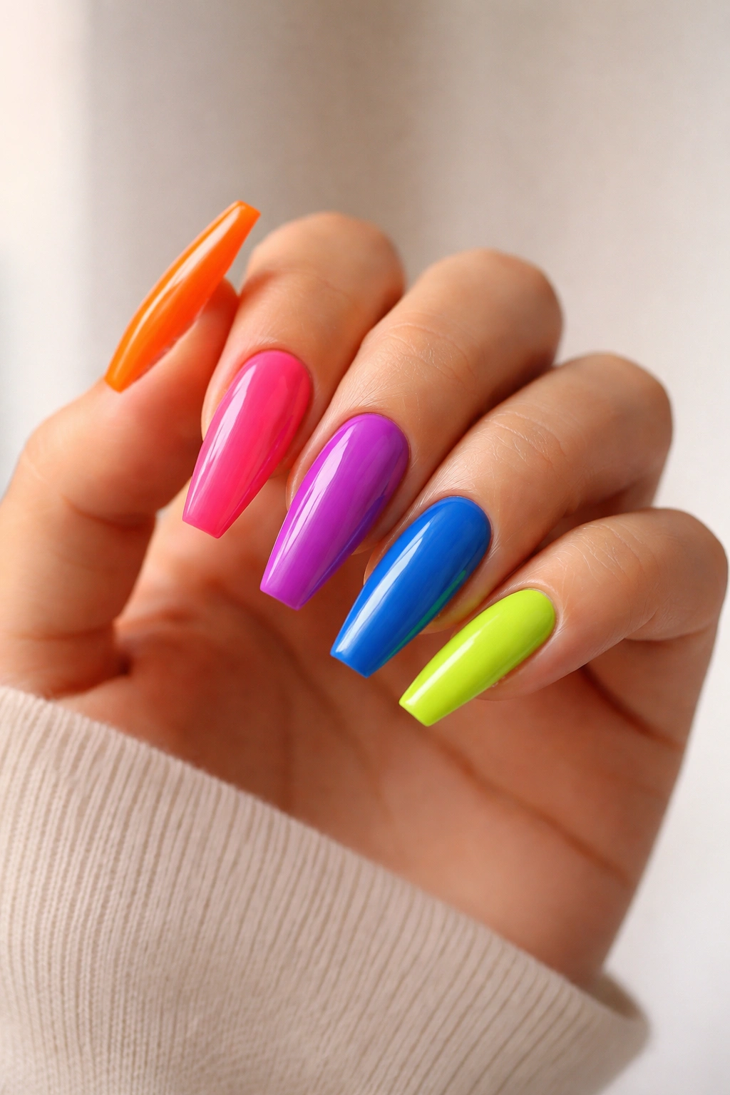
I like skittle manicures more on ballerina nails than on short squares, and I’ll stand by that. The shape gives each color its own slim little panel, so the whole set reads as a palette rather than a bag of candy dumped on the hand.
The smartest version uses five shades with equal intensity. Think tangerine, hot pink, violet, cobalt, and lime—each one fully saturated, each one glossy, each one clean. What you do not want is one muddy cream sitting beside four bright shades. Uneven depth makes the set look accidental.
This design is less about art and more about curation. Keep every nail solid. No gems. No swirls. No decals. The tension comes from the sequence itself. I prefer arranging the shades so the darkest or coolest color lands on the middle finger; it anchors the hand.
A skittle set is also a strong option if you can’t pick one color and don’t feel like committing to a full rainbow mural. You still get variety, though the structure stays neat. For an even tighter look, keep all five shades within either a warm family or a cool family instead of jumping all over the wheel.
It’s playful, yes. It can still look polished.
10. Tangerine Swirls on a Sheer Base
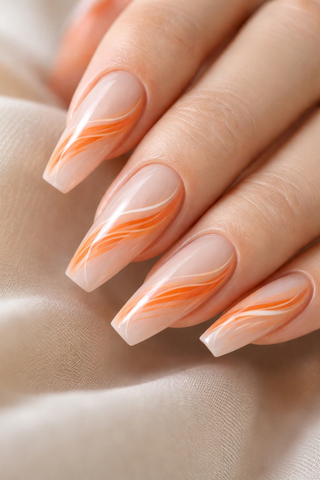
White swirls rescue orange from looking flat. Better yet, they turn tangerine ballerina nails into something airy instead of dense.
The base should stay sheer—milky nude, pale peach, or a translucent blush that smooths the nail line without hiding it. Over that, tangerine curves can move from sidewall to tip in loose ribbons. Add one or two thin white lines near the orange, not stacked on top, and suddenly the whole manicure feels lighter.
This design works because the ballerina tip gives the swirls a straight edge to run into. On a rounded nail, the curves can look too soft. Here, they still have motion, though the shape keeps them under control.
You don’t want every nail covered in the same exact pattern. That’s a fast route to looking stamped. A smarter set varies the swirl placement: one nail with a curve near the cuticle, one with the ribbon running down the center, one with more open space near the tip.
Go glossy. Matte makes swirl work look chalky unless the lines are thick and graphic, which is a different mood entirely. Done right, this set feels fresh and bright without turning cartoonish.
11. Teal Aura Nails Fading Into Black Edges
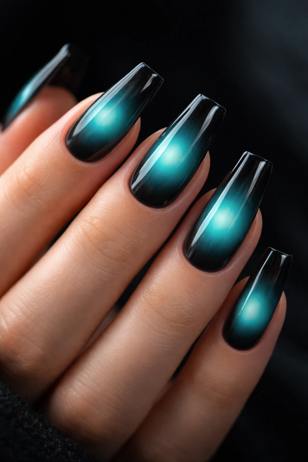
Most aura sets lean soft. Pink centers, airbrushed lilac, hazy peach. Nice enough. Teal aura fading into black edges has more bite.
The center glow should sit slightly above the middle of the nail, not dead center like a target. That small shift keeps the effect more dimensional. Around it, a smoky black or charcoal edge frames the teal and makes the color seem brighter than it is. Ballerina nails help because the tapered sides guide the fade upward and the squared tip gives the aura a defined ending point.
What to ask your nail tech for
Say you want a diffused teal center with a smoked perimeter, not a hard halo ring. Airbrush gives the smoothest result, though sponge fading can work if the blend stays soft. A glossy topcoat keeps the aura fluid; matte makes it look more velvety and a touch moodier.
This design earns its keep at medium-long length. Short nails can wear aura art, though the fade compresses fast and loses some of the mystery. The black edge also hides tip wear better than a pale set would, which is a nice bonus if you’re rough on your hands.
Moody, colorful, and a little dramatic. Good combination.
12. Pastel Mismatch Nails With a Matte Finish
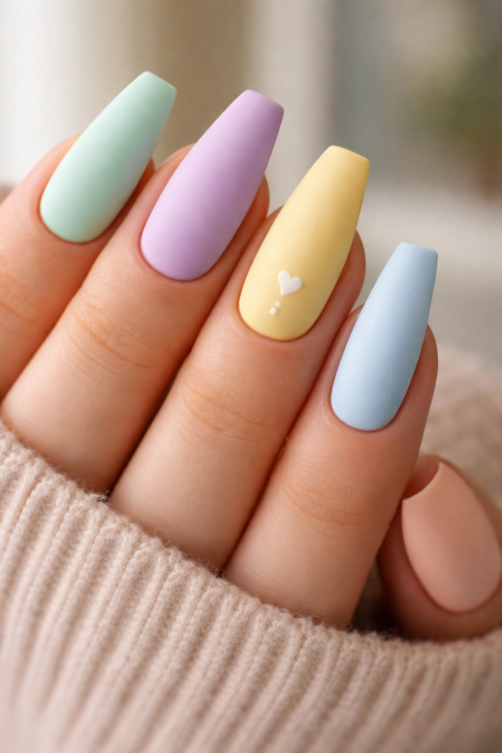
A matte topcoat changes pastel mismatch nails from sweet to sharp in about 90 seconds of curing time. Same colors. Different attitude.
I’m talking about a set where each nail gets its own pastel—mint, lilac, butter yellow, baby blue, soft peach—but every shade has a creamy, chalky finish instead of candy gloss. Ballerina nails keep the look from becoming childlike because the shape already carries edge.
This is one of the few mismatch designs where I’d avoid accent art almost entirely. Tiny black dots or a single slim line on one finger can work, though the matte surface and color rotation already do enough. More detail tends to crowd the set.
There’s a practical upside too. Matte pastels make shape and filing quality easier to read, which sounds minor until you realize how much cleaner the hand looks when every sidewall matches. If your tech is precise, this design shows it off. If the shaping is lazy, matte will expose that in five seconds.
Use a stain-resistant matte topcoat if you drink coffee, handle makeup, or wear dark denim often. Some matte finishes pick up surface marks faster than gloss.
13. Grape Purple With Gold Foil Shards
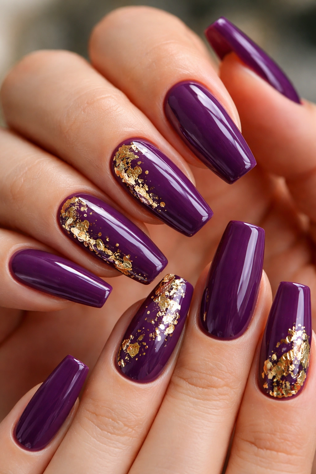
Gold foil on dark purple can look messy when the placement has no restraint. On a clean grape-purple ballerina set, though, foil gives the manicure just enough crackle and warmth.
The base color should sit between plum and violet, deep but still clearly purple in indoor light. Then place foil in irregular flecks near one side of the nail or clustered toward the tip. Random does not mean scattered everywhere. You want three to five small foil pieces per accent nail, pressed flat so the topcoat seals them smooth.
Where the foil should sit
A few placements work better than others:
- Near the sidewall and tip for a broken-metal look
- Floating through the center third on one or two nails only
- Framing the lower corner of the nail for a more editorial feel
I’d keep at least half the nails pure purple with no foil at all. That contrast gives the metallic pieces room to matter. If every nail is loaded with gold, the eye stops reading the detail and sees clutter instead.
Gloss is the move here. Matte can mute the foil and make the purple go dusty. When the surface stays slick, the gold flashes against the grape base and the whole set feels richer.
14. Turquoise Marble With Fine Silver Veins
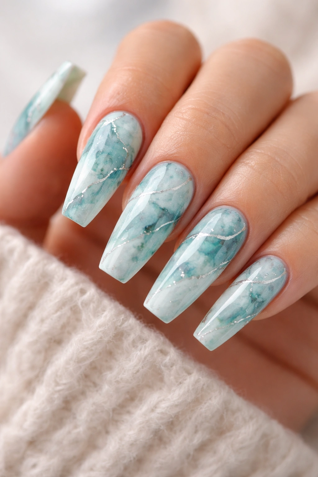
Turquoise marble has a cold, mineral look that hits fast. You see it and think stone, water, metal, all at once.
On ballerina nails, marble art gains structure because the flat tip echoes the cut slab feel of actual stone. The base can lean robin’s-egg blue, richer turquoise, or a mix of white and aqua feathered together. Thin silver veins running through the design keep it from turning cloudy.
A good marble nail should not look busy from ten feet away. You want soft blur in the blue areas and only a few crisp lines cutting through the haze. Too many dark veins and the set starts reading cracked countertop. Nobody wants that.
This design looks strongest when the pattern changes slightly from nail to nail. One with more white space, one with a deeper aqua pool, one with a silver line hugging the side. Repeated copy-paste marbling always feels dead to me. Real stone has variation. Your manicure should too.
If you wear silver jewelry often, this one slides right in. It has color, though it still feels cool and composed rather than loud.
15. Lemon Yellow Nails With Tiny Daisy Clusters
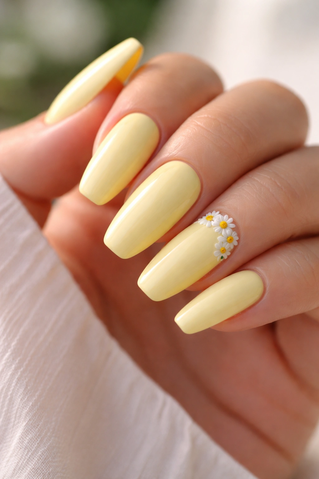
Need something cheerful without tipping into cartoon territory? Lemon yellow with tiny daisy clusters is the answer when it’s handled with restraint.
The yellow should be clean and fresh, not mustard, not neon. Think crushed lemon candy. Then place small daisy clusters—three or four petals per flower, soft white with a golden center—on one or two nails only. A corner placement near the cuticle or sidewall looks better than covering the whole nail bed.
I prefer this design over a full floral set because the yellow already does enough. The daisies are there to break the surface and add charm, not to turn your hand into wallpaper. On a ballerina shape, those little floral groupings look especially neat because the tip keeps the design from floating too soft.
A sheer nude base under the daisy nails can make the set feel lighter, while the fully yellow nails carry the color story. Or go all yellow and tuck the flowers into negative space. Both work.
This manicure suits shorter ballerina lengths better than extreme ones. At long length, tiny daisies can start to look a bit lost unless you scale them up.
16. Multicolor Flame Tips on a Clear Base
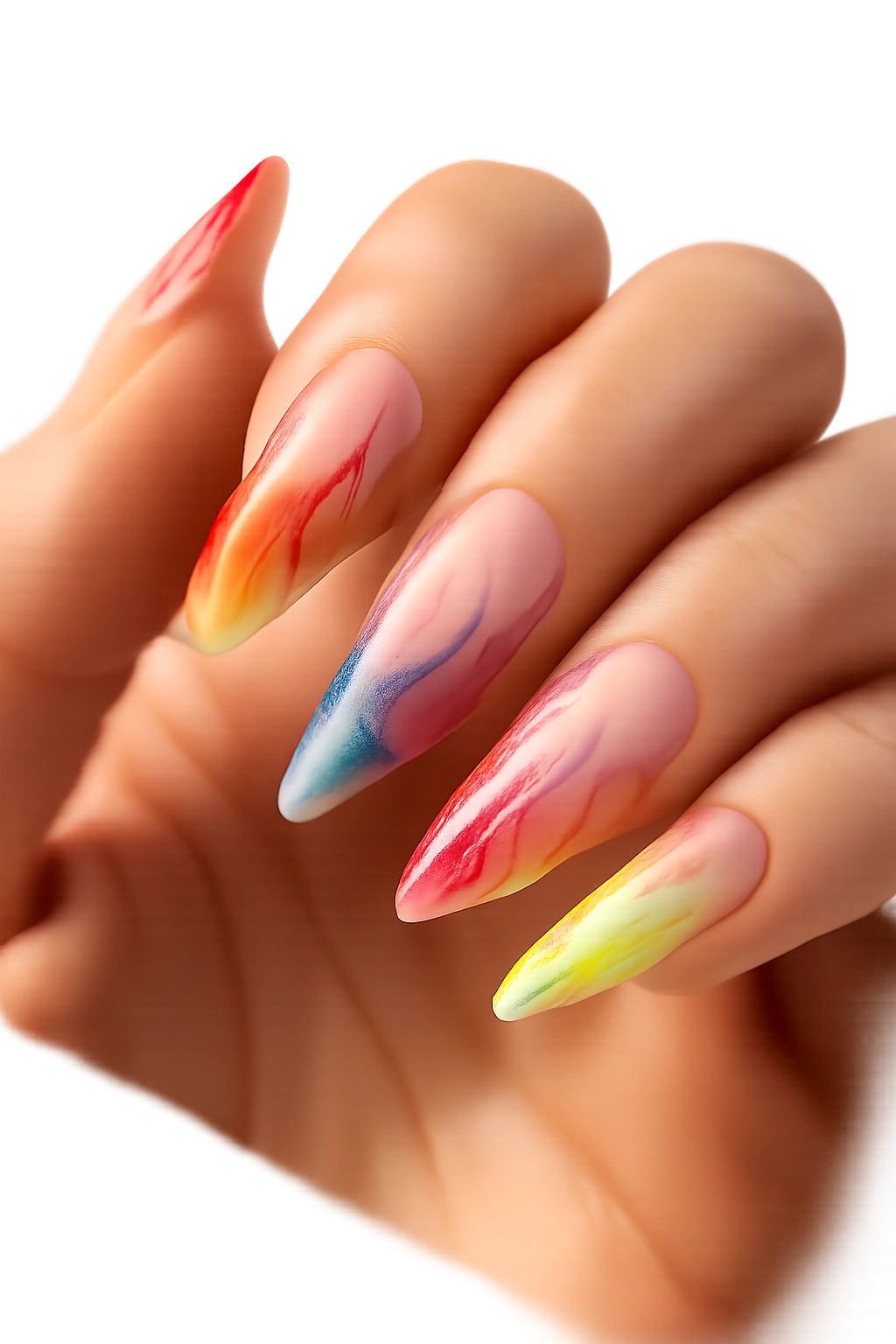
Flames still work.
They work best when the base stays clear or sheer and the color lives at the tip, where the ballerina edge gives each flame tongue a crisp starting point. Red, orange, pink, cobalt, lime—pick two or three tones and let them twist into each other rather than stacking five random shades on every nail.
The art needs contrast to read well. A transparent base gives you that. Full-coverage flames over a solid background can still look cool, though the negative space version feels cleaner and more graphic on this shape.
A few things make flame nails stronger:
- Keep the flames thin at the base and fuller near the tip
- Vary the height from nail to nail so the set doesn’t look stamped
- Use a fine liner brush for the inner curves
- Seal with gloss; matte kills the sense of motion
I like this design more on medium-long ballerina nails than on square tips because the taper makes the flames look like they’re actually moving. There’s enough attitude here already. Skip rhinestones. Skip decals. Let the lines do the job.
17. Raspberry Glitter Gradient
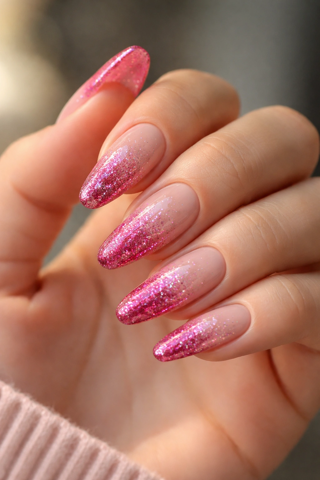
Unlike full-glitter nails, a raspberry gradient keeps the sparkle where movement already happens—near the tip. That placement matters. The hand catches light at the free edge first, so a fade feels more natural than wall-to-wall shimmer.
Start with a raspberry or berry-rose base, sheer or milky depending on how loud you want the final look. Then pack fine glitter heavily at the tip and pull it downward with a dry brush so the particles thin out through the middle of the nail. The cuticle area should stay mostly clean. That open space keeps the gradient airy.
Chunk size matters more than people think. Fine glitter gives a velvety fade. Larger hex glitter can work, though it often makes the transition look rough unless it’s layered over a fine base. If the goal is polished sparkle rather than craft-project sparkle, go finer.
This design wears well because any slight wear at the very tip gets hidden under the glitter density. Handy. It also grows out more gracefully than a glitter half-moon near the cuticle, which can look awkward fast.
Raspberry feels richer than pale pink, and the ballerina shape gives the shimmer a sharper ending point. Nice pairing.
18. Mint and Peach Checkerboard
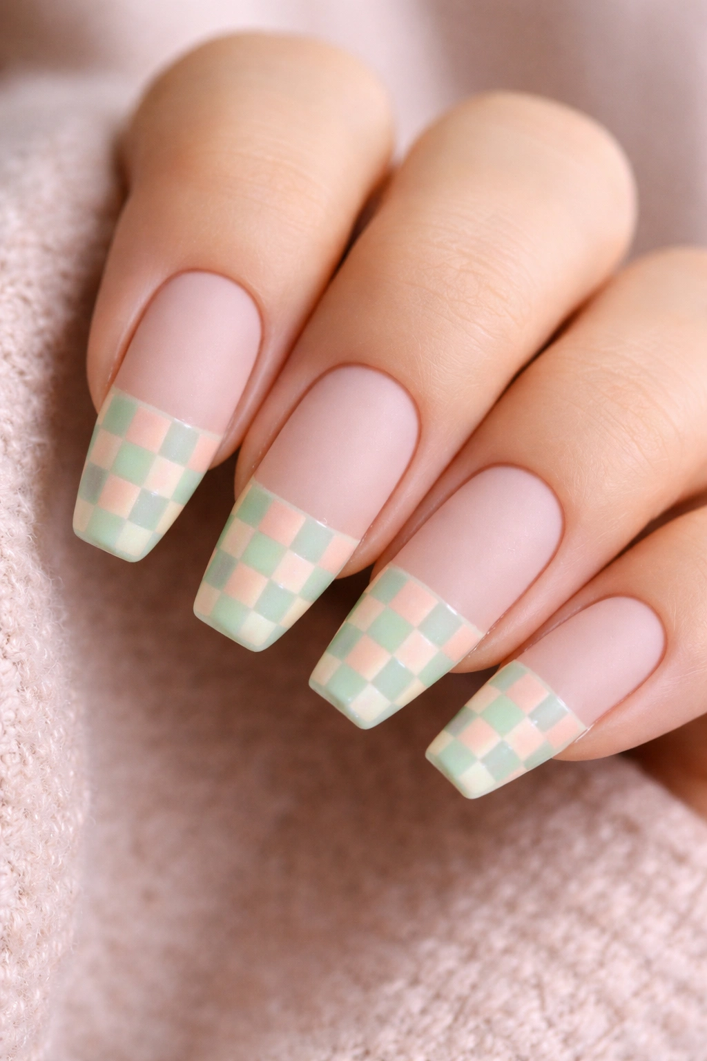
Checkerboard can look juvenile on the wrong shape. On ballerina nails, the square tip gives the pattern a reason to exist.
The secret is scale. Make the squares small enough to read as pattern, though not so tiny that they blur. On a medium ballerina nail, four columns by five rows is often enough. Mint and peach work because both shades are light, though neither disappears into the background. You get contrast without the harshness of black-and-white checks.
How to stop checkerboard from taking over
Use checkerboard on every nail if you love commitment. If you want a tighter set, put the pattern on two or three nails and keep the rest solid mint or peach. Another smart route is to run the checker only across the tip, almost like a race flag French.
Matte topcoat can make the design feel more editorial. Gloss gives it a brighter, almost vinyl look. I lean matte here because it tones down the sweetness of the color pair.
Straight lines matter. If your tech struggles with grid work, ask for the pattern to sit on accent nails only. One crooked row pulls attention fast. Done cleanly, though, this set has a retro snap that feels fresh on ballerina nails.
19. Sapphire Cat-Eye Nails With a Cobalt Shift
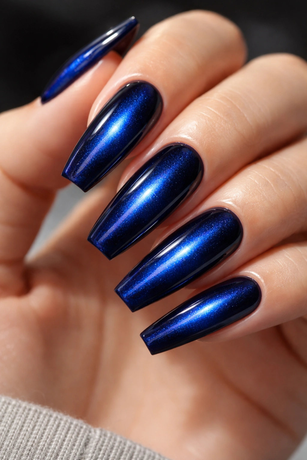
Tilt your hand once and sapphire cat-eye slides from deep navy to electric blue. That shifting stripe makes this design one of the richest ways to wear color without any painted art at all.
Cat-eye gel uses magnetic pigment suspended in polish. After the color goes on, a magnet is held above the nail for a few seconds to pull the particles into a line, wave, halo, or diagonal beam. On ballerina nails, a centered vertical stripe looks sleek, while a diagonal pull can make the nail look even longer.
If you want the effect to show up clearly, ask for these details:
- A dark blue or blackened sapphire base
- Magnetic hold for 3 to 5 seconds per nail before curing
- A smooth, glossy topcoat to sharpen the light line
- Medium or long length, where the shift has room to travel
There’s no need to add crystals or foil. Cat-eye polish already changes as you move, which gives the set enough life. I also like that it feels bold without relying on loud contrast. The drama comes from motion and depth, not from piling three techniques onto one nail.
This one looks expensive. Not flashy. Expensive.
20. Primary-Color Abstract Brushstrokes
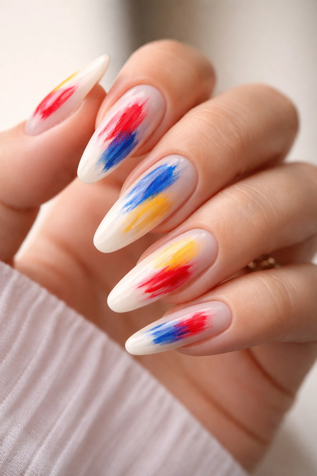
If matching sets make you itch, abstract brushstrokes in red, blue, and yellow are your way out. The design has structure, though it still leaves space for a hand-done feel.
Start with a milky white or sheer nude base. Then add one or two painterly strokes per nail—maybe a thick red slash near the tip, a cobalt curve hugging one sidewall, a short yellow swipe crossing the center. The trick is balance. Every nail should look related, not identical. Think edited chaos, not finger painting.
I’d keep the brushstrokes slightly textured at the edge instead of outlining them into cartoon precision. A little dry-brush drag gives the set more character. Ballerina nails help because the straight tip contains the loose art. Without that hard stop, abstract color can drift too soft.
You can thread in a thin black line on one or two nails if you want a stronger graphic finish. Gold leaf can work too, though sparingly. The core idea is still color and gesture.
This is one of those manicures that looks especially good in motion—holding keys, flipping pages, tapping a glass. A small piece of portable art, and yes, that sounds dramatic, but it’s true.
Final Thoughts
Ballerina nails reward decisiveness. Pick a color story, give it room, and let the shape do some of the work for you. A crisp cobalt tip, a jelly emerald wash, a slash of tangerine swirl, a checkerboard grid—each one lands harder on this silhouette because the structure is already built in.
If I had to narrow the field, I’d call out electric coral, cobalt micro-French, emerald jelly, sapphire cat-eye, and primary-color brushstrokes as the sets with the strongest mix of impact and wearability. They feel bold without looking confused.
Shorter length, longer length, matte, gloss, chrome, aura—the right choice comes down to how much attention you want your hands to pull. Some days you want one sharp line of blue at the tip. Other days you want hot pink mirror nails that do half the talking before you say a word.
