

Coffin nails have become the go-to shape for anyone who wants dramatic length with a sophisticated silhouette. Unlike traditional almond or stiletto shapes, the coffin cut—wide at the nail bed and tapered toward a flat, squared-off tip—creates an architectural canvas that’s perfect for bold color blocking and eye-catching designs. The key to making coffin nails truly pop is choosing bright colors that complement your skin tone while creating maximum visual impact.
The beauty of bright nail designs lies in their versatility. Whether you’re drawn to neon brights that practically glow under natural light, jewel tones that catch the sun, or high-gloss pastels with depth and dimension, the coffin shape amplifies whatever you choose. The broader surface area of coffin nails means you can work with bolder designs, wider stripes, and more intricate patterns than shorter nail shapes would allow. What might look overwhelming on a round or square nail reads as perfectly balanced on a coffin shape.
The challenge, though, is moving beyond the same tired designs you see everywhere. Most people stick with simple solid colors or basic French tips, missing the opportunity to create something that actually feels fresh and intentional. The right bright nail design should feel polished enough for work or special events, yet expressive enough to reflect your personality. It’s about finding that sweet spot between eye-catching and elegant.
Below are twenty bright coffin nail ideas that work beautifully on long nails—each one tested for wearability, longevity, and the kind of compliments that come with genuinely great nail art.
1. Electric Lime with Chrome Silver Accent
This combination works because of the pure contrast between a almost-neon lime green and a mirror-finish chrome silver that catches light from every angle. The lime should cover three nails, while the fourth accent nail gets the chrome treatment with a thin lime striping detail down the center. The chrome creates a modern, almost futuristic feel that prevents the lime from reading as juvenile.
Why This Design Stands Out
The electric lime has staying power because it works across multiple skin tones—cool undertones see it as crisp and sharp, while warmer undertones get a softer, almost tropical vibe. Chrome finishes don’t require fussy application; you use a special powder that adheres to wet topcoat, meaning there’s minimal skill barrier to getting a professional result. This design reads equally well for casual or elevated settings because of how polished the chrome looks.
How to Get the Best Results
- Start with a quality base coat and two thin layers of the lime green polish rather than one thick coat, which prevents streaking
- The chrome powder works only on wet topcoat, so apply topcoat to your accent nail and press the powder in with a fluffy brush immediately—any delay and the powder won’t adhere properly
- Seal everything with a glossy topcoat to lock in the chrome and give the lime maximum shine
- The lime-to-chrome ratio matters; make sure the chrome stripe is proportional rather than overwhelming the bright green background
Pro tip: If you’re applying chrome powder for the first time, practice on a test nail or your non-dominant hand first—the timing window is genuinely narrow.
2. Hot Pink with Holographic Glitter Gradient
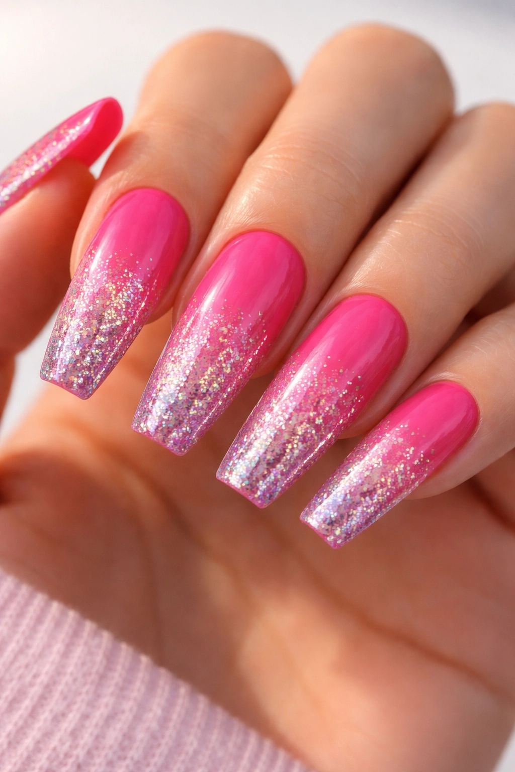
Start with a true hot pink base (not too blue, not too coral—somewhere in the middle) and layer it with a holographic glitter that goes from dense coverage at the tip to sparse scattered glitter toward the nail bed. This gradient creates depth and the holographic sparkle catches rainbow light from every angle. The effect is bold enough to feel intentional, delicate enough to work with professional settings.
What Makes It Different
Holographic glitters have evolved dramatically over the last several years; modern formulas include extremely fine pigments that create actual rainbow refraction rather than just colored sparkle. The hot pink base matters because it’s bright enough to stand on its own but warm enough that it doesn’t compete with the rainbow glitter for attention. You’re creating a visual hierarchy where the pink is the statement and the holographic shimmer is the supporting detail.
Application Tips for Perfect Results
- Use a gel base if you want the design to last three weeks without chipping; this design shows wear faster with regular polish because the glitter edges get worn first
- Apply the glitter while the pink base is still slightly tacky, not completely wet—this helps you control exactly where it lands
- Use a damp nail brush to adjust glitter placement before it sets; this level of control makes the gradient look intentional rather than random
- Seal with a glitter-friendly topcoat that doesn’t shrink back from the edges as it cures
Worth knowing: Holographic glitter can look completely different in daylight versus indoor lighting—test your design in multiple light sources before committing to the full set.
3. Coral Orange with White Geometric Blocks
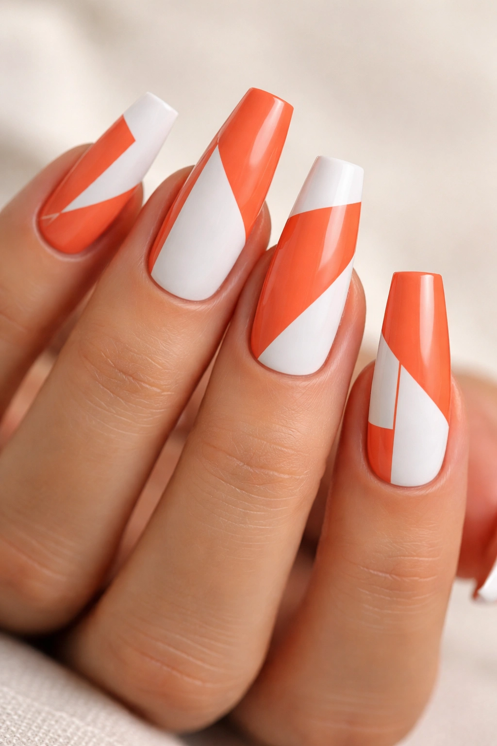
Geometric designs on coffin nails need to respect the shape rather than fight it. Here, a bright coral-orange base gets white geometric block patterns—squares, rectangles, and clean lines arranged asymmetrically across the nails. Some nails have a single block, others have multiple, creating visual movement without feeling chaotic. The white should be bright and opaque to create true contrast against the coral.
The Geometric Advantage
White on coral creates pure color contrast, which means the design reads clearly even from a distance. The geometric shapes complement the architectural nature of the coffin shape itself; you’re echoing the shape’s clean lines in your design. This isn’t a delicate design—it’s bold and modern and reads instantly as intentional.
How to Execute Without Shaky Lines
- Use white nail art polish, not regular polish, because it’s formulated for tighter brush control and opaque coverage in one coat
- A thin striping brush or nail art pen gives you more control than a standard polish brush; invest in the right tool and the execution becomes significantly easier
- Tape off your geometric shapes with thin painter’s tape for perfectly clean edges, or use a dotting tool for circular shapes within the design
- Build confidence by practicing your design on a nail wheel first, not directly on your nails
Insider note: If your geometric lines aren’t perfect, they honestly look better slightly imperfect—perfectly geometric lines can read as cold, while slightly organic geometry feels intentional and human.
4. Sunshine Yellow with Black Cat-Eye Effect
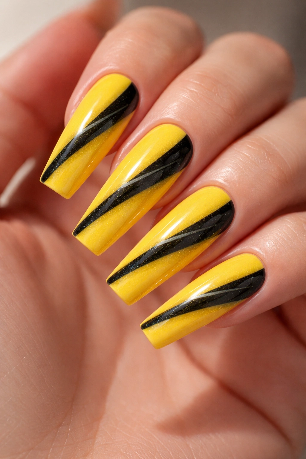
A true sunshine yellow (not mustard, not pale) paired with a black cat-eye stripe creates maximum contrast and maximum drama. The cat-eye effect uses a special magnetic polish that creates a thin, vertical light-catching line when a magnet is held above the nail during the final seconds of cure time. The effect looks like a cat’s eye opening, which is why it’s called cat-eye. Place the black cat-eye on yellow for a design that reads as both playful and sophisticated.
Why Cat-Eye Polish Creates Impact
The cat-eye effect works because it adds dimension and movement to a solid-color base. It’s not confetti glitter that can read as chaotic; it’s a single intentional line that draws the eye. On yellow, the black line creates a jewelry-like quality that elevates what could otherwise be a fun but simple manicure. The effect catches light and movement, making your nails feel alive.
Getting Cat-Eye Polish to Work Properly
- Cat-eye polish is thicker than regular polish and requires careful application; use thin coats and let each one set completely between coats
- The magnetic stick must be held parallel to the nail surface and about a quarter-inch away; hold it too close and you’ll drag the polish, too far and the effect disappears
- Practice on your non-dominant hand first—the timing of moving the magnet away before topcoat cure takes a few tries to perfect
- Use a gel base under cat-eye polish for better adhesion and longevity, as the magnetic properties can sometimes cause regular polish to lift
Important detail: Always allow the black cat-eye coat to be almost completely set before applying the final topcoat—if you seal too early, the magnetic effect becomes muted.
5. Vibrant Teal with Gold Foil Leaf Details
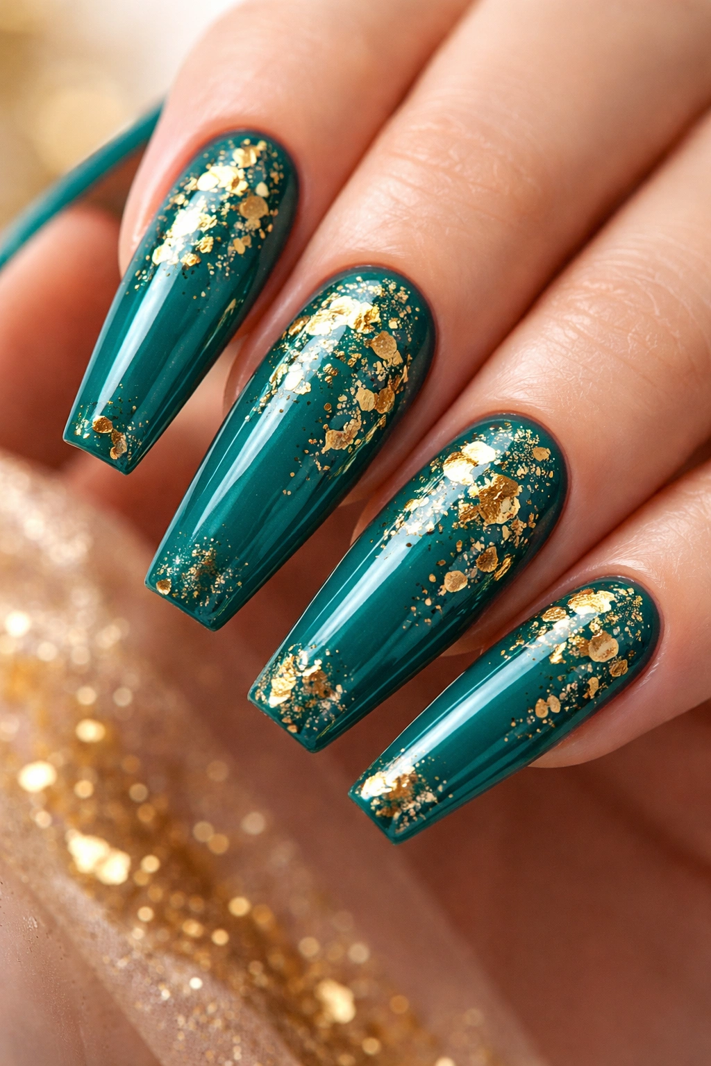
Teal sits in that perfect spot between blue and green, making it work for nearly every skin tone. Pair it with gold foil leaf details scattered across the nail surface—not a full coverage of foil, but strategic placement that creates visual interest. The gold foil catches light and creates a textured, dimensional quality that makes the teal feel more luxe than a simple solid manicure.
The Color Theory Behind Teal and Gold
Teal and gold is a classically elegant pairing that reads both modern and timeless. The teal is bright enough to feel contemporary, while gold adds warmth and richness. This combination works equally well for day wear and evening events because neither color screams any particular occasion. The foil adds luxury without being over-the-top, which is why this pairing has remained popular across multiple seasons and trends.
How to Apply Gold Foil Successfully
- Gold foil comes in small sheets or broken pieces; pieces work better for scattered accent designs because full sheets are harder to control on curved nail surfaces
- Apply foil to wet, sticky topcoat (sometimes called sticky gel or a special foil base)—this is the only adhesive that works reliably
- Press foil down gently and lift away; the foil will stick to the wet topcoat and the backing will come free
- Seal everything with a topcoat after foil is placed; this protects the foil and prevents it from lifting or peeling at the edges
Pro insight: The key to foil looking intentional rather than random is grouping the pieces in asymmetrical clusters rather than spreading them evenly across all nails.
6. Neon Orange with Reverse Ombre Effect
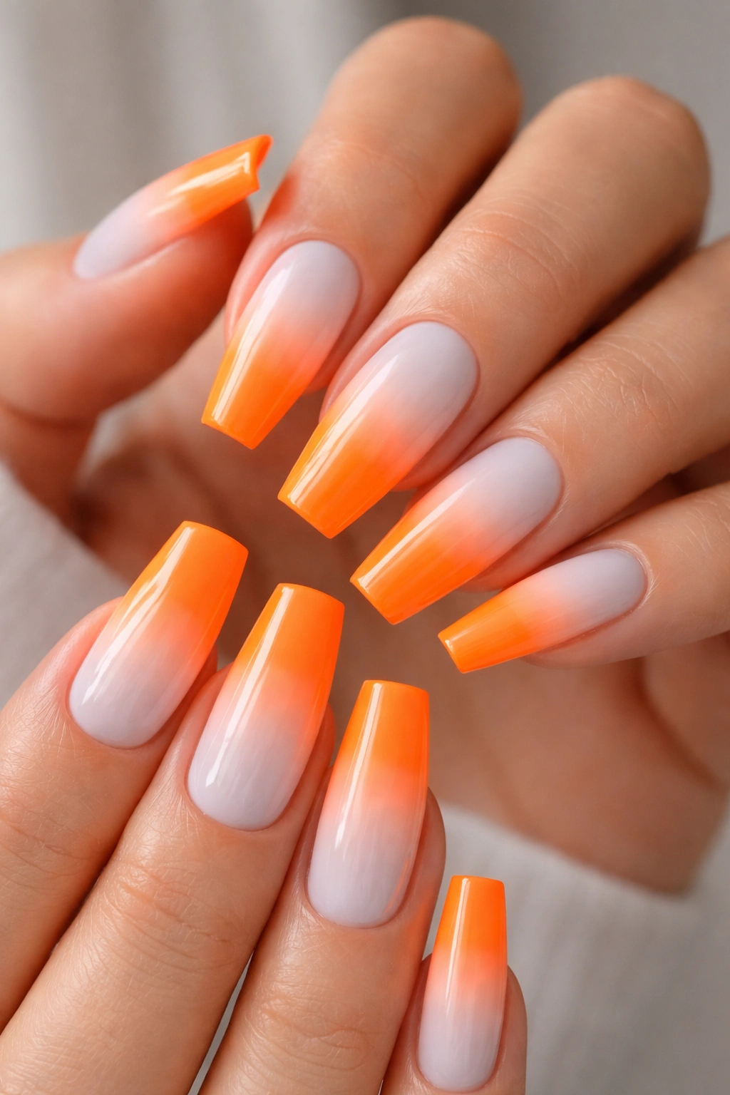
Reverse ombre flips the traditional gradient; instead of going from dark to light, it goes from light to dark. Start with white at the base and gradient into neon orange at the tips. This creates a unique visual flow and makes the orange appear even brighter because of the white’s contrast. The neon orange should be the actual accent here, not the white—the white is just the foundation that makes the orange pop.
Creating a Seamless Ombre Blend
Ombre requires a sponge to blend two polishes into each other; the blending is what creates the gradient rather than a harsh color line. The neon orange needs to be opaque enough to show up in one layer, but thin enough to blend smoothly. Practice your ombre technique on a nail wheel several times before applying to actual nails; this is the part that separates polished results from splotchy ones.
The Right Tool and Technique Matter
- Use a small makeup sponge or nail-specific sponge; stipple (don’t swipe) the sponge across the color line to blend
- Apply more topcoat than usual to an ombre manicure because the blending step can remove some polish thickness
- Let each ombre fade fully before sealing; if the ombre looks wet or glossy before topcoat, it hasn’t set properly
- The gradient should be gradual rather than sudden—if the color transition happens too quickly, it looks like a stripe rather than an ombre
Remember: The sponging motion is up-and-down stippling, never swirling—swirling creates mud instead of blend.
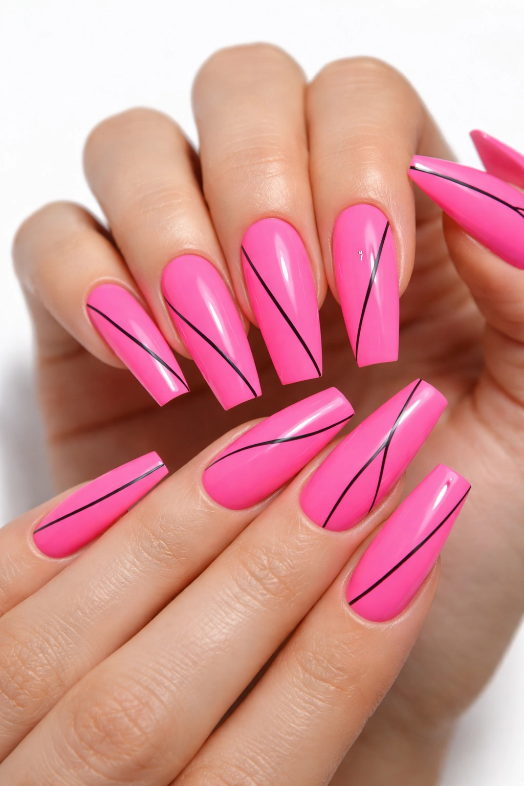
7. Bright Magenta with Negative Space Geometric Pattern
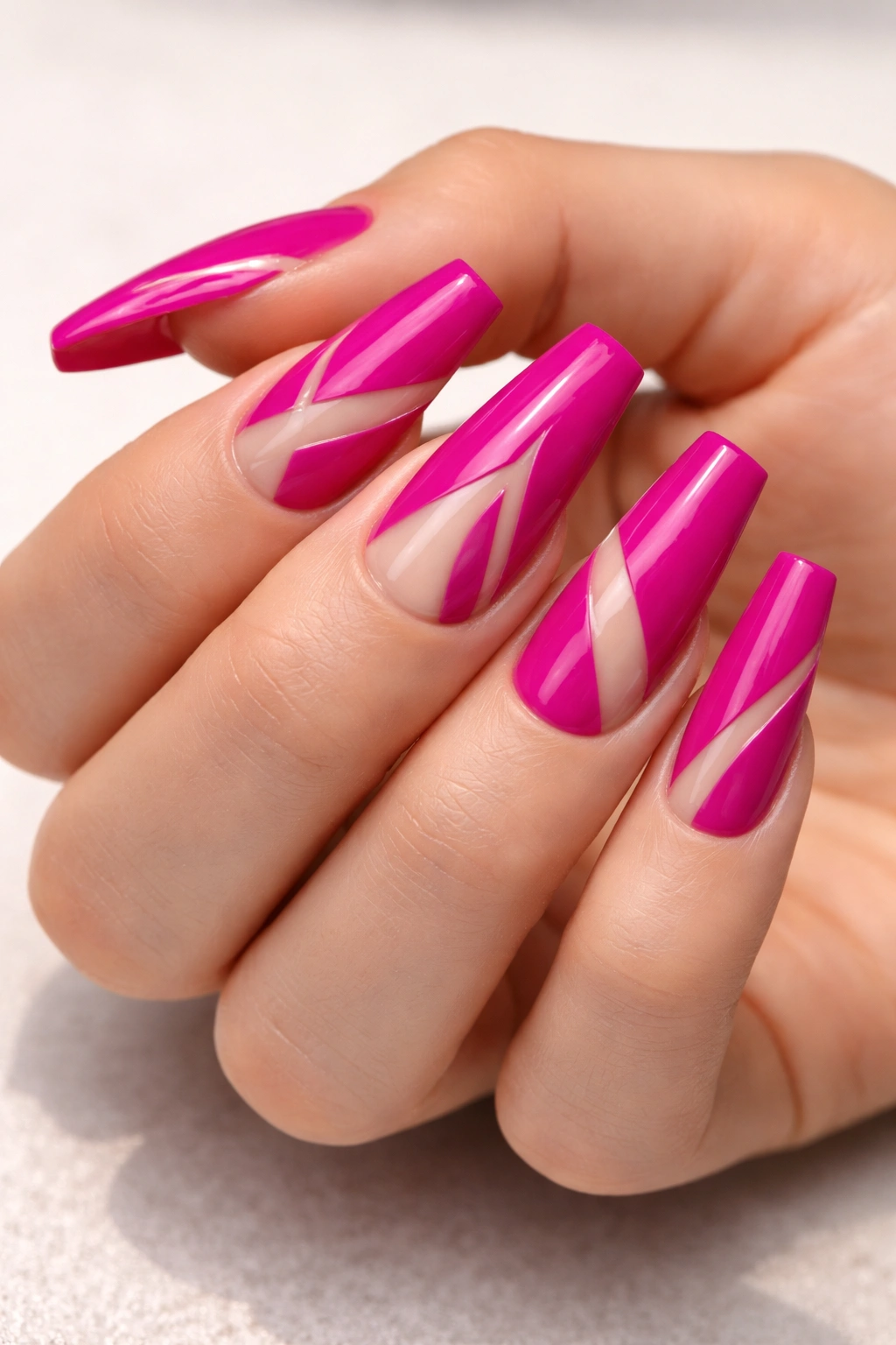
Negative space designs leave portions of the nail bare (showing the natural nail underneath or a base coat) to create the pattern rather than using polish. For bright magenta, a clean geometric negative space pattern looks particularly striking. Think triangles, stripes, or abstract shapes that break up the magenta and create visual interest through absence rather than addition. This approach is sophisticated and feels intentional in a way that many magenta designs don’t.
Why Negative Space Feels Elevated
Negative space designs read as more modern and refined because they require intention and planning—you’re removing elements rather than adding them. With such a bright color as magenta, the negative space gives the eye a resting point while still maintaining the brightness. The design feels less busy than it would if you covered every millimeter with pattern.
Creating Clean Negative Space Lines
- Use painter’s tape to mask off your negative space areas before applying magenta; this creates perfectly clean edges
- Apply magenta in thin, even coats—thick coats look less refined and can bubble under tape
- Remove tape while the polish is still tacky (not completely dry) to prevent tearing or lifting
- If the polish seeps slightly under the tape, you can clean it up with a thin brush and rubbing alcohol before it fully sets
Styling note: Negative space designs look better when the bare areas align with the coffin shape’s proportions—vertical negative space often looks better than horizontal on this nail shape.
8. Electric Purple with Silver Mirror Chrome Tips
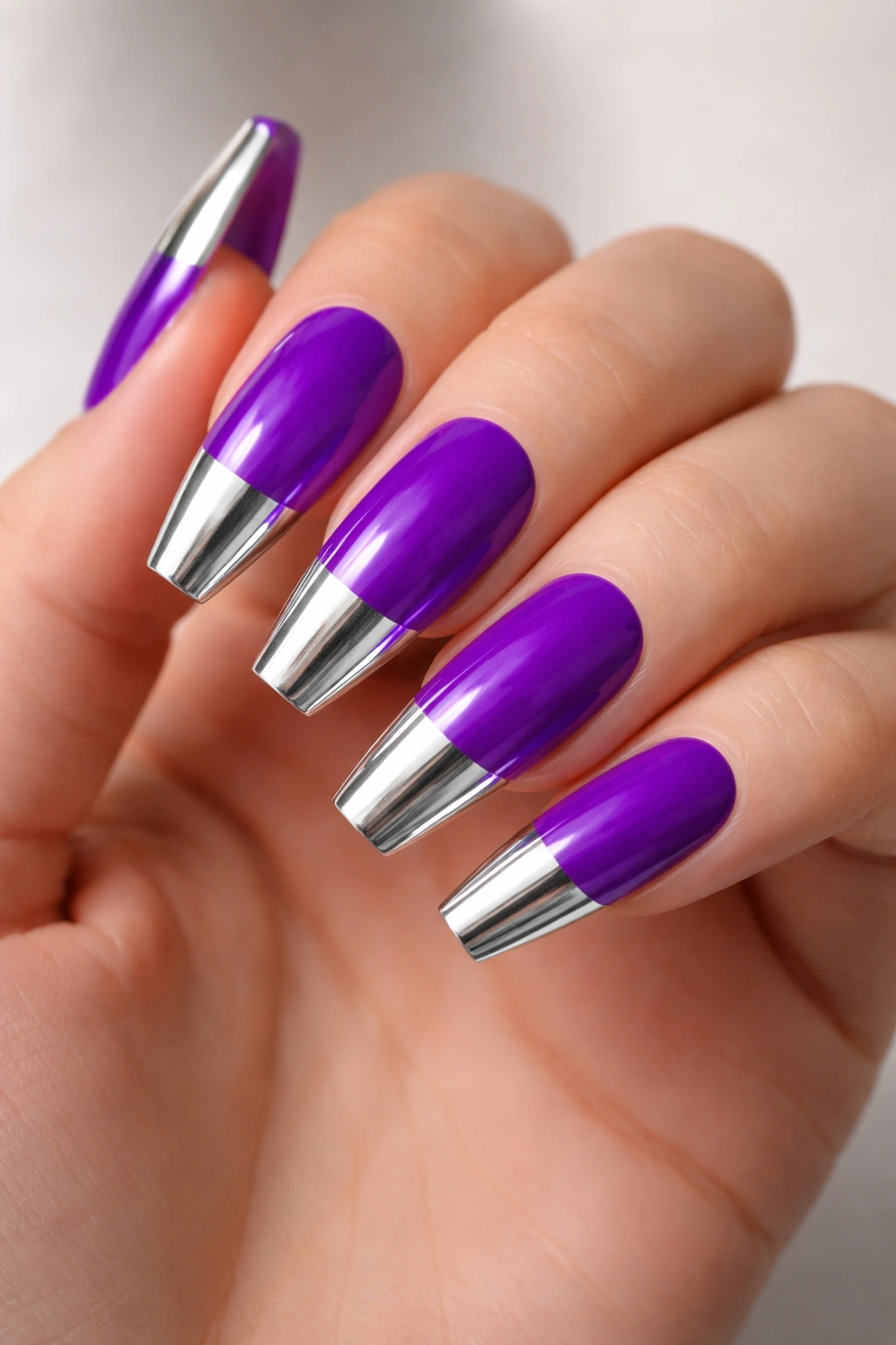
Electric purple is bold, powerful, and demands to be noticed. Pair it with chrome silver tips—just the top third of each nail in mirror-finish chrome. The contrast between the matte or semi-matte purple and the highly reflective chrome creates visual drama and sophistication simultaneously. This design reads as editorial and fashion-forward without trying too hard.
The Power of Purple in Nail Design
Purple occupies a special place in color psychology—it’s creative, confident, and unexpected without being as attention-demanding as hot pink or neon green. Electric purple specifically has an almost iridescent quality that seems to shift depending on the light, which means the manicure stays interesting every time you look at it. Adding chrome tips takes the design from bold to truly editorial.
Applying Chrome to Purple Successfully
- Purple can sometimes be porous and absorb topcoat unevenly; use a particularly thick topcoat or a special chrome base under the powder
- The chrome powder adheres only to wet topcoat, so apply topcoat to just the tip area and immediately press in the powder
- Work in small sections if you have a full set; apply topcoat to one or two nails at a time and add powder before moving to the next nails
- The transition from purple to chrome should be relatively clean; aim for the chrome to start around the halfway point of the nail
Pro tip: Allow at least 24 hours before getting your hands wet if you want the chrome to last; early water exposure can cause the powder to lose its reflective quality.
9. Acid Lime with Black Drip Design
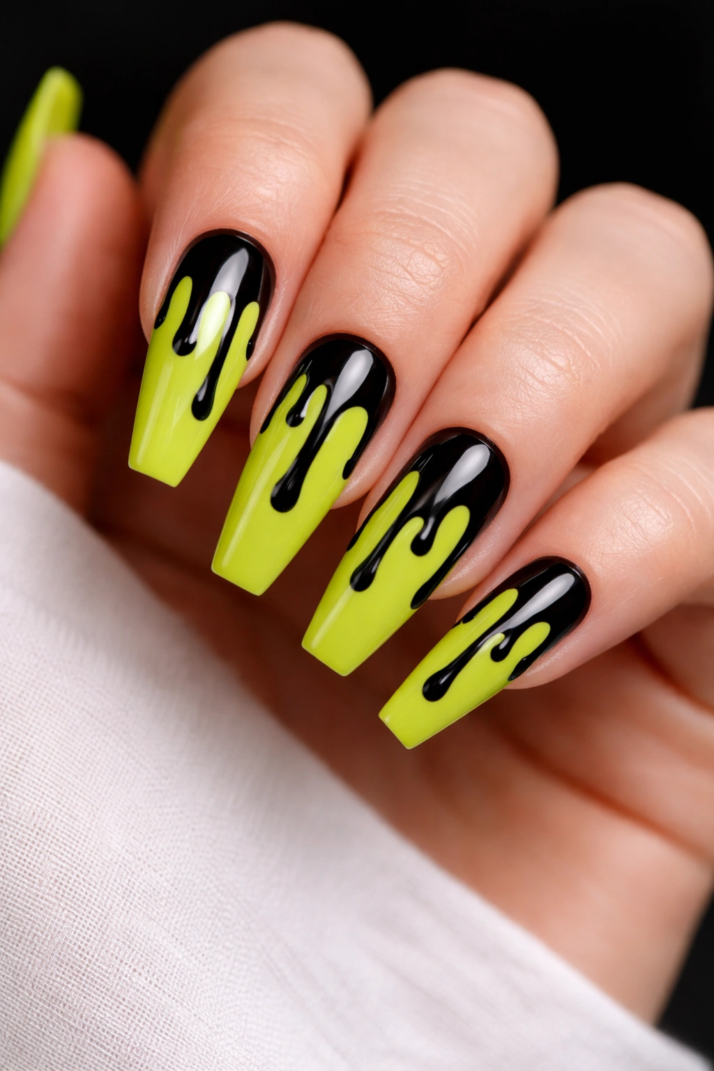
A drip design is exactly what it sounds like—a pattern that looks like something is dripping down the nail. For acid lime, paint the nails in the bright color, then use black polish to create a drip pattern from the top edge of the nail downward. The drips should be uneven and organic-looking, not perfectly symmetrical. This design is eye-catching and contemporary without being overly complicated.
Making Drips Look Intentional
Drips work best when they vary in width and length—some should reach the nail tip, others should stop partway down. This asymmetry is what makes the design look intentional and artistic rather than accidental or sloppy. The acid lime needs to be fully set before you apply the black drips, or the colors will muddy together.
Tools and Approach for Drip Designs
- A thin striping brush or nail art pen works better than a standard brush for creating controlled drips
- Paint your drip freehand rather than using tape; the slightly organic quality of freehand is what makes drips look good
- Start at the top edge and drag downward, lifting the brush slightly to create the drip effect rather than a solid line
- You can use a topcoat with gloss on the lime and matte topcoat just on the black drips for added dimensional contrast
Design insight: Odd numbers of drips (three or five per nail) tend to look more balanced than even numbers on long nails.
10. Coral Pink with Holographic Striped Detail
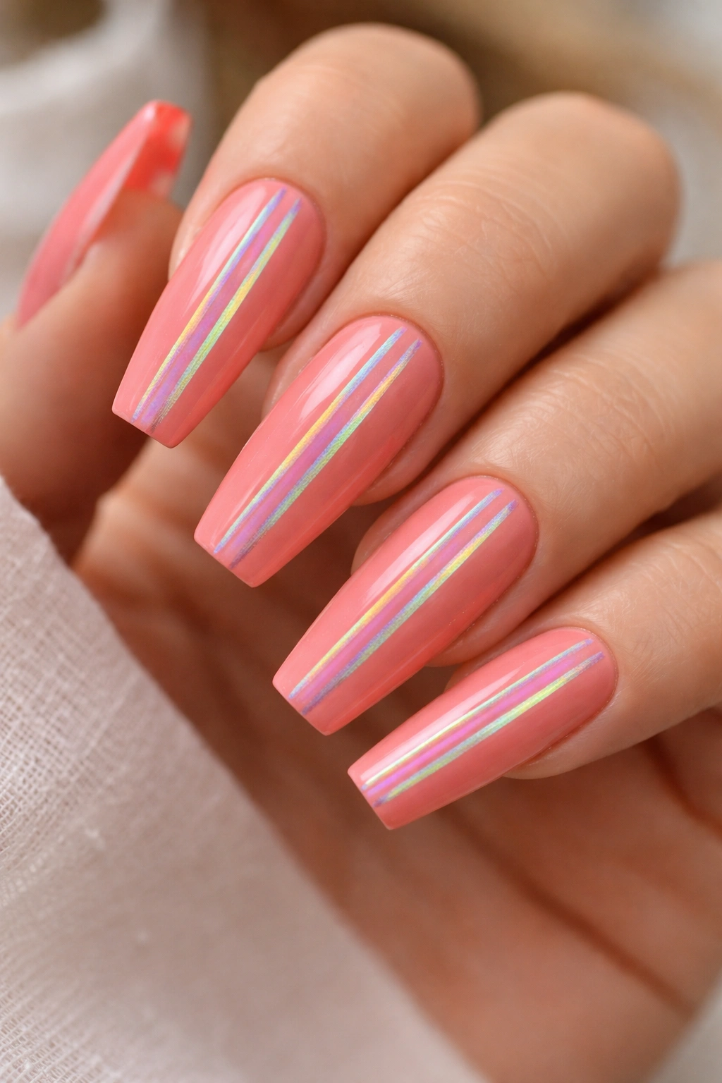
Coral pink is versatile enough to feel fresh in almost any design. For this approach, the entire nail is coral pink, but thin holographic stripes run vertically down the nail. The stripes should be thin and evenly spaced, creating a subtle but sophisticated pattern. Holographic stripes catch light and add movement to what would otherwise be a simple solid manicure.
Holographic Stripes Versus Full Coverage Glitter
Striped holographic designs are more refined than full glitter coverage because they maintain the clarity of the base color while adding visual interest. The coral pink remains the primary statement while the holographic stripes support it. This balance is what makes the design work for both casual and dressier occasions.
Creating Even Holographic Stripes
- Use a thin striping brush to apply holographic polish or foil stripes; regular polish application creates thicker stripes that can look clunky
- Space your stripes evenly by using painter’s tape as a guide; apply tape, paint your stripe in the gap, remove tape
- Alternatively, use holographic nail art pens which give you more control over stripe width and spacing
- The stripes should complement rather than compete with the coral pink base, so keep them relatively thin
Important note: Some holographic polishes are thicker and need to be applied to topcoat rather than directly to the base color for best results—check the formula before you start.
11. Sunshine Yellow with Ombré Purple Tips
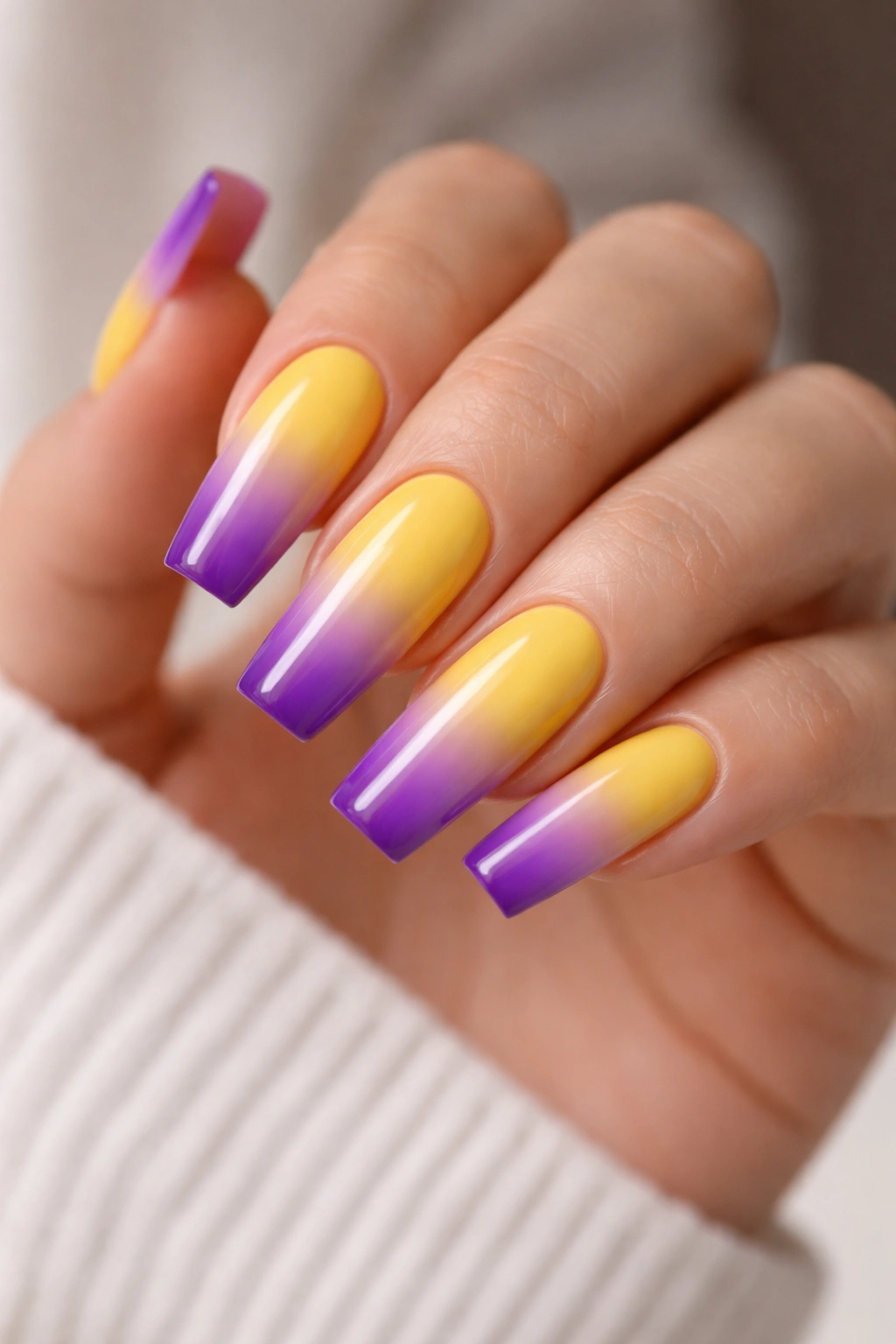
This design plays with unexpected color combinations by pairing warm sunshine yellow with cool purple. The yellow covers the nail beds and portion of the nails toward the base, while the tips gradient into purple. The transition should be gradual and blended, creating a harmonious gradient despite the colors being opposite on the color wheel. The result feels sophisticated and intentional rather than accidental.
Color Theory in Ombré Nail Design
Yellow and purple are complementary colors, which means they naturally create contrast and interest when placed next to each other. By making them gradient into each other rather than sitting as solid blocks, you’re creating visual harmony between the contrast. The ombré blend softens what could otherwise be too stark a color shift, making the design feel polished rather than experimental.
Blending Warm to Cool Tones Successfully
- Start with your yellow base and let it set completely before attempting the ombré
- Sponge the purple on gradually, allowing several swipes to build up the purple’s intensity rather than applying it all at once
- The blend zone should be roughly in the middle to upper-middle of the nail; this placement looks balanced on coffin shapes
- Use a sponge with a fine texture rather than a coarse one—coarse sponges create a speckled look rather than a smooth blend
Tip: If the ombré looks muddy or brownish in the blend zone, you may be over-blending; a light touch creates cleaner results than heavy pressure.
12. Hot Lime with 3D Gold Ball Accents
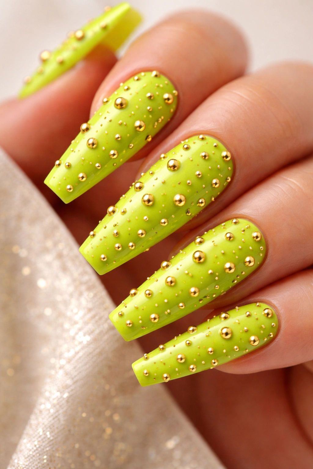
Three-dimensional details elevate nail art from flat design into miniature sculpture. For hot lime nails, tiny gold balls (created using special 3D nail gel and small ball tools) placed strategically across the nails create unexpected texture and luxury. These aren’t flat gold elements—they’re actual dimensional bumps that you can feel when you run your finger across your nails. The effect is eye-catching and conversation-starting.
The 3D Nail Art Process
3D nail design requires special materials—typically UV gel base, colored gel, and either pre-made 3D elements or the ability to create raised shapes using special techniques. The gold balls are created by applying small drops of thick gel and allowing them to cure, then potentially painting or coating them with gold foil. The result looks almost like tiny jewelry adhered to your nails.
Creating Durable 3D Elements
- 3D elements last longest when created entirely from gel rather than mixing gel and acrylic; acrylic can sometimes crack or lift
- The gold balls should be placed away from the tip edge where they’re less likely to get knocked or caught
- Seal the 3D elements thoroughly with topcoat to prevent lifting
- Avoid sleeping on your hands or putting pressure directly on the 3D elements, which can cause them to pop or break
Reality check: 3D nail elements are stunning but require more care and maintenance than flat designs; be honest about whether you’ll treat them carefully enough to make them last.
13. Neon Pink with Minimalist Black Line Art
Sometimes the boldest design statement is achieved through minimalism. A neon pink base with a single thin black line creating abstract line art—perhaps a minimalist face, a geometric shape, or an organic curved line—creates an elegant manicure that proves you don’t need complexity to create impact. The line should be thin, controlled, and intentional.
Why Minimalism Works with Bright Colors
Neon colors naturally draw attention, so adding busy patterns on top creates visual overload. By pairing the neon pink with a single thoughtful line element, you’re letting the color be the primary statement while adding just enough design interest to feel intentional. This approach is particularly effective on coffin nails, where the broader surface area can handle the brightness without feeling overwhelming.
Executing Minimalist Line Art
- Use a thin brush or nail art pen for precise control over your lines
- Practice your line design on paper first, or sketch it lightly on the nail with a pencil eraser before committing with polish
- Thin lines show any shakiness or imperfection, so either invest in the right tools or accept that slight organic variation is part of the charm
- A matte topcoat on just the black lines while keeping the pink glossy creates dimensional contrast
Design philosophy: In minimalist nail art, every element should have purpose—there’s no room for filler, so choose your line design carefully.
14. Vibrant Tangerine with Sunset Ombré Gradient
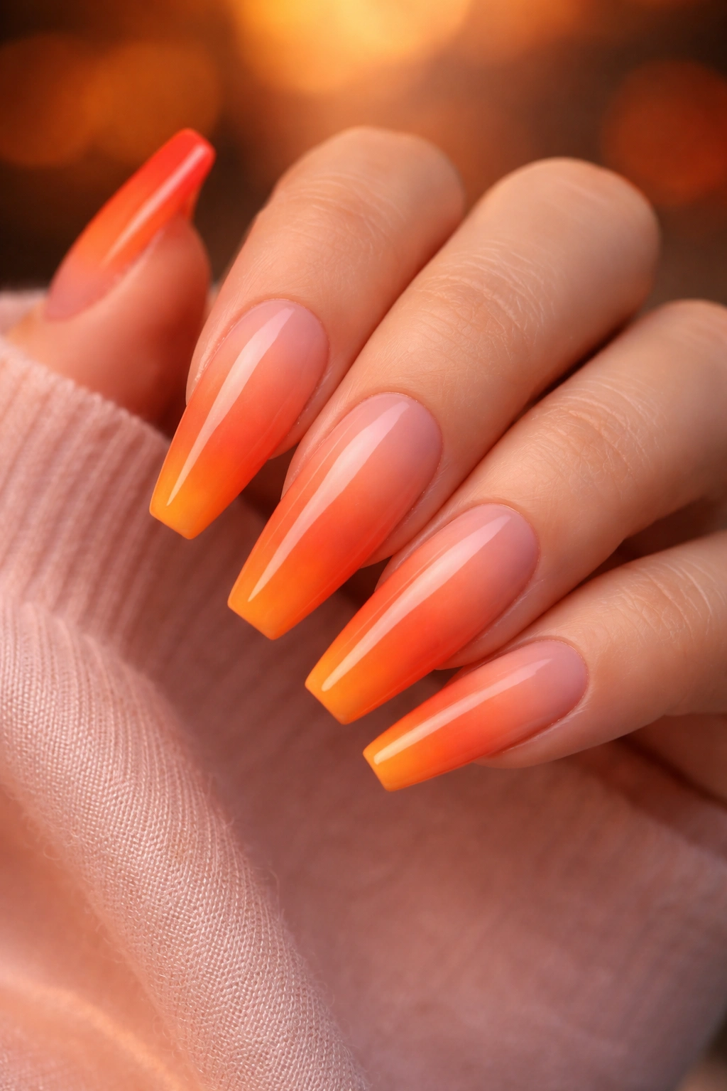
A sunset ombré moves from vibrant tangerine at the tips through coral and peachy orange tones as it transitions toward the nail bed. The effect mimics an actual sunset and creates color harmony because all the colors are within the warm family. The ombré should be subtle rather than dramatic, with each color transitioning gently into the next. The result feels warm, glowing, and luxurious.
Creating a Multi-Color Ombré
Multi-color ombré is more complex than two-color ombré because you’re blending three or more colors rather than just two. The key is using colors that naturally sit next to each other on the color wheel so the transitions feel organic. Starting with the darkest or brightest color at the tips and working toward lighter or softer tones as you move toward the base creates visual balance.
Technique for Sunset Gradients
- Organize your colors in the order they’ll appear on the nail before you start applying anything
- Use separate sections of your sponge for each color to prevent muddy blending
- Let each color layer set slightly before applying the next color to maintain color clarity
- Apply more topcoat than usual because the blending process removes some polish from the nails
Key insight: The sponge should slightly overlap each color into the next, creating a blend zone rather than clear color lines.
15. Electric Blue with White Polka Dot Pattern
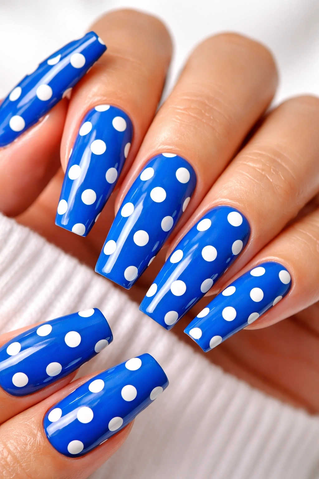
Sometimes the most impactful design is one of the simplest. Electric blue nails with crisp white polka dots creates playfulness, polish, and personality all at once. The dots should be evenly spaced and consistent in size, creating a pattern that feels intentional rather than random. The high contrast between electric blue and white ensures the design reads clearly from any distance.
The Polka Dot Advantage
Polka dots work on almost any nail shape and with almost any bright color. The pattern is universally recognized as cheerful and intentional, yet sophisticated enough to work professionally. On electric blue, white polka dots create maximum contrast, ensuring the design is visible and impactful. This is a design that works equally well on a nurse, an accountant, or an artist.
Tools for Perfect Polka Dots
- A dotting tool (a small metal stick with a rounded ball at the end) creates consistent dots much better than brushes
- Dip the dotting tool into white polish and press firmly onto the nail; the pressure creates a dot that’s size-consistent
- Practice your dot size and spacing on a nail wheel before committing to your actual nails
- A matte topcoat on just the blue background with gloss on the white dots creates dimensional contrast
Pro tip: If your dots aren’t perfectly round, that’s actually okay—slightly organic polka dots feel more handmade and artistic than robotically perfect dots.
16. Hot Orange with Black and White Geometric Color Block
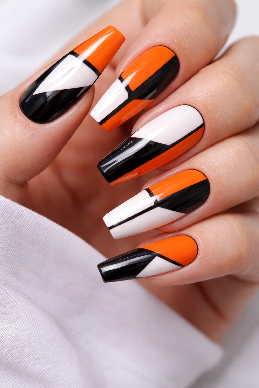
Geometric color-blocking on hot orange creates a modern, sophisticated look that feels architectural and intentional. Divide each nail into sections using clean black lines, then fill sections with black, white, or the orange itself, creating an abstract pattern. The geometry should be balanced across the nails but not identical on each one—asymmetrical balance feels more contemporary than perfect symmetry.
Color-Blocking Principles
Color-blocking works because the clean lines and solid colors create visual clarity. There’s no confusion about where one color ends and another begins. On hot orange, using both black and white as secondary colors prevents the design from feeling monotonous while the black and white contrast with the warmth of the orange.
Creating Clean Geometric Blocks
- Use painter’s tape to create your geometric pattern before applying any polish; this ensures perfectly clean lines
- Apply dark colors first, then remove some tape and apply lighter colors, then remove remaining tape for the orange
- Work one nail at a time if you’re using tape; managing tape across a full set is complex
- Alternatively, use a thin brush or striping tool to hand-paint clean lines—this takes practice but offers more flexibility
Design variation: Try making the geometric pattern asymmetrical; have some nails with lots of blocks and others with minimal blocks for visual variety.
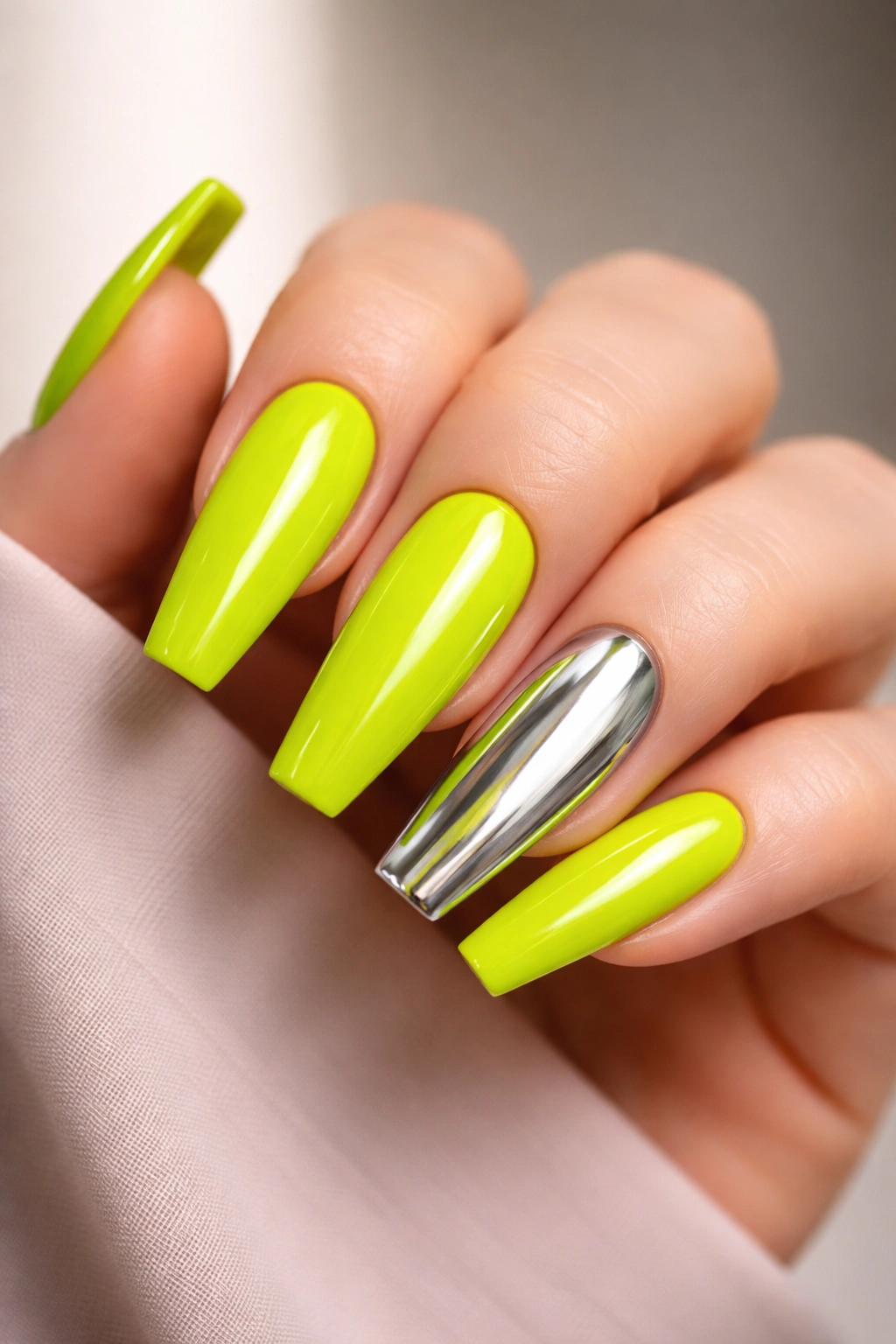
17. Neon Yellow with Glitter Ombré to Clear
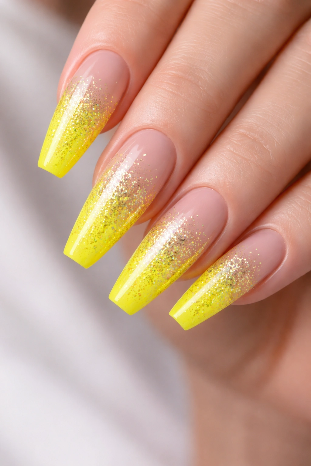
Neon yellow is bold on its own, but pair it with a glitter ombré that fades from dense glitter coverage at the tips to sparse or no glitter toward the base, and you’ve created something genuinely eye-catching. The glitter should be fine and sparkly rather than chunky; fine glitter makes the design feel more refined. The gradient from glitter to clear creates dimensionality and makes the yellow feel like it’s glowing.
Glitter Ombré Technique
Glitter ombré requires applying glitter to wet topcoat (not directly to the polish base) and building up density gradually. Start with just a few glitter pieces near the tip, add more as you move toward mid-nail, then transition to sparse glitter and finally clear. The ombré should be gradual enough that it feels intentional rather than like you’re running out of glitter.
Applying Glitter for Dimensional Effect
- Apply your neon yellow base and let it set completely before adding topcoat
- Brush a thin layer of topcoat across the entire nail, then sprinkle glitter into just the tip area while topcoat is still wet
- Add topcoat to mid-nail area and sprinkle glitter more sparsely, then seal with final topcoat
- Use a thin brush to distribute glitter slightly if it lands in clumps, or leave clumps as texture for added dimension
Styling insight: Fine iridescent glitter shows more dimension than colored glitter when paired with a bright neon base.
18. Bright Coral with Negative Space Triangle Accent
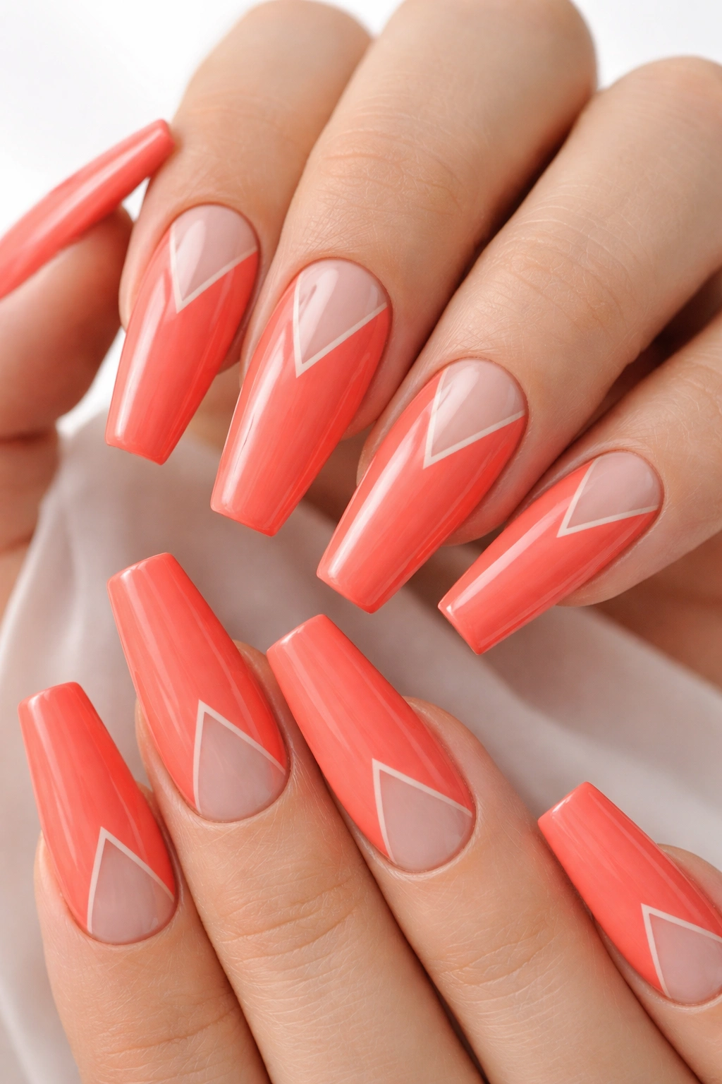
A bright coral base with strategically placed negative space triangles creates a modern, geometric aesthetic. The triangles should be clean and proportional, positioned across the nails in asymmetrical clusters. The negative space reveals either the natural nail underneath (if you’re doing natural-nail manicures) or a neutral base color underneath the coral. The effect is sophisticated and intentional.
Geometric Negative Space Strategy
Negative space designs on bright colors work best when the negative areas create actual visual contrast rather than blending into the background. Coral is warm and bright, so if you’re using a pink or nude base underneath, the contrast creates visual interest. The triangles should feel like they’re revealing something intentional rather than looking like design accidents.
Creating Perfect Triangle Negative Space
- Map out your triangle placement on the nails with a pencil eraser or light pencil before applying any polish
- Use small triangle stencils or painter’s tape cut into triangles to create perfectly clean edges
- Apply your coral base first, then remove tape to reveal the triangles
- Alternatively, apply coral to the full nail, then use a precise tool to carefully remove polish from triangle areas before it fully sets
Remember: Negative space only reads clearly if the polish beneath is completely different from the coral—avoid murky base colors that blur the design.
19. Lime Green with Gold Metallic Brush Stroke Details
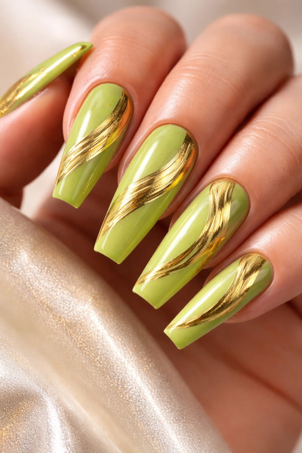
Gold brush strokes painted across lime green nails create an artistic, almost painted-by-hand aesthetic. The brush strokes should be organic and flowing rather than rigid—they’re meant to look like actual brushwork, not geometric patterns. The gold should be a true metallic gold that catches light, creating shine and dimension against the bright green. The overall effect is luxe and artistic.
Brush Stroke Design Philosophy
Brush stroke designs work because they acknowledge that nail art is actually art—there’s no pretense of perfection, just authentic artistic expression. On bright lime green, loose gold brush strokes create visual interest while the organic quality of the strokes prevents the design from feeling too polished or stiff. This approach feels particularly contemporary and editorial.
Creating Organic Brush Stroke Effects
- Use a thin or medium natural-hair brush (not synthetic); natural hair holds metallic polish better and creates more authentic-looking strokes
- Load just enough gold metallic polish to paint one continuous stroke; don’t dab or stipple
- Let the brush move naturally across the nail, allowing the line to vary in thickness and direction
- Multiple overlapping strokes create more visual interest than single isolated strokes
Artistic insight: Some imperfection in your brush strokes actually enhances the design—perfectly smooth, identical strokes look less authentic.
20. Sunshine Yellow with Neon Orange Reverse French
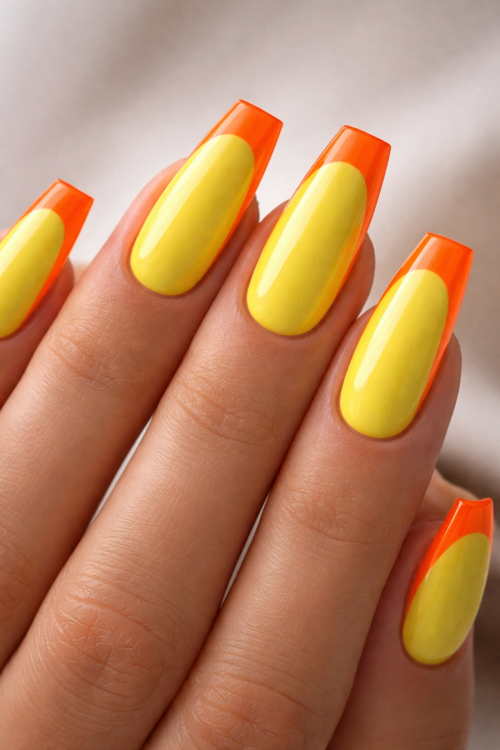
A reverse French flips the traditional French manicure; instead of a white tip, you have a bright colored tip and a nude or neutral base. For this design, sunshine yellow is the base and neon orange forms the reverse French tip. The contrast between the warm yellow and the more vibrant neon orange is eye-catching, and the reverse French shape is more contemporary than a traditional French manicure. The design feels cheerful yet polished.
Reverse French Nail Shape
The reverse French tip should cover roughly the top third of the nail, with a clean curved line separating the base color from the tip color. On coffin nails, this shape is particularly flattering because it follows the natural slope of the coffin shape. The curved line should be smooth and consistent across all nails, which requires either tape or a very steady hand.
Creating a Perfect Reverse French Line
- Use a curved French guide (a flexible curved template) or carefully applied painter’s tape to create your tip line
- Paint your sunshine yellow base first and let it set completely before applying the neon orange tip
- Apply orange to the tip area with careful, deliberate brush strokes—rushing creates wobbly lines
- The line should be clear and defined without being harsh; use a glossy topcoat to enhance the definition
Pro technique: Apply topcoat to just the tip area before painting the orange polish—the tackiness helps the orange adhere and prevents it from sliding during application.
Final Thoughts
The most important rule for bright coffin nail designs isn’t about technique or tools—it’s about choosing colors and designs that genuinely excite you. These twenty ideas represent different styles, complexities, and approaches because bright nail design should feel personal. Some of these designs work for people who want something understated (the minimalist line art or negative space options), while others suit people who want maximum visual drama (the holographic gradient or 3D elements).
The coffin shape itself is your greatest asset here. That broad nail bed and architectural taper creates a canvas that works beautifully with bold colors and interesting designs. Where shorter nails would make some of these patterns feel cramped or overwhelming, coffin nails have the room to breathe. Use that space intentionally—let your design fill it with purpose, whether that’s through color intensity, geometric precision, dimensional elements, or artistic texture.
Keep in mind that bright nail designs have real staying power. The longevity of your manicure depends far more on base coat application, topcoat quality, and avoiding trauma to the tips than on the complexity of the design. A simple bright solid color can last three weeks if you apply it properly, while an intricate design might fail in one week if your base coat isn’t solid. Invest in quality products and proper technique before worrying too much about design complexity.
Most importantly, your bright coffin nails should make you feel confident and interesting every time you look at your hands. If a design doesn’t genuinely excite you, it’s not worth the time or expense to apply it. Use these ideas as inspiration and starting points, then customize them to match your style, your life, and your actual nail care capacity. The best nail design is always the one that makes you happy.
