

Pastel nail colors offer a timeless elegance that works beautifully regardless of season or occasion. Unlike bold, saturated hues that demand attention, pastels whisper—they flatter every skin tone, complement both casual and formal aesthetics, and let your personality shine through without overwhelming your look. The magic of pastel nails lies in their versatility; they work as a clean, minimalist statement all on their own, or they become the perfect canvas for intricate nail art, delicate florals, geometric patterns, and creative designs.
Whether you’re drawn to soft romantic shades, cool-toned sophistication, or warm peachy tones, the pastel palette offers something for everyone. These aren’t just spring-specific colors either—contrary to common misconception, pastels look just as stunning paired with winter blacks, cozy autumn textures, and summer tans. The key is understanding which specific pastel shade complements your undertone and personal style, then playing with finishes, textures, and nail art techniques to make each shade entirely your own.
What makes pastels particularly special is how they interact with light. A milky base creates a translucent, ethereal quality that lets your natural nail show through beautifully, while a more opaque finish delivers a modern, polished appearance. Chrome effects, glitter accents, marble patterns, and even simple solid applications all transform the same base color into completely different moods. The following fifteen pastel shades represent the most captivating, wearable, and genuinely flattering options in the pastel spectrum—each with its own distinct character and styling possibilities.
1. Soft Lavender
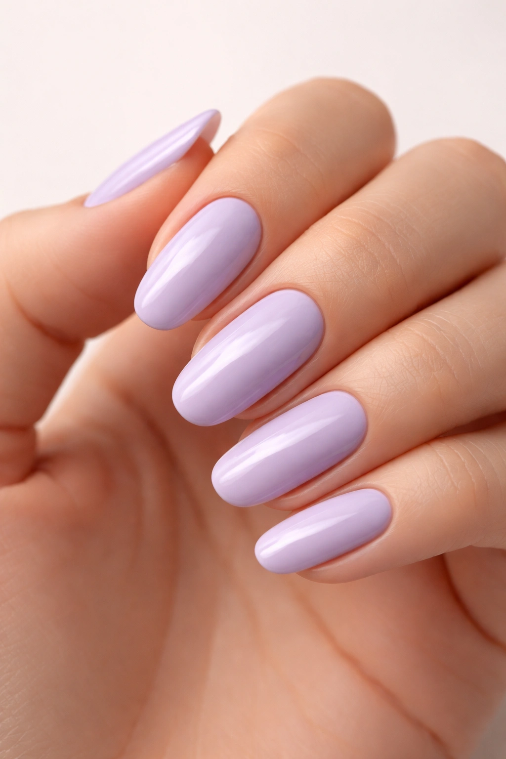
Soft lavender sits at the intersection of pink and purple, making it one of the most universally flattering pastel shades available. This delicate purple has become a nail artist favorite because it photographs beautifully, looks stunning on virtually every skin tone, and carries romantic, whimsical energy without feeling childish or overly feminine. The shade works because lavender contains just enough warmth to complement warm undertones while maintaining the coolness that cool undertones crave.
Why Lavender Is a Timeless Pastel Choice
Lavender’s appeal lies in its psychological associations—it’s calming, sophisticated, and subtly luxurious. When nail artists talk about their go-to pastel shades, lavender consistently ranks at the top. Celebrity manicurist Hang Nguyen, who specializes in sophisticated pastel work, notes that soft lavender provides excellent coverage while maintaining that airy, delicate aesthetic pastels are known for. The shade manages to feel both gentle and bold simultaneously, making it work equally well as a solid manicure or as the base for intricate nail art.
How to Style Soft Lavender Nails
- Classic elegance: Pair lavender with chrome powder for a glazed, dimensional effect that catches light beautifully
- Romantic details: Add hand-painted tiny daisies, hearts, or minimalist floral stems in white or deeper purple
- Modern edge: Combine lavender with geometric patterns, checkerboard designs, or abstract line work in complementary pastels
- Statement finish: Apply a shimmer or soft glitter top coat for subtle sparkle without overwhelming the delicate base color
For those with deeper skin tones, lavender tends to be particularly striking. The contrast between rich skin and a soft, cool-toned purple creates visual pop and makes the color appear even more vibrant. On lighter skin, lavender creates a cohesive, harmonious look that elongates fingers and feels inherently elegant.
Pro tip: If you find basic lavender feels too plain for your taste, layer a matte top coat over the glossy version, or add a single accent nail with the same lavender but finished with a subtle texture like a light shimmer or fine glitter.
2. Butter Yellow
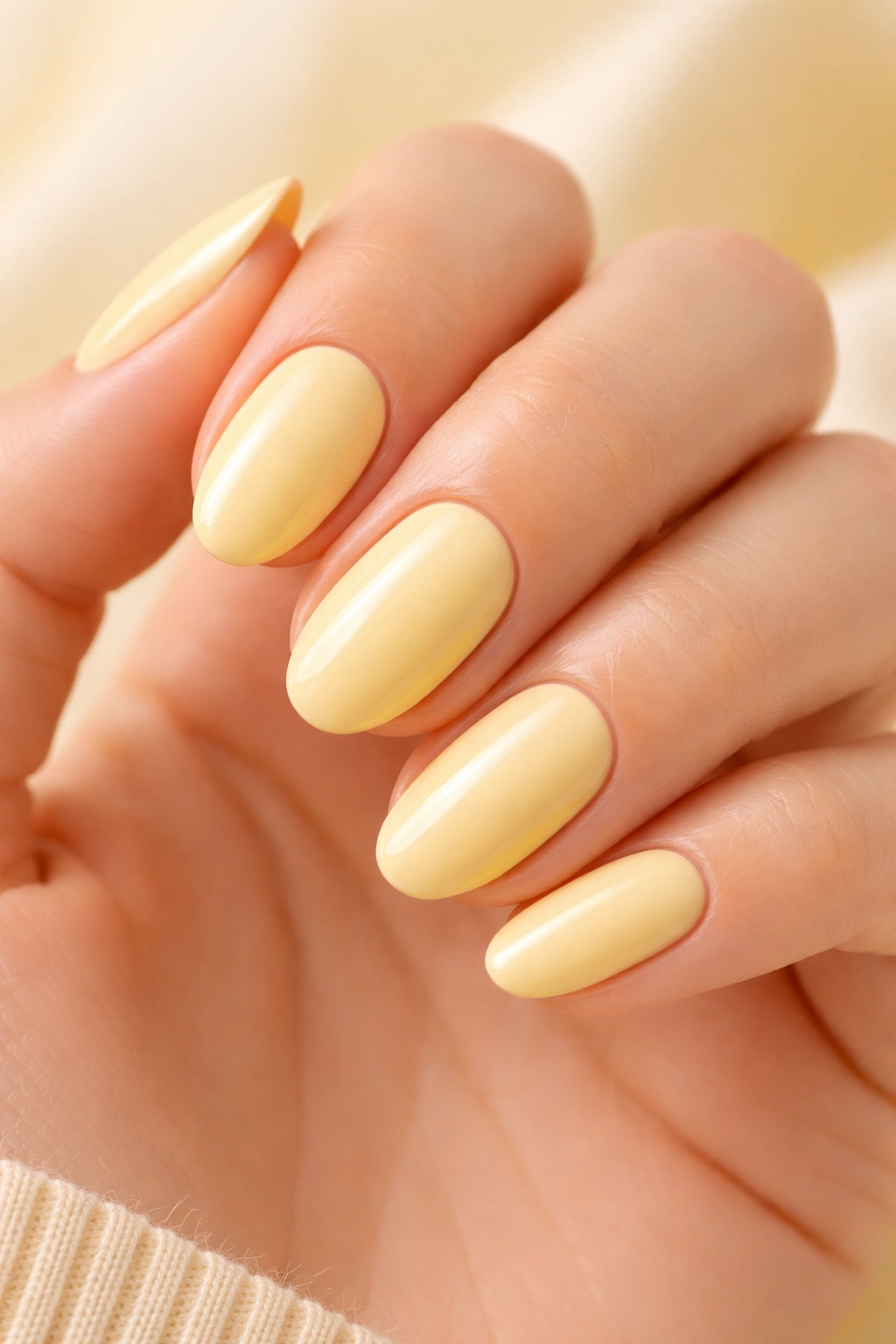
Butter yellow represents pastels at their most joyful—it’s bright enough to feel summery and optimistic, yet soft enough to maintain that signature pastel delicacy. This warm, creamy yellow with white undertones feels completely different from neon or mustard yellows; it’s gentle, approachable, and somehow makes people smile when they look at your hands. Butter yellow became a major trend because it photographs exceptionally well and adds instant radiance to any complexion.
The Psychology Behind Butter Yellow’s Appeal
Yellow is universally associated with happiness and warmth, but most people avoid it because traditional yellows can look unflattering or too bold. Butter yellow solves this problem by delivering all the joy with none of the harshness. This shade triggers a mood boost simply by existing on your fingertips—it’s impossible to have a bad day when you’re staring at buttery, creamy, soft yellow nails. The shade works across seasons because while it reads as inherently summery, pairing it with darker, cooler clothing creates an intentional contrast that feels fashion-forward and deliberate.
Creating Dimension with Butter Yellow
- French tip variation: Create thin, crispy white tips over a butter yellow base for a fresh take on the classic French
- Ombre effect: Blend butter yellow into a softer cream or white at the tips using a makeup sponge for a gradient manicure
- Pattern play: Add delicate patterns like tiny lemons, daisies, or polka dots in white or pale green for personality
- Minimalist approach: Keep it completely solid and let the color do all the talking—sometimes simplicity is most impactful
Butter yellow looks particularly stunning on warm-toned skin, where it creates a monochromatic, harmonious effect. On cooler undertones, the contrast makes the yellow pop even more dramatically. The key to wearing butter yellow confidently is understanding that this shade isn’t trying to be subtle—it’s meant to be noticed, appreciated, and celebrated.
Worth knowing: Butter yellow can sometimes appear slightly uneven in coverage, so applying three thin coats rather than two thick ones will ensure a flawless, opaque finish that looks professionally done.
3. Baby Pink
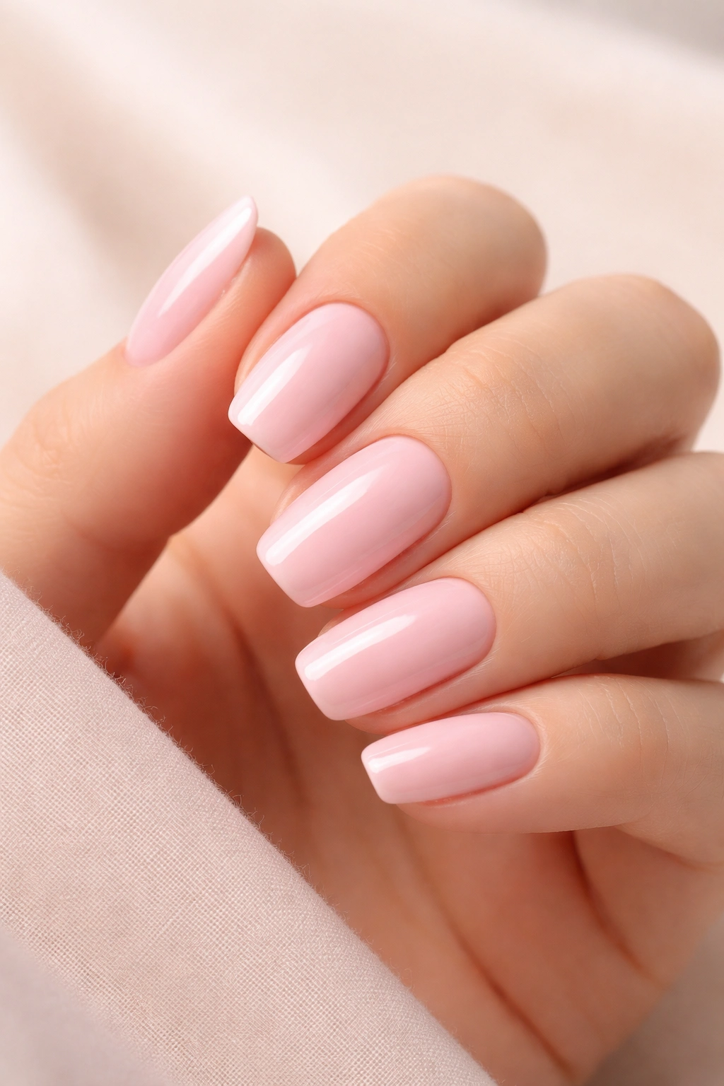
Baby pink is the original pastel nail color—the shade that started the entire soft, delicate nail movement. It’s Ballet Slippers by Essie’s all-time best-seller for good reason: this particular shade of pale, warm pink flatters virtually everyone and works in virtually every context. Baby pink doesn’t try to make a statement; instead, it creates the perfect neutral-but-interesting backdrop for literally anything else you want to do with nail art.
Why Baby Pink Remains the Gold Standard
Baby pink works because it sits in that perfect sweet spot between warm and cool, pink and nude, visible and subtle. This shade is forgiving, timeless, and genuinely universally flattering in a way few colors achieve. It doesn’t clash with any skin tone, works with any outfit color palette, and looks equally polished on short, practical nails or long, dramatic acrylics. Baby pink communicates elegance without trying too hard, which is precisely why it remains a favorite among people who want beautiful nails without the drama.
Design Possibilities with Baby Pink Base
- Accent nail focus: Keep most nails baby pink and dedicate one or two to intricate nail art
- Marble effect: Create subtle white or gray marble veining over the baby pink base for a luxury feel
- Rhinestone placement: Add scattered crystals, especially at the cuticle or in a scattered pattern, for formal occasions
- Minimal line work: Use a thin brush to add simple line designs, geometric shapes, or delicate patterns in white or a deeper pink shade
The beauty of baby pink lies in its humility. This shade knows what it does best and does it consistently—it makes every manicure look polished, intentional, and well-cared-for. Even when you’re wearing it completely solo with no additions, baby pink reads as put-together and sophisticated.
Insider note: Baby pink appears slightly different depending on undertones and lighting. Some versions lean more beige, others more cool. Test a few different baby pink shades to find the specific one that makes your hands look their absolute best.
4. Mint Green
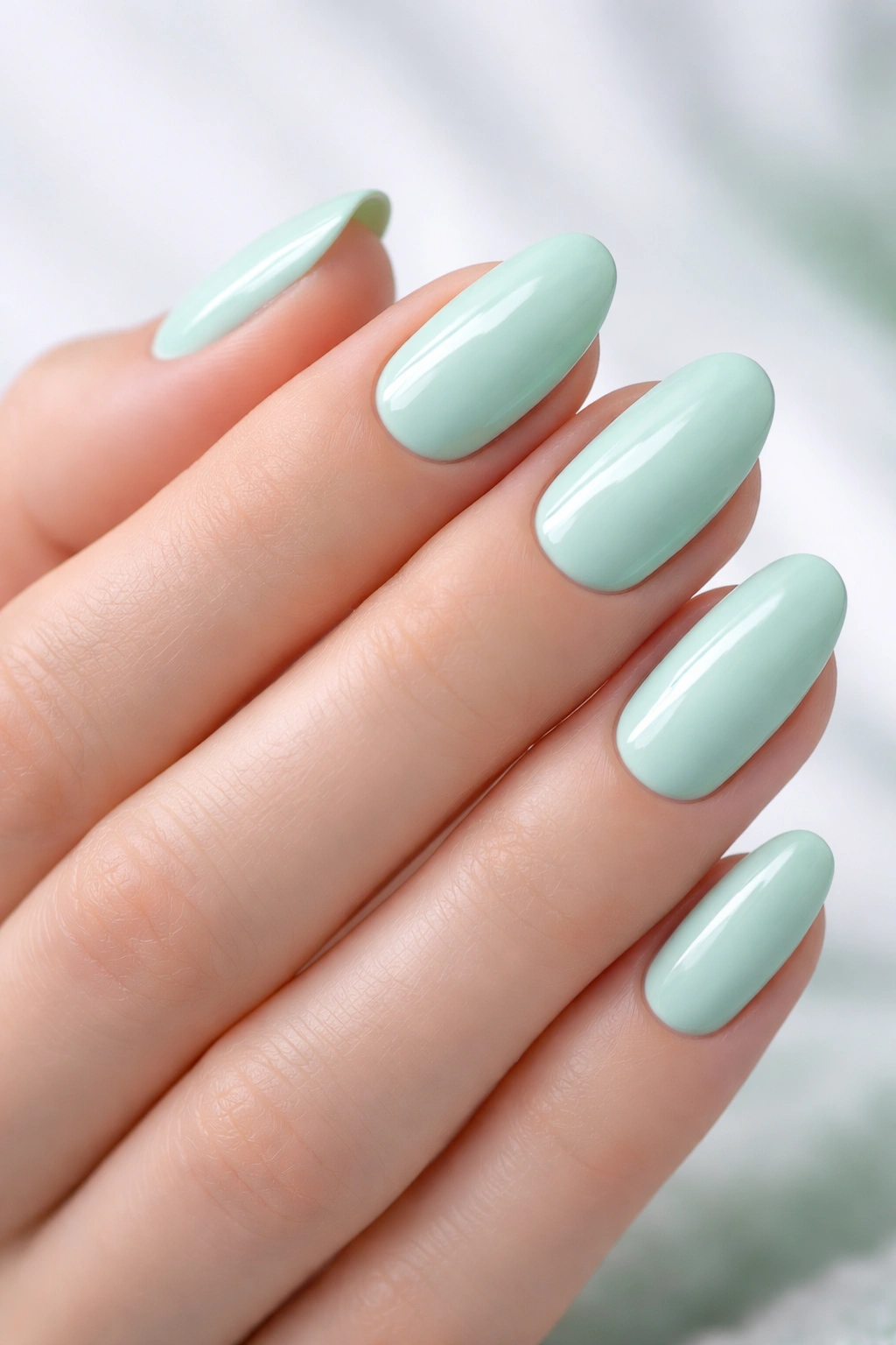
Mint green brings cool, refreshing energy to the pastel landscape. This pale, slightly bluish-green feels spa-like and calming, evoking imagery of ocean breezes, fresh herbs, and clean, modern aesthetics. Mint works as a surprisingly sophisticated choice because it feels unexpected—people don’t often reach for green nails, which makes mint feel special and intentional rather than default.
Understanding Mint’s Versatility
Mint green occupies interesting territory: it’s cool enough to feel contemporary and modern, yet soft enough to maintain that gentle pastel quality. The shade works across seasons because it pairs equally well with white and blacks (winter/formal) and with warm, golden outfits (summer/casual). Mint flatters warm undertones by providing contrast, and it flatters cool undertones by creating harmony. It’s one of the few colors that genuinely looks beautiful on everyone, if you find the right specific mint shade for your undertone.
Ways to Maximize Mint’s Impact
- Monochromatic moment: Pair mint nails with mint clothing or accessories for a cohesive, intentional aesthetic
- Contrasting accessories: Wear mint nails with warm gold jewelry or warm-toned outfits to create dynamic visual interest
- Floral complement: Add white daisies or tiny flowers in pink for a garden-fresh aesthetic
- Ombre layers: Blend mint into white for an icy, gradient effect that feels ethereal and high-fashion
Mint green is particularly striking on deeper skin tones, where the coolness creates beautiful contrast and makes the color appear more vibrant. On lighter complexions, mint can sometimes feel a touch washed out, so opting for a slightly more saturated mint or adding subtle shimmer helps it stand out more.
Fun fact: Mint green became increasingly popular as people discovered it pairs beautifully with the current trend toward “clean girl” aesthetic—minimal makeup, natural beauty, understated luxury. Mint nails fit perfectly into this philosophy.
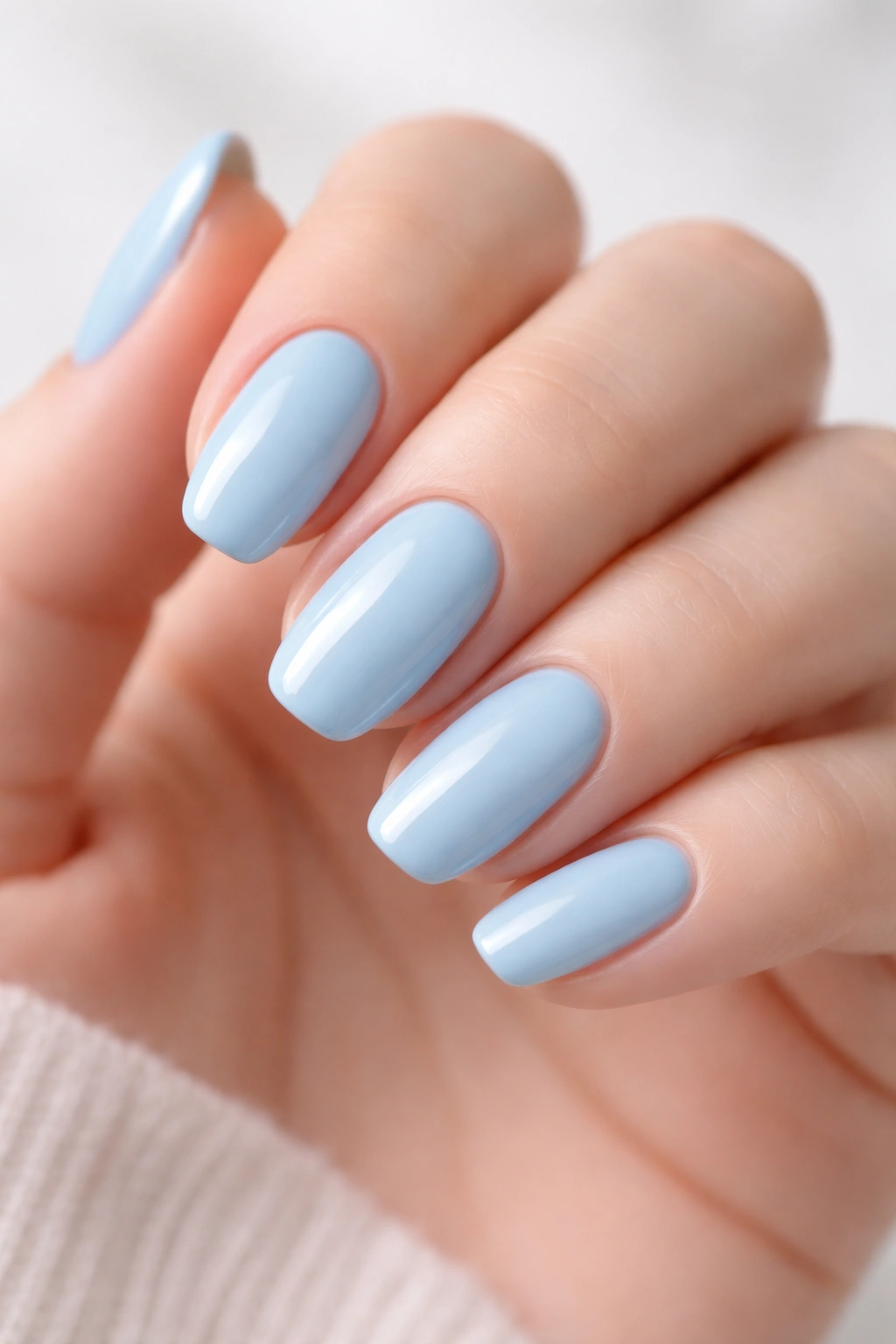
5. Powder Blue

Powder blue delivers that quintessential pastel feeling—soft, dreamy, and reminiscent of spring skies and gentle, calming spaces. This pale, slightly grayish-blue feels both nostalgic and contemporary simultaneously, working for people who love classic aesthetics and those who appreciate modern minimalism. Powder blue photographs beautifully and has that magical quality of looking different depending on lighting, making it endlessly interesting to wear.
The Sophisticated Side of Powder Blue
Powder blue isn’t just pretty—it’s intellectually interesting as a color choice. The shade contains gray undertones that prevent it from reading as childish or overly cute. Instead, it feels refined, thoughtful, and intentionally chosen. Celebrity manicurist Brittney Boyce notes that powder blue works year-round because it translates across seasons without feeling seasonal. In winter, pair it with cozy sweaters and cool-toned jewelry; in summer, combine it with beige and whites for a fresh, breezy effect.
Styling Powder Blue Nails
- Shimmery finish: Add a subtle shimmer or pearl top coat for an ethereal, almost luminous quality
- French tip variation: Apply powder blue as the tip over a white or nude base for modern French manicure energy
- Accessory complement: Blue nails pair beautifully with silver jewelry, making it ideal for formal occasions
- Pattern addition: Add white patterns, delicate florals, or geometric designs for visual interest without overwhelming the base color
Powder blue works particularly well on cooler undertones, where it feels harmonious and naturally flattering. On warm undertones, the contrast makes the blue pop more dramatically, though adding warmth-toned accessories helps create balance. The key to wearing powder blue confidently is understanding it’s a statement shade—you’re choosing blue nails intentionally, and that choice communicates sophistication.
Pro tip: Layer powder blue over a white base coat to ensure opaque, even coverage. Blue can sometimes appear slightly translucent without this protective layer, so a white foundation gives you maximum control over the final look.
6. Peachy Coral
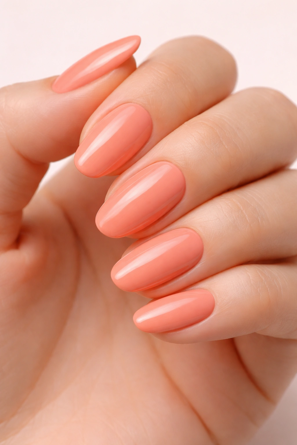
Peachy coral represents the sweet spot where warm pastels live—it’s playful enough to feel youthful and fun, yet sophisticated enough for professional environments. This shade combines the warmth of peach with the subtle boldness of coral, creating a hue that feels both comforting and special. Peachy coral flatters warm undertones beautifully and creates striking contrast on cool undertones, making it genuinely versatile.
Why Peachy Coral Deserves More Attention
Peachy coral is slightly underutilized compared to pinks and blues, which means choosing this shade feels like discovering something special. The color carries joyful, optimistic energy while maintaining the subtlety pastels are known for. It works in summer when paired with bronzed skin and warm-toned clothing, and it works in cooler months when balanced with neutral or cool-toned pieces. This is a shade that genuinely adapts to your personal aesthetic rather than demanding you adapt to it.
Creative Applications for Peachy Coral
- Ombre blend: Mix peachy coral with lighter cream or white at the tips for a soft gradient effect
- Fruit-inspired art: Add tiny watercolor strawberries, peaches, or citrus slices in white and deeper coral for personality
- Metallic accent: Layer fine gold or rose gold glitter over the peachy coral base for warmth-on-warmth luxury
- Negative space design: Create curved negative space designs in white or nude against the peachy coral base
Peachy coral is one of those shades that looks luminous on sun-kissed skin but equally beautiful on pale or deeper complexions. The key is finding the specific peachy coral that has the right balance of peach warmth and coral saturation for your undertone—some versions lean more fruity, others more sandy.
Worth knowing: Peachy coral sometimes requires multiple coats for opacity, especially if you’re applying it directly to bare nails without a colored base coat. Don’t skip the base—it helps the color pop and ensures lasting wear.
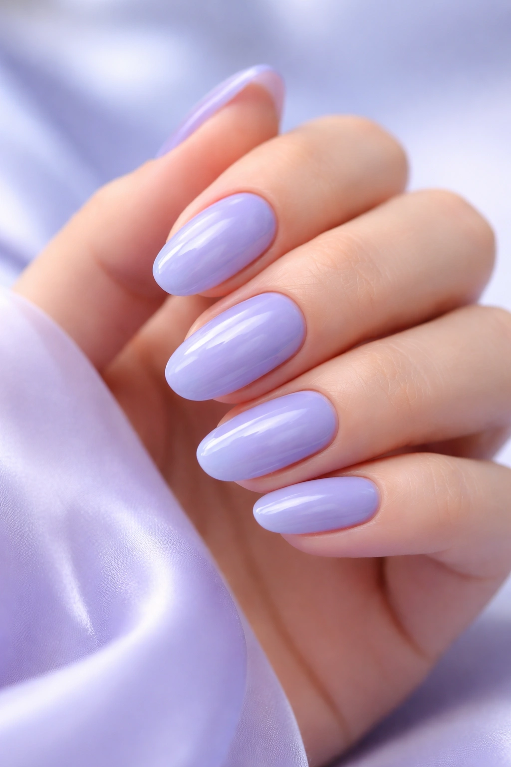
7. Lilac
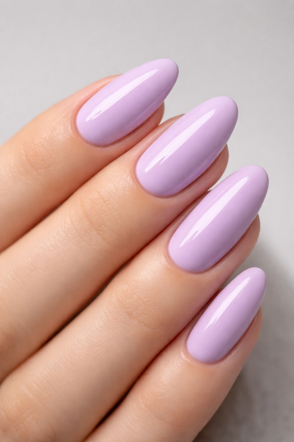
Lilac brings deeper, more saturated pastels into the conversation. Unlike soft lavender, lilac contains more pigment and presence while still maintaining that essential pastel delicacy. This shade of purple feels vintage, romantic, and inherently elegant. Lilac appears in everything from fashion runways to garden imagery to vintage ’90s aesthetics, making it feel both timeless and thoroughly contemporary simultaneously.
Lilac’s Multifaceted Appeal
Lilac works because it’s purple—a color historically associated with luxury, creativity, and sophistication—in a soft, approachable form. This shade allows you to wear purple without commitment or drama; it’s purple that’s been softened with white, creating something gentler while maintaining the color’s inherent elegance. Lilac suits cool undertones naturally but also works beautifully on warm undertones when paired with complementary accessories and clothing.
Elevating Lilac with Design
- Chrome top coat: Add chrome powder over lilac for a glazed, multidimensional effect that catches light beautifully
- Gold foil details: Scatter gold leaf or foil accents across lilac for luxury without heavy-handedness
- Floral imagery: Paint realistic or abstract flowers in deeper purple, pink, or white for romantic vibrancy
- Matte finish: Apply matte top coat for a velvety, modern aesthetic that feels artistic and intentional
Lilac’s versatility extends to nail shape and length. The shade works on short, practical nails for a polished daily look, and it absolutely shines on longer, more dramatic nail shapes where the color can really showcase. The depth of lilac means it photographs exceptionally well, making it perfect for anyone who wants their nails to look Instagram-worthy.
Insider note: Lilac can sometimes appear slightly chalky or dusty depending on the specific formula. Opt for lilacs with creamy, glossy finishes rather than matte formulas for maximum vibrancy and visual impact.
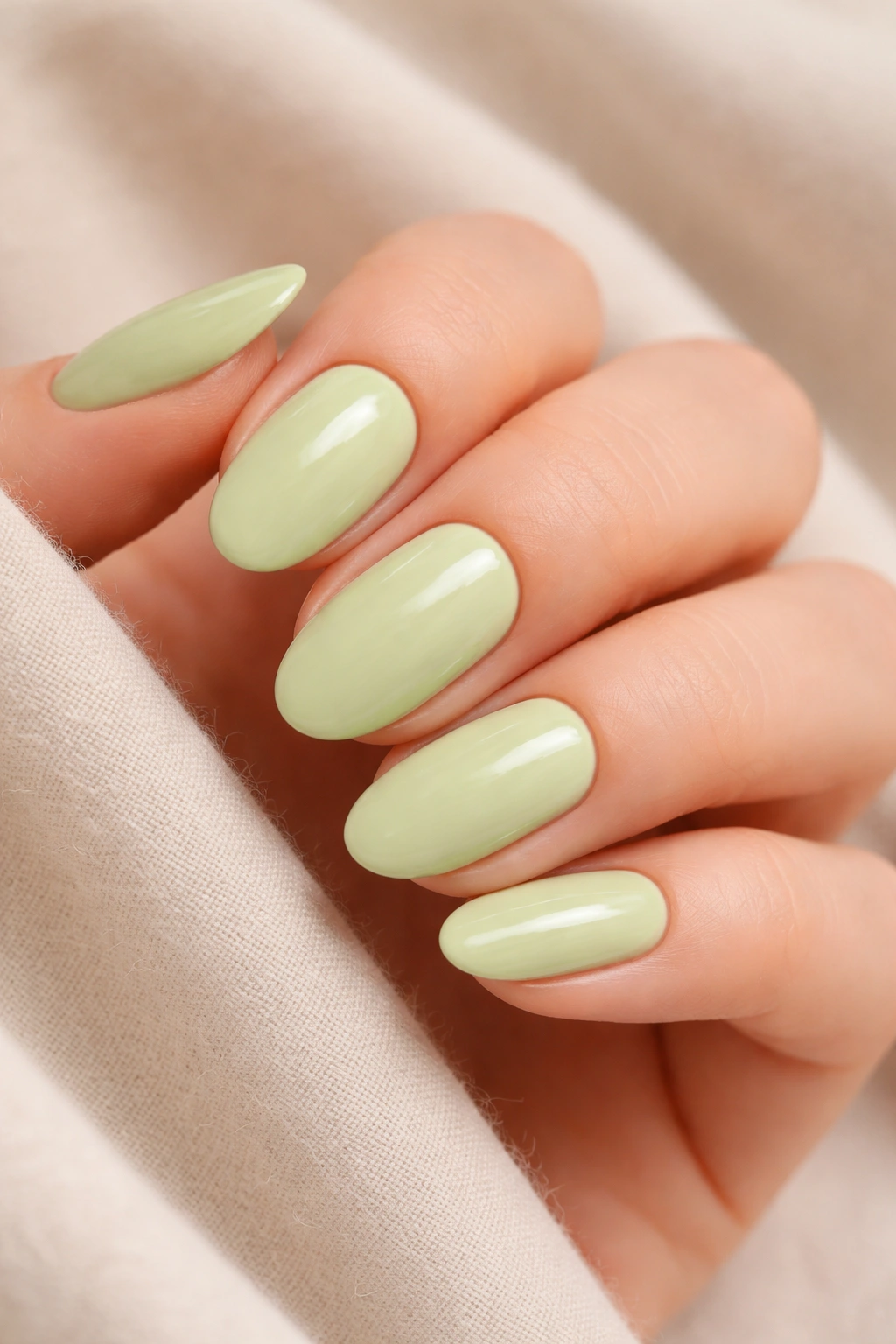
8. Sage Green
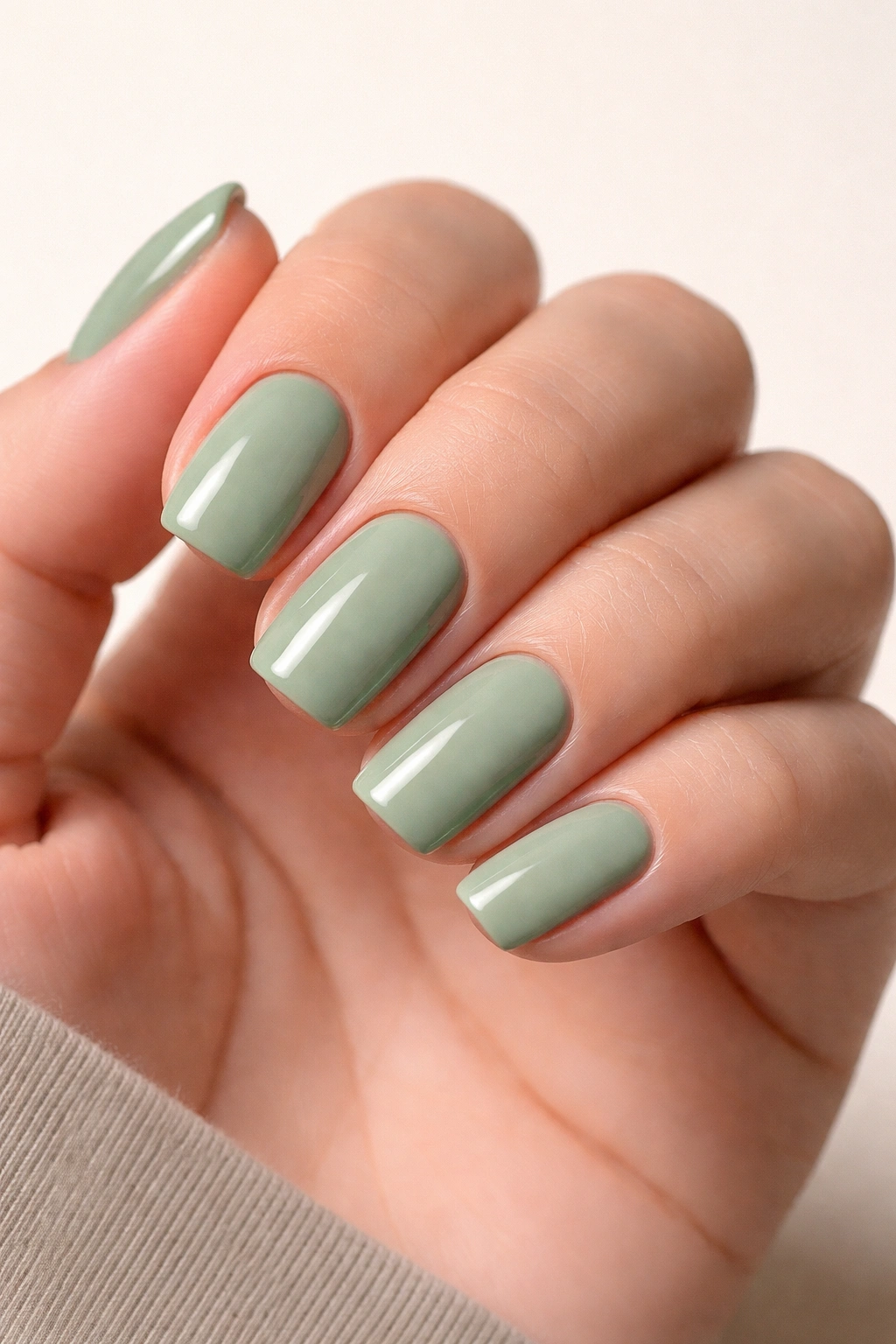
Sage green brings earthy, grounded energy to the pastel palette. This muted, slightly grayish-green feels natural and organic while remaining distinctly sophisticated. Sage green works because it doesn’t read as bright or loud; instead, it feels calm, centered, and intentionally chosen. The shade has gained popularity as people embrace more nature-inspired aesthetics and appreciate colors that feel less processed and more authentically natural.
The Understated Elegance of Sage
Sage green appeals to people who prefer subtle beauty over flashy statements. This shade communicates thoughtfulness, intention, and a appreciation for quieter, more refined aesthetics. It pairs beautifully with warm gold jewelry and warm-toned clothing, and it creates striking contrast with cool silvers and neutrals. Sage green works in professional environments, casual settings, and everything in between because it’s inherently approachable and non-confrontational.
Styling Sage Green Nails
- Monochromatic dressing: Pair sage green nails with sage green clothing for a cohesive, intentional aesthetic
- Botanical details: Add simple leaf designs, delicate botanicals, or minimalist plant imagery in white or deeper green
- Earthy texture: Opt for matte finish or velvet texture for an organic, grounded feel
- Warm metal pairing: Wear sage green nails with gold jewelry, warm scarves, or caramel-toned pieces for harmony
Sage green photographs beautifully in natural light, appearing almost watercolor-like and ethereal. In indoor lighting, it reads more as a sophisticated neutral. This quality makes sage green an excellent choice for people who want something that works across different environments and lighting situations without looking washed out or dingy.
Pro tip: If you find straight sage green feels too muted for your taste, add subtle shimmer or pair it with one accent nail that features deeper forest green or black for contrast and visual interest.
9. Blush Beige
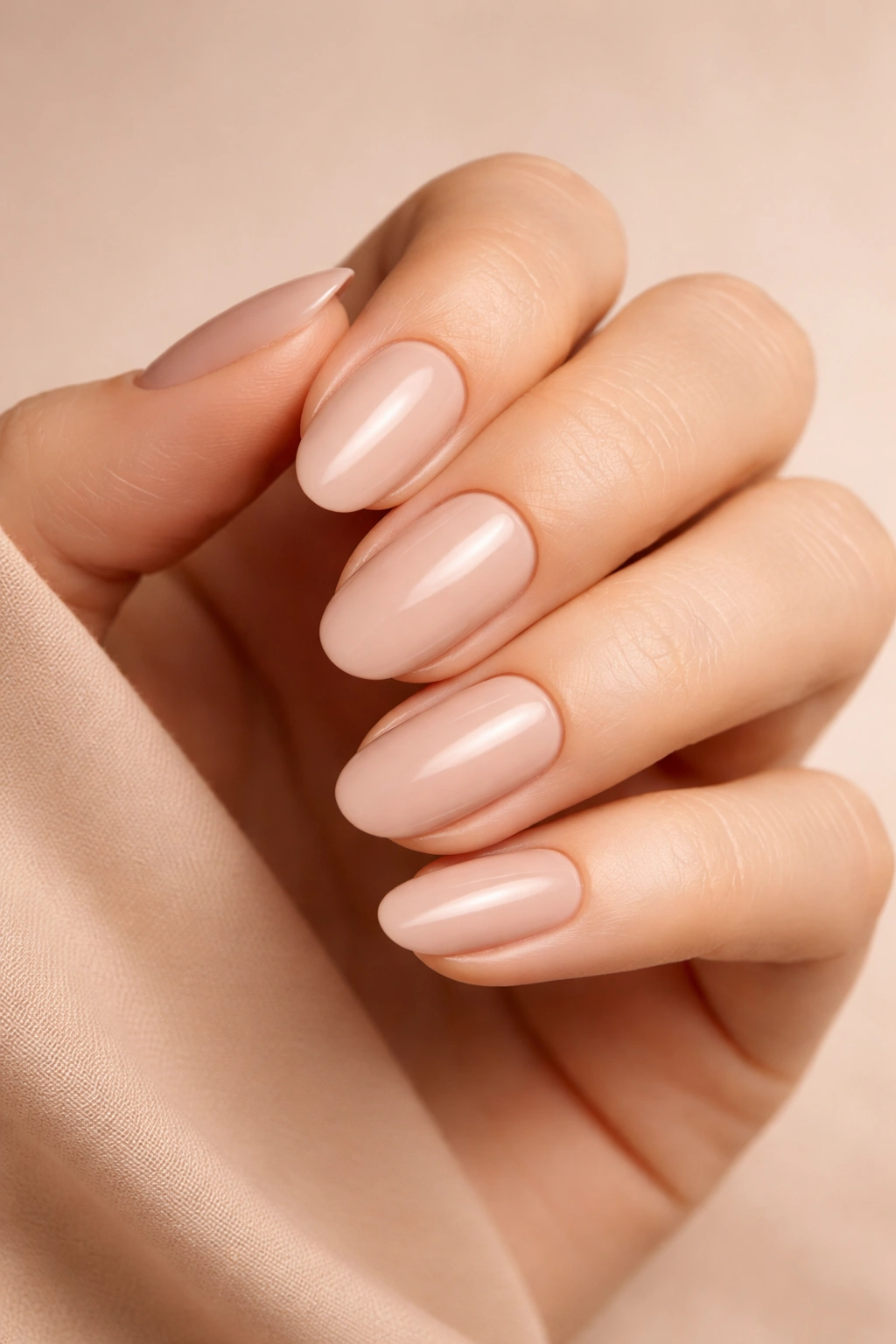
Blush beige occupies the space between nude and pink—it’s a sophisticated neutral that flatters virtually every skin tone by appearing to naturally match or complement rather than contrast. This shade feels inherently chic and put-together; wearing blush beige nails communicates understated luxury and refined taste. The color works because it’s interesting enough to feel intentional while remaining subtle enough for any context.
The Versatility of Blush Beige
Blush beige is the manicure equivalent of a perfect white linen shirt—it’s a foundational piece that works with everything and never looks wrong. This shade allows your natural nail to show through slightly while adding warmth and intentionality. It works equally well in professional boardrooms, casual weekend settings, formal events, and everyday life. Blush beige also provides the perfect canvas for virtually any nail art while still maintaining sophisticated elegance as a solo color.
Maximizing Blush Beige’s Potential
- Monochromatic luxury: Pair blush beige nails with blush, beige, and taupe clothing for a harmonious, expensive-looking aesthetic
- Subtle accent: Keep most nails blush beige and dedicate one to a detailed design or pattern for focal interest
- French variation: Apply blush beige as the main color with a slightly deeper or lighter tip for a modern French aesthetic
- Jewelry showcase: Let blush beige nails showcase whatever jewelry you’re wearing—rings, bracelets, and watches all pop beautifully against this base
Blush beige works on every skin tone because it’s fundamentally warm without being orange, and neutral without being cold. On deeper skin, it reads as a complementary warm tone. On lighter skin, it appears to match or enhance natural undertones. This quality makes blush beige one of the most genuinely universal nail colors.
Worth knowing: Blush beige benefits from careful color matching. The specific shade of your blush beige should coordinate with your personal undertone, so test a few options to find your perfect version rather than assuming all blush beiges are identical.
10. Pistachio
Pistachio green brings playful personality to the pastel spectrum. This pale, slightly warm-toned green feels whimsical without being childish—it’s the color of actual pistachios, creamy gelato, and soft, dreamy aesthetics. Pistachio works because it’s unexpected while remaining entirely wearable, communicating that you have personality and aren’t afraid of color.
Pistachio’s Unique Position in the Pastel Palette
Pistachio sits apart from most greens because it contains enough warmth to feel friendly and approachable while maintaining sufficient coolness to feel contemporary. The shade appeals to people who love color but prefer softer, more sophisticated expressions of it. Pistachio photographs beautifully, appearing creamy and almost edible in images, making it perfect for anyone who likes their nails to look polished and visually interesting.
Creative Ways to Wear Pistachio
- Solid statement: Wear pistachio completely solo with just a glossy top coat for maximum impact
- Gradient effect: Blend pistachio into cream or white at the tips for an ombre that feels fresh and spring-inspired
- Pattern play: Add white stripes, minimalist geometric designs, or botanical details for artistic expression
- Glossy pop: Keep pistachio glossy and shiny for a luminous, almost creamy appearance that catches the light beautifully
Pistachio works especially well on warm and neutral undertones, where it feels harmonious and naturally flattering. On cool undertones, the contrast makes pistachio appear more vibrant and striking, which is equally beautiful—just a different vibe. The key to wearing pistachio confidently is embracing its playfulness while understanding it’s still ultimately sophisticated.
Pro tip: Pistachio pairs beautifully with warm gold jewelry and beige or cream-toned clothing. If you’re wearing pistachio nails, lean into warm color palettes for maximum visual harmony and cohesion.
11. Periwinkle
Periwinkle brings that magical blue-purple hybrid energy—it’s the color of twilight, flowers, and dreamy romantic moments. This pale shade of purple-blue feels both whimsical and sophisticated, youthful and mature. Periwinkle works because it occupies interesting territory between two beloved colors, making it feel special and unique while remaining entirely approachable and wearable.
The Emotional Quality of Periwinkle
Periwinkle carries romantic, dreamy energy that softer lavenders sometimes lack. This shade feels creative, thoughtful, and distinctly artistic—it’s the choice of people who love color but appreciate subtlety. Periwinkle works across seasons and occasions, adapting its appearance based on lighting and context while maintaining its essential whimsical charm. The shade photographs beautifully and always appears intentional and well-considered.
Styling Periwinkle Nails
- Romantic nail art: Paint delicate florals, butterflies, or celestial designs in white or silver for ethereal beauty
- Glossy shine: Keep periwinkle glossy and luminous for maximum dreaminess and visual impact
- Paired jewelry: Wear periwinkle with silver jewelry and cool-toned accessories for a cohesive aesthetic
- Accent nail: Keep most nails periwinkle and feature one detailed design for focal interest and personality
Periwinkle works on most undertones, though it shines particularly beautifully on cool undertones where it feels naturally harmonious. On warm undertones, the contrast makes periwinkle pop dramatically. Either way, periwinkle reads as a color chosen by someone with thoughtful aesthetic sensibility.
Worth knowing: Periwinkle can sometimes read as slightly gray or muddy depending on the specific formula and lighting. Look for periwinkles with true blue-purple undertones rather than those that lean heavily toward gray for maximum vibrancy and visual impact.
12. Pale Lilac
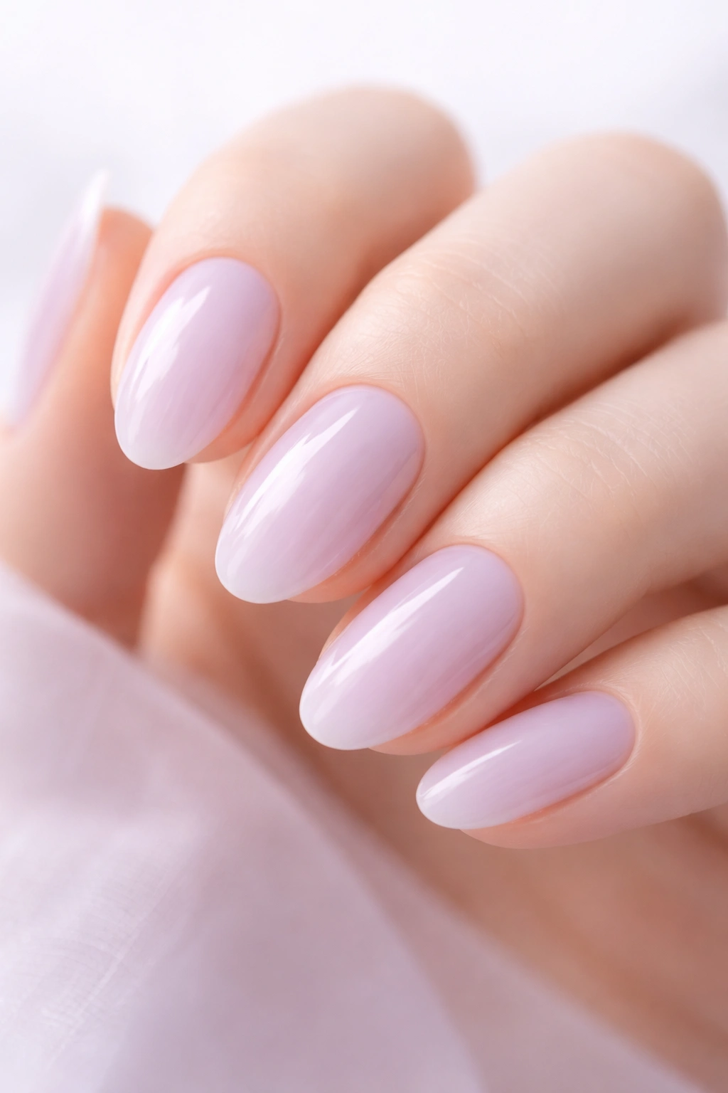
Pale lilac represents pastels at their most ethereal and delicate. This barely-there version of lilac is almost translucent, creating a gauzy, watercolor quality that feels impossibly romantic. Pale lilac works for people who love color but want the absolute softest possible expression of it. This shade floats between visible and almost-not-there, making it feel uniquely special and refined.
The Delicate Beauty of Pale Lilac
Pale lilac appeals to people who prefer minimalist, understated beauty—it’s color that whispers rather than shouts. This shade creates the impression of effortless elegance; wearing pale lilac communicates taste, refinement, and appreciation for subtle beauty. The color works in virtually any context because it’s so gentle that it never feels wrong or out of place. Pale lilac also works on every skin tone because the color is light enough that it complements rather than contrasts.
Expressing Personality with Pale Lilac
- Minimalist luxury: Wear pale lilac completely solo for maximum elegance and understated beauty
- Textured finish: Add matte top coat for a velvety feel that communicates artistic sensibility
- Delicate nail art: Paint the tiniest details in white, silver, or even more pale lilac for layers of refinement
- Glossy glamour: Apply ultra-glossy top coat for a luminous, almost liquid appearance
Pale lilac photographs exceptionally well in natural light, where it appears almost magical and ethereal. In indoor lighting, it reads as a sophisticated neutral with just a whisper of color. This quality makes pale lilac perfect for people who want their nails to photograph beautifully and look elegant in all lighting situations.
Insider note: Pale lilac requires careful application because the light color can show imperfections. Ensure your nail surface is perfectly smooth and your base coat is evenly applied before layering pale lilac for flawless results.
13. Creamy Peach
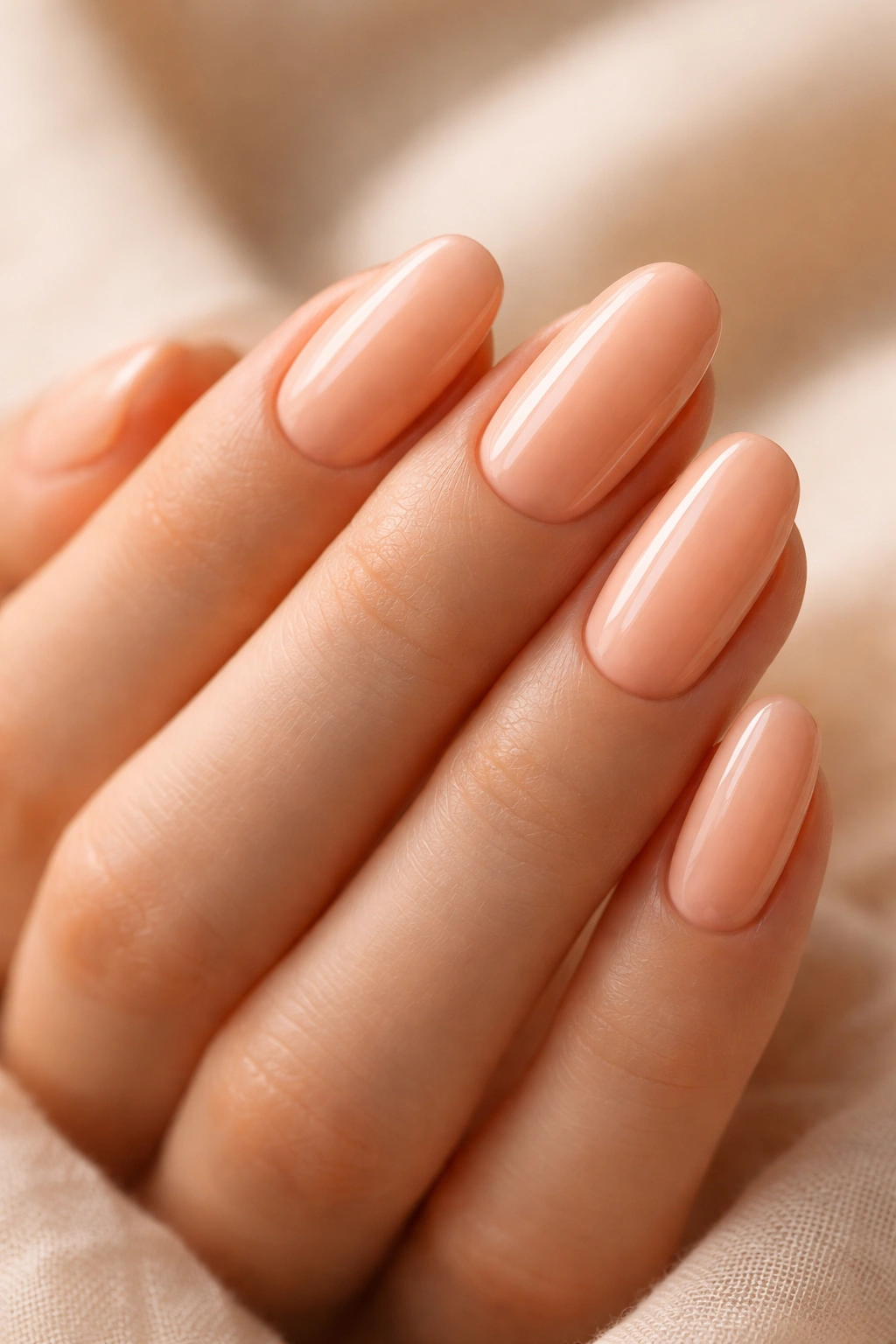
Creamy peach brings warm, comfortable, welcoming energy to the pastel landscape. This soft orange-pink feels summery and cheerful without being loud or overwhelming. Creamy peach works because it’s universally flattering—it contains enough warmth to complement most undertones while remaining soft and delicate enough to maintain pastel sensibility. The shade feels approachable and friendly while still reading as intentionally chosen and well-styled.
Why Creamy Peach Feels So Right
Creamy peach appeals to people who appreciate warmth and comfort in their aesthetic choices. This shade works for people with warm undertones naturally and creates beautiful contrast with cool undertones. Creamy peach pairs beautifully with warm gold jewelry, caramel-toned clothing, and warm neutrals. It also works with cool tones, but the magic really happens when you lean into the warmth that creamy peach naturally carries.
Wearing Creamy Peach with Confidence
- Fruit-inspired art: Paint tiny peaches, oranges, or watercolor fruits in white and deeper coral for playful personality
- Shimmer addition: Add subtle shimmer or warm gold glitter for luminosity and dimension
- Mixed manicure: Combine creamy peach with complementary pastels like pale yellow or soft pink for a multi-color look
- Solo shine: Keep creamy peach glossy and solo for a warm, welcoming, effortlessly beautiful appearance
Creamy peach photographs gorgeously, especially in warm or golden lighting, where it appears almost edible and absolutely luminous. This quality makes creamy peach a favorite among people who love how their nails look in photographs and want colors that photograph beautifully in all lighting situations.
Pro tip: Creamy peach works particularly well with warm-toned makeup and clothing. If you’re wearing creamy peach nails, coordinate your lipstick, blush, and wardrobe with warm, peachy tones for maximum visual harmony and a polished, intentional aesthetic.
14. Baby Blue
Baby blue represents pure, classic pastels at their most charming. This pale, gentle blue feels innocent and sweet without ever reading as immature or childish. Baby blue works because it’s fundamentally approachable—it’s soft, friendly, and communicates a gentle, kind aesthetic sensibility. The shade works on virtually every skin tone, in virtually every context, making it one of the most genuinely universally wearable pastel shades.
The Enduring Appeal of Baby Blue
Baby blue has remained popular for decades because it’s genuinely beautiful and flattering. This shade doesn’t follow trends; it IS the trend. Baby blue works for people who appreciate classic, timeless beauty and prefer colors that won’t feel dated in a year or two. It’s the nail equivalent of a perfect white button-down shirt—essential, beautiful, and always appropriate. Baby blue also provides an excellent canvas for any nail art you want to add while remaining stunning as a solo color.
Styling Baby Blue Nails
- Classic elegance: Pair baby blue with silver jewelry and cool-toned clothing for cohesive sophistication
- Accented details: Keep most nails baby blue and add one detailed design or pattern for interest
- Shimmery enhancement: Add subtle shimmer or pearl finish for luminosity and visual dimension
- French variation: Create baby blue French tips over nude or white base for modern classic aesthetic
Baby blue appears slightly different depending on undertones and lighting, sometimes reading as more gray, sometimes more white-based. Finding the specific baby blue that flatters your complexion will ensure you get maximum impact from this universally flattering shade. Most people find at least one baby blue shade that looks absolutely perfect on them.
Worth knowing: Baby blue sometimes requires multiple coats for opacity and evenness of color. Don’t rush application—thin coats applied carefully create more professional-looking results than thick coats applied quickly.
15. Soft Mauve
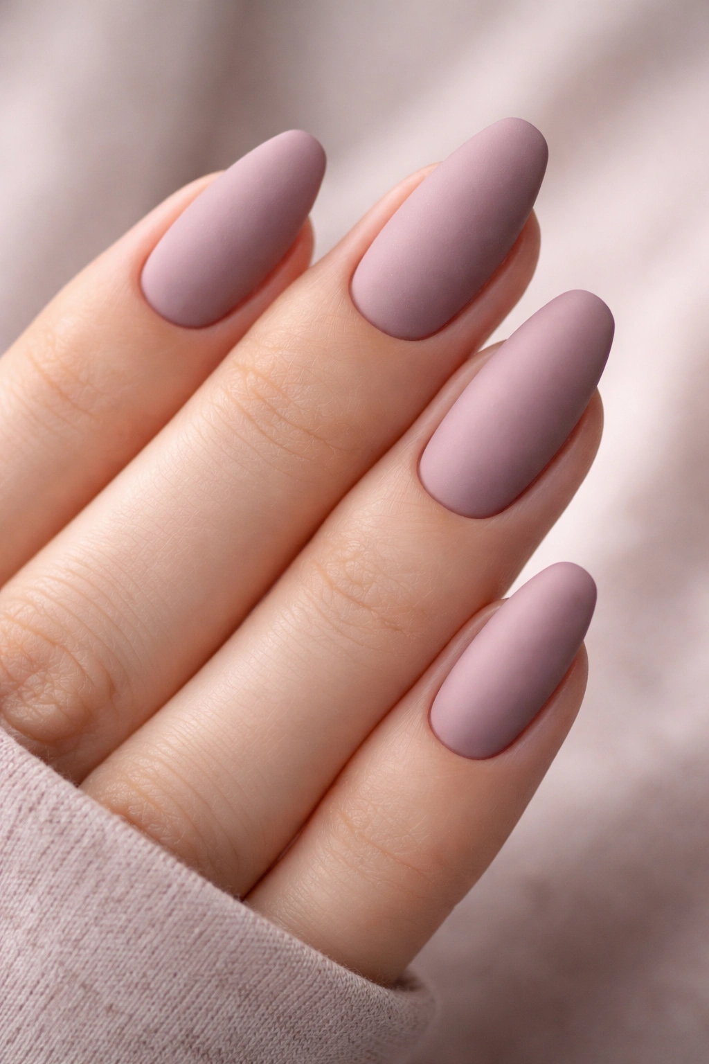
Soft mauve closes our exploration of pastel nail colors with a shade that bridges the gap between pink and purple with sophistication and grace. This elegant, slightly gray-toned purple feels mature, refined, and distinctly artistic. Mauve works because it’s complex—it’s not quite one color or another, creating visual interest while maintaining the softness pastels are known for. Soft mauve communicates taste, thoughtfulness, and appreciation for nuanced beauty.
The Sophisticated Subtlety of Soft Mauve
Soft mauve appeals to people who love color but prefer expressing it through refined, understated choices. This shade feels creative without being trendy, artistic without being loud, and elegant without being boring. Mauve works particularly well on cool undertones, where it feels naturally harmonious, but it also works beautifully on warm undertones when paired with complementary accessories. The color adapts to different lighting situations, sometimes reading as more pink, sometimes more purple.
Expressing Artistry with Soft Mauve
- Matte elegance: Apply matte top coat for a velvety, artistic finish that communicates creative sensibility
- Abstract details: Add minimalist abstract designs, lines, or geometric patterns in white or deeper mauve
- Soft shimmer: Layer subtle shimmer or opal glitter for dimension without overwhelming the gentle base color
- Accent focus: Keep most nails soft mauve and dedicate one or two to detailed nail art for sophisticated visual interest
Soft mauve photographs beautifully and appears thoughtfully chosen and intentional. The shade works in professional environments because it reads as put-together and refined, and it works in casual settings because the softness prevents it from feeling overly formal or uptight. Soft mauve is the shade of someone who knows what they like and isn’t afraid to express it subtly.
Pro tip: Soft mauve pairs beautifully with plum, burgundy, and other wine-toned pieces in your wardrobe. If you’re wearing soft mauve nails, coordinate with warm or jewel-toned accessories for maximum visual impact and cohesion.
Final Thoughts
Pastel nail colors offer something rare in the beauty world: genuine versatility without sacrificing personality or intentionality. Whether you choose a warm peachy shade, a cool lavender, or something entirely unexpected like pistachio or sage green, each of these fifteen colors communicates something about your aesthetic sensibility and personal style. The beauty of pastels lies in their ability to work across seasons, contexts, and occasions while still feeling distinctly chosen and thoughtfully applied.
The real magic happens when you experiment with these shades, discovering which ones make your hands look their absolute best and which colors resonate most strongly with your personal aesthetic. Test different finishes—matte, glossy, shimmer, chrome—and try adding various nail art elements to see how each pastel transforms under different styling approaches. Some people find their signature shade immediately; others enjoy rotating through multiple pastels, choosing based on mood, outfit, or occasion.
Remember that pastel nails aren’t just a seasonal trend—they’re a timeless approach to nail color that remains relevant and beautiful year-round. Pair pastels with cozy winter sweaters, bright summer outfits, warm autumn tones, and cool spring pieces. Let your nails adapt and evolve with your personal style, trying new combinations and techniques as inspiration strikes. The fifteen shades explored here represent just the beginning of what’s possible when you embrace the soft, sophisticated world of pastel nail colors.
