

Long coffin nails provide the perfect canvas for bold, statement-making designs, and orange is one of the most versatile and striking colors to work with. Whether you’re drawn to warm burnt oranges, vibrant corals, or peachy tones, orange nail designs offer the range to express confidence, creativity, and seasonal style. The coffin shape—with its elegant tapered sides and flat top—amplifies the impact of orange’s warmth and allows intricate details to really stand out.
What makes orange particularly compelling for coffin nails is its psychological power. Orange conveys energy, optimism, and playfulness while still maintaining sophistication when applied in the right way. A bright neon orange screams bold confidence, while a muted burnt orange whispers understated elegance. The length of a coffin nail extends the visual real estate, giving you room to play with gradients, patterns, embellishments, and layered details that simply wouldn’t work on shorter nails. That extra length transforms a simple solid color into a full design opportunity.
The designs below showcase the incredible range of what orange coffin nails can be—from minimalist and modern to ornate and glamorous. Each one is tailored specifically for the coffin shape and long length, taking advantage of both the size and the silhouette. You’ll find designs that work year-round, designs for specific occasions, and styles that pair beautifully with different skin tones and personal aesthetics.
1. Sunset Gradient with Gold Flakes
This design captures the magic of a burning sunset directly onto your nails, creating a visual experience that changes as light hits the surface. The base starts with a deep coral orange at the cuticle, gradually transitioning through peachy-orange tones toward the tips, finishing with soft golden-yellow at the very edge. The gradient is where the artistry happens—smooth blending is essential, so most nail artists use a sponging technique rather than trying to hand-paint the transition.
Why This Design Stands Out
The genius of a sunset gradient lies in its depth and movement. Unlike a flat orange, this design creates dimension that makes your nails appear longer and more sculpted. The gold flakes scattered across the surface catch light and add shimmer without going full glitter, which keeps the look sophisticated rather than over-the-top. This design works for every skin tone because you can adjust the specific shades—go deeper and richer on warm skin, brighter and more peachy on cooler tones.
How to Make It Your Own
- Sponging technique creates smooth transitions—dabbing a makeup sponge into two colors and pressing onto the nail blends them seamlessly in seconds
- Add gold flakes strategically—place them denser near the center and sparser toward the edges for a refined effect rather than scattered everywhere
- Seal with a thick glossy topcoat—this magnifies the gradient effect and makes the gold flakes pop against the background
- Consider chrome accents on just the tip—a thin line of rose gold chrome at the very edge creates an even more luxe sunset finish
- Layer matte and glossy—try a matte finish on the coral-to-orange section with glossy only on the yellow-to-gold for dimensional contrast
2. Burnt Orange Matte with Black Geometric Patterns
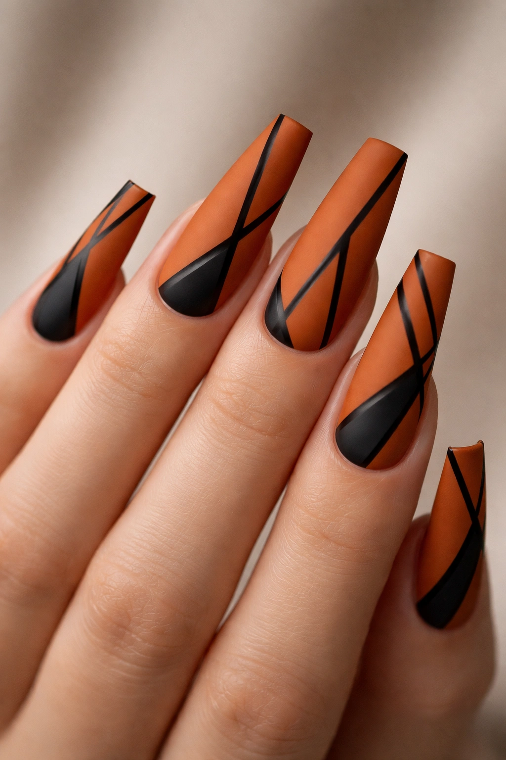
Matte finishes are experiencing a major moment, and burnt orange matte—a deep, earthy orange-brown tone—is sophisticated without being basic. The geometric patterns in crisp black lines create contrast and visual interest: think sharp triangles, clean rectangles, or angular stripes that follow the natural lines of the coffin shape. The matte finish makes the geometric designs pop even more because there’s no shine competing for attention.
What Makes Geometric Patterns So Powerful
Black lines against burnt orange create high contrast that reads sharp and intentional from any distance. The geometric approach keeps this design modern and architectural rather than delicate or overly feminine—it’s bold statement work. The coffin shape itself is already geometric, so when you layer geometric patterns onto it, you’re amplifying that angular energy. This design pairs perfectly with minimalist fashion, professional settings, and anyone who loves contemporary art.
Design Details Worth Knowing
- Hand-painted lines require precision—thinner black lines (0.5mm) look more refined than thick ones, and they’re easier to keep clean and straight
- Negative space is your friend—don’t cover the entire nail in patterns; leave breathing room so the burnt orange shows through and the design stays clean
- Symmetry creates impact—mirror patterns on the left and right sides of each nail feel intentional rather than random
- Combine patterns on different nails—put triangles on your thumb, stripes on your index, rectangles on your middle for cohesion without repetition
- Topcoat thickness changes the feel—a thick glossy topcoat over matte gives subtle shine, or keep it completely matte for an ultra-modern vibe
3. Coral Orange Marble
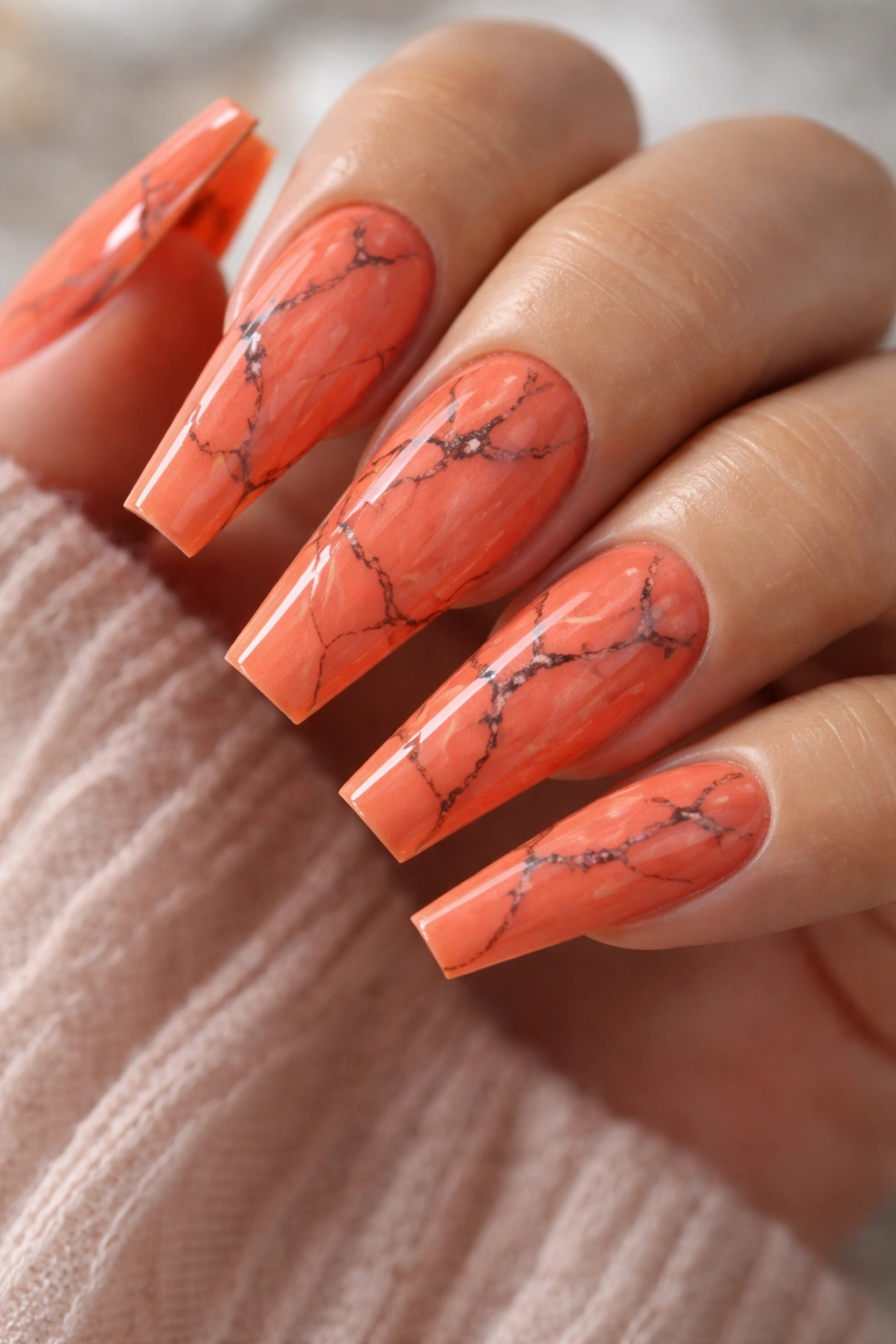
Marble patterns mimic natural stone with swirling, organic lines that look complex but require surprisingly simple execution. Start with a bright coral-orange base, then use thin black or dark gray lines to create the veined marble effect. The key is keeping the lines thin and slightly irregular—marble in nature is never perfectly symmetrical, and your nails shouldn’t be either. The coffin shape’s width gives you enough space to incorporate multiple marble veins per nail.
Why Marble Feels Elevated
Marble conjures luxury and refinement because it’s a material associated with high-end design. Translating that aesthetic to your nails makes even a simple coral orange feel expensive and intentional. The organic nature of marble patterns also means minor imperfections actually enhance the design rather than detract from it. A perfectly imperfect vein is more authentic and visually interesting than a too-precise line.
Creating Authentic-Looking Veins
- Use a thin liner brush or nail art pen—not a thick brush; the veins in marble are delicate and intricate
- Vary your line weight subtly—make some veins thicker and some thinner to mimic natural variation
- Let lines branch and connect—real marble has veins that split and merge, not just straight paths
- Black, gray, or dark teal all work beautifully—the color of your veins should contrast enough with coral orange to be visible but not so much that it feels harsh
- One topcoat of matte, one glossy option—either finish works; matte looks more stone-like, glossy more polished
4. Tangerine Ombre with Chrome Details
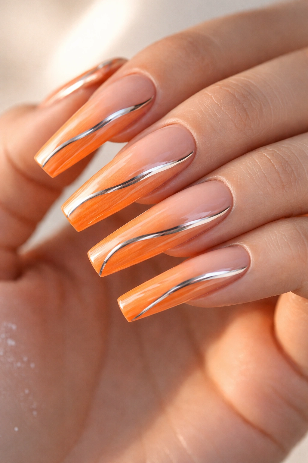
An ombre creates gradient by shifting from one color to another, but instead of multiple colors in one gradient, a true ombre uses varying depths of the same color family. This design builds from pale peachy-orange at the cuticle through vibrant tangerine in the middle, deepening to almost rust-orange at the tips. Chrome details—whether a thin line accent, a gradient chrome effect, or chrome flakes embedded in the ombre—add metallic shine that transforms the design from pretty to show-stopping.
The Psychology of Ombre on Coffin Nails
An ombre naturally extends the visual length of your nails because the color gradation draws the eye down and outward. On a coffin shape, this creates an elongating effect that makes your nails appear even longer and more dramatic. The chrome accents catch light and movement, adding another dimension that keeps the design interesting from every angle. This is the design for someone who wants impact without going full glitter.
Chrome Application Methods
- Chrome dust mixed into topcoat—apply over the darker orange section for a subtle shimmer effect
- Chrome powder pressed into wet topcoat—for more intense metallic coverage in specific areas
- Thin chrome stripe accent—a single line of chrome (rose gold or silver) down the center or side of the nail
- Half-chrome ombre—chrome gradually fades from full coverage at the tip to invisible at the cuticle
- Chrome tips with ombre fade—tips are full chrome while the ombre transitions to solid orange at the base
5. Orange Leopard Print
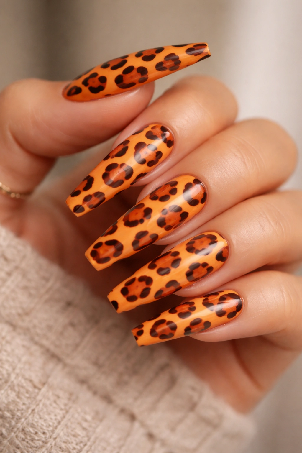
Leopard print is timeless and instantly recognizable, but on orange coffin nails, it takes on new character. The base is a warm, medium orange—not too dark, not too pale—so the leopard spots have room to create contrast. The spots themselves use darker orange-brown, black, or deep burgundy to form the classic rosette pattern (hollow circles with a small dot in the center, rather than solid spots). Leopard print feels playful yet sophisticated, especially when executed with precision.
Why Leopard Print Works on Long Coffin Nails
The coffin shape’s width provides ample space for the rosette pattern to display its full complexity. Leopard print on shorter nails can look cramped, but on coffin nails, each rosette has breathing room and the pattern becomes genuinely striking. The warm orange base enhances the animal-print aesthetic, leaning into warmth and richness rather than making it feel trendy or dated. This design feels confident and fashion-forward.
Executing Leopard Print Without It Looking Costume-y
- Vary your rosette sizes slightly—don’t make every spot identical; nature never does
- Leave plenty of orange showing between spots—don’t pack them so densely that they overwhelm the base color
- Use a dotting tool for consistency—precise circles look intentional while irregular ones look sloppy
- Outline with darker color, fill with a medium shade—this creates the rosette dimension rather than solid spots
- Place heavier concentration in the center of the nail—fade out toward the edges for a more refined effect than full coverage
- Matte topcoat makes leopard print feel more sophisticated than glossy
6. Burnt Orange with Gold Leaf Accents
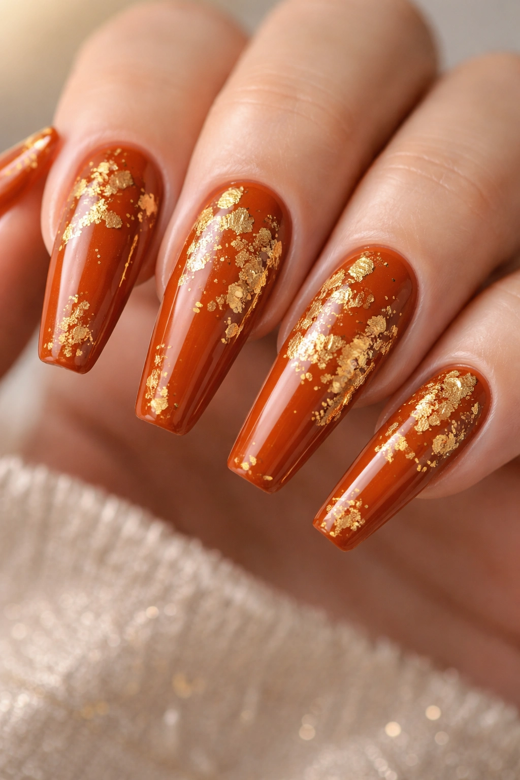
Gold leaf creates an instant luxury feel by adding actual metallic material to the nail surface. Start with a rich burnt orange base—a warm, slightly muted orange that leans toward brown—then strategically place genuine gold leaf (not just gold paint) across the surface. The leaves catch light differently than regular polish and create texture you can actually feel, elevating this design from pretty to genuinely special. This design reads expensive, intentional, and polished.
The Difference Between Gold Leaf and Gold Paint
Real gold leaf has three-dimensional quality and reflectivity that gold paint simply cannot replicate. When light hits gold leaf, it bounces differently, creating shimmer and depth. Gold leaf also has slightly irregular edges that create organic, beautiful imperfections. Using actual gold leaf signals quality and care in a way that immediately reads as more luxe than any metallic paint.
Working with Gold Leaf Successfully
- Apply to a slightly sticky topcoat—the tackiness helps the leaf adhere without needing additional adhesive that might look messy
- Press gently with a soft brush—gold leaf tears easily, so use a dedicated soft brush or a natural fiber brush
- Seal with clear topcoat immediately—this protects the leaf and prevents flaking
- Place leaf strategically, not all over—scatter it along the edges, accent the tips, or create a focal point on one or two nails
- Mix leaf placement with other accents—pair gold leaf with thin black lines or chrome details for visual balance
- Gold leaf looks stunning in matte finish—the contrast between the matte burnt orange and the shiny leaf is what makes it work
7. Neon Orange with Black Line Art
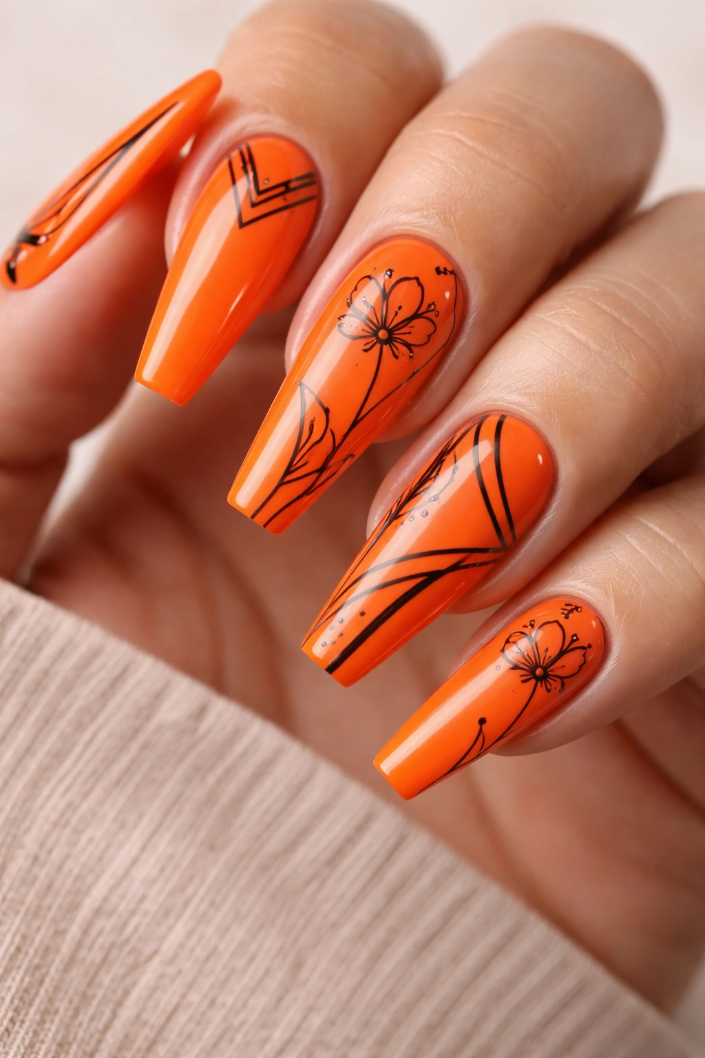
Neon orange is unapologetically bold—a bright, almost electric orange that demands attention. Pair it with precise black line art (think minimalist florals, geometric shapes, or abstract line work) and you get the perfect balance of vibrant color and refined detail. The contrast between the neon base and the black lines is so high that even very thin, delicate line work remains completely visible and impactful. This design says you’re confident, creative, and unafraid of color.
Why Neon Needs Restraint in the Design Details
Pure neon can feel overwhelming on its own, but add disciplined line art and it becomes fashion-forward instead of loud. The black lines give the eye something specific to focus on, creating visual interest without adding more color to an already vibrant palette. The coffin length means there’s enough nail space for line art to breathe and be appreciated rather than cramped.
Creating Line Art That Works on Neon
- Thin, clean lines are non-negotiable—thick lines on neon look heavy and less refined
- Use pure black for maximum contrast—avoid charcoal or dark gray when your base is neon
- Simple line work reads better than complex—one minimalist flower per nail beats intricate mandalas
- Consider negative space intentionally—at least 40% of each nail should remain pure neon with no design
- Abstract lines and geometric shapes work better than realistic imagery—they let the neon shine without competing for attention
- Matte finish keeps it modern—glossy can make neon feel a bit costume-y, while matte elevates it to intentional design
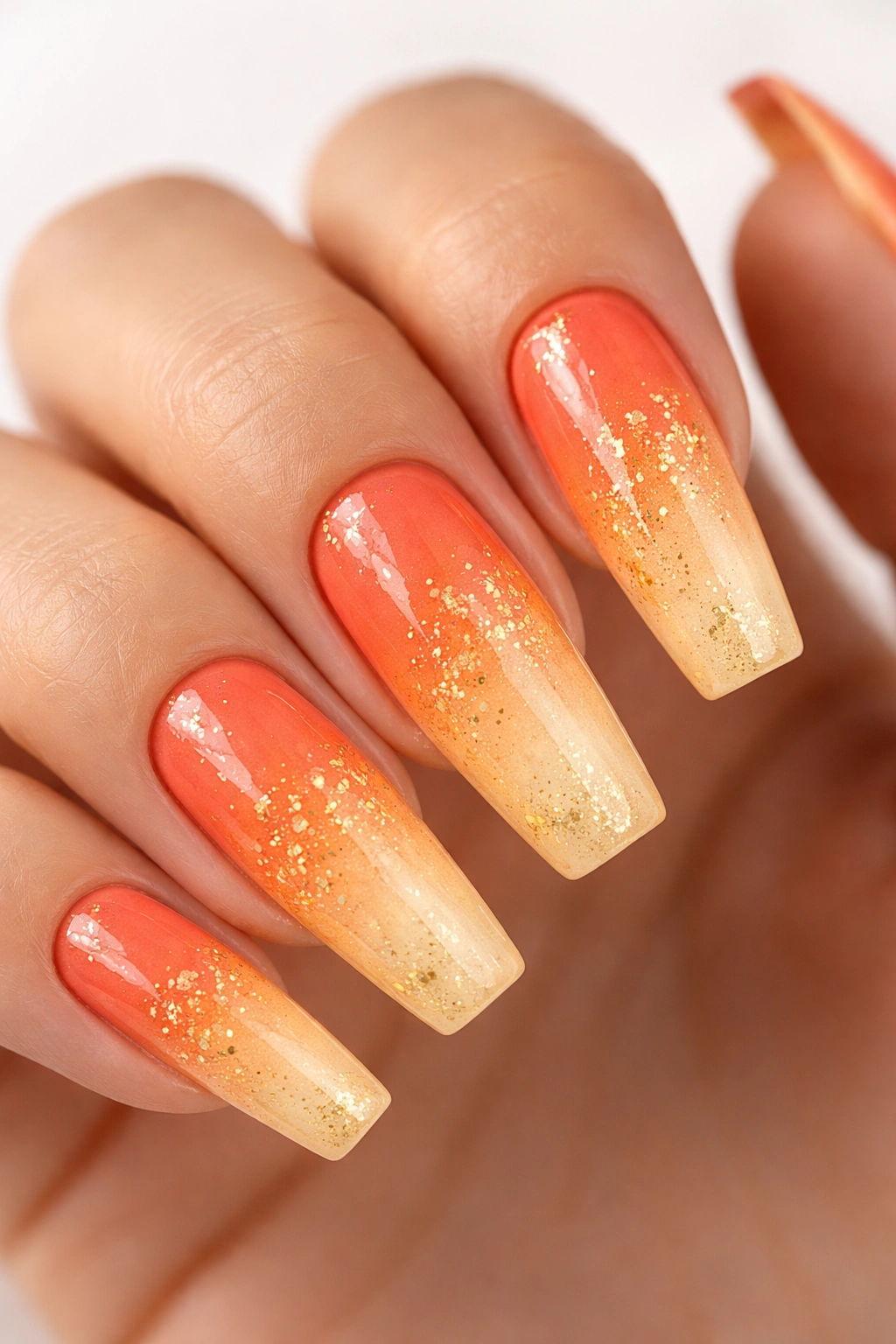
8. Peach Orange Glitter Gradient
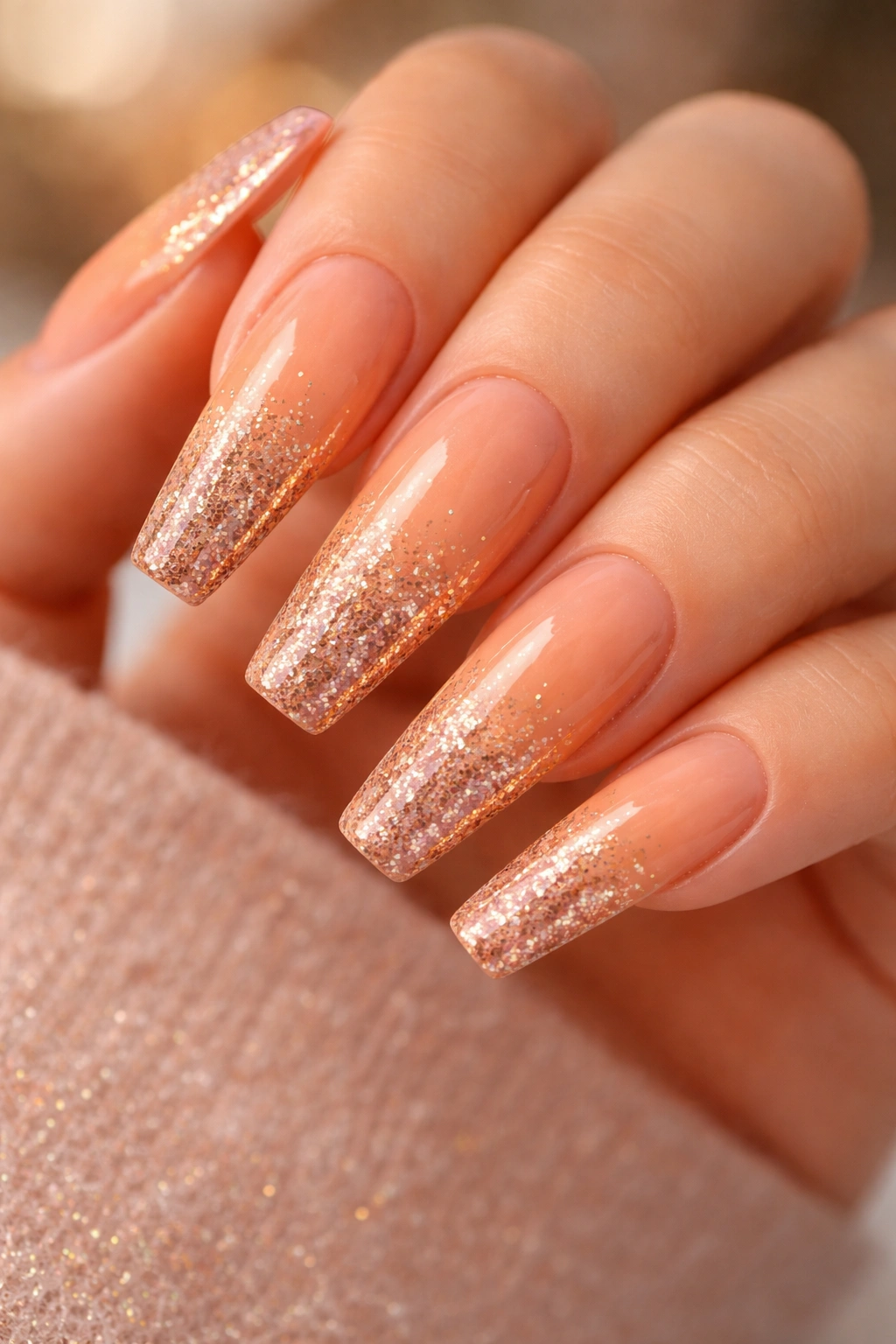
A glitter gradient starts with minimal glitter at the base and progressively gets denser toward the tips, creating a visual pull toward the fingertips. Peach orange—warmer and lighter than burnt orange, softer than true neon—serves as a gorgeous base for shimmery accents. Use multi-colored glitter (golds, champagnes, rose golds, and hints of lighter coral) rather than a single glitter color, so the gradient becomes more dimensional and catches light from multiple angles.
The Art of Glitter Placement
Glitter gradients require patience and precision, but the payoff is a design that looks intricate and intentional. The peach orange base is forgiving of skin undertones—it works beautifully on warm, cool, and neutral complexions. The gradient effect makes your nails appear longer because the eye travels from sparse glitter to dense glitter, following the length of the nail.
Building a Flawless Glitter Gradient
- Use a base topcoat with slightly higher tackiness—this helps glitter stay where you place it rather than sliding around
- Start with one layer of sparse glitter—place individual pieces rather than pouring glitter on and hoping
- Build layers slowly—three thin layers of increasing density look better than one thick layer
- Mix glitter sizes for depth—combine chunky glitter with ultra-fine sparkle for complexity
- Leave the cuticle area relatively clear—maybe just a few flecks, so the peach base is prominent near the base
- Seal with a thick topcoat—this protects the glitter and gives it a smooth, polished finish
9. Deep Orange with White Minimalist Design
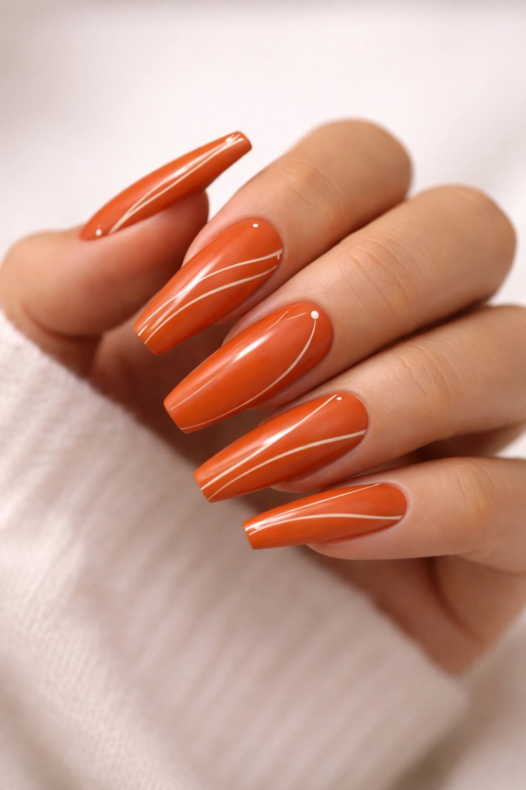
Minimalism in nail art means simplicity, negative space, and intentional design—not every inch of the nail filled with decoration. A deep, warm orange base paired with just a few thin white lines, dots, or simple shapes creates a sophisticated, modern aesthetic. This might be one thin white stripe down the center, three small white dots arranged deliberately, or a minimalist line drawing (think three-line flower or abstract face). The white creates contrast without chaos.
Why Less Is More in Nail Design
Minimalist design relies on visual impact through restraint. By using only white on your deep orange base, every element becomes significant and memorable. This approach works across all settings—professional, casual, formal, creative. The simplicity also means the design remains relevant for longer; you won’t tire of it as quickly as you might a busier design.
Executing Minimalist White Design
- Use a white gel pen or thin liner for precision—not a brush that might create uneven lines
- Plan your placement before applying—even minimalist design benefits from intention
- One element per nail is often more powerful than spreading design across all nails—put your white line design on just your ring and pinky fingers for impact
- The white should take up no more than 15-20% of each nail—let the orange be the star
- Keep lines extremely thin—thick white lines look heavy against deep orange
- Matte finish emphasizes the minimalist aesthetic—glossy can make it feel less intentional
10. Orange with Holographic Finish
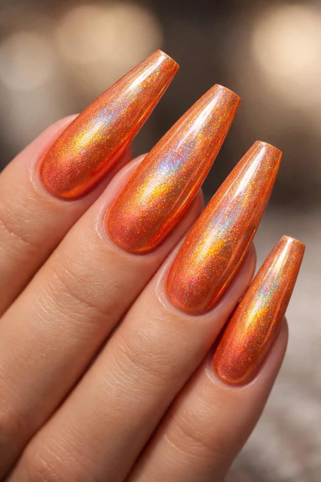
Holographic finishes have that magical quality of shifting color as the light and angle change—what looks peachy from one angle might look pink or gold from another. Start with a rich orange base, then apply holographic powder or a holographic topcoat to create the color-shifting effect. The coffin shape’s size means the holographic effect is visible and impressive, especially in sunlight or under varied lighting. This design bridges playful and sophisticated beautifully.
What Makes Holographic So Captivating
Holographic finishes are naturally eye-catching because they’re dynamic—they’re never the same color twice in different light. This quality makes holographic particularly striking on long nails where the nail surface is large enough for the color shift to be genuinely visible. Unlike chrome, which is metallic and reflective, holographic is more of a color-shift effect, giving it a distinctly different personality.
Applying Holographic for Best Results
- Use a quality holographic powder, not cheap alternatives—cheaper versions don’t have true color-shifting properties
- Apply with a dedicated holographic brush—the bristles need to catch the powder properly
- Layer your holographic topcoat thickly—thin applications don’t show the full effect
- Let each coat fully dry before applying the next—holographic effect builds with layers
- Top with a clear gloss coat—this seals the effect and makes the shift even more visible
- Photograph in different light—sunlight, indoor light, and darker lighting all show different aspects of the holographic effect
11. Creamsicle Orange and White Swirl
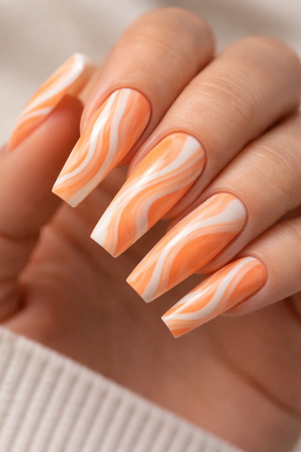
Creamsicle colors evoke nostalgia and playfulness—a blend of orange and cream/white that feels summery, fun, and slightly retro. Instead of using orange and white as two separate elements, a swirl design marbles them together across the nail surface, creating a dynamic, organic pattern. The swirl pattern works beautifully on the coffin shape because the width accommodates the swirling lines while the length makes the full pattern visible.
Why Swirl Designs Feel Special
Swirl patterns look complex but are actually fairly simple to execute, making them perfect for designing nails at home or at a salon. Each swirl is unique, so even if you’re doing the same design on all ten nails, none of them are identical—they feel organic and artistic rather than mass-produced. Creamsicle colors are inherently cheerful and flattering on virtually all skin tones.
Creating Beautiful Swirls Without Chaos
- Use a marble tool or toothpick to drag lines—not free-hand swirling, which is harder to control
- Plan your swirls before starting—maybe three main swirls per nail rather than random swiping
- Orange should dominate slightly more than white—so the design still reads as orange nails, not white with orange accents
- Keep the swirls flowing vertically or diagonally—avoid too many chaotic directions that feel messy
- Use a thick, glossy topcoat—this magnifies the swirl detail and gives it shine
- Avoid over-working the design—once you’ve created your swirls, stop; further manipulation makes it muddy
12. Rich Rust Orange with Burgundy Accent
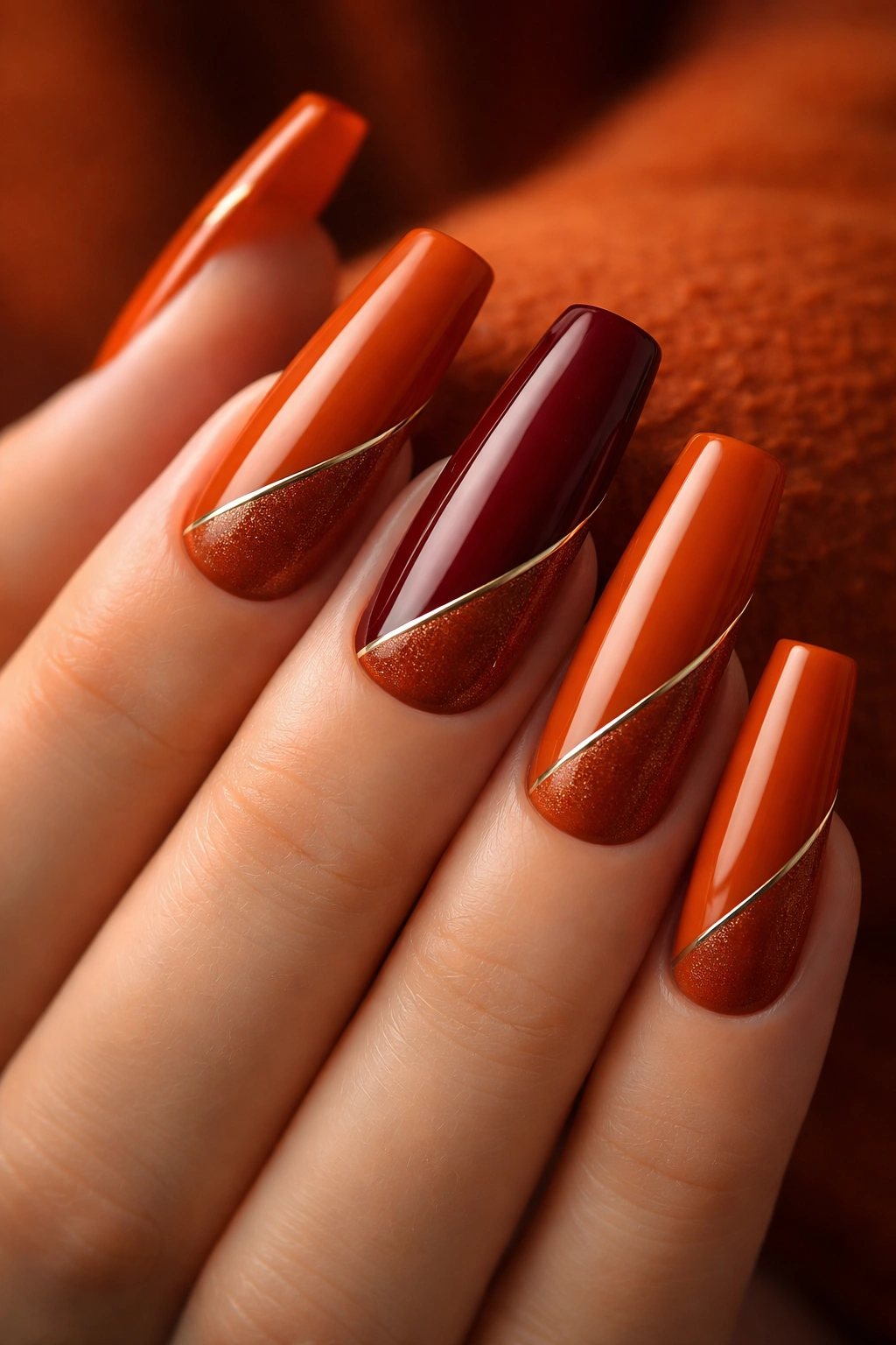
This design pairs two warm tones from the same color family but different depths—a rich rust orange as the primary color on nine nails, with one accent nail in deep burgundy. The burgundy isn’t a contrasting color; it’s a natural evolution of the orange into a deeper, slightly cooler tone. This creates sophistication and visual interest without jarring color clash. On the rust orange nails, you might add a thin gold or copper line as a connector between the two colors.
Why Monochromatic Warm Tones Work So Well
Monochromatic (single-color-family) designs feel inherently sophisticated because they require confidence in color rather than relying on contrast to create interest. A rich rust and deep burgundy combination is deeply autumnal and luxurious, working beautifully on all skin tones but particularly stunning on warm complexions. The warm undertones in both colors create cohesion that makes this design feel intentional and high-end.
Executing the Rust-to-Burgundy Transition
- One accent nail in burgundy is more impactful than multiple—reserve the burgundy for your ring finger or middle finger for maximum focal point
- Add a thin metallic line on the rust orange nails as a bridge—this connects the two colors and makes the transition feel intentional rather than random
- Keep finishes consistent across both colors—either both matte, both glossy, or both with subtle shimmer
- The burgundy nail can incorporate additional details—maybe a thin gold line design while rust orange stays solid
- This palette works in matte finish particularly well—it reads elegant and earthy rather than shiny
- Consider adding a tiny gold accent where rust meets burgundy—a small dot of gold or thin line unifies the entire design
Final Thoughts
Orange coffin nails offer incredible versatility—from minimalist elegance to bold statement designs, from warm everyday colors to show-stopping metallics and effects. The coffin shape’s length and width provide the perfect canvas for these designs to truly shine, and orange’s warmth makes it flattering across all skin tones. Whether you’re drawn to deep burnt orange, bright neon, peachy coral, or rustic rust tones, there’s an orange design here that matches your style and confidence level.
The designs above range from beginner-friendly (solid orange with simple accents) to intermediate (requiring patience with glitter gradients or marble veining) to more advanced (demanding precision with line art). Start with a design that resonates with you, whether that’s based on your personal style or your current skill level. Remember that nail design is personal—these twelve designs serve as inspiration, not rules. Feel free to combine elements from multiple designs, adjust colors to match your specific undertone, or modify details to suit your aesthetic. Your nails are a mini canvas, and orange coffin nails are the perfect length to make your design truly remarkable.
