

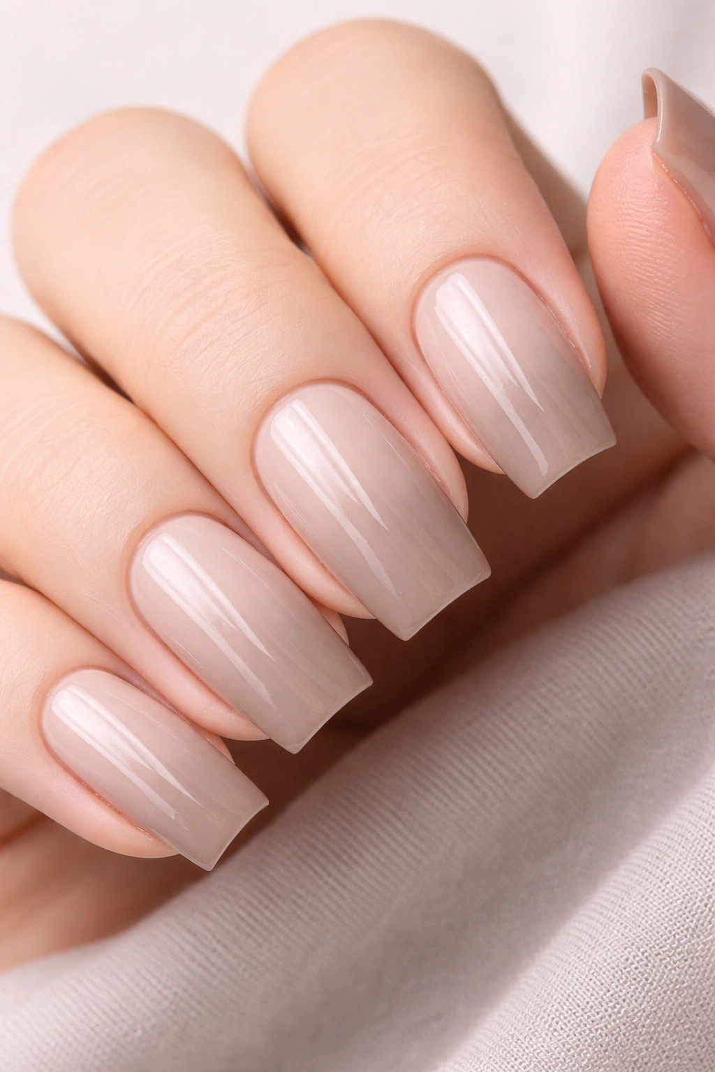
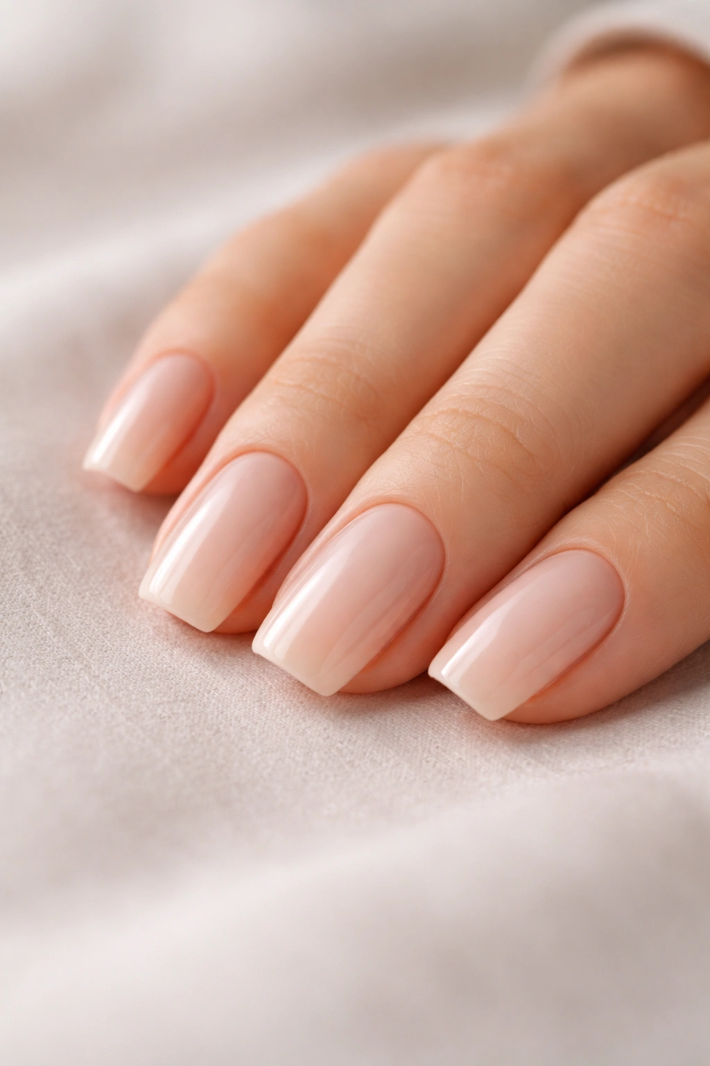
The soft square shape has become the quiet darling of nail design—and for good reason. Unlike dramatic stilettos or strictly geometric squares, soft squares curve gently at the corners while maintaining a modern, understated elegance that works everywhere from the office to weekend coffee runs. They’re the sweet spot between edgy and approachable, giving your nails a polished look without requiring constant careful handling or feeling over-the-top.
What makes soft square nails so compelling isn’t just the shape, though. It’s the nail art possibilities that emerge when you pair this flattering silhouette with thoughtfully restrained designs. The best everyday soft square looks embrace simplicity without sacrificing personality. They layer minimalist aesthetics with subtle detail—a whisper of shimmer, a delicate line, a hint of dimension—creating nails that feel fresh, intentional, and genuinely wearable. These are designs that pass the professional setting test, photograph beautifully on Instagram, and make you smile every time you catch a glimpse of your hands.
If you’ve been scrolling through nail inspiration but struggling to find looks that feel both special and practical, these twelve soft square designs are worth bookmarking. They showcase how much personality can live within restraint, and they’ll likely spark ideas for your own nail artist or DIY attempts.
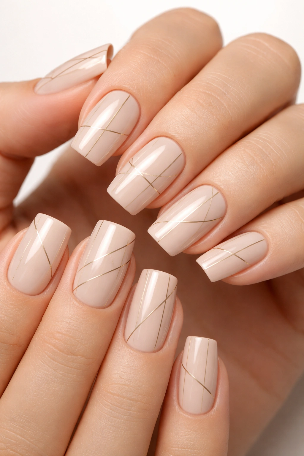
1. Soft Square Nails with Minimalist Nude Lines
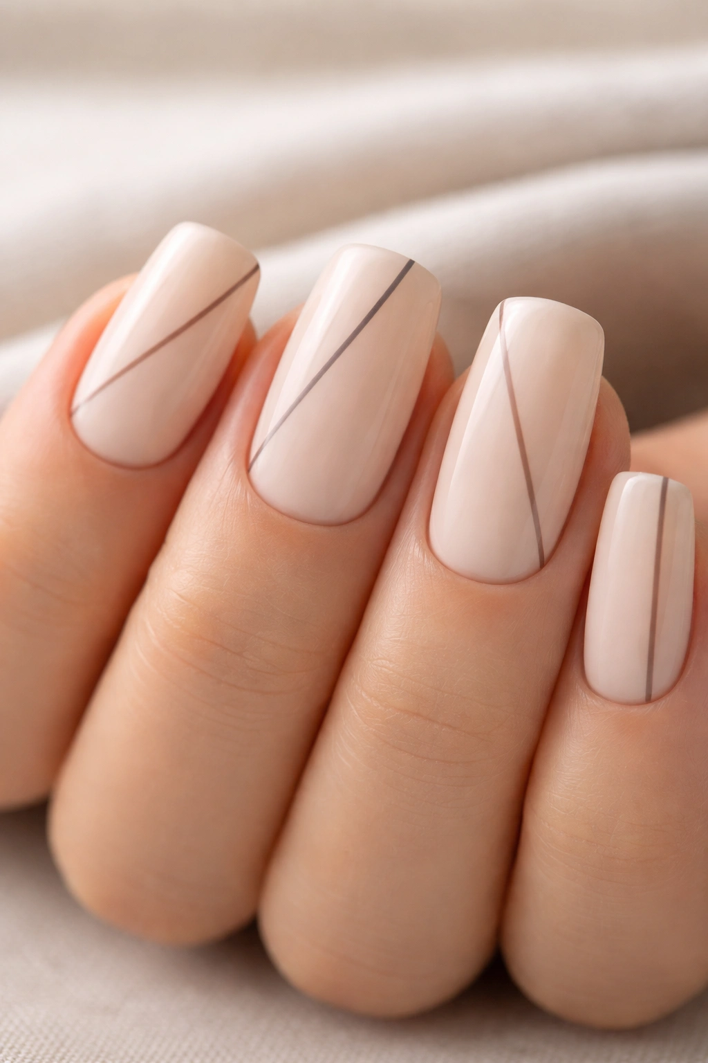
This design strips nail art down to its most essential form—a creamy nude base with single, hand-drawn lines running vertically or at precise angles across each nail. The beauty lies entirely in the execution and the contrast between the warmth of the base color and the cool precision of the lines, typically rendered in charcoal gray, taupe, or muted brown.
Why This Works for Every Day
The minimalist line aesthetic feels mature and intentional without demanding attention. Lines can be varied—some nails might feature one vertical line, others two or three at different angles—creating visual interest while maintaining cohesion across all ten fingers. The nude base extends your nail bed visually, making your fingers appear longer while keeping the overall look grounded and office-appropriate.
How to Make It Your Own
- Vary line thickness from hairline-thin to a slightly more confident 2mm stroke
- Experiment with line placement—vertical, diagonal, or horizontal each create different visual effects
- Try negative space where the line intentionally breaks or gaps rather than running uninterrupted
- Switch the base color to a softer gray, warm beige, or barely-there pink if straight nude feels too simple
- Add a single tiny dot where lines intersect for subtle extra detail
This design works on both natural and medium-length soft square nails, though the impact intensifies when you have a bit of length to showcase those clean lines.
2. Soft Square with Creamy White and Gold Accent
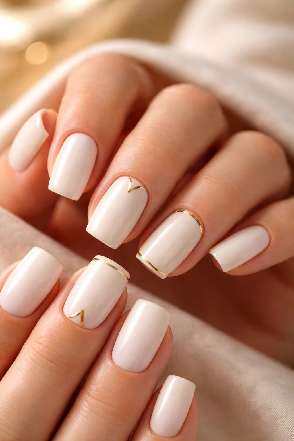
Creamy white as a base—not stark white, but the soft, warm ivory-tinged white that feels like luxury rather than clinical—pairs beautifully with gold elements on one or two accent nails. The gold might appear as a thin frame around the nail edge, a geometric shape in the center, or even just a minimal accent stripe on a single accent nail.
What Makes This Combo Timeless
White and gold carry an inherent elegance that transcends trends. On soft square nails, this pairing feels fresh because the gentle curves soften what could otherwise read as severe or architectural. The creamy undertones prevent the white from feeling stark, while the gold adds just enough warmth to feel personal rather than generic.
Ways to Layer in Gold
- A thin gold line framing the perimeter of one or two accent nails
- A small gold geometric shape—triangle, rectangle, or organic blob—on the nail bed
- Gold dust or fleck embedded in the top coat for subtle sparkle without overwhelming the design
- A gold half-moon accent on the base of one accent nail
- Diagonal gold stripes across a single accent nail for visual movement
The cream-white base on soft squares also photographs exceptionally well, which explains why this look appears constantly in professional nail portfolios. It’s classic because it genuinely translates across skin tones and looks expensive with minimal effort.
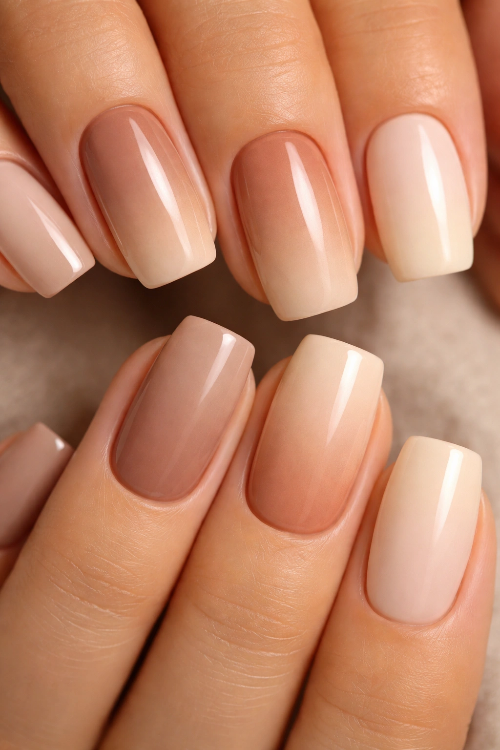
3. Soft Square Nails in Understated Taupe Ombre
An ombre effect using two soft, closely related taupe or greige tones creates subtle dimension without the drama of a bold color shift. One taupe might be warmer or slightly darker, creating a gentle gradient that’s almost unnoticeable in some lighting but catches beautifully when your hand moves or light hits at an angle.
Why Taupe Is the Underrated Choice
Taupe occupies the perfect middle ground between brown, gray, and pink—it coordinates with virtually everything in a neutral wardrobe while adding enough sophistication to feel intentional. On soft square nails, a taupe ombre reads as refined rather than muddy because of the gentle color graduation and the shape’s inherent elegance.
Creating the Ombre Effect
- Blend two complementary taupes using a makeup sponge dabbed gently along the nail edge
- Keep one shade concentrated at the base and fade the second shade toward the tip
- Use a dry brush technique to pull color from one section into another, creating a hazy transition
- Leave the very tip slightly lighter or more opaque for a defined finish
- Apply a glossy or matte top coat depending on how much shine you want (matte actually makes this effect more visible)
This design feels particularly good during fall and winter but remains appropriate year-round because the colors are so inherently neutral and calming.
4. Soft Square with Matte Finish and Subtle Texture
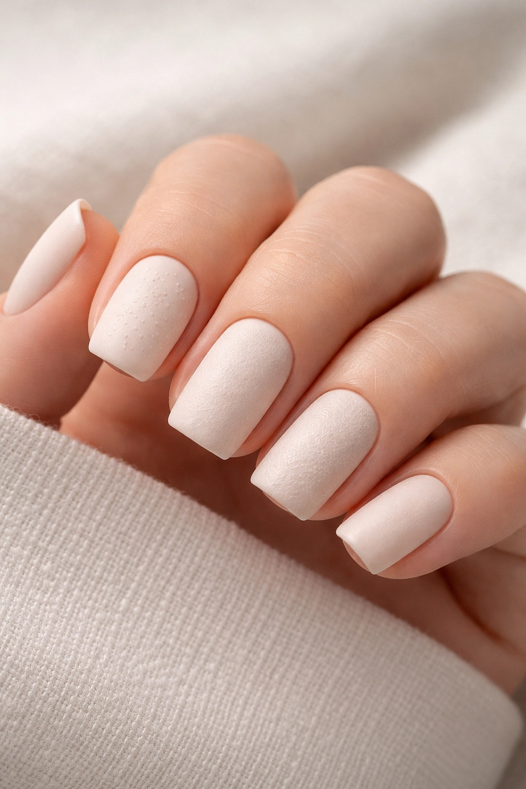
Matte soft square nails with a barely perceptible texture take a completely different sensory approach to nail art. The matte finish alone changes how light plays across your nails, making them feel more modern and less jewelry-like than glossy options. Adding subtle texture—perhaps through stamped dots, faint geometric patterns, or a barely-there sand finish—creates an almost tactile quality.
The Appeal of Matte Over Glossy
Matte finishes inherently feel more contemporary and less “done up” than high-shine nails, making them perfect for people who want polished-looking nails that don’t scream effort. The soft square shape in matte actually appears slightly more squared-off because the finish doesn’t catch light the same way, creating a satisfying visual impact.
Texture Options That Stay Subtle
- Barely visible stamped dots arranged in geometric patterns
- A faint crosshatch or linear pattern created with a thin stamping plate
- Subtle speckles suggesting an aggregate or stone texture
- Fine lines creating a linen or fabric-like appearance
- A slight grainy texture from a matte powder topcoat rather than matte polish
Pair matte finishes with warm nudes, soft grays, or creamy whites for the most wearable effect. The combination of matte finish and soft square shape creates an almost architectural elegance.
5. Soft Square Nails with Delicate Freckles
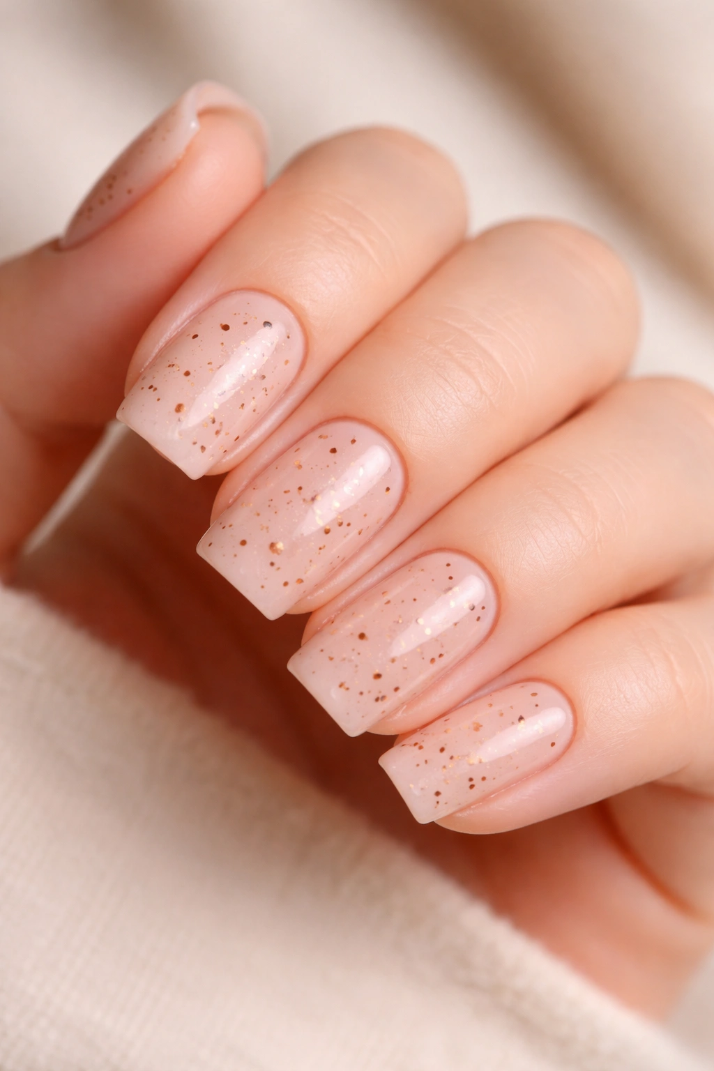
Tiny, intentional freckles scattered across a soft square nail base create whimsy paired with subtlety. These aren’t the sun-kissed freckles of a tanned arm but rather deliberate artistic dots in warm brown, rust, or terracotta scattered irregularly across a nude or pale pink base. The freckles should look like they were placed with intention, not randomly, which requires thoughtful spacing.
Why Freckles Feel Personal
Freckle designs transform plain nails into conversation starters while remaining technically understated. The individual dots are small enough that the design reads as subtle, but their collective impact is charming and memorable. This design particularly suits people drawn to maximalist aesthetics who want to tone it down for everyday wear.
Executing Freckles Properly
- Use a thin nail art brush or dotting tool to place freckles individually—never spray or randomly dot
- Space freckles closer together on some nails and more sparingly on others for organic variation
- Angle freckles slightly rather than placing them in strict vertical alignment
- Concentrate more freckles on accent nails if desired, fewer on others
- Choose warm brown, rust, cinnamon, or even a light bronze tone for the most flattering freckle color
The base color matters tremendously here—warm nudes, soft peaches, or pale pinks create the most beautiful canvas for freckles. This design photographs beautifully and feels current without being trendy.
6. Soft Square in Barely-There Pink with Sheer Overlay
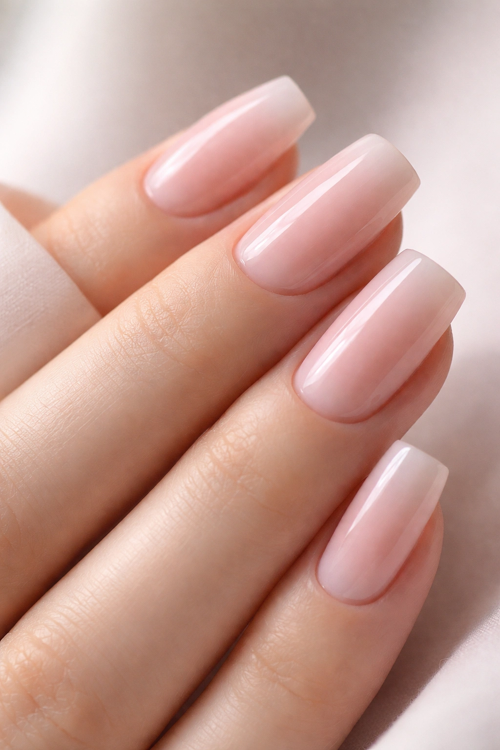
This design starts with a barely-there pink base—so pale it’s almost white with just a whisper of pink undertone—then adds a sheer overlay effect where a slightly more saturated pink concentrates toward the tip or in a specific section. The effect should feel almost accidental, as though the nail polish happened to pool slightly more densely in one area rather than being deliberately applied.
The Magic of Sheer Layering
Sheer overlays create visual depth and a sense of movement across the nail that feels more sophisticated than flat color. Because the soft square shape itself provides good canvas space, this technique translates beautifully without looking cramped or busy. The barely-there base keeps the overall effect subtle and wearable even in conservative professional settings.
How to Build a Sheer Overlay
- Apply a barely-there pink base color in two thin coats for even, pale coverage
- Choose a second pink that’s noticeably but not dramatically darker or more saturated
- Apply the second pink as a gradient toward the tip using a sponge or dry brush technique
- Alternatively, create a concentrated pool of the deeper pink in one corner or the center
- Seal with a glossy top coat that enhances the sheer, luminous quality
This design works particularly well when you want your natural nail to show through slightly, creating a skin-like quality. It’s the nail design equivalent of a fresh face—effortless and glowing rather than painted.
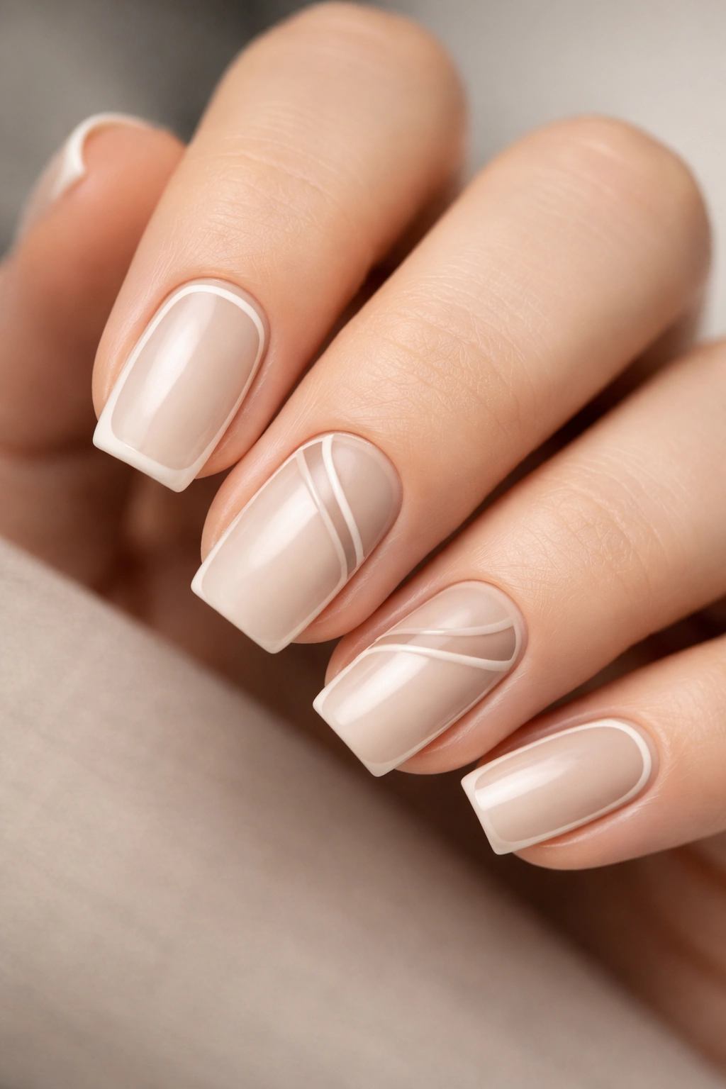
7. Soft Square Nails with Thin Linear Patterns
Linear patterns—thin, geometric lines arranged in deliberate grids, waves, or angular arrangements—create visual interest without heavy-handed design. Each line should be thin and precise, sometimes in a contrasting color but often just slightly darker than the base color, creating an almost embossed effect where the pattern reads as texture rather than color contrast.
Why Lines Feel Modern
Linear patterns connect to architectural and contemporary design movements, giving nails that follow this approach an inherently modern sensibility. On soft square nails, the effect is particularly striking because the soft curves contrast beautifully with sharp, geometric lines. This creates visual tension in the best possible way.
Line Pattern Variations
- Perfectly spaced vertical lines across all nails (classic and clean)
- Diagonal lines creating a sense of motion or direction
- Crosshatch patterns where lines intersect at regular intervals
- Wavy horizontal lines suggesting movement or water
- Angular geometric patterns creating abstract shapes
- Asymmetrical lines where some nails have more density than others
The base color should be neutral—cream, beige, soft gray—to let the line work stand out clearly. The contrast color can be charcoal, deep taupe, or even a warm brown depending on your preference. This design scales beautifully from minimal (lines on accent nails only) to more impactful (lines across all nails with varying density).
8. Soft Square in Natural Beige with Negative Space
This design uses negative space—intentional areas where the nail polish is absent and natural nail or skin shows through—to create visual interest on a neutral beige base. Negative space might appear as small geometric cutouts, a frame around the nail perimeter, or organic shapes intentionally left unpainted to create contrast with the solid colored portions.
The Elegance of Less
Negative space designs feel contemporary because they challenge the assumption that nails should be entirely covered with color. By leaving strategic areas bare, you create a more modern, editorial aesthetic. On soft square nails, negative space works particularly well because the shape’s curves and the clean edges of the square provide good visual scaffolding for where negative space begins and solid color ends.
Negative Space Techniques
- Paint a thin border around the nail edge, leaving the center bare
- Create geometric cutouts—triangles, rectangles, or hexagons—distributed across the nail
- Leave a negative space moon shape at the base or tip of the nail
- Paint diagonal stripes, leaving gaps between them so bare nail shows through
- Create a frame effect where only the outer third of the nail is painted
The beige base creates enough color to anchor the design while the negative space prevents it from feeling heavy. This design particularly suits people who love the idea of nail art but feel constrained by fully painted nails.
9. Soft Square Nails with Soft Earth Tone Gradient
A gradient using three soft earth tones—perhaps moving from warm taupe through terracotta-tinged beige to soft cream—creates a sophisticated ombre effect that suggests natural materials like sand, stone, or earth. The colors should be closely related enough that the gradient feels organic rather than jarring, with clear transitions between each tone.
Why Earth Tones Feel Grounded
Earth tone palettes inherently calm the nervous system and feel approachable despite their sophistication. The gradient effect on soft square nails creates visual movement and dimension that makes the design feel expensive and intentional. This look works across seasons because earth tones are timeless.
Executing a Multi-Tone Gradient
- Choose three colors from the same color family—all warm, all cool, or all true neutrals
- Apply the lightest shade as a base across all nails
- Blend the medium tone onto half of each nail using a sponge
- Add the darkest tone to just the tips or one corner
- Use a clean, damp sponge to gently blend the transitions between colors
- Seal with a top coat that maintains the natural, earthy feel
The beauty of this design lies in the blending—harsh transitions between colors look amateurish, while seamless gradients read as professional and refined. Take time with the sponge work, and consider doing multiple light applications rather than one heavy application.
10. Soft Square with Embedded Metallic Flakes
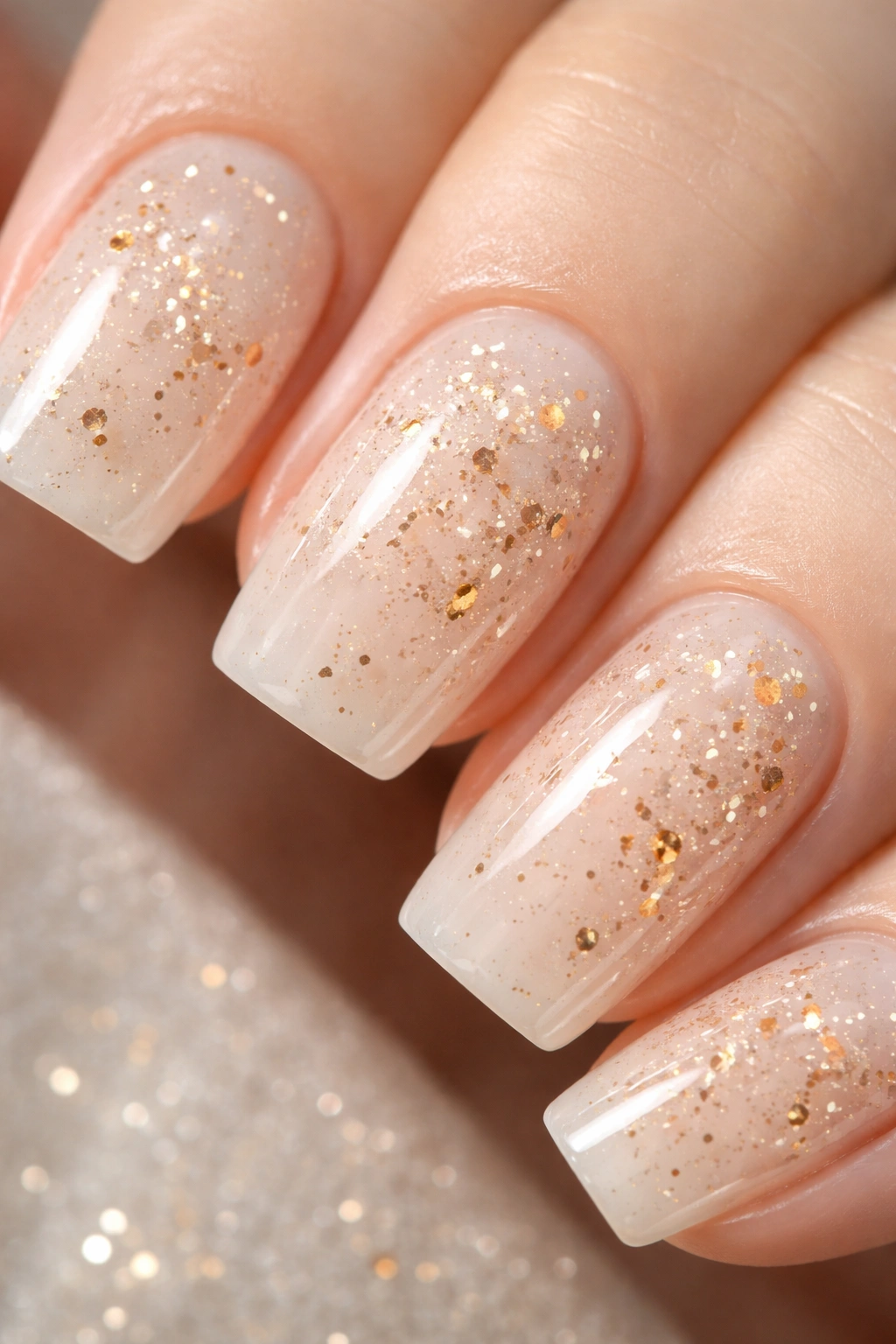
This design suspends actual metallic flakes—gold, copper, or bronze micro-flakes—within a clear or pale-tinted top coat that sits over a creamy base color. The flakes catch light and create sparkle without the design feeling holiday-specific or overly glittery. The soft square shape provides excellent canvas space to showcase how light plays across the embedded flakes.
The Sophistication of Embedded Flakes
Flakes embedded within the topcoat rather than loose on the surface feel more refined than traditional glitter. The clear topcoat holds them in place while allowing them to be visible from all angles, creating an almost three-dimensional quality. On soft squares, this effect feels particularly luxurious because of the nail’s size and elegant shape.
How to Incorporate Metallic Flakes
- Apply a creamy base color (nude, cream, pale pink, or soft gray work beautifully)
- Mix metallic flakes into a clear topcoat or use a commercially available flake topcoat
- Apply this flake-embedded topcoat carefully and evenly across the nail
- The flakes should be sparse enough that the base color remains visible underneath
- Finish with a glossy topcoat for maximum shine and protection
- For subtlety, apply the flaked topcoat only to accent nails
The key is restraint—too many flakes and the design reads as costume-y, but the right amount creates an ethereal, sophisticated effect. Copper and bronze flakes tend to feel warmer and more wearable than gold for everyday settings.
11. Soft Square in Creamy Ivory with Handwritten Details
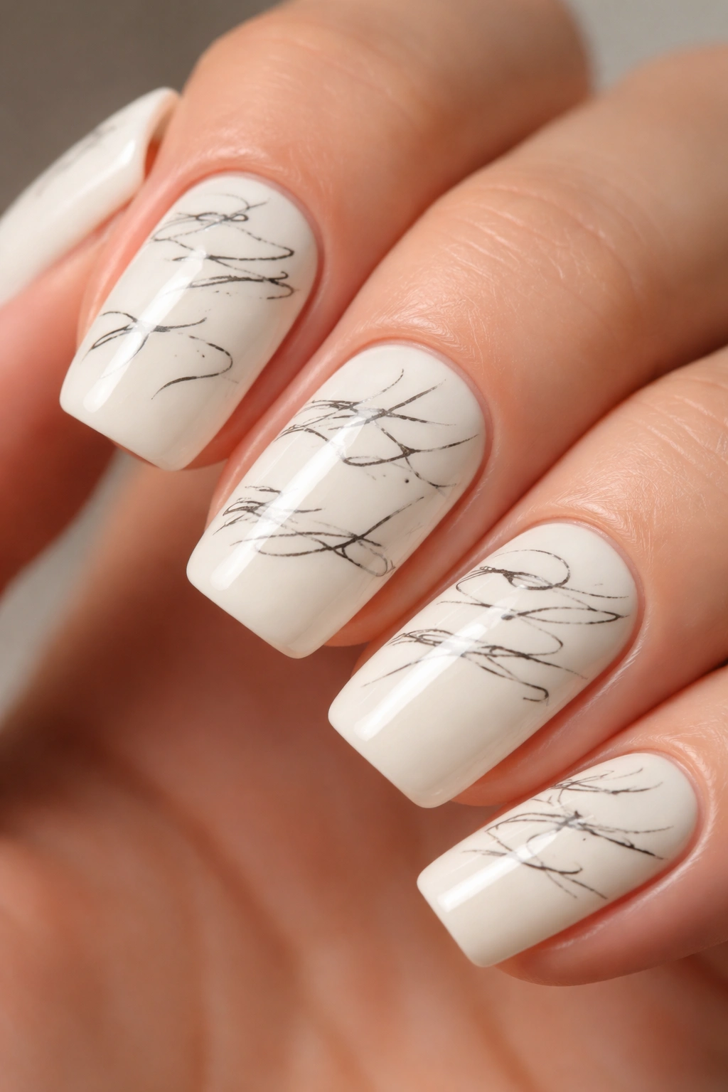
Hand-drawn lettering or simple script words scattered across creamy ivory soft square nails create a personalized, journal-like aesthetic. The lettering should be small, intentional, and readable upon close inspection but not immediately obvious from a distance. This design works beautifully for words with personal meaning—initials, dates, affirmations, or simply beautiful words you love.
Why Handwritten Details Feel Personal
Handwriting connects nails to personal expression in a way that standardized designs cannot. The slight imperfections of hand-drawn lettering feel authentic and human rather than manufactured. On soft square nails, handwritten details occupy sufficient space to be legible without overwhelming the overall look.
Executing Handwritten Details
- Use a fine-tipped nail art pen or extremely thin brush with steady-hand polish
- Practice lettering on paper first to develop consistency
- Keep lettering small enough to appear intentional rather than cluttered
- Space lettering across all nails or concentrate on accent nails
- Choose script or print lettering depending on personal preference
- Use colors that create subtle contrast—dark gray on ivory, navy on cream, or even a shade just slightly darker than the base
Words work best when they’re personal—a significant date, initials of someone meaningful, or a favorite word. Avoid generic phrases that anyone could use; the power of this design lies in its individuality.
12. Soft Square Nails with Pearlescent Shimmer Base
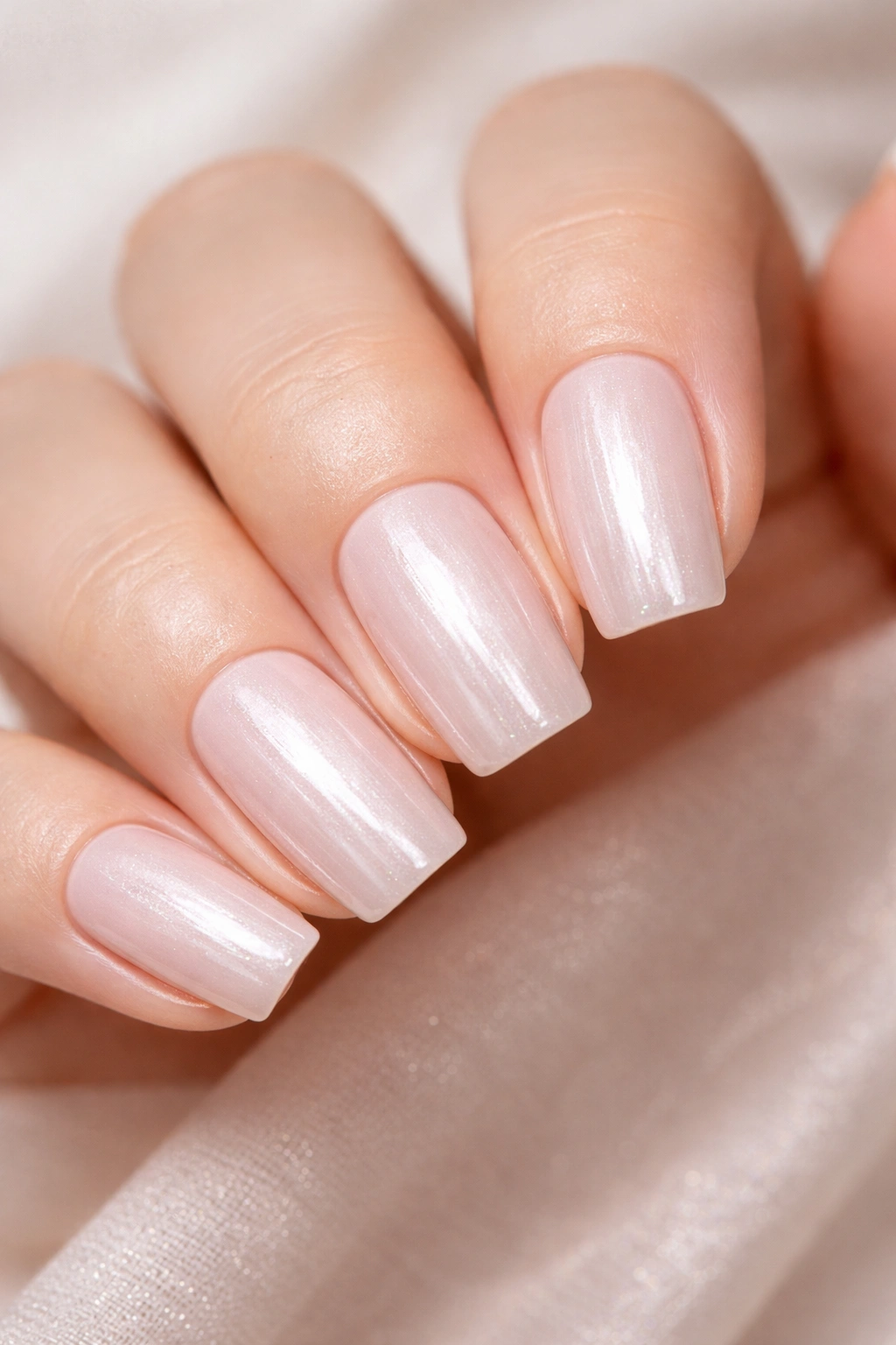
Rather than adding shimmer on top of a base, this design uses a pearlescent polish as the foundation color itself. The shimmer is built into the polish, creating an iridescent quality where the color seems to shift subtly depending on light and angle. A pearlescent nude, cream, or soft pink catches light beautifully without requiring additional embellishment.
The Quiet Luxury of Pearlescent Finish
Pearlescent finishes feel inherently more luxurious than flat colors because of how light interacts with the polish. The shimmer is sophisticated and subtle rather than glittery or sparkly, making it appropriate for professional settings while still feeling special. The soft square shape showcases this effect beautifully because of the surface area and the elegant silhouette.
Working with Pearlescent Polishes
- Choose a pearlescent polish in a neutral color family for maximum wearability
- Apply two thin coats rather than one thick coat for even color and shimmer distribution
- The shimmer should be noticeable in good lighting but not overwhelming
- Pair with a glossy topcoat to enhance the iridescent quality
- Consider adding a single accent element—a thin line, small dot, or minimal design—in a contrasting color on one nail if desired
Pearlescent finishes photograph beautifully and create visual interest without requiring detailed nail art skills. This design essentially gives you sophistication built into the polish itself, making it perfect for people who want polished nails with minimal effort.
Final Thoughts
The appeal of these twelve soft square designs lies in their shared philosophy—that elegance lives in restraint, and personality can absolutely coexist with professional appropriateness. Each design respects the soft square shape itself, using the nail’s natural elegance as a foundation rather than fighting against it. Whether you choose delicate freckles, precise lines, warm gradients, or luminous pearlescence, you’re working with a palette of techniques that feel current without being trendy.
The best part about soft square nails is their forgiveness and adaptability. These designs work beautifully on natural nails, gel applications, acrylics, and dip powder. They photograph well, last respectably (particularly if you’re using a quality topcoat or professional application), and they transition seamlessly from work to weekend to evening plans. You never have to explain a soft square look or feel self-conscious about your nails looking “done.”
Save these looks and bring them to your nail artist, or use them as jumping-off points for your own creative variations. The underlying principle remains consistent—soft squares paired with thoughtful, restrained design create nails that feel both special and genuinely wearable every single day.
