

Duck nails have become the ultimate statement maker for anyone who wants their manicure to absolutely command attention. These bold, oversized squared-off nails extend well past your fingertip in a dramatic, unapologetic way that screams confidence. When you combine the structural drama of duck nails with baddie aesthetics—think rich jewel tones, metallic accents, intricate patterns, and edgy design elements—you get a nail style that’s impossible to ignore. The beauty of this nail shape is that it’s essentially a blank canvas for creative expression, and the “baddie” approach means you’re not holding back on color, attitude, or visual impact.
If you’ve been scrolling through nail inspo and feeling stuck between safe and sensational, duck nails are your answer. They’re the manicure equivalent of walking into a room and owning it. Whether you’re drawn to moody minimalism with a twist, full-on glitter chaos, or sophisticated edge, there’s a baddie duck nail aesthetic waiting for you. Let’s explore twenty ideas that range from subtle-but-bold to absolutely fierce.
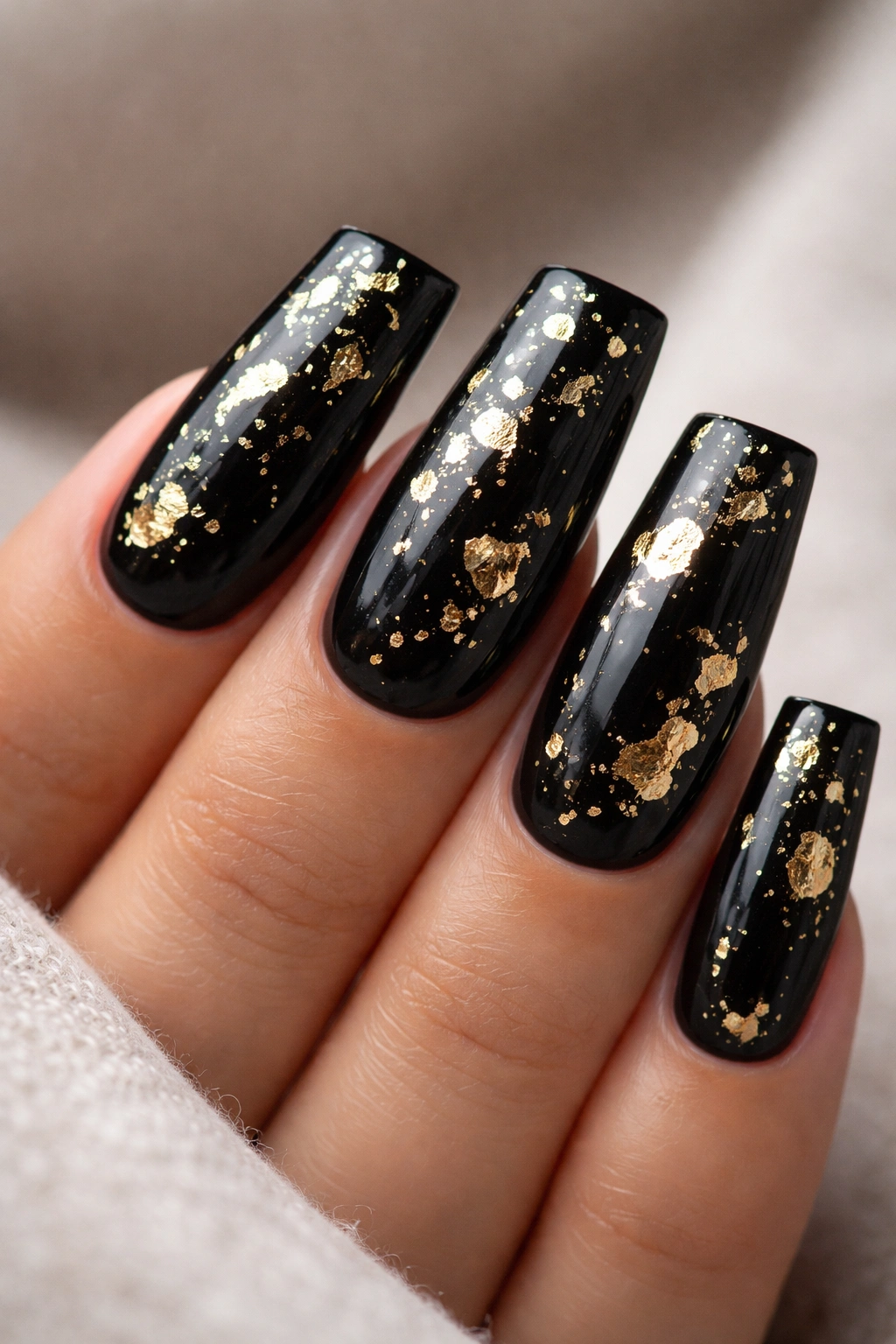
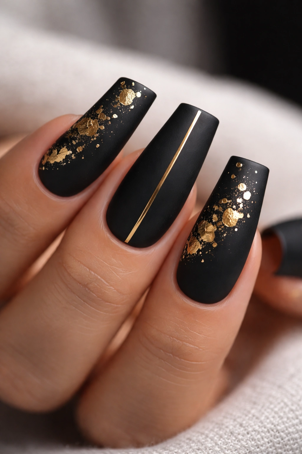
1. Jet Black with Gold Foil Accents
Pure jet black forms the foundation here, but the gold foil details elevate it into territory that feels expensive and intentional. Think scattered geometric foil pieces across one or two nails, or a clean vertical stripe of foil down the center of your middle or ring finger. The contrast between matte black and the reflective gold creates dimension that catches light from every angle.
Why This Works as a Baddie Statement
Black is the ultimate neutral that somehow feels aggressive and refined at the same time. Add gold, and suddenly you’re broadcasting wealth and taste without saying a word. This design works for literally any occasion—work, date night, casual hangout—because it reads as polished rather than over-the-top.
Design Details to Consider
- Use real gold foil (not painted-on metallic) for authentic light-catching depth
- Leave at least one nail completely black and matte to anchor the look
- Consider a thin gold outline along the squared edge for subtle edge-play
- Mix foil placement—avoid placing it identically on every nail
Pro tip: Seal the foil with a clear top coat and UV light immediately. Gold foil is delicate and shifts if you’re not careful during the curing process.
2. Deep Burgundy with Rhinestone Constellation
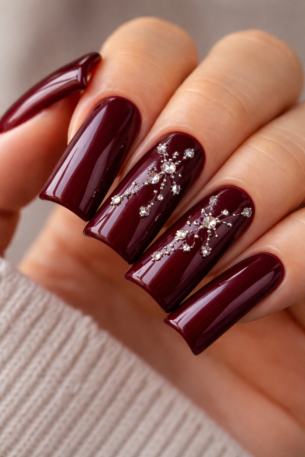
This shade of burgundy sits right between wine and oxblood—dark enough to feel moody and rich, but not so dark that it reads as plain. The trick is scattering small rhinestones across two or three nails in a random constellation pattern that feels like intentional artistry rather than random glam.
The Baddie Psychology Behind It
Burgundy screams confidence and mystery. It’s the color of someone who doesn’t need bright colors to feel bold. Rhinestones add just enough glimmer to keep it from feeling funeral, while the constellation arrangement keeps it from looking costume-y.
Application Pro Tips
- Start with a burgundy that has true depth—avoid sheer or translucent versions
- Place stones while the top coat is still tacky, not after it’s fully cured
- Use varying stone sizes (mix 1mm, 2mm, and 3mm) for a more organic, less-uniform look
- Leave some nails stone-free to balance the visual weight
Worth knowing: This design photographs beautifully and has serious staying power if you use quality stones and a strong adhesive topcoat.
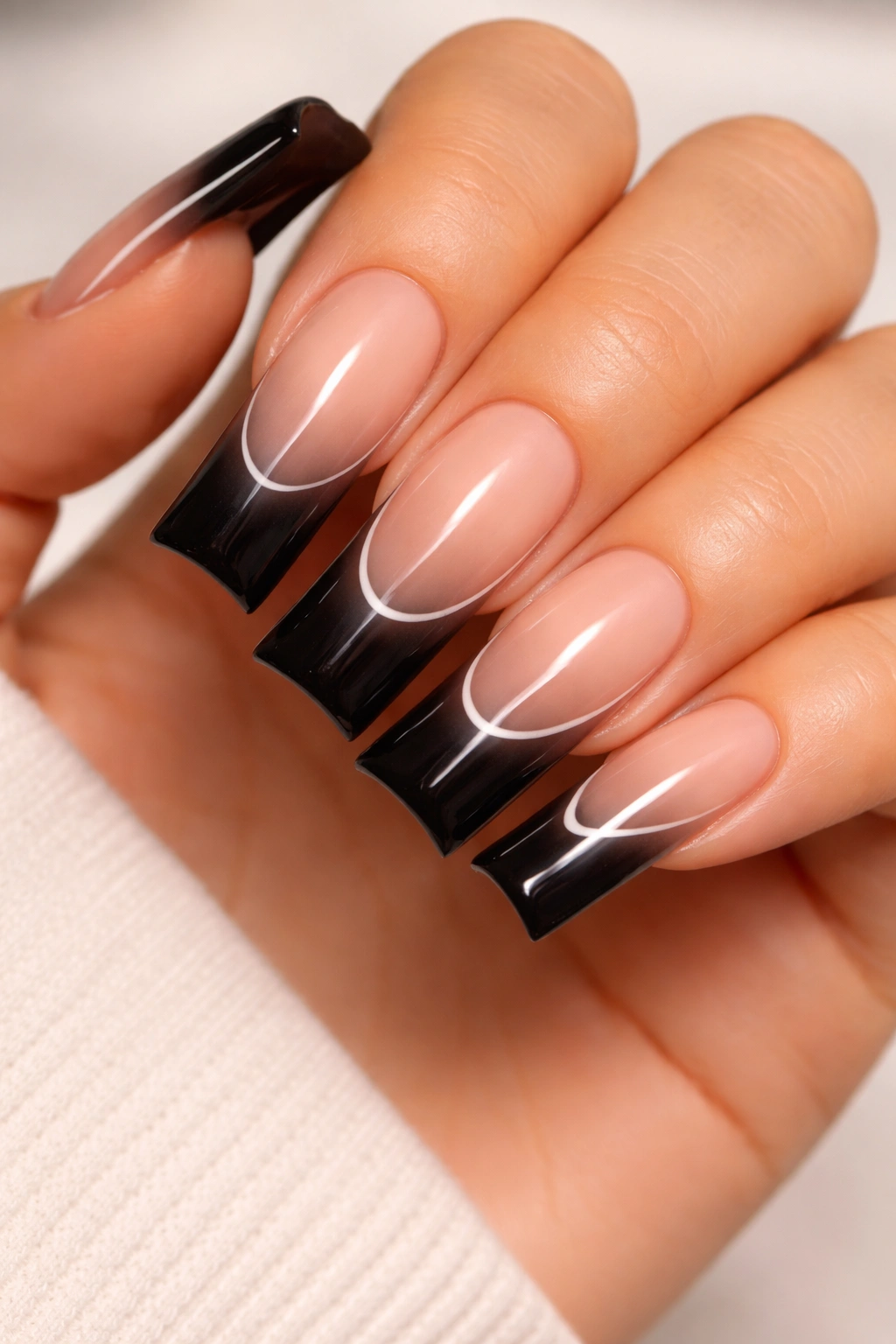
3. Navy Blue Ombré to Black Gradient
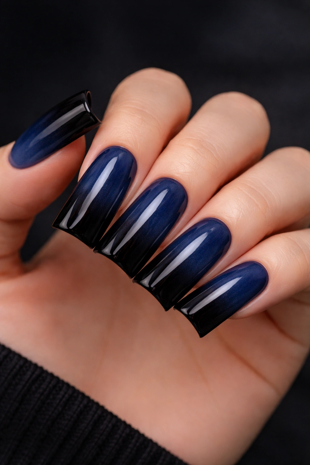
Navy shifts gradually into true black moving from the base to the tip, creating a visual waterfall effect that’s mesmerizing in motion. The ombré should be seamless enough that there’s no visible line of demarcation—just a smooth, continuous darkening.
Why Gradient Design Feels Baddie
Movement in nail design reads as confidence. A static color is fine, but one that’s deliberately transitioning from one shade to another? That communicates intentionality and design knowledge. It’s subtle sophistication with serious impact.
Getting the Gradient Right
- Use a makeup sponge (not a nail sponge—those are too thin) to blend navy and black polish at the nail
- Sponge the colors onto the nail multiple times for seamless blending
- Finish with a smooth top coat that levels the texture and enhances the gradient
- Consider adding a single line of silver or chrome at the transition point for extra dimension
Pro tip: The ombré effect is easier on longer nails because you have more space to blend. On duck nails specifically, the length works in your favor.
4. Black with White Negative Space Line Art
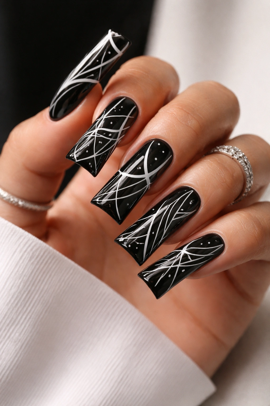
Keep the base black and create white fine-line designs—think geometric shapes, abstract patterns, or even minimalist portraits—using a thin art brush or a nail pen. The white against black creates stark, almost graphic-design-level contrast that feels editorial and intentional.
The Art of Minimal Line Work
White lines against black aren’t just visually striking; they read as artistic and deliberate. This is the nail equivalent of fashion’s “less is more” philosophy, except you’re working with high-contrast visual drama.
Design Ideas That Photograph Well
- Vertical white lines at different intervals across all nails
- Small geometric shapes (triangles, rectangles, circles) scattered asymmetrically
- One statement line that wraps around a single nail
- Abstract face line drawings on one or two accent nails
Insider note: Use white gel polish for the lines rather than regular polish—it adheres better to the black base and creates crisper edges.
5. Metallic Chrome with Matte Black Tips
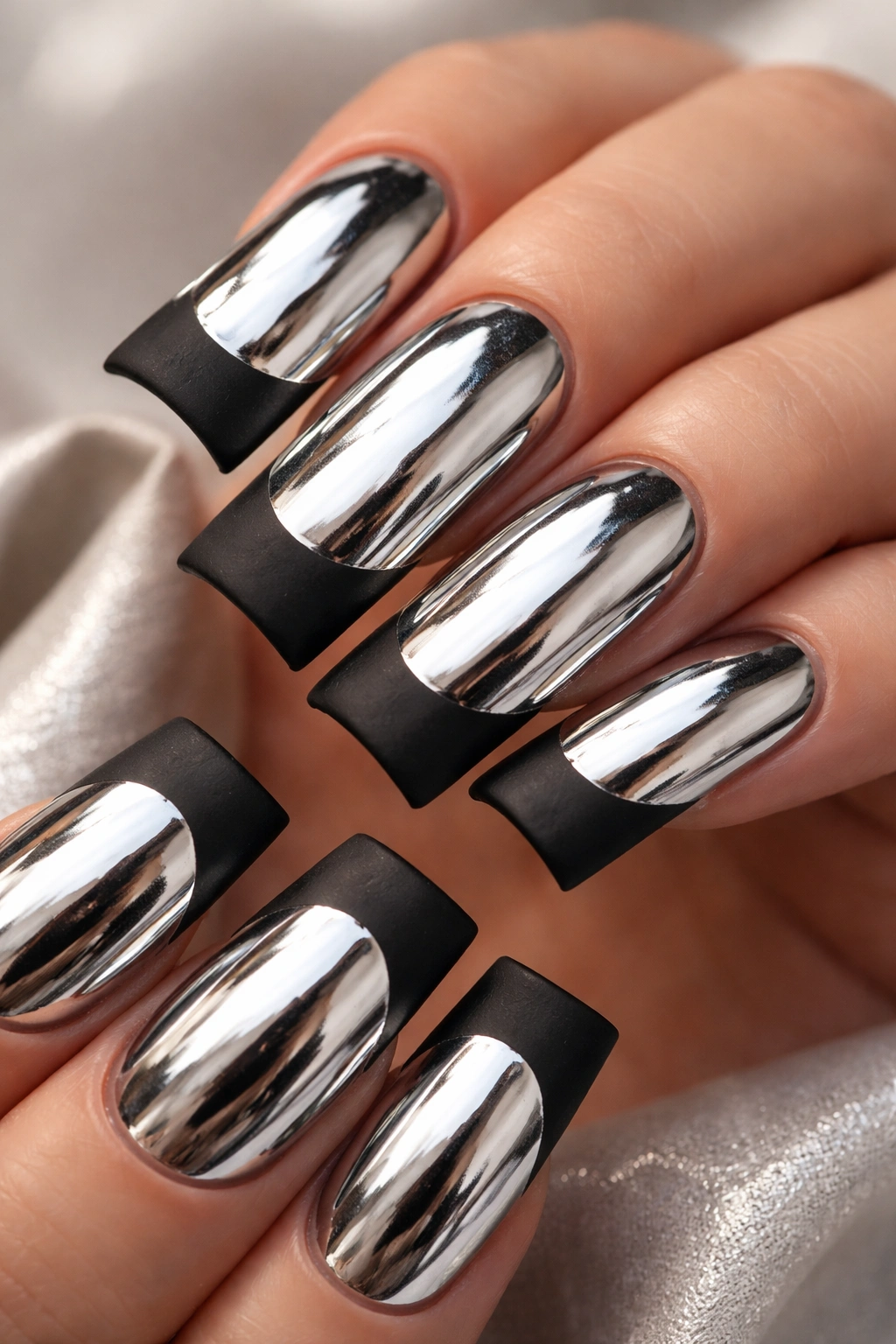
This flips the traditional ombré approach. Start with a reflective, mirror-like chrome finish covering most of the nail, then transition to a matte black at the very tip. The contrast between ultra-shiny and ultra-flat creates visual tension that reads as intentionally edgy.
Why This Chrome-to-Matte Combo Hits Different
Chrome nails are bold on their own, but the sudden shift to matte black at the edge adds an unexpected twist. It’s predictable enough to be wearable, but unexpected enough to be memorable. Your nails literally change texture as they extend, which is incredibly cool.
Execution Details
- Apply chrome powder to the entire nail first
- Once fully cured and sealed, use painter’s tape or a thin stripe guide to define where matte begins
- Paint matte black carefully, using a thin brush for clean edges
- The transition line should be thin and crisp—roughly 2-3mm from the tip
Pro tip: Cure chrome nails under LED UV light immediately—chrome finishes can shift if left uncured even for a few seconds.
6. Emerald Green with Pearl Shimmer Overlay
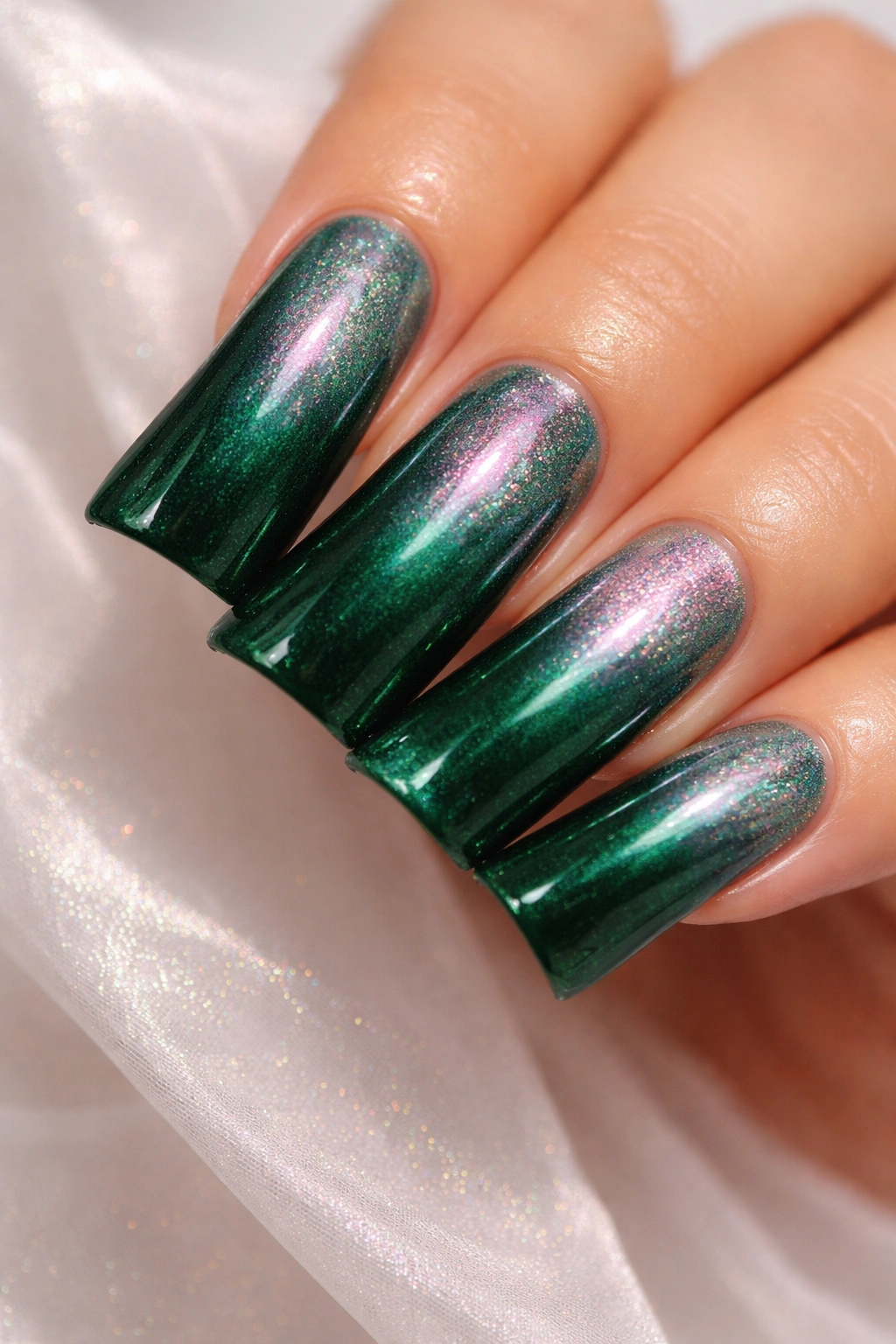
Start with a rich, deep emerald base and layer a subtle pearl shimmer on top, creating a multidimensional finish that shifts between green and soft iridescent pink depending on the light. This is luxury and mystery combined.
The Emerald Effect
Emerald is the color of opulence. In the context of baddie aesthetics, it represents someone with taste and depth. The pearl shimmer prevents it from feeling staid or predictable—instead, it feels expensive and thoughtfully designed.
Layering for Maximum Impact
- Start with a solid emerald base—make sure it’s fully opaque
- Add the pearl shimmer as a second layer, using a brush or sponge to apply it
- Some nails can get heavier shimmer, others lighter, for asymmetrical visual interest
- Add a glossy top coat that amplifies the shimmer effect
Worth knowing: This design shows beautifully under indoor lighting and absolutely glows under sunlight or UV light from your phone camera’s flash.
7. Black Base with Holographic Shattered Glass Effect
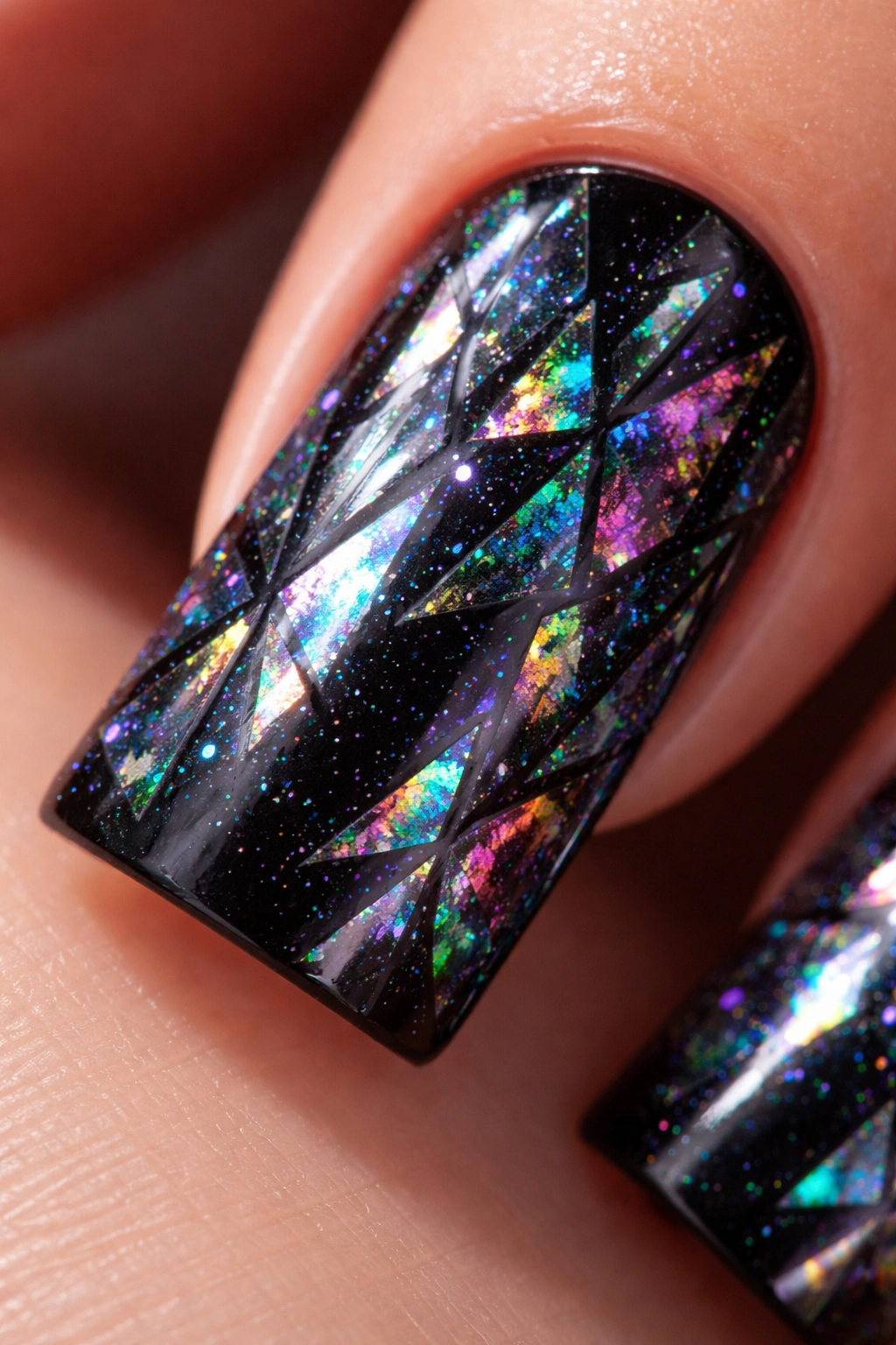
Paint the entire nail black, then layer holographic powder or shattered foil that breaks the surface into prisms of reflected light. From a distance, it looks sophisticated black. Up close, it’s a galaxy of refracted color.
The Optical Illusion of Shattered Glass
This design plays with perception in a way that feels inherently baddie. It’s calm from far away, absolutely chaotic up close—kind of like the aesthetic itself. You’re showing different sides of yourself depending on how closely someone looks.
Application Strategy
- Ensure the black base is perfectly smooth and fully cured
- Apply a layer of glossy top coat over the black
- While tacky, dust holographic powder generously and press it into the tacky surface
- Seal with another layer of clear top coat
- The effect should look intentional, not accidental
Pro tip: Holographic shattered glass effects work best in natural light or bright indoor lighting. They’re less visible in dim rooms.
8. Deep Plum with Gold Geometric Shapes
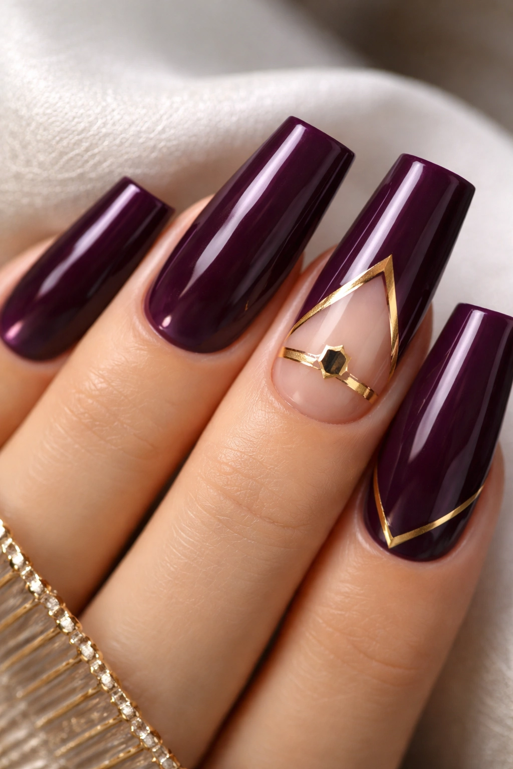
A sophisticated plum shade (deeper than grape, more purple than burgundy) paired with clean gold geometric shapes—triangles, hexagons, or abstract angular forms. This combination feels regal and modern simultaneously.
Why Plum Reads as Baddie
Plum isn’t an obvious choice, which is exactly why it works. It’s a color that signals taste and individuality. Pair it with geometric gold shapes, and you’re communicating that you’re intentional about every element of your aesthetic.
Geometric Design Placement
- Keep shapes minimal—no more than 3-4 shapes per nail
- Use shapes as accents on one or two nails rather than covering all
- Let the plum breathe; negative space is part of the design
- Consider one nail with a larger statement shape versus smaller shapes elsewhere
Worth knowing: This design is professional enough for work settings while still feeling bold and current.
9. Matte Black with Chrome Powder Splatter Effect
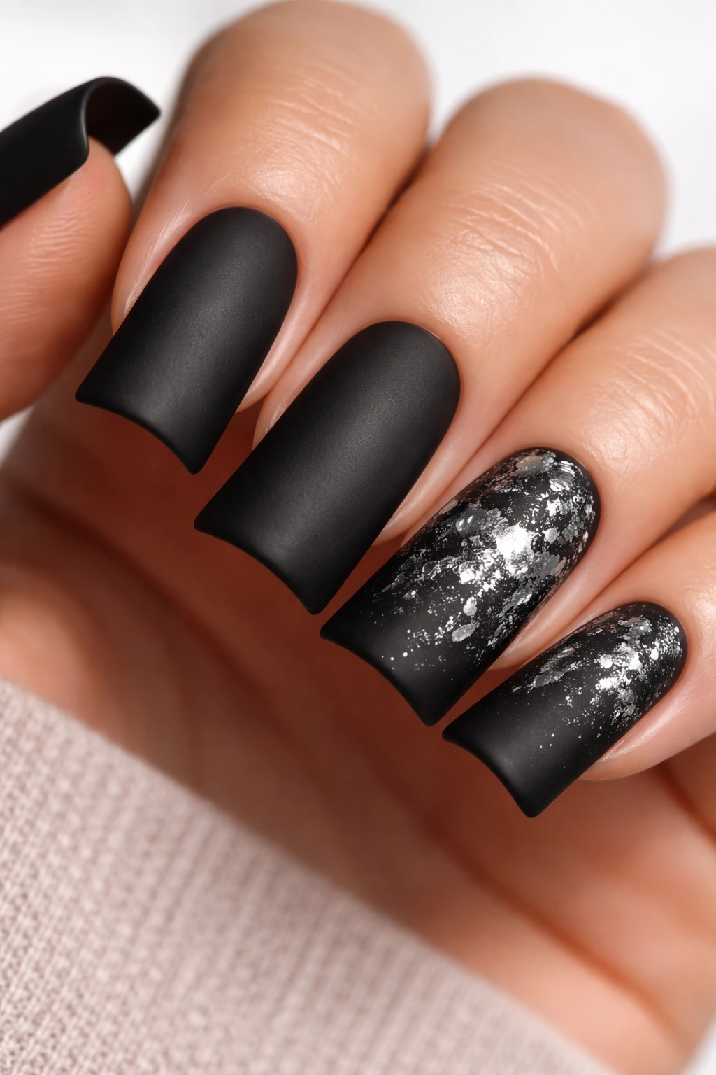
Paint nails matte black, then use a toothbrush or dedicated splatter brush to flick chrome powder suspended in gel polish across the surface, creating an explosion of reflective spots. It’s controlled chaos.
The Energy of Splatter Design
Splatter effects communicate movement and rebellious energy. In the context of baddie aesthetics, it says you’re not afraid of mess or unconventional beauty. The chrome upgrade transforms a casual splatter into something polished and intentional.
Getting the Splatter Right
- Use a thin, stiff brush (old toothbrush works perfectly)
- Mix chrome powder into a small amount of clear gel
- Load your brush and flick it quickly across the matte black surface
- Do multiple passes for varying density—some splatter areas heavier, others lighter
- Cure under LED light
Pro tip: Do the splatter effect on one or two nails as statement pieces. A matte black base on the rest keeps the look balanced.
10. Nude-to-Black Ombré with Minimal White Detailing
Create an ombré that transitions from a warm nude or beige at the base through soft browns to deep black at the tip. Add minimal white details—maybe a thin line or tiny dot—at the transition point for subtle complexity.
Why Neutral Gradients Feel Baddie
The baddie aesthetic doesn’t always mean loud colors. Sometimes confidence comes from knowing how to create visual interest through subtle shifts and restraint. This ombré reads as high-fashion and intentional.
Achieving a Smooth Neutral Transition
- Choose a nude that matches your skin tone
- Blend through warm browns rather than jumping straight to black
- The transition should feel like a continuous color gradient, not separate bands
- White detailing should be minimal—this is about letting the ombré shine
Insider note: This design is incredibly versatile and genuinely works for any occasion, which somehow makes it feel more baddie because you’re choosing sophistication over shock value.
11. Blood Red with Black Lace Overlay
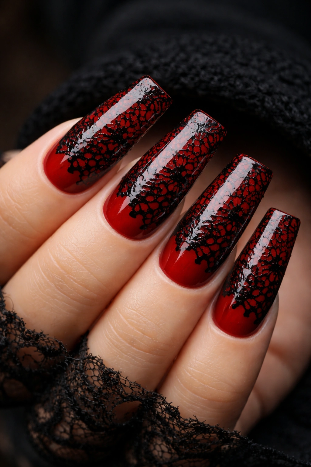
A vibrant, true blood red base with delicate black lace patterns applied on top. The lace creates an intricate, mysterious overlay that softens the intensity of the red while adding visual complexity and edge.
The Power of Lace on Bold Color
Lace creates juxtaposition—it’s traditionally delicate, but when paired with an aggressive color like blood red, it becomes edgy and unexpected. This combination signals sophistication mixed with rebellion.
Applying Lace Patterns
- Use a thin brush and black gel to hand-paint lace patterns, or
- Apply real lace temporarily to sticky gel and paint around it, then remove and cure, or
- Use pre-made lace decals from nail supply shops
- Patterns work best on one or two nails as statement features
- Keep the rest of the nail in solid red to avoid visual overwhelming
Pro tip: Blood red shows variations based on lighting—cooler lighting makes it appear darker and more dramatic, while warm lighting brings out its richness.
12. Glossy Black with Subtle Oil Slick Finish
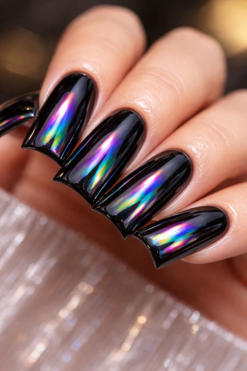
Paint nails in true jet black gloss, then layer a clear topcoat infused with oil-slick pigments that create moving rainbow reflections when light hits them. From some angles, pure black; from others, subtle color shifts.
The Sophisticated Shift of Oil Slick
Oil slick finishes feel current and artistic without being costume-y. In black, they read as premium and intentional rather than novelty. The effect changes with every movement, keeping your nails perpetually interesting.
Layering Oil Slick Effect
- Start with a perfectly opaque black gloss
- Apply a clear oil-slick topcoat in thin layers (thick applications lose the effect)
- Cure between each layer for best results
- The effect is best viewed in natural light and motion
Worth knowing: Oil-slick nails photograph beautifully and create a luxury aesthetic that photographs even better than it looks in person.
13. Navy with Tiny White Stars or Pearls
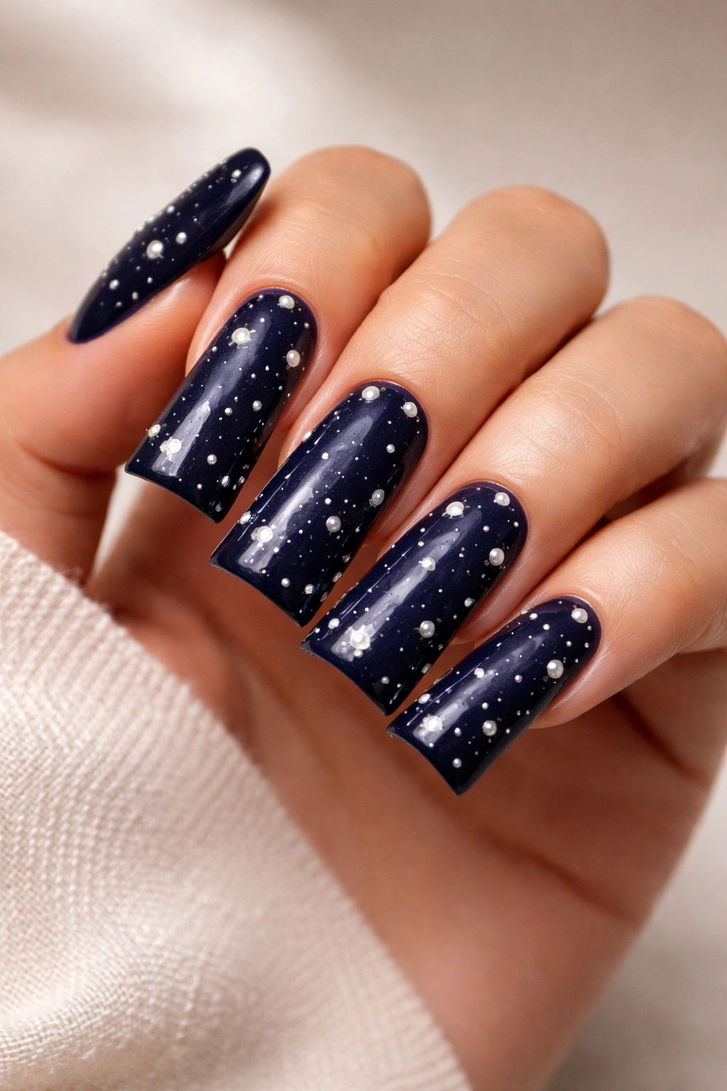
A deep navy base studded with small white pearls or tiny white details arranged to look like stars scattered across the nail. Minimal design, maximum impact.
Why Stars Feel Baddie in Navy
Stars suggest guidance, confidence, and a sense of destiny. Navy is calm and authoritative. Together, they create a vibe that’s confident without being aggressive. The pearls add luxe texture that makes nails feel three-dimensional.
Placement Strategy for Stars
- Space pearls randomly rather than in perfectly even rows
- Concentrate heavier density on some nails (2-3) and lighter on others
- Consider one nail with a larger central pearl as an accent piece
- Leave at least 30% of the navy base uncovered for balance
Pro tip: Use caviar beads instead of pearls for a more avant-garde texture effect. They’re smaller and create a different visual density.
14. Jet Black with Fine Gold Leaf Flakes
Apply thin, organic-looking gold leaf flakes to a jet black base, creating the effect of gold scattered throughout rather than applied in defined patterns. It should look like luxury that happened accidentally.
The Artistic Approach to Gold Accents
Gold leaf feels artisanal and intentional in a way that painted gold doesn’t. It’s the difference between someone with taste and someone trying too hard. Scattered flakes read as effortfully effortless.
Applying Gold Leaf Correctly
- Use actual thin gold leaf (not foil)
- Apply over a tacky topcoat rather than dry polish
- Tear leaf into random, organic pieces—avoid perfect geometric shapes
- Distribute asymmetrically across nails
- Seal carefully with a smooth topcoat that doesn’t disturb placement
Pro tip: This design is easiest to apply using a tacky UV gel topcoat as your base rather than regular polish.
15. Deep Plum with Negative Space Half-Moon Design
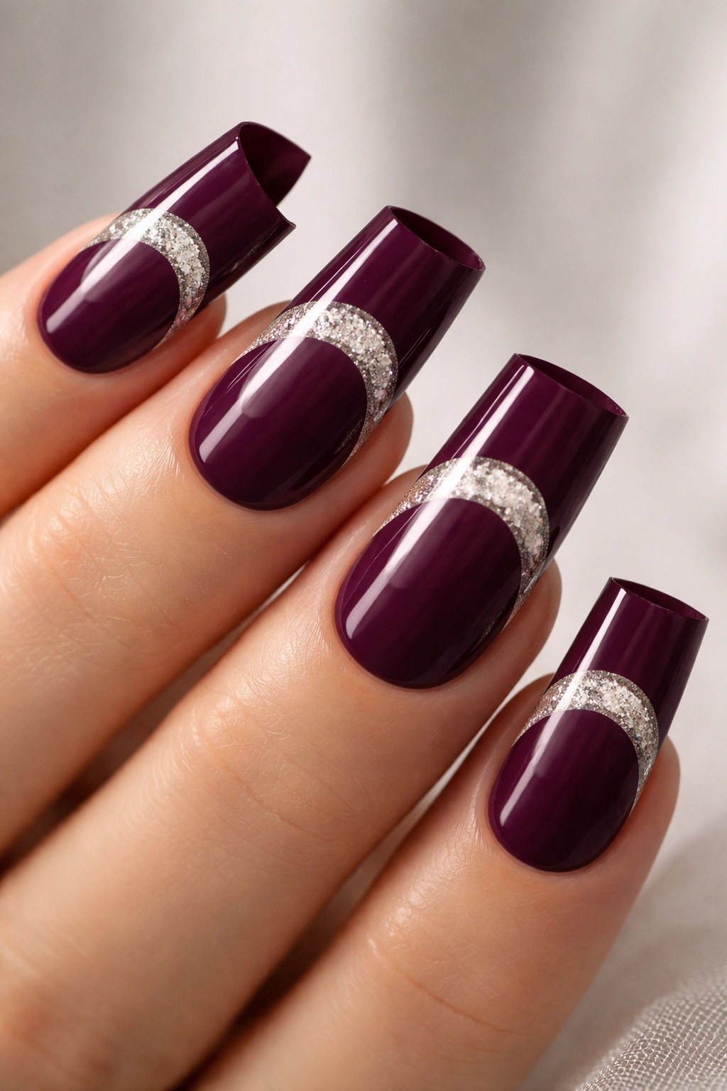
Paint the base of the nail deep plum, leaving an unpainted (or differently painted) half-moon shape at the tips. The contrast creates a modern, geometric look that feels both minimalist and bold.
The Power of Negative Space
Negative space automatically reads as intentional and designed. You’re not painting the whole nail, which communicates confidence in your aesthetic choices. This particular half-moon approach feels editorial and current.
Achieving Clean Half-Moon Lines
- Use a half-moon nail guide or stencil for crisp edges
- Keep the plum opaque and rich so the unpainted contrast shows clearly
- Consider filling the negative space with glitter, chrome, or metallic details
- Alternatively, paint the negative space in contrasting color (gold, black, or nude)
Worth knowing: This design works beautifully on every nail of the same hand or just on accent nails—both approaches feel intentionally designed.
16. Charcoal Gray with Subtle Holographic Dust
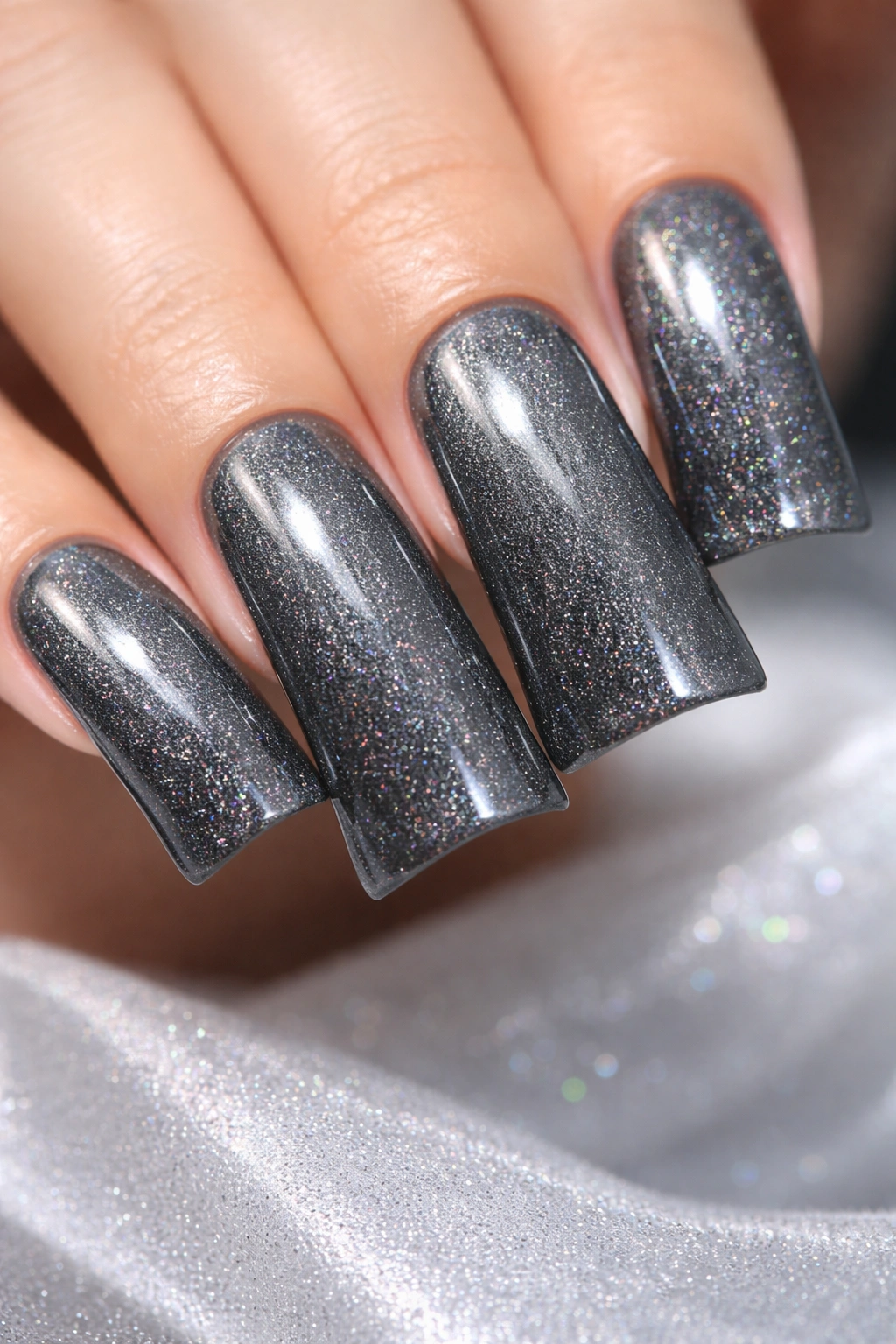
A sophisticated charcoal gray that’s darker than normal gray but not quite black, with a whisper of holographic dust mixed into the topcoat. The effect is understated but absolutely present when light hits it.
Why Charcoal Reads as Refined Baddie
Charcoal is the color of someone who doesn’t need brightness to command attention. It’s moody and serious without being dramatic. The holographic dust adds just enough of a twist to feel current and intentional without sacrificing sophistication.
Application Strategy
- Use a true charcoal gray, not a muddy gray-brown
- Mix holographic dust into your clear topcoat sparingly
- Apply in thin layers so the holographic effect builds gradually rather than appearing obvious
- The dust should only be visible in certain light angles
Pro tip: This design is incredibly forgiving to maintain because holographic dust hides chips better than solid colors.
17. Black with Metallic Gold Dragon Scale Pattern
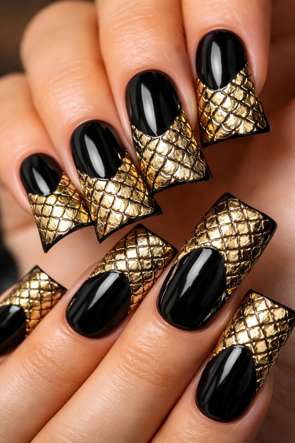
Paint nails black, then create a dragon scale pattern in metallic gold using a thin brush or nail stamping plate. Scales should overlap slightly and cover roughly half of each nail, creating an armor-like effect.
The Mythology of Dragon Scales
Dragons are symbols of power, mystery, and untamable energy. Gold scales on black feel like protective armor wrapped in luxury. This design communicates strength and sophistication simultaneously.
Creating Dragon Scale Patterns
- Use a thin brush and metallic gold gel for best results
- Start at the tip and work toward the base, overlapping scales as you go
- Keep scales relatively small (roughly 5-7mm each) for intricate detail
- Consider leaving one or two nails all black as resting points for the eye
- Seal with a glossy topcoat that amplifies the metallic effect
Insider note: This is an intricate design that requires a steady hand or nail stamping expertise, but the result is absolutely show-stopping.
18. Deep Oxblood with Matte Finish and Minimal Glitter Accent
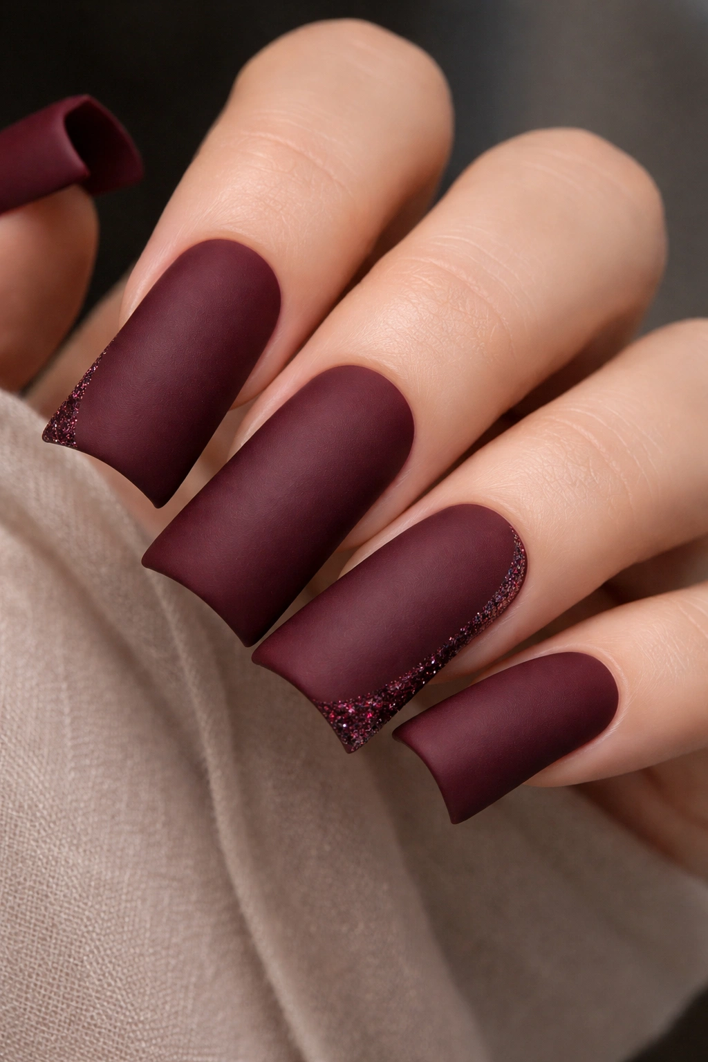
Rich oxblood (deep burgundy-red that’s almost brown-tinted) in a matte finish, with just a few strategically placed small glitter pieces catching light. The contrast between matte and glitter creates interesting visual tension.
The Confidence of Matte Finishes
Matte nails read as intentional and artistic rather than simply shiny. Oxblood already feels sophisticated, so matte elevates it further. The minimal glitter prevents it from feeling dull while keeping the focus on color richness.
Strategic Glitter Placement
- Use micro glitter or very small glitter pieces
- Place only on one or two accent nails
- Consider placing glitter along the edge of the nail rather than scattered across it
- Use a glitter adhesive to ensure pieces stay in place throughout wear
Pro tip: Matte topcoat can dull glitter’s sparkle. Try sealing with a gloss topcoat just on the glitter pieces, leaving the rest matte.
19. Black Base with White Marble Swirls
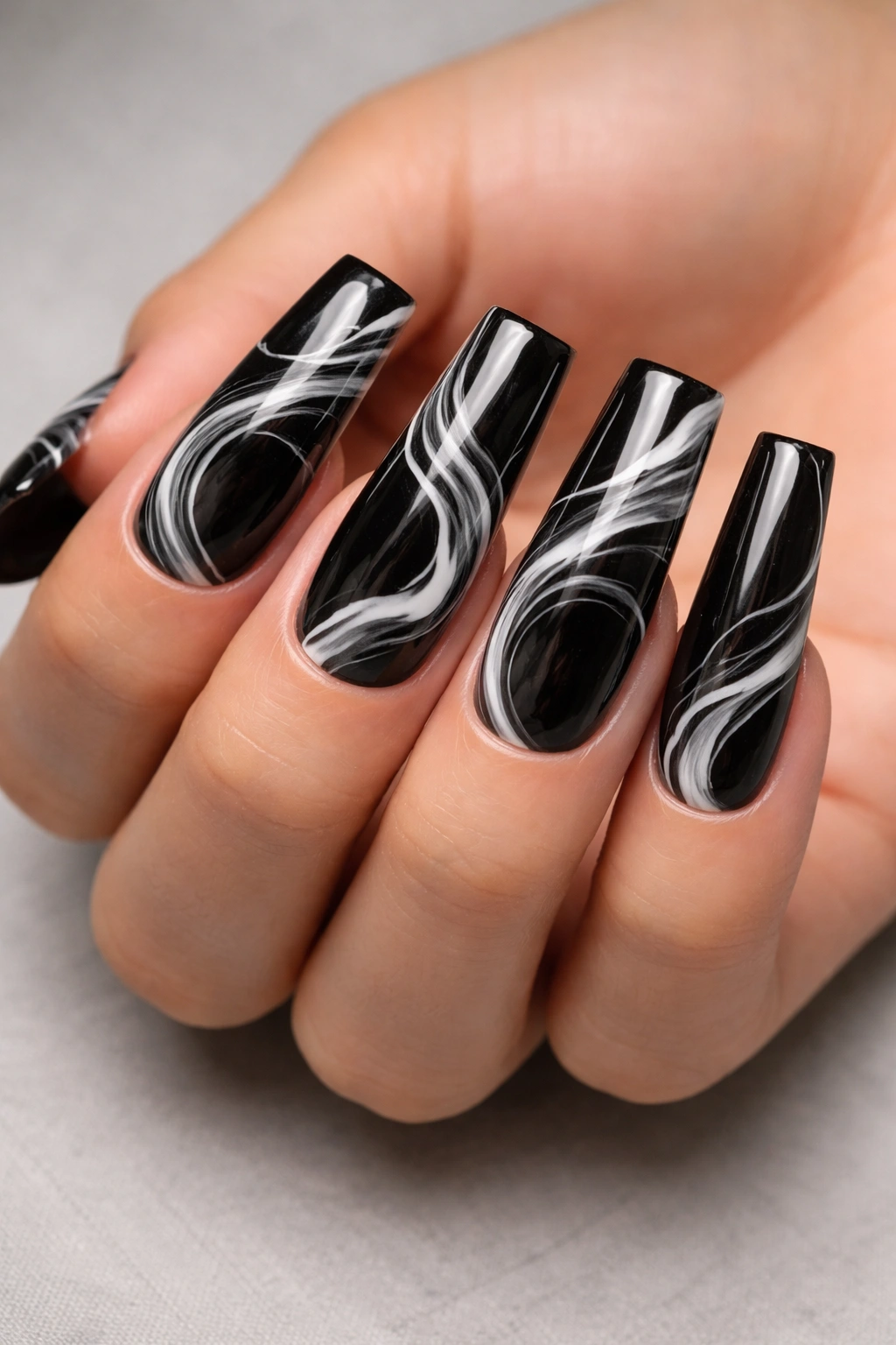
Paint nails black and create white marble swirls using a thin brush or by dragging white gel through black in organic, flowing patterns. The effect is like capturing white smoke against a black background.
Why Marble Feels Artistic and Baddie
Marble patterns read as artistic and intentional. They’re organic enough not to look cartoonish, but they’re clearly designed. Black-and-white marble is timeless and sophisticated while maintaining serious visual impact.
Creating Marble Swirls
- Use white gel polish and a very thin brush
- Create flowing, curved lines rather than straight ones
- Swirls should overlap and intersect in some places
- Don’t cover the entire nail—let black show through
- Cure, then seal with a glossy topcoat
Worth knowing: Marble effects are forgiving to create because organic lines don’t require perfect precision. Asymmetry is actually preferable.
20. Midnight Blue with Holographic Rainbow Sparkle Gradient
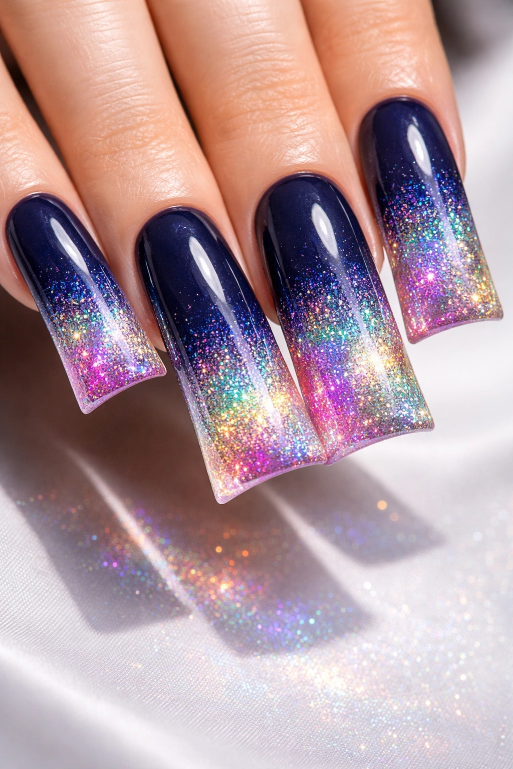
Start with a midnight blue base that gradually incorporates holographic sparkle particles, creating a gradient effect where the tips are almost completely holographic rainbow and the base is solid blue. The effect shifts from solid to nearly transparent sparkle.
The Mesmerizing Quality of Holographic Gradients
This design combines color richness with light-catching movement. It’s the most visually complex of the group, which makes it the ultimate statement piece. Somewhere between sophisticated and absolutely impossible to ignore.
Building the Sparkle Gradient
- Start with solid midnight blue at the base
- Create layers of holographic gel increasing in concentration toward the tip
- Each layer should have more sparkle particles than the one below it
- By the tip, it should be predominantly holographic with just hints of blue showing through
- Cure each layer individually for best effect
Pro tip: This design shows at its absolute best under UV light, LED flash, or direct sunlight. In dim lighting, it reads as blue with subtle shimmer rather than full sparkle.
Final Thoughts
Baddie duck nails are about more than just length and color—they’re about confidence in your aesthetic choices and commitment to visual impact. Whether you’re drawn to moody jewel tones, the sophistication of metallics, or the artistry of detailed overlays, there’s an approach here that aligns with how you want to present yourself to the world.
The beauty of these designs is their versatility. You can wear any of them to a professional setting and communicate intentionality and taste, or you can wear them casually and own the space simply through the boldness of your choice. Duck nails demand attention by their very shape; the design you choose on top of that shape determines what story you’re telling.
Start with the idea that resonates most with your aesthetic, then collaborate with your nail artist on customization details that make it uniquely yours. The baddie aesthetic isn’t about following rules—it’s about breaking them with such confidence that everyone else wonders why they were following them in the first place.
