

There’s something genuinely comforting about squoval nails, especially when the weather turns crisp and the urge to cocoon inside becomes irresistible. The shape sits in that perfect sweet spot — practical enough that you can actually function without catching them on everything, yet elegant enough to feel intentional and polished. Pair that with the rich, moody color palettes and luxe finishes that define cooler-month aesthetics, and you’ve got nail designs that feel like a little luxury you can wear every single day.
Short squoval nails are having a real moment, and for good reason. They’re the goldilocks of nail shapes — not so short that you feel like you’re sacrificing beauty, not so long that they interfere with real life. When you’re layering sweaters, holding a warm mug of something comforting, or just existing in a season that calls for slower living, short squovals hit differently than their longer counterparts. They photograph beautifully, they’re genuinely functional, and they feel sophisticated without requiring high-maintenance upkeep.
The designs that work best during cooler months lean into warmth and comfort visually, even if it’s ironic on a technical level. We’re talking deep jewel tones, creamy warm neutrals, plush velvet textures, shimmering metallics that catch light like frost, and rich earthy shades inspired by the landscape around you. The color psychology matters here too — these aren’t cheerful, bright designs meant to lift your mood on a gray day in the traditional sense. Instead, they’re designs that acknowledge the mood of the season and lean into it, creating something that feels anchored and real rather than fighting against what the season actually is.
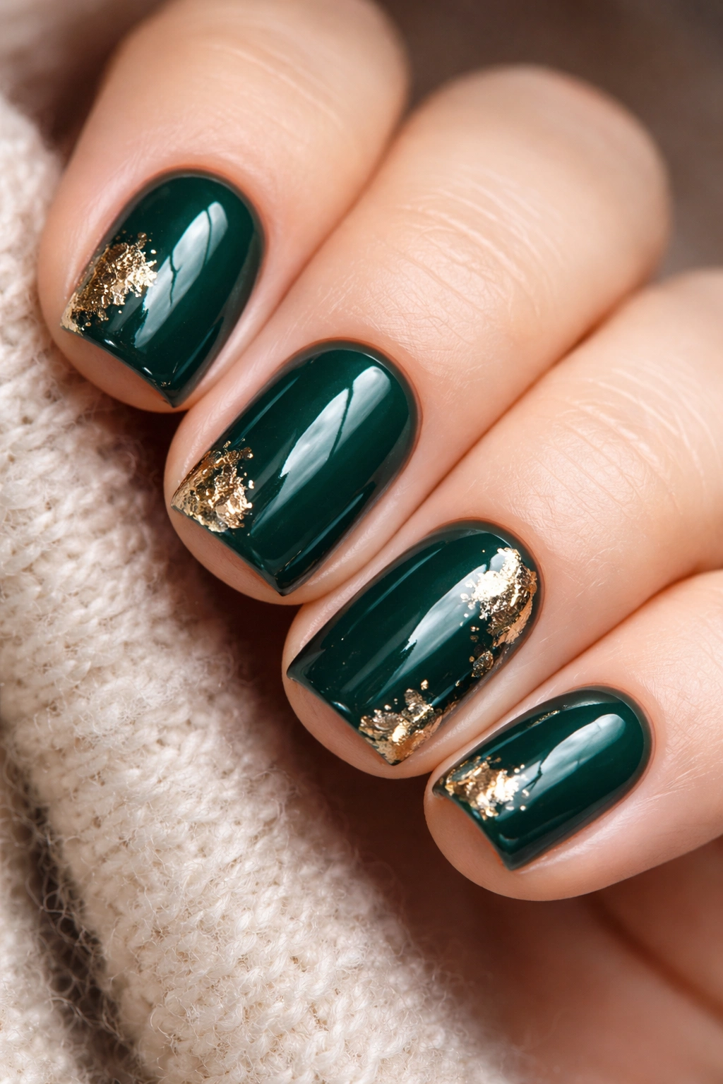
1. Chocolate Mousse with Gold Leaf Accents
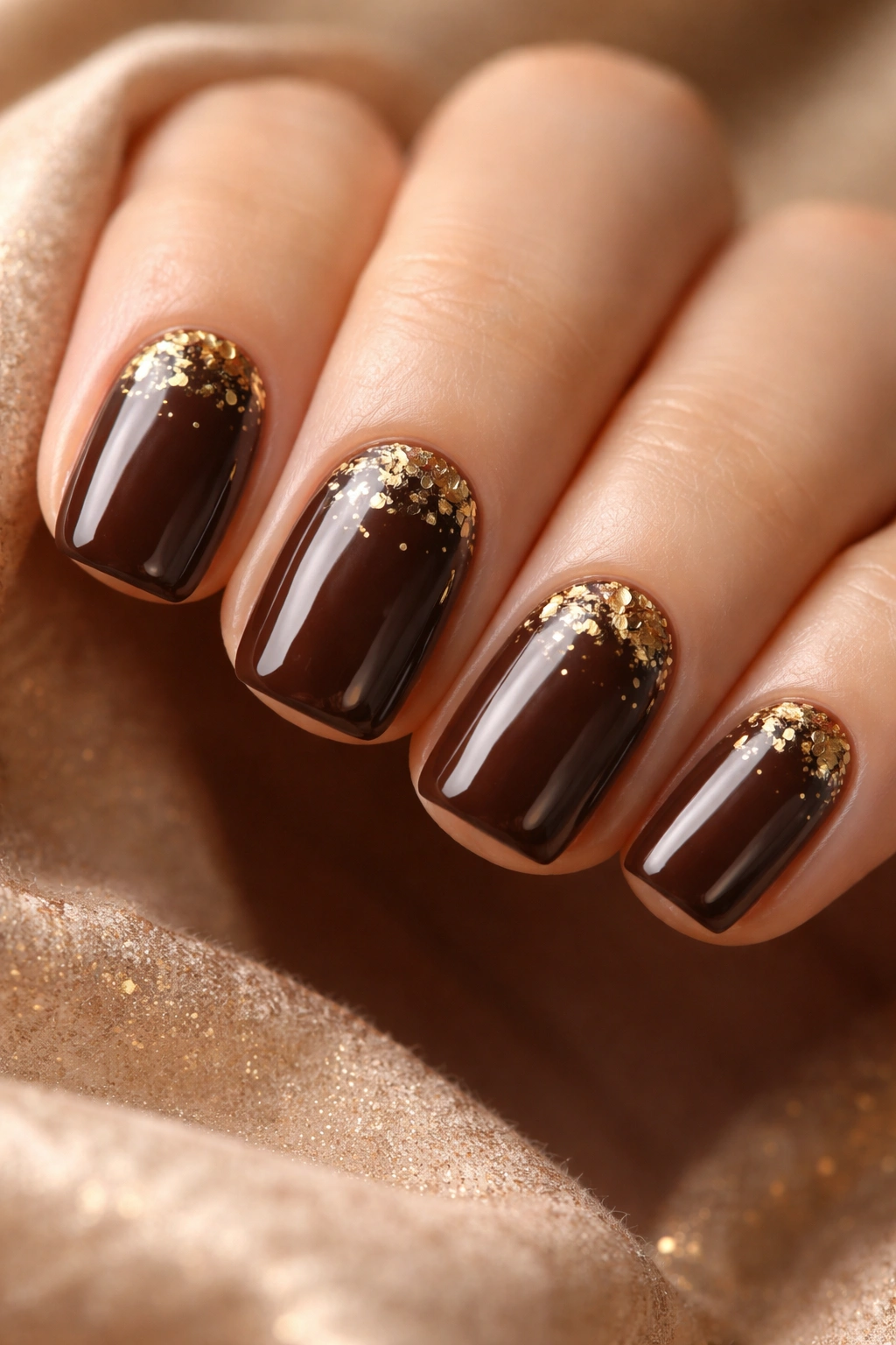
There’s something undeniably luxurious about a deep, creamy chocolate brown paired with delicate gold leaf scattered across the nail surface. This design works beautifully on short squovals because the negative space of the nail shape lets the chocolate color serve as a rich backdrop without feeling overwhelming.
Why This Works for Cooler Months
Chocolate brown is one of those colors that immediately evokes warmth and comfort — think leather jackets, cozy sweaters, and rich hot chocolate. The gold leaf adds just enough shimmer to catch light without feeling glittery or juvenile. This combination reads as deliberately elegant rather than heavily decorated, which is exactly the vibe you want when you’re not trying too hard but still want your nails to feel special.
How to Achieve This Look
- Use a creamy, opaque chocolate brown polish as your base (2-3 coats for full coverage)
- Apply a matte topcoat first to dull the finish and give the gold leaf something to grip
- Press tiny pieces of loose gold leaf onto the still-wet topcoat, concentrating them toward the cuticle area or scattered randomly across the nail
- Seal with a glossy topcoat to protect the leaf and add dimension
Pro tip: Chocolate mousse works especially well on warm-toned skin, but it’s genuinely flattering on most complexions. The gold prevents it from looking too heavy or dragging your nails down visually.
2. Burnt Orange Ombré to Cream
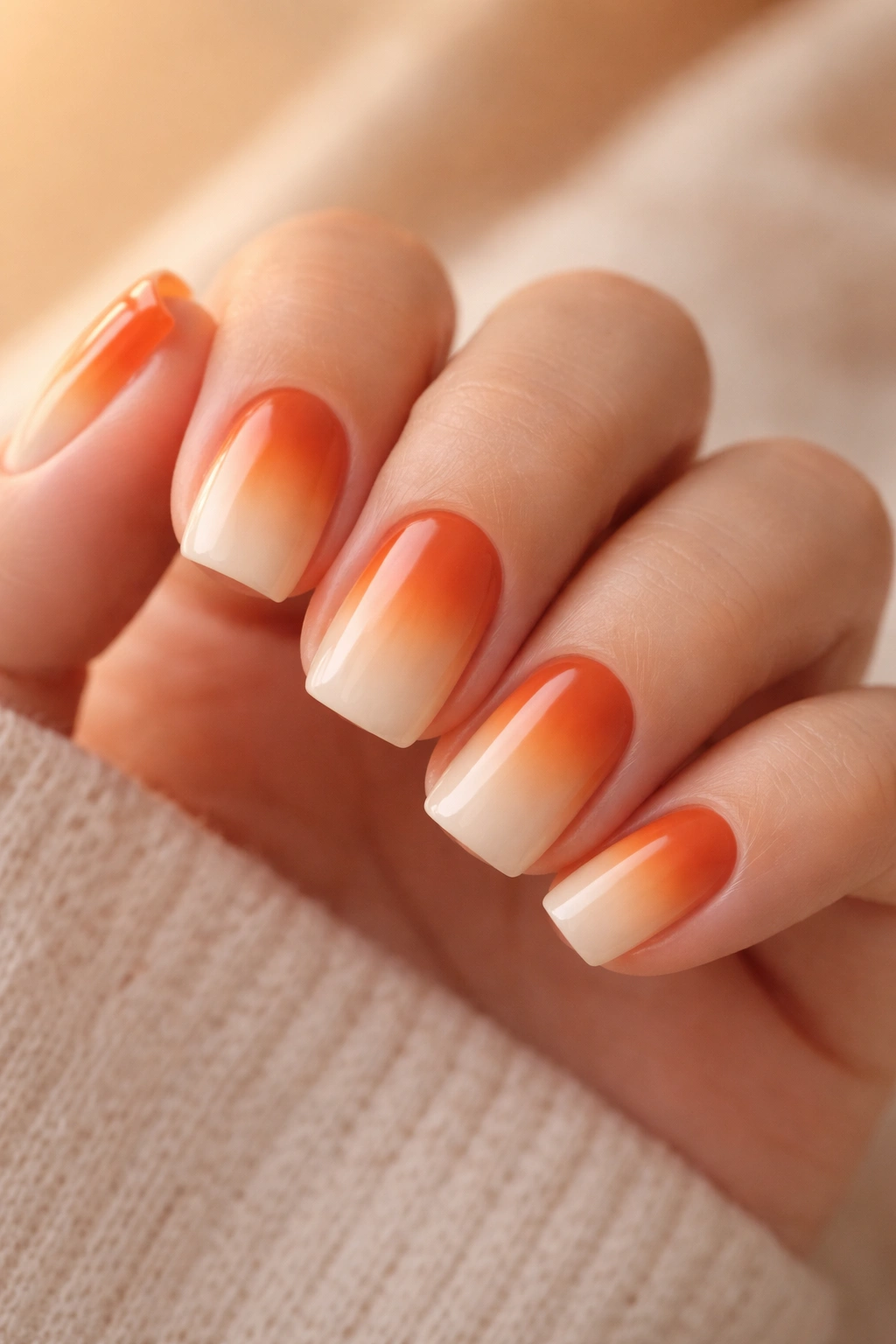
An ombré that transitions from a deep, earthy burnt orange at the tip to a soft cream at the cuticle area captures the exact feeling of watching the sun set during colder months. The warmth of the orange grounds the design, while the cream keeps it from feeling heavy.
What Makes This Design Special
This isn’t a typical sunset ombré with bright oranges and pinks. Instead, it’s specifically a burnt orange — the color of rust, of dried leaves, of terra cotta that’s weathered beautifully. The gradient into cream creates an almost three-dimensional quality that makes the nail look longer than it actually is, which is a subtle but real benefit for shorter lengths.
Application Tips for Flawless Blending
- Paint your base cream color (2 coats, full coverage)
- Mix burnt orange with a touch of brown to deepen and dull it slightly
- Use a blending sponge (a cosmetic makeup sponge works perfectly) to dab the burnt orange onto the sponge, then stipple and drag it across the tip in a gradient pattern
- Build the color gradually with 2-3 light applications rather than one heavy one
- Seal with a shiny topcoat to enhance the blended effect
Worth knowing: The key to a smooth ombré on short nails is keeping the transition zone fairly wide — trying to create too sharp a color line on a small canvas looks choppy rather than intentional.
3. Plush Burgundy Velvet
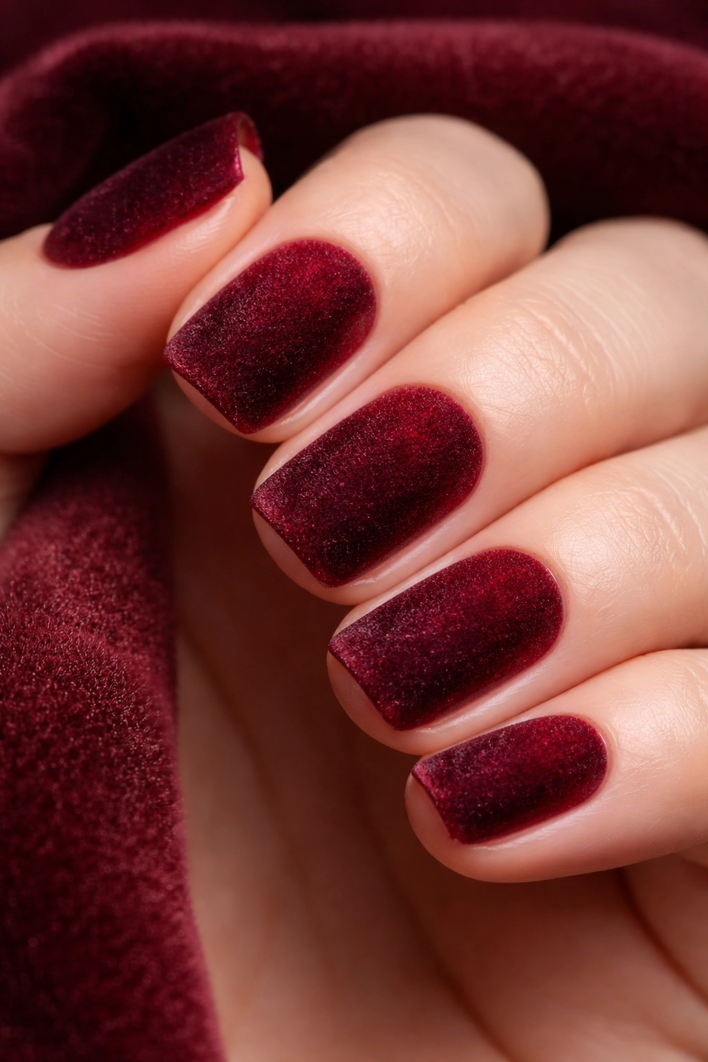
A true burgundy velvet finish is pure tactile luxury. The matte, velvety texture combined with that deep wine color creates an almost jewel-box effect that feels intentional and high-end without being trendy or fleeting.
Why Velvet Finish Matters Here
Velvet nails have a unique quality where the color actually looks deeper and richer than traditional matte finishes. The texture catches light in a way that creates subtle dimension, making even a simple single-color design feel complex and thoughtful. On short squovals, this finish reads as elegant restraint rather than lack of creativity.
Achieving the Perfect Velvet Texture
- Paint 2-3 coats of a deep burgundy polish, allowing proper drying time between coats
- While the final coat is still wet, gently dust the entire nail with velvet powder using a soft brush or applicator sponge
- Press the velvet powder lightly into the nail surface so it adheres properly
- Seal with a clear, matte topcoat (this is crucial — a glossy topcoat will ruin the effect)
Insider note: Burgundy velvet is unexpectedly forgiving — it hides dust, minor chips, and imperfections better than almost any other finish, so it actually stays looking fresh longer than you’d expect.
4. Deep Teal with White Marble Veining
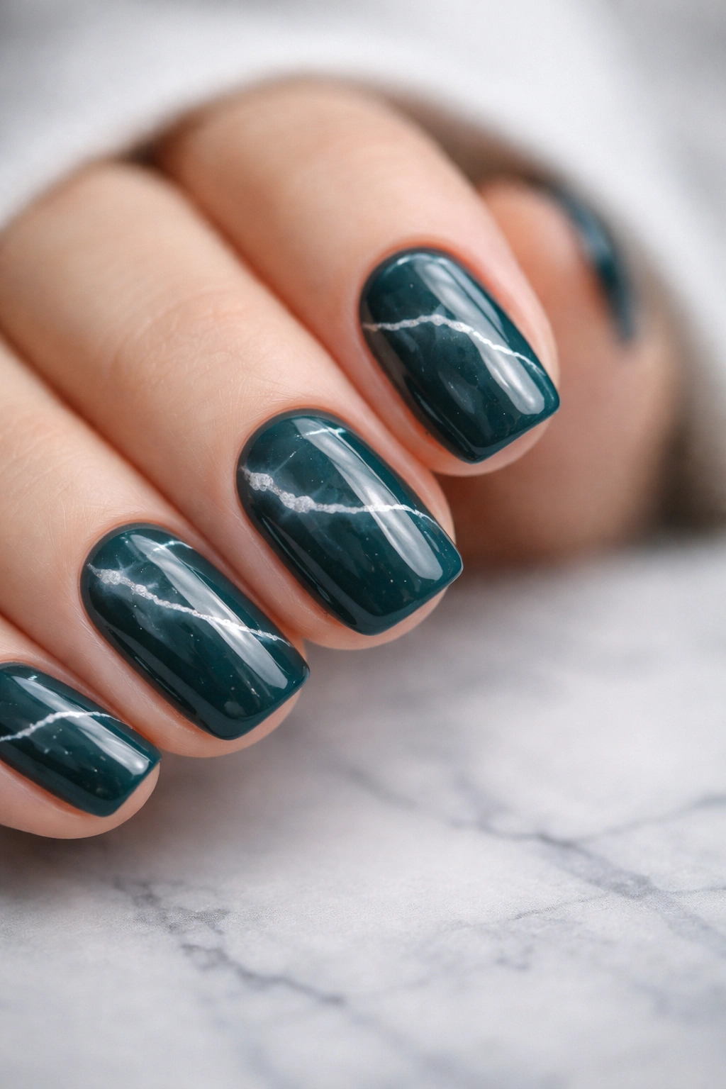
Deep teal sits in that perfect zone where it reads as both calming and sophisticated — it’s got enough depth to feel moody without being dark, and enough blue to feel fresh without being cold. White marble veining breaks up the solid color in a way that feels organic rather than fussy.
The Psychology of Teal in Cooler Months
Teal doesn’t immediately feel like a typical cooler-month color, but here’s the thing: it’s the color of twilight skies, deep water, and the space between day and night. The white veining adds a sense of movement and flow that makes the design feel alive and contemplative rather than just dark and serious. It’s the perfect color if you like deeper tones but find pure black or navy a bit flat.
Creating Convincing Marble Effect
- Paint 2 coats of deep teal as your base
- Mix white polish with a tiny drop of gray to mute it slightly (pure white can look harsh against teal)
- Use an ultra-thin nail art brush to paint irregular, branching lines across the nail surface
- Drag a toothpick or dotting tool through some of the white lines while they’re wet to create a dragged, natural-looking effect
- Seal with glossy topcoat to enhance the marble’s visual depth
What to watch for: Marble veining on short nails looks best when the lines are delicate and irregular — thick or geometric veining will make the nails look busy rather than elegant.
5. Sage Green Creme with Copper Flakes
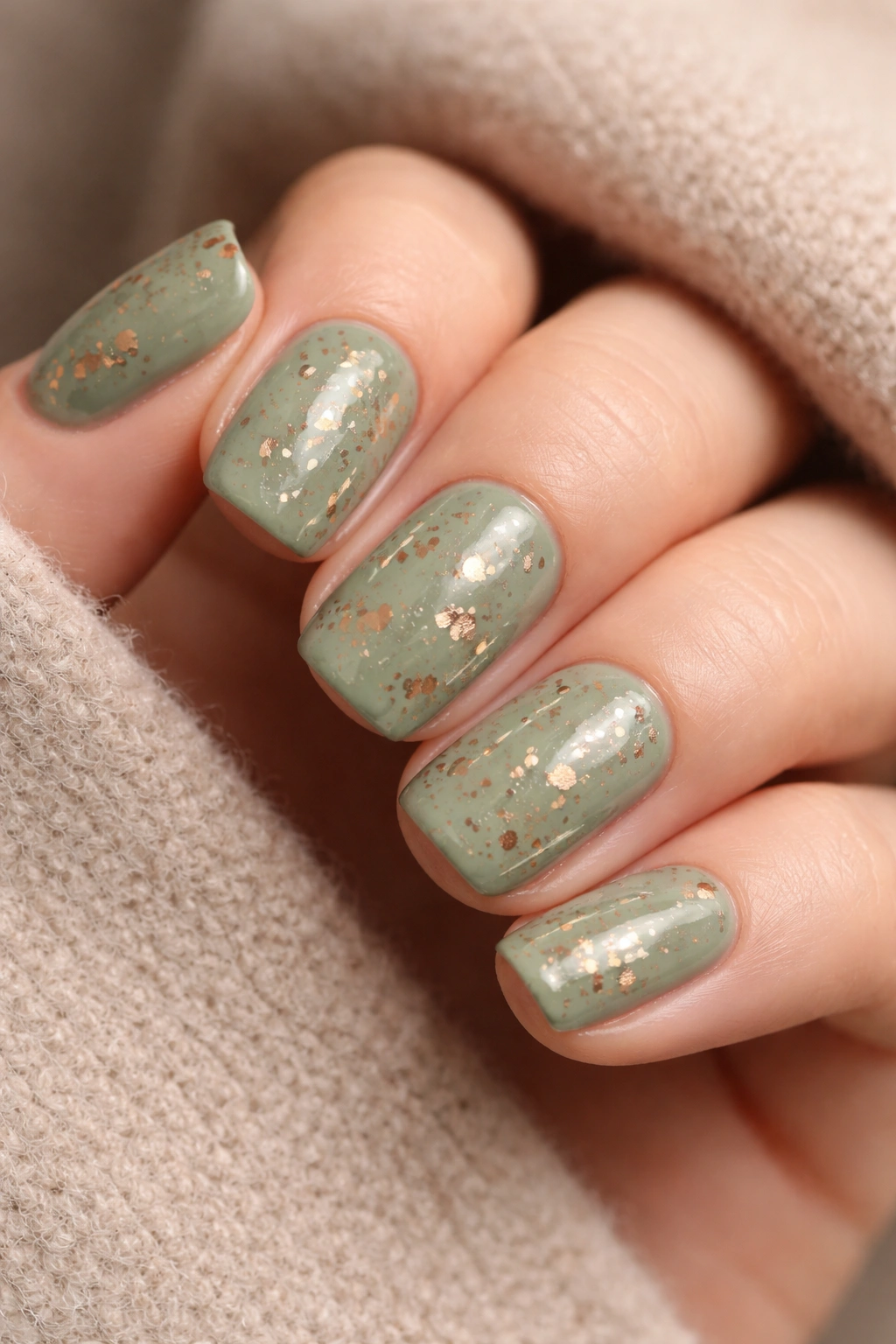
Sage green is the cooler-month color that actually feels warm, paradoxically. It’s gentle, grounding, and naturally elegant. Suspended copper flakes add just enough sparkle without pushing it into full glitter territory.
Why This Combination Works
Sage green and copper are a classic pairing in interior design, and for good reason — the warmth of copper complements the cool-but-comfortable green perfectly. On nails, this creates a sense of balance and intentionality. It’s the design equivalent of a well-edited wardrobe: nothing is random, everything serves a purpose, and the overall effect is greater than the sum of its parts.
How to Get Flakes Suspended Evenly
- Paint 2 coats of sage green creme as your base (creme finishes, not shimmers, work best here so the color reads clearly)
- While the second coat is still slightly tacky, use a cosmetic sponge or flat brush to pick up a small amount of copper flakes
- Gently press the flakes onto the nail surface, distributing them across the entire nail rather than concentrated in one area
- Once dry, seal with 2 coats of topcoat — the first coat will suspend the flakes, the second ensures they’re fully sealed
Real talk: This design actually improves with age slightly — as the topcoat settles and cures, the flakes seem to catch light even more beautifully.
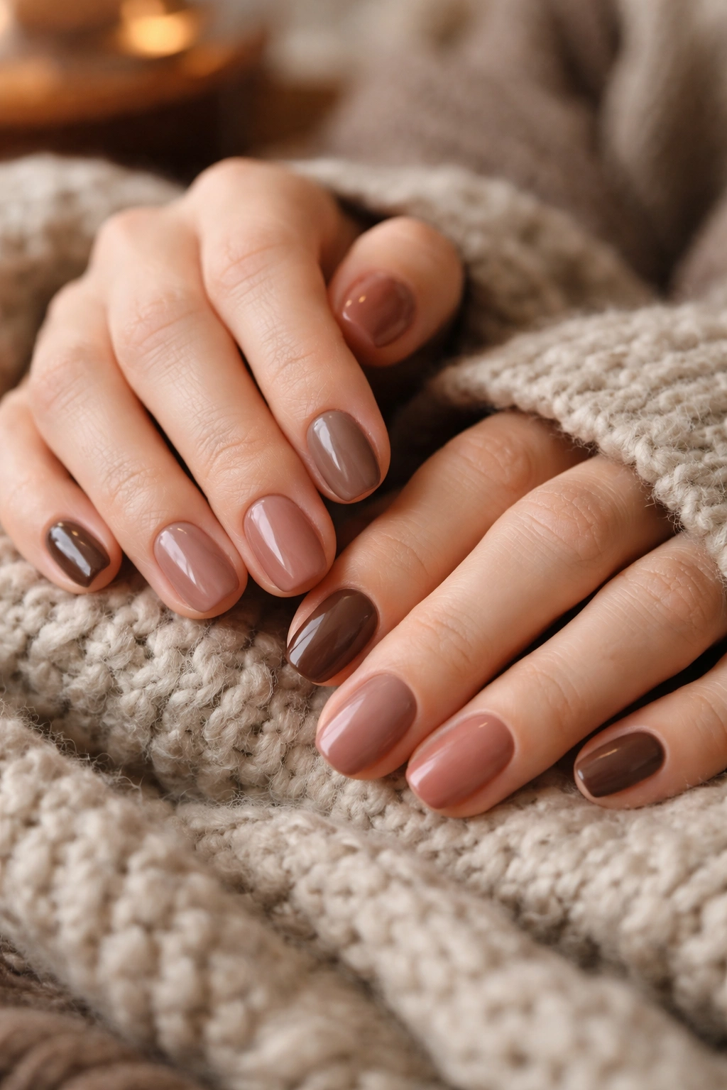
6. Mocha Brown Gradient to Rose Gold
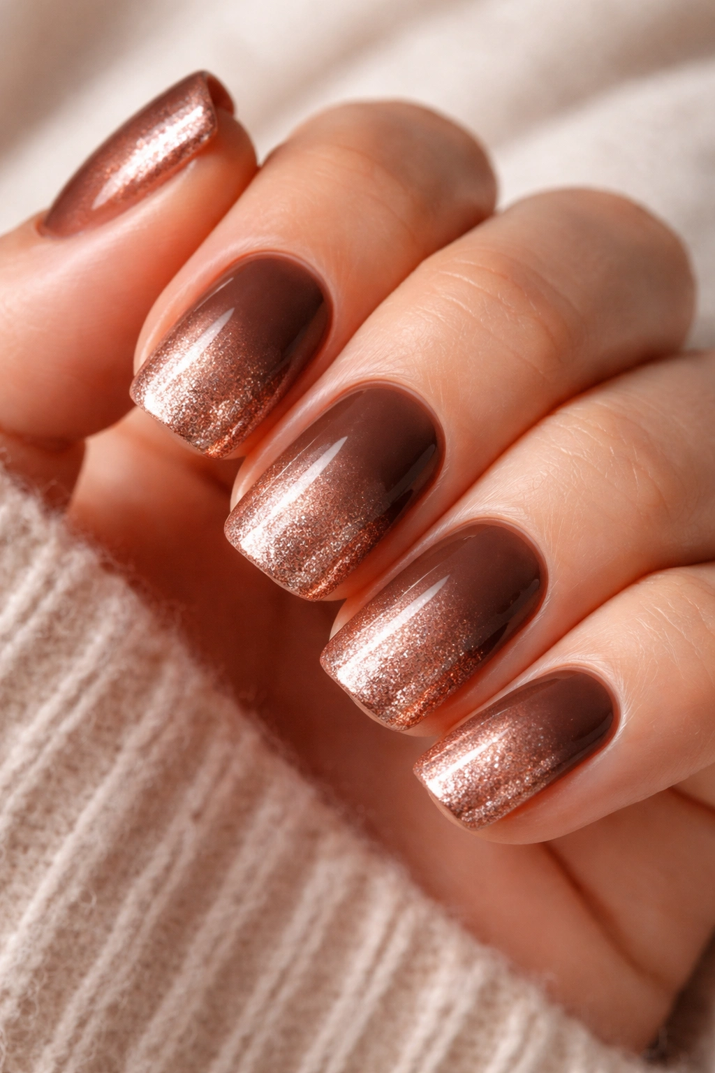
A warm mocha brown that melts into rose gold creates an almost 3D effect on short nails, with the gradient drawing the eye downward and making your fingertips look longer than they actually are. This is sophisticated enough for formal settings but cozy enough for everyday wear.
The Magic of Warm Gradients
Mocha brown is that perfect in-between shade — deeper than tan, warmer than true brown, complex enough to feel intentional. Rose gold adds luxury without being loud. Together, they create a design that feels like it cost a lot at a professional salon, but you can absolutely execute this at home.
Blending Mocha to Rose Gold Seamlessly
- Paint mocha brown on the entire nail (2 coats)
- Create a rose gold shade by mixing a champagne or pale gold with just a touch of pink and copper
- Use a blending sponge to apply rose gold to the tip, then gently dab and drag to create a gradient toward the center of the nail
- Build the gradient gradually with light applications
- Finish with a shiny topcoat that amplifies the metallics
Pro tip: If your first gradient attempt looks too harsh, don’t panic — painting a very thin third coat of mocha brown over the transition line and then re-blending softens everything beautifully.
7. Forest Green Shimmer with Minimal Art
A true forest green shimmer is jewel-toned without being glittery, and it works beautifully on short squovals without needing decoration. If you do add art, keep it minimal — a single fine line or a small accent near the cuticle is all that’s needed.
Shimmer vs. Glitter: The Distinction
Shimmer is smooth, integrated, and sophisticated. Glitter reads as celebratory or playful. Forest green shimmer sits firmly in the elegant camp. It catches light in a way that feels luxe rather than childish, and on short nails, this restraint actually makes the design feel more intentional and mature.
Minimal Art That Adds Impact
- Paint 2-3 coats of forest green shimmer for full, even coverage
- If you’re adding a line detail, use a thin brush and metallic gold or copper to paint a single fine line along the cuticle line, letting it follow the natural curve of your nail
- Alternatively, add 2-3 small dots in a cluster near the cuticle in a contrasting metallic shade
- Seal with glossy topcoat to enhance the shimmer and protect any details
What to know: With shimmer finishes, the topcoat you choose matters significantly — a quality topcoat will make the shimmer look cohesive and luxe; a cheap topcoat can make it look grainy and dull.
8. Cream Base with Tortoiseshell Accent Nails
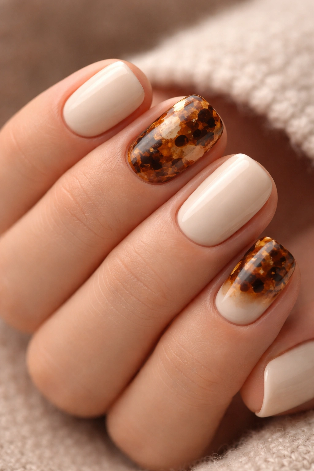
This design plays beautifully with negative space — keep most nails in a soft, warm cream, then choose one or two accent nails to showcase a detailed tortoiseshell pattern in browns, blacks, and golds. It’s enough to be interesting without being overwhelming.
Why Tortoiseshell Works in Cooler Months
Tortoiseshell is inherently warm and organic. The mottled pattern mimics natural materials like tortoiseshell, leather, and wood grain — all textures that feel quintessentially cozy. On short squovals, tortoiseshell accent nails create visual interest without the design-heavy feeling of full coverage pattern nails.
Creating Convincing Tortoiseshell Pattern
- Paint cream base on all nails (2 coats, full coverage)
- On your accent nail or nails, layer the tortoiseshell pattern: paint irregular patches of dark brown, then add smaller patches of black, then fill gaps with gold and touches of amber
- Use both brush strokes and sponging techniques to create an organic, non-uniform pattern
- The key is randomness — tortoiseshell should never look geometric or perfectly balanced
- Seal with glossy topcoat
Worth knowing: One accent tortoiseshell nail on a thumb or ring finger creates impact without being matchy; two accent nails (perhaps ring and pinky) creates more visual balance on a full manicure.
9. Charcoal Gray Creme with Frost Details
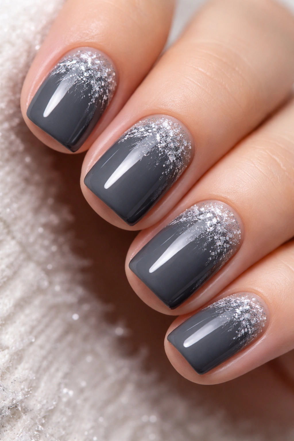
A sophisticated charcoal gray works year-round, but during cooler months, adding delicate frost or ice-crystal details transforms it into something seasonally resonant. These details can be as simple or detailed as your patience allows.
The Sophistication of Charcoal
Charcoal gray is one of the most underrated nail colors. It’s neutral enough to pair with any outfit, but it reads as intentional and thoughtful rather than boring. It’s the nails equivalent of a perfect gray sweater — endlessly wearable, always appropriate, and somehow never feels plain when done well.
Creating Frost Crystal Details
- Paint 2-3 coats of charcoal gray creme as your base
- Mix white polish with a touch of blue and a tiny amount of iridescent powder for a frosty tone
- Using an ultra-thin brush or toothpick, paint delicate branching lines that radiate outward from the cuticle area
- Add small dots along the branches, or small triangular shapes to mimic ice crystals
- The lines should be fine and organic, not geometric or rigid
- Seal with glossy topcoat
Pro tip: If frost details feel intimidating, start with just a few small clusters of tiny dots near the cuticle rather than full branching patterns. This achieves the effect with much less pressure.
10. Warm Caramel with Negative Space Design
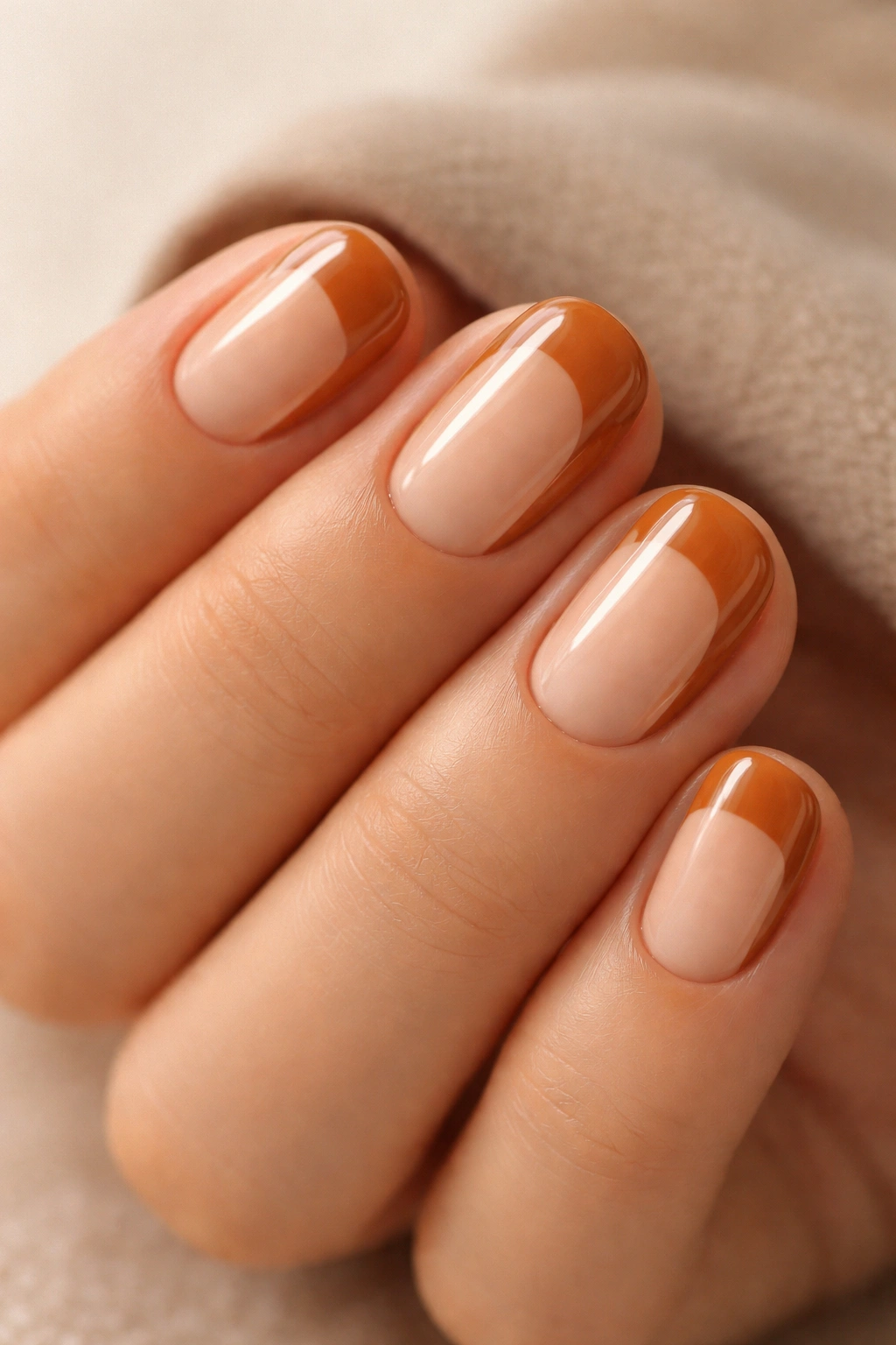
Warm caramel is that perfect cooler-month color — it’s the shade of autumn leaves, hot caramel sauce, and cozy knitwear. By leaving strategic areas of nail bare (negative space), you create a design that feels modern and intentional rather than simply unfinished.
Why Negative Space Matters on Short Nails
Negative space designs are particularly effective on shorter nails because they visually break up the nail surface, making them appear more interesting and longer than they are. The contrast between the warm caramel and your skin tone creates visual dimension that a solid color can’t achieve.
Planning Your Negative Space Strategically
- Paint your caramel base on the full nail (2 coats)
- Once dry, use a very fine brush to paint clean outlines of the areas you want to leave bare — think of drawing a frame
- Carefully remove the polish within those outlines using a thin brush dipped in acetone, or a nail art pen tool
- You can create geometric lines down the center of the nail, a circular negative space near the cuticle, or curved sections along the sides
- Seal the edges carefully with topcoat so the negative space design stays clean
What to watch for: The edges between painted and unpainted areas need to be sharp and clean for this design to read as intentional rather than accidental. Take your time with the outlines.
11. Deep Plum with Gold Geometric Lines
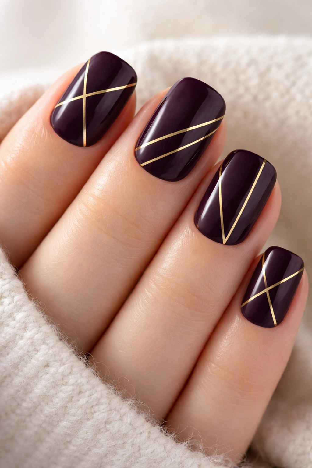
Deep plum is one of the most elegant cooler-month colors, and when you add gold geometric lines, it transforms into something gallery-worthy. The geometry keeps the design from feeling too ornate, while the gold adds luxury.
The Elegance of Geometric Meets Jewel Tone
Plum is naturally regal, and geometry adds structure and intention. Together, they create a design that feels both artistic and edited. It’s the kind of design that makes people ask if you had it done professionally, even though the geometry is quite doable at home with basic tools.
Creating Clean Geometric Lines
- Paint 2-3 coats of deep plum as your base
- Using a thin brush or nail art pen, paint gold lines in your chosen geometric pattern: this could be triangles down the center, parallel lines across the nail, a grid pattern, or angular sections
- Keep the pattern consistent across all fingers for cohesion
- The lines should be clean and confident — hesitant, shaky lines read as unintentional rather than artistic
- Practice on a nail wheel first if geometry isn’t your strong suit
- Seal with glossy topcoat
Pro tip: Gold lines on plum photograph beautifully, which is a bonus if you’re the type who documents your nails.
12. Soft Oatmeal with Embossed Texture
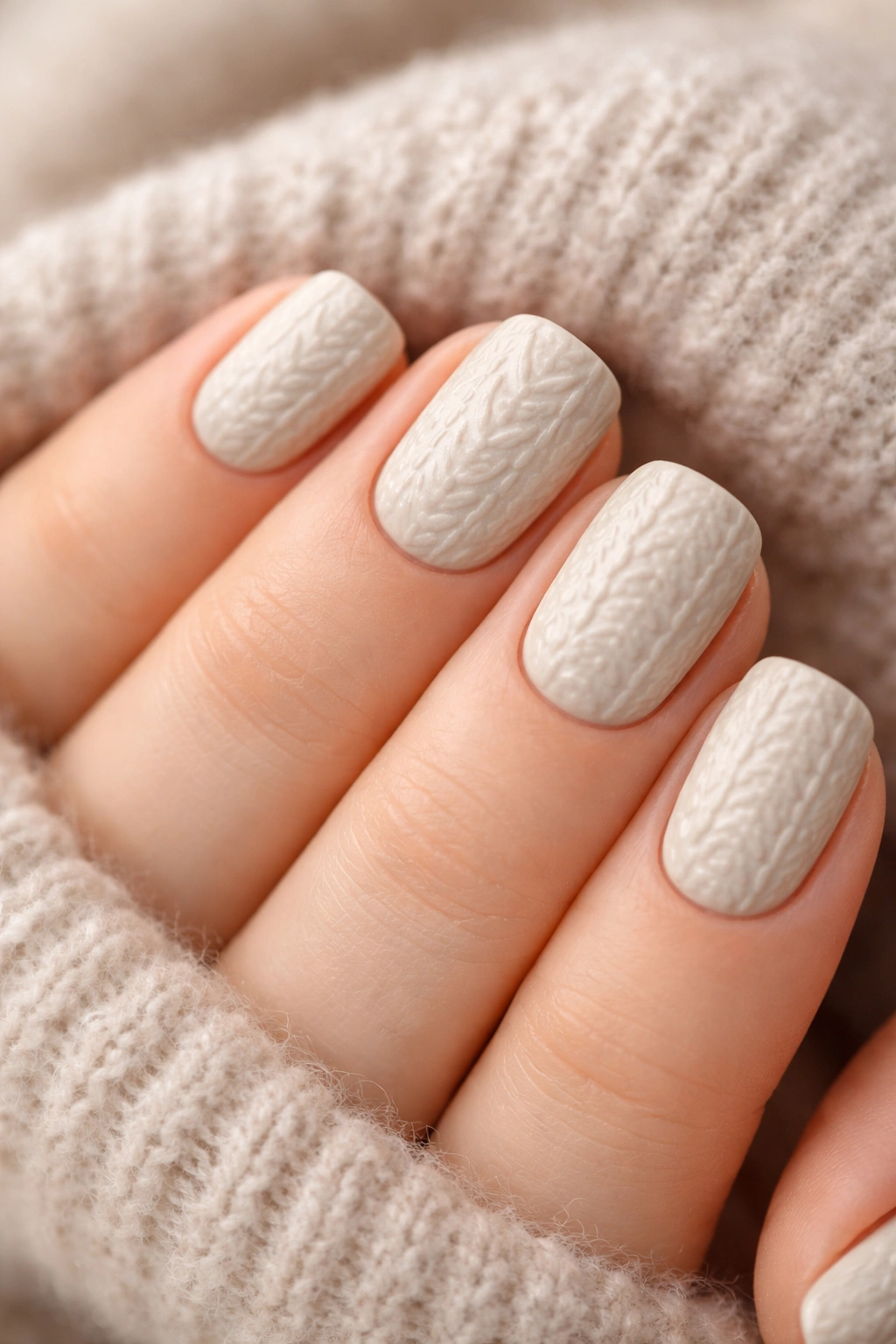
An understated oatmeal base with embossed texture — created using stamping plates or careful layering — creates a design that’s visually interesting while remaining subdued and elegant. It’s the definition of cooler-month quiet luxury.
The Appeal of Textured Minimalism
Not every design needs color to be striking. Texture alone can create visual interest and tactile appeal. An oatmeal base with subtle texture feels like a cashmere sweater or linen pants — expensive-looking because of quality and intentionality, not because of flashiness.
Creating Subtle Embossed Texture
- Paint 2 coats of soft oatmeal creme as your base
- Choose a stamping plate with a delicate, intricate pattern (lacy designs work particularly well)
- Use a muted gray or taupe stamping polish on the plate for contrast without harsh color shock
- Stamp the pattern carefully onto the oatmeal base, positioning it to cover about 60% of the nail
- Alternatively, use a dotting tool dipped in taupe to create small texture details across the nail
- Seal with topcoat — glossy topcoat will make the texture more visible, matte topcoat will make it more subtle
What to know: This design benefits from good lighting to really show off the texture — it’s the kind of design that looks more impressive in person than in photos because of the tactile element.
13. Dusty Rose with Scattered Pearl Accents
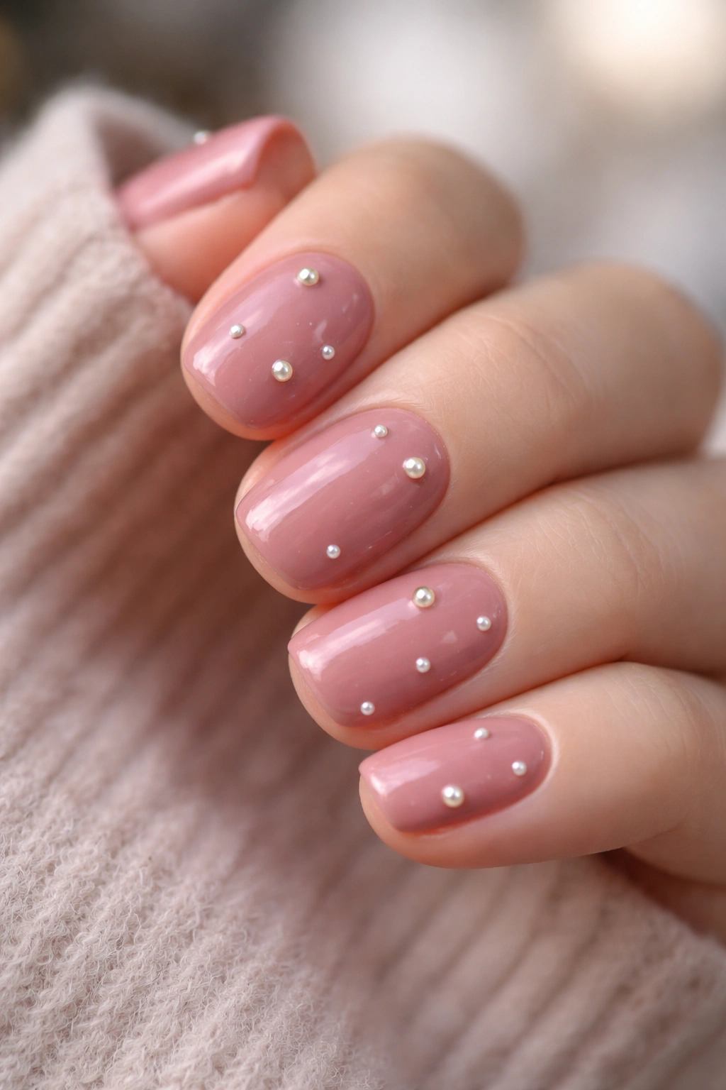
Dusty rose is the cooler-month pink that actually works — it’s muted enough to read as sophisticated rather than sweet, and scattered pearl accents add subtle shimmer without overwhelm. This is the design for anyone who wants pink but doesn’t want to feel like they’re wearing a little girl’s manicure.
Why Dusty Rose Replaces Bright Pink in Cooler Months
Bright, saturated pink feels summery and cheerful — which are wonderful qualities, but not particularly aligned with cooler-month aesthetics. Dusty rose, by contrast, feels contemplative and mature. It’s pink’s sophisticated older sister. Pearl accents keep it from feeling matchy with pearls — the scattered placement means they catch light organically rather than feeling planned.
Distributing Pearl Accents Naturally
- Paint 2-3 coats of dusty rose creme as your base
- While the final coat is still very slightly tacky, use a dotting tool to place small pearl beads or caviar beads across the nail surface
- Place them scattered rather than in a pattern — use an asymmetrical distribution
- Press gently so they adhere properly
- Once fully dry, seal carefully with topcoat — use light coats so you don’t dislodge the pearls
Real talk: Pearl accents will eventually shed with normal wear — this is completely normal and part of the charm of the design. Simply replace lost pearls every few days if you want full coverage.
14. Chocolate Brown Base with Deep Burgundy Tips
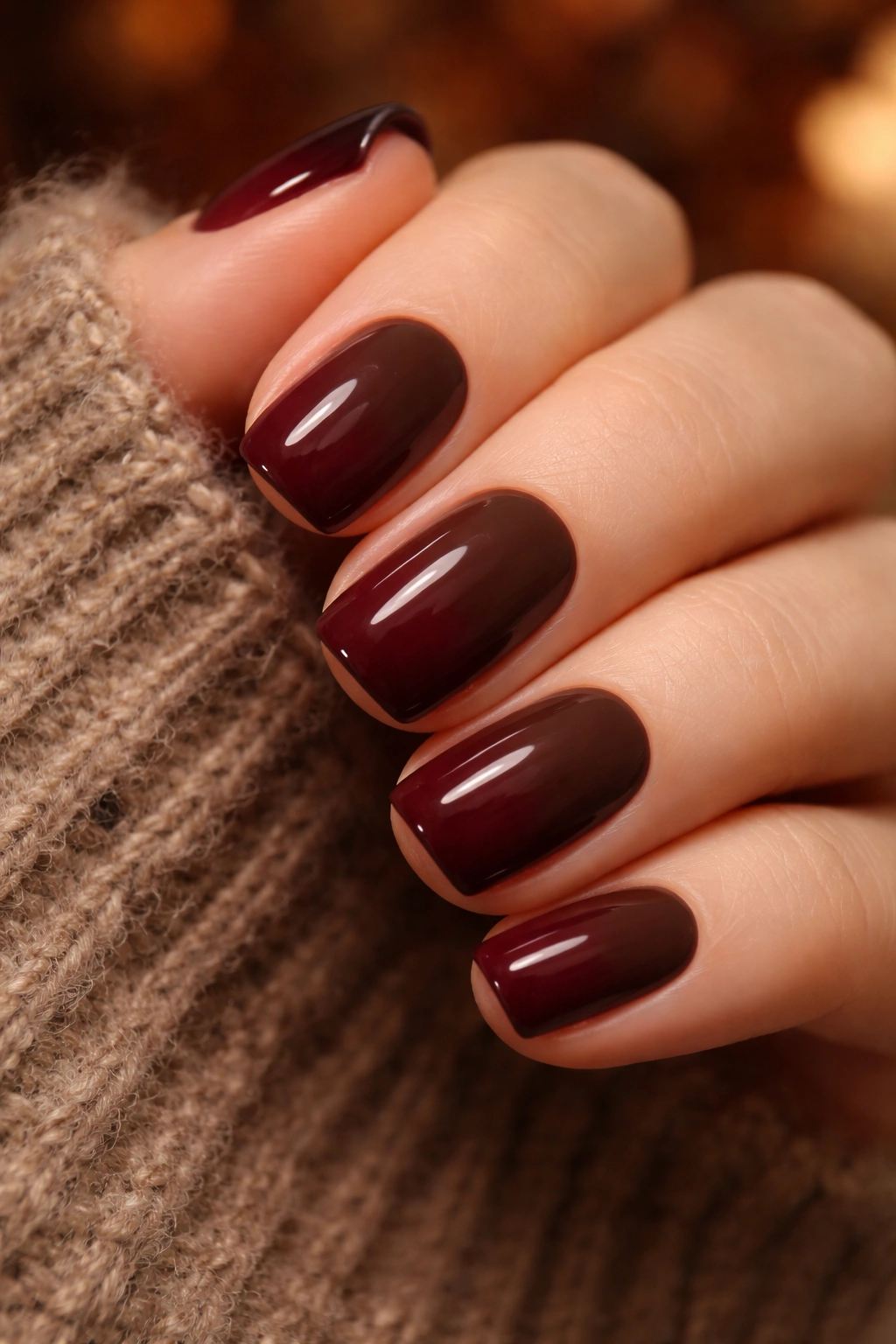
An ombré that goes from chocolate brown at the cuticle to a deep burgundy at the tip creates an almost autumnal effect. The colors are so close in undertone that the gradient feels natural and organic rather than stylized.
The Comfort Zone of Warm Ombré
Brown to burgundy is the kind of color combination that belongs in a cozy room filled with leather furniture and warm lighting. On nails, it creates a sense of ease and intentionality. Both colors are naturally flattering on most skin tones, and the gradient between them creates dimension without requiring technical precision.
Creating a Smooth Brown-to-Burgundy Gradient
- Paint your chocolate brown base on the entire nail (2 coats)
- Create a deep burgundy shade that shares brown undertones with your base color
- Using a blending sponge, dab burgundy onto the sponge and stipple it onto the tip of the nail
- Gently drag and blend the burgundy back toward the cuticle, creating a gradient zone
- Build the color gradually over 2-3 applications rather than trying to get it right in one heavy application
- The transition should feel gradual and natural, not like two separate colors on the same nail
- Finish with glossy topcoat
Pro tip: If you’re nervous about blending, try this approach: paint the brown base, paint solid burgundy on the tip only, then use a clean, dry blending sponge to soften and feather the edge between colors.
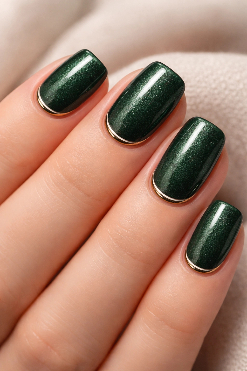
15. Navy Blue Base with Metallic Silver Accents
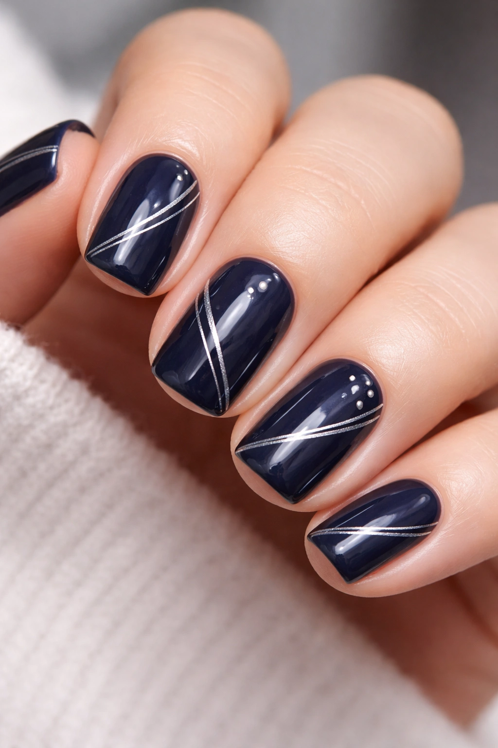
A true navy blue — not so dark it looks black, but saturated enough to read as purposeful — paired with metallic silver accents is timelessly elegant. The cool tones work together harmoniously, and the contrast between the richness of navy and the brightness of silver feels balanced.
Navy as the Ultimate Cooler-Month Base
Navy is one of those colors that feels both calm and sophisticated. It doesn’t announce itself like a bright color, but it’s not anonymous like a neutral. It’s the perfect base color for someone who wants their nails to feel intentional without being loud. Silver accents add just enough shimmer to break up the solid color without competing for attention.
Placement Options for Metallic Silver Accents
- Paint 2-3 coats of navy blue creme as your base
- For a minimalist approach: paint a thin silver line along the cuticle line, or place 3-4 small silver dots in a scattered pattern
- For more visual impact: use a sponge to create a silver ombré at the tip, or paint silver stripes along the sides of the nail
- Another option: stamp a metallic silver design (delicate lace, geometric pattern, or tiny lines) onto the navy base
- Seal with glossy topcoat to enhance the metallic effect
What to know: The key to this design reading as “intentional sophistication” rather than “trying too hard” is restraint — less is genuinely more with navy and silver.
16. Warm Taupe with Burnt Sienna Striping
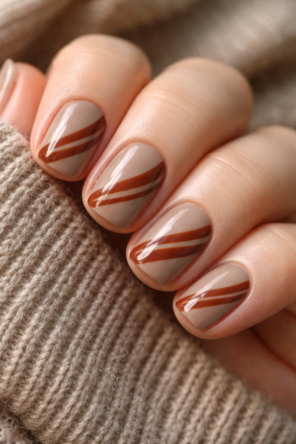
Taupe is that perfect cooler-month neutral that’s warmer than gray and more sophisticated than beige. Adding burnt sienna stripes in varying widths creates visual interest while keeping the overall palette warm and grounded.
The Underrated Beauty of Taupe
Taupe doesn’t get the love it deserves. It’s neutral enough to work with any outfit, but it’s warm enough to feel intentional and thoughtful. It’s the nail equivalent of a perfect cashmere cardigan — elevated, wearable, and somehow never boring. Burnt sienna stripes add just enough color play to prevent the design from feeling boring or one-note.
Creating Confident Striping Details
- Paint 2-3 coats of warm taupe as your base
- Using a thin striping brush, paint burnt sienna lines of varying widths across your nail
- You can create parallel lines (3-4 lines running the same direction), crossing lines (perpendicular stripes), or a combination
- Keep the lines clean and confident — shaky lines will read as unintentional
- Space the lines intentionally — they shouldn’t crowd the nail or feel random
- Seal with glossy topcoat
Pro tip: If drawing straight lines makes you anxious, use thin striping tape to create guides, paint your burnt sienna color, then remove the tape to reveal clean lines.
17. Emerald Green Creme with Champagne Foil Accents
Emerald green is jewel-toned luxury, and when you add champagne foil accents, the design feels genuinely high-end. This is the design for when you want your nails to feel special and intentional without being matchy-matchy or overdone.
Why Foil Creates Luxury Appeal
Foil finishes have an inherent shimmer and depth that regular shimmer polish can’t quite match. The foil sits on top of the nail surface, catching and reflecting light in a dimensional way. On short squovals, this creates an elegant, jewelry-like quality that reads as intentional indulgence.
Applying Foil Accents Effectively
- Paint 2-3 coats of emerald green creme as your base
- Once completely dry, apply a very thin layer of foil adhesive (the sticky base that foil adheres to) to specific areas: you can do a small section near the cuticle, a few scattered patches, or a full tip gradient
- Press champagne foil onto the adhesive, using a soft brush or your finger to smooth it and ensure full contact
- Once set (usually 30 seconds to a minute), gently peel away the foil transfer backing
- The champagne will remain adhered to the nail in the shape of your adhesive application
- Seal carefully with topcoat
Worth knowing: Foil accents will eventually wear away with normal use — this is expected and part of the design’s lifespan. Most foil manicures last 1-2 weeks before needing touch-ups.
18. Cream with Minimalist Eucalyptus Line Art
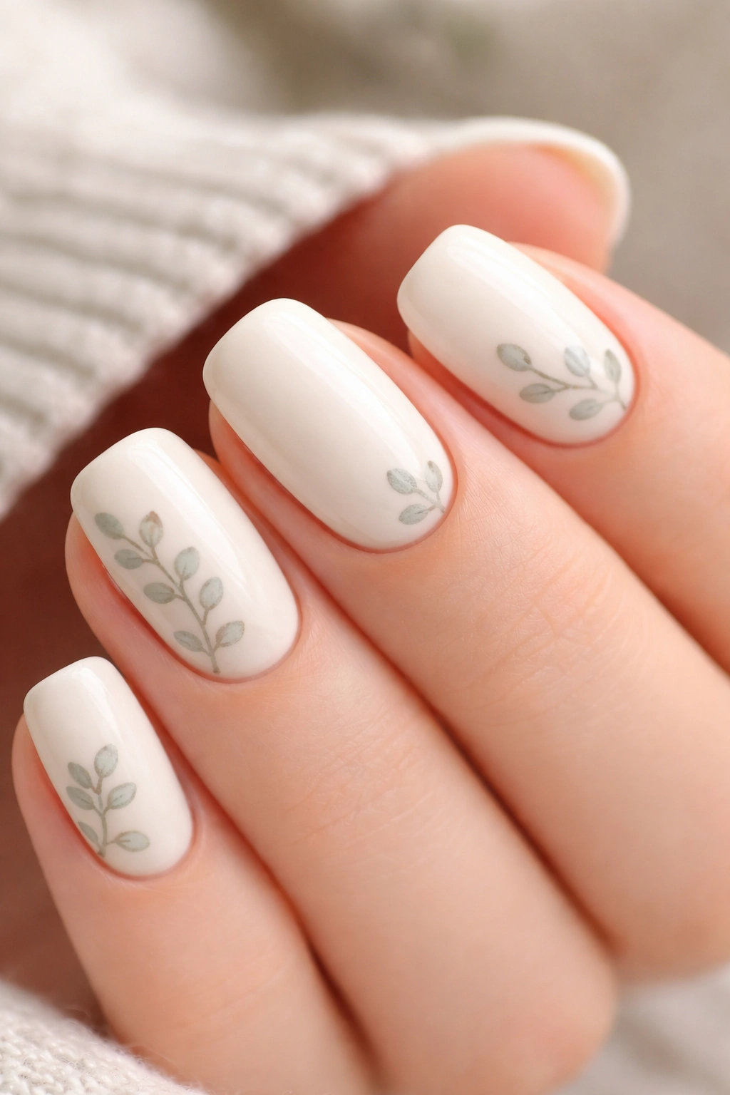
A soft, warm cream base with delicate eucalyptus leaf line art creates a design that’s botanical without being floral or cutesy. This is sophisticated, calming, and feels fresh in a cooler-month context that might otherwise feel heavy.
Bringing Nature Into Your Nails Thoughtfully
Eucalyptus is having a real moment in home decor and aesthetics, and it translates beautifully to nails. The leaves have a graceful, organic shape that’s recognizable without being cartoonish. A few carefully placed leaves on a cream base feel like a whisper of nature rather than a botanical statement.
Drawing Minimalist Eucalyptus Details
- Paint 2-3 coats of warm cream creme as your base
- Using a very thin brush, outline 2-3 simple eucalyptus leaves using a warm gray or soft green
- The outline should be fine and delicate — you’re suggesting the shape of a leaf, not creating a detailed botanical illustration
- Add a thin center vein to each leaf to suggest dimension
- Placement can be scattered across the nail, clustered near the cuticle, or positioned along one side
- Keep the details minimal — this should read as understated rather than illustrated
- Seal with glossy topcoat
Pro tip: If drawing freehand feels daunting, use a thin nail art stamp with a eucalyptus design, or practice on a nail wheel several times before committing to your actual nails.
Final Thoughts
Short squoval nails during cooler months are less about being trendy and more about meeting yourself where you are — offering yourself a little moment of intentional beauty in a season that invites slower living and thoughtful details. The designs that work best aren’t the loudest or the most complicated, but the ones that feel authentic to your actual lifestyle and aesthetic.
What all of these designs share is specificity. Instead of just “brown nails,” you’ve got chocolate mousse with gold leaf or warm caramel with negative space. Instead of generic “pink,” you’ve got dusty rose with scattered pearls. This specificity is what transforms a simple manicure into something that feels curated and considered — and that’s genuinely the whole point of a beautiful nail design.
Short squovals offer you the luxury of looking intentional and put-together without requiring the maintenance of longer nails. You can change your design every week without feeling like you’re chasing trends — you’re simply exploring what works for your mood, your outfit, and the particular quality of light in cooler months. Give yourself permission to experiment, to keep the designs that make you happy, and to abandon the ones that don’t feel right. The best nail design is always the one that makes you smile when you catch your reflection.
