

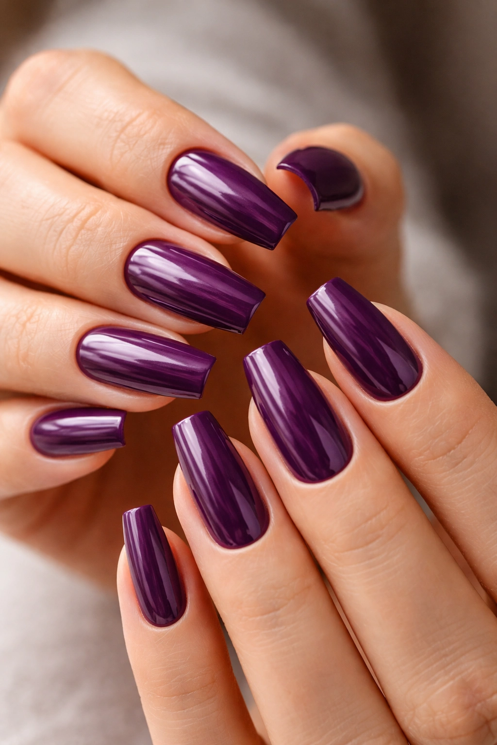
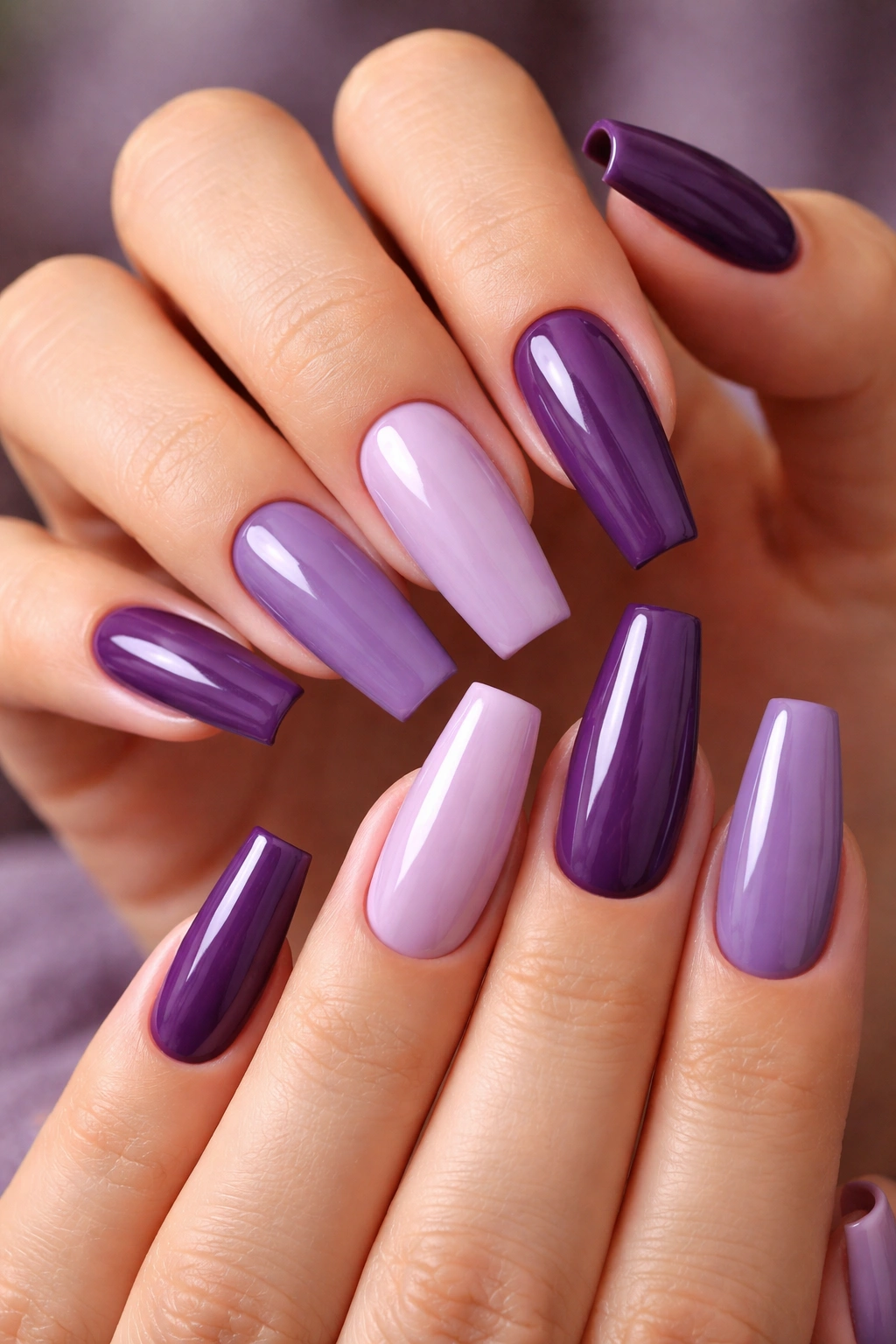
Purple coffin nails can look expensive fast—but only when the color, shape, and finish all pull in the same direction. A deep plum on a sharp coffin reads polished and intentional. A chalky purple on thick, blunt tips can swing the other way in a hurry.
That’s why this category is trickier than it looks. Purple carries a lot of personality on its own, and coffin nails already have strong lines, so small choices matter more here than they do with a soft pink oval. One millimeter too much bulk at the free edge, a cloudy top coat, or a glitter mix that’s too chunky, and the whole set loses that rich feel.
I’ve seen simple purple acrylic nails beat heavily decorated sets by a mile. Usually the winning set had cleaner sidewalls, better color depth, and a finish that matched the design—inky gloss, smoked chrome, a fine velvet flash, something with restraint. The losing set had too much happening at once.
Shape does half the work.
If you want purple coffin nails that look rich instead of loud, the designs below are the ones worth saving, screenshotting, and taking to your nail tech with a clear plan.
Crisp taper, thin free edges, and a clean cuticle line
Before color even enters the conversation, the shape has to be right. Coffin nails look polished when the sidewalls taper evenly and the tip stays flat but not bulky. If the nail flares out, the whole manicure starts to look wide and heavy, which is rough on purple because purple already pulls attention.
The free edge matters more than most people think. On a salon chair, a thick tip can look fine. Two hours later, when you’re holding a coffee cup or typing, that same tip looks blunt and plastic. Ask for a thin side profile with a small apex near the stress area, not a flat slab of acrylic or gel.
Cuticle work is where expensive-looking nails usually win. Dermatology guidance from the American Academy of Dermatology warns against aggressive cuticle cutting, and that’s not only about nail health. Once the skin around the nail gets red, ragged, or shiny from over-filing, no deep plum or soft lavender is going to save the look.
Three details make the biggest difference:
- A snug polish line that sits close to the cuticle without flooding it
- Even sidewalls that taper the same way on all ten nails
- A smooth top coat with no ripples, dips, or lumps over nail art
You do not need a pile of crystals to make coffin nail designs look costly. You need clean structure.
Choosing plum, lavender, or mauve by skin tone and nail length
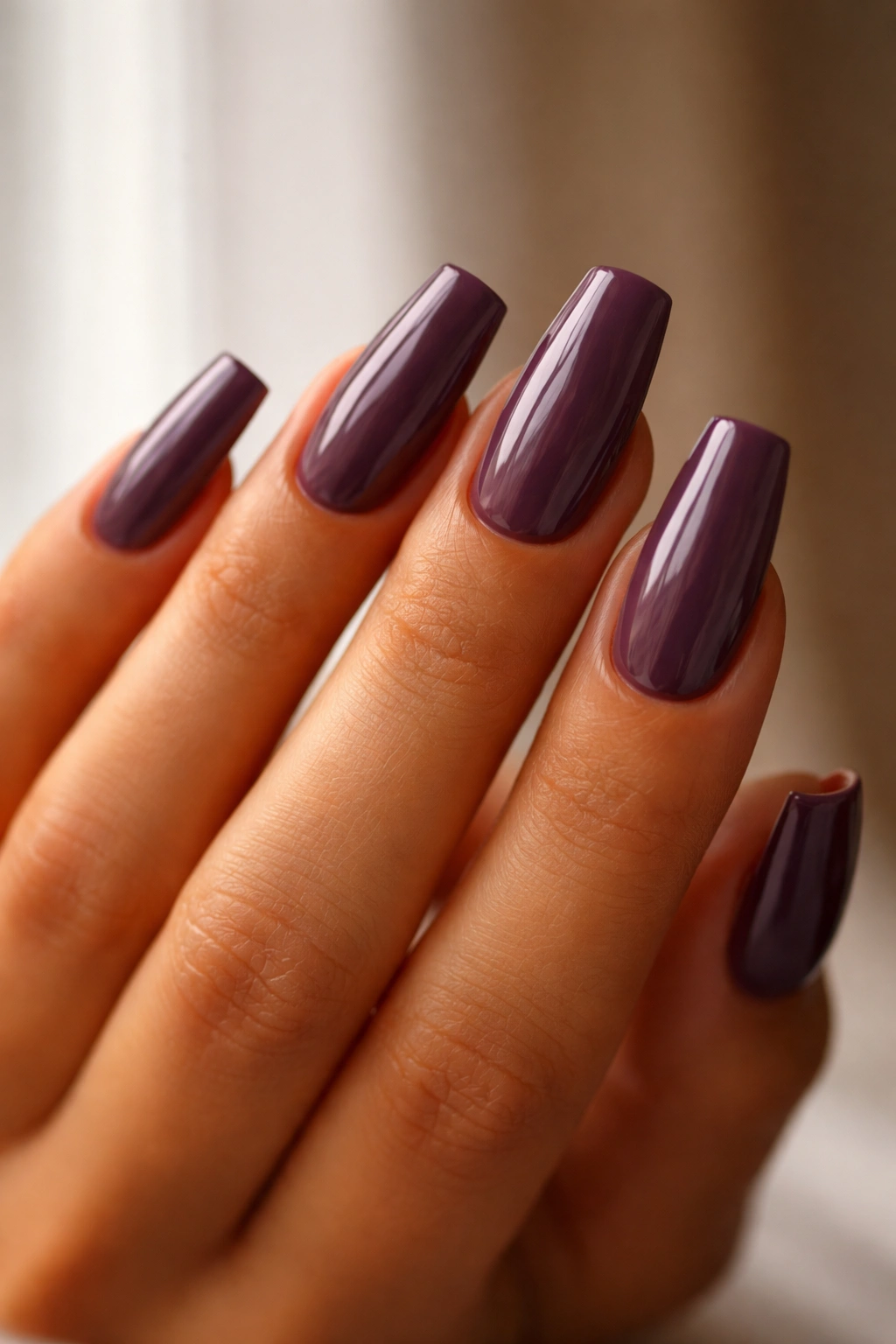
Not every purple gives the same effect. Depth changes everything. On longer coffin nails, dark grape, aubergine, black cherry, and wine shades tend to look sleeker because they visually slim the width. On shorter coffin shapes, a smoky mauve or milky lavender can keep the set from feeling too heavy.
Undertone matters too. If your skin leans golden, olive, or deep, rich eggplant and red-based purples usually look smoother against the hand than icy blue-violet shades. Cooler skin often wears lilac, orchid, and amethyst more easily—though a neutral plum works on almost everyone, which is why salons keep reaching for it.
Length changes the mood. A 10 to 12 mm free edge can handle a dusty lavender or soft mauve fade without losing structure. Once you push into longer extensions, around 14 to 18 mm, deeper purples tend to look more tailored because they keep the coffin silhouette lean.
One more thing. Purple with too much white mixed in often goes chalky on coffin nails.
If you love pale purple, aim for milky translucency instead of full pastel opacity. That small shift is the difference between porcelain and correction fluid.
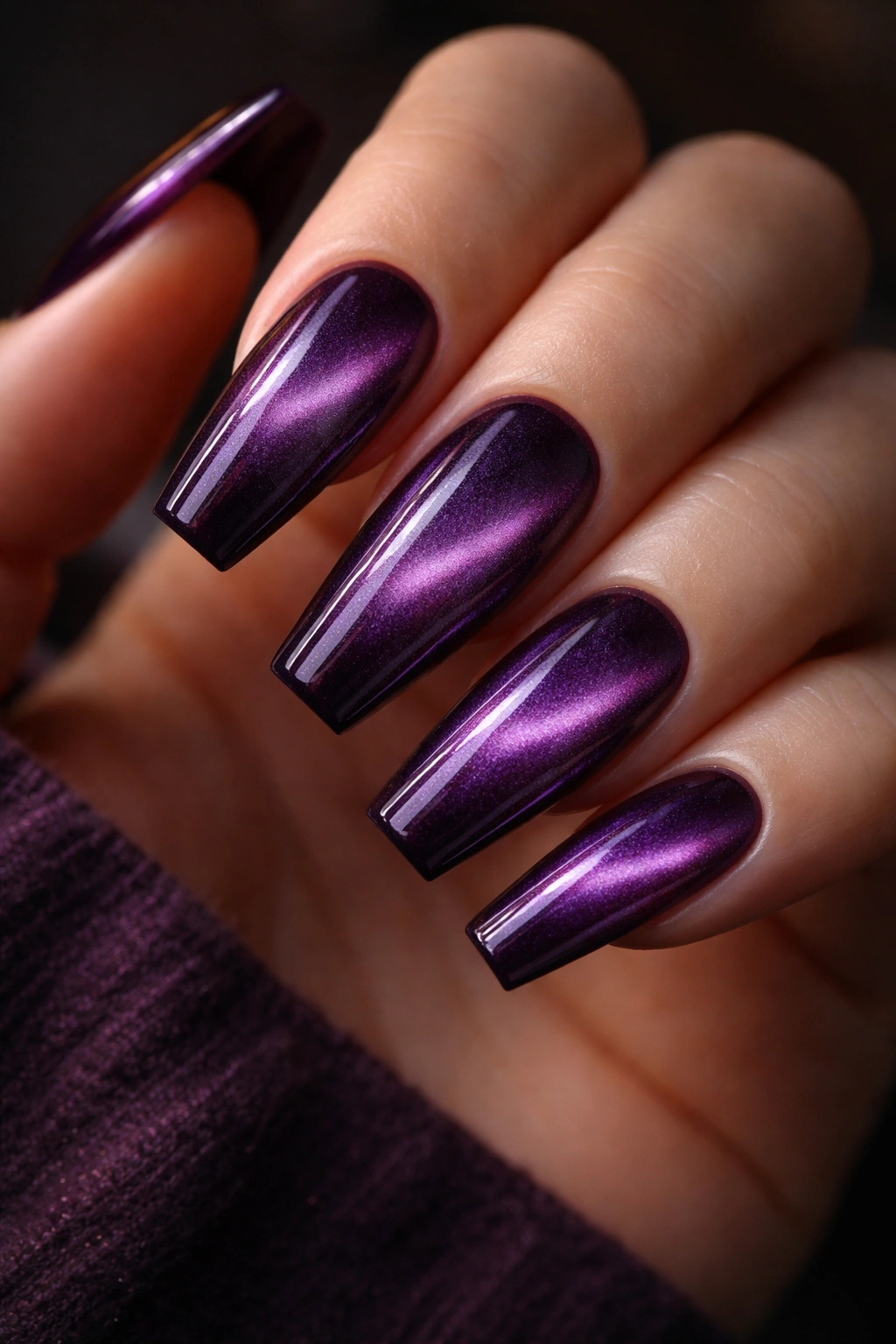
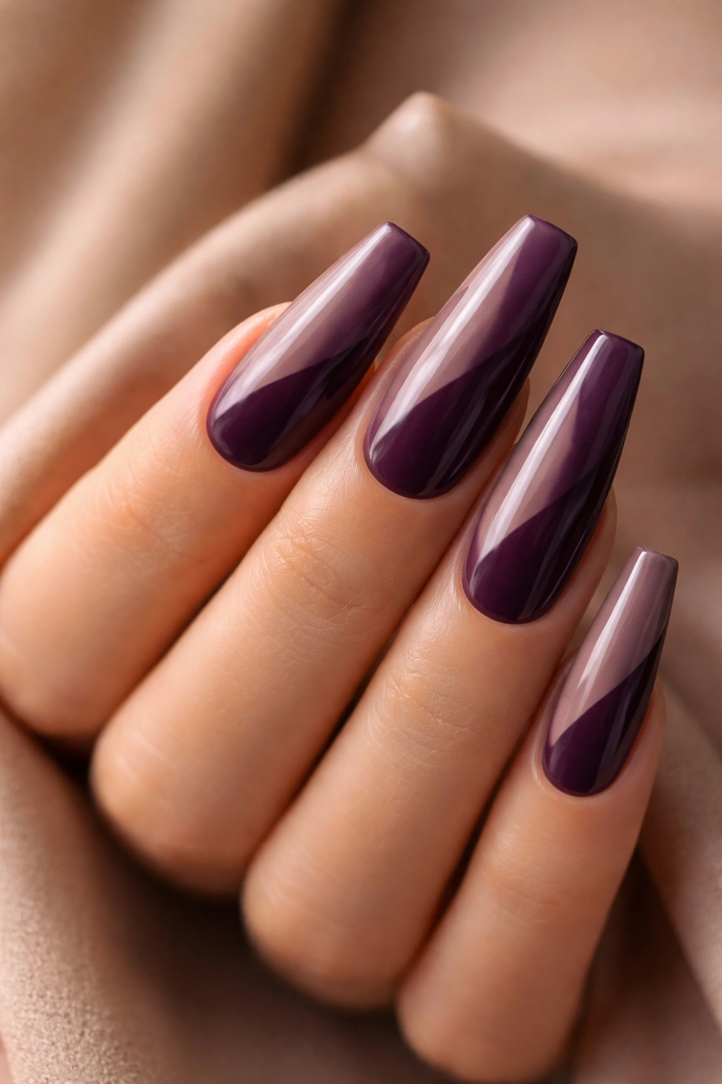
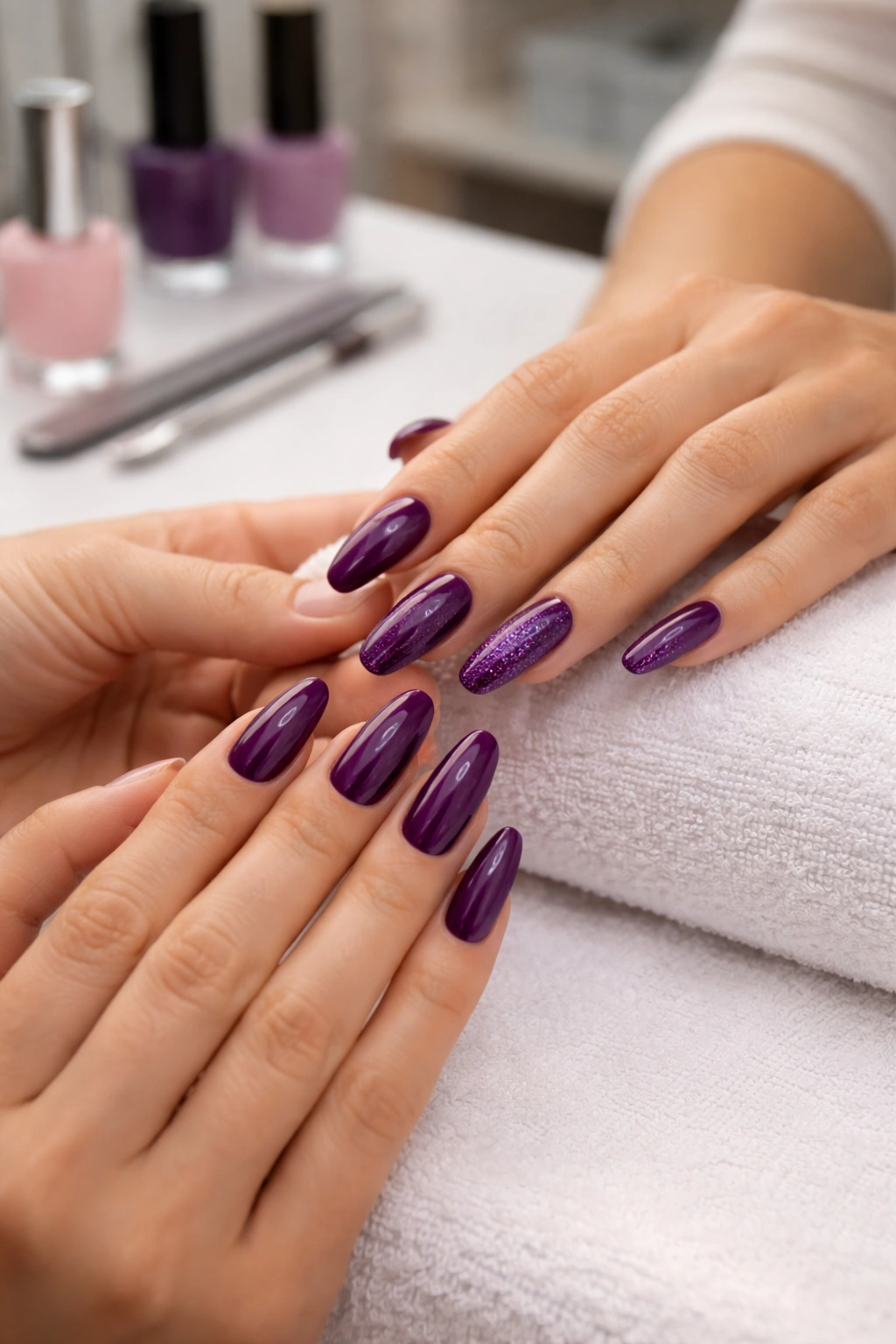
1. Black Cherry Plum With Glassy Shine
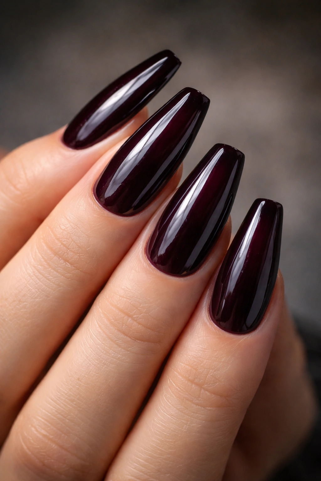
If you only save one idea from this list, make it this one. Black cherry plum is the easiest rich purple manicure to wear because it looks almost black in low light, then opens up into wine and berry tones when your hands move.
That depth flatters the coffin shape. Dark shades visually narrow the nail plate, which helps the tapered sides look sharper and cleaner. It also hides tiny signs of grow-out better than pale purple, so the set stays polished longer between fills.
Why this shade reads expensive
The finish is doing almost as much work as the color. A black cherry shade with a glassy, wet-look top coat feels like lacquered leather or polished stone. A dull top coat kills it. So does patchy pigment.
Quick design notes
- Keep the length in the medium to long coffin range, around 12 to 18 mm past the fingertip
- Choose a creme or jelly-creme formula, not chunky shimmer
- Pair it with gold jewelry or deep neutral clothing if you want the whole look to feel pulled together
- Skip accent nails unless the accent is tiny and tonal
Best move: ask for two thin coats of color and a floated top coat, not three heavy coats of pigment. The side view should stay slim.
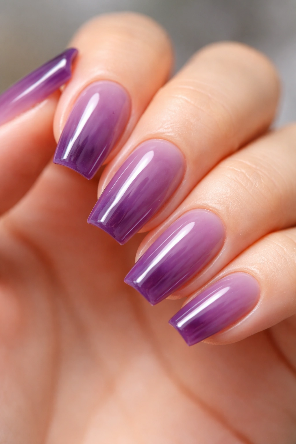
2. Milky Lavender Over a Soft Nude Base
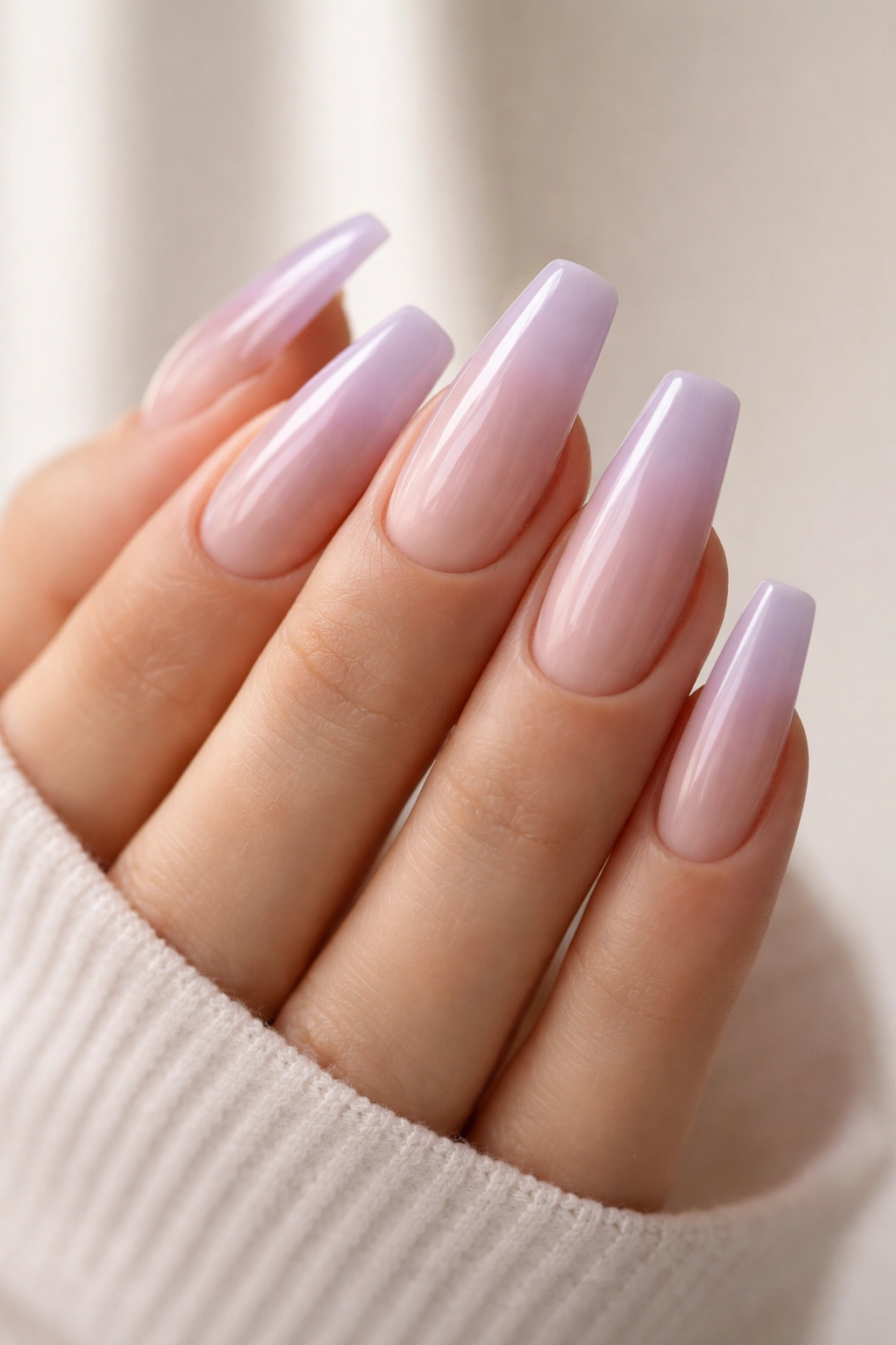
Soft purple can look pricier than dark purple when the opacity is controlled. That’s the whole trick here. You do not want a flat, chalky lavender sitting on top of the nail like paint on drywall. You want a sheer, creamy lavender wash over a structured nude or pink builder base.
That little bit of translucency makes the color look deeper and cleaner. The natural nail bed still whispers through, which keeps the set from reading heavy. On coffin nails, that matters. Hard lines already make a statement, so a softer color finish gives the eye somewhere to rest.
This works best on medium coffin lengths, especially when your hands are dry or your skin leans neutral to cool. A milky lavender softens the contrast between nail and skin, and that can look much more polished than a bright violet block of color.
Opacity is the whole game.
If you want this look at the salon, ask for a jelly-milky lavender over a sheer pink base, not an opaque pastel. One coat too many and the set turns chalky. I would also keep the top coat high-gloss here. Matte tends to make pale purple feel flat unless the surface design is doing something special.
3. Amethyst Velvet Cat-Eye
Why does this one look like it belongs with a heavy coat, a watch with some weight to it, and a proper dinner reservation? Because magnetic polish creates depth at the center and shadow at the edges, and that kind of movement reads richer than flat glitter.
A good amethyst cat-eye should not look loud or stripey. The effect needs to feel soft, almost like brushed velvet under glass. The richest versions use a dark purple or near-black base, then pull the magnetic pigment into a centered glow or a diagonal sweep. Hold the magnet too far away, or for too little time, and the effect turns weak. Around 5 to 8 seconds per nail is the sweet spot for many magnetic gels, though the exact formula matters.
It looks expensive in dim rooms.
How to wear it without overdoing it
Keep the whole set in the same color family. Skip rhinestones. Skip foil. Skip the urge to add “just one extra detail” to make it feel dressier. The velvet finish is already the event.
Medium-long coffin nails show this design best because the magnetic shift has enough space to develop. Shorter nails can still wear it, though the effect will look tighter and more compact. If your tech offers both a cat-eye stripe and a full velvet pull, pick the full velvet pull for a softer, costlier feel.
4. Grape Jelly Translucent Overlay
I saw a set like this across a restaurant table once, and from a distance it looked almost understated. Then the hand wrapped around a water glass and the purple deepened through the curve of the nail—like dark candy or tinted glass. That’s the charm of a jelly finish when it’s done right.
A grape jelly overlay builds color in layers instead of laying down one opaque block. You get depth, shine, and a little bit of light passing through the edge, which keeps the coffin shape from looking thick. Three sheer coats over a clear or blush-toned base usually does it.
The mechanism is simple: translucency creates visual depth. Your eye reads the layers, the free edge, the base tone under the purple. Opaque polish hides all that and can make the nail look flatter.
Key details that make this design work:
- Use 2 to 3 sheer coats, not one thick coat
- Keep the shape on the short-to-medium coffin side if you want a cleaner daily look
- Choose a true grape or blackberry jelly, not neon purple
- Pair it with a clear, high-shine top coat only
If full-coverage purple feels too solid on your hands, this is the one to try next.
5. Aubergine With a Hairline Gold Cuticle Arc
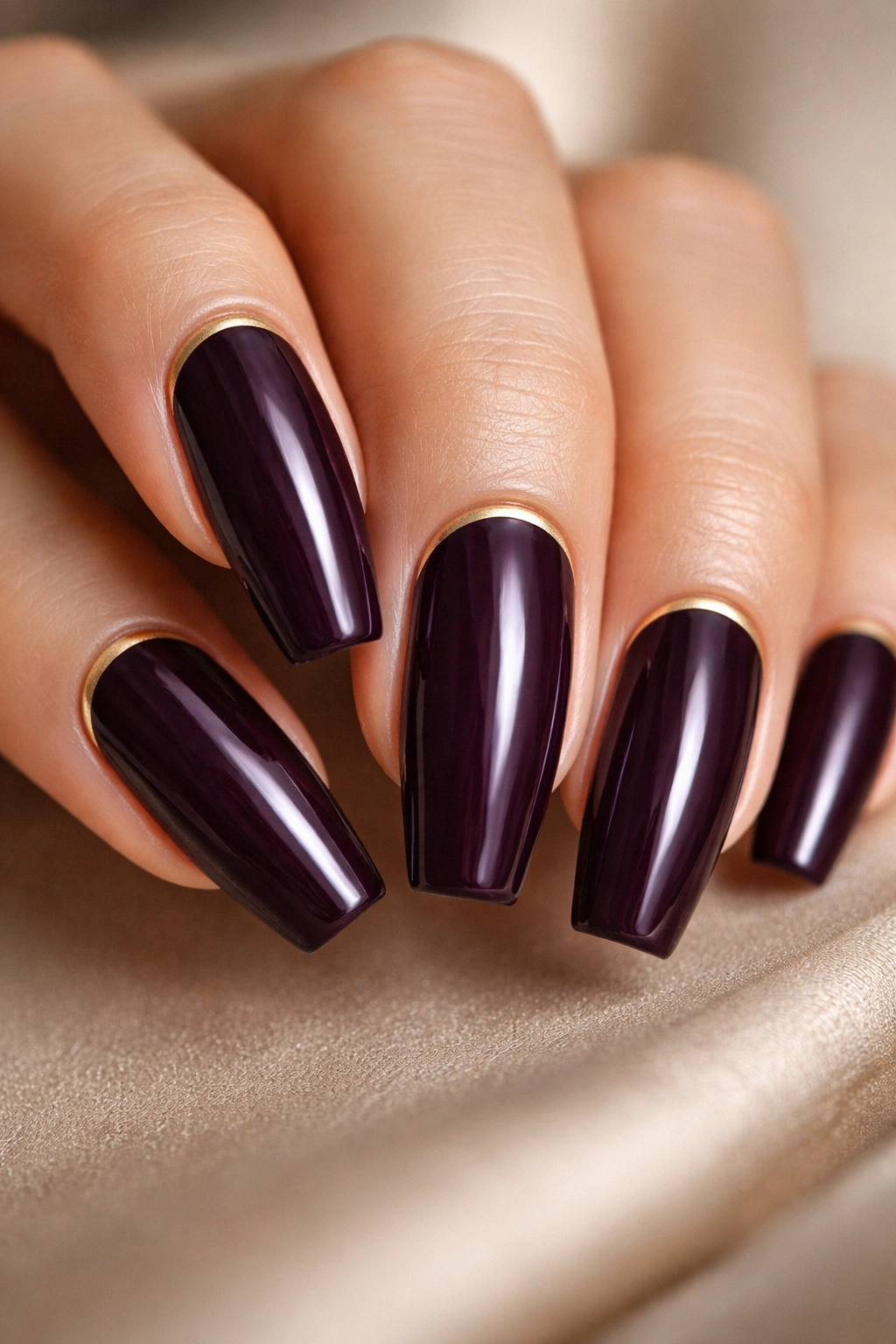
This is the manicure version of wearing one good piece of jewelry and leaving the rest alone. Aubergine already has enough weight and depth on its own, so the gold detail needs to stay tiny—more like a whisper than a statement.
The line should sit tight against the cuticle area, drawn with a liner brush or foil gel in a band no thicker than 0.5 to 1 mm. Any wider and it starts to look costume-y. Any roughness in the curve shows immediately, so this design lives or dies on prep and precision.
A warm, bronzy gold usually looks better than a yellow gold here. Yellow can fight with the purple and make the whole set look sharper than it needs to. Bronzy gold melts into aubergine more smoothly, especially on medium to deep skin tones.
This one is dressy.
It is also less forgiving of grow-out than an ombré or sheer wash, because the design sits right where regrowth shows first. I like it most for events, photos, weekends away, or anyone who gets fills on a tighter schedule. If you want the same mood with less maintenance, ask for the gold arc on two accent nails per hand instead of all ten.
6. Dusty Mauve Ombre Into Bare Nude
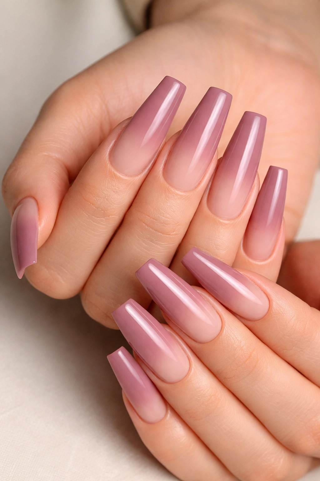
Unlike full mauve coverage, a nude-to-mauve fade lengthens the nail and softens the coffin edges. That’s why this design works so well on hands that want purple but not a dense, dramatic block of color.
The best version keeps the nude base visible near the cuticle and places the dusty purple mostly on the upper third of the nail. If the fade starts too low, the nail can look shorter. If the mauve is too pink, you lose that moody purple feel that makes the set read expensive.
Airbrush gives the smoothest result, though a sponge blend can still look clean if the pigment is thin and the top coat levels well. What you’re after is haze, not stripes. The color should dissolve into the base, not sit on top of it like two separate layers.
Who wears this best? People who want office-friendly coffin nails, first-time coffin wearers, anyone who hates obvious grow-out, and anyone whose fingers look shorter in dark full-coverage shades.
My recommendation: choose a dusty mauve with grey in it, not candy mauve. Grey mutes the sweetness and gives the design more bite.
7. Royal Purple Micro-French on Long Coffin Nails
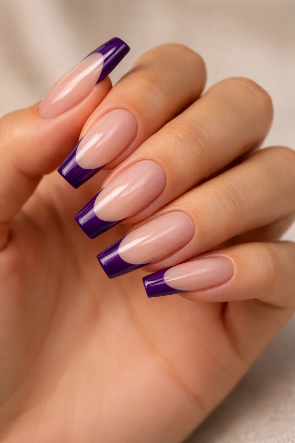
French tips stop looking sweet and start looking tailored when the line gets thinner and the color gets deeper. A royal purple micro-French on a long coffin base has that effect immediately. It feels sharper than a full-coverage set and cleaner than a thick smile line.
The base matters here. A sheer beige, neutral pink, or softly blushed nude keeps the purple tip looking intentional. If the base is too milky or too white, the contrast can get harsh.
What makes this different from a standard purple French
Traditional French designs often rely on a rounded smile line and a brighter white tip. Coffin nails look better with a shallower curve and straighter side edges, which echoes the shape rather than fighting it. The line should look crisp, not bubbly.
Design notes worth asking for
- Tip width around 2 to 3 mm on medium-length nails
- A saturated royal purple creme, not metallic polish
- A base with some transparency, so the nail bed still looks natural
- No more than one tiny accent element, if any at all
Small detail, big payoff: ask your tech to keep every tip width consistent when both hands are laid flat next to each other. Uneven French lines make even pricey sets look rushed.
8. Plum Marble With Fine White Veins
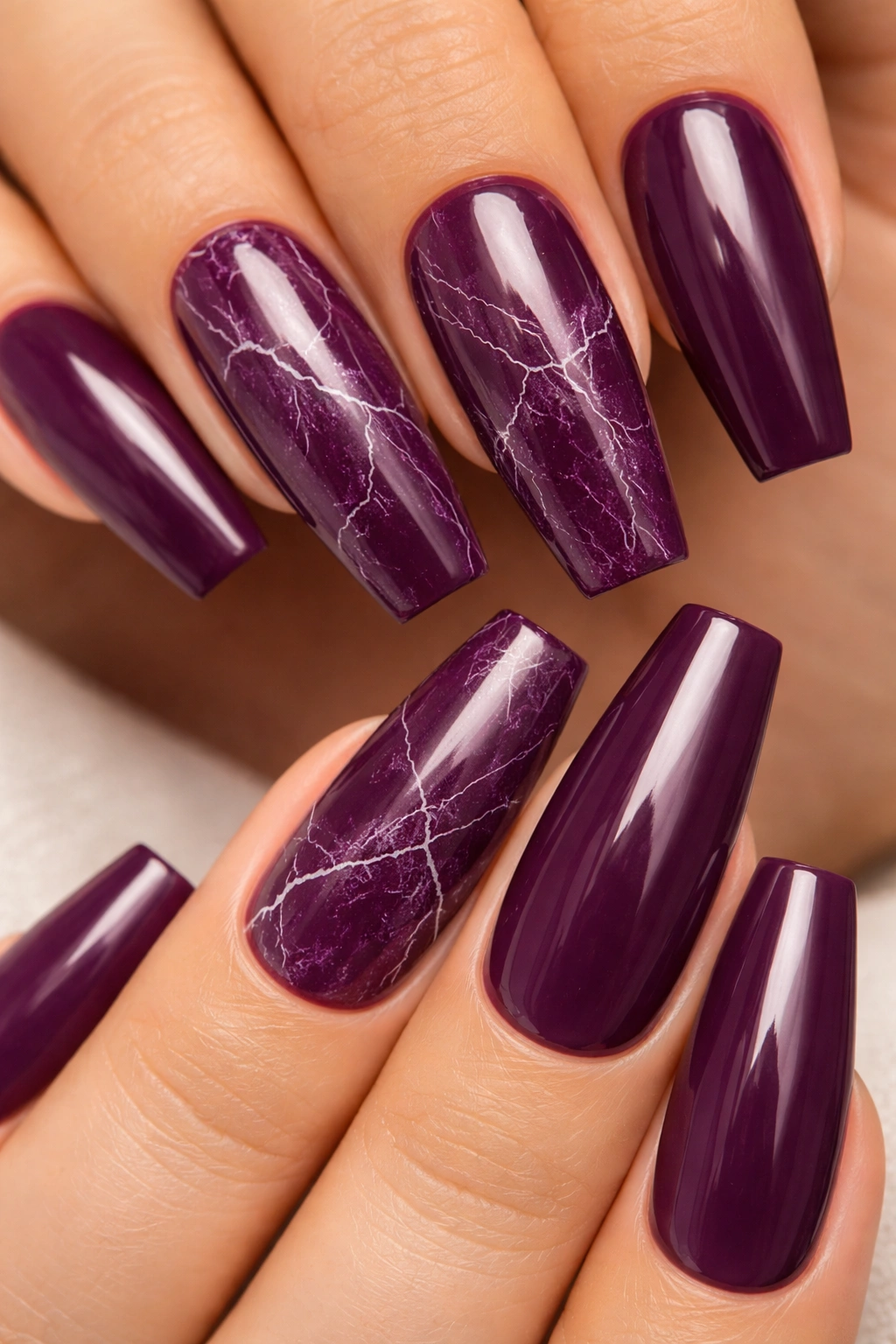
Marble nail art goes wrong all the time. Usually the problem is contrast. Too much white, thick black lines, too many swirls, and the nail starts looking frosted instead of stony. The rich version uses plum as the main body color and keeps the veining thin, broken, and a little unpredictable.
A layered approach works best. Start with a translucent plum or mauve-plum base, bloom in a second deeper purple, then drag a fine white vein through selected areas with a liner brush or needle tool. Seal it under gloss so the surface looks smooth, like polished stone instead of painted art.
This design has more personality than a plain dark purple set, though it still feels composed when you limit it. I would not do full marble on all ten nails unless the pattern is airy. Two to four marble nails mixed with solid plum is usually stronger.
The white veins need restraint. Think hairline cracks in quartz, not thick lightning bolts.
And skip the hard black outlines unless your tech has a light hand. A whisper of charcoal in one or two places can add depth. Heavy black turns the design cartoonish fast.
9. Matte Orchid With Glossy Raised Swirls
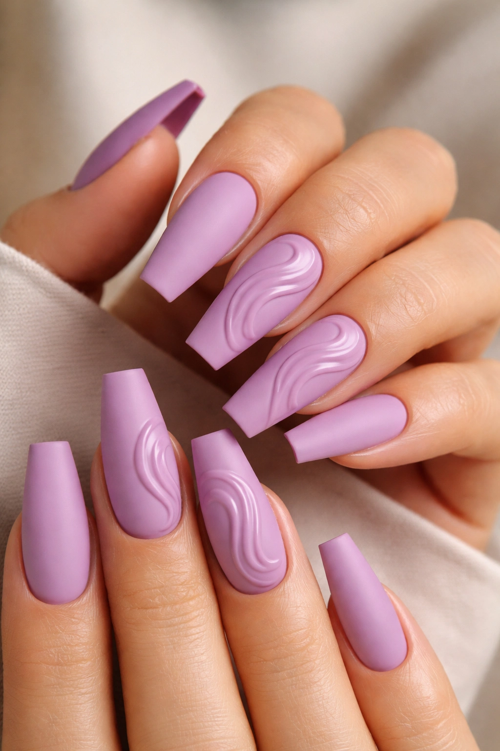
Can matte nails still look expensive? Yes—when the matte finish feels soft, almost powdery, and the glossy detail is used with discipline. Orchid is a smart shade for this because it has enough body to survive matte top coat without turning flat.
Pastel lavender matte can look dusty. Medium orchid, lilac-grey, or smoky violet matte has more weight to it. That makes the gloss-on-matte contrast sharper and cleaner.
How to keep this design crisp
Use raised swirls made from clear builder gel or a closely matched glossy purple gel. The lines should sit up only a touch—around 0.5 mm, not thick enough to snag on hair or knitwear. Too much height and the nail art looks puffy.
Keep the swirl placement controlled. One or two design nails per hand is enough. Full sets of raised swirls can tip into busy territory on coffin nails because the shape is already graphic.
Maintenance matters here.
Matte top coat shows hand cream, cuticle oil, and makeup residue faster than gloss. A quick wipe with alcohol on a lint-free pad brings it back, though I would still choose this design for shorter wear or for someone who does not mind a little upkeep.
10. Smoky Lilac Chrome Over a Charcoal Base
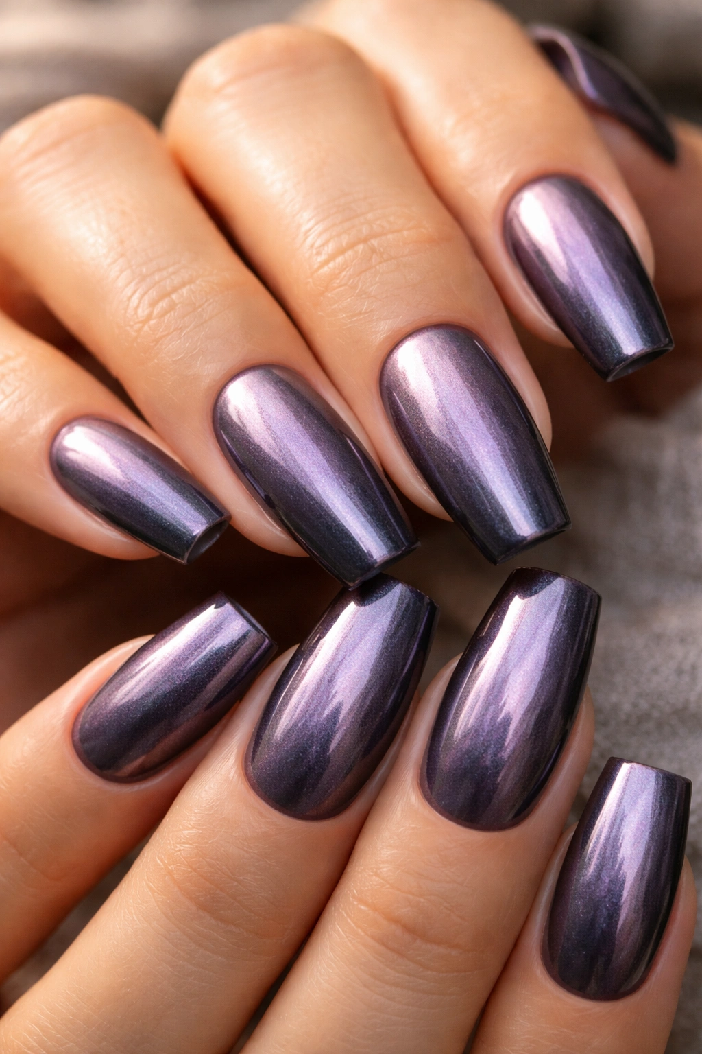
Under a side lamp, this one flips from pewter to violet smoke. It’s not mirror-silver flashy chrome. It’s softer, darker, and more expensive-looking because the base underneath is doing half the work.
A pale chrome over a white base can lean icy and flat. Lilac chrome over charcoal or blackened plum has depth, and that depth gives the surface a more fluid look. You see grey, purple, a soft metallic shift, then a darker halo around the edges.
Application matters. Rub the chrome powder into a fully cured no-wipe top coat, then seal it without dragging the brush too hard across the surface. Heavy top-coat pressure can scratch the powder and leave dull patches, especially near the sidewalls.
A few choices make this design land better:
- Start with a charcoal, deep grey-purple, or blackened plum base
- Use a fine pearl or lilac chrome powder, not a harsh mirror chrome
- Keep nails in the medium to long coffin range so the shift has room to show
- Avoid extra glitter, foil, or gems on top
If your wardrobe leans black, grey, espresso, or denim, this is one of the easiest purple coffin nail designs to fold into your daily look.
11. Mulberry Tortoiseshell Blend
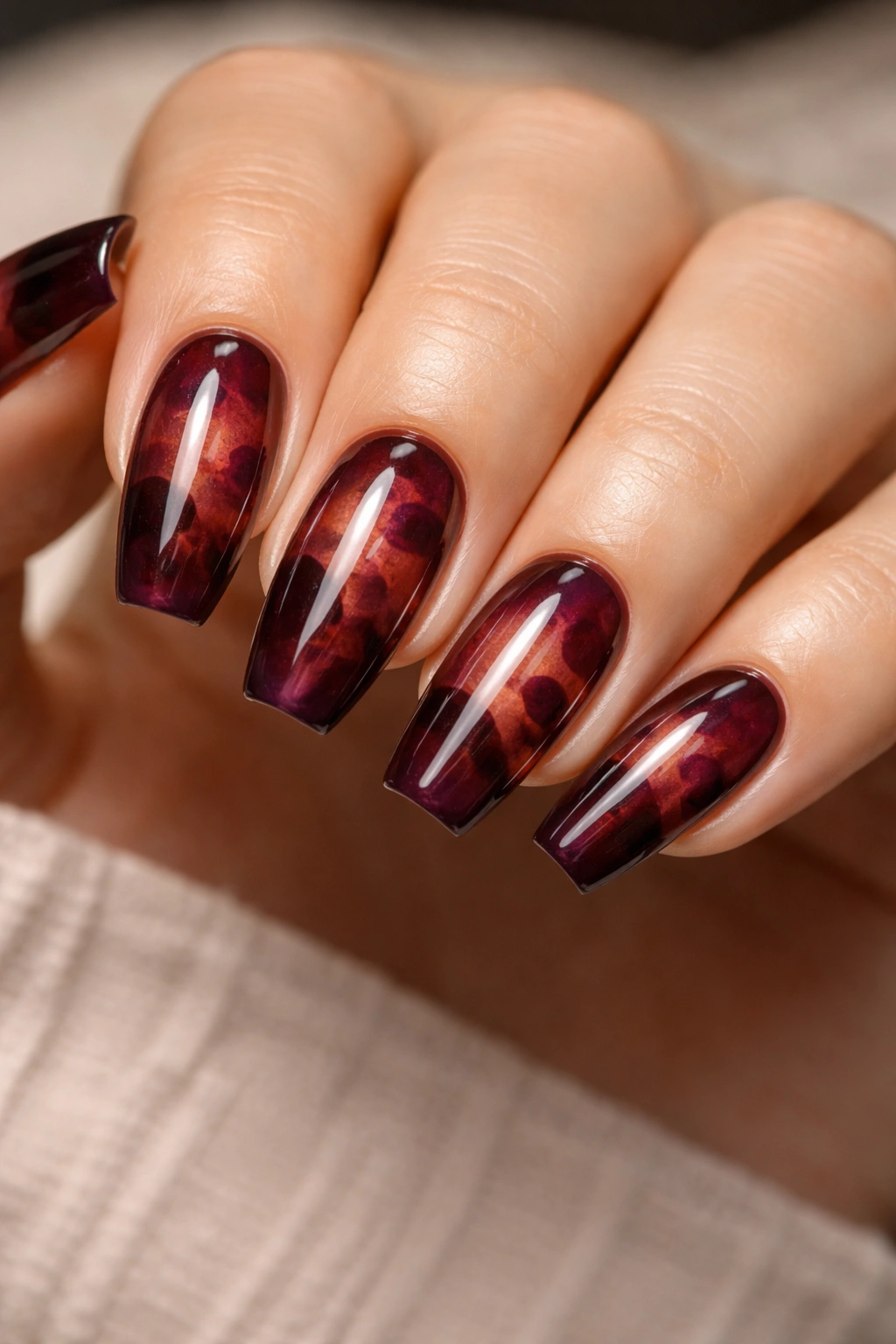
Tortoiseshell does not have to mean amber and honey. A mulberry version—layered with transparent berry, cola brown, and a touch of black—can look like antique resin, especially on a sharp coffin shape with a thick gloss top coat.
The beauty of this set is the layering. You build soft, irregular patches with translucent color, cure between layers, then glaze everything so the edges blur slightly into one another. Done well, the nails look deep rather than busy. Done badly, they look blotchy. There is not much middle ground here.
I like this style most on shorter or medium coffin nails because the pattern already carries detail. On long nails, full tortoiseshell can get heavy unless the colors stay sheer and the negative space stays open. Two or three accent nails with solid mulberry companions is a safer call for most people.
Brown matters more than you’d expect. If the brown is too red, the whole set starts reading wine-stained. If it is too flat, the purple disappears. A clear cola-brown jelly between the berry layers is what usually makes the design click.
This one rewards patience. Expect multiple passes, thin layers, and a tech who knows how to edit.
12. Eggplant and Cocoa Diagonal Color Block
Unlike black-and-white blocks, which can look stark and graphic in a cold way, eggplant paired with cocoa has warmth. That warmth is what gives the manicure its rich feel.
The line placement matters. A diagonal split that runs from one sidewall near the cuticle down toward the opposite corner of the tip helps lengthen the nail. Straight horizontal blocks can cut the coffin shape in half. That is almost never what you want.
Who is this good on? Medium coffin lengths, shorter fingers, anyone who likes clean nail art but does not want florals, swirls, marble, chrome, or sparkle. It feels polished and architectural without shouting.
Color placement is where I get opinionated. Put the lighter cocoa shade closer to the cuticle and the deeper eggplant toward the tip. That order gives you a softer grow-out and keeps the darker color where the coffin shape is strongest.
A striping line in gold can work here, though I would only add it if the set is otherwise plain. The purple-and-brown pairing already has enough character to stand on its own.
13. Lavender Quartz Accent Nails in a Mostly Solid Set
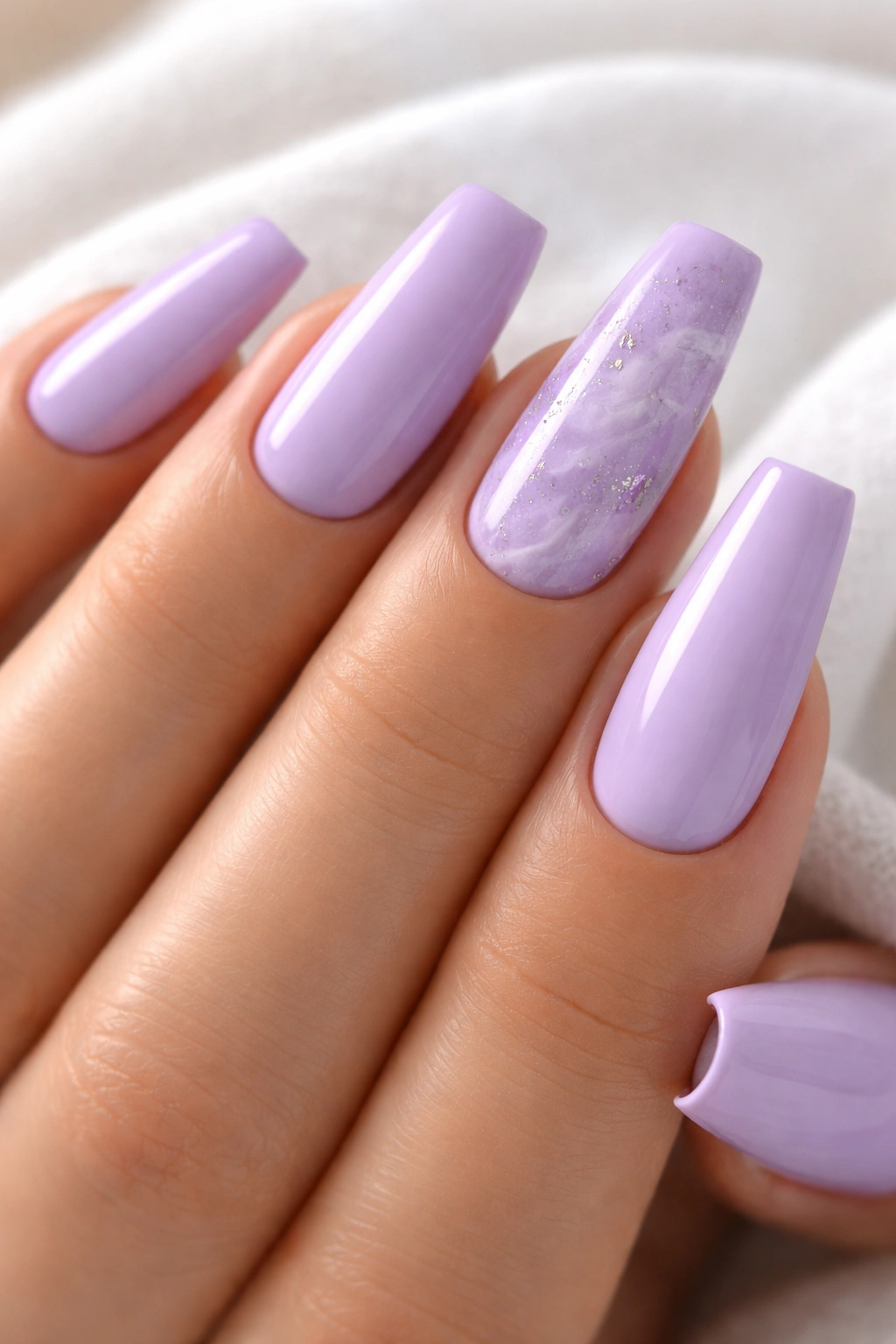
Stone-effect nails look more expensive when they are used sparingly. That’s why a mostly solid set with two lavender quartz accents beats ten full quartz nails almost every time. Your eye gets one focal point, then a clean field of color around it.
Pick a muted lavender, grey-lilac, or soft dusty violet for the solid nails. The quartz accents should start with a milky translucent base, then pick up faint lavender wisps, a few cloudy white fractures, and tiny pieces of silver foil. Tiny means tiny—think 2 to 3 mm flecks, not big metallic shards.
Where the stone effect belongs
Ring fingers are the easy choice, though thumbs also work if you want the design to show up more in photos. I would not place quartz on every finger that faces outward. The set needs some quiet space around the detailed nails.
Details that keep it from looking busy
- Use 8 solid nails and 2 quartz accents
- Keep the foil sparse and irregular
- Skip black outlining completely
- Finish with a high-gloss top coat so the stone layers look embedded
Best salon note: ask for “soft quartz, not marble.” That wording helps steer the tech away from thick veining and high-contrast lines.
14. Wine Purple Micro-Glitter Fade at the Tip
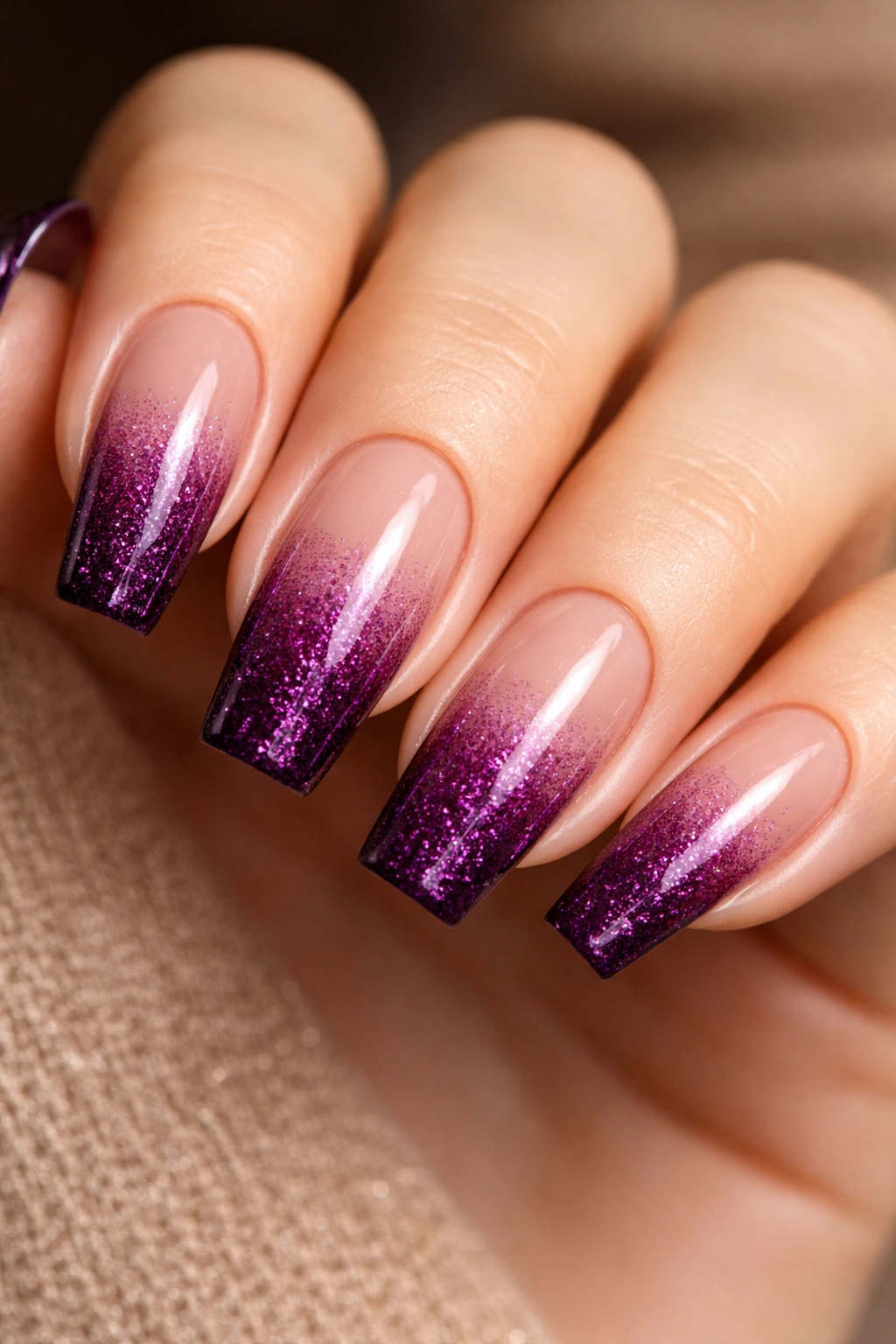
Glitter is not the problem. Chunky glitter is the problem. A fine wine-purple shimmer packed at the tip and faded upward can look refined, dense, and evening-ready in a way large hex glitter almost never does.
Particle size is everything here. Look for shimmer or micro-glitter under 0.2 mm, ideally in the same color family as the base. If the base is berry-wine and the glitter is silver holographic, the whole thing breaks apart visually. If both sit in that same wine-plum range, the fade looks seamless.
Placement matters too. Keep the glitter concentrated on the top quarter to top third of the nail. Start the fade too low and the design shortens the nail bed. On a coffin shape, you want the sparkle to sharpen the tip, not swallow the whole nail.
This set works well over a translucent blackberry, deep mauve, or clear wine base. I would not pair it with heavy crystals or foil. The glow at the tip is enough movement.
One caution: make sure the top coat fully smooths the surface. If you can feel texture when you run a fingertip across the nail, ask for another leveling coat. Rich-looking nails should feel sleek.
15. Monochrome Purple Mix-and-Match With One Strong Color Story
If you get bored with ten matching nails, this is the grown-up way to cheat. A monochrome mix-and-match set can look custom and expensive when all ten nails stay inside one tight purple family. The problem comes when each nail belongs to a different mood board.
A strong set like this might use four related shades: lilac-grey, dusty mauve, plum, and blackberry. Then it repeats one or two design ideas across the hands—maybe a solid nail, a micro-French, a velvet accent, and one marble or quartz detail. That gives the set variation without chaos.
Control is everything.
Here’s the formula I trust most:
- Choose one dark anchor shade for at least 3 nails
- Add one midtone purple for 3 or 4 nails
- Use one pale or sheer purple as a lighter break
- Keep metal accents all silver or all gold, never both
- Repeat one motif on both hands so the set looks planned
This is the set I would recommend to someone who wants personality but still wants their manicure to look edited. It feels custom because it is. The palette does the heavy lifting, and the coffin shape gives it structure.
The salon phrases that help you get the same look
A photo helps. Two photos help more. Five usually confuses the whole appointment.
When you’re asking for purple coffin nails that look rich, the best phrases are the specific ones: “thin free edge,” “tight cuticle line,” “medium coffin taper,” “fewer accents,” “high-gloss finish,” and “keep the profile slim.” Nail techs can work with that. “Make it classy” is a lot less useful.
If you want jelly, cat-eye, chrome, quartz, or marble, say the finish before the color. “Aubergine jelly” and “aubergine creme” are two different manicures. Same shade family, different result.
I’d also call out what you do not want:
- No bulky charms
- No thick acrylic at the tip
- No random rhinestones “to fill space”
- No extra silver on top of gold, or the other way around
- No opaque pastel if you asked for milky lavender
That last point saves people all the time. Salon language can get fuzzy fast, and purple has more finish variation than most colors give it credit for.
Cuticle oil, glove habits, and fill timing
The rich look does not end when you leave the salon. Purple polish shows dullness fast, especially dark plum and glossy wine shades. Once the shine goes cloudy and the cuticles dry out, the set loses that expensive feel even if the design itself is strong.
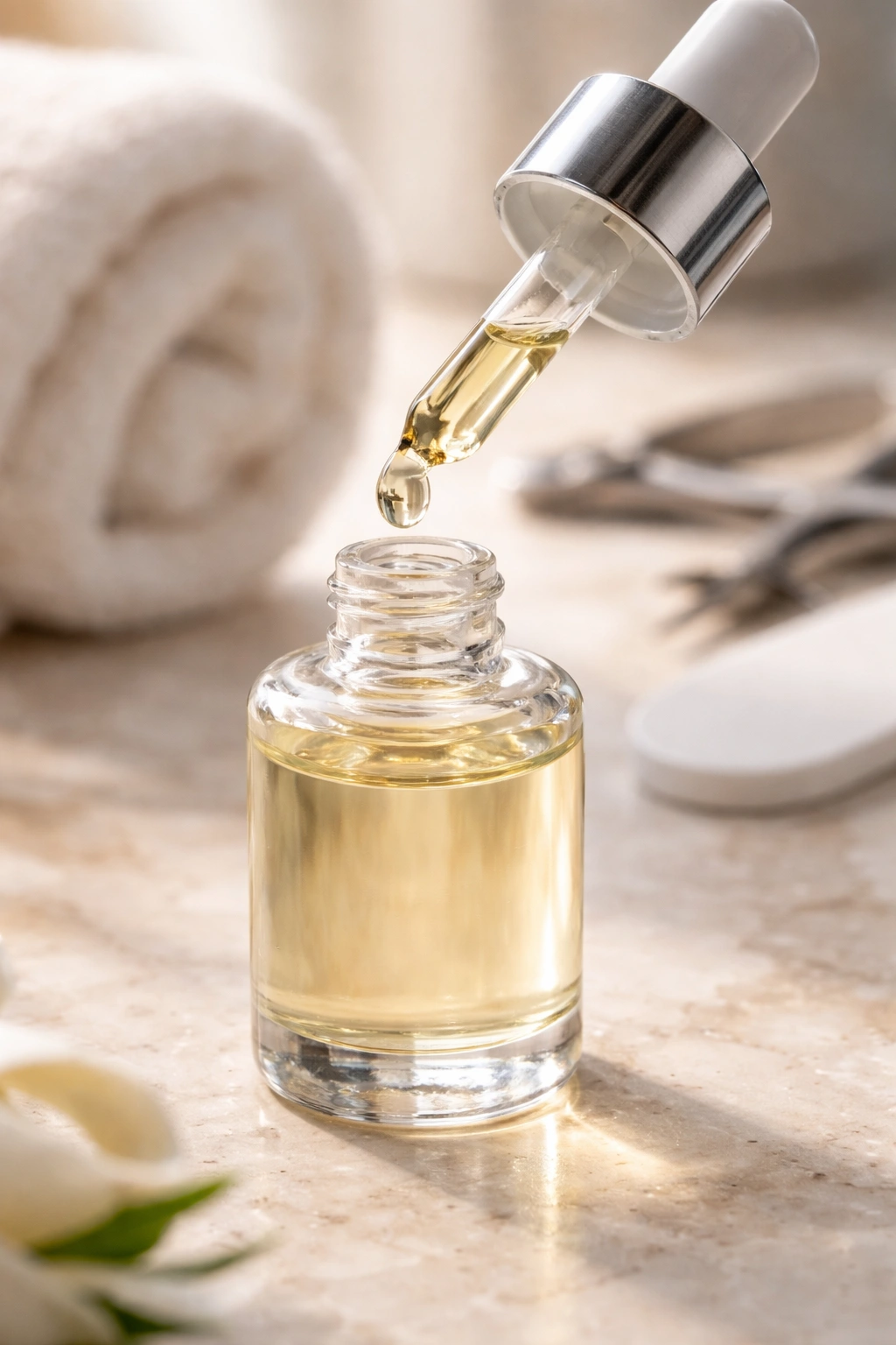
Cuticle oil twice a day helps more than another accent nail ever will. A tiny drop massaged around each nail keeps the skin smooth and soft, which makes the whole manicure look fresher. Hand cream helps too, though oil does more for the immediate nail area.
Gloves matter. Dish soap, cleaning spray, and long hot-water sessions are rough on top coat and rougher on skin. If you wear gel or acrylic coffin nails for two to three weeks, these little habits change how the set looks by day ten.
Fill timing matters too. A sharp coffin shape starts to look front-heavy when the apex moves forward with growth. If you wear longer sets, do not stretch fills too far. The color might still look decent, though the structure starts to tell on you.
Final Thoughts
The purple coffin nails that look richest are not usually the busiest ones. They’re the sets with a clear point of view: deep black cherry gloss, a controlled lavender milk wash, a clean micro-French, one stone accent that knows when to stop.
Restraint does not mean boring. It means every detail earns its place—shape, finish, opacity, line weight, even the way the top coat sits over the nail art.
Pick a purple with depth, keep the coffin shape sharp, and do not let bulk or clutter creep in. That combination does more than any extra gem ever will.
