

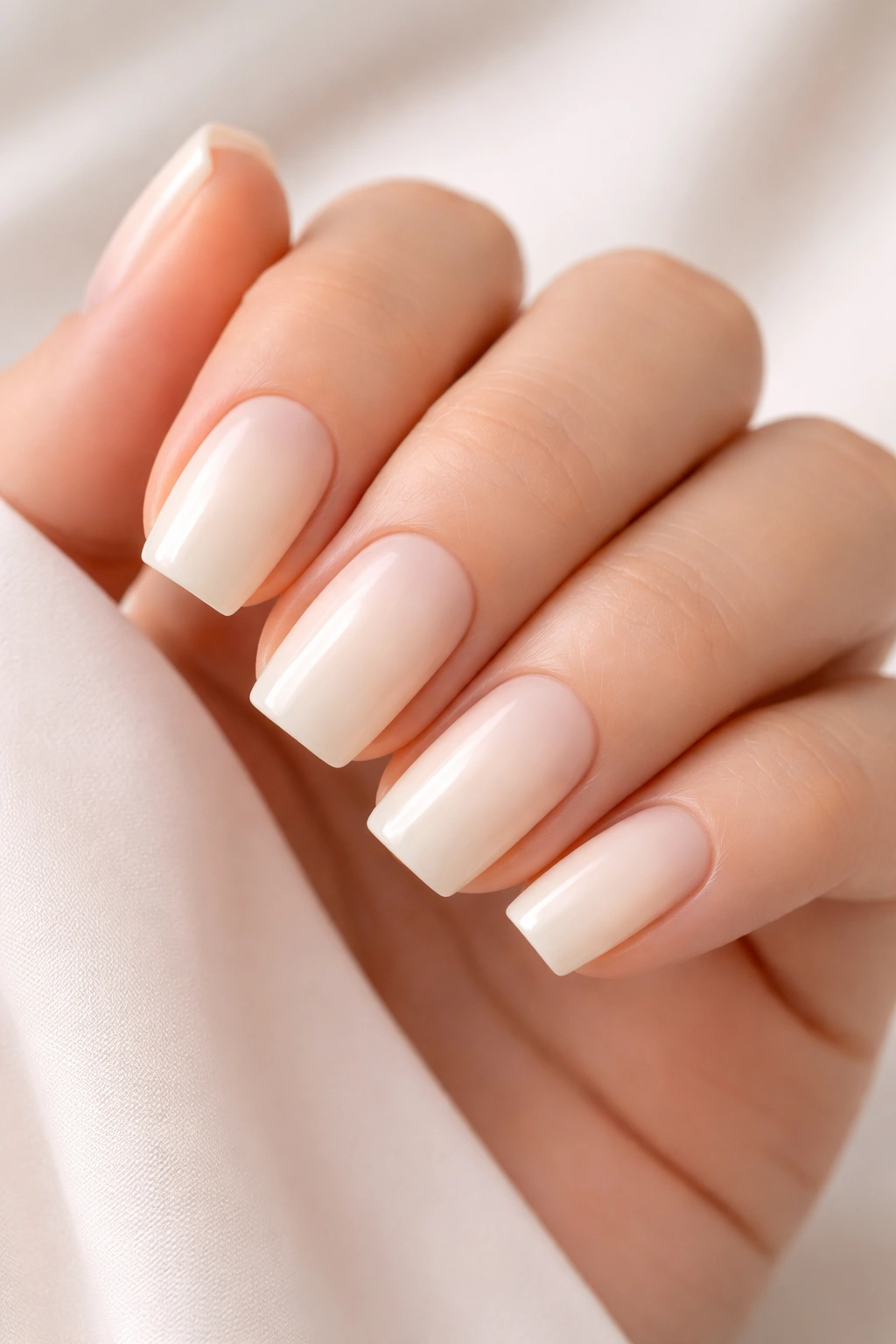
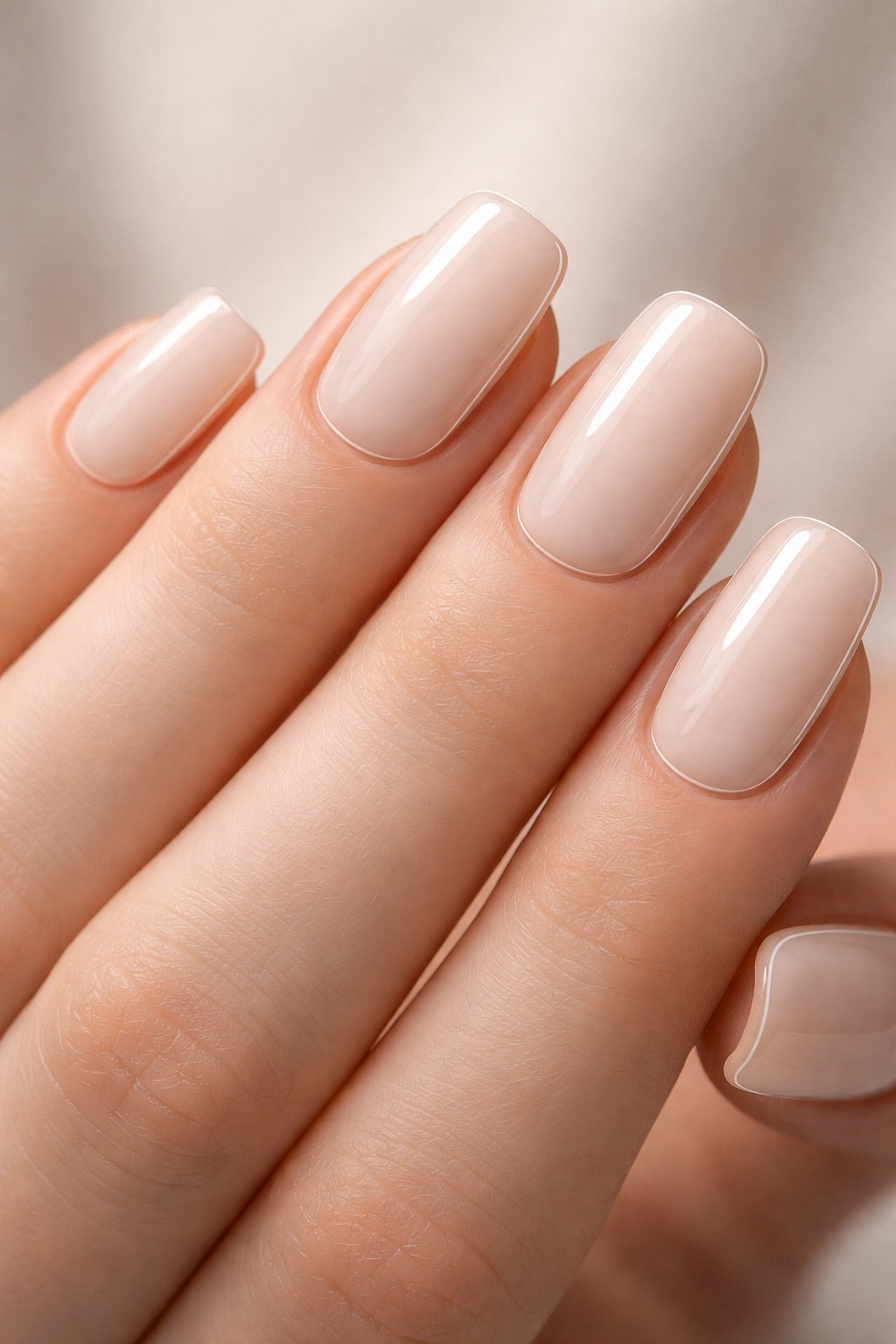
If you’ve been scrolling through nail inspiration and feeling overwhelmed by long, dramatic stilettos or bold neon designs, squoval nails might be exactly what you’re looking for. The squoval shape—that perfect hybrid between a square and an oval—sits comfortably at the sweet spot: it’s practical enough for daily life, but it still feels intentionally styled and modern. When you keep the color palette neutral, you unlock something truly special: a canvas that works with literally every outfit, every season, and every occasion, without demanding attention in a way that feels exhausting.
Short squoval acrylics have quietly become the go-to choice for people who want nails that feel elevated without the maintenance nightmare of lengthy extensions. They photograph beautifully, they won’t snag on everything you touch, and there’s something deeply satisfying about a neutral palette that reads as sophisticated rather than boring. The trick is understanding that neutral doesn’t mean monotonous—there’s enormous range within warm beiges, cool grays, creamy whites, soft taupes, and everything in between.
What makes squoval such a game-changer is that it flatters almost every hand shape and skin tone. The squared edges give you that modern, clean aesthetic, while the softly rounded corners keep things approachable and wearable. Add in the neutral color story, and you’ve got nails that feel expensive, intentional, and endlessly versatile. Whether you’re drawn to minimalist designs, subtle textures, or understated patterns, there’s a neutral squoval idea here that’ll feel like it was made specifically for you.
1. Creamy Vanilla with Delicate Gold Thin Stripes
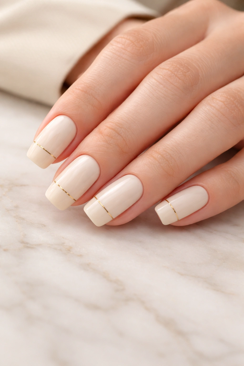
Imagine the warmth of vanilla cream with just the slightest whisper of sophistication running through it—that’s the power of thin gold stripes placed strategically across a soft cream base. This design works because the stripes are almost accidental-looking, like you woke up with perfect nails instead of sitting in a salon chair for two hours. The cream keeps it grounded and professional, while the gold adds just enough glimmer to feel special without crossing into cocktail territory.
Why This Design Works Across Every Context
The beauty of cream-and-gold is that it reads differently depending on where you are. In a boardroom, it’s polished and professional. At brunch with friends, it feels effortlessly put-together. The thin gold stripes—we’re talking maybe one-sixteenth of an inch wide—don’t compete with anything else you’re wearing. They complement your outfit rather than demanding to be the focus. This is the definition of sophisticated restraint, and people absolutely notice it, even if they can’t quite put their finger on why your nails look so intentional.
How to Make It Last and Keep It Fresh
- Apply the cream base in at least two thin coats for opacity and a smooth finish
- Use a thin liner brush or nail art striping brush for the gold lines—thicker lines read less elegant
- Space the stripes about a quarter-inch apart for balance, or place just one stripe down the center of each nail
- Seal everything with a glossy topcoat to make the gold really sing and protect the design
- The stripes fade gracefully as your nails grow, so you don’t have to rush for a fill appointment
Pro tip: Use a gold gel liner if you have access to one—it adheres better to acrylic and won’t chip as easily as regular gold polish striped on top.
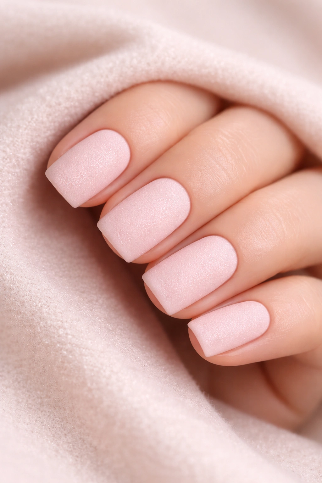
2. Warm Taupe with Matte Finish and Subtle Shimmer
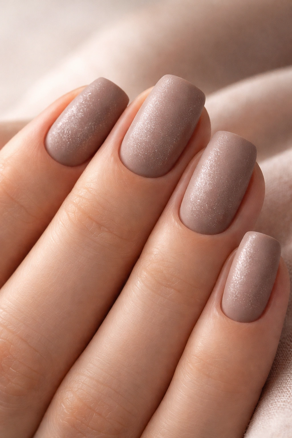
Taupe occupies this magical space where it feels both cozy and contemporary at the same time. When you pair it with a matte finish, something unexpected happens—it becomes almost powdery and soft, like suede or velvet. Then add a barely-there shimmer (we’re talking microglitter, not disco ball), and you’ve got depth and texture without any flash or drama.
The Psychology Behind This Combination
Matte nails already signal that you have opinions about style and aren’t just following the glossy trend. The shimmer underneath? That’s the secret detail that makes people lean in and ask “what is that color?” It’s the difference between a sweater that’s nice and a sweater that makes someone ask where you got it. The taupe specifically works because it doesn’t compete with your skin tone—it enhances it. The subtlety reads as confidence; you don’t need your nails to shout.
Key Steps to Achieve This Look Properly
- Start with a taupe base that’s specific to warm undertones (ask your tech if it’s more “greige” or “warm taupe” versus cool taupe)
- Build the color in thin, even coats—don’t try to get full opacity in one layer
- Once dry, lightly dust the entire nail with a fine shimmer powder or microglitter while the topcoat is still tacky
- Apply a matte topcoat over the entire nail to seal the shimmer and create that velvety finish
- If using gel, a matte gel topcoat will give you significantly better longevity than acrylic with regular matte topcoat
Worth knowing: This design shows less dirt and wear than you’d expect, and it actually looks more intentional as it slightly fades—it’s not one of those designs that immediately looks “old.”
3. Soft Beige with White French Tips
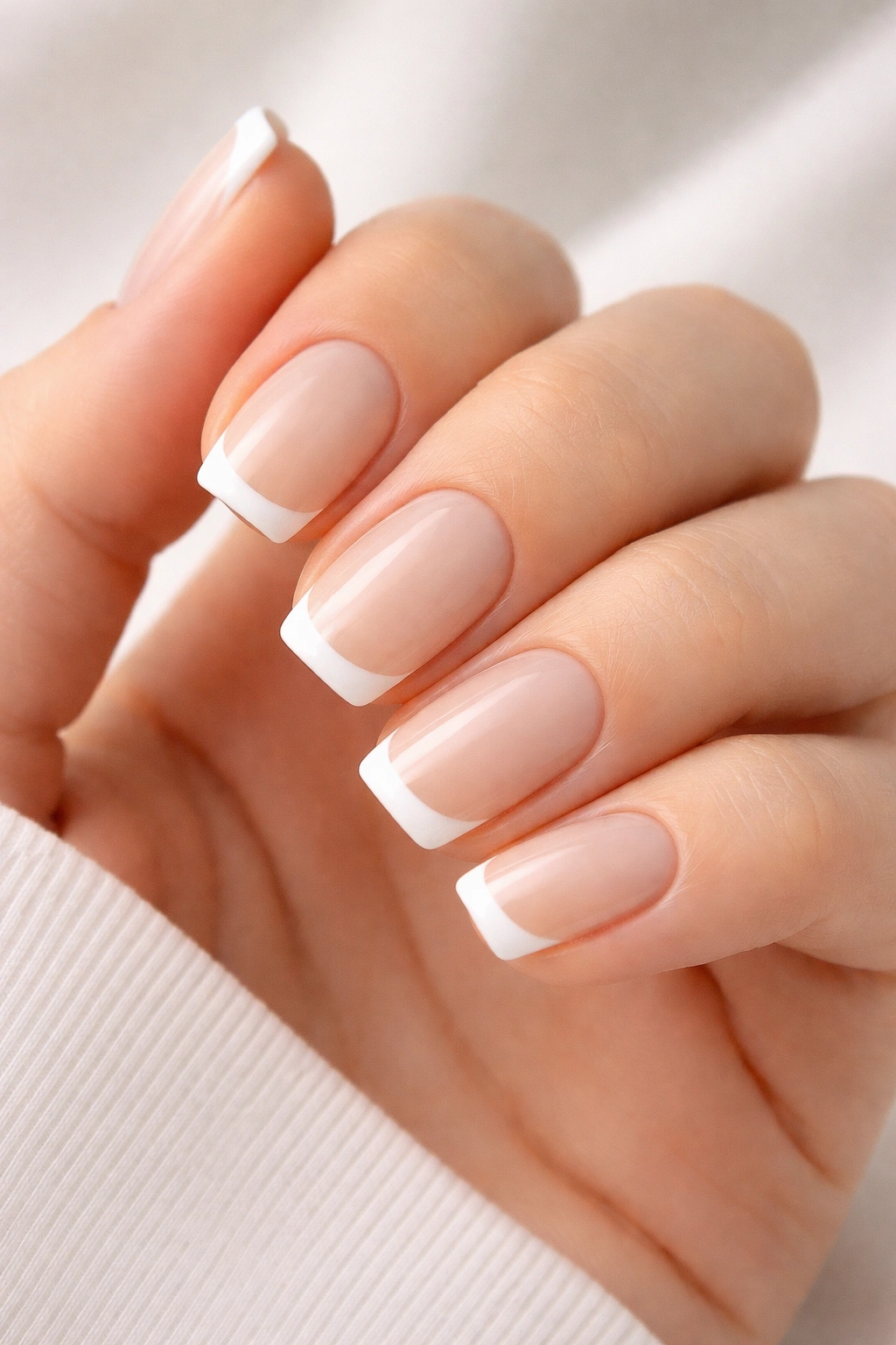
French tips have been around for decades, but short squoval French tips feel entirely modern because of the proportions. On short nails, you want the white tip to be understated—maybe a millimeter or two, not a thick dramatic line. This keeps it ladylike without veering into that “too much” territory that can happen with exaggerated French tips.
Why Proportion Matters So Much Here
A thick white tip on a short nail can look costume-like, but a delicate one reads as intentional and refined. The soft beige underneath is warm enough to feel current without being trendy or seasonal. Beige has this superpower where it reflects light differently depending on what you’re wearing, so it subtly coordinates with your entire wardrobe without you having to think about it. It’s the neutral that actually feels like neutral instead of boring.
Application Tips That Actually Make a Difference
- Use a very thin brush or nail guide to create the white tip line—precision here is everything
- The white line should be slightly curved to follow the natural shape of your nail edge (not a perfectly straight line)
- Apply at least two coats of white to get true opacity and brightness against the beige
- A glossy topcoat will make the beige and white blend more seamlessly than a matte would
- File the very edge gently after application to ensure there’s no thickness that would catch or snag
Pro tip: Asking your nail tech to “barely-there” French tips is key—show them a reference photo with the proportion you want. One millimeter makes all the difference.
4. Cool Gray with Barely-There Glitter Accent
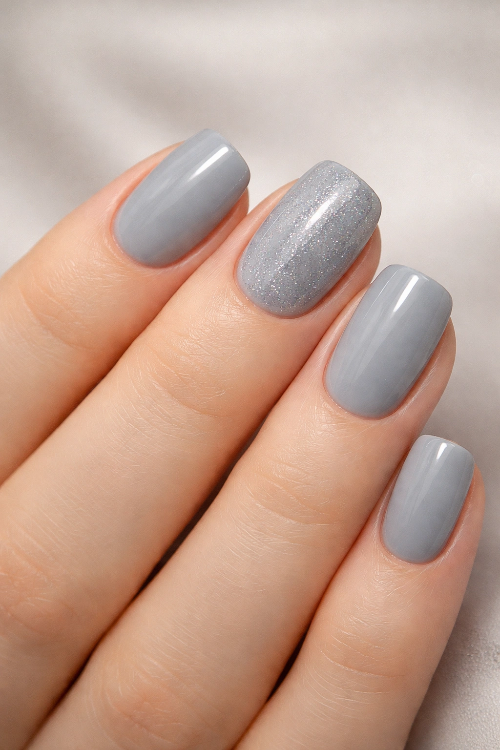
Cool gray is the nail color equivalent of the perfect cashmere sweater—it works with absolutely everything and somehow manages to feel both minimal and luxurious. When you add glitter, it has to be almost invisible, like the light is hitting it and creating sparkle rather than the nails being covered in it.
The Elegance of Restraint in Nail Design
Glitter is often loud and unsubtle, but when you use it sparingly on gray—maybe just a light dusting on the accent nail or the tips—it becomes something completely different. It’s sophisticated. It’s a detail that rewards close inspection. People won’t see your nails from across the room; they’ll notice them when they’re looking at you directly, and that’s when the subtle glitter catches the light and creates this moment of recognition that something is thoughtfully designed.
Making This Design Work in Your Daily Life
- Choose a cool gray that has slight depth to it rather than a flat gray (slightly smoky or blue-undertoned grays look more intentional)
- Apply glitter to just one accent nail, or scattered very lightly across all nails
- Use clear glitter rather than colored—it disappears into the gray while still creating sparkle
- A topcoat with a slight shimmer will enhance the glitter effect without looking like you’ve added more
- The beauty here is in the subtlety, so resist the urge to pile on more glitter
Insider note: This design stays elegant through the entire growth cycle because as the gray grows out, the understated glitter doesn’t make the regrowth look messy—it actually looks intentional and more interesting.
5. Pale Pink with Micro-Texture and Matte Finish
Pale pink without any texture can read as too simple or even unfinished, but add a barely-visible texture—like a very fine sandpaper effect or a microsanded look—and suddenly it becomes a design. Matte finishing it transforms the entire vibe from “basic light manicure” to “intentional modern aesthetic.”
How Texture Changes Everything
Your eyes expect nails to be shiny, so when they’re not, there’s a moment of recognition that creates visual interest. The micro-texture adds depth that you feel more than see—it catches light differently than a smooth surface would, creating subtle dimension. Pink is inherently feminine, but when you make it matte and textured, it becomes edgy and contemporary. It’s the same color doing completely different work depending on how it’s finished.
Achieving Micro-Texture on Acrylic
- After your base color is applied and dried, use an extremely fine grit file or buffer (like 1000+ grit) to create a barely-visible texture across the entire nail
- Go lightly—you’re not trying to completely dull the surface, just create a subtle sanded effect
- Apply a matte topcoat that will seal in this texture while maintaining that velvety feel
- The texture should feel smooth to touch but look non-reflective
- This design photographs beautifully because the matte finish doesn’t create glare or weird highlights
Worth knowing: The micro-texture actually hides minor imperfections in the acrylic application better than smooth nails do, so this is a great choice if you’re working with a newer nail tech.
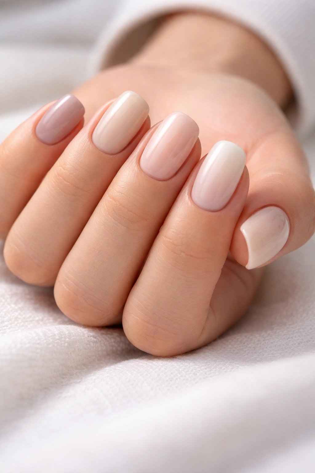
6. Warm Ivory with Subtle Nude Ombre
Ombre nails are traditionally dramatic, but when you keep both colors in the neutral family—ivory at the base fading to a slightly warmer nude at the tips—something magical happens. The gradient is so subtle that some people won’t even register it as a design; they’ll just think your nails are beautifully done. But people who know nails will recognize the intentional sophistication.
The Art of Understated Ombre
The key here is that the two colors shouldn’t be dramatically different. You want them close enough that the transition feels almost accidental, like the light is hitting them at different angles. This creates interest without creating a bold statement. The warm ivory at the base keeps the nail bed looking elongated and clean, while the nudish tone at the tips adds depth. It’s dimensional without being busy.
How to Apply Ombre for Subtle Results
- Choose an ivory and nude that are no more than 2-3 shades apart on the color wheel
- Use a makeup sponge or soft brush to blend the colors where they meet—spend time on this gradient zone
- Start with the ivory at the base and work the nude toward the tips
- Multiple thin layers of the nude create a more subtle gradient than one thick application
- Seal with a glossy topcoat that will make the gradient smoother and more blended
Pro tip: Practice your gradient on a color wheel or paint chip first to find the exact shades that feel right—this is worth getting right because it’s what makes this design feel effortlessly perfect.
7. Pale Nude with Delicate Line Work Around the Edge
Line work on nails can feel precious and overly detailed, but when you keep it minimal—maybe just a thin line running around the perimeter of each nail near the edge—it reads as graphic and modern rather than fussy. The pale nude keeps it soft and wearable; the line work keeps it interesting.
When Minimalism Becomes Maximally Stylish
There’s something about a line that follows the shape of your nail—it emphasizes the squoval shape you’ve chosen and draws attention to the craftsmanship. It’s a nod to architectural design and precision. The pale nude underneath is almost invisible, so all the visual interest comes from that purposeful line. This is the kind of design that makes your hands look intentional, like you’re someone who thinks about details.
Executing Clean Line Work
- Use a super thin brush or nail art liner—thin lines read more elegant than thick ones
- Create the line using a slightly darker neutral (taupe, gray, or warm brown works beautifully against pale nude)
- The line should be about a millimeter or less from the edge of the nail, following the shape of your nail edge
- Thin lines require patience and a steady hand, so this is worth asking your tech specifically about
- One thin line per nail is more impactful than multiple lines fighting for attention
Worth knowing: Line work actually doesn’t fade noticeably as your nail grows, so this design maintains its impact through the entire growth cycle.
8. Soft Greige with Scattered Minimalist Shapes
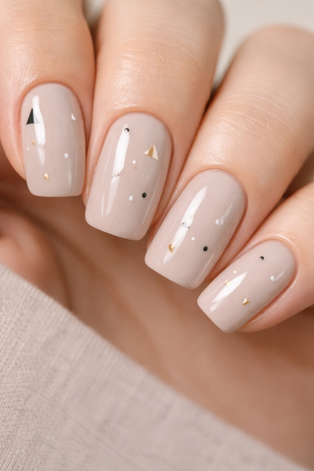
Greige (that perfect gray-beige hybrid) is possibly the most versatile neutral nail color because it works with both cool and warm undertones in your skin. When you add minimalist shapes—tiny lines, dots, or abstract marks scattered across it—you get visual interest without commitment to a specific style.
The Appeal of Minimal, Abstract Design
Scattered shapes read differently to different people. Some will see them as artistic, others as geometric, others as organic and random. That flexibility is actually the strength of this design. You’re adding visual interest without forcing a specific aesthetic or vibe. It feels personal without being a full nail art piece. Minimalist shapes also photograph beautifully—they look intentional and modern without being too busy.
Creating Intentional-Looking Scattered Details
- Start with a base of greige applied in smooth, even coats
- Using a thin brush and a darker neutral shade, add small shapes: thin lines, tiny circles, small dashes, maybe a triangle or two
- Scatter them across the nail in a pattern that feels organic rather than rigid (don’t line them up in rows)
- Less is more—three to five shapes per nail is plenty
- A glossy topcoat will unify everything and make the shapes pop against the greige
Pro tip: Taking a reference photo of your scattered shapes after your first manicure means you can replicate the exact placement at your next fill appointment if you love it.
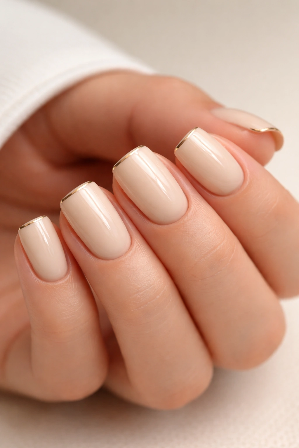
9. Creamy White with Soft Gold Foil Accent
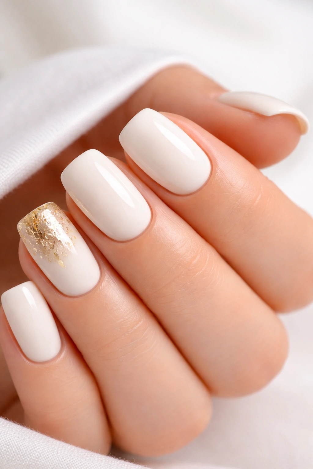
Creamy white on short squoval nails is instantly elegant, and adding gold foil to just one accent nail (usually the ring finger) is the perfect amount of shimmer without overwhelming the design. Gold foil is different from glitter—it’s a solid metallic sheet that catches light as one piece rather than multiple sparkles.
How Foil Accents Change the Game
Foil reads as more intentional and refined than glitter because of the craftsmanship involved in application. It’s a moment of luxury without being over the top. The creamy white keeps everything soft and approachable, while the foil adds that touch of something special. It’s the difference between a white dress shirt and a white dress shirt with a perfect gold brooch—the impact is disproportionate to how much you’ve added.
Applying Foil Successfully to Acrylic
- Creamy white should be applied in at least two coats for full opacity
- While the final coat or a thin layer of topcoat is still tacky, gently press the foil piece onto the nail
- Use a soft brush to press it down, following the contours of your nail
- Seal with topcoat once the foil is fully adhered
- Gold foil won’t chip like glitter would; it stays intact through the entire growth cycle
Worth knowing: You can ask for foil placement on just the tips of the accent nail rather than covering the entire nail, which creates a slightly more subtle effect.
10. Warm Taupe with Negative Space Design
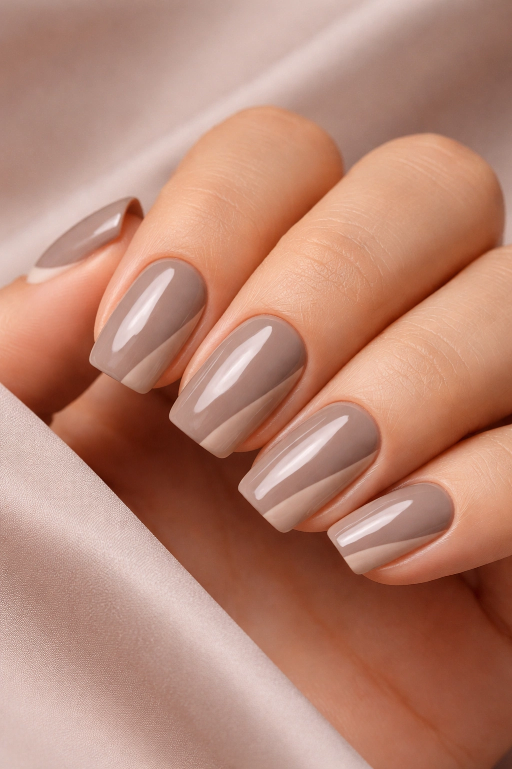
Negative space designs—where you intentionally leave part of the acrylic unpainted to show the natural nail or a clear base—have become a hallmark of modern nail design. When you use warm taupe as your color and create a simple negative space element, you get contemporary sophistication without any extra effort.
Why Negative Space Feels So Current
Negative space works because it creates visual complexity while actually being simpler to execute than a fully detailed design. Your eye is drawn to both the color and the space, creating interest through what’s not there. It feels intentional, artistic, and very current without being trendy enough to feel dated next year. The warm taupe grounds the design and keeps it sophisticated rather than experimental.
Creating Negative Space That Actually Works
- Decide on your negative space shape before application: a thin line down the center, a curved swoosh along the edge, a small triangle, or a geometric cutout
- Tape off or carefully paint around your chosen negative space area
- Apply warm taupe to the remaining space in thin, even coats
- Make sure your negative space shape is clean and intentional—blurry edges will read as a mistake
- A glossy topcoat over the entire nail will seal everything and create a unified look
Pro tip: Negative space designs actually look more intentional on acrylic than on natural nails because the contrast is clearer.
11. Pale Mauve with Horizontal Line Definition
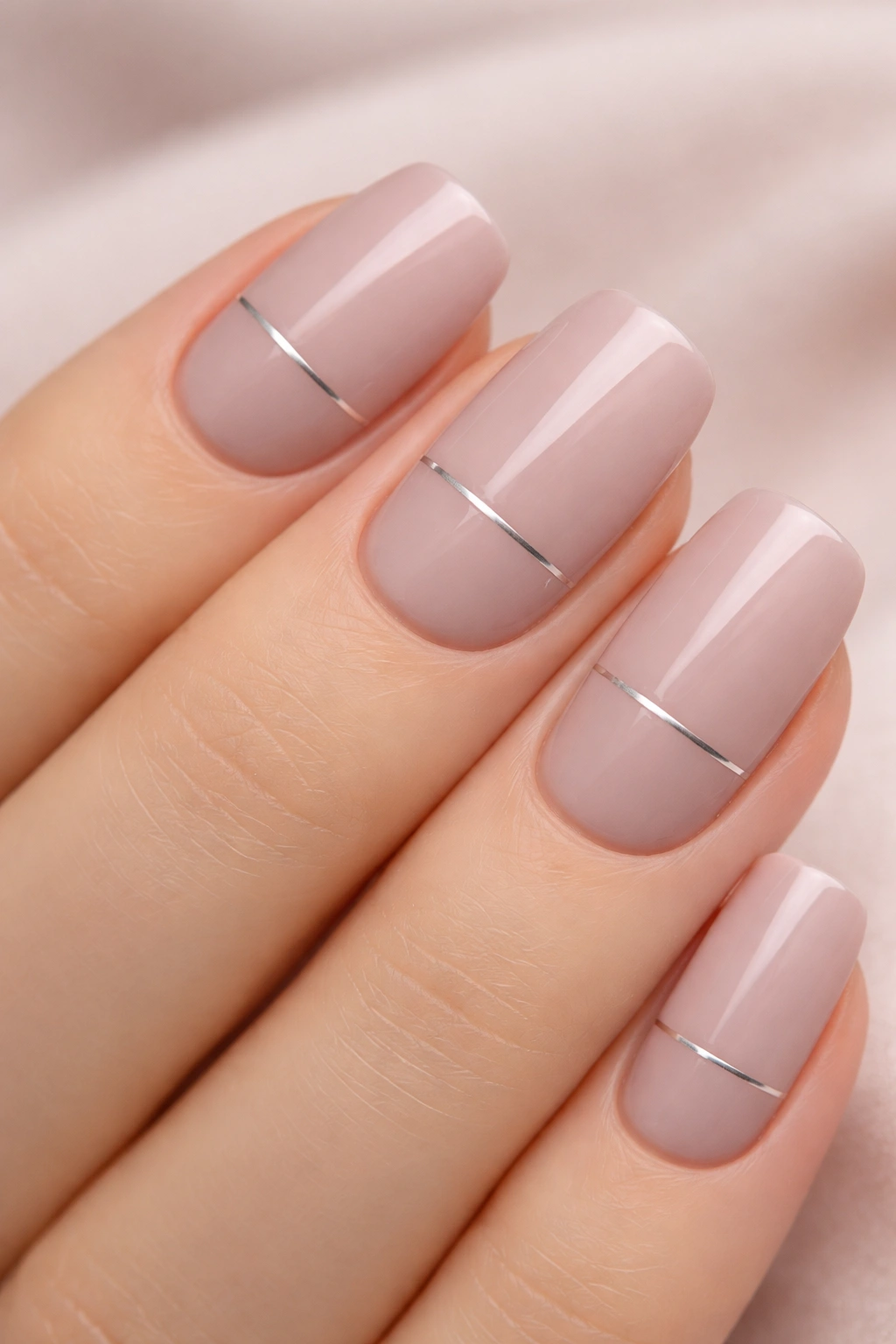
Pale mauve is one of those colors that feels both modern and timeless—it’s had staying power because it genuinely works across seasons and skin tones. Adding a simple horizontal line that divides the nail creates structure and interest while maintaining the softness of the mauve.
The Power of Horizontal Lines in Nail Design
A horizontal line drawn across the middle (or lower third) of your nail creates visual balance and adds geometry to something organic. It draws attention to your nail shape and creates the illusion of length and proportion. Pale mauve is soft enough that a thin line doesn’t create harsh contrast; instead, it adds subtle definition that reads as intentional rather than stark.
Applying Horizontal Lines Cleanly
- Paint your pale mauve base in smooth, even coats
- Using a thin brush and a slightly darker mauve, gray, or taupe shade, create your horizontal line across the nail
- The line should be perfectly straight (a guide or tape can help here)
- Positioning matters—higher lines create the illusion of shorter nails, lower lines elongate them
- One continuous line across all nails creates cohesion and a graphic, intentional look
Insider note: This design is particularly flattering on people with shorter hands because the horizontal line visually breaks up the nail bed in a way that’s proportionally balanced.
12. Cool Beige with White Dot Pattern
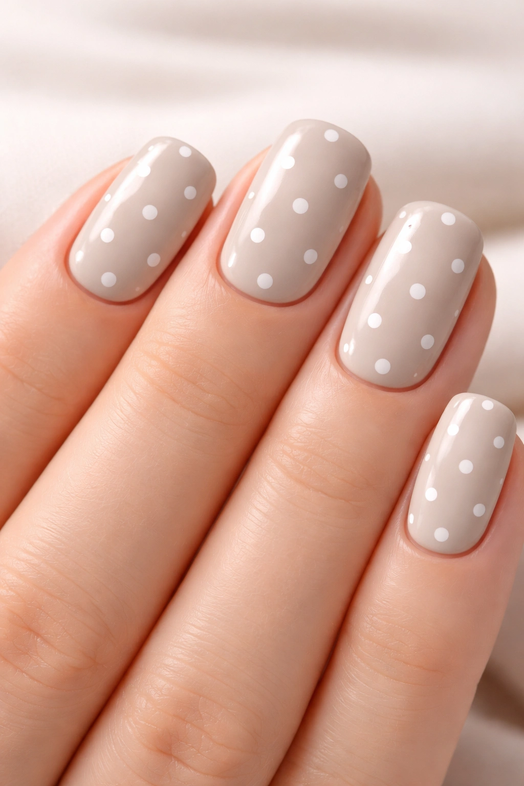
Dots might sound simple, but when they’re uniformly sized and spaced across a cool beige base, something sophisticated happens. Each dot is small enough to read as a pattern rather than individual nail art, creating visual texture without complexity. It’s maximally cute while still being minimally fussy.
Why Dots Read as Modern and Not Retro
The key is spacing and size. Very small, evenly spaced dots on a neutral color feel contemporary and graphic. The beige keeps everything cool and modern rather than warm or whimsical. This is the kind of design that appeals to people who want something more interesting than solid color but don’t want to commit to something trendy-feeling. Dots have this amazing quality where they feel playful but still entirely professional.
Creating Perfect Dot Patterns
- Use a dotting tool or the end of a thin brush handle for consistency
- Create white dots in a regular pattern: all over the nail, or just on the tips, or in a gradient
- Space them about a quarter-inch apart for visual interest without overwhelming density
- Multiple thin coats of white creates better opacity and definition than one thick application
- A glossy topcoat will make the dots crisp and distinct
Pro tip: Photographing your nail pattern after the first manicure helps you recreate the exact spacing if you love it and want to repeat it.
13. Soft Nude with Brushstroke Texture Effect
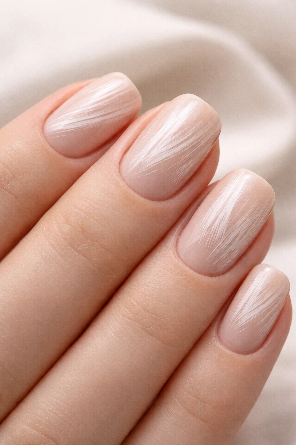
Brushstroke texture—where you deliberately apply color in directional strokes rather than smooth, even coverage—creates organic visual interest that reads as artistic and intentional. Soft nude is the perfect base for this because it’s neutral enough that the texture is the star rather than the color competing for attention.
How Intentional Imperfection Became Sophisticated
There’s a trend toward celebrating brushwork in nail design, and it makes sense: it feels handmade, artistic, and one-of-a-kind. When you do this on soft nude, it reads as beautifully executed rather than messy. The directional strokes create movement and dimension that flat color simply can’t achieve. It’s a way to add personality without adding complexity.
Creating Intentional Brushstrokes
- Apply your soft nude base in thin, smooth coats first
- Using a slightly different shade or a glossy topcoat with texture, apply directional brushstrokes: downward strokes, side-to-side, or diagonal
- Vary your stroke direction slightly across each nail for organic interest
- The strokes should be visible but not so heavy-handed that they look messy
- Seal with topcoat that will protect the texture while maintaining that artistic look
Worth knowing: This design hides imperfections beautifully and actually improves as it grows out, because the regrowth creates additional texture that blends seamlessly.
14. Warm Ivory with Thin Metallic Accent Line
Similar to the nude with line work design, but executed with a metallic element, this combines warmth, sophistication, and just a touch of shimmer. A single thin metallic line running along the edge or through the center of your nail is enough to elevate warm ivory from simple to considered.
Why Metallic Lines Feel Intentional
Metallic finishes catch light differently than matte or glossy, creating dimension and drawing attention without being over the top. On warm ivory, rose gold, champagne, or even warm bronze metallic lines create a harmonious color story that feels elegant rather than flashy. It’s a design that works in professional settings but doesn’t feel boring or understyled.
Applying Metallic Accent Lines
- Warm ivory base needs to be smooth and evenly applied in multiple thin coats
- A metallic gel or metallic acrylic paint applied with a thin brush creates the cleanest line
- The line can run along the edge of the nail, down the center, or in a swoosh—choose what feels balanced on your hand
- Metallic lines require a glossy topcoat to properly seal and shine
- The thickness of the line should be delicate—think hair-thin rather than thick and obvious
Pro tip: Champagne metallic creates a softer, more blended look than true gold or rose gold, making it incredibly wearable.
15. Pale Gray with Clear Gloss Top Layer
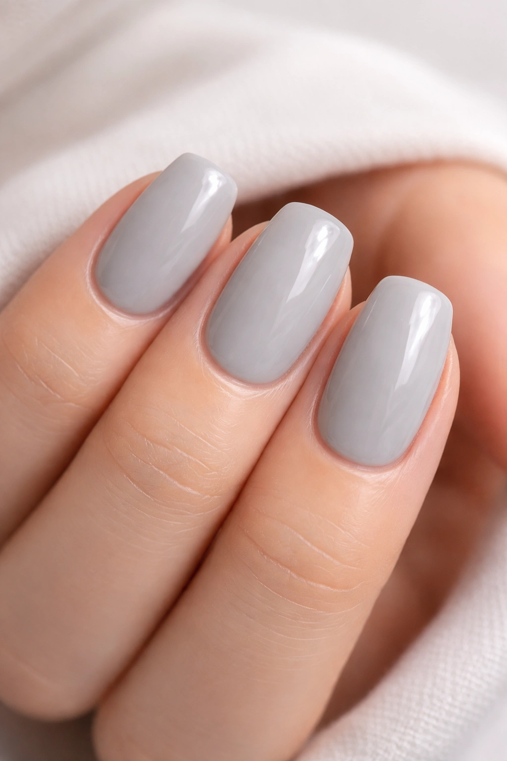
Sometimes the most sophisticated design is almost no design at all. Pale gray with a perfectly smooth, glossy topcoat is the definition of understated elegance. There’s no texture to distract, no additional elements competing for attention—just a neutral color executed flawlessly.
The Luxury of Perfect Simplicity
This design works because it demands precision and quality execution. You can’t hide behind patterns or texture; you’re betting everything on an even application, perfect shine, and clean lines. It reads as supremely confident—you don’t need your nails to do anything except look beautifully done. The pale gray is specific enough to feel intentional while being neutral enough to work with every outfit and occasion.
Executing Perfection with Simplicity
- Pale gray should be applied in thin, even coats—rushing this step shows
- File your nails into a perfect squoval shape before application
- Each coat of pale gray should be completely smooth with no visible brushstrokes
- Apply a premium, high-shine topcoat in at least one generous layer
- The shine should be uniform across all nails with no dull spots or streaks
- Minimal, yes—but the execution is where this design earns its sophistication
Insider note: This design is the perfect choice if your nail tech is particularly skilled at application—it’s where their craftsmanship truly shows.
Final Thoughts
The magic of short squoval acrylics in neutral colors is that they work everywhere you go. You’re not competing with anyone else’s aesthetic; you’re just creating the perfect backdrop for your own style. Whether you choose creamy warmth, cool grays, textured details, or intentional simplicity, you’re making a choice that says you pay attention to the details that matter.
What makes these designs timeless is that they’re not following a trend—they’re setting one. A year from now, five years from now, these designs will still look contemporary and intentional because they’re based on principles of proportion, balance, and quality execution rather than seasonal color trends or fleeting design fads.
The squoval shape gives you permission to keep things short and practical without sacrificing that polished, considered aesthetic. And neutral colors mean your nails become part of your overall look rather than competing with it. That’s the freedom that comes from understanding what actually works for your life, not just what looks good in a photo. These fifteen ideas give you plenty of directions to explore, and honestly, once you find your favorite, you’ll understand why short squoval neutrals have become such a beloved choice.
