

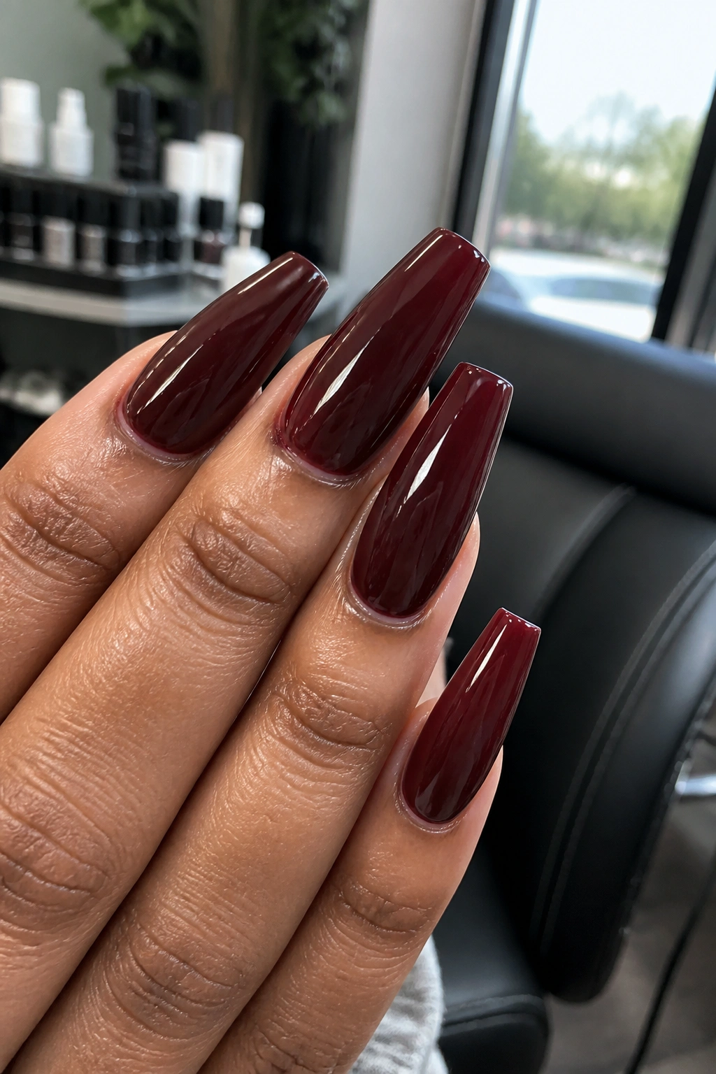
Burgundy is one of those nail colors that can make a basic set look like it cost twice what you paid. On a coffin shape, it gets even stronger: the tapered sidewalls stretch the color, the flat tip gives it presence, and the deep red base picks up every bit of shine, shadow, and detail. Burgundy coffin nails sit in that sweet spot between classic red and near-black drama, which is why they so often read polished, expensive, and a little bit intimidating—in a good way.
The catch is that burgundy can also go wrong fast. If the shape is bulky, the sidewalls flare out, or the color has too much brown without enough depth, the whole set starts to look heavy instead of sleek. I’ve seen the same shade look plush and tailored on one hand, muddy and flat on another, just because the finish, length, and undertone were off by a notch.
That’s what makes this color fun. Small changes matter. A jelly finish gives burgundy a stained-glass glow. A matte topcoat pulls it toward velvet. Add a skinny gold line, a cat-eye stripe, or one tortoiseshell accent, and the mood shifts from wine bar to designer handbag.
The best sets don’t rely on rhinestones piled three stories high or art on every finger. They rely on restraint, sharp shaping, and color that looks deep enough to swim in.
What Makes Burgundy Coffin Nails Look Expensive
A rich-looking manicure usually comes down to shape, surface, and color depth. Coffin nails need clean tapering from the stress area to the tip. Not pinched. Not wide. If the free edge looks thick from the side, even a gorgeous burgundy gel starts reading clunky.
Surface matters more than most people think. A luxe set has a smooth apex, a crisp cuticle line, and no ripples under the topcoat. Dark shades show every wobble. That’s why burgundy is less forgiving than pale pink or sheer nude—if the prep is messy, you’ll see it.
Then there’s the shade itself. The strongest burgundy tones usually have one of three personalities:
- Wine-based burgundy, which leans red and glossy
- Oxblood burgundy, which carries a brown-black edge
- Black cherry burgundy, which looks almost plum in low light
Finish changes everything. Gloss makes the color look deeper. Matte can look plush if the nail is perfectly smooth, but chalky if the product underneath is uneven. Metallic accents work best when they’re thin and controlled—one gold line, a chrome glaze, a single crystal cluster—not ten competing ideas on one hand.
Little details do the heavy lifting here.
How to Choose the Right Burgundy Coffin Nails for Your Hands
If you’ve ever saved a burgundy nail photo and then hated the look on your own hands, the problem was probably not the color family. It was the version of burgundy.
Match the undertone first
Hands with pink or neutral undertones tend to look sharp in blue-based burgundy, black cherry, and cooler wine shades. Golden or olive skin often pairs well with oxblood, cabernet, and brown-leaning burgundy. Neither rule is rigid, though. Jewelry can shift the whole picture. Silver makes cool burgundy feel icier; gold warms up almost any red-brown shade.
Then choose your length
Short coffin nails can work, though they need a soft taper or they start looking square. Medium and long coffin lengths show burgundy best because the color has room to build visual depth across the nail plate. If you type all day, open cans with your hands, or fuss with contact lenses, medium length is the safer call.
Pick one finish and commit
Gloss, velvet, chrome, matte, jelly—each finish tells a different story. Mixing three on one set can look scattered unless the nail art is tight and the color palette stays narrow. If you want that rich look, stick to one main finish with one accent idea. That editing step matters more than people want it to.
Now for the fun part.
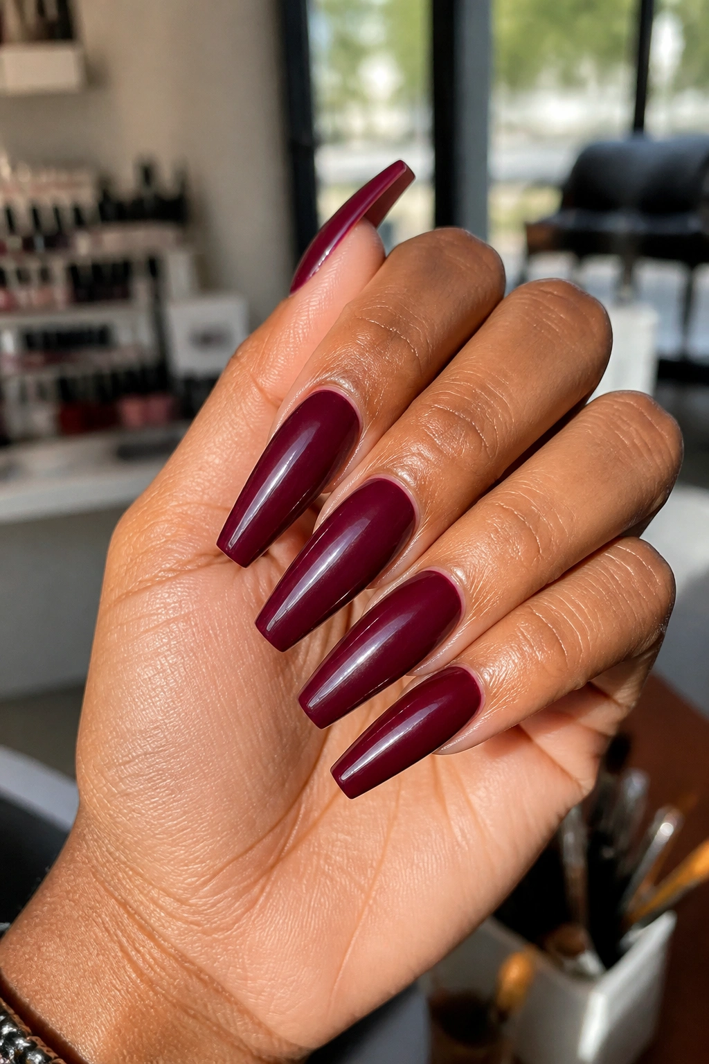
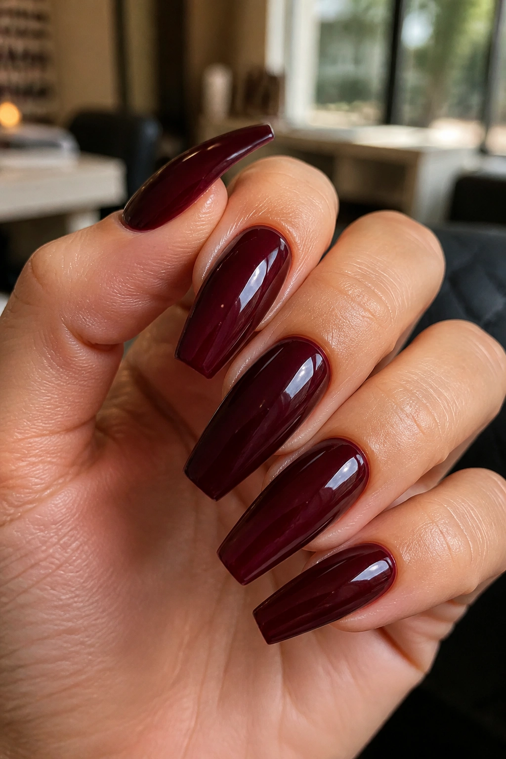
1. Glossy Deep Wine Burgundy Coffin Nails With Clean Sidewalls
If you want the safest path to a rich manicure, start here. Deep wine burgundy on a medium coffin shape is hard to beat because it doesn’t need extra art to look finished. The shine does the work. The color does the rest.
This set lives or dies by prep. The sidewalls need to run straight, the tip needs a flat edge, and the cuticle line should look tucked and neat rather than flooded. When all of that is right, a glossy wine shade reflects light like glass and gives the nails a smooth, almost liquid depth.
Why this one works so well
The shade sits right between classic red and dark plum, which means it pairs with black, cream, camel, denim, gold jewelry, silver rings—almost anything you already wear. It also flatters both short fingers and long fingers because the coffin shape adds length without looking needle-sharp.
What to ask for at the salon
- A medium coffin shape with slim sidewalls, not a wide square taper
- Two thin color coats instead of one thick one, which keeps the surface smooth
- A high-gloss no-wipe topcoat for that wet, lacquered finish
- Cuticle cleanup before curing so the dark shade doesn’t pool at the edges
Best move: skip accent nails. This design looks richer when every finger matches.
2. Matte Oxblood Coffin Nails With a Skinny Gold Outline
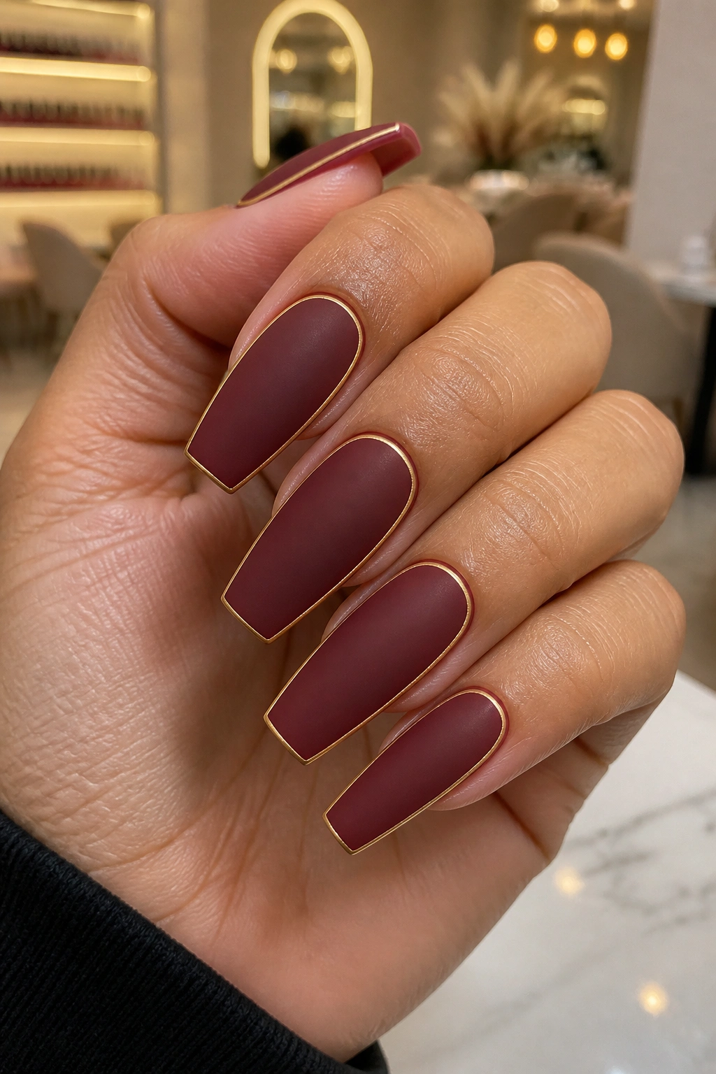
Matte burgundy can look flat. Matte oxblood with a whisper-thin metallic outline looks tailored.
That gold line is doing more than decoration. It sharpens the silhouette of the coffin shape and gives the eye a place to land, which keeps dark matte color from turning dull. Done right, the gold should sit near the perimeter or trace a French line so thin it almost feels like jewelry for the nail rather than nail art.
I like this style most on a slightly longer coffin shape because the negative space around the line helps the design breathe. On short nails, the outline can crowd the surface. On medium-long nails, it looks intentional and spare.
There’s a discipline to this set that I love. It does not beg for attention. It assumes you’ll notice.
Use a warm oxblood base if you wear a lot of gold rings, brown leather, camel coats, or cream knitwear. Use a cooler burgundy if your jewelry leans silver and your wardrobe is full of charcoal, navy, or black. The line itself should stay thin—about the width of a striping brush stroke, not a chunk of foil tape. Once it gets thick, the whole thing loses that polished edge and starts feeling costume-like.
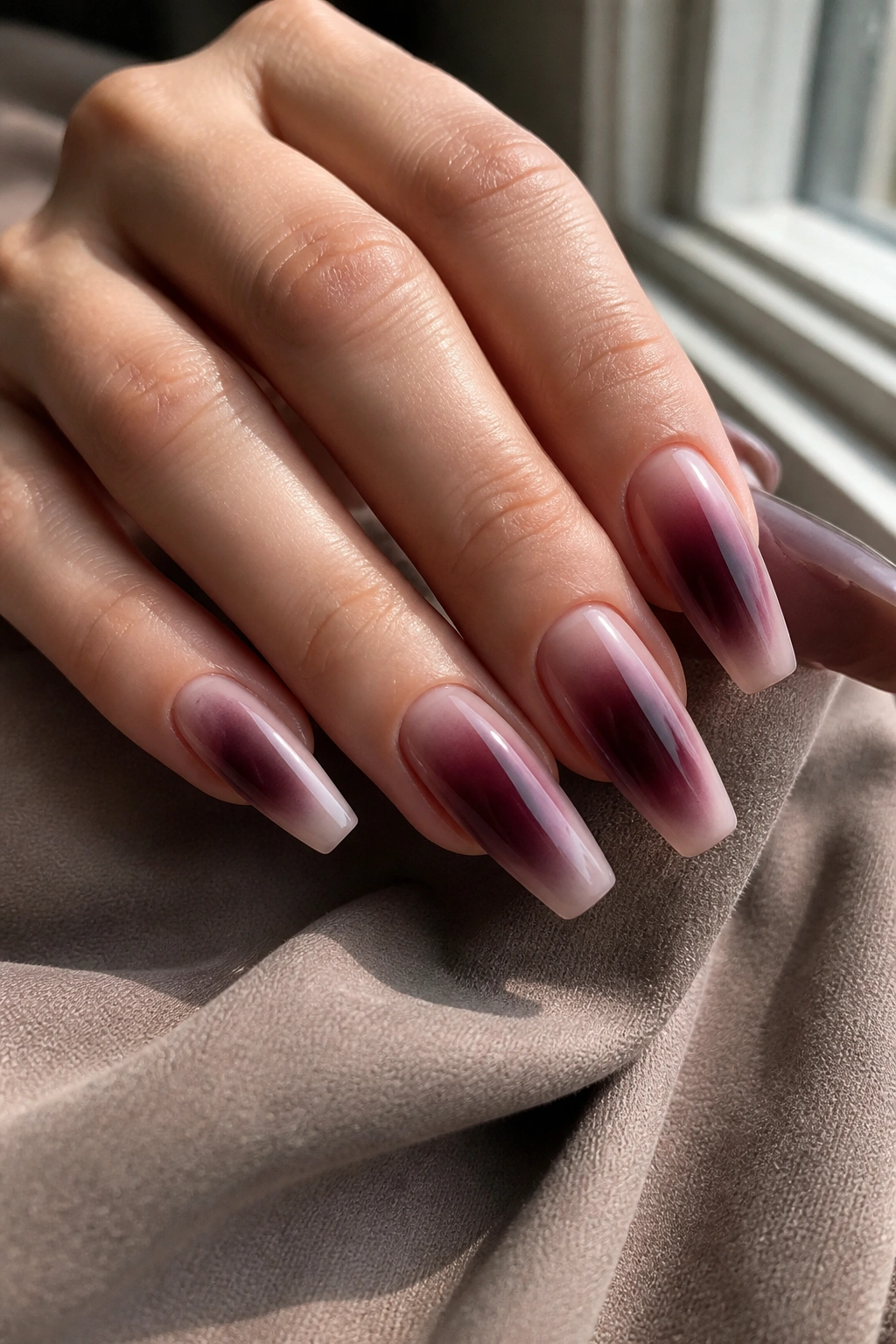
3. Black Cherry Jelly Burgundy Coffin Nails
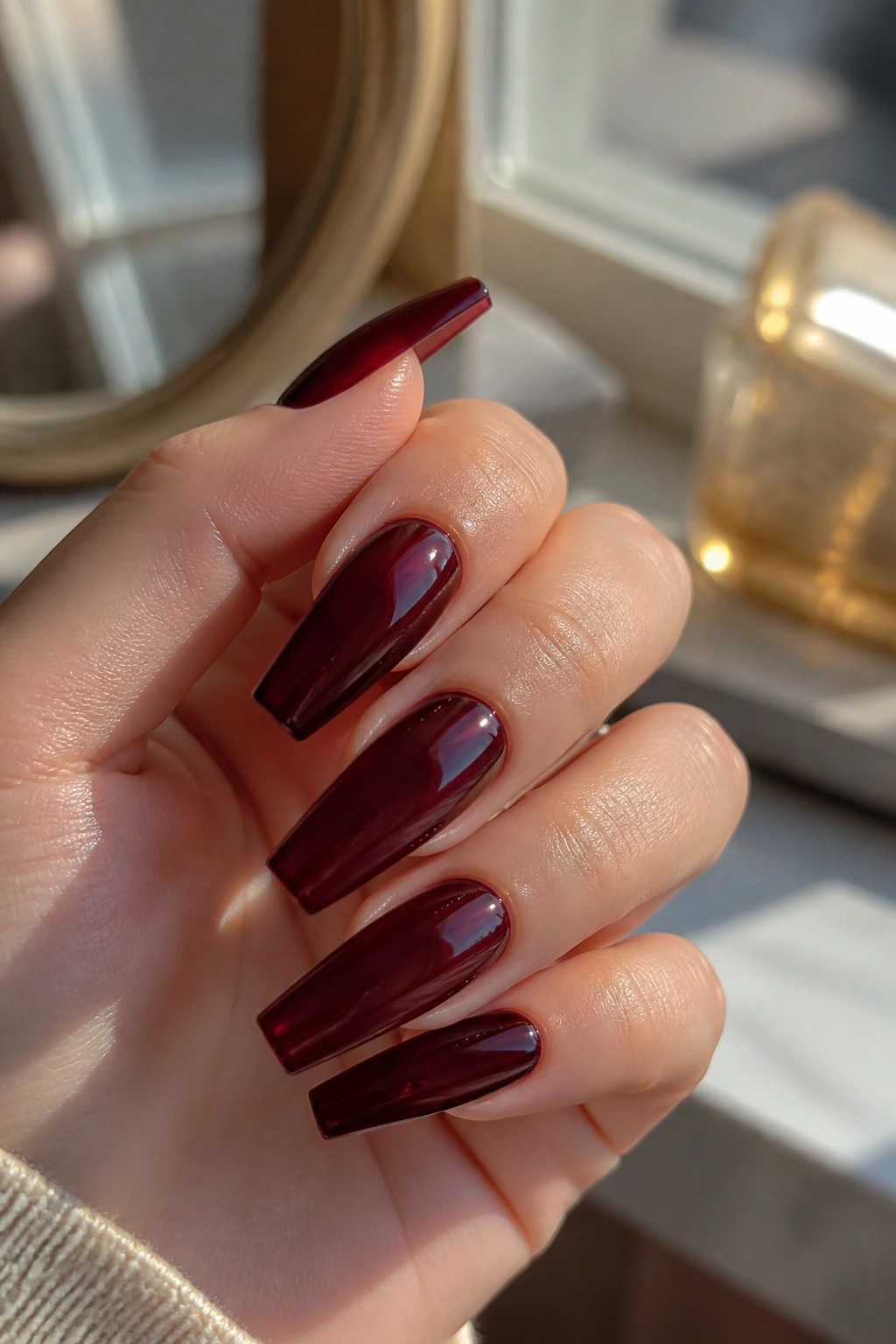
Why does a jelly finish make burgundy look pricier than a standard cream polish on some sets? Because light can move through it.
A black cherry jelly has translucence. You still get depth, but it’s a layered depth, the kind you notice when the hand turns and the color shifts from cherry cola to plum to wine. On a coffin shape, that semi-sheer finish stretches across the flat tip and looks almost like tinted glass.
This style works best on structured gel overlays, soft gel extensions, or well-made press-ons with a smooth apex underneath. If the base isn’t even, jelly polish will show every ridge. No mercy there.
How to wear it without losing the rich effect
Keep the design clean. No chunky glitter. No loud decals. If you want detail, go for one of these:
- a single micro-French line in black
- one encapsulated gold flake accent nail
- a darker jelly second coat on the ring finger for tonal contrast
Low light is where this set earns its keep. Under daylight it reads juicy and red; indoors it turns moodier, closer to merlot. That shift gives it more personality than a flat cream finish, and personality—when it’s controlled—is what makes nail art look expensive instead of random.
4. Burgundy French Fade Coffin Nails on a Milky Nude Base
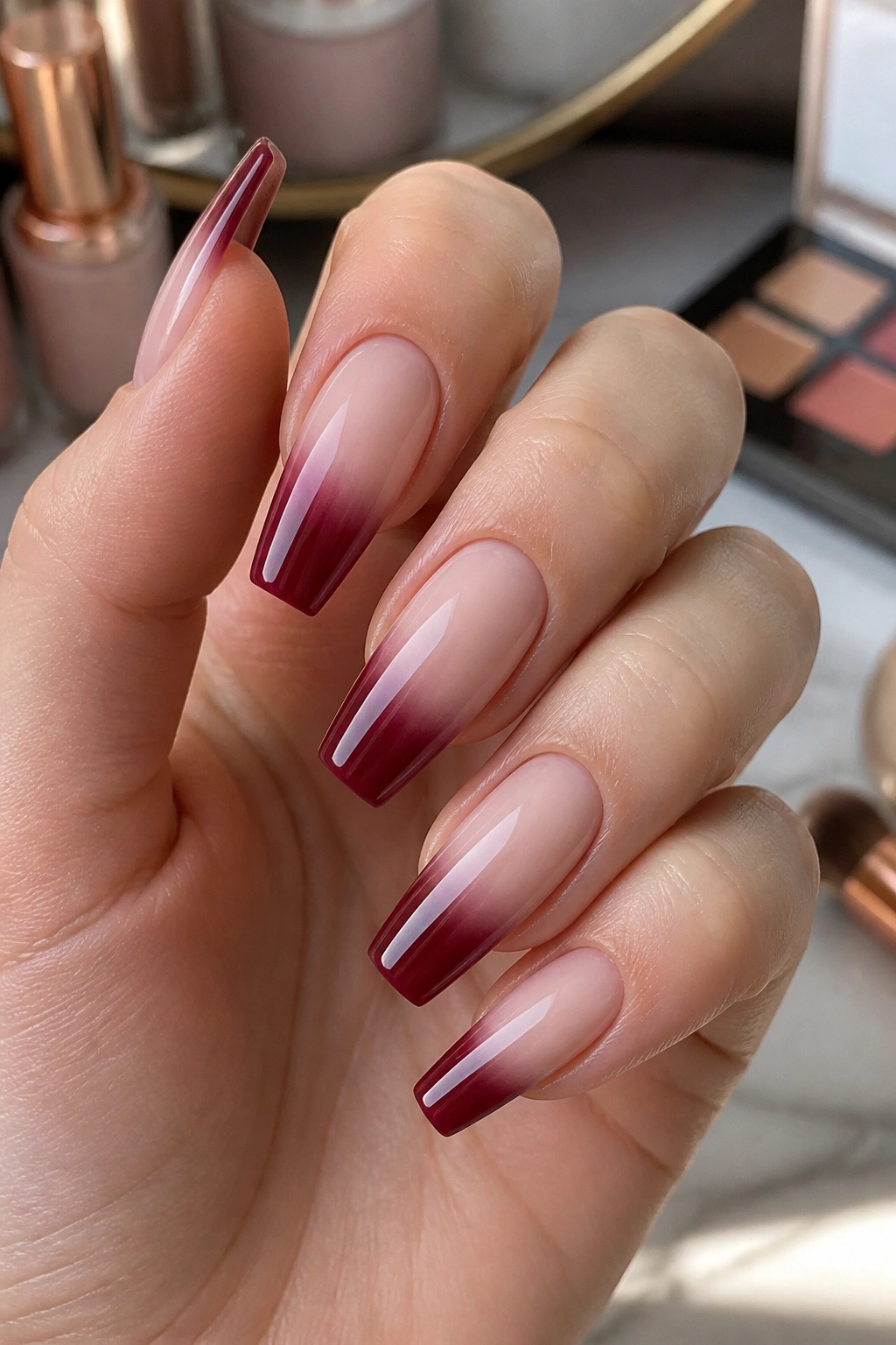
Picture a milky nude base that melts into burgundy at the tip, soft as smoke instead of sharply blocked. That fade gives coffin nails a lifted, elongated look, and it reads lighter than a full dark set without losing the richness that makes burgundy worth choosing in the first place.
This is a smart option if you want dark nails but worry that full-color burgundy feels too heavy on your hands. The nude at the cuticle keeps the manicure airy, while the burgundy on the tip frames the shape.
A good French fade needs blending skill. Sponge work can look grainy if it’s done carelessly. Airbrush, blooming gel, or patient brush blending gives a cleaner result.
Details that make the design land
- Milky pink-beige base, not a flat opaque nude
- Deep burgundy concentrated at the free edge
- Soft gradient transition with no harsh stripe across the middle
- Gloss finish to merge the colors into one smooth surface
I’d skip extra crystals here. The fade is the feature. Add a tiny gold half-moon on one finger if you want a little flash, but no more than that. This set already has movement, shape, and contrast built in.
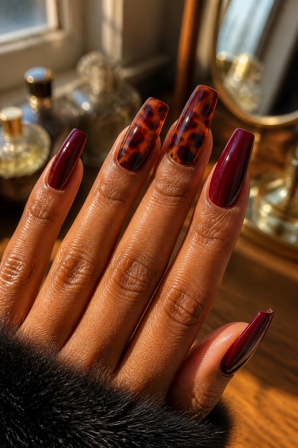
5. Croc-Stamped Burgundy Coffin Nails With Patent Shine
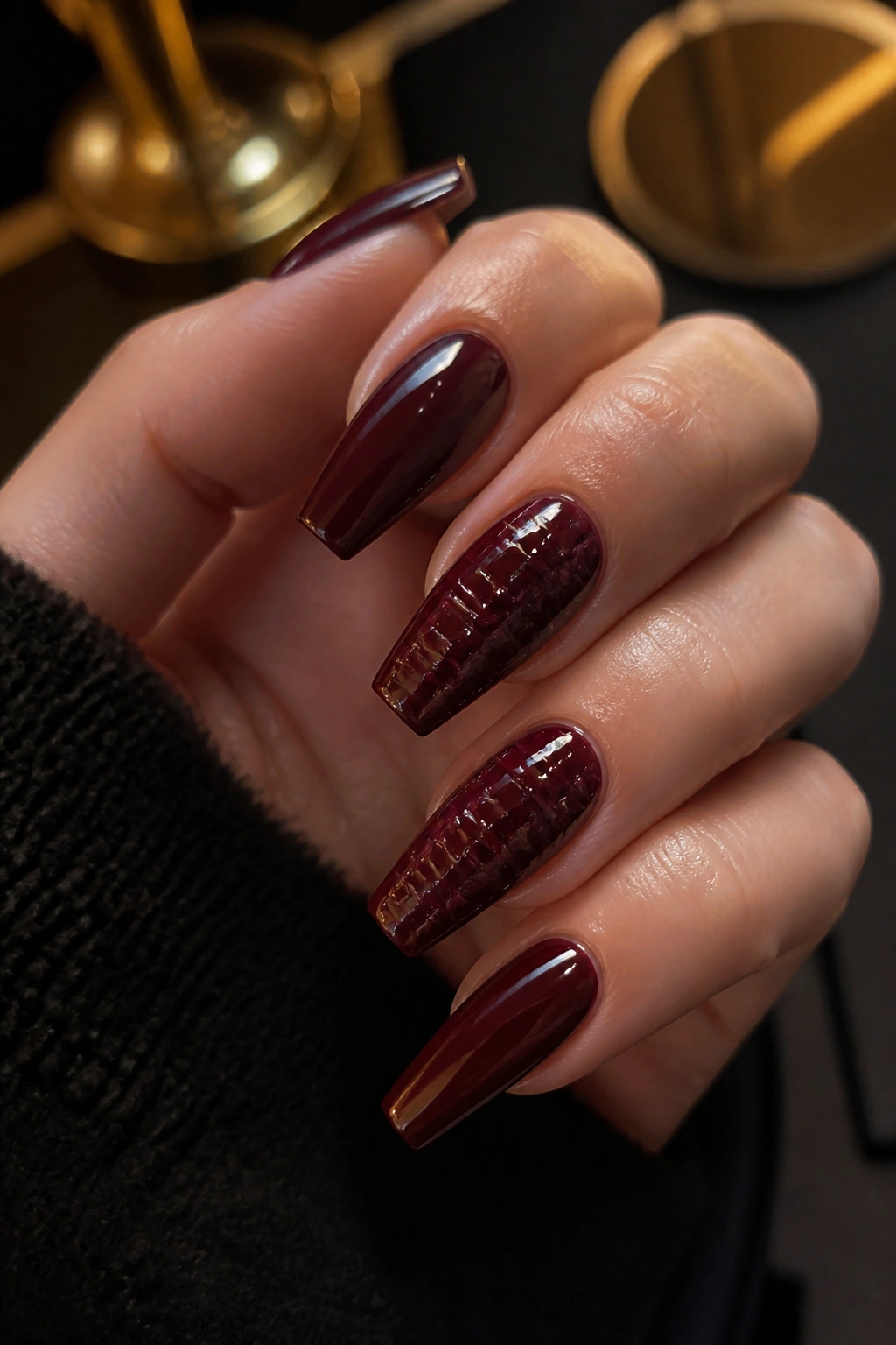
Texture can turn dark nails from plain to sharp in about ten seconds. Croc-stamped burgundy is proof.
The trick is to keep the pattern tight and glossy, almost like embossed leather. When the base color is a deep oxblood or brown-red, and the raised pattern catches the light in patches, the nails start to echo a luxury bag or a pair of polished boots. That connection matters because people read materials before they read details. Leather, lacquer, glass, velvet—those textures carry their own associations.
I would not put this design on every finger unless the nails are medium length and the stamp is fine. On a full long set, five textured nails can feel crowded. Two or three croc nails mixed with solid burgundy fingers looks smarter and holds the “rich” mood longer.
Placement changes the vibe, too. A full croc accent on the middle and ring fingers feels fashion-forward. A croc French tip over a nude base looks lighter and a bit more playful. My favorite version, though, is solid deep burgundy on three nails and croc texture on two, all under the same glossy topcoat so the set still reads cohesive.
One warning: this design needs clean molding. If the texture is thick, lumpy, or spread too wide across the nail, it starts looking homemade in the wrong way. Fine detail or nothing.
6. Velvet Cat-Eye Burgundy Coffin Nails That Shift in Low Light
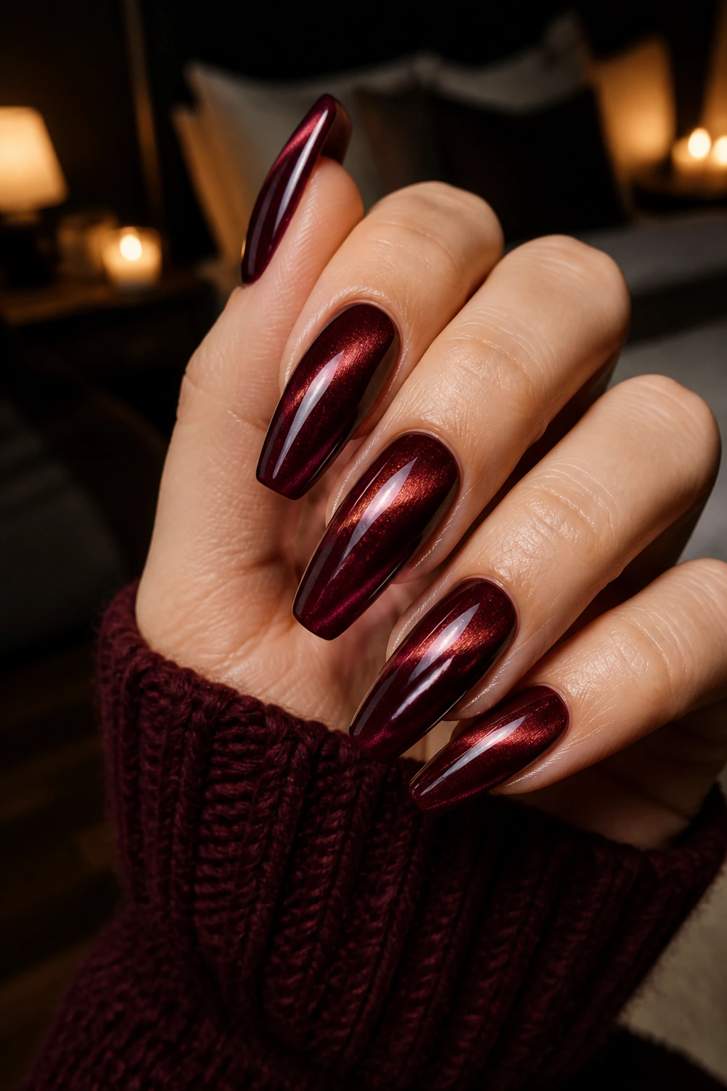
Unlike flat shimmer polish, magnetic cat-eye gel gives burgundy a moving line of light. That’s why it feels richer. The color seems to have depth under the surface, almost as if the nail were cut from stone and polished.
The best version uses a burgundy base with a fine magnetic pigment—not chunky glitter—and a centered or diagonal pull that follows the coffin shape. When the magnet line is placed well, it lengthens the nail and gives the hand more elegance without needing extra decoration.
Who is this best on? Anyone who likes dark nails but gets bored with single-tone cream polish after three days. Cat-eye keeps changing as the hand moves, so it feels active without being loud.
Go darker than you think. A cabernet, oxblood, or black cherry base gives the magnetic stripe more contrast. If the starting shade is too bright, the effect can slip into holiday ornament territory, which is not the mood here. I also think this style looks better with a rounded coffin taper rather than a severe, knife-like tip. The softer shape lets the reflective line look smooth instead of harsh.
Wear it with plain rings and let the finish do the work. This one does not need help.
7. Burgundy Coffin Nails With Micro Crystal Cuticle Details
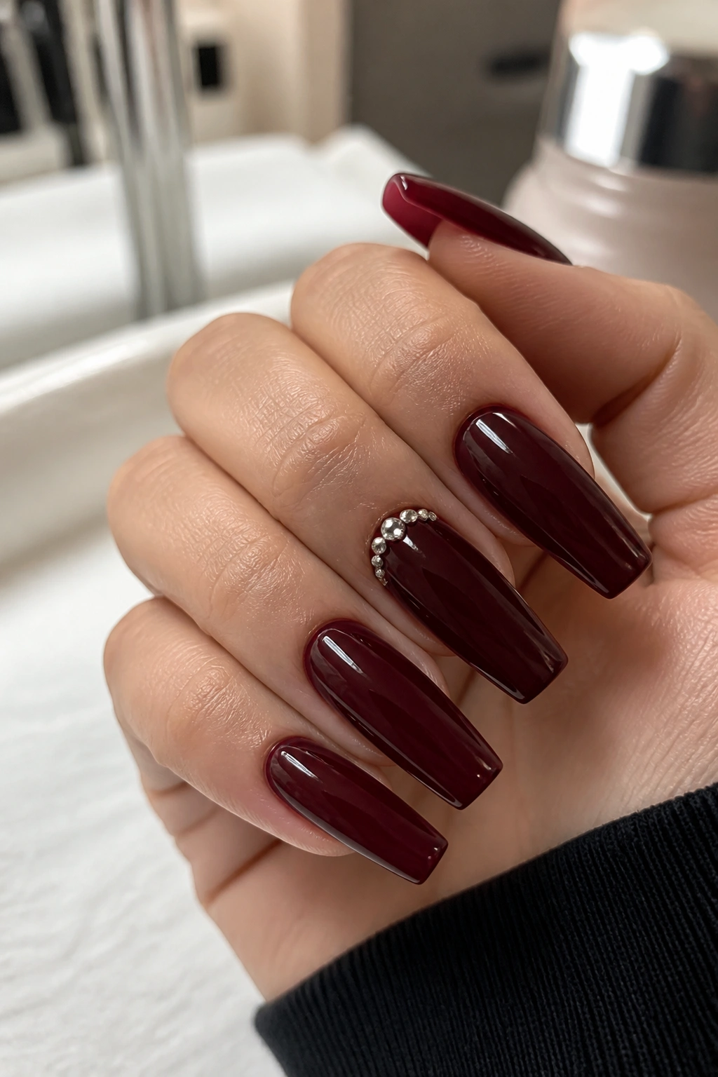
There’s a thin line between elegant crystal placement and “I glued the craft drawer to my hand.” Micro stones near the cuticle stay on the right side of that line.
This style uses a rich burgundy base—cream, jelly, or cat-eye—and finishes it with two to five tiny crystals placed at the base of one or two nails. Think punctuation, not fireworks. The stones should be small enough that they catch light when your hand moves but don’t dominate the color.
Where the luxury feel comes from
The placement matters more than the crystal itself. A curved cluster that mirrors the cuticle shape looks neat and intentional. Randomly scattered rhinestones never do. Use clear stones if you want a sharper, cooler finish. Use champagne-toned stones with warm oxblood for a softer gleam.
Quick design notes
- Keep crystals to one hand feature zone, usually ring fingers or thumbs
- Pair them with solid burgundy on the remaining nails
- Choose flat-back micro stones, not large pointed gems
- Seal the base well so hair doesn’t snag around the edges
A lot of people overdo this design because crystals feel fun in the moment. Stop early. If you think the set needs ten more stones, it probably needs none.
8. Tone-on-Tone Marble Burgundy Coffin Nails
Marble nail art can get muddy fast when dark shades are involved. Done in two or three close burgundy tones, though, it looks expensive because the pattern stays subtle and the depth comes from movement inside the same color family rather than from loud contrast.
Use a wine base, then swirl in black cherry, plum-burgundy, or a touch of translucent brown-red. The goal is not a dramatic stone slab. The goal is controlled veining that catches your eye on second look. That second look matters. Loud art announces itself. Rich art tends to reward a closer glance.
I like tone-on-tone marble best on long coffin nails because the shape gives the veining room to stretch. Shorter nails can still wear it, though the marbling should be broader and simpler—one or two swirls, not six tiny wisps crammed onto a small plate.
A single metallic accent can help. Not a full gold foil nail. One thin broken vein of gold through one marble nail is enough. More than that and the design starts chasing attention.
This is also one of the few burgundy styles that looks good under either gloss or velvet-matte topcoat. Gloss makes the swirls look fluid. Matte makes them feel like polished stone. Different mood. Same color story.
9. Burgundy-to-Espresso Ombre Coffin Nails
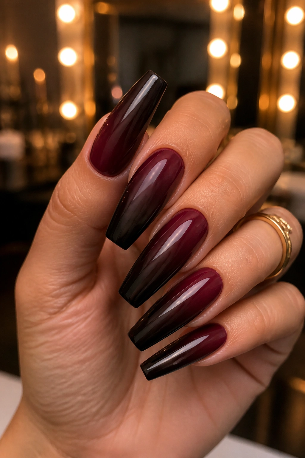
Can you pair burgundy with brown without making the set look dull? You can—if the brown is dark enough and the gradient is smooth enough.
A burgundy-to-espresso ombre works because the two shades share warmth and depth. The result feels grounded, expensive, and a little moodier than a burgundy-to-black fade. Black gives drama. Espresso gives softness, which can be more wearable if you want a dark set that still feels plush.
The easiest way to make this look fail is choosing the wrong brown. Milk chocolate is too light for most versions. Taupe is too dusty. Go with espresso, bitter cocoa, or near-black brown so the gradient keeps that shadowy finish.
Best placement for the fade
You’ve got two solid options:
Vertical fade
Burgundy on one side, espresso on the other. This makes the nail look narrower and works nicely on medium coffin lengths.
Horizontal fade
Burgundy near the cuticle or tip, espresso at the opposite end. This reads softer and more classic, especially under a high-gloss topcoat.
Wear this set with gold jewelry and it looks warm, plush, and expensive in a quiet way. Wear it with silver and the burgundy steps forward while the brown fades back. Small styling shift. Big visual payoff.
10. Cabernet Chrome Burgundy Coffin Nails
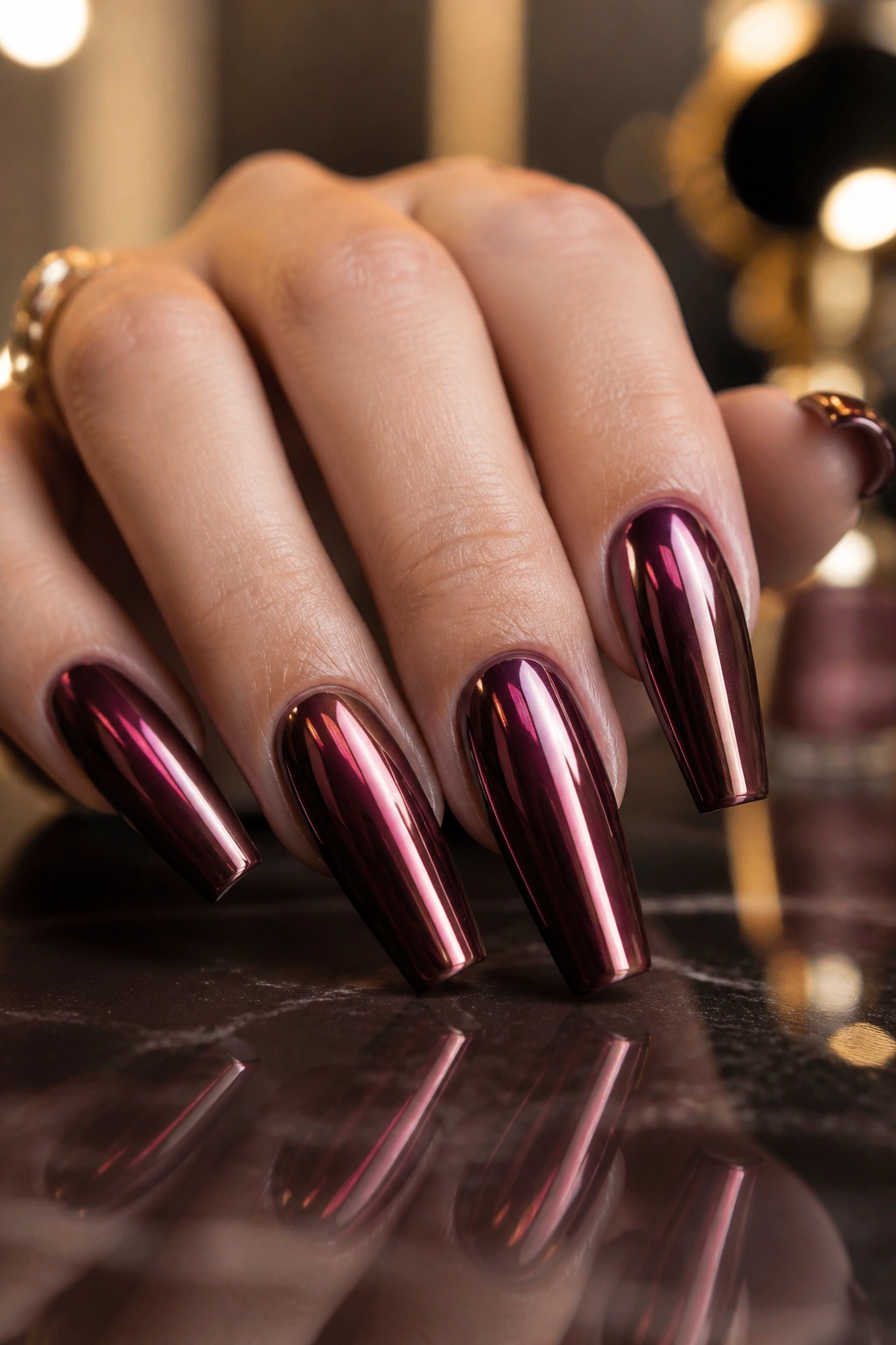
Chrome is risky on dark nails. Done badly, it looks like a party favor. Done with a deep cabernet base and a fine mirror powder, it looks slick and deliberate.
The base color should stay visible under the chrome. That’s the whole point. You want a red-wine glow under the metallic sheen, not a silver film covering everything up. Think of it as a glaze, not armor. A thin chrome layer over burgundy catches light at the high points and leaves the depth underneath intact.
This design hits hardest on medium-long coffin nails with a clean, narrow taper. Wide nails can make chrome feel bulky. Slimmer shaping keeps the finish sleek.
Use it for a full set if you like statement nails and clean outfits. If your style already includes busy prints, stack rings, or heavy accessories, chrome on all ten fingers can fight with the rest of the look. In that case, pick two chrome accent nails and eight solid burgundy nails. Same mood, less noise.
One little detail I keep coming back to: chrome shows fingerprints and surface flaws more than cream polish does. Buffing, dust removal, and topcoat smoothness matter here. Skip those steps and the shine turns messy fast.
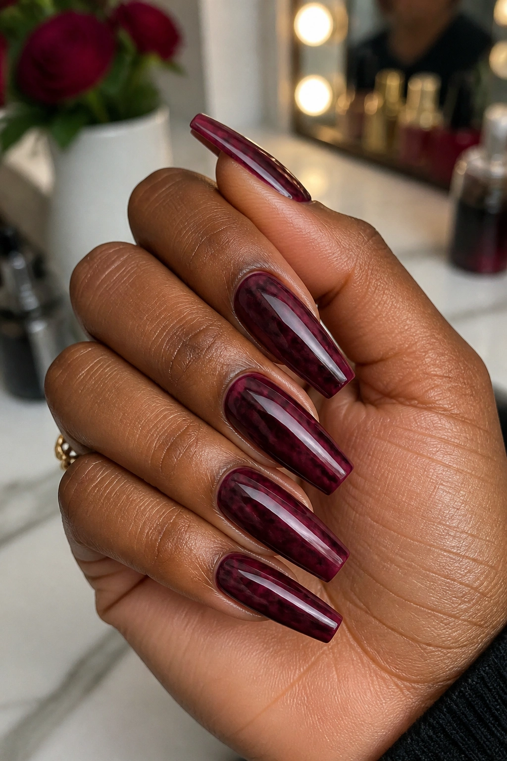
11. Burgundy Coffin Nails With Tortoiseshell Accent Fingers
This combo sounds odd until you see it. Then it makes complete sense.
Tortoiseshell brings amber, brown, caramel, and black into the set, which makes a deep burgundy look richer by association. It’s the same reason burgundy lipstick pops harder next to tortoiseshell sunglasses or a glossy brown handbag. Warm layered tones flatter each other.
I prefer two tortoiseshell accent nails, usually the middle and ring fingers, with the rest in a dark wine or oxblood cream. Putting tortoiseshell on all ten fingers is too much pattern for a coffin shape. A little is enough.
What to watch for
- The tortoiseshell should have transparent amber areas, not opaque muddy blobs
- Black patches need irregular edges, more like ink spreading than polka dots
- Pair it with a warm burgundy, not a cool purple-red
- Finish the whole set in gloss so the tones feel tied together
This is one of those designs that looks better in motion than in a still photo. As your hand turns, the tortoiseshell catches warm light while the burgundy stays deep and grounded. You get contrast without chaos, which is a lot harder to pull off than people think.
12. Plum-Burgundy Aura Coffin Nails
Aura nails can look airy and soft, but they don’t have to live in pastel land. A plum-burgundy aura takes the same blurred-center idea and gives it more weight.
Start with a sheer or milky base, then bloom a burgundy-plum haze in the center of each nail. The edges stay lighter, which creates a floating effect. Because coffin nails have that flat tip, the centered glow sits on the nail like a soft spotlight and gives the hand a more styled look than a plain sheer manicure.
I like this one for people who want burgundy without committing to a full dark set. You still get the color, though it feels lighter, softer, and more dimensional. It’s also a good choice if your wardrobe leans cream, taupe, grey, or blush and you want your nails to add depth without taking over.
A trick that helps: ask for the center bloom to skew slightly lower than dead center, closer to the middle of the nail plate than the tip. That placement tends to flatter the coffin shape more. Put the bloom too high and the nails can look tip-heavy.
Leave the stones, foil, and charms out of this one. Aura nails already have atmosphere built in. Piling on extra detail usually dilutes the effect.
13. Burgundy and Cream Monogram-Inspired Coffin Nails
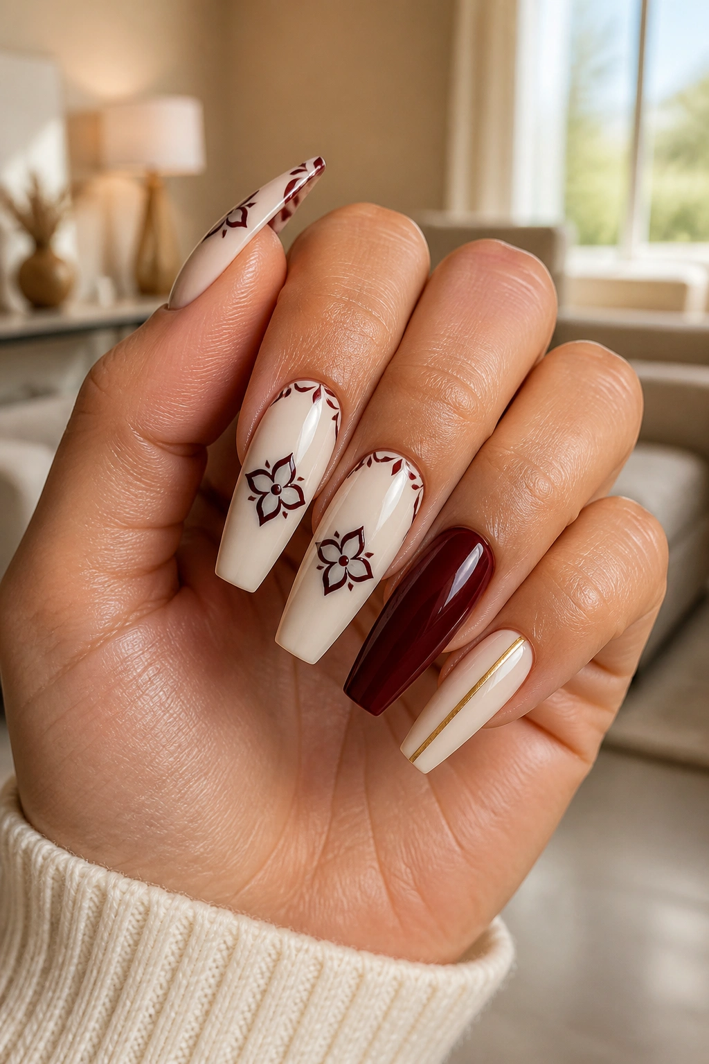
Unlike busy logo-style nail art, a monogram-inspired set can look clean if it borrows the mood of luxury fashion without copying it line for line. Think cream base, burgundy detailing, maybe one fine gold line or miniature pattern element—controlled, graphic, and crisp.
The reason this combo works is contrast. Cream brightens the hand, burgundy grounds it, and the coffin shape gives those clean blocks and lines somewhere to sit. It feels editorial when the spacing is right.
Who should wear this? Someone who likes structured outfits, pointed flats, trench coats, neat handbags, sharp collars. You know the type. This set has more polish than softness.
Go easy on the pattern count. One accent nail with a repeating motif, one burgundy French tip, one solid burgundy nail, one cream nail with a skinny stripe—that sort of mix. If every finger carries a different graphic, the set loses that tailored feel. I’d also keep the cream slightly warm rather than paper-white. Soft ivory or almond makes the burgundy look deeper and less stark.
There’s a fine line between “designer-inspired” and cluttered. Clean spacing is what keeps you on the right side of it.
14. Sheer Burgundy Glass Coffin Nails With Transparent Tips
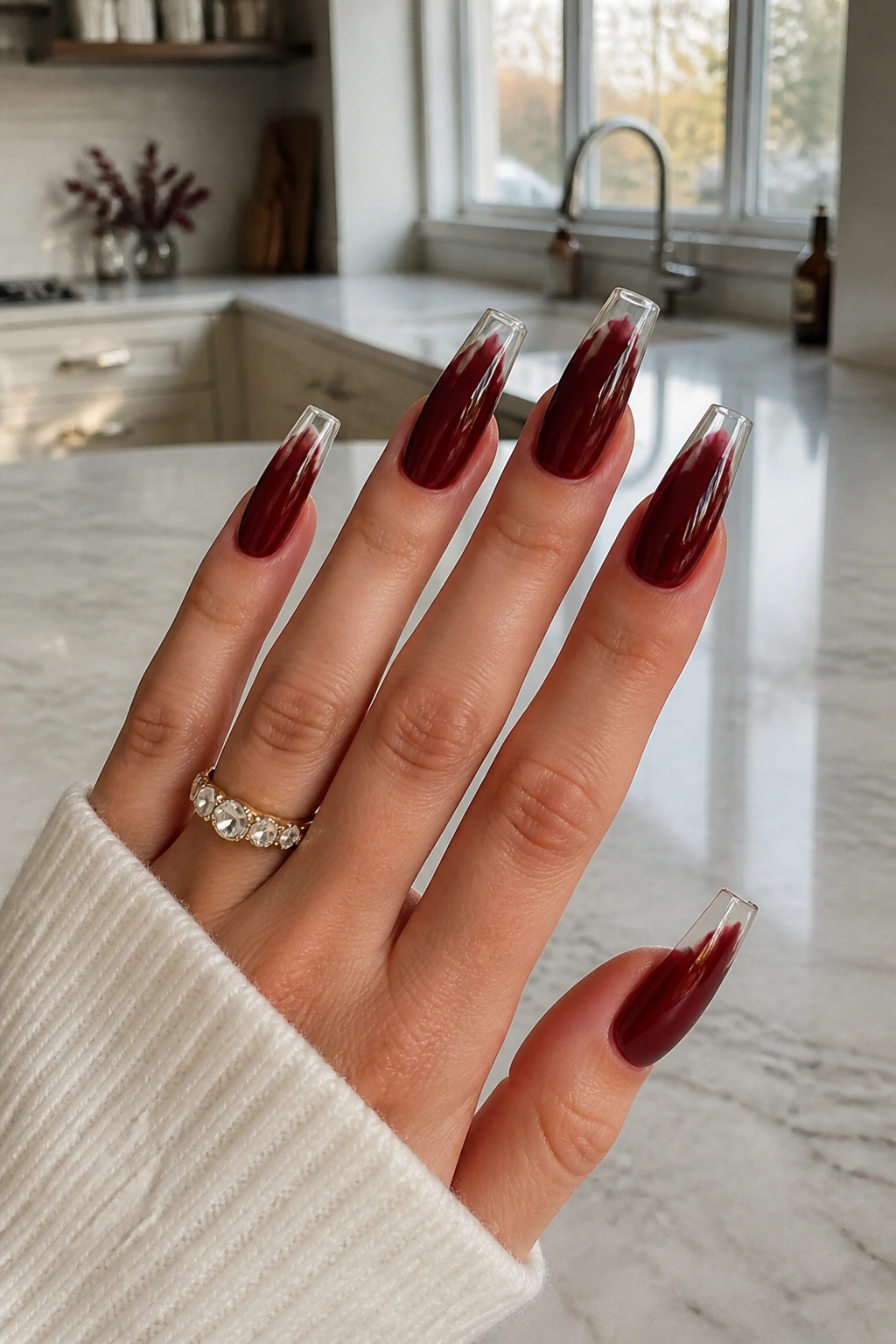
Some burgundy manicures look rich because they’re dark. This one looks rich because it’s translucent.
Glass nails use a sheer, syrupy color that lets light pass through the tip, especially on extensions. With burgundy, the effect lands somewhere between stained candy, red wine, and tinted resin. The coffin shape is ideal for it because the transparent flat tip shows the color gradient better than a rounded almond does.
How the look comes together
You want a slightly stronger burgundy concentration near the nail bed and a lighter wash toward the tip, or the reverse if you prefer a more dramatic edge. Either way, the transparency needs to stay visible. If the tech piles on too many coats, you lose the whole point.
Good additions—and bad ones
Works well:
- thin gold foil pressed inside one nail
- a subtle black outline on the tip
- one clear accent nail with burgundy encapsulation
Skip these:
- chunky glitter
- large decals
- thick milky overlays that cloud the transparency
This style looks best when your cuticles are neat and your shape is exact. Sheer finishes don’t hide anything. They reward clean work and expose sloppy work in seconds.
15. Espresso, Gold, and Burgundy Color-Block Coffin Nails
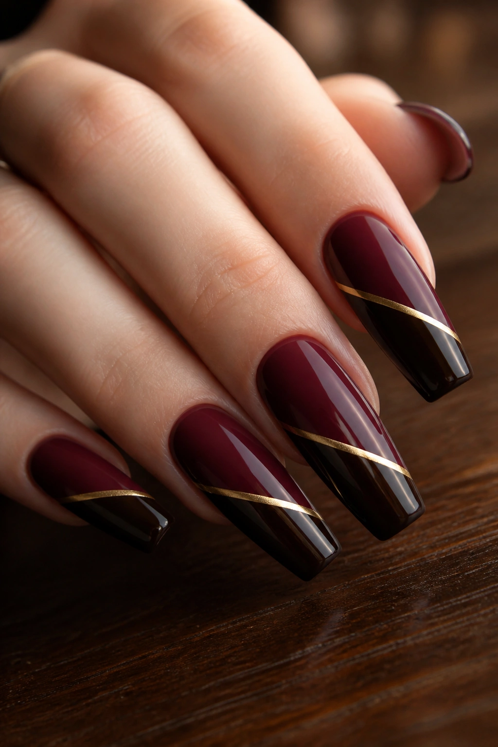
If you want a set that feels dressed up without crossing into costume, color blocking is a strong closer. Espresso, gold, and burgundy make sense together because each shade deepens the others. Burgundy supplies the jewel tone, espresso adds shadow, and gold gives the lift.
The secret is proportion. Gold should be the smallest player—thin striping tape lines, a sliver of chrome, a half-moon accent. If gold takes over, the manicure starts looking flashy instead of rich. Espresso and burgundy should carry most of the surface area.
One clean layout is a diagonal block across the nail: burgundy on the lower half, espresso near the tip, divided by a whisper-thin gold line. Another is a reverse French with burgundy at the base, espresso tip, and a gold rim between them. Both work, though the diagonal block often flatters coffin shape more because it echoes the taper.
This design needs confidence in the file work. Uneven symmetry will show. So will messy line painting. But when it’s crisp? It looks considered. Not fussy. Not loud. Considered—and that’s often what people mean when they say a manicure looks expensive.
Final Thoughts
If I had to narrow all of this down to three things, they’d be shape precision, color depth, and restraint. Burgundy already brings drama. Coffin nails already bring structure. You do not need to force the point with five extra design ideas on top.
The sets that read richest are usually the ones that pick one strong finish—gloss, velvet, jelly, chrome—and let it breathe. Add one accent. Maybe two. File the sidewalls clean. Keep the surface smooth. Suddenly the whole manicure looks sharper.
And if you’re stuck between two designs, go darker and cleaner. Burgundy rewards confidence.
