

The hunt for press-on nails that don’t scream “fake” is real. Most drugstore press-ons feel plastic-y and look obviously artificial the moment you hold them up to the light. But here’s the thing: not all press-ons are created equal. The ones that genuinely pass for salon acrylics share specific characteristics — thickness, finish quality, proper application, and thoughtful design details that make all the difference. You’re looking for nails that catch light the right way, hold their shape without looking rigid, and maintain that subtle dimensional depth that separates expensive acrylics from obvious costume pieces.
The quality gap between a $4 set and a $20 set is enormous. Cheap press-ons often have visible seams, uneven thickness, and finishes that look waxy or plasticky under natural light. Premium press-ons, on the other hand, use multi-layered construction, professional-grade acrylics or gel formulations, and meticulous attention to detail that makes them nearly indistinguishable from custom applications. The nail beds are often more opaque and realistic, the edges are better refined, and the overall weight and feel in your hand signal quality immediately.
What separates the truly convincing press-ons from mediocre ones isn’t just price — it’s understanding what creates that salon-quality illusion. Thick coverage is essential. The ability to see through the nail base (translucence) destroys the acrylic effect instantly, which is why the best press-ons use dense, opaque formulations. Shape matters tremendously too. A slightly tapered or stiletto silhouette, rather than blunt or baby boomer shapes, reads immediately as intentional and polished. And finish — a genuine gel-like shine or a subtle matte with strategic highlights feels infinitely more sophisticated than a flat plastic gleam.
1. Coffin-Shaped Ombré Gradient Sets
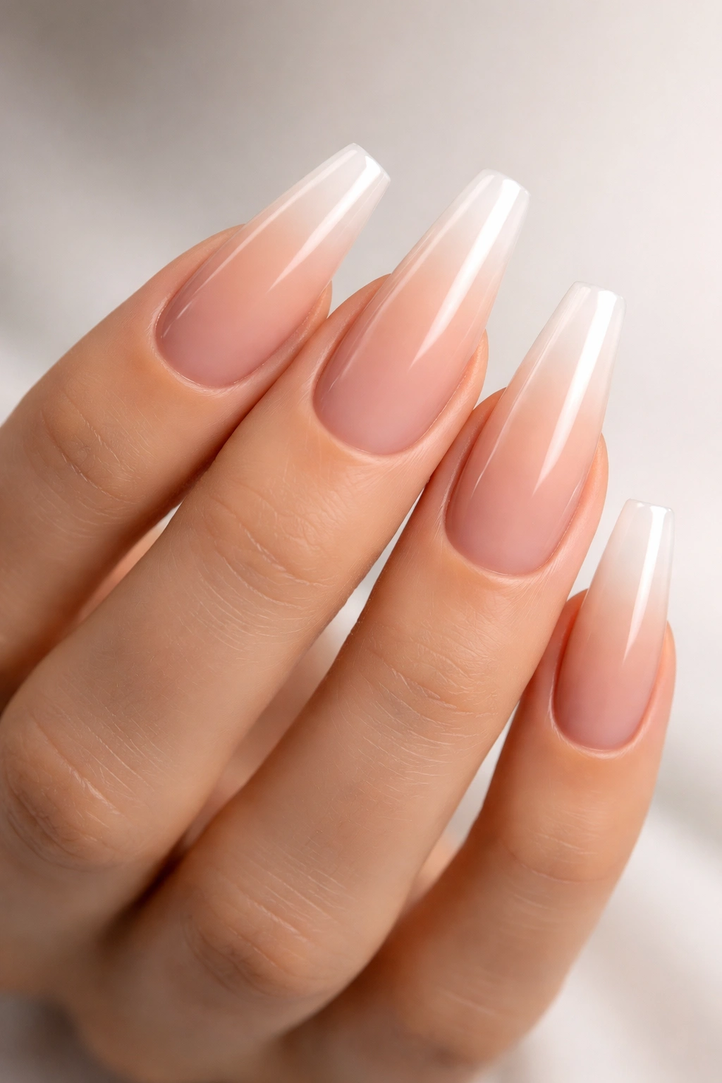
Coffin nails remain the gold standard for a reason. This shape naturally flatters most hand shapes, provides enough surface area for dimension and design complexity, and screams high-end salon work. The best versions taper gradually from a wider nail bed to a pointed tip — not too blunt, not aggressively sharp. When combined with an ombré gradient that transitions from a nude or pink base into clear or white tips, you get that coveted French manicure depth that expensive acrylics deliver.
Why This Shape Passes for Salon Work
The coffin silhouette has become synonymous with professional manicures because it’s not easy to execute at home with filing alone. When a press-on coffin nail is molded perfectly, with smooth edges and that signature tapered narrowing, it immediately signals intention and investment. The slight curve and taper distribute light beautifully across the nail surface, creating shadow and dimension that mimics how real acrylics catch light.
Finding the Right Fit and Application
Pressure and placement matter more with this shape than others. Because coffin nails are narrower at the tip, a single misaligned nail looks noticeably off. Measure carefully using the size guide (they typically run small — size up if between sizes), and apply with slow, deliberate pressure from the center of your nail bed outward. Many people press too hard at the tip, creating air bubbles that become visible within days. Use adhesive tabs rather than glue for your first application so you can remove and reposition without damage.
Pro tip: Buff your natural nail very lightly before application — just enough to remove shine and create tooth for the adhesive. Skip buffing entirely and your press-ons may pop off within 48 hours.
2. Nude-to-Pink Gradient with Thin White Tips
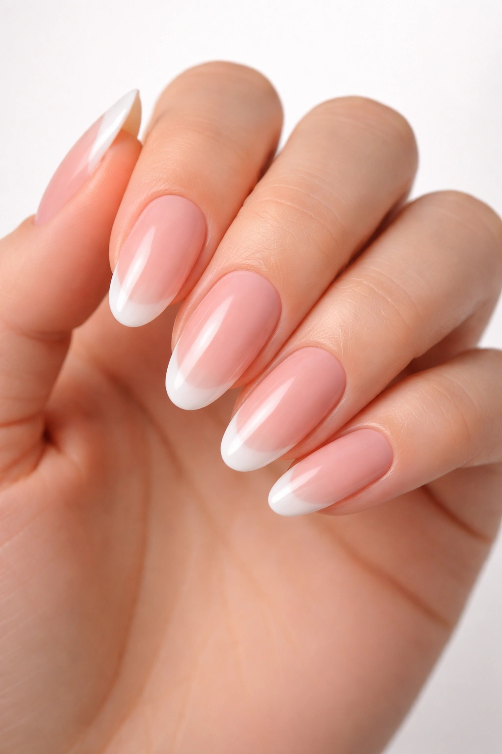
This is the absolute classic that’s been the acrylic standard for over a decade. A soft nude or peachy-pink base that melts seamlessly into a bright or milky white tip creates an elongating effect that flatters virtually every skin tone. The gradient is subtle but unmistakable, and when done well, the transition looks airbrushed rather than painted in obvious bands of color. This style reads as effortlessly elegant and professional in any setting.
The Gradient Execution That Looks Professional
The difference between drugstore gradient nails and salon-quality ones comes down to how fluidly the colors transition. Cheap versions often have a harsh line where the pink meets the white — you can see exactly where one color stops and another begins. Luxury press-ons use a true ombré technique where pigments overlap and blend, creating a soft, graduated transition that looks like it was applied with an airbrush. This blending is what costs more but feels worth it immediately when you look at your nails.
Which Nail Shapes Work Best for This Design
Almond, oval, and coffin shapes all showcase the gradient beautifully. Square or stiletto tips can look a bit stark with this design — the softer, more rounded silhouettes allow the gradient to flow naturally along the nail’s contour. The length should sit between medium and long — not so short that the white tips become minimal, not so long that the nails feel impractical. Around three-quarters of an inch beyond your fingertip hits the sweet spot for both visual impact and real-world wearability.
Worth knowing: Gradients hide grow-out better than solid colors. Even as your natural nail grows in underneath, the fading transition along the length makes it less noticeable that the manicure is aging.
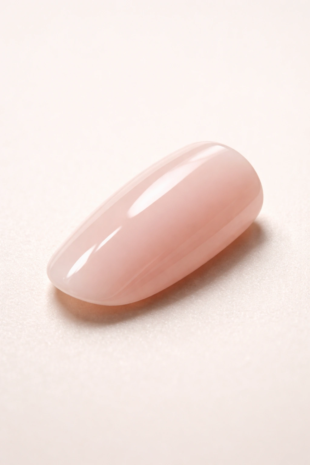
3. Thick Milky White or Sheer Builder Gel Finish
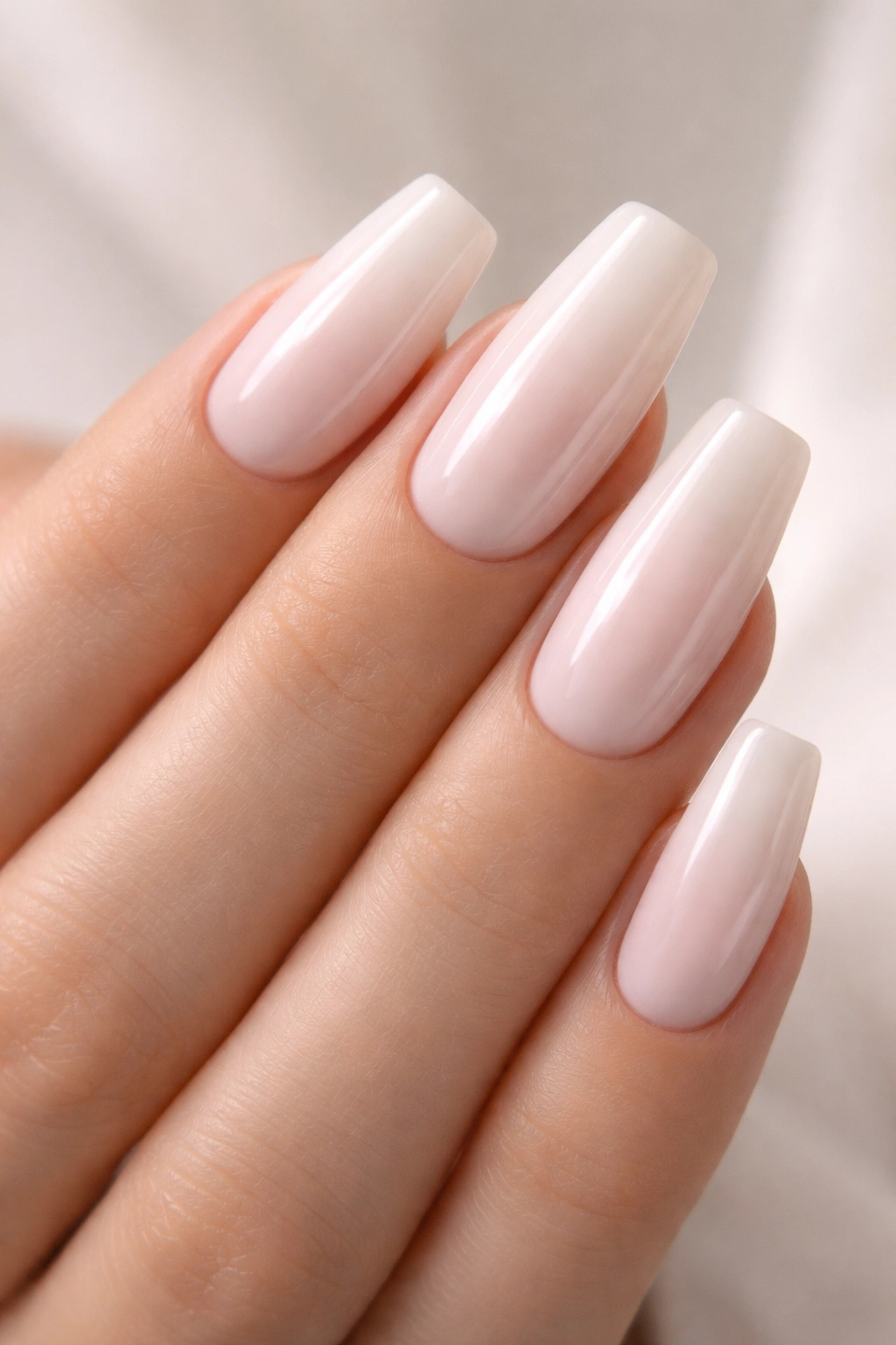
These nails use that pearlescent, semi-transparent white finish that’s become the signature of high-end modern acrylics. Not opaque white (too stark, too costume-y), but a creamy, slightly translucent white that lets just a whisper of your nail bed show through — exactly the effect you get with builder gel applied in layers. This finish feels impossibly smooth and catches light like expensive salon work rather than plastic.
The Optical Illusion of Sheer Opacity
This finish works because it occupies a visual middle ground. It’s opaque enough that your natural nail isn’t showing through (which looks cheap), but sheer enough that it creates dimension and depth. Under artificial light, these nails glow softly. Under sunlight, they catch and scatter light beautifully rather than reflecting it flatly. This is the kind of subtle difference that separates believable press-ons from obvious fakes.
How Long These Actually Last
Sheer builder gel finishes tend to hold up better than glossy acrylics or heavily pigmented colors. There’s less surface area for chips to become visible — small imperfections blend into the translucency rather than creating obvious dark marks. Many wearers report these nails lasting two to three weeks before needing replacement, even with regular hand washing and daily use. The finish also photographs beautifully, which matters if you’re wearing them for events or social media.
Pro tip: These nails pair perfectly with simple nude or neutral nail beds. Skip complicated designs — let the finish and shape do the work.
4. Stiletto Nails with Metallic or Chrome Accents
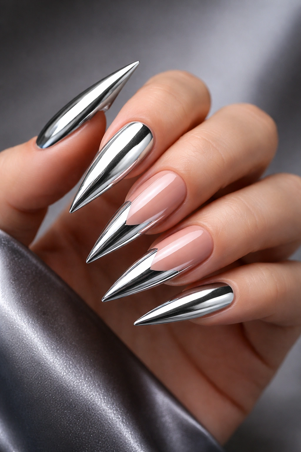
Stiletto nails are the bold choice, and they’re also the ones that most obviously signal “high-maintenance professional manicure.” When a press-on stiletto is perfectly molded — with that dramatic point and elegant curve — it creates an undeniably striking silhouette that’s hard to replicate cheaply. Add metallic accents, chrome finishes, or detailed nail art, and you’ve got something that looks undeniably salon-made.
Achieving That Signature Stiletto Curve and Point
The quality difference in stiletto nails is dramatic. Cheap versions often have a harsh, unnatural point or a flattened curve that feels dumpy rather than elegant. Premium stilettos use smooth, gradual tapering that creates a graceful arc from base to tip. The point should feel sharp enough to be dramatic but not so fragile that it seems likely to break. This balance is what separates costume costume-wear from genuine luxury press-ons.
Metallic Finishes That Look Expensive
Chrome, holographic, and mirror finishes have become more accessible, but they’re still primarily associated with high-end manicures. The best versions use actual metallic particles or reflective coatings rather than simply painted finishes. They shift color slightly when viewed from different angles, catch light dramatically, and feel substantial when you look at them. Cheap metallics look flat and one-dimensional by comparison.
Worth knowing: Stiletto nails require adjustment in how you handle daily tasks. Everything from typing to opening doors feels different. Some people adapt immediately; others find them unwieldy. Try them for one event before committing to wearing them regularly.
5. Tapered Coffin with Deep Burgundy or Berry Tone
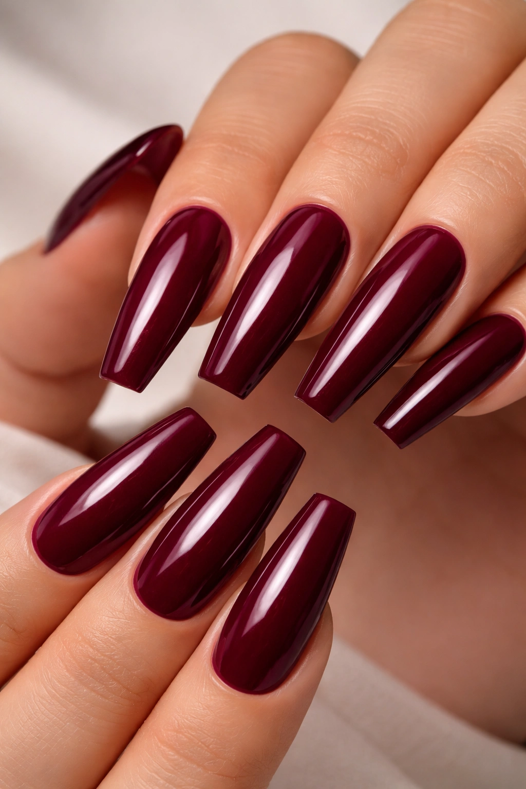
These nails use rich, jewel-toned colors that feel instantly luxurious and upscale. A deep burgundy, wine, or berry shade on a perfectly tapered coffin nail reads as intentional sophistication. The depth of color is key — it should be opaque enough that it looks pigmented and intentional, not translucent or washed out. This color family photographs beautifully and flatters nearly every skin tone, making it a surprisingly versatile choice despite the boldness.
The Psychology of Depth and Opacity in Color
Colors at this depth of pigmentation feel more expensive because they require actual layering to achieve. You can’t paint rich burgundy in a single coat and expect it to look professional. Real acrylics or gel systems build color gradually, creating a complexity and luminosity that single-coat press-ons can’t match. Look for sets that specify multiple layers of pigmentation or high-quality gel construction — the color will visibly outperform basic versions.
Styling This Shade for Maximum Impact
Deep berry tones work best when they’re the star of the show. Skip complicated designs or multiple accent colors — a simple, clean berry manicure looks far more elegant than the same color with glitter or elaborate nail art. The coffin shape elongates and the color feels refined. Pair these nails with minimal jewelry and let them anchor your whole aesthetic. This is the nail equivalent of a perfectly tailored blazer.
Pro tip: These colors can stain your cuticles and surrounding skin during application. Wear rubber gloves when applying the nails and wash your hands thoroughly afterward.
6. Almond-Shaped Nude with Delicate Gold Geometric Design
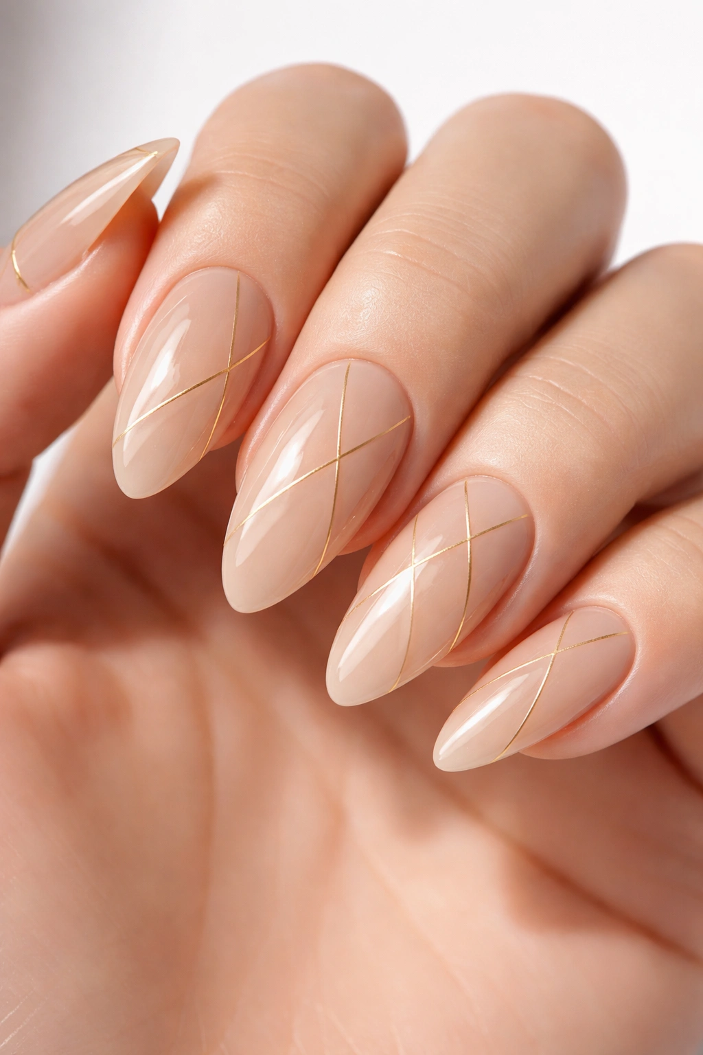
This style splits the difference between subtle and statement-making. A soft nude base keeps the overall look professional and wearable, while a carefully executed gold geometric pattern — thin lines, small triangles, or minimalist shapes — adds sophistication without looking costume-y. The almond shape is the most universally flattering, especially with this design approach. It’s elegant, slightly modern, and works in any professional or casual setting.
Precision in Nail Art That Looks Salon-Quality
The gap between amateur and professional nail art is all about precision and intention. When geometric designs are painted freehand by an amateur, the lines waver, the spacing feels off, and the overall effect looks shaky. Professional or high-end press-ons use a templating or digital application process that ensures perfectly straight lines and exact symmetry. The designs look intentional and carefully considered, not like someone painted them while slightly drunk.
Gold Accents That Don’t Look Cheap
Not all gold finishes are created equal. Metallic paints and foils applied to the surface of cheap nails can look plasticky and flat. Higher-end sets use actual gold leaf, quality metallic pigments, or inlaid metallic elements that catch light the way real metal does. The difference is subtle but immediate — quality gold looks warm and luminous, while cheap gold looks yellow and flat.
Worth knowing: Geometric designs hide imperfect application better than solid colors. If a nail sits slightly crooked, the pattern can distract from it in a way that a blank canvas can’t.
7. Square-Shaped French Tips with Extended White Edge
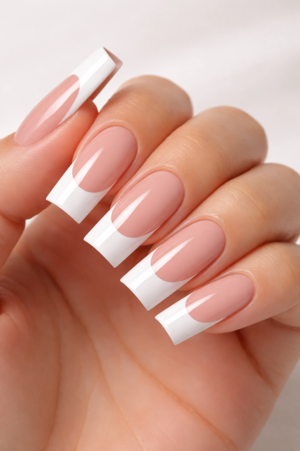
There’s a reason French tips never go out of style — they work. A clean white edge that extends generously beyond the free edge of your nail is the signature of expensive acrylic work. When the base is nude, peachy, or pink and the white tip is bright, opaque, and precisely defined, you get that timeless, high-maintenance manicure effect. Square nails with extended French tips read as deliberately chosen and professionally maintained.
The Engineering of a Perfect French Tip
A French tip press-on lives or dies by the precision of the white edge. The line should be clean and distinct, not fuzzy or slightly transparent. The white should extend the full width of the nail without tapering, creating that bold contrast between base and tip. The thickness of the white should be consistent from one nail to the next — if two nails have tips of noticeably different widths, the whole set looks sloppy. This precision is what separates drugstore French tips from salon-quality ones.
Proportions That Actually Look Good
The white tip should typically extend about one-quarter to one-third of the total nail length. Too much white (more than half the nail) looks costume-y. Too little (just a thin line) looks understated and doesn’t create the desired visual impact. The extended square shape naturally accommodates a generous French tip beautifully — it feels proportional and balanced rather than exaggerated.
Pro tip: Avoid bright neon white tips. Look for creamy white, soft white, or off-white finishes that read as sophisticated rather than artificial.
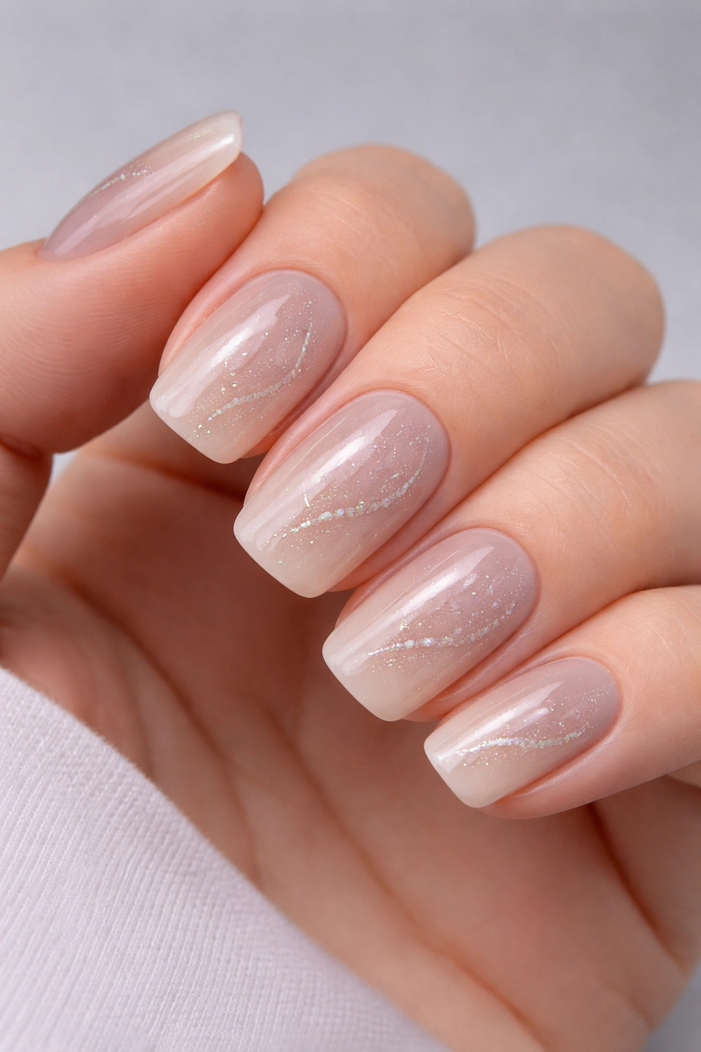
8. Oval-Shaped Clear Builder Gel with Subtle Ombre to Soft Pink Tips
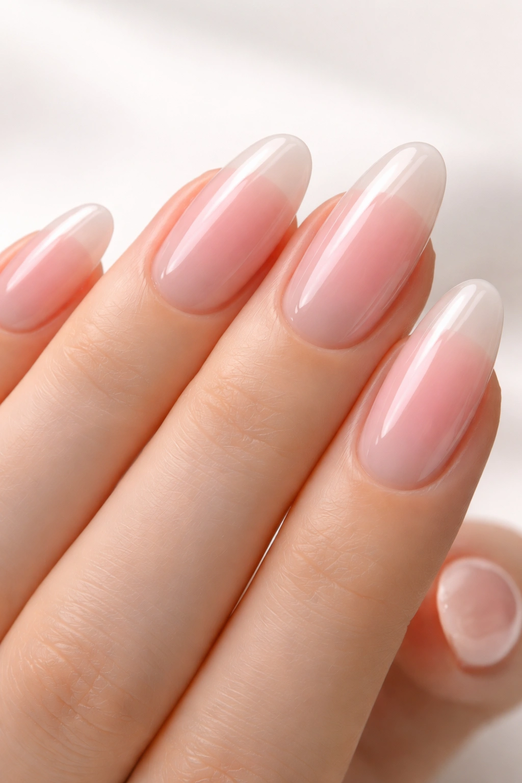
This is the contemporary take on the classic French — less graphic, more gradient-based, and somehow more modern despite being equally timeless. A clear or nearly clear nail base gradually transitions into soft pink tips with just enough sheer pigmentation that the transition feels organic rather than demarcated. This style feels like a soft-serve ice cream aesthetic, which sounds silly but actually reads as incredibly elegant when executed well.
The Builder Gel Effect That Looks Authentic
Builder gel bases are thicker and denser than standard acrylic, creating a nail that feels slightly weightier and more substantial in your hand. They photograph with beautiful depth and luminosity rather than the flat shine of glossy acrylics. The graduated color creates a subtle enhancement rather than a bold statement, which is exactly why this style has become the mainstay of upscale salons serving people who want their nails to look expensive but not aggressive.
Application Tips for Flawless Results
The oval shape is among the easiest to apply because it’s forgiving of minor misalignment — the rounded sides create natural shadows that hide small placement imperfections. Start with your ring and pinky fingers (the easiest ones to glue) and work your way to your thumbs (the trickiest). Let each nail set completely before pressing on the next. Most press-ons use tabs or glue that reach full adhesion within 24 hours, so avoid heavy hand washing or intense activities immediately after application.
Worth knowing: This style maintains its beauty throughout wear. As your natural nails grow underneath, the clear base means the regrowth looks like an intentional ombre rather than an obvious demarcation line.
9. Coffin Nails with Sophisticated Abstract Watercolor Design
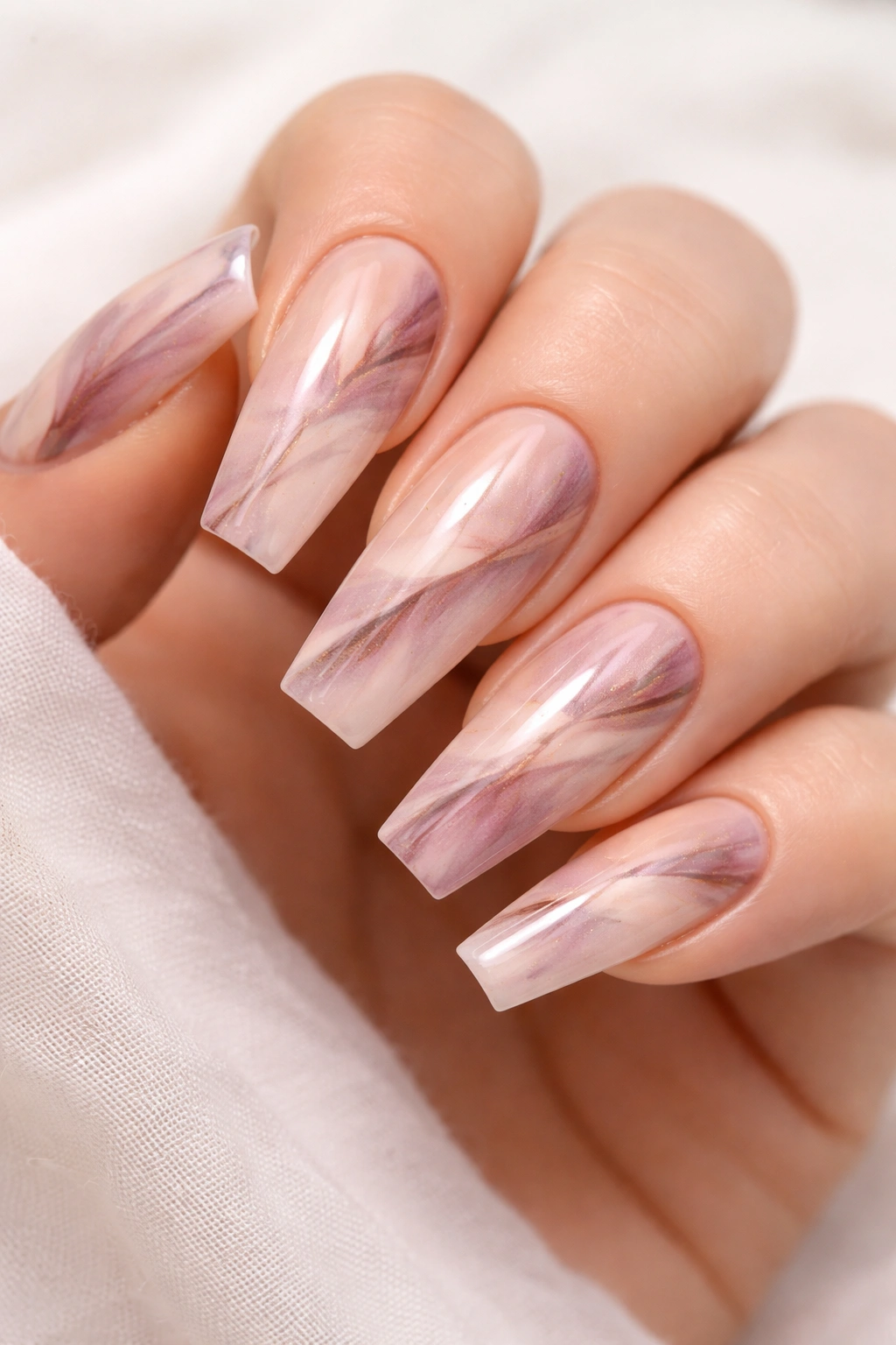
These nails elevate the design game without crossing into cartoonish territory. Subtle watercolor patterns — soft washes of color that blend and merge rather than forming defined shapes — feel artistic and high-end. Soft pinks, mauves, creams, and metallics wash together on a light or nude base, creating an effect that looks bohemian but still polished. This style works because the design is complex enough to be interesting but cohesive enough to feel intentional.
Artistry That Reads as Professional, Not Homemade
The difference between amateur and professional watercolor nail art comes down to color theory and constraint. A professional design uses a limited, complementary color palette rather than every color available. The colors are applied in a way that creates flow and movement rather than random splashing. There’s negative space — areas of the nail left plain — that gives the eye somewhere to rest. Cheap watercolor designs try too hard, overcomplicating every inch of the nail.
Why Coffin Shape Works for This Aesthetic
The elongated coffin shape gives plenty of surface area for the watercolor pattern to develop and breathe. The gentle taper creates a natural focal point at the tip where the design can intensify. Round or oval shapes constrain the pattern into a smaller space, making complex designs feel cramped. The coffin is the ideal canvas for any intricate, artistic nail design.
Pro tip: Seal the design with a professional top coat after application. Some adhesive can slightly blur delicate watercolor details, and a protective clear layer safeguards the artwork during wear.
10. Rounded Square with Subtle Dual-Tone Ombre and Micro Details
This is the style for someone who wants luxury sophistication without drama. A rounded square shape is modern and practical while still feeling intentional. A subtle ombre (perhaps nude-to-gray or cream-to-taupe) creates sophistication through understated color work. Micro details — very fine lines, tiny dots, or minimal accent elements — add complexity that reads as expensive customization rather than complicated design. The overall effect is “I have impeccable taste and I invest in quality.”
The Appeal of Minimalist Luxury Design
Truly high-end nails often follow the principle of “maximum sophistication through minimal elements.” Rather than filling every millimeter with design, this approach uses restraint and precision. A single thin line of gold, a tiny constellation of dots, or a barely-there accent creates an effect that feels curated and intentional. This is the nail equivalent of a designer handbag in a neutral color — the sophistication comes from quality and taste rather than loudness.
Choosing Micro Details That Actually Stay Put
Fine lines and tiny accents on press-ons can lift or blur if they’re not sealed properly. Look for sets that specify a protective topcoat or gel sealing. The details should be embedded into the nail surface or protected by a clear layer that extends fully over the design. Poor applications have details that sit on the surface and gradually flake away during normal wear.
Worth knowing: This style is arguably the most versatile for different occasions. You can wear these nails to corporate meetings, casual outings, or date nights without them ever feeling out of place.
Final Thoughts
The best press-on nails that pass for acrylics share key characteristics: thickness that blocks light rather than filtering it, professional-grade finishes that catch light realistically, shapes that feel intentional and refined, and designs (when present) that feel curated rather than overdone. They also require proper application — rushing the process or skipping preparation steps will sabotage even the highest-quality set.
What matters most isn’t finding expensive press-ons (though price often correlates with quality), but understanding what actually creates that “salon manicure” effect. It’s the opacity, the finish quality, the shape precision, and the dimensional detail work. Once you know what to look for, the good ones become immediately obvious — they feel different in your hand, they look different under light, and they stay put longer because the adhesive interface is engineered correctly.
Start with the styles that match your hand shape and daily lifestyle. If you’re typing constantly, stilettos might frustrate you; coffin or almond shapes offer elegance with practicality. If you prefer minimal maintenance, skip intricate designs and let a beautiful finish do the heavy lifting. The right press-on nails should feel like an investment in a polished version of yourself, not a compromise you’re tolerating until you can afford a salon visit.
