

White and blue coffin nails can look sharp, airy, polished—or cheap in a hurry. The colors don’t hide mistakes. White shows every ridge, blue can flood around the cuticle if the polish is rushed, and the coffin shape makes uneven filing stand out from across the room.
That’s why this color pairing is more interesting than it first seems. When it’s done well, white and blue coffin nails feel crisp without looking cold, and playful without tipping into cartoon territory. When it’s done badly, the shape turns clunky, the white looks chalky, and the whole set loses that clean edge people usually want from a coffin silhouette.
A small detail changes everything here: the shape needs a slim taper, not a harsh pinch. If the sidewalls are too wide, pale blue starts looking blocky. If the tip is filed too flat and too broad, even nice art can feel heavy. I also think white-heavy sets look better over a smoothed base—builder gel or a ridge-filling layer helps—because bright white polish is not forgiving.
Some designs lean crisp and graphic. Others feel soft, cloudy, almost porcelain-like. Those are the sets worth saving.
1. White and Blue Coffin Nails With Cobalt French Tips
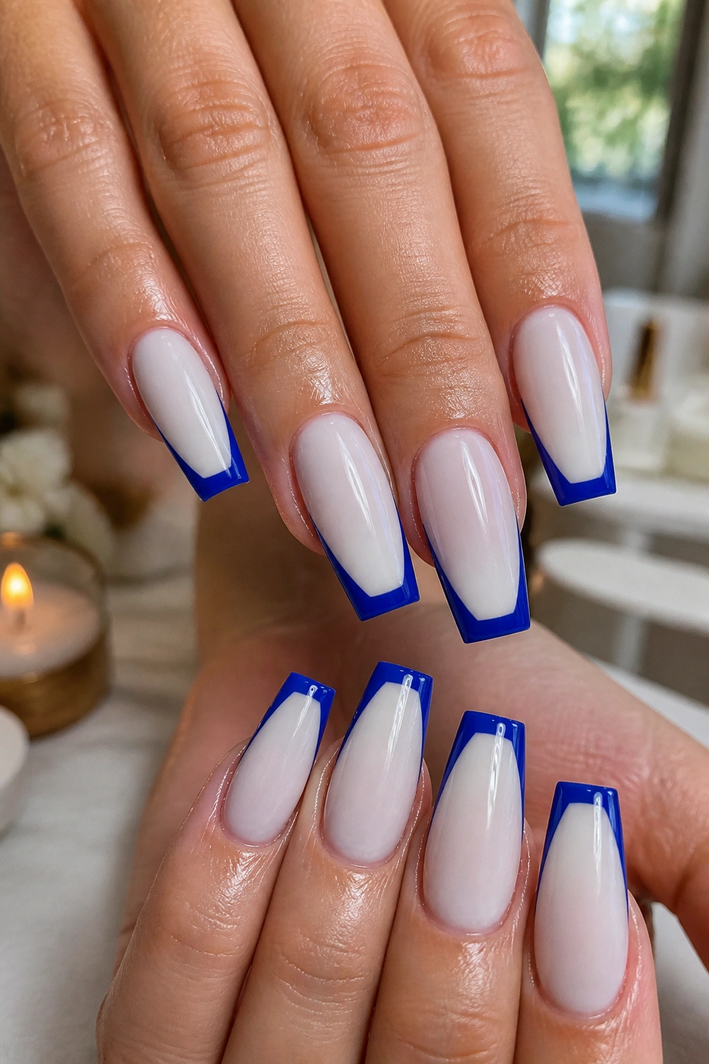
If you only try one design from this list, make it this one. A milky or crisp white base with saturated cobalt tips has the kind of contrast that makes coffin nails look intentional from ten feet away.
The trick is tip depth. On a medium coffin shape, a 3 to 4 mm French tip usually gives enough blue to frame the free edge without swallowing the nail. Go thinner and the design can look accidental. Go thicker and you start drifting into a full-color blue set.
Why It Works on Coffin Shape
Coffin nails already have a strong outline. A cobalt tip follows that geometry instead of fighting it. You get a neat border at the widest visual point of the nail, which makes fingers look longer and the taper look cleaner.
Bright white also keeps the design from turning heavy. I’d skip a stark, paper-white base if your nails are on the shorter side, though. A semi-sheer milky white softens the contrast and gives the blue room to stand out.
Quick Design Notes
- Best length: medium to long, with at least 10 to 12 mm of free edge
- Best finish: glossy top coat, no matte here
- Line shape: a soft smile line looks smoother than a dead-straight tip
- Extra detail: one tiny silver stud at the cuticle on each ring finger is enough
My take: cobalt French tips look expensive when the lines are crisp. Sloppy edges ruin them fast.
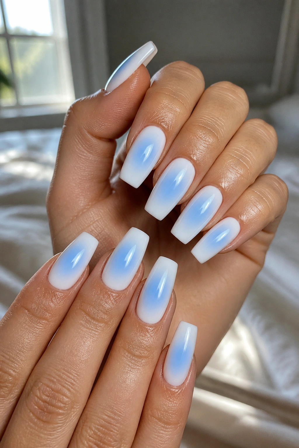
2. Milky White Ombré Fading Into Powder Blue
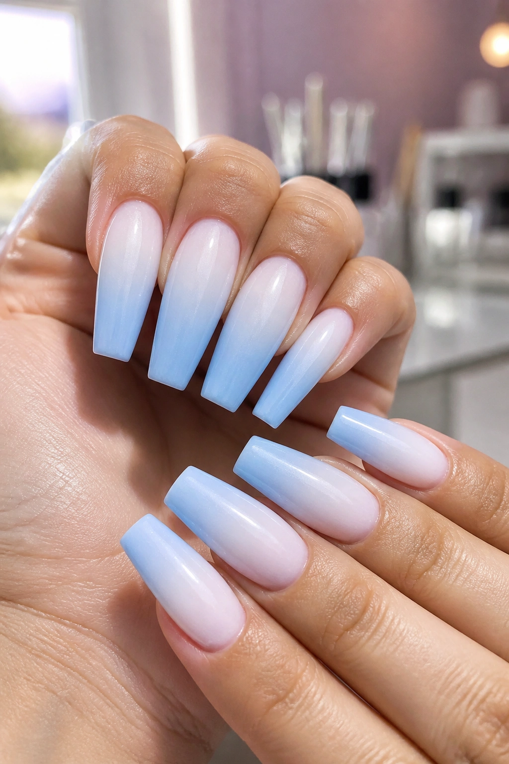
Why does this one keep showing up on well-done sets? Because ombré softens the bluntness of coffin nails in a way solid color never quite can.
A fade from milky white at the cuticle into powder blue at the tip gives you color without a hard dividing line. That matters on a coffin shape. Straight blocks of pale color can make the tip look wider than it is, while a smooth gradient stretches the whole nail visually.
Use the word milky on purpose when you ask for this set. Opaque white can make the fade look chalky. A translucent, creamy white blends into blue far better, whether the tech is airbrushing, sponging, or using a blooming gel method under a sheer layer.
How to Keep the Fade Soft Instead of Patchy
The blue should build slowly over the last third of the nail, not crash into the center. Think 60 percent white, 40 percent blue, with the deepest color parked near the free edge. That placement keeps the nail airy.
I also like this set with a little length—say 12 to 16 mm beyond the fingertip—because the gradient has room to breathe. On shorter coffin nails, the fade can still work, but it needs a lighter blue and less contrast.
Skip glitter here. The whole point is the cloud-like blend.
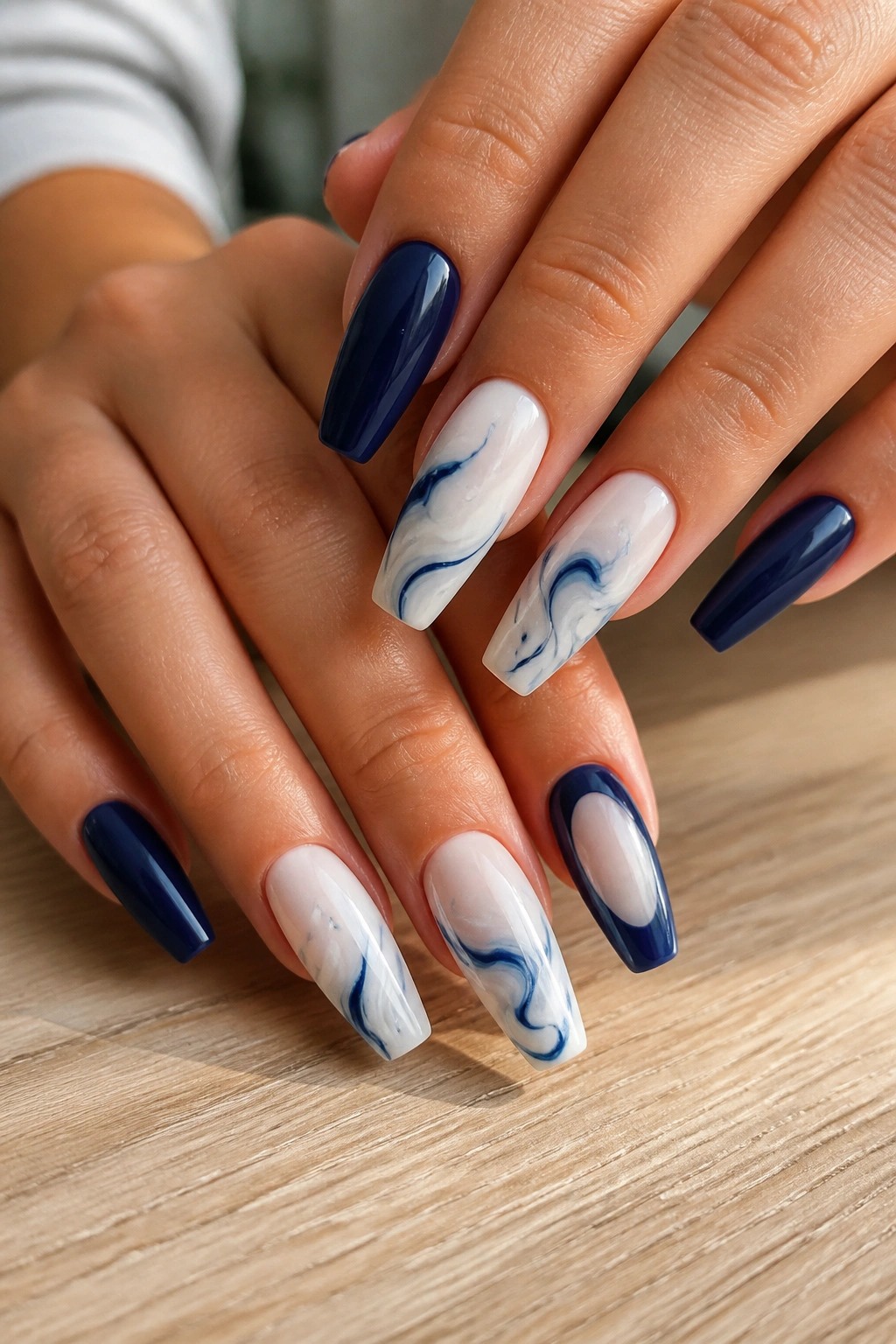
3. White Marble With Inky Blue Veins
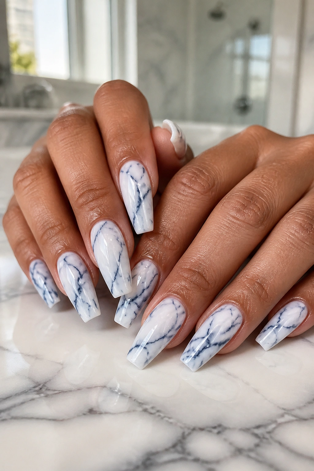
Picture a glossy ceramic mug, white with those thin blue lines running through it. That’s the mood here, and on coffin nails it reads far cleaner than full marble in five different colors.
This design lives or dies by the veining. Too many lines and it looks busy. Too few and it looks unfinished. The sweet spot is a sheer or soft white base with two or three inky blue veins per nail, plus one blurred branch line that breaks away from the main streak.
A nail tech usually gets this look with blooming gel, a fine liner brush, or a quick drag through wet polish. The blue should not be a bright pastel. It needs some ink in it—navy, cobalt, or a deep royal blue thinned slightly so the lines feather at the edges.
What Makes Marble Look Real
Natural-looking marble has variation. One line starts thicker, then thins out. Another barely shows. A little translucent pooling near one side makes the design feel less stamped and more stone-like.
- Use glossy top coat so the surface looks like polished tile
- Keep one or two nails plain white if you want the set to breathe
- Ask for fine silver foil only if the veins are sparse
- Medium-long coffin shape gives the pattern enough room to travel
The best marble sets don’t look identical nail to nail. That tiny inconsistency is what makes them convincing.
4. White Chrome With Navy Half-Moons
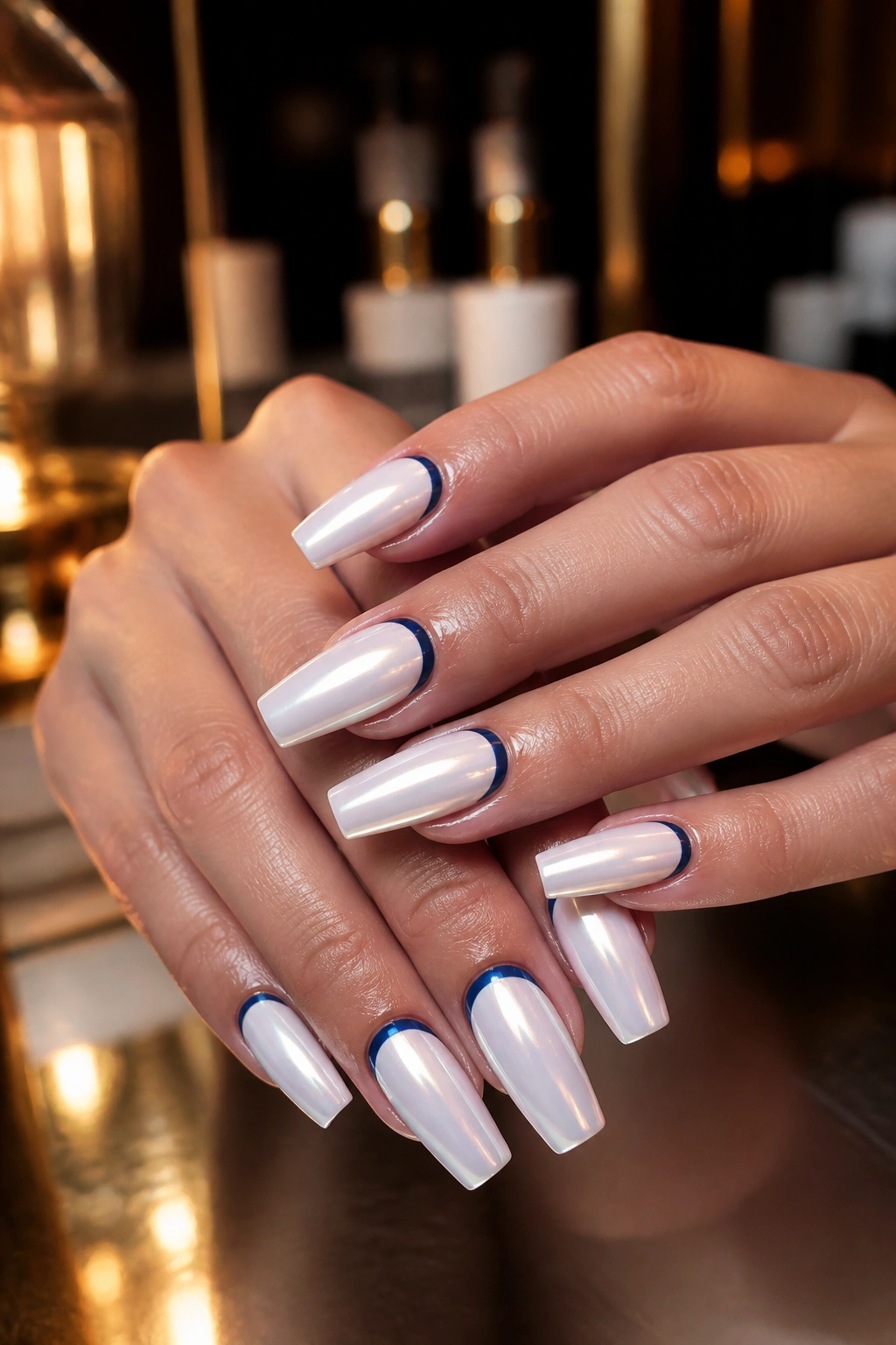
Chrome gets written off as flashy, which is unfair. A soft white chrome finish can look almost pearly, and once you pair it with navy half-moons near the cuticle, the whole set turns graphic in a smart way.
You’re not looking for a mirror-metal effect here. The nicer version is a glazed white surface—almost like pearl powder over milk-white gel—with a curved navy crescent hugging the base of the nail. That half-moon can be glossy against chrome, or matte against chrome if you want more contrast.
The reason this design suits coffin nails is shape contrast. The tip of the nail is flat and structured. The cuticle detail is curved. That push-pull gives the manicure a finished feel without needing rhinestones, decals, or extra accent nails.
I like this on medium length more than extra-long length. On a huge coffin shape, the half-moons can start to feel too far from the tip and the design loses tension. Keep the crescents thin—about 2 mm at their tallest point—and let the chrome do the rest.
One warning, though. Chrome shows scratches faster than plain gel. If you’re hard on your hands, this is a better weekend set than a two-and-a-half-week workhorse.
5. Delft-Inspired Floral Blue and White Coffin Nails
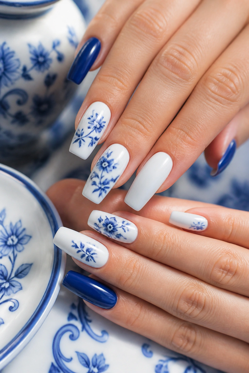
Tiny blue florals on a soft white base have a ceramic quality that never feels random. They remind me of old plates, tiled walls, painted pottery—objects with crisp edges and hand-done detail. On coffin nails, that little bit of tradition looks fresh because the shape is modern and sharp.
Placement Makes the Difference
Do not paint every nail full of flowers. That’s where sets like this go off track. The design lands better when two or three nails carry the floral work, one nail stays solid blue, and the rest remain milky white or sheer white.
The flowers themselves should stay small. A blossom wider than 5 or 6 mm starts to eat the whole nail. Fine stems, tiny leaves, little curved petals—that’s enough. Deep cobalt or Delft-style blue gives the art the right ceramic feel.
The Finish Should Stay Simple
Gloss is the safest finish because it mimics glazed porcelain. Matte can work, but it loses part of the reference. If you want extra detail, a micro-dot border near the tip or cuticle ties the whole set together without making it fussy.
This is one of those designs where hand-painting matters. Stamping can look neat, but painted florals have slight pressure changes in the lines. You notice it. Your eye reads that variation as craft, and that’s what makes the manicure feel considered instead of mass-produced.
6. Sky Blue Base With Soft White Cloud Art
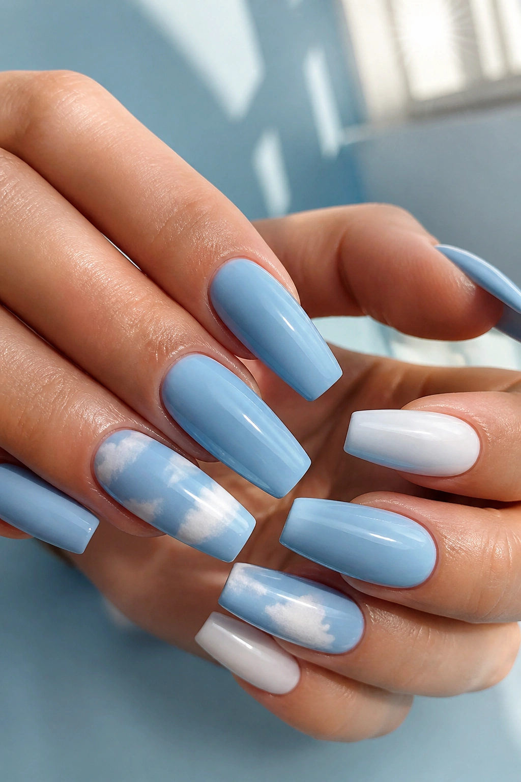
Childish? Not if it’s done with restraint.
Cloud nails go wrong when the blue is too bright and the cloud shapes are too puffy. A dusty sky blue or faded baby blue base keeps the design calm, and soft white clouds dabbed in with a dry brush look more like mist than cartoon bubbles.
You do not need clouds on every nail. In fact, I’d avoid that. Two cloud nails on each hand is plenty, with the others left solid blue, sheer white, or finished with a thin white micro-French. That mix keeps the set wearable outside of vacation photos.
The edges of the cloud matter more than people think. Hard outlines make them look sticker-like. A better cloud has a faded lower edge and a brighter white center, almost like the polish was tapped on in layers.
A few ways to keep this design grown-up:
- Choose blue with a gray undertone, not candy blue
- Keep the clouds small and off-center
- Mix in plain nails so the art has contrast
- Use glossy top coat for a wet-sky finish
Done right, this design feels airy. Done wrong, it feels like a themed birthday set. There is a difference.
7. Alternating Navy Solids and White Swirl Nails
Unlike a fully detailed set, this one gives you strong contrast without adding twenty minutes of fine art. Alternating textures and line work does the heavy lifting.
Here’s the layout I like most: two solid navy nails, two milky white nails with cobalt or navy swirls, and one accent nail that flips the pattern—white swirl over blue, or blue swirl over white. That break in pattern keeps the set from looking too planned.
Swirl art works well on coffin nails because the shape is blunt and straight. The curves soften it. A swirl that starts near one sidewall and snakes diagonally toward the tip also makes the nail look longer, which is handy if your coffin shape is medium rather than dramatic.
Keep the lines thin. About 1 mm is plenty. Thick swirls can crowd the nail fast, and once they start touching each other the whole thing loses air. I also think navy works better than bright blue here because it gives the white room to stand apart.
This is a good choice if you like bold color but don’t want stones, charms, or raised gel art. It still has personality, but it wears more easily through daily life. Less snagging. Less fuss. Still sharp.
8. White and Blue Coffin Nails With an Icy Glitter Fade
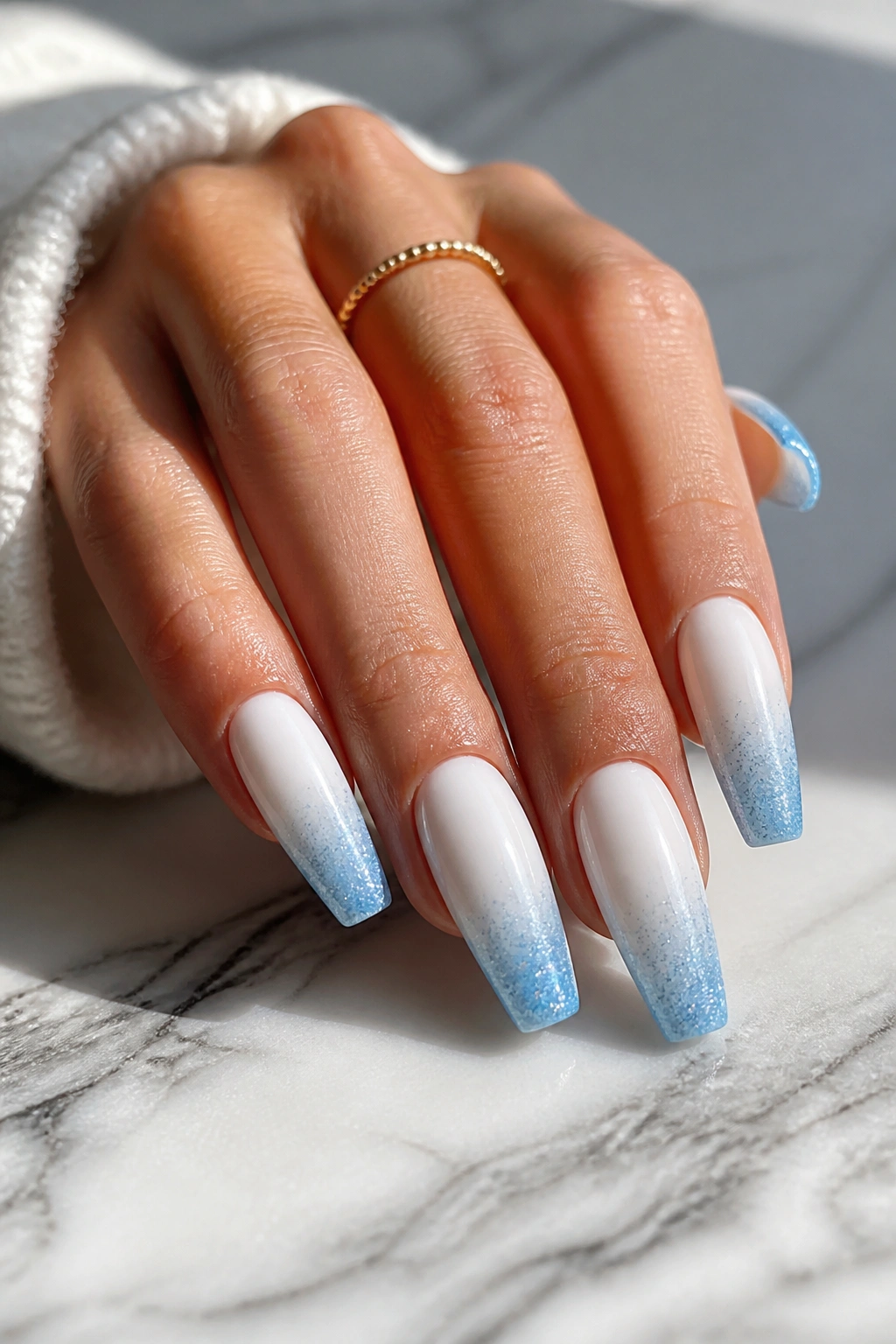
Glitter looks cleaner when it starts at the tip. I’ll defend that point every time.
On coffin nails, a white base with an icy blue glitter fade pulls the eye outward toward the shape, which makes the taper look slimmer. Starting glitter at the cuticle often does the opposite. It crowds the nail bed and makes growth more obvious after a week.
Use fine glitter, not chunky craft-style pieces. Reflective micro-glitter or a blue shimmer gel gives that frosted look without creating a bumpy surface. The nicest version has a solid or milky white base, with glitter packed at the free edge and fading upward over the last half of the nail.
What Keeps It From Looking Cheap
Encapsulation helps. A thin layer of builder gel over the glitter, then filing, then top coat, gives you a flat glassy surface. Without that step, the texture can feel rough and the sparkle can look scattered.
- Best base: creamy white, not stark correction-fluid white
- Best glitter tone: icy blue, silver-blue, or pale sapphire
- Best length: medium-long so the fade has room
- Good accent move: leave one nail solid white for contrast
A little sparkle goes a long way here. Once every nail is packed with glitter from edge to edge, the design loses its clean wintery—well, not wintery, more icy—feel and turns noisy.
9. Porcelain Stripe Nails With White Base and Blue Lines
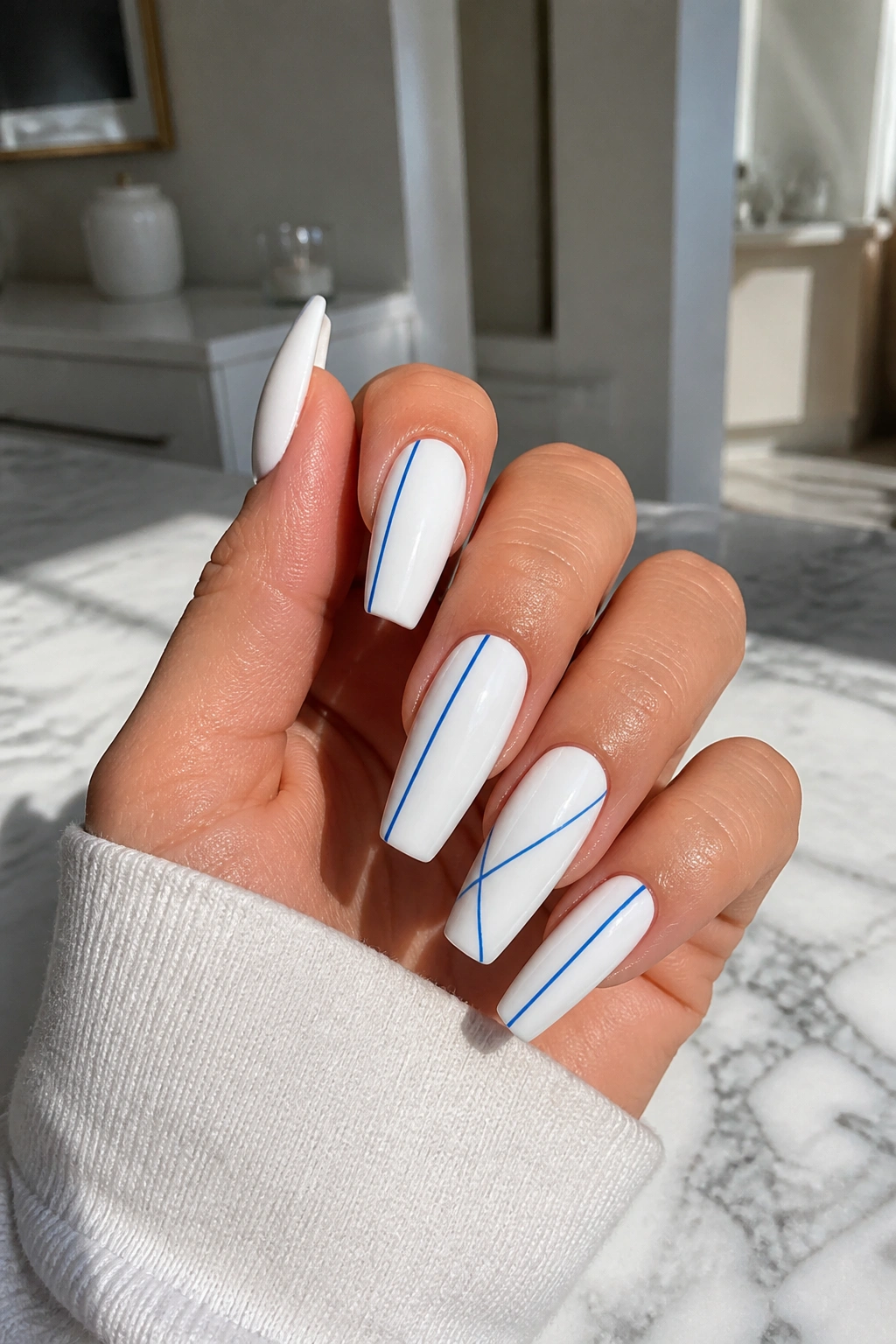
This one has a tailored look that I love on coffin shapes. Think of a crisp white nail with one or two razor-thin blue lines running vertically, diagonally, or framing one side like trim on a porcelain tile.
The appeal is control. A line that thin leaves a lot of white space, and white space is your friend on coffin nails. It stops the shape from feeling crowded. If your nail beds are on the wider side, vertical stripes are useful because they visually narrow the plate.
You don’t need symmetry on every nail. In fact, I would avoid it. One nail can have a single cobalt stripe off-center. Another can carry two micro-lines near the sidewall. A third can stay plain white. That irregular layout looks more editorial than matching pinstripes on all ten nails.
Gloss works best. Matte stripes on matte white can disappear, and chrome lines can pull too much focus unless the rest of the set is stripped back. Ask for a liner brush line no thicker than 0.5 to 1 mm. The width matters more than people expect.
If you like clean designs but want something less expected than a French tip, this is one of the smartest ways to wear blue and white together.
10. Baby Blue Aura on Milky White Coffin Nails
Want color without covering the whole nail? A baby blue aura does that in one soft blur.
Aura nails place the color in the center of the nail, leaving a pale border around the edges. On a milky white coffin base, that blue halo effect looks soft but still deliberate. The shape stays crisp because the perimeter is light, while the center adds enough color to keep the manicure from looking plain.
The Placement Changes Everything
A centered aura gives a classic diffused look. Shift the blue slightly higher, toward the upper middle of the nail, and the set starts looking brighter and longer. Push it too close to the cuticle, though, and the nail bed can look shorter.
Airbrush gives the smoothest result, but a sponge blend can still work if the color is sheer. Ask for jelly blue rather than full-opacity pastel. Sheer pigment diffuses better, and the milky edge stays visible instead of getting swallowed.
I like this design with a high-gloss top coat and no extra art. No gems. No foil. Maybe one nail with a tiny white star if you need a small detail, but I’d rather keep the set clean. The blur is the whole point.
11. White 3D Bow Accent With Blue Pearl Details
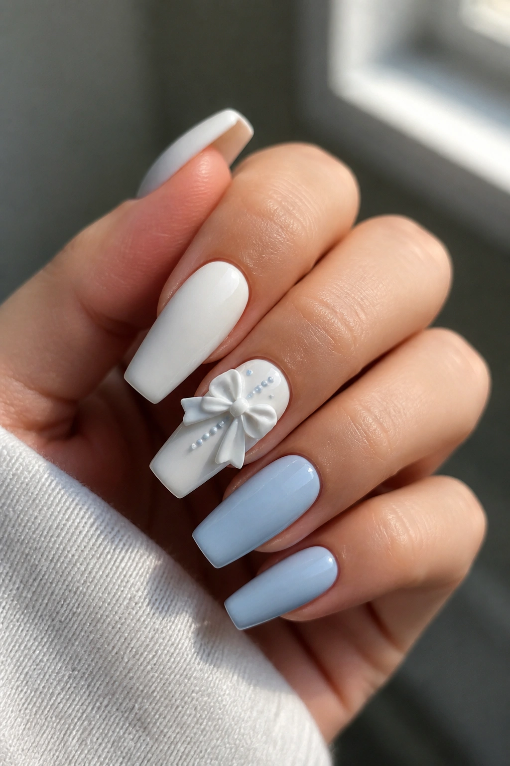
I’d save this one for days when you want the nails to feel a little dressed up, because raised details always pull focus. The key is using them sparingly.
A sculpted white bow on one accent nail—usually the ring finger or middle finger—paired with tiny blue pearl details gives the set depth without taking over the whole hand. The rest of the nails should stay quiet: solid milky white, pale blue, or a clean French tip.
The bow matters less than the placement. Put a chunky 3D bow dead center on every nail and you’ll hate your pockets within hours. Place one bow near the cuticle or slightly off-center, keep it low-profile, and the design stays wearable.
A few details worth thinking about before you commit:
- Flat-backed blue pearls snag less than round beads
- A builder gel bow sits cleaner than a large acrylic charm
- Keep raised art to one or two nails total
- Do not bury pearls under thick top coat; seal around them instead
- Medium length wears this design better than extra-long length
This is not an everyday office set for most people, and that is fine. Nails do not always need to be practical to be worth wearing. They do need to be placed smartly, though.
12. Matte Navy Coffin Nails With Glossy White Outlines
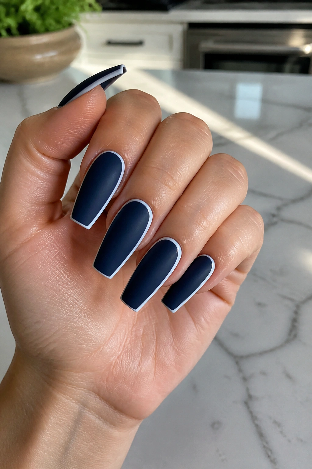
Matte can make long coffin nails look sharper than gloss. That soft, light-absorbing navy surface gives the shape a flatter, cleaner face, and once you trace part of it with a glossy white outline, the contrast feels architectural.
You can outline the full perimeter of the nail, but I think partial framing looks better. A white line along one sidewall and across the tip has more tension than a full border. It leaves the design slightly unfinished in a good way—your eye completes it.
There’s also a texture trick happening here. Navy matte recedes. Glossy white pulls forward. That difference means the design reads from a distance even when the line is thin. You don’t need thick paint to make it noticeable.
One practical note: matte top coat collects fingerprints, oil, and makeup residue faster than glossy finishes. Wipe the nails with alcohol or a gentle cleanser every few days if you want that velvety surface to stay clean. Also, keep the white liner crisp. Wobbly outlines look harsher on matte because nothing reflects light to blur the edges.
This design has a cool, slightly graphic mood without tipping into full-on abstract art. Sharp. Quiet. A little severe, maybe—that’s why I like it.
13. Blue Checkerboard Accent on a Crisp White Set
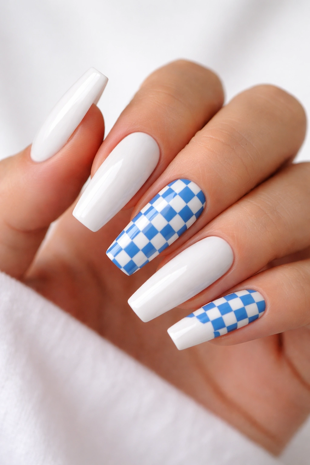
This one can go wrong fast, which is exactly why it looks so good when it’s done with discipline. Checkerboard needs restraint.
The cleanest version keeps the checker pattern on one or two accent nails only. Pair those with mostly white nails, then add one solid blue nail or one slim French tip so the set feels connected rather than random. Once checkerboard spreads across all ten nails, the coffin shape starts fighting the print.
Scale Matters More Than Color
Big squares feel clunky on a tapered nail. Small squares—about 2 to 3 mm each—fit the shape better and look more polished. A medium cobalt, denim blue, or soft navy all work. Bright electric blue can still work, but it turns the manicure much louder.
A Layout That Usually Lands Well
- Thumb: solid white
- Index: white with blue French tip
- Middle: blue-and-white checker accent
- Ring: solid white or milky white
- Pinky: solid blue
That kind of spacing gives the eye a break. It also makes grow-out less noticeable than a full checkerboard set, which matters if you like to stretch your fill appointments a bit longer than your tech would prefer.
14. Dusty Blue Base With White Lace Detail
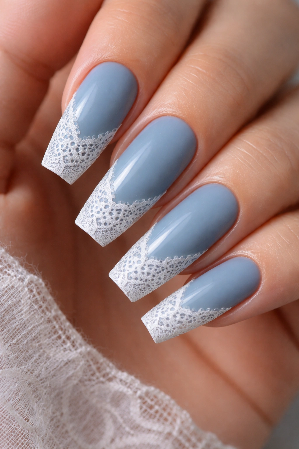
A dusty blue base with painted white lace has a fabric-like softness that coffin nails usually don’t have on their own. The shape is structured. The lace is delicate. Together, they keep each other in check.
This design needs a muted blue—something chalky, gray-blue, or faded cornflower. Bright blue makes the lace look costume-like. A softer base gives the white detail room to read as thread, not just random squiggles.
Lace also looks better when it follows a clear zone. Along the tip, near one sidewall, or cascading from the cuticle downward by a third of the nail—those placements feel intentional. A full nail of lace can work, but only if the pattern stays open with tiny gaps. Dense lace turns muddy once top coat hits it.
You can get this look through stamping, stickers, or hand painting. Hand painting has the nicest line quality, but I won’t pretend stamping can’t look neat when it’s done well. For wear, matte blue with glossy white lace gives a subtle texture contrast. Gloss on both layers works too if you want the design to feel more polished and less textile-like.
This set suits dressier clothes, sure, but it also looks good with a plain white shirt and denim. That contrast is half the point.
15. White and Blue Coffin Nails With Ocean-Tinted Tips
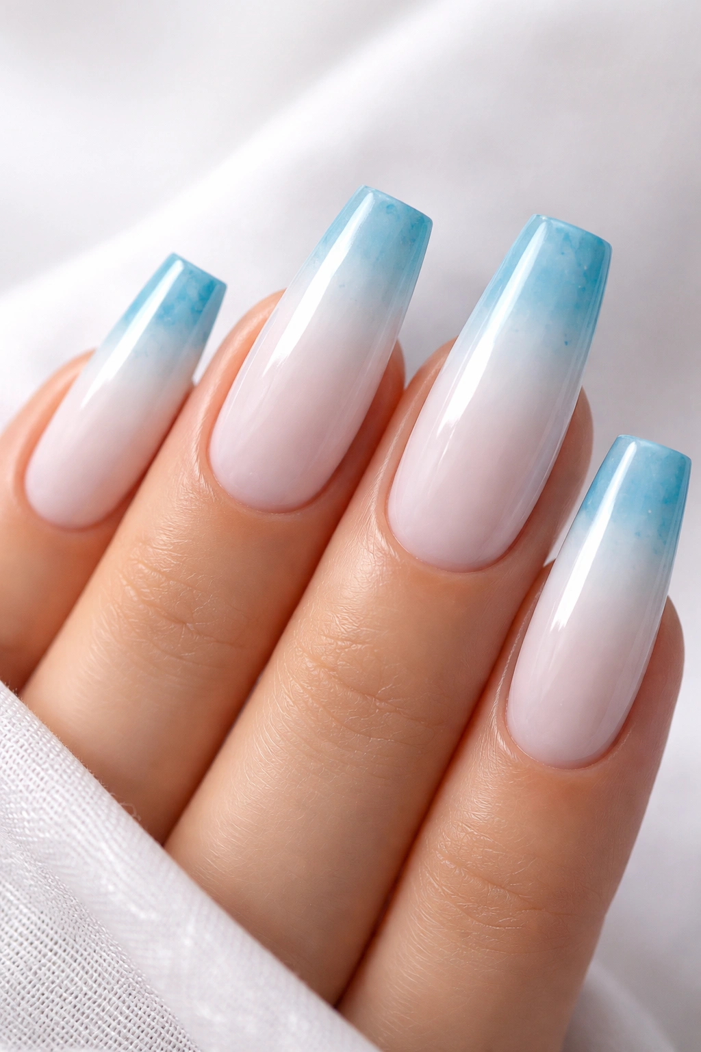
Unlike a standard French manicure, this design uses a translucent white base and watercolor-like blue tips that look as if the color drifted into place instead of being painted in a hard line. That blur makes the whole set feel lighter.
The blue should sit somewhere between sea glass and shallow water. Too dark, and the effect stops looking fluid. Too pale, and it disappears. Jelly blue, sheer aqua-leaning cobalt, or a washed sapphire tone all work well as long as the color is transparent enough to let some light through.
Best Finish Choices
A high-gloss top coat gives the tips that wet, glassy effect. If you want more edge, a whisper-thin silver line where the blue fades into the base can sharpen the transition without turning it into a formal French.
A few design tweaks I’d consider:
- Blur the blue over the last third of the nail, not halfway up
- Keep the base sheer white rather than opaque
- Add silver foil to one accent nail only if you want more shine
- Use medium-long coffin shape so the watercolor edge has space to spread
I like this set most when it stays airy. The minute you pile shells, rhinestones, glitter, and chrome on top, the water effect gets buried. Leave some space. It pays you back.
Final Thoughts
The smartest white and blue coffin nails all understand the same thing: the shape is already doing part of the work. You do not need heavy art on every finger to make the manicure feel finished. A crisp cobalt French, a soft powder-blue fade, or a few porcelain-like lines can say more than a crowded set ever will.
White polish asks for care. Keep that in mind before you book anything with a lot of bright white surface area. Self-tanner, hair dye, turmeric, and makeup transfer can stain the free edge faster than people expect, and a fresh layer of glossy top coat every few days helps more than most aftercare advice.
If I had to narrow the field, I’d start with cobalt French tips for contrast, milky blue ombré for softness, and porcelain stripes for a cleaner graphic look. Those three cover most moods, and each one lets coffin nails look like coffin nails—sharp, slim, and a little self-assured.
