

Squoval nails—that perfect hybrid between square and oval—have become the go-to shape for anyone who wants the durability and structure of a square nail with the softer, more flattering edges of an oval. But the real magic happens when you pair this versatile shape with rich, jewel-toned colors that feel sophisticated, wearable, and endlessly elegant. Rich tones don’t demand attention through brightness; they command it through depth, complexity, and that understated luxury that actually photographs well and looks polished in real life, not just on Instagram.
The beauty of working with rich-toned squoval nails is that you’ve got serious range. You can go moody and dramatic with deep burgundy or forest green, create an unexpectedly feminine look with chocolate brown, or lean into that expensive-looking aesthetic with a luxe gold or bronze. These colors work for literally every season, every occasion, and every age—they’re professional enough for the office, interesting enough to stand out without screaming for attention, and versatile enough to pair with anything in your closet. Whether you prefer minimalist designs or intricate nail art, the squoval shape gives you the canvas to pull it off.
What makes these 15 designs stand out isn’t just the color choice—it’s the specific techniques, finishes, and accents that transform a simple rich tone into something genuinely covet-worthy. Some of these designs use metallic touches, others play with texture, and some rely on clean geometric lines or subtle details that reward close inspection. Each one works beautifully on squoval nails because this shape strikes that ideal balance between modern and timeless, bold and wearable.
1. Deep Burgundy with Gold Geometric Lines
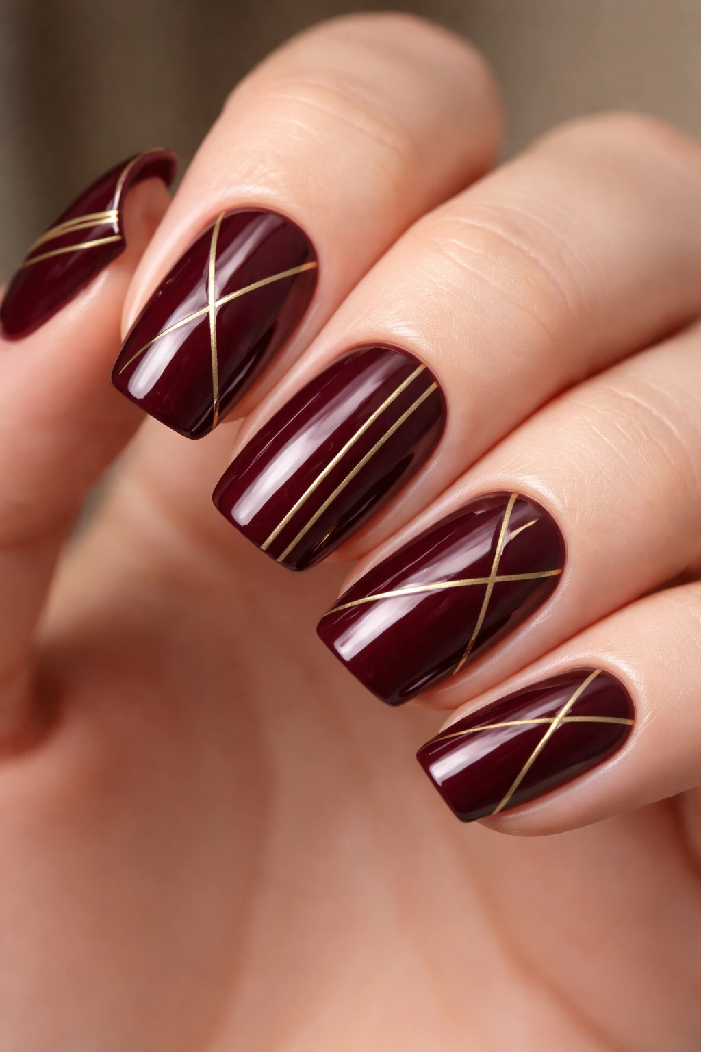
Deep burgundy is the rich tone that quietly does everything. It’s warm enough to feel luxurious, dark enough to look expensive, and universally flattering on every skin tone. This design keeps the color centered and adds fine, hand-painted (or nail-striped) gold lines that create angular geometric patterns across the nail—think triangles, thin vertical stripes, or asymmetrical bar designs that only cover portions of the nail.
Why This Design Works on Squoval Nails
The structured lines on a geometric design actually benefit from the squared-off edge of a squoval shape. The geometry feels intentional and architectural rather than accidental. Burgundy is a color that absolutely sings on shorter nails because it reads as so polished—you don’t need length to make it impressive. The gold detailing adds just enough visual interest to keep the design from feeling plain while staying completely office-appropriate.
How to Achieve This Look
Start with two smooth coats of a deep burgundy like OPI’s “An Affair in Red Square” or Sally Hansen’s burgundy. Let it dry completely. Using a thin striping brush or the precision tip of a gold gel pen (if you’re doing gel), paint delicate gold lines with a steady hand. If you’re not confident in hand-painting, nail striping tape in gold is your friend—press it onto the nail in your desired pattern, paint over it with gold, then carefully peel the tape off while the polish is still slightly tacky. Seal with a clear topcoat.
Pro tip: Don’t make the gold lines perfectly symmetrical on every nail—let them vary slightly from finger to finger. That organic asymmetry is what prevents the design from looking like a template.
2. Chocolate Brown Shimmer Base with Burgundy Swirl
This design combines two rich tones for a sophisticated two-color effect that honestly looks harder to do than it actually is. Chocolate brown serves as your base—rich, understated, and deeply flattering. Over that, you’ll add a swirl or marbled effect in burgundy using either freehand brushwork or a water marble technique that pulls the dark burgundy through the brown in organic, flowing patterns.
Why This Design Feels So Luxe
The contrast between two rich tones creates depth and dimension that a single color can’t achieve. You’re using value contrast (light and dark) rather than bright-color contrast, which reads as refined instead of playful. Swirled or marbled nails feel bespoke and custom, like each nail is unique. The shimmer in the base catches light and makes the whole manicure feel more expensive and polished.
How to Achieve This Look
Apply two coats of chocolate brown shimmer as your base. Once fully dry, use a smaller detail brush to swirl burgundy polish onto the nail in flowing, organic patterns—think smoky wisps rather than precise shapes. You can do this freehand, or if you want more control, use the water marble method: fill a cup with room-temperature water, drop your burgundy and chocolate brown into concentric circles, create a pattern with a toothpick, then dip your nail in at an angle. Seal everything with a glossy topcoat, which really brings out the dimension.
Pro tip: If you mess up the swirl, a thin topcoat can diffuse harsh lines and soften the effect into something more blended and intentional-looking.
3. Forest Green with Matte Finish and Metallic Accents
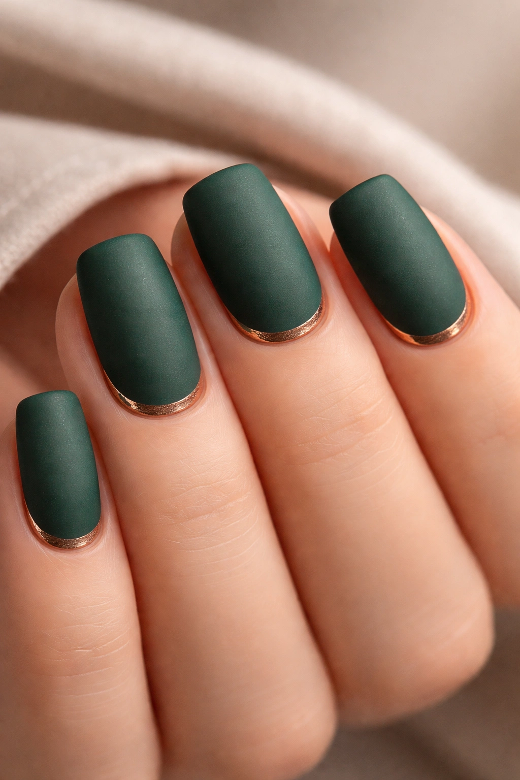
Forest green is one of those rich tones that feels like a secret—people respond to it emotionally even if they can’t name exactly why. Pair a deep forest green matte topcoat with tiny accents in metallic copper or gold on the cuticle line or as a thin frame around the edge of the nail, and you’ve got something that looks expensive and creative without being over the top.
Why It’s Genuinely Elegant
Matte finishes automatically read as more sophisticated than glossy ones—there’s something about the way light doesn’t bounce off a matte nail that makes it feel more intentional and editorial. Adding metallic accents to a matte base creates a beautiful textural contrast without introducing a second bright color. Forest green on squoval nails feels naturally balanced—not too edgy, not too safe.
How to Achieve This Look
Paint two coats of forest green (like Sally Hansen’s “Emerald Bay” or OPI’s “Suzi Says Feng Shui”). Once dry, apply a matte topcoat—this is a non-negotiable step because it transforms the entire vibe of the color. Once the matte topcoat is fully set, use a thin brush or striping brush to paint metallic accents. A thin metallic line along the cuticle line creates a subtle frame effect, or you can do a thin border around the edge of the nail. Seal with a glossy topcoat (yes, glossy over matte creates a really interesting effect—it catches light and adds depth).
Pro tip: If you’re nervous about hand-painting metallic details, use striping tape to create perfectly clean lines, then paint your metallic color over it.
4. Oxblood Red with Subtle Gradient to Black
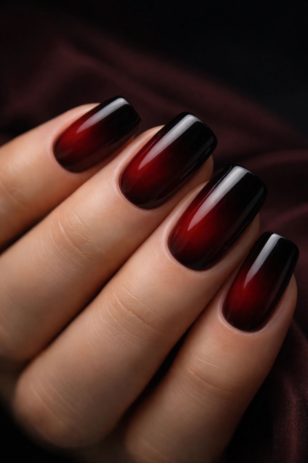
This is a dramatic design that somehow feels both bold and completely wearable. Oxblood (that deep, almost-brown red) transitions into black using an ombré or gradient technique, creating a smoky fade effect that’s mesmerizing. The gradient doesn’t have to be perfectly blended—slightly blurred and moody is actually more interesting than pristine.
Why This Gradient Is So Effective
Gradients create movement and visual interest while staying monochromatic, which means they never look dated or overly trendy. The shift from warm (oxblood) to cool (black) is sophisticated and creates depth. On squoval nails, this gradient follows the shape naturally and flatters the finger because the color gets darker toward the tips, which is inherently lengthening.
How to Achieve This Look
Apply two coats of oxblood as your base. Once dry, use a makeup sponge to stipple black polish onto the tips and blend it upward into the oxblood using a dabbing motion (not dragging, which can leave harsh lines). Keep working with the sponge, layering and blending, until you’ve got the gradient effect you want. Some people prefer to do this with a blending brush instead of a sponge—experiment and see which tool gives you the look you’re after. Finish with two coats of topcoat, which helps even out the texture from the sponge application.
Pro tip: Do the gradient on one practice nail (like a fake tip) first. That single practice run will teach you exactly how much pressure and layering you need.
5. Navy Blue with Negative Space French Tip
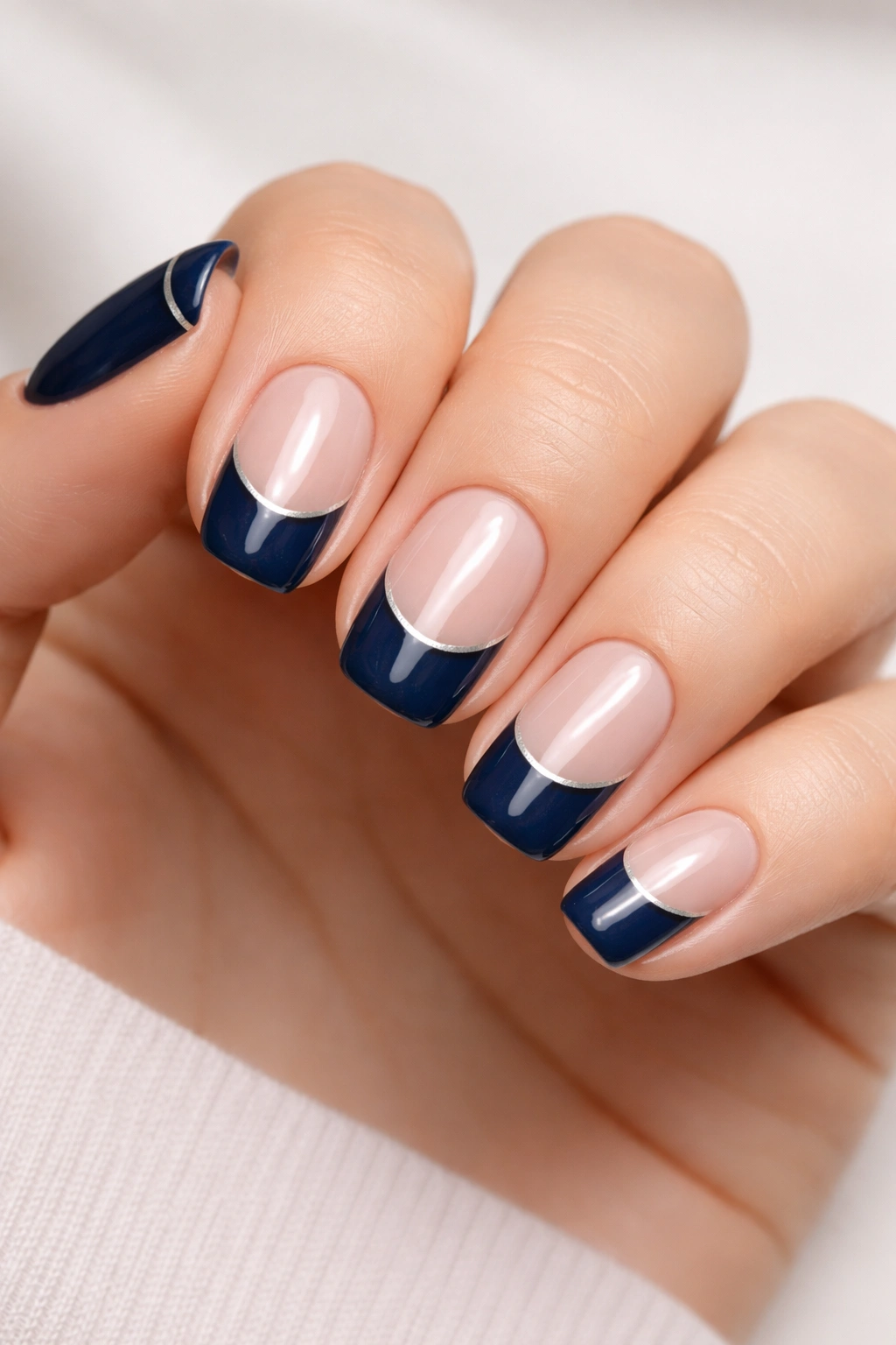
Navy is the quiet luxury of rich tones—it’s what a billionaire’s jewelry looks like. This design keeps most of the nail in navy but creates a negative space French tip effect where the tip of the nail is left bare (just natural nail or base coat). You can add the tiniest accent of gold or silver in the corner for an extra touch, but the strength of this design is its simplicity.
Why Minimalism Enhances Rich Tones
When your color is already doing the heavy lifting—and navy absolutely is—you don’t need to add much else. A negative space French tip feels modern and intentional while being incredibly easy to execute. It breaks up the color visually without adding a second color, which keeps things refined. On squoval nails, this effect looks particularly chic because the straight edge of the square makes the negative space super clean.
How to Achieve This Look
Apply base coat and let it dry. Paint the entire nail in navy. Once completely dry, use striping tape or a French tip guide to mask off the last ¼ to ½ inch of your nail, leaving just the tip bare. If you want a metallic accent, paint a tiny line of gold or silver in one corner of the negative space while your tape is on. Carefully remove the tape (this is crucial—do it while the polish is just barely set, not completely dry). Seal with topcoat, making sure you seal the raw edge of the tape line so it doesn’t chip.
Pro tip: If your tape line isn’t perfectly clean, a tiny brush dipped in base coat can clean up any fuzzy edges before you seal it all with topcoat.
6. Plum Purple with Velvet or Suede Finish
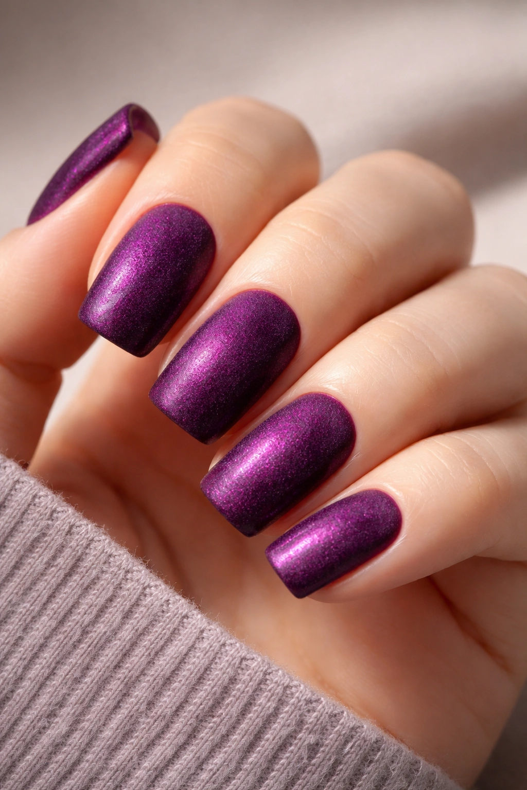
Plum is a rich tone that exists in that magical zone between purple and burgundy—warm enough to feel luxurious, cool enough to feel modern. Adding a velvet or suede finish (a special topcoat that creates a velvety texture) transforms it into something genuinely tactile and unique. This is a design where the texture is the entire point.
What Makes Velvet Finish Special
Velvet topcoats create a texture that genuinely stops people—they want to touch your nails. It’s one of the only nail finishes that reads as luxury because it’s unexpected and requires a special product. Plum in a velvet finish feels editorial, sophisticated, and nothing like standard manicures. The color becomes even richer because the matte texture eliminates shine and creates shadow.
How to Achieve This Look
Apply two coats of plum (Essie’s “Plumberry” or Sally Hansen’s “Plum Crazy” work beautifully). Once completely dry, apply a velvet or suede finish topcoat according to the product instructions. Some velvet topcoats are applied directly over wet polish, while others go over dry polish—read your product. The finish will look slightly dull or matte at first, but that’s exactly right. You can seal it with a clear topcoat if desired, though some people prefer the raw velvet texture.
Pro tip: Velvet finishes are more delicate than regular topcoats, so consider this a special-occasion manicure rather than an everyday one. The texture is also slightly harder to clean, so keep a nail brush handy.
7. Terracotta Bronze with Metallic Copper Strokes
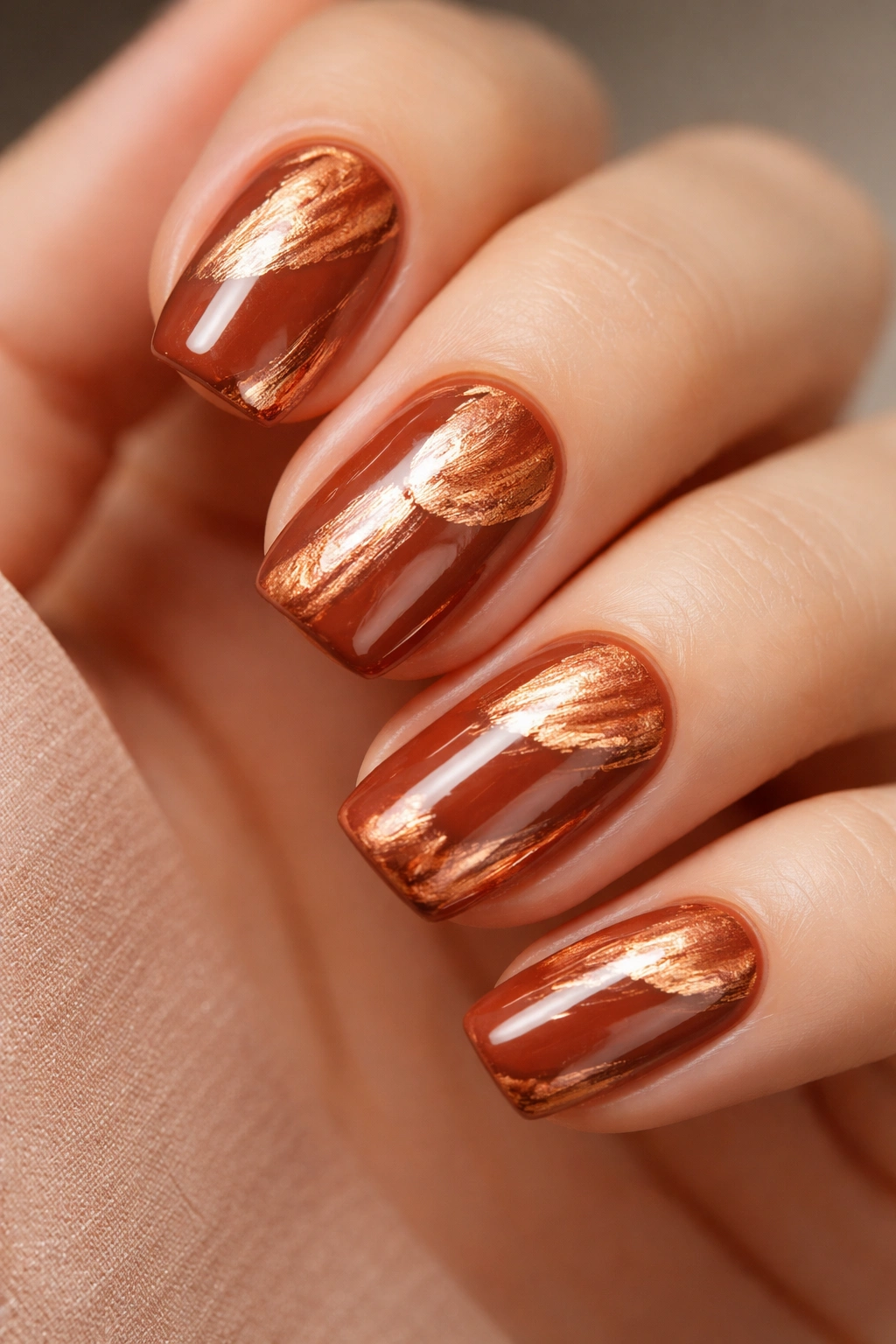
Terracotta is that warm, earthy rich tone that somehow works on every skin tone and in every season. This design keeps terracotta as the main event but adds irregular, freehand strokes of metallic copper that look almost like brushstrokes you’d see in abstract art. The strokes don’t follow a pattern—they’re intentionally organic and varied from nail to nail.
Why Organic Metallic Details Feel Artistic
Freehand metallic strokes feel less formal and templated than geometric designs. They celebrate imperfection and create an artisanal, handmade vibe. The copper against terracotta is a naturally harmonious color pairing—they’re in the same warm family, so they complement each other without clashing. Squoval nails provide enough space to show off these artistic details without looking crowded.
How to Achieve This Look
Apply two coats of terracotta (OPI’s “Aloha from OPI” captures this beautifully). Once dry, use a thin detail brush to paint irregular strokes of metallic copper. Don’t aim for symmetry—let the strokes vary in length, thickness, and placement on each nail. Some people do loose diagonal lines, others do abstract splotches, and others do something in between. There’s no wrong way here. Seal with glossy topcoat to really make the metallic shine.
Pro tip: If your metallic strokes feel too thick or heavy, apply them over a slightly damp topcoat so they diffuse and blend slightly into the base color.
8. Deep Emerald with Gold Foil Accents
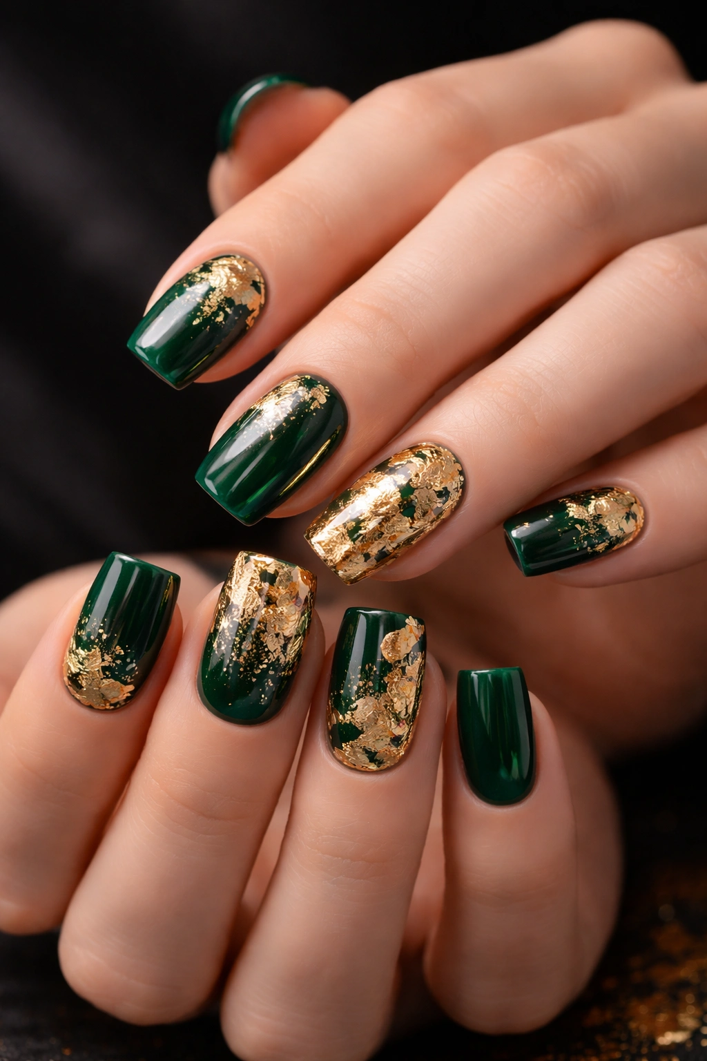
Deep emerald green is the jewelry box of nail colors—think expensive emerald gemstones, which are rarely perfectly clear or uniformly colored. This design uses deep emerald as the base and incorporates actual gold foil pieces (or metallic confetti foils) that catch light and create that precious-stone effect. You can do full foil coverage or just accent a few nails with scattered pieces.
Why Foil Creates a Luxury Effect
Foil literally catches and reflects light in a way regular polish can’t, which is why it reads as so luxurious and intentional. Deep emerald with gold foil feels like a vintage art deco piece—there’s something timeless and upscale about that combination. You’re not just painting nails; you’re creating something that genuinely looks like jewelry.
How to Achieve This Look
Apply two coats of deep emerald. Once dry, you’ve got two options: (1) use a very sticky topcoat and press foil pieces directly onto it while it’s tacky, or (2) apply a layer of clear builder gel or sticky topcoat, arrange your foil pieces, and seal with another layer of clear. The foil stays where you place it—you can do a small accent on one nail, scattered pieces across all nails, or cover an entire nail. Seal everything with clear topcoat.
Pro tip: Foil works best with gel polish because the sticky base and cure process keep it permanently in place. If you’re using regular polish, a very thick, sticky topcoat is essential.
9. Chocolate Brown Crème with Thin White Geometric Lines
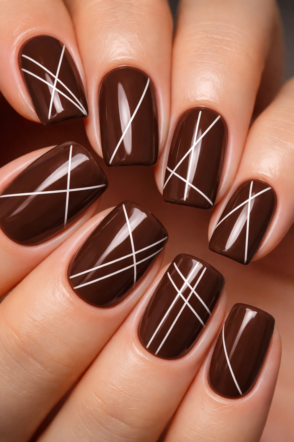
This design pairs chocolate brown (that rich, warm, universally flattering tone) with clean, architectural white lines that create geometric shapes—triangles, thin grids, or asymmetrical line work. The white lines are thin enough to feel delicate but structured enough to feel intentional and modern.
Why White Lines Elevate Brown
Brown is one of those rich tones people overlook, but it’s secretly one of the most versatile and flattering. White lines against chocolate brown create maximum contrast without introducing a bright color, which keeps things sophisticated. The geometric element makes this design feel editorial and considered rather than plain. On squoval nails, geometric white lines look particularly clean because of the structured shape.
How to Achieve This Look
Apply two coats of chocolate brown crème. Once completely dry, use a thin striping brush or nail art pen with white polish to paint your geometric lines. You could do thin vertical stripes down the center of each nail, triangular corner designs, asymmetrical grids, or any geometric pattern that appeals to you. Let each nail be slightly different—this prevents it from looking too templated. Seal with glossy topcoat, which makes the white lines absolutely pop against the brown.
Pro tip: If hand-painting feels intimidating, white striping tape creates perfectly clean lines without requiring any brush control.
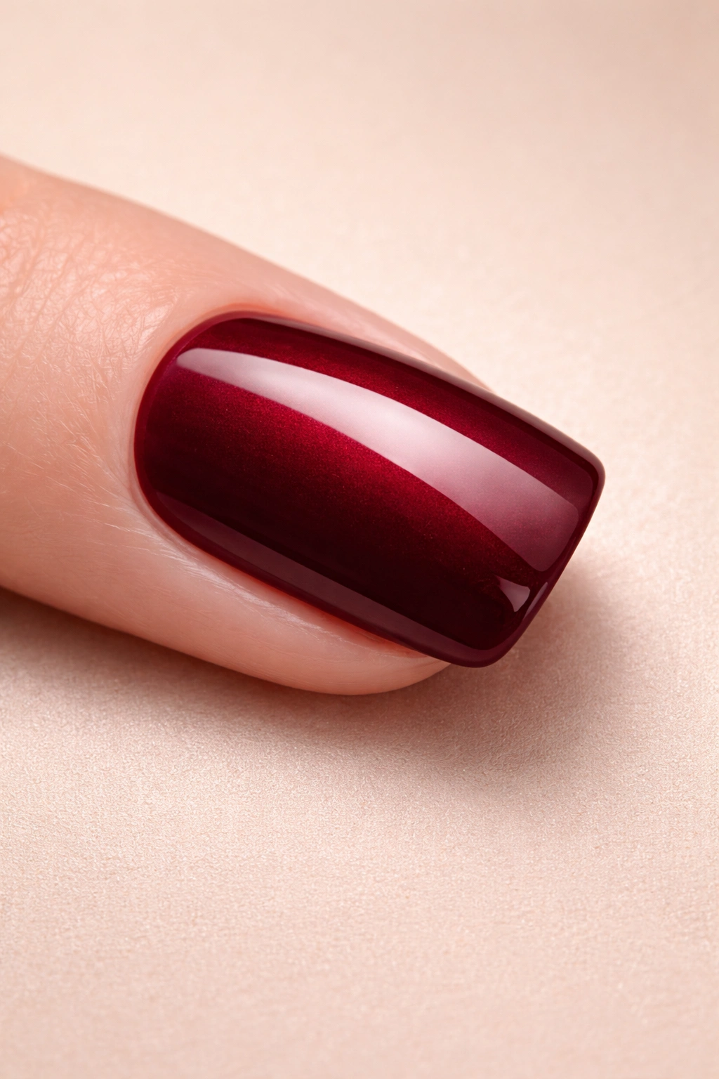
10. Burgundy Wine with Glass Fleck Texture
Burgundy wine is deep, sophisticated, and genuinely elegant without any additional effort. This design takes that rich tone and adds glass fleck (also called glass nail art, glitter glass, or crushed glass effect)—tiny fragments that catch light like prisms and create a subtle sparkle that’s more refined than regular glitter. You can do full coverage or just accent a few nails.
What Makes Glass Fleck Different From Glitter
Glass fleck is infinitely more sophisticated than chunky glitter. The tiny fragments create a sparkle that reads as textural and intentional rather than party-like. Burgundy wine with this subtle sparkle effect feels evening-appropriate and genuinely luxurious. The fleck catches light without making the nail look shiny—it’s a more grown-up kind of sparkle.
How to Achieve This Look
Apply two coats of burgundy wine. Once dry, apply a sticky topcoat. While the topcoat is still tacky, sprinkle glass fleck over the sticky layer (you can do the entire nail or just accent areas like the cuticle or tips). Press gently so the fleck adheres. Carefully brush away excess fleck. Seal with a clear topcoat. Some brands sell glass fleck in specific colors; burgundy-colored fleck would create a monochromatic textured effect, or you can use clear or multicolor fleck for more visibility.
Pro tip: Glass fleck shows best under certain lighting, so try this design if you regularly spend time under bright lights or outdoors where light catches it beautifully.
11. Deep Navy with Cream Marble Veining
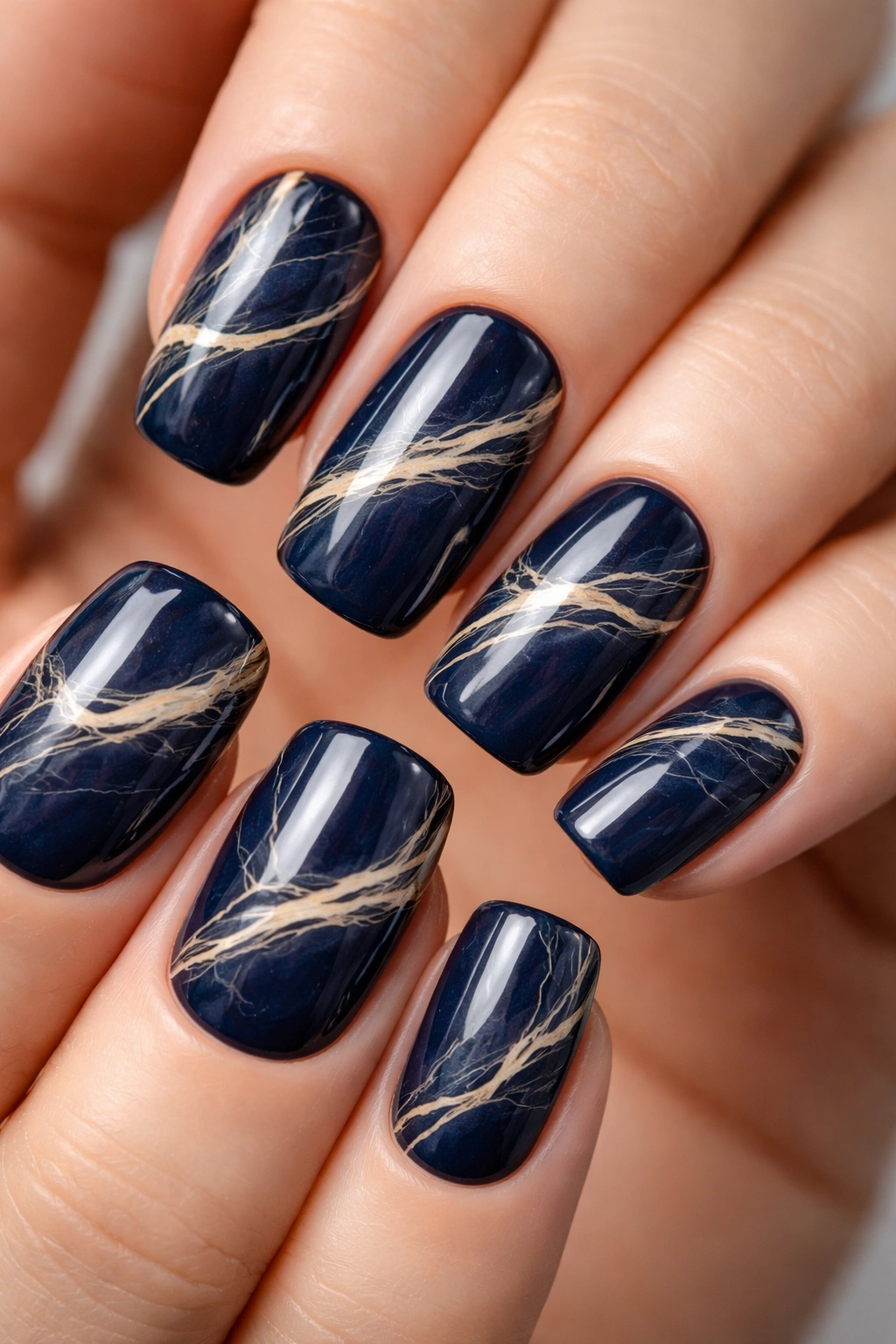
Navy serves as a rich, grounding base for this design, which incorporates cream or off-white marble veining—fine, organic lines that mimic natural marble and create an expensive, organic aesthetic. The veining doesn’t need to be perfect; slightly irregular and natural-looking is actually the whole point. It’s like wearing a piece of stone jewelry.
Why Marble Nails Feel Upscale
Marble is inherently associated with luxury materials, so even when marble nails are a design trend, they always feel special and intentional. Navy and cream marble is a classic, timeless pairing that reads as expensive without being loud. Each nail has slightly different veining patterns, which means they’re unique while still being cohesive. This design bridges minimalism and art—it’s decorated but understated.
How to Achieve This Look
Apply two coats of deep navy. Once dry, use a very thin brush to paint fine, irregular lines in cream or off-white polish. The lines should look organic and vein-like—avoid perfectly symmetrical patterns. You can water-marble this design instead for a more blended effect: use a cup of room-temperature water, drop navy and cream into concentric circles, swirl with a toothpick, and dip your nail in. Either method works beautifully. Seal with glossy topcoat, which really brings out the “marble” effect.
Pro tip: If you’re hand-painting veins, very diluted cream polish flows more smoothly than thick polish, so add a tiny drop of clear or topcoat to thin it out.
12. Oxblood with Negative Space Half-Moon Design
Oxblood red (that deep, warm, almost-burgundy tone) pairs with a negative space half-moon design where the cuticle area is left bare, showing natural nail or a nude base. This creates a sophisticated yin-yang effect that’s both modern and timeless. You can accent the bare space with a thin metallic line for extra polish.
Why Half-Moon Design Flatters Squoval Nails
The negative space creates visual interest while keeping the design clean and office-appropriate. The half-moon shape is inherently flattering because it lengthens the nail and breaks up the color. On squoval nails, this geometric effect looks particularly intentional and modern. The combination of oxblood and bare nail hits that sweet spot between bold and restrained.
How to Achieve This Look
Apply a nude or clear base coat. Once dry, use a half-moon or cuticle nail guide to create a template for the upper portion of the nail where your oxblood will go. Paint two coats of oxblood within that guide. If you want a metallic accent, use a thin brush to paint a line of gold or rose gold where the oxblood meets the bare cuticle area. Carefully remove your guide (do this while the polish is just barely set). Seal with topcoat.
Pro tip: The half-moon guides available on Amazon are genuinely worth the few dollars—they create clean lines that are nearly impossible to get freehand.
13. Forest Green Crème with Dimensional Foil Leaf Accents
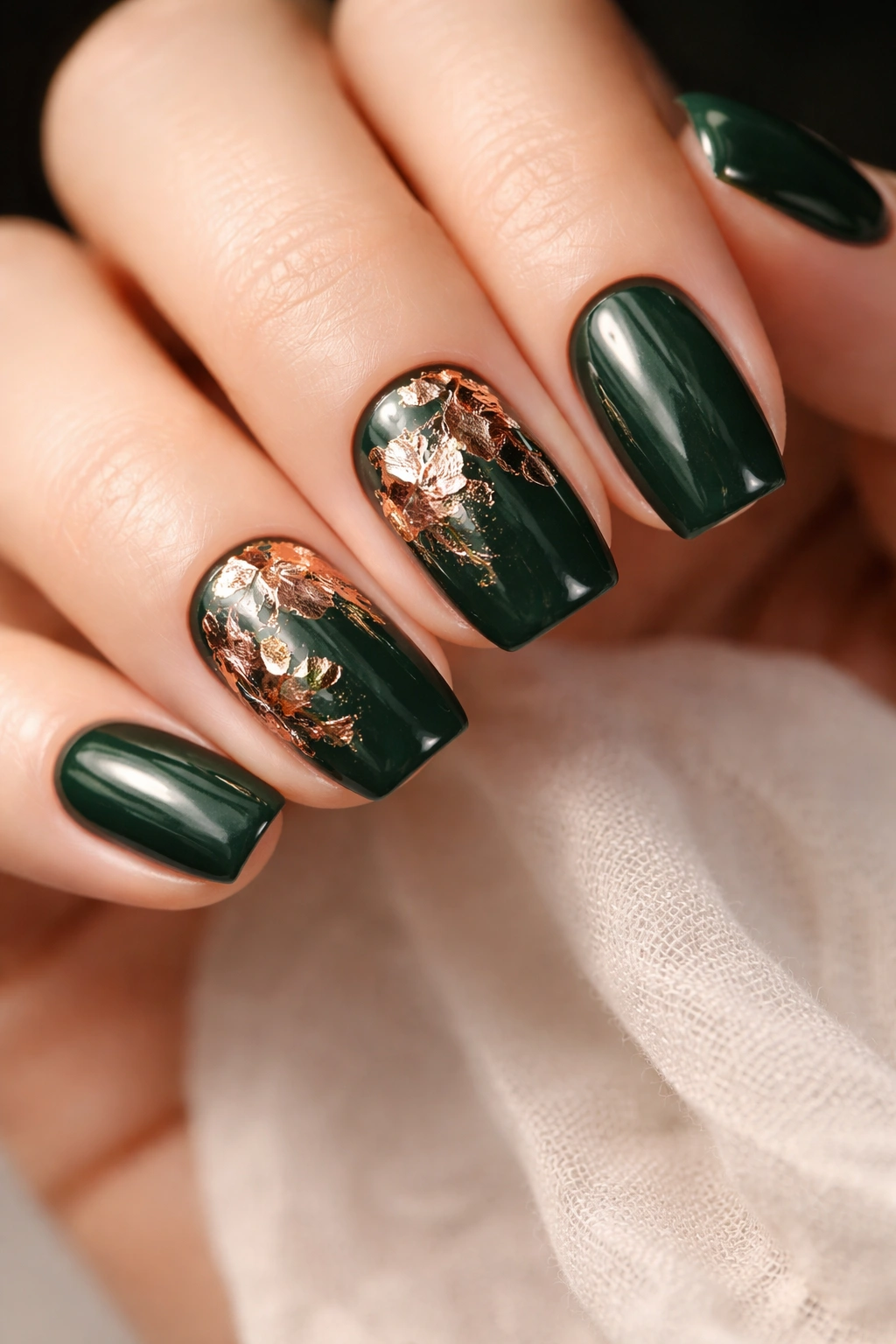
This design takes rich forest green and adds dimensional interest through foil leaf accents—you can use actual loose leaf pieces (rose gold, copper, or gold) that stick to topcoat and create a three-dimensional effect. Accent just one or two nails, or spread the leaves across all fingers for a more dramatic effect.
Why Dimensional Elements Feel Special
Foil leaves add tactile, physical dimension to nails in a way flat polish can’t achieve. They catch light from multiple angles and genuinely look like delicate leaves adhered to your nail. Forest green provides a beautiful backdrop for warm metallics, and the natural leaf imagery paired with green creates an organic, nature-inspired aesthetic that feels both artistic and wearable.
How to Achieve This Look
Apply two coats of forest green crème. Once dry, apply a thick, sticky topcoat layer. While tacky, carefully place foil leaf pieces onto the nail (you can find these online or in craft stores). Press gently to ensure they adhere. Once they’re set, seal with another layer of clear topcoat, being gentle so you don’t disturb the leaves. The leaves will stay permanently in place.
Pro tip: Foil leaves show up best on solid-color nails, so resist the urge to add other designs—let the leaves be the star.
14. Deep Plum with Holographic Shimmer and Matte Top Layer
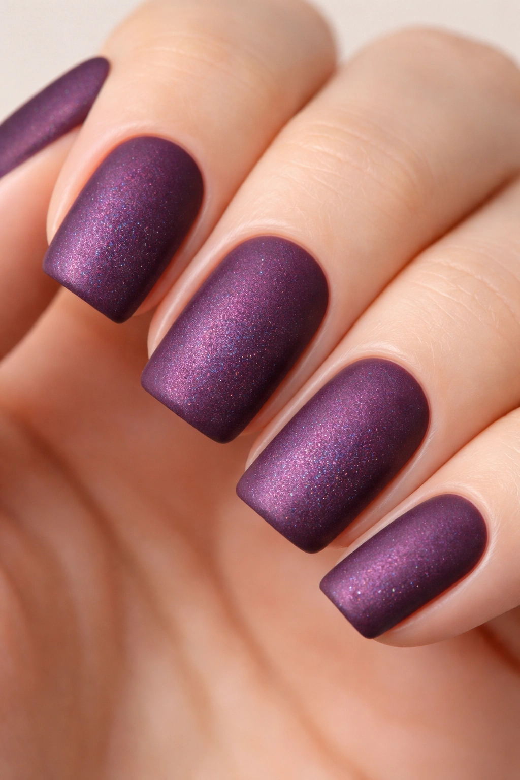
This advanced design creates a genuinely mesmerizing effect: deep plum with holographic shimmer underneath, then sealed with a matte topcoat so you get that luxurious matte effect while the holographic shimmer subtly shows through from beneath. It’s like looking at holographic color hidden inside a frosted surface.
Why This Two-Topcoat Technique Creates Depth
Layering finishes creates dimension that neither finish can achieve alone. The holographic shimmer adds visual interest and catches light in unexpected ways, while the matte seal keeps it sophisticated and refined. The interplay between the hidden shimmer and matte surface creates an almost jewelry-like depth. This is a design that makes people look twice.
How to Achieve This Look
Apply two coats of deep plum crème. Once dry, apply a holographic shimmer topcoat (this is a specialty product that adds iridescent shimmer). Let it cure if it’s gel, or dry fully if it’s regular polish. Once that layer is set, apply a matte topcoat over it. The matte will subdue the shimmer visibility slightly, but the holographic will still catch light from beneath when you move your hand. The effect is subtle but genuinely special.
Pro tip: This design requires good topcoat products, so invest in quality brands—cheap topcoats won’t seal properly and might make the layers muddy-looking instead of layered.
15. Terracotta with Negative Space Geometric Design and Metallic Fill
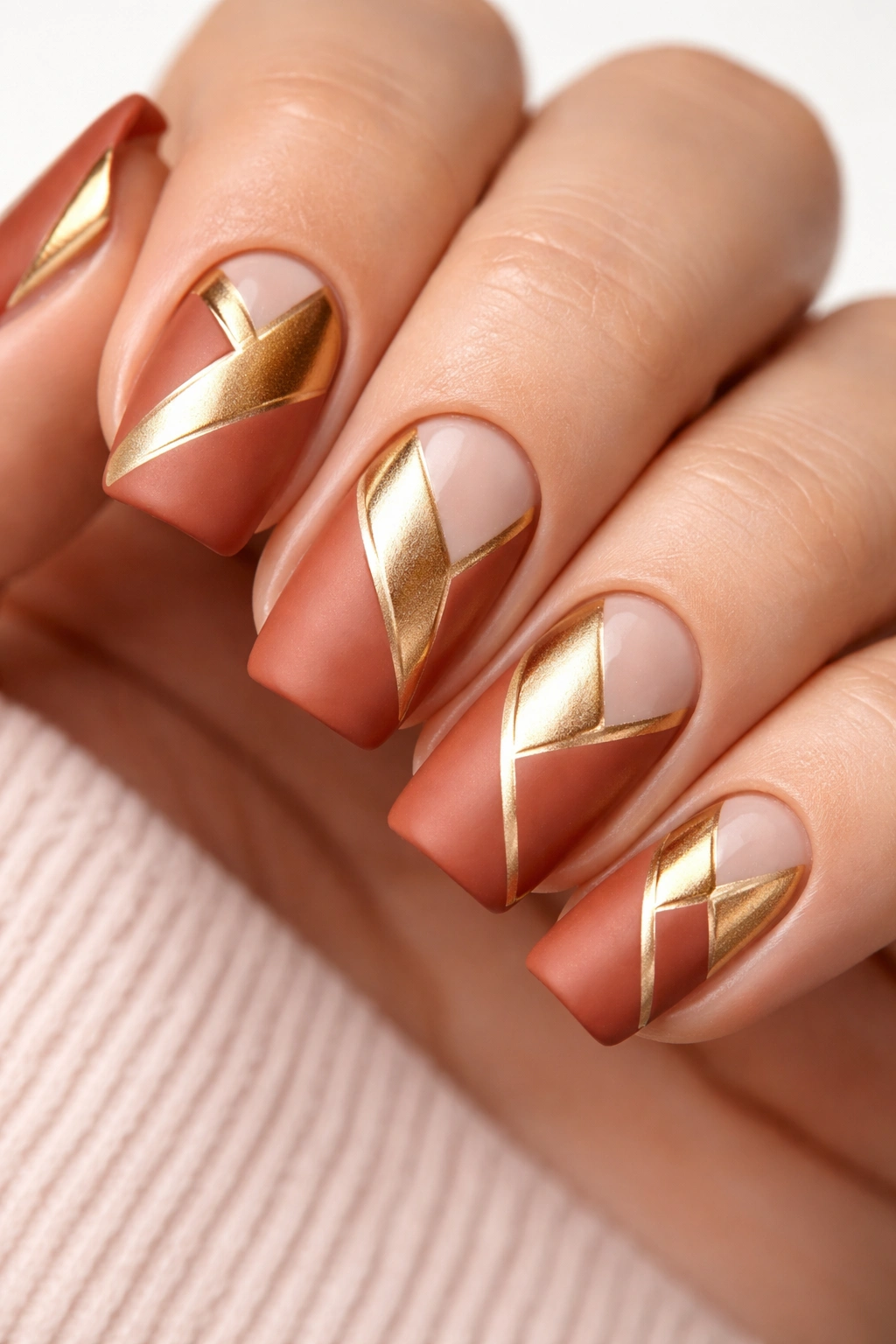
This is the statement design of the bunch. Terracotta serves as the base, but you create geometric negative space (areas you don’t paint) and fill those spaces with metallic polish—copper, gold, or rose gold. The contrast between matte terracotta and shiny metallic creates visual drama that’s still entirely wearable because both colors are in the warm family.
Why Mixed Finishes and Negative Space Create Impact
Negative space designs automatically feel modern and intentional. Adding metallic fills to those spaces creates dimension and visual movement. Terracotta and warm metallics are a naturally harmonious color pairing, so even though this design is more visually complex, it feels balanced and intentional rather than chaotic. On squoval nails, you have enough space to create interesting geometric shapes without the nail looking overcrowded.
How to Achieve This Look
Apply base coat. Paint your entire nail in terracotta. Once fully dry, use nail guides, striping tape, or freehand to create geometric negative space areas—these could be triangles in corners, a stripe down the center, angular shapes along the edge, or any geometric pattern you envision. The areas you don’t paint will remain base color (or you can paint them a contrasting metallic). Use a thin brush to carefully paint metallic polish into your negative space areas. Let the metallic dry completely, then seal everything with topcoat.
Pro tip: Practice your geometric pattern on paper first, or do a test nail with base coat and tape before committing to your full manicure.
Final Thoughts
Rich-toned squoval nails represent something genuinely special in the world of nail design: they’re sophisticated enough for any occasion, flexible enough to accommodate everything from minimalist to intricate designs, and flattering on every person regardless of skin tone, age, or personal style. The colors themselves do so much of the heavy lifting—a deep burgundy, forest green, or navy nail doesn’t need much else to look intentional and polished.
The real skill in working with these designs is understanding that with colors this rich, restraint is often more powerful than excess. A single geometric detail, a metallic accent, or even just a perfectly executed matte finish can be far more impactful than covering every millimeter with embellishment. These 15 designs work because they respect the inherent beauty of the color while adding just enough visual interest to feel fresh and considered.
Squoval nails also have a practical advantage most people don’t talk about: they’re genuinely durable compared to longer, pointier shapes, which means your beautiful rich-toned manicure actually lasts. You get to enjoy it for weeks instead of watching it chip away. That durability combined with the versatility of these rich tones means you can invest in quality nail care and actually see that investment pay off.
Whether you’re drawn to the depth of burgundy, the sophistication of navy, the understated luxury of chocolate brown, or the unexpected elegance of terracotta, these designs give you a framework for making them genuinely yours. The beauty of nail design is that you can adapt any of these to match your personal style, skill level, and the occasion—mix and match elements, adjust the complexity, or lean into the ones that speak to you. Rich-toned squoval nails are, fundamentally, a way of telling the world that you take care of details, you appreciate quality, and you’re confident enough to skip the bright colors and let your hands speak in deeper, quieter tones.
