

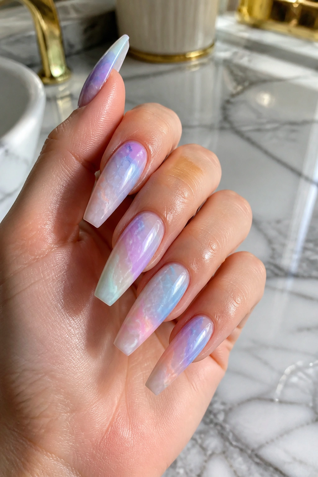
Coffin nails can look sharp in the wrong color. Not ugly—just harsher than most people expect once that long tapered shape is on an actual hand instead of a salon swatch ring.
That’s why pastel coffin nails keep winning people over. The shape still gives you that clean, elongated silhouette, but soft color takes the edge off it. A pale lilac, a washed peach, a milky mint—those shades stretch the finger without making your hands look severe, dry, or overdone.
The trick is not “pick any pastel and hope.” Some pastel shades turn chalky. Some look flat against the nail plate. Some make a gorgeous sample stick and then look oddly heavy once they’re built over acrylic or hard gel. The difference usually comes down to opacity, undertone, and how the color is placed on the coffin shape. A sheer, milky pastel in two thin coats will often beat a thick opaque pastel in three.
And the shape matters more than people think. When the sidewalls stay straight for most of the nail and the tip is filed flat—not too wide, not too pinched—pastel color has room to look polished instead of toy-like. That’s the sweet spot.
Why pastel coffin nails flatter more hands than dark shades
Low-contrast color is easier on the eye. That sounds small, but it changes the whole manicure. Deep burgundy, black, and sharp neon create a strong line between the nail and the skin around it. Pastels soften that line, so the hand looks longer and calmer at the same time.
The coffin shape already does the lengthening
Coffin nails pull the eye forward. The sidewalls stay straighter than almond nails, and the squared-off tip gives structure. Add a soft pastel and you get length without the hard stop that darker colors create at the free edge.
That’s a big reason these shades suit so many people. The shape does the architecture. The color keeps it friendly.
Milky formulas beat chalky ones
If you’ve ever tried a pale yellow or baby blue and felt like your hands looked dusty, the problem was probably not the shade family. It was the finish. Milky pastels have a translucent base that lets light pass through the color a bit, which makes them look smoother on the nail. Chalky pastels sit flat on top and can highlight ridges, thickness, and dry cuticles.
Nail techs know this even if they don’t always say it out loud. The sample wheel may show one pale blue, but the bottle that actually flatters most clients is the one with a jelly or creamy milk base.
Undertone still matters, just less than people think
Cool skin usually likes lilac, blue, and pink-lavender. Warm skin tends to glow next to peach, butter yellow, and apricot. Neutral undertones can move around more freely.
But the real crossover shades sit in the middle. Blush pink, milky lilac, peachy nude, soft periwinkle—those are the colors that rarely fight the hand wearing them.
What to tell your nail tech before the shaping starts
A good pastel set starts before the first coat of color.
If you’re getting acrylics, hard gel, or a structured gel manicure, ask for a medium coffin first unless you already know you love long nails. On most hands, that means roughly 10 to 16 mm past the fingertip. Longer can look great, sure, but soft shades often look cleaner when the shape is a little restrained.
Use this checklist at the salon:
- Ask for straight sidewalls with a soft taper near the final third of the nail.
- Keep the tip slim, not bulky. Pastels show thickness fast.
- Choose a milky or semi-sheer base if your natural smile line is strong and the polish itself is light.
- Request thin color layers. Two thin coats usually look smoother than one heavy pass and a fix-up coat.
- Match the top coat to the color idea. Gloss makes jelly and milk shades look juicy; matte can calm down pinks and lavenders.
- Skip aggressive cuticle cutting. Dermatologists at the American Academy of Dermatology have long warned that cutting live cuticle tissue can raise the chance of irritation and infection.
One more thing. If you’re filing your own shape at home, use a 180-grit file for product and a 240-grit file for natural nail refining. A rough file plus pale polish is a bad mix because every wobble at the sidewall shows up.
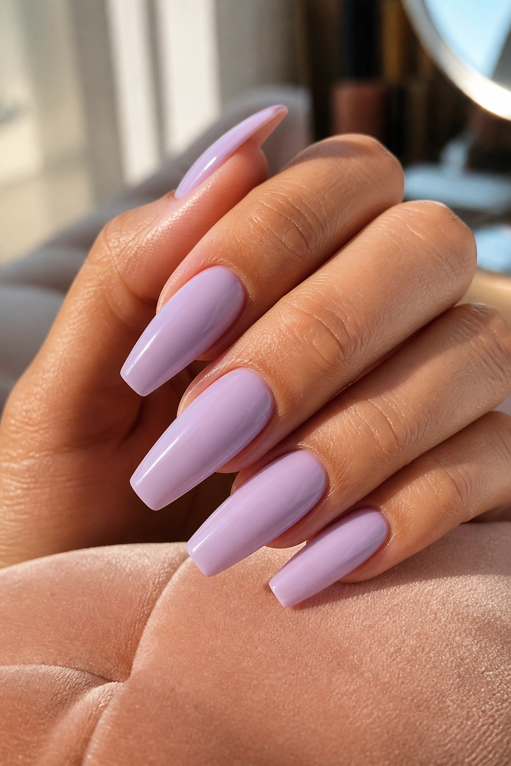
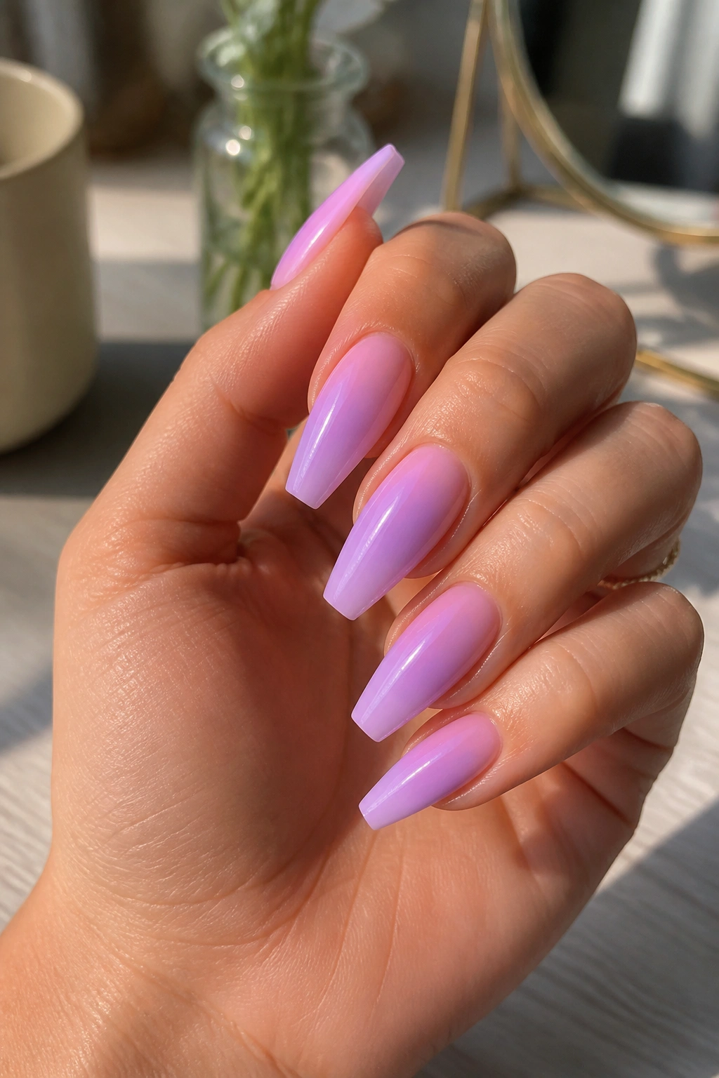
1. Milky Lilac Gloss
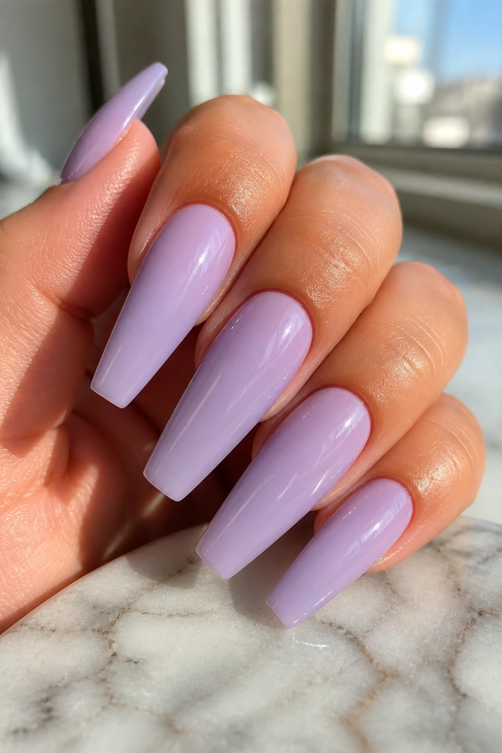
If you only try one color from this whole list, make it milky lilac.
Lilac has enough coolness to feel fresh, but once you add a milk base and a glossy top coat, it stops looking icy. It turns soft, a little creamy, and much easier to wear than a flat pastel purple. On fair skin it reads gentle. On medium and deep skin it pops without yelling. That range is why nail techs reach for it again and again.
Why this shade behaves so well
Purple sits in a useful middle lane. It isn’t as sweet as baby pink, not as tricky as pale yellow, and it doesn’t pull green the way some cool blues can. A good milky lilac also hides small surface flaws better than opaque lavender because the light passes through it instead of bouncing off a dense layer of pigment.
Quick details that help:
- Best length: medium coffin, about 12 to 15 mm past the fingertip
- Best finish: high-gloss top coat
- Best formula: jelly-cream or “milk bath” lavender
- Best accent: one tiny silver dot at the cuticle or none at all
Salon tip: ask for a shade that looks one step softer than the bottle cap. Once it’s built over a nude or pink base, the final result usually reads a little brighter.
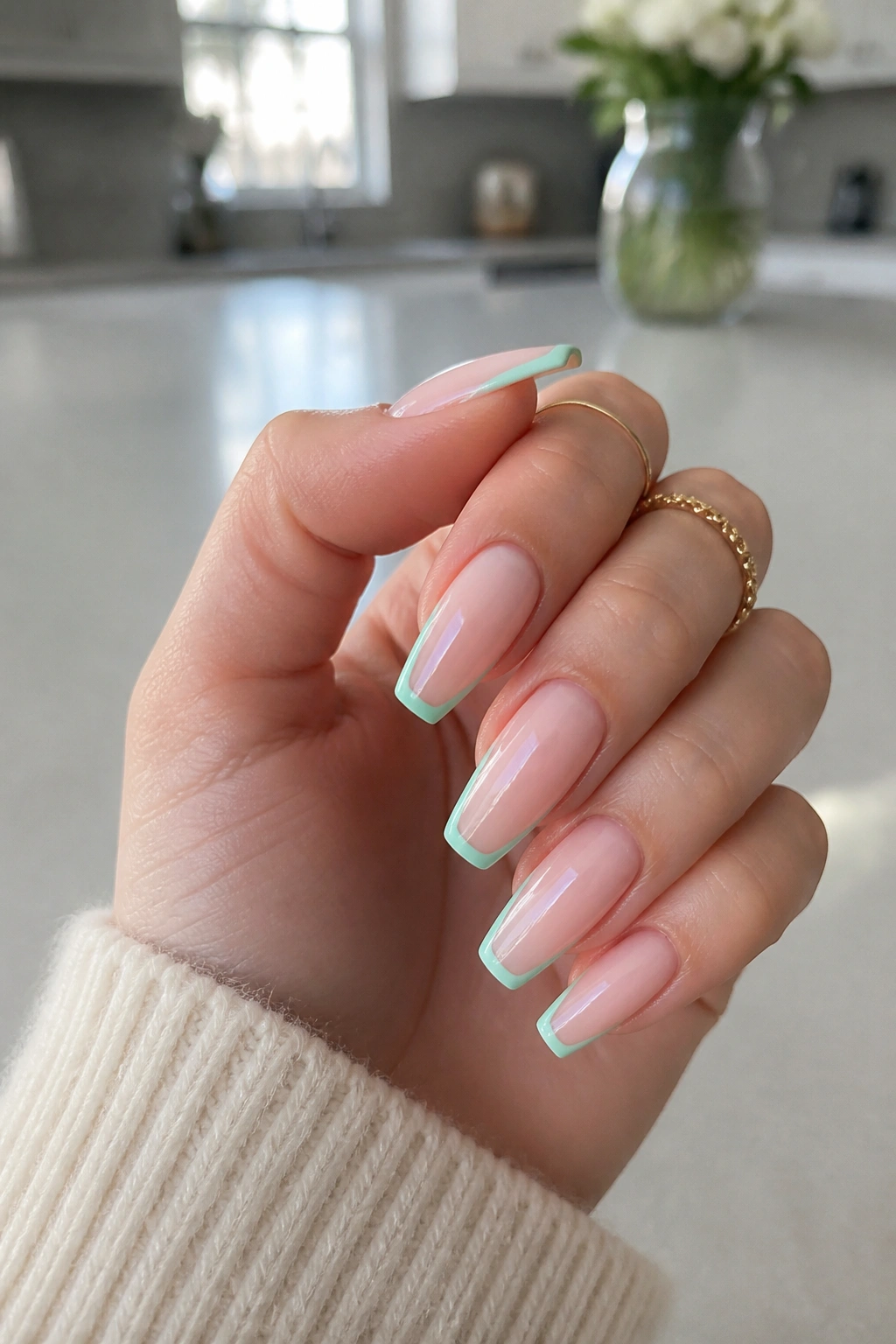
2. Powder Blue Micro-French
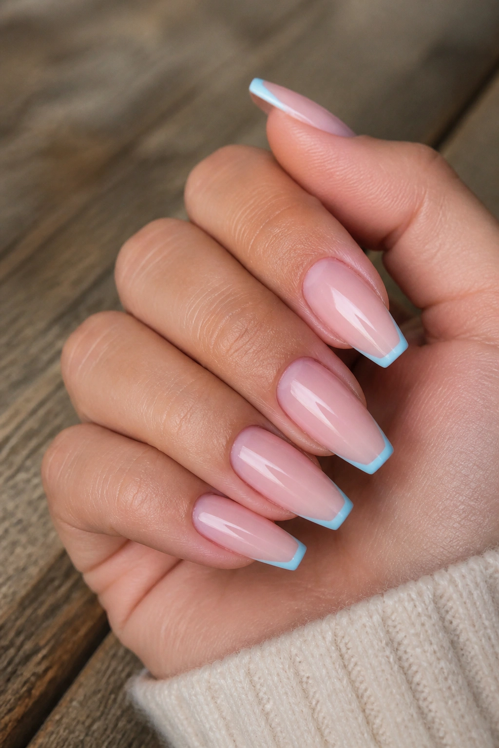
Baby blue looks better on more people when you keep it at the tip.
A full set of opaque powder blue can be cute, though it also has a habit of making the nail look wider if the shape is even slightly off. A micro-French fixes that. You keep a sheer pink or beige base over most of the nail, then add a 1 to 2 mm powder blue line across the coffin tip. Same color family. Far cleaner result.
That small band of color gives you the pastel hit without covering the whole nail plate. If your skin pulls warm, the nude base balances the blue. If your skin is cool, the blue line feels crisp instead of cold. On deeper skin tones, that fine strip stands out in a nice sharp way.
I like this look on people who want pastel nails but still use their hands hard during the week. Chips are less obvious, grow-out is slower-looking, and the whole set keeps its shape visually because the blue sits right where the flat coffin tip already lives.
Ask your tech for a soft powder blue, not a white-based sky blue. Too much white in the mix can turn the tip chalky, and then the line starts to look heavy.
3. Peach Sorbet Ombré
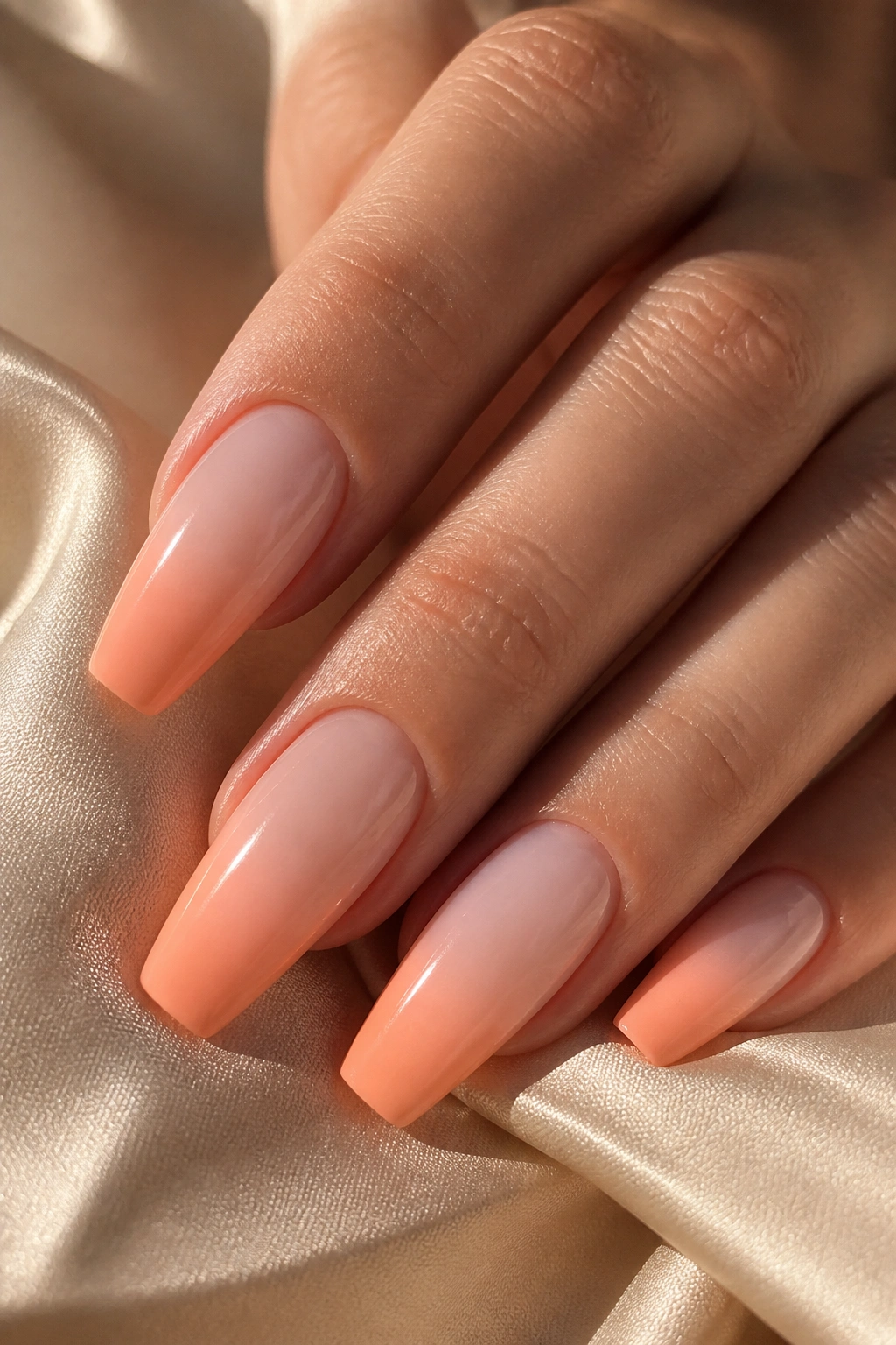
Why does a peach ombré look easier to wear than solid peach? Because the gradient does some of the blending for you.
Solid peach can lean too orange on one person and too pink on another. A peach sorbet fade, starting from a milky nude at the cuticle and deepening toward the tip, solves that problem. The color feels warm and bright, but the natural base near the skin keeps it from taking over the whole hand.
Peach also has a healthy look to it. Not fake-tan orange. Not coral lipstick peach. More like the soft inside of ripe stone fruit. On coffin nails, that warmth takes the edge off the shape and makes the tip look narrower.
How to wear it so it stays soft
The cleanest version uses:
- A sheer blush or beige base
- Airbrushed or sponged peach concentrated on the last half of the nail
- A gloss top coat to melt the gradient together
If your skin runs cool, ask for peach with a pink cast. If your skin runs warm or olive, a faint apricot shift can look great. The ombré is doing the heavy lifting anyway, so the exact peach can move a little without going wrong.
This is one of the few pastel looks that still has color from across the room.
4. Pistachio Green Cream Finish
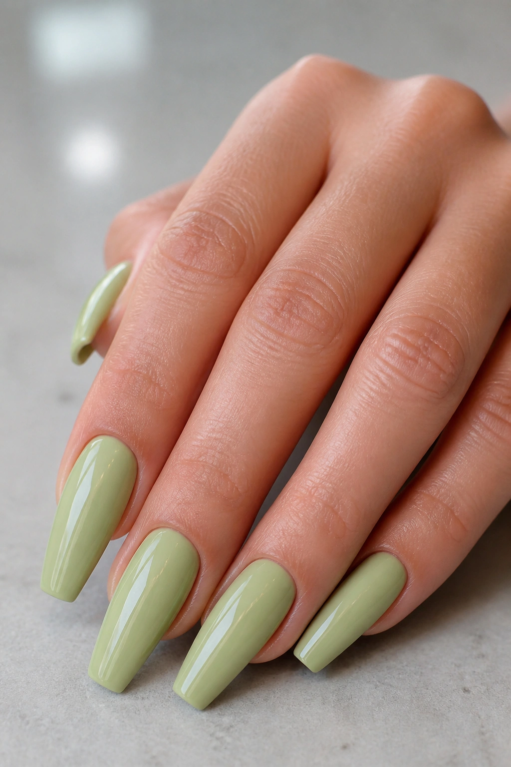
On the swatch stick, pistachio can look like a dare. On an actual hand, it settles down fast.
That’s because the best pistachio shades are not neon green and not sage. They sit between the two—soft, creamy, and a little muted. On a coffin shape, that muted quality matters. Sharp shape plus soft green creates tension in a good way, and the color feels more fashion-forward than pink without getting weird.
A cream finish helps. Glitter muddies the shade. Matte can make it look dry. Glossy cream gives pistachio enough depth to look intentional.
Useful guardrails:
- Keep the length short-to-medium coffin if you’re trying green for the first time.
- Ask for slight warmth in the shade. Cold minty greens are trickier.
- Pair it with shorter sidewalls and a slim tip so the set stays elegant.
- Skip chunky gems. Pistachio already has personality.
This is the color I’d suggest to someone bored by blush pink but not ready for chartreuse, lime, or anything loud. It’s still pastel. It just has a little bite to it.
5. Butter Yellow with a Sheer Pink Base
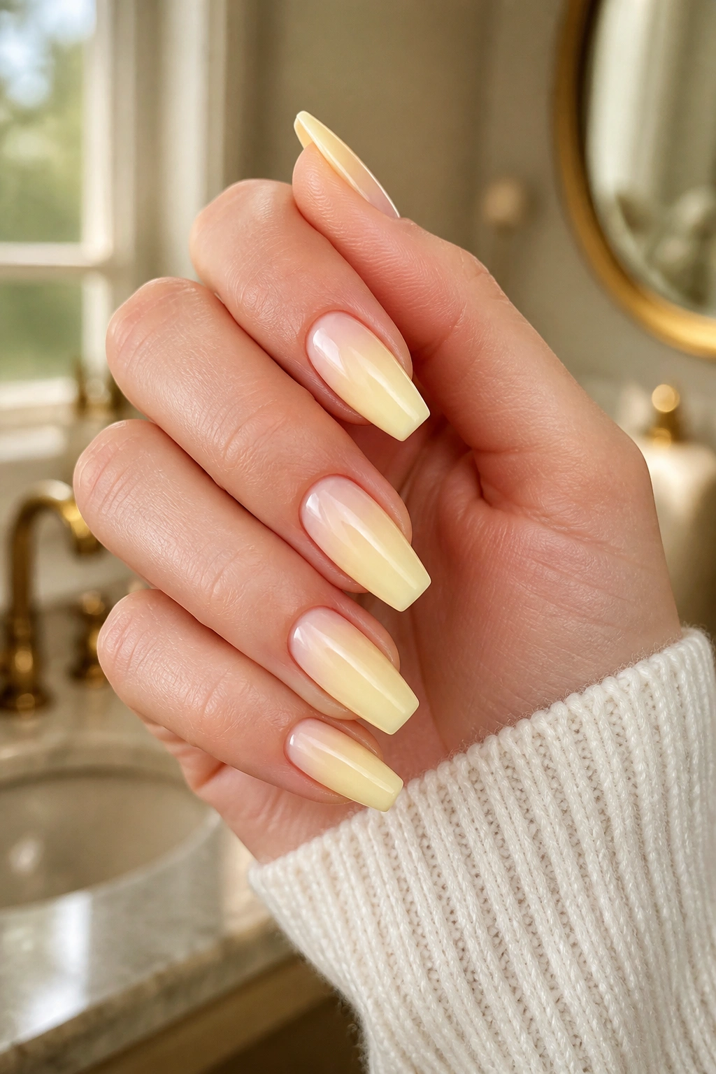
Yellow is where many pastel manicures go wrong.
The problem is not the color itself. It’s that salon yellows are often packed with white pigment, and white pigment makes pale shades go flat fast. When that happens, the nail can look thicker, drier, and shorter than it is. A sheer pink base under butter yellow fixes most of that in one step.
You still get the creamy yellow effect, though the pink underneath warms it up and gives the shade more life. That matters on every skin tone. Fair skin gets a little warmth. Medium and tan skin get softness instead of a chalky block. Deep skin gets contrast without the dull cast that pale yellow sometimes creates.
Length matters here. Keep butter yellow at medium coffin or shorter, with a slim free edge. Long yellow nails can look heavy unless the structure is immaculate.
I also like yellow more when the cuticles are polished and hydrated. Pale yellow is unforgiving about dry skin around the nail. One drop of jojoba-based cuticle oil, rubbed in for 20 seconds, changes the whole frame of the manicure.
Best version: one coat of milky pink builder base, then two thin coats of custard or butter yellow, then a glassy top coat.
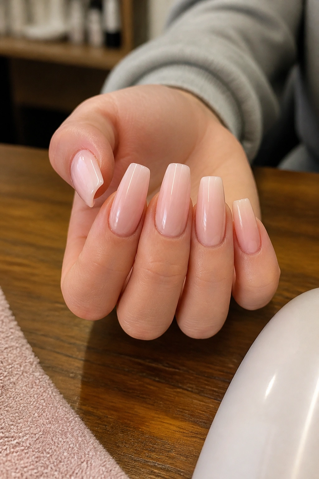
6. Blush Pink Matte Coffin
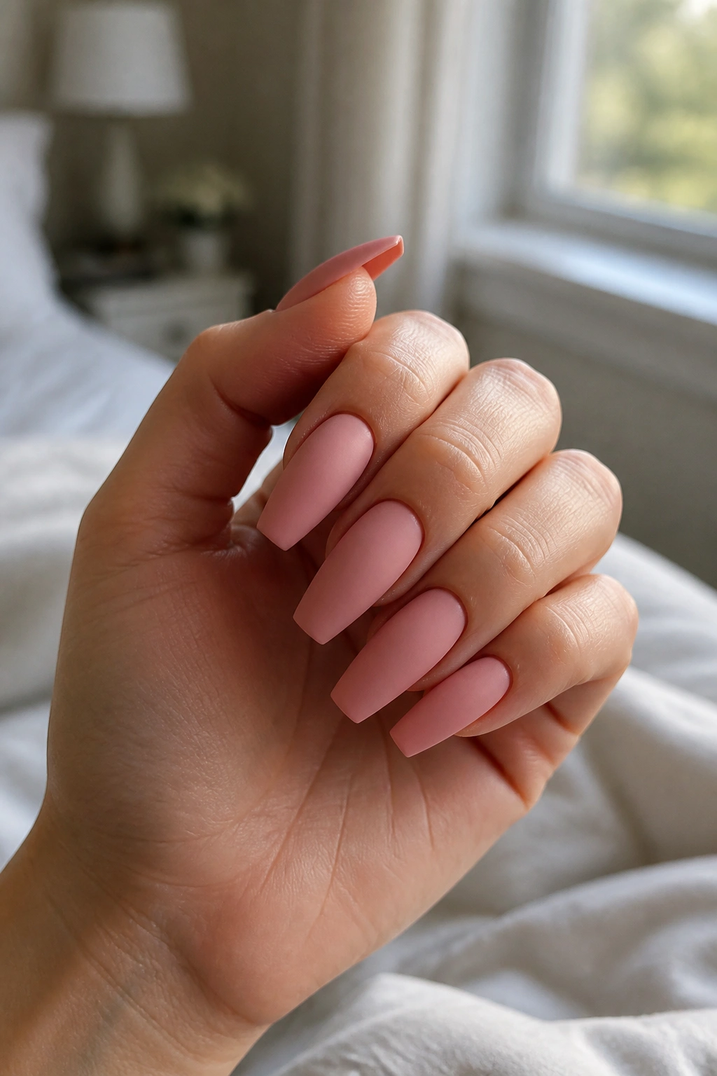
Unlike glossy baby pink, matte blush tones down reflection and lets the shape speak first.
That’s useful if you love coffin nails but do not want them to read flashy. Matte blush looks modern, a little powdery, and more grown-up than candy pink. On a medium coffin, it can make the nail look sculpted rather than sugary.
The shade matters more than the finish. Go for beige-pink blush, not bubblegum. You want the pink to sit close to your natural nail bed color, only cleaner and softer. That’s where the flattering part comes in. When the shade echoes real skin and nail tones, the manicure feels settled on the hand instead of pasted on top.
This is also a good choice if you wear gold and silver jewelry interchangeably. Blush matte doesn’t push hard in either direction.
One warning, though—matte top coats pick up makeup, self-tanner, ink, and hair dye faster than gloss. If you color your own hair or cook with turmeric, keep a soft nail brush near the sink. Matte pastels are worth the extra care. They just ask for it.
7. Lavender-to-Pink Aura Nails
Soft center. Softer edge.
Aura nails can look gimmicky when the color contrast is high. Pastel aura nails are a different story. A lavender center diffused into a pinky nude or pale blush base gives the coffin shape a glow without turning it into a cartoon.
The placement is the whole trick. Keep the deepest lavender in the center of the nail plate, then feather it outward so the sidewalls and cuticle area stay lighter. That placement rounds out the nail bed visually, which is helpful on coffin shapes that can sometimes look long and flat.
Placement matters more than the exact shade
You do not need a loud halo. You need:
- a base that matches your nail bed family
- one softly airbrushed lavender bloom
- edges that stay clean and translucent
A small aura also grows out better than a bold central dot because there’s less hard contrast near the cuticle.
I like this set on medium-to-long coffin nails where you want some art but still want your hands to look soft. It catches the eye up close. From farther away, it reads like a dreamy wash of color.
8. Mint Outline Coffin
Want pastel without coating the whole nail? Try an outline.
A mint outline manicure keeps the center of the nail sheer pink, beige, or milky nude, then traces the sidewalls and tip with a fine mint border. On a coffin shape, that border emphasizes the structure in a neat, graphic way. The result is cleaner than full mint polish and easier to wear if you are unsure about green.
There’s a practical reason this flatters so many hands. Because the center stays close to your natural nail tone, the manicure keeps some of your own warmth. The mint acts like trim rather than wall paint.
The border should be thin—about 1 mm, maybe 1.5 mm on longer nails. Wider than that and the set can start looking boxy. A steady hand matters here, so this is one I’d save for a nail tech who likes detail work or for press-ons with printed outlines.
I also prefer mint outline on a glossy top coat. Matte can make the border look dusty, and chrome can pull the shade colder than needed. Keep it crisp. Keep it light. Done right, this one looks sharp in the best way.
9. Periwinkle with a Pearl Chrome Veil
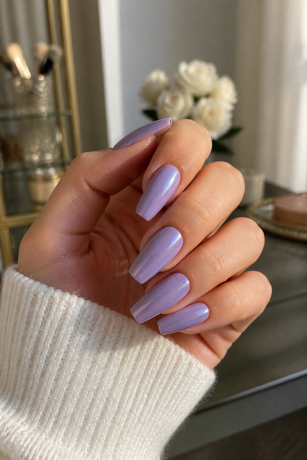
Chrome sounds cold. On periwinkle, it reads softer than you’d guess.
The key word is pearl. Not mirror. Not silver foil. A pearl chrome veil over pastel periwinkle gives you that glazed finish people keep asking for, though the base color keeps it from turning metallic and hard. Because periwinkle sits between blue and violet, it flatters more skin tones than a straight baby blue does.
There’s also movement in the color. Some angles lean blue. Some lean lavender. That slight shift makes the manicure feel lively without needing rhinestones, decals, or extra art.
Ask for the gentle version
Tell your tech you want:
- a milky periwinkle base
- fine pearl chrome powder
- no mirror finish
- a medium coffin shape with slim thickness
Heavy chrome over pastel can look frosty in a way that ages the hand. A dusting is enough. One pass with an eyeshadow-style applicator over a no-wipe top coat usually does it.
If you wear cool neutrals, denim, navy, gray, or soft white a lot, this set slides right in.
10. Soft Coral Jelly Coffin
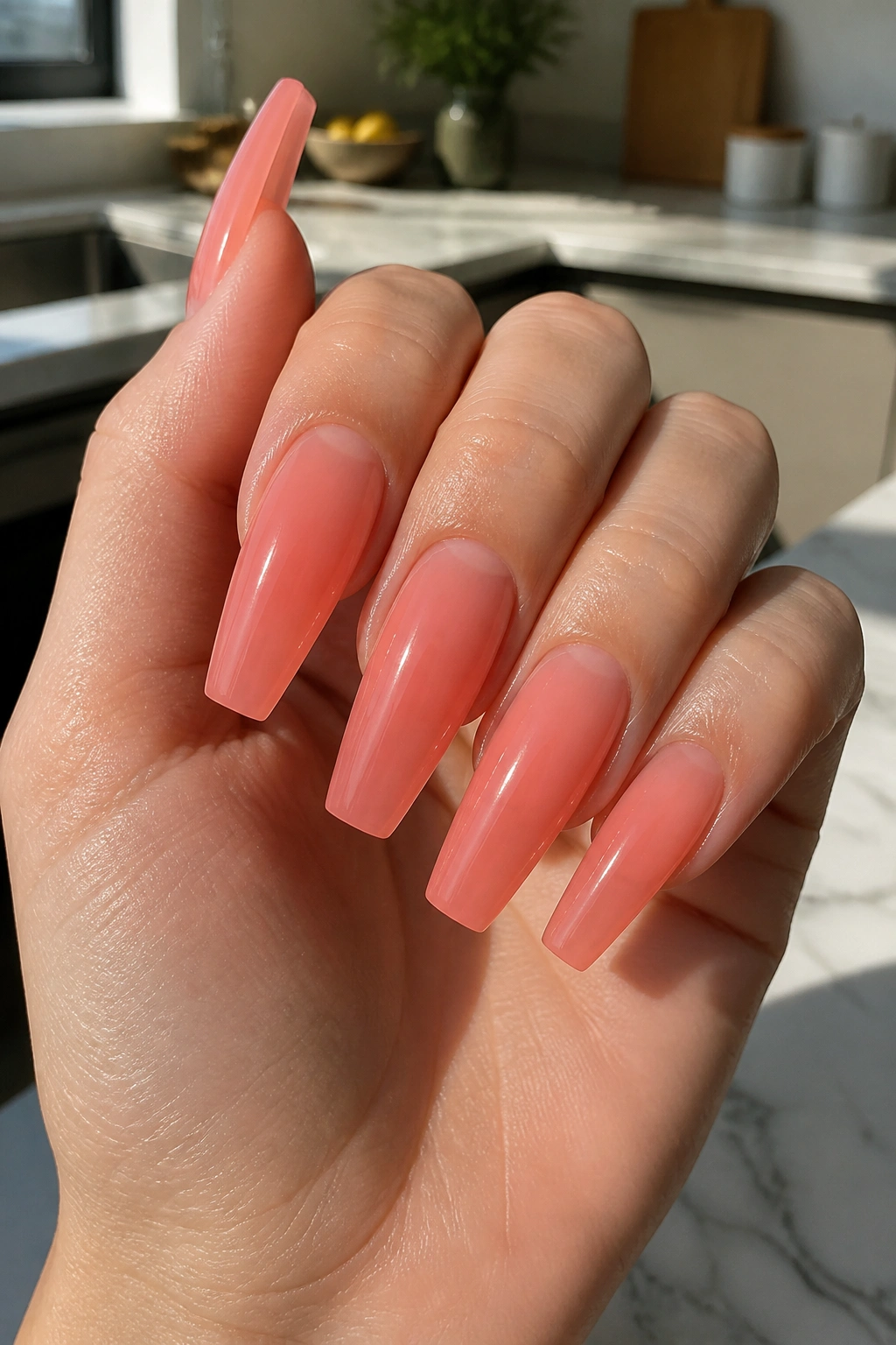
Coral scares people because they picture neon vacation polish from a drugstore shelf. A soft coral jelly is not that color.
Jelly formulas let light through the polish, so coral looks juicy instead of loud. On coffin nails, that transparency matters because it keeps the shape from looking blocky. The nail still has color, though the free edge and natural nail bed show through a bit, which gives the whole set more depth.
This is one of the few warm pastel shades that can look lively on deep skin, olive skin, pale cool skin, and everything between. The reason is simple: coral sits between pink and orange, so it borrows brightness from one side and warmth from the other. You get warmth without the heavy orange cast that turns some peach sets tricky.
I’d keep this one glossy and clean. No matte. No chrome. Maybe one tiny pearl detail on a ring finger if you insist, though the jelly finish already does enough. Soft coral jelly looks best when you let the color be the point.
A good target is two jelly coats over a sheer nude base. Three or four coats can push it out of the jelly lane and into regular polish territory, which loses the effect.
11. Pastel Rainbow Skittle Coffin Nails
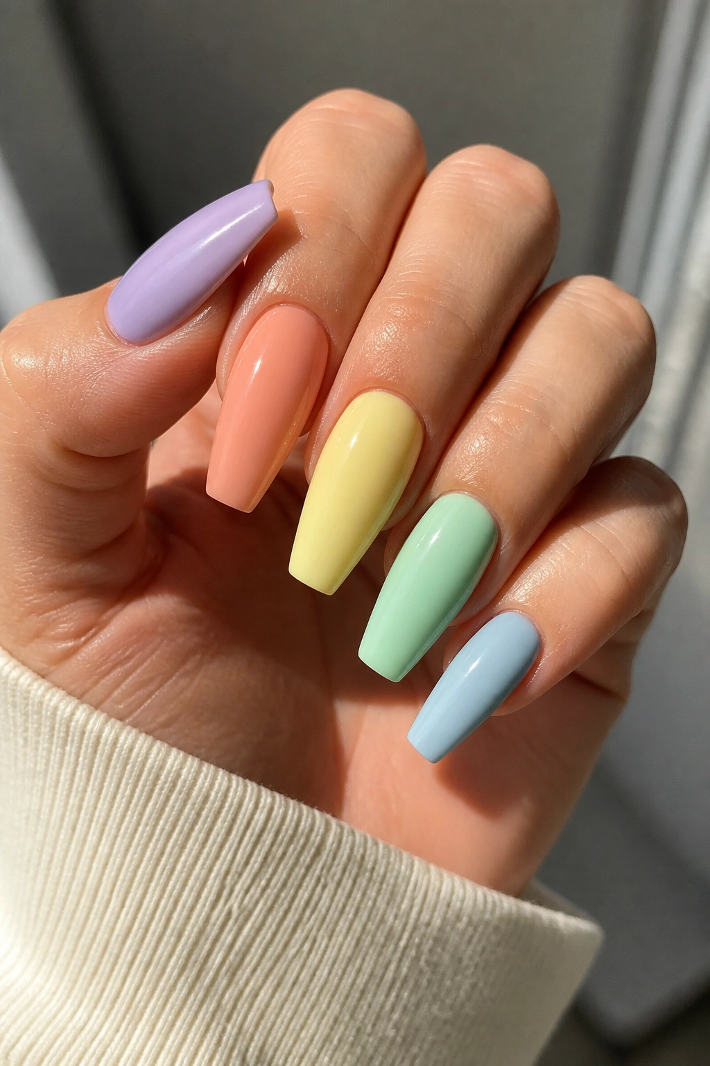
A skittle set only looks polished when the colors share the same temperature and milkiness. Five random pastels do not make a good palette. They make a sample tray.
The flattering version uses shades that look like they came from one family: milky lilac, soft peach, butter yellow, muted mint, and dusty baby blue. Each nail gets its own color, though the finish stays the same from thumb to pinky. That consistency keeps the set from feeling busy.
What I like here is that every skin tone picks up a favorite shade somewhere in the lineup. The peach warms the hand. The blue cools it. The lilac bridges the gap. Because no single color dominates the whole set, the manicure feels lighter and easier to wear than a full ten nails of one tricky pastel.
A palette recipe that rarely misses
Try this order from thumb to pinky:
- lilac
- peach
- butter yellow
- mint
- dusty blue
Or reverse it on the other hand if you like symmetry.
Keep the shape and length identical across all nails. Skittle nails need structure to stay chic. On coffin nails, that means matching sidewalls and a tip width that stays consistent within 1 mm or so from nail to nail. Tiny shape differences show up fast when every finger is a different shade.
12. White-Base Pastel Swirls
One thin white ribbon can wake up a whole pastel set.
Start with a milky nude or sheer pink base, then layer two or three narrow swirls in pastel shades across each nail—think lilac, mint, baby blue, or peach. The white line acts like a visual outline, keeping the soft shades from blurring together into mush.
This design works on nearly any hand because the base still lets skin tone lead. You are not replacing the whole nail with color. You are sketching on top of it. That difference matters more than people expect.
Keep the lines fine
The best swirls are:
- thin
- spaced apart
- curved with the length of the nail
- different on each finger, though not chaotic
Thick blobs ruin the delicacy. So does loading six colors onto one nail. Two pastels plus white is often enough. Three if your tech has a steady brush hand.
White-base swirls also age well between appointments because the grow-out line is softened by the sheer base. If you like nail art but hate seeing week-two regrowth, this one is easier to live with than full-color abstract sets.
13. Blush Nude with Pastel Side French
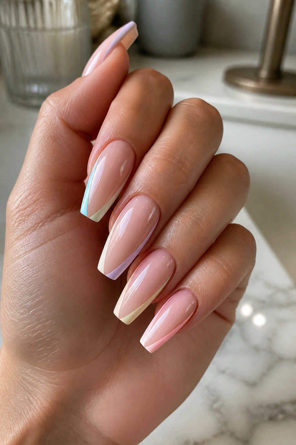
This is the low-risk salon pick when you want compliments and no drama.
A side French places the pastel color along one sidewall and across the tip rather than straight across the free edge. On a coffin shape, that diagonal sweep creates length fast. Use a blush nude base and a pastel edge—lilac, mint, powder blue, or peach—and the manicure stays slim, clean, and flattering.
The diagonal line does something a standard French does not. It pulls the eye upward and across, which can make shorter nail beds look longer. That’s handy if you love coffin nails but your natural nails grow wide or fan out.
I also like side French designs because they let you wear a trickier pastel in a controlled dose. Unsure about mint? Put it on the side French. Nervous about pale yellow? Use it as the diagonal tip color. You get personality without committing the whole nail to a shade you may not want for three weeks.
Ask for the side stripe to stay fine near the cuticle and a touch wider near the tip. That gradient line looks intentional and helps the coffin shape read cleaner.
14. Apricot Milk with Tiny Gold Flecks
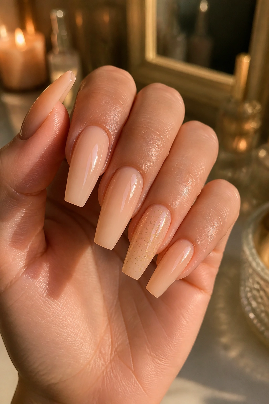
Put apricot milk next to jewelry and you see why it works. The color sits in that useful middle zone between pink, peach, and nude, so it warms the hand without pushing too orange.
Then add tiny gold flecks. Tiny. Not foil chunks the size of cornflakes. I mean delicate specks, scattered lightly through one or two nails or pressed into all ten under a milky top layer. The gold gives the manicure warmth and depth, though the apricot keeps it soft.
This set looks rich on deeper skin and still fresh on lighter skin because the color is not trying to be pastel peach in a loud way. It’s more like peach tea with milk. Gentle, warm, and a little creamy.
A few smart limits help:
- Use fine gold leaf or micro glitter, not chunky metallic pieces
- Keep the apricot sheer-to-medium in opacity
- Stay with gloss, because matte can mute the gold too much
- Put heavier flecks near the tip or one accent nail, not all over every nail
If you like a manicure that feels dressed without needing stones, charms, or big art, this one scratches that itch.
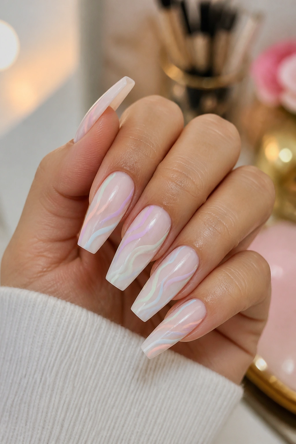
15. Watercolor Marble in Mixed Pastels
Busy nail art can still look soft when the edges bleed into each other.
A watercolor pastel marble uses diluted-looking swirls of blue, pink, lilac, mint, and peach over a sheer base. The colors overlap lightly, almost like they were dropped into water and pulled once with a fine brush. On coffin nails, that soft movement keeps the flat tip from feeling harsh.
The reason this look flatters so many people is that no single shade dominates. Your eye reads the set as a wash of color rather than “that person is wearing mint nails” or “that person has yellow nails.” The mix does the balancing.
Keep the marble airy
The nicest version has:
- a translucent nude or milky base
- two or three pastel tones per nail
- lots of negative space
- a glossy top coat that blurs the design slightly
If every inch of the nail is filled, the marble turns muddy. If the lines are too sharp, it starts looking like stone print instead of watercolor. You want softness here.
I’d save this one for medium or long coffin nails, where the brushwork has room to breathe. On short coffin shapes, the design can get cramped.
How to keep pastel coffin nails clean between appointments
Pale polish shows wear faster than deep red or black. Not damage, exactly. More like the manicure tells on you sooner.
Cuticle oil is the easiest fix. Use one drop morning and night, especially with milky pinks, yellow, and matte finishes. Dry skin around a pale manicure stands out right away, and oil keeps the frame of the nail looking fresh.
Staining is the next issue. Hair dye, self-tanner, turmeric, tomato sauce, pen ink—those are the usual culprits. Wear gloves when you know you’re dealing with strong color. Wash hands after cooking with spices. If a glossy pastel set starts looking dull, a little non-acetone cleanser on a lint-free pad can remove surface grime without stripping the shine.
If you wear gel or acrylic, removal matters too. The British Association of Dermatologists and the AAD both warn against rough picking and peeling because it can thin the natural nail plate. That damage shows up even more under sheer pastel colors. Do not peel product off. Soak, file down carefully, or book the removal.
One small thing people skip: sunscreen on the backs of the hands before UV curing. If you care about hand skin, it’s an easy habit to build. Fingerless UPF gloves work too.
Final Thoughts
Pastels look best on coffin nails when the color has some softness in it—milky, jelly, creamy, or diffused—and when the shape stays slim through the sidewalls. That pairing is what makes the style flattering instead of harsh.
If you want the safest first pick, start with milky lilac, blush nude side French, or peach sorbet ombré. Those three rarely fight the hand wearing them, and they grow out well.
If you want something with more personality, go for pistachio cream, periwinkle pearl chrome, or a watercolor marble. Those look like you made a choice, not like you grabbed the nearest pastel bottle.
A soft color can still have edge. That’s the fun of coffin nails.
