

There’s a nail shape that makes gradients look intentional rather than accidental. Almond nails — tapered, slightly pointed, with gently curved sides — give ombre a natural vanishing point. Color doesn’t just stop at the tip. It dissolves there, the way dusk fades into dark. That particular effect is surprisingly difficult to achieve on square or rounded nails, where the flat edge interrupts the fade before it can complete itself.
Choosing the right ombre combination is only half the equation. The other half — the part most nail content glosses over — is matching it to your skin tone. A lavender-to-white gradient that looks ethereal on a fair complexion can read as chalky and flat on olive skin. A coral-to-peach fade that pops beautifully on warm medium skin can turn harsh and slightly orangey on cooler undertones. Getting this right changes everything about how the finished manicure actually reads.
Skin tone compatibility is what most ombre nail roundups skip entirely. You’ll see a gorgeous photo, decide that’s the one, then realize after three careful coats that something’s off. The colors aren’t reading the way they did in the image. Most of the time, that’s an undertone mismatch — the base color sitting too close to the skin’s natural pink, yellow, or olive cast and canceling it out rather than working with it.
Each design here includes specific details: the color combination, the finish type (matte, glossy, shimmer, or metallic), the application approach, and which skin tones it’s most suited to. Some work across every complexion with barely any adjustment. Others are targeted — built for a specific skin tone and not especially flattering on others. All 18 are designed with almond nails in mind, and length recommendations are included where they matter.
Why the Almond Shape Transforms an Ombre Gradient
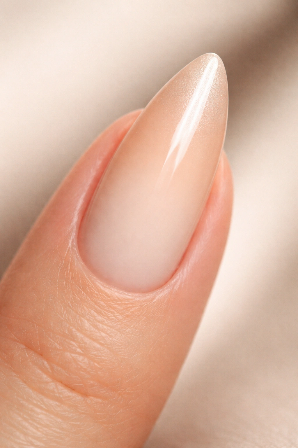
Square and coffin nails create a horizontal edge at the tip — the ombre hits that edge and stops, sometimes abruptly. Almond nails work differently. The two curved sides converge into a soft point, which gives the gradient somewhere definitive to land. The lighter tip color can thin itself out toward that point, and the visual result is clean in a way that blunt nail shapes rarely achieve.
On a medium-length almond nail — roughly 6–8mm of extension past the fingertip — there’s enough vertical canvas for the gradient to travel its full range. The lighter shade can occupy the top 40% of the nail plate without crowding the base, and the two tones blend through a wide middle zone without either feeling compressed. Longer nails are better still; shorter ones under 5mm extension still work but benefit from closer color pairings rather than high-contrast combinations.
There’s a secondary effect worth knowing about. The curved sides of almond nails create natural shadow lines along the edges of each finger. Those shadows deepen the visual weight of the base color and brighten the center of the nail, which subtly mirrors the ombre pattern itself. The shape and the technique reinforce each other — and that’s exactly why almond nails and ombre gradients work as consistently well as they do.
Two Techniques for Blending Ombre on Curved Nails
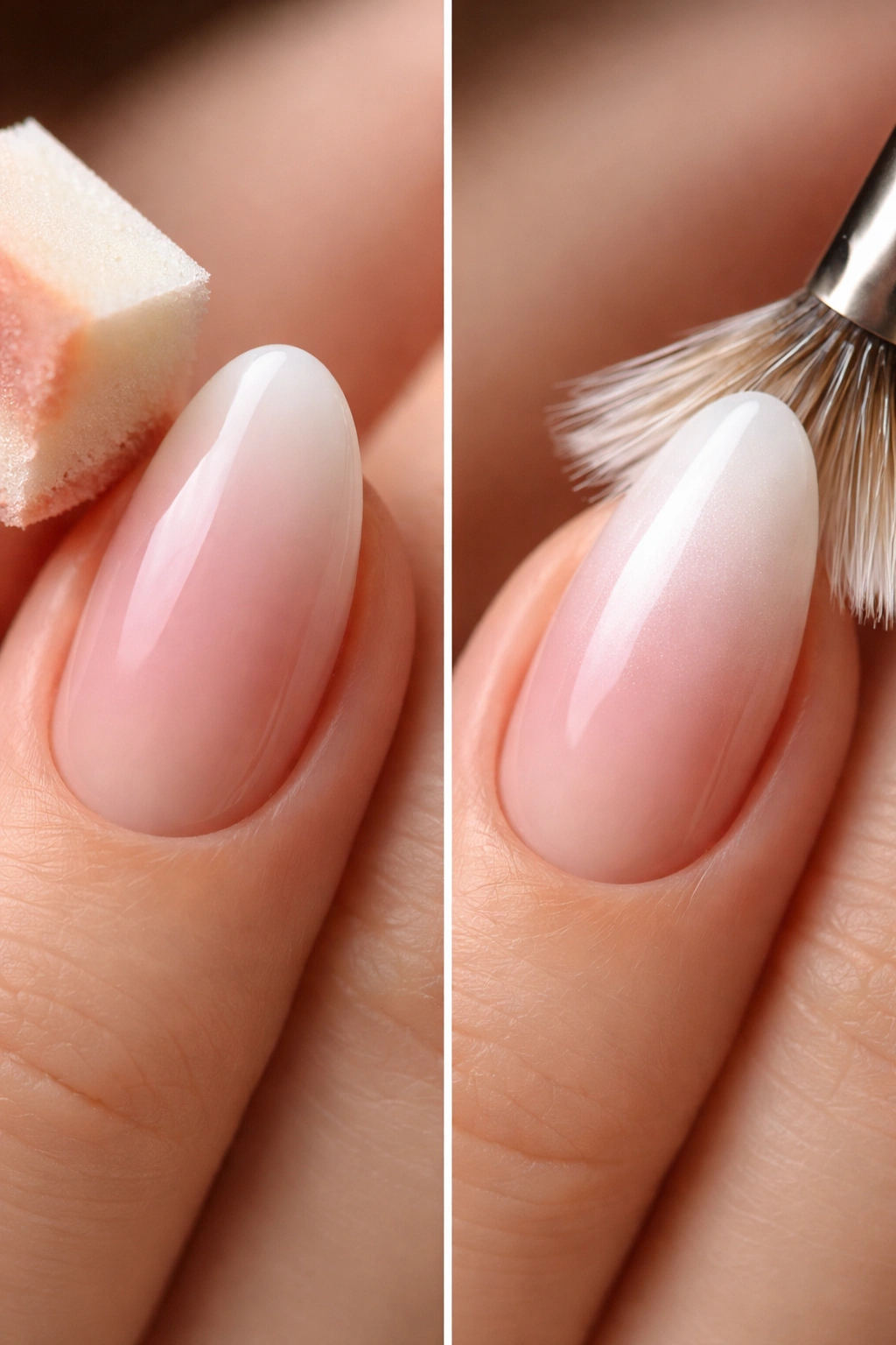
For beginners, a makeup sponge is the most forgiving tool available. Cut a wedge-shaped piece roughly the width of your nail. Apply your two ombre colors side by side on the sponge with about 10–12mm of overlap in the center, then roll — not press — the sponge onto the nail in a gentle rocking motion from one side to the other. That overlap zone is where the blend actually happens.
Plan on 4–6 layers to build full opacity. Each layer goes on the same way, always rolling in the same direction. After every couple of layers, re-apply fresh color to the sponge — polish dries quickly on the sponge surface, and a half-dried sponge creates streaks rather than smooth fades. Once all layers are down, clean up the edges with a fine-tipped brush dipped in acetone, then seal with two thin coats of top coat.
The fan brush method is faster but demands a steadier hand. Load a thin fan brush with the lighter color and work it across the top third of the nail. Switch to the darker color for the bottom third, then blend the middle 30% — where both colors overlap — with short cross-hatch strokes before either side dries. Most polishes stay workable for about 60–90 seconds in ambient light before they start to set, so move deliberately.
Which Method Suits Which Finish
Sponge blending is the better choice for shimmer and metallic finishes. The rolling motion distributes reflective particles evenly and keeps the sparkle consistent through the blend zone. Fan brush blending works better for creams and mattes, where a slightly more defined gradient line is appropriate — and for chrome ombre, where the metallic powder gets applied after curing anyway.
Understanding Undertones Before You Pick Your Palette
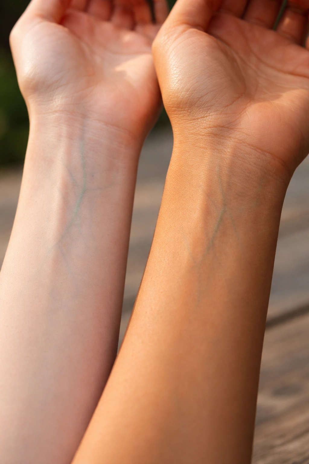
Look at the inside of your wrist in natural daylight — not indoor lighting, which distorts color. Blue or purple veins point to a cool undertone. Green veins indicate warm. If the veins look genuinely teal and you can’t commit to either category, you’re likely neutral, which means you can pull from both warm and cool palettes without much risk.
A second check: hold a piece of pure white fabric next to a piece of cream or off-white fabric next to your face. Whichever one makes your skin look more alive and less ashy is the one that works with your undertone. Cool-toned skin responds better to crisp white. Warm and neutral complexions typically look more balanced against cream.
The base color — the shade sitting at the cuticle — is the one doing the compatibility work. That’s the color the eye reads in relation to the skin. The tip color matters far less. So when any of the designs below specify that a combination works best for warm or cool skin, it’s the base shade driving that recommendation. Keep that principle in mind as you browse.
1. Vanilla to Champagne
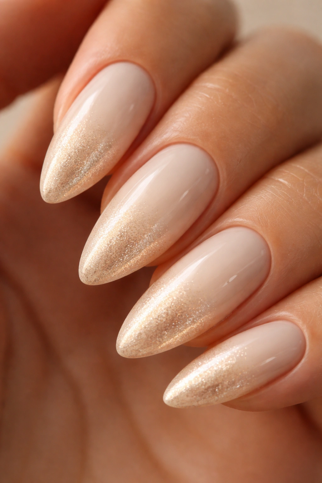
This is the one people describe as “barely there” — and that label undersells it. Vanilla to champagne is a cream-to-metallic shimmer gradient with almost no pigment contrast from across the room, but up close it catches light in a way that makes the nails look three-dimensional. The base is a warm off-white with a slight yellow-cream cast; the tip shimmers with fine gold particles that sit just at the surface. Understated from a distance. Striking up close.
This is one of the more universally flattering combinations on this list because neither color fights any particular complexion. On fair skin, the cream base reads as clean and minimal and the champagne tip adds warmth without going full gold. On medium complexions, both shades play off golden and olive undertones without friction. On deeper skin, the metallic shimmer at the tip catches light in a way that looks genuinely expensive.
For the champagne portion, use a fine-shimmer formula — particles 0.1mm or smaller keep the tip reading as a gradient rather than a glitter accent. Apply the vanilla as a full two-coat base across the entire nail before sponge-blending the champagne from the center upward. Keep the transition zone in the upper 40% of the nail plate. A glossy top coat, generously applied, finishes it cleanly.
Length note: this combination looks noticeably better with some nail to work with. At 6mm extension or longer, the champagne tip has enough space to pick up light the way it’s supposed to.
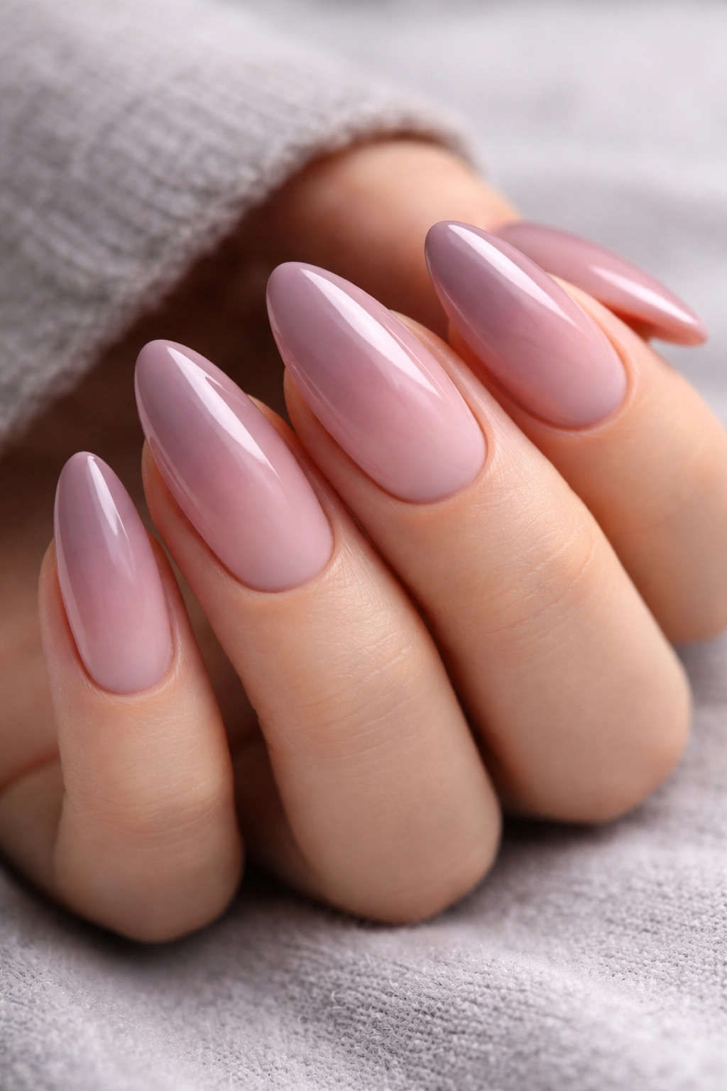
2. Dusty Rose to Pale Blush
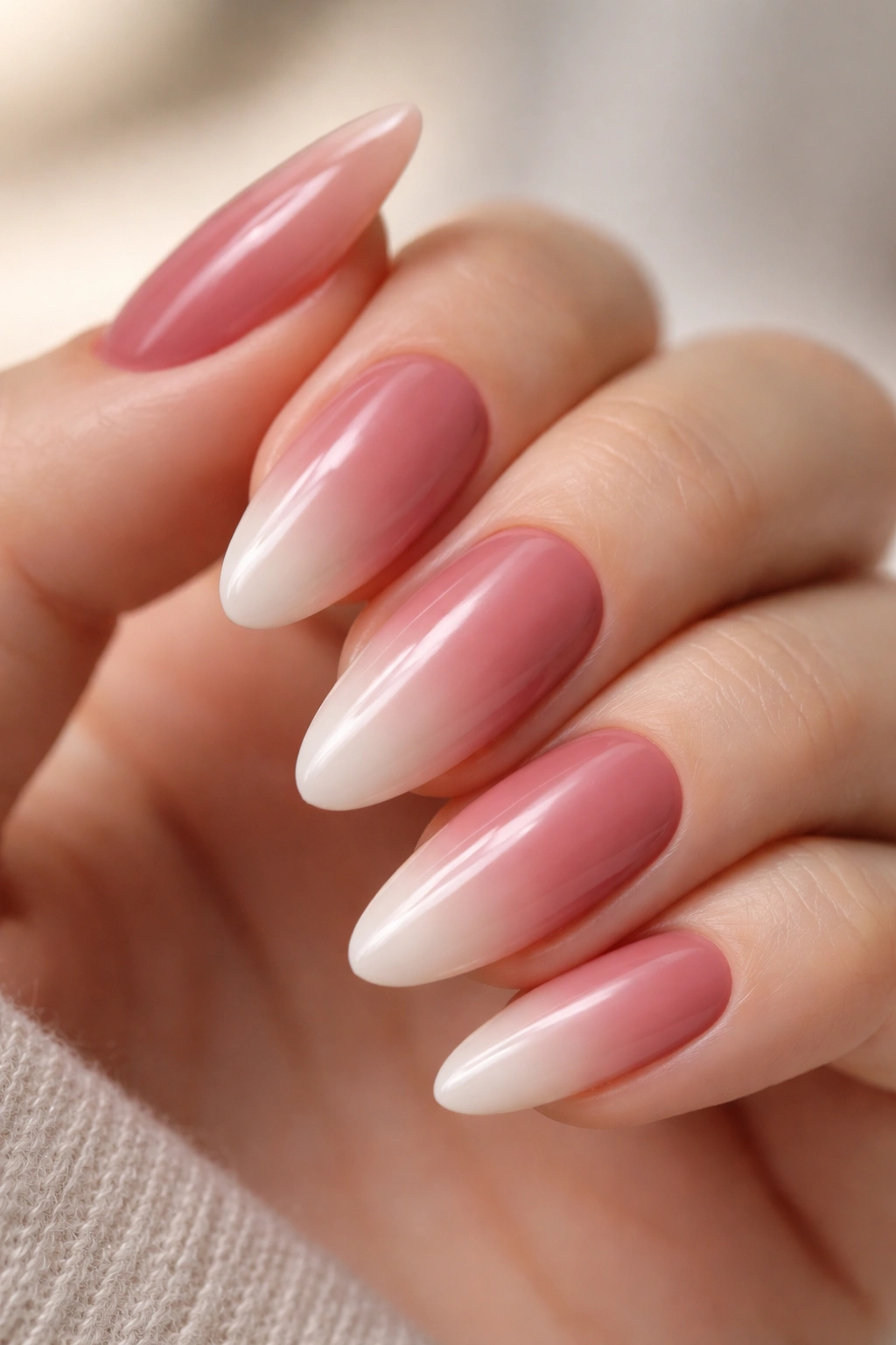
Dusty rose at the base, pale blush at the tip — a pink so light at the tip that it reads almost as skin-tone from a distance, with just a faint rose tint keeping it visible. The two colors sit close enough on the spectrum that the transition is seamless. You’d have to look carefully to find where one ends and the other begins.
Who This Works Best For
This combination was designed, consciously or not, for cool and neutral undertones. The gray component in dusty rose harmonizes with the blue-pink cast in cooler complexions, making the nails look like a natural extension of the hand rather than something applied on top. On warm undertones, that gray can turn slightly muddy against a yellow or olive-toned skin — not badly, just less clean than it could be.
If you have warm undertones and love this color family, make one substitution: replace the dusty rose base with a warm mauve. Look for something described as “taupe-mauve” or “brown-rose” rather than “dusty rose” or “cool mauve.” Same pink family, warmer in temperature, and the gradient reads just as elegantly without the undertone friction.
Application and Finish Notes
- Matte top coat is the right call — it intensifies the dusty, slightly melancholy quality of the rose base in a way that gloss doesn’t
- Apply the blush tip color as the full base coat first across the entire nail, then sponge the dusty rose in from the cuticle end only
- The blend zone should occupy roughly the middle 35% of the nail plate
- Two thin coats of matte top coat, applied 3 minutes apart to prevent streaking
Matte is what takes this from a pretty gradient into something that actually gets commented on.
3. Navy to Ice Blue
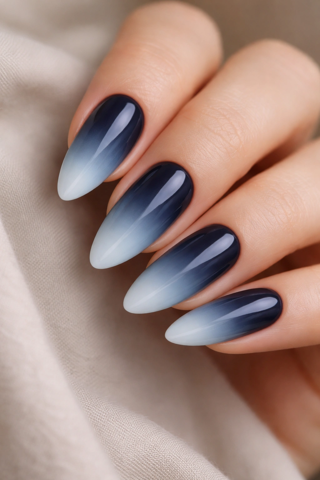
Can a dark-to-light ombre work when the base color is as deep as navy?
Yes — but you have to commit to it and handle the blend properly.
Why Dark-to-Light Is Worth Doing
Most ombre designs go light-at-the-base, dark-at-the-tip. Navy to ice blue flips that completely. Deep navy sits at the cuticle, and the gradient lightens toward the pointed tip, ending in an almost-white pale blue. The effect genuinely resembles looking up through deep water toward the surface. On an almond nail, the tapered tip softens the contrast enough that it doesn’t feel aggressive — it feels considered.
A direct two-color blend from navy straight into ice blue creates a jarring jump in the middle zone; those colors are too far apart for a clean two-step fade. Building through four shades — navy, medium blue, pale blue, ice blue — distributes the contrast across the full nail plate, and the transition becomes gradual enough that the eye follows it naturally rather than being stopped by it.
How to Build the Gradient
- Start with two full coats of navy across the entire nail as the base
- Add medium blue over the top 60% of the nail plate
- Add pale blue over the top 40%
- Blend ice blue from the top 20% downward, feathering the edges with a dry fan brush
- Glossy top coat — this combination needs light reflection to show its full color depth
Deep skin tones with cool or neutral undertones carry this gradient with particular clarity. The navy base reads as rich against a deeper complexion, and the ice blue tip creates high contrast that registers from across a room. On very fair or light skin, navy at the cuticle can feel heavy — cobalt blue makes a softer alternative that gives the same dark-to-light direction with less visual weight at the base.
4. Burnt Sienna to Peach
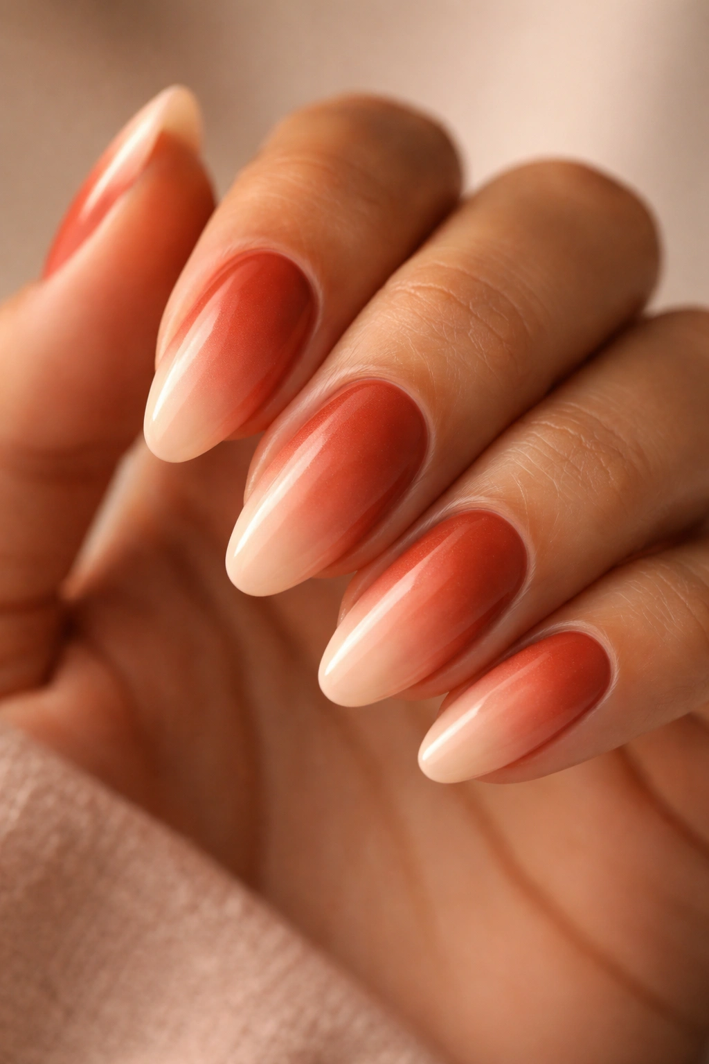
This one is for warm and olive skin tones, full stop. Burnt sienna is a deep orange-red-brown — the color of dry earth, terracotta pots, late afternoon sun on brick. Peach is the soft, warm cream-pink that lives at the lighter end of that same family. On warm or olive skin, these two shades don’t just complement the complexion; they mirror it. The gradient looks like it was pulled directly from the hand itself, and the nails look like they belong in a way that few colors achieve.
On cool undertones, this combination doesn’t work. The fully warm, orange-leaning palette reads as clashing against a blue-pink or red-pink complexion. Worth saying plainly so you don’t spend time on a pairing that won’t land for your skin.
A practical note on application: burnt sienna is notoriously sheer in many formulas. Look specifically for polishes labeled “opaque” or “full coverage” in this color range. A sheer formula needs 4–5 coats before the sponge-blended peach goes on, and that many thick layers can start to look uneven. A genuinely opaque formula in 2–3 coats gives you a cleaner base and saves real effort.
The finish that works best here is a fine satin shimmer — not full metallic, but a satin sheen that adds warmth to both colors without making them feel lacquered. Straight matte in burnt sienna tends to go flat; high gloss pushes the orange notes into garish territory rather than earthy richness.
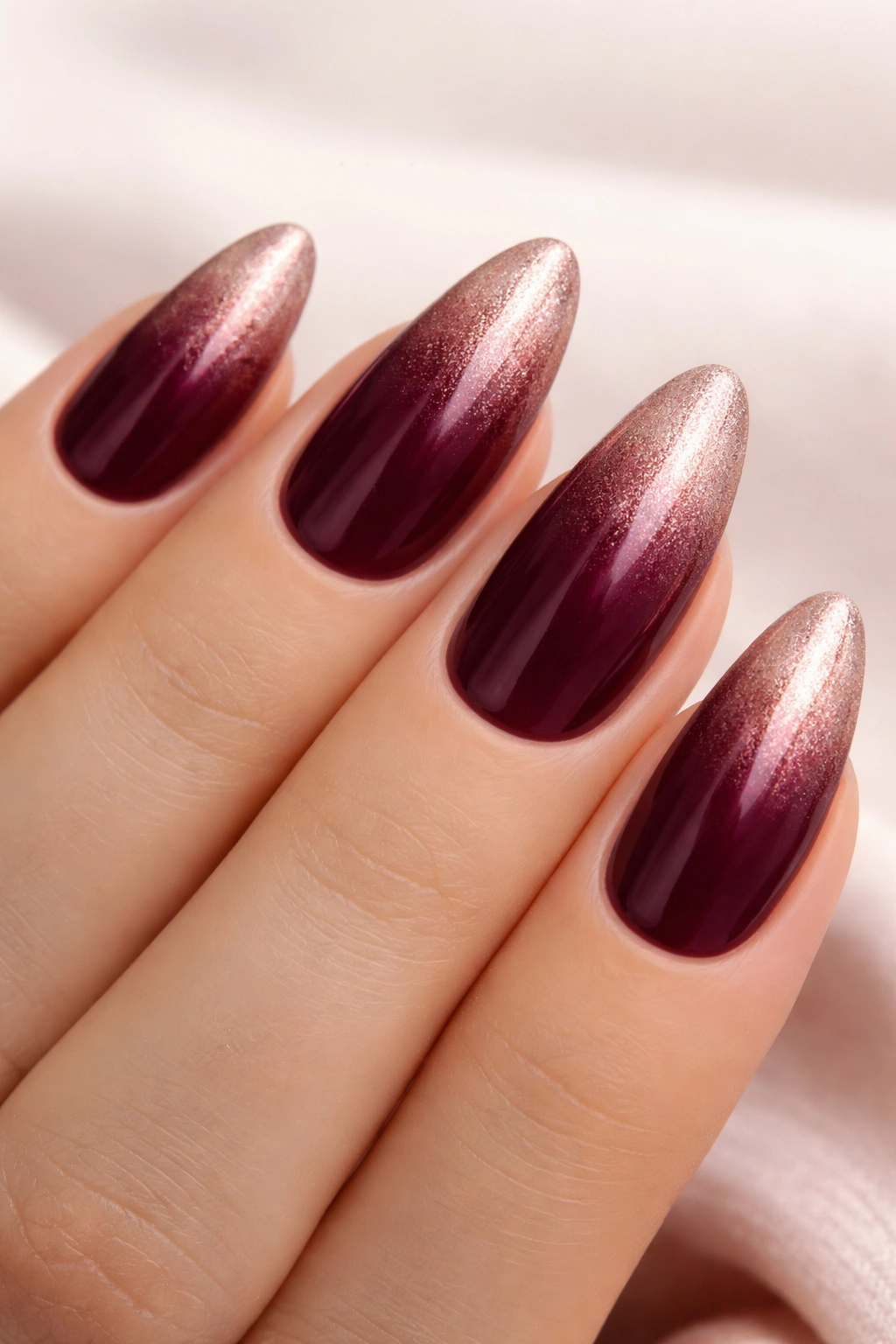
5. Deep Plum to Lilac
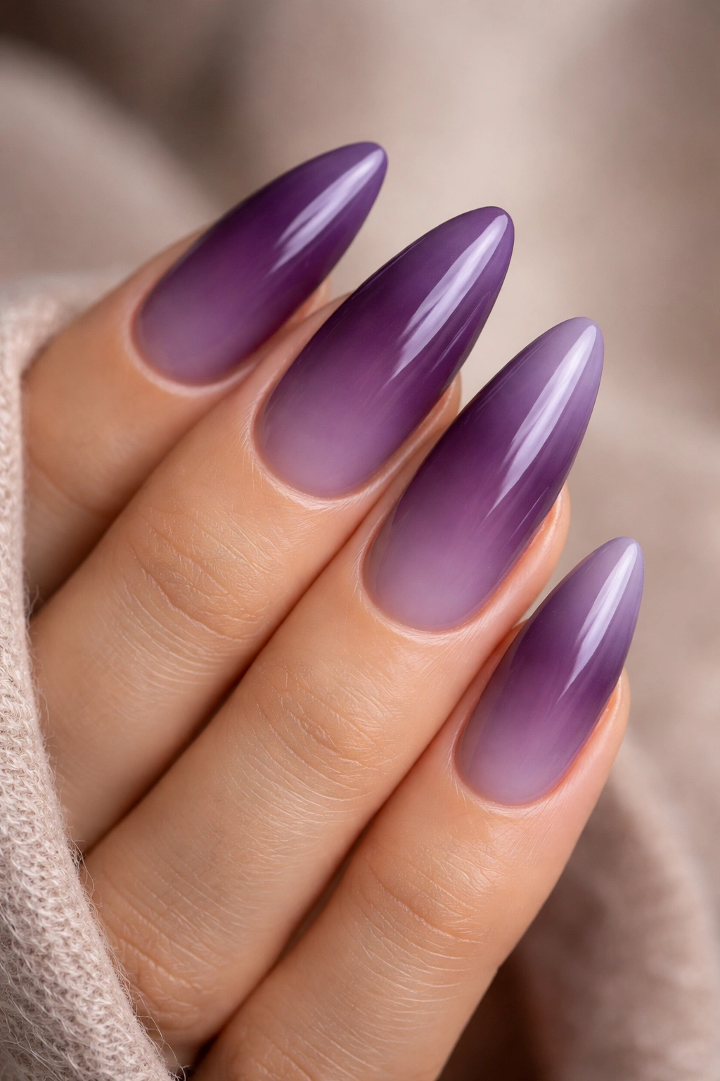
Deep plum to lilac is one of those gradient combinations where the contrast does all the work. The deep, almost purple-black base is dramatic enough to stand on its own as a bold nail color. The pale, slightly gray lilac at the tip is soft enough to prevent the whole thing from tipping into overwrought territory. Between them, the gradient moves through a rich violet middle ground, and the finished result on an almond nail reads clearly from across a table.
What makes this combination work across every skin tone is the gray quality in the lilac tip. Pure lavender — the pink-heavy, warm version — can clash with warm undertones and look slightly garish against them. A dusty, gray-lilac is neutral enough in temperature to avoid that conflict entirely. The plum base has so much depth that it creates real distance from the skin color and doesn’t sit close enough to any undertone to cause friction.
Key details for this design:
- Base: true deep plum or “blackened plum” — check that the formula doesn’t read as flat brown under artificial light
- Tip: “dusty lilac” or “muted lavender,” not “warm lilac” or “pink-lilac”
- Build through three colors — plum, violet, gray-lilac — for the widest, smoothest fade
- Finish: semi-gloss or full gloss, since the plum base needs light reflection to show its full richness
- Length: best at 7mm+ extension, giving the gradient enough room to travel
For a bold autumn or winter nail, this is the one to reach for. The depth reads as seasonal, the pale tip keeps it feeling contemporary, and the purple family flatters every skin tone when the shades are chosen correctly.
6. Cocoa Brown to Caramel
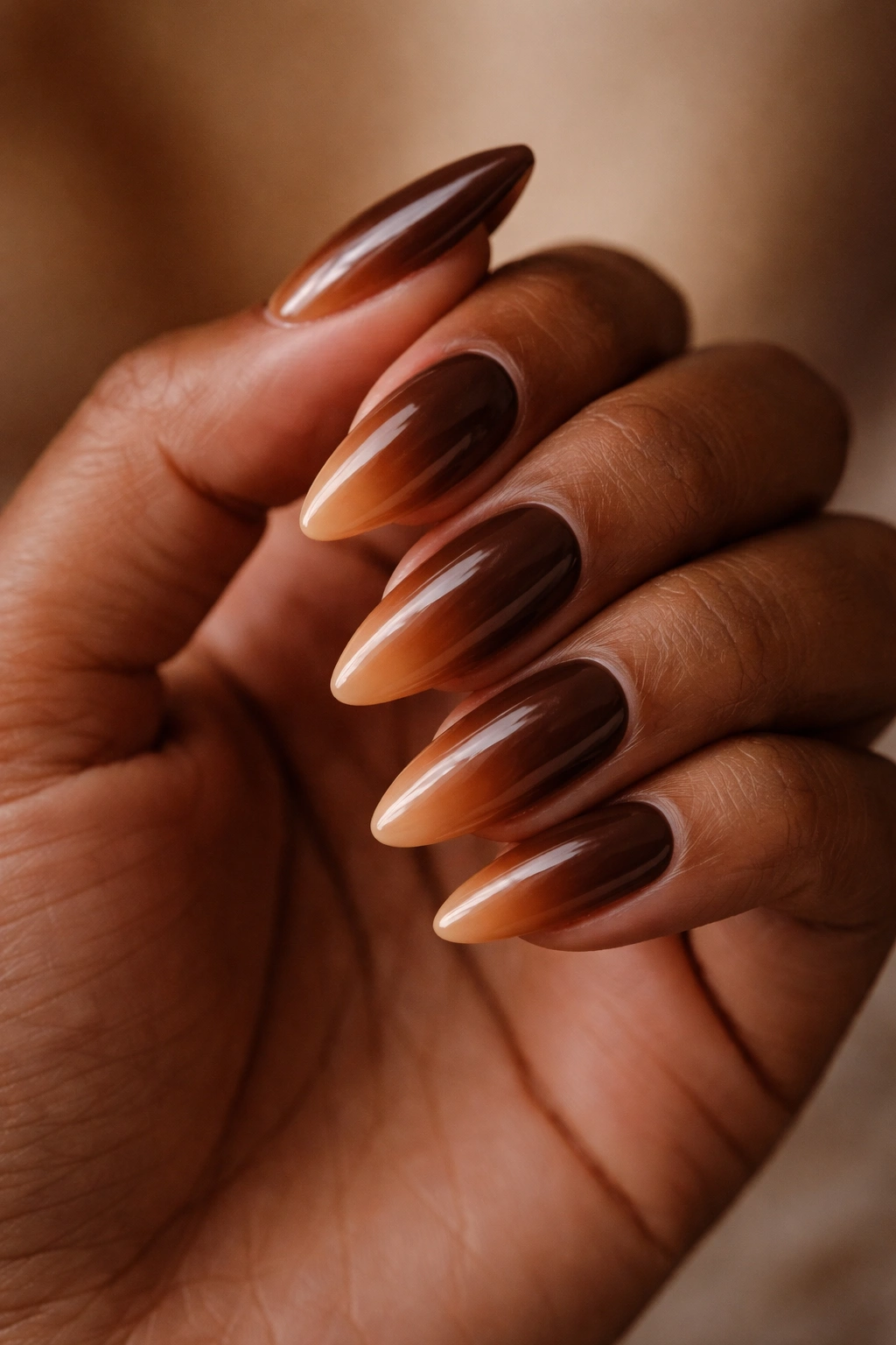
Unlike most entries here that deliver obvious color contrast, cocoa to caramel stays entirely within the brown family. No dramatic shift. No bold color payoff from six feet away. What it offers instead is warmth — a gradient that reads as quietly luxurious against medium and deep skin tones in a way that high-contrast combinations sometimes can’t match.
Fair skin tends to find this combination underwhelming. When there’s insufficient contrast between the gradient colors and a light complexion, both shades blend into the skin rather than playing off it. On medium, warm-medium, and deep skin tones, that’s exactly the point — the cocoa base is earthy and grounded, the caramel tip glows warm, and together they look considered rather than bold.
The finish is critical here. A glossy top coat turns this gradient into something almost leather-like — warm, rich, slightly lacquered in a way that makes both colors look more expensive than they are in the bottle. Matte kills the glow that makes this design special, so skip it here.
Finding the Right Cocoa Brown
Look for polishes labeled “golden brown” rather than “dark brown.” Standard dark brown formulas can turn cool and ashy under fluorescent lighting, which strips out the warmth the gradient depends on. A cocoa with a genuine golden undertone stays warm in every light condition. Hold the bottle up at a diagonal to a light source — you should see amber or honey quality in the base of the formula, not flat dark brown.
7. Sage Green to Mint
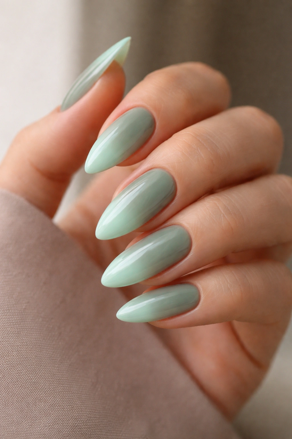
Sage green has developed a steady following across interior design, fashion, and nails alike — and it makes a particular kind of sense as a polish color. It’s muted and slightly gray, far from the bright greens that polarize people, sitting in a useful zone between green and gray that pairs naturally with mint. Mint, at the lighter end of the scale, reads as almost white from a distance but shows its green quality up close.
Sage at the base, mint at the tip. What gives this combination depth beyond what you’d expect from two closely related shades is the temperature contrast built into the palette itself: sage has warm, slightly yellow-green undertones, while mint is cooler with a blue-green cast. That internal temperature shift within the gradient creates visual richness that a same-temperature fade simply wouldn’t have.
On neutral undertones, this combination works without adjustment. The sage base hits the skin’s balanced midpoint, and the mint tip adds brightness without going cool enough to create friction. On cool undertones, swap sage for a blue-leaning green — one that looks like it has a tiny drop of blue mixed in — so the whole palette reads in the same cool direction. On warm undertones, push the sage toward olive (more yellow in it) so the base echoes the skin’s warmth.
One note on finish: matte is clearly the right choice here. Matte sage has a botanical, slightly velvety quality that gloss wipes away. Apply the matte top coat in one thin pass while the ombre layers are fully dry — at least 4 minutes after the final gradient layer — to avoid dragging the polish or creating a streaky surface.
8. Black to Gunmetal Grey
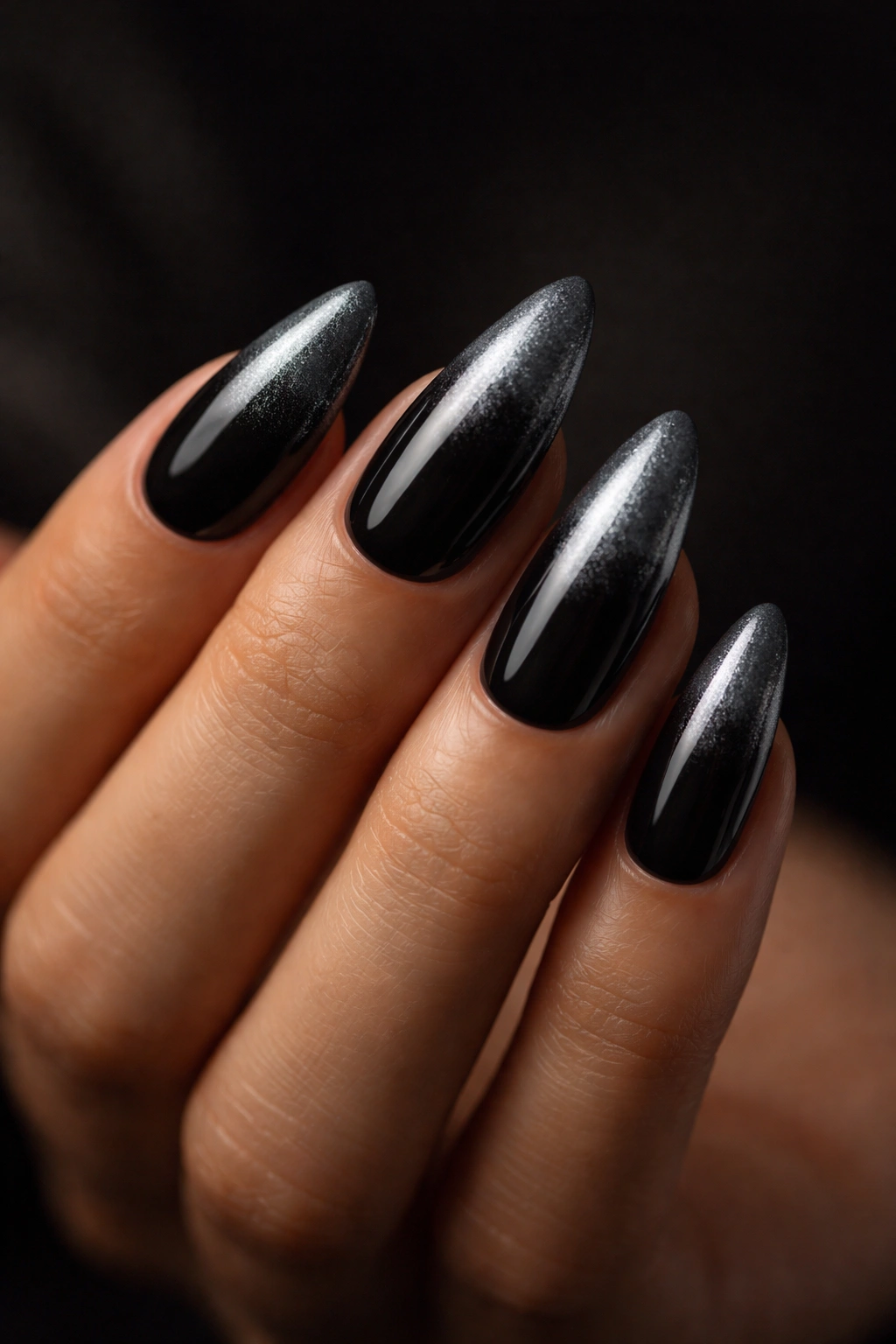
Not every ombre needs to be soft.
Black at the base fading to metallic gunmetal grey at the tip is a choice that reads as precise and intentional — and on an almond nail, the pointed tip delivers that metallic shimmer to a focused focal point that square or coffin nails can’t replicate.
The real contrast in this design comes from finish, not color. Black is flat or semi-matte; gunmetal grey is metallic, with fine silver particles throughout the formula. The gradient isn’t doing much heavy lifting in terms of hue shift from dark to light — those two are fairly close on the spectrum. What’s shifting is texture: from solid and opaque at the base to reflective and shimmering at the tip.
Apply the gunmetal metallic as the full base coat, two layers for coverage. Once dry, sponge the black in from the cuticle end, covering about 60% of the nail plate. The blend zone sits in the middle third. Because black is so opaque and the metallic is so reflective, even a slightly rough blend looks deliberate — the stark shift in finish character does most of the visual work without requiring perfect technique.
This combination suits every skin tone because neither color carries a strong warm or cool bias. Deep skin tones wear it with particular authority — the black base reads as rich against a deeper complexion rather than harsh or flat. If you have very fair skin and the contrast feels aggressive, add a small amount of dark grey into the black formula to soften it toward deep charcoal.
9. Coral to Ivory
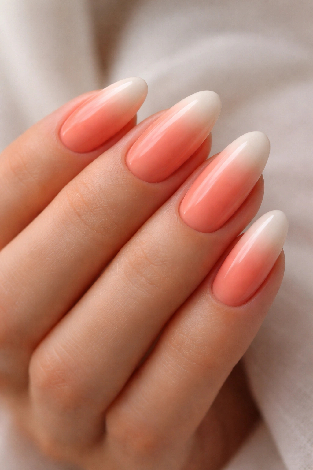
Coral is a tricky color to get right on nails. Too much orange and it looks garish. Too much pink and it loses the warmth that makes it interesting. The right coral for this ombre sits exactly in the middle: equal parts pink and orange, no yellow bias in the formula.
What Makes the Combination Work
Coral to ivory on almond nails reads as warm and light without being juvenile. The ivory tip is creamy rather than stark white — it carries a slight yellow warmth that keeps the transition smooth and prevents the tip from reading like a halfway-done french manicure interrupted by accident. The coral provides the color energy; the fade toward ivory softens it without washing it out entirely.
Shade Adjustments by Skin Tone
- On golden or warm medium skin: Standard coral-to-ivory works without modification — the warmth in the coral mirrors the skin’s natural cast
- On cool or pink-biased skin: Choose a coral that leans more pink than orange so the base doesn’t create an orange-against-cool-pink mismatch at the cuticle
- On deeper skin tones: Push the coral darker, toward a rich deep coral-orange with real pigment depth — a pale coral can look dusty and underpowered against a deep complexion
Application Order
Apply the ivory as the full base coat first, then sponge the coral in from the cuticle — not the other way around. Building the darker shade onto a light base gives cleaner control over how far the gradient travels and how deep the coral reads. Start the coral around 60% from the base and blend upward through the center 20%. Glossy finish — coral benefits from light reflection in a way that matte suppresses.
10. Wine Red to Blush Pink
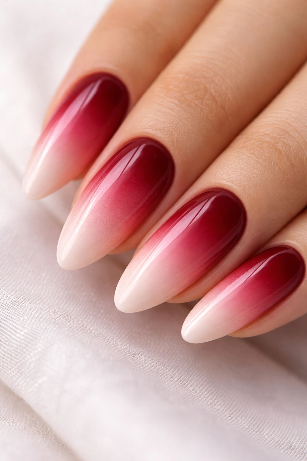
Why does wine red-to-blush pink work when direct red-to-pink gradients usually don’t?
The answer is the intermediate step. A two-color blend from wine red directly to blush pink forces two shades together that sit at opposite ends of the red-pink spectrum. The blend zone turns muddy — a grayish, brownish-pink middle that nobody intended. Adding a mid-range rose or berry pink as a third color bridges the gap. With that middle tone in the sponge layering process, the gradient travels smoothly from deep to light without the muddy middle zone.
Wine red has a deep, slightly cool quality — it leans toward berry-red rather than orange-red. That cool quality makes it well-suited to medium and deep complexions with pink or neutral undertones. On warm complexions, the cool wine base can feel mismatched against golden or yellow-toned skin. The fix: choose a wine with a brown-red quality, closer to oxblood than pure cool wine. That brown warmth in the base removes the undertone conflict without changing the gradient direction.
Three-Color Sponge Loading
Load the sponge with all three colors in a line — wine red, rose pink, blush — each taking up roughly one-third of the sponge width. Orient the sponge so the wine red section is nearest the cuticle when you apply. A single pass deposits all three tones, and 4–5 layers build the gradient with transitions throughout the full range. No additional blending tools needed.
11. Terracotta to Sand
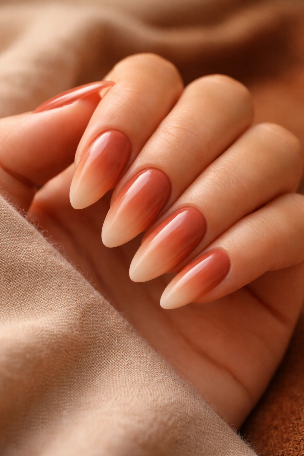
Terracotta at the base, warm sand at the tip — this gradient reads as afternoon light made into nail color. Terracotta is earthy, orange-brown, the color of sun-dried clay pots and old buildings in warm climates. Sand is the soft, yellow-warm beige at the lighter end of that same family. Nothing dramatic. No stark contrast. Just a gradient that feels warm and considered from every angle.
This combination lives entirely within the warm, earthy part of the spectrum — no cool notes anywhere in the palette. That’s what makes it ideal for olive and warm-toned skin, where the gradient mirrors rather than fights the natural golden or yellow cast in the complexion. On cool-toned skin, the fully warm palette reads as disconnected from the skin’s blue-pink quality, and neither color does anything flattering at the cuticle.
Details that matter:
- The terracotta base should lean slightly orange — if the formula reads as muted rust, that’s the right zone
- Sand is not beige and not cream: it’s a warm yellow-beige, slightly dusty but unmistakably warm
- Sponge from the cuticle end, bringing terracotta coverage to about 50% of the nail plate
- Leave the top 30% as pure sand and blend through the middle 20%
- Semi-gloss preserves the terracotta’s warmth better than full matte
If you love the earthy concept but have cool undertones, a stone grey-to-off-white gradient gives you the same minimalist energy at a cooler temperature.
12. Cobalt Blue to Periwinkle
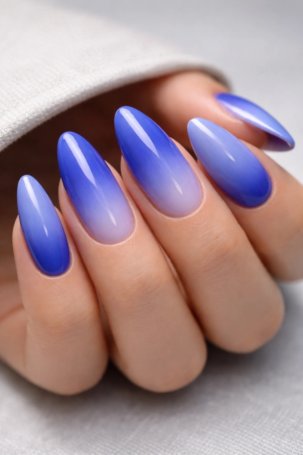
Most blue ombres play it safe — sky blue to baby blue, slate to powder. Cobalt to periwinkle refuses that safety. Cobalt is saturated, intense, and purely blue with almost no gray. Periwinkle is lighter but carries a lavender note that gives it warmth at the tip. Between them, the gradient moves through a bold blue spectrum that manages to feel both strong and delicate at once.
Unlike softer blue combinations that suit fair skin particularly well, cobalt to periwinkle is at its best on deeper complexions. The saturation of cobalt needs real contrast from the skin to read as vivid rather than washed out — on a deeper complexion, that contrast exists naturally, and the bold blue delivers with a clarity that looks almost gemstone-like. On medium skin tones, three coats of cobalt at the base instead of two builds the opacity needed for the gradient to have its full impact.
On fair skin with cool undertones, cobalt at the cuticle can feel aggressive against a very light, pink-toned complexion. A soft navy-to-periwinkle gives the same gradient direction with less color intensity and suits lighter complexions considerably better.
Gloss is essential here. The saturation in cobalt requires light reflection to show its full color depth — matte cobalt goes flat and slightly chalky, and the gradient loses the entire point of itself.
13. Olive Gold to Champagne
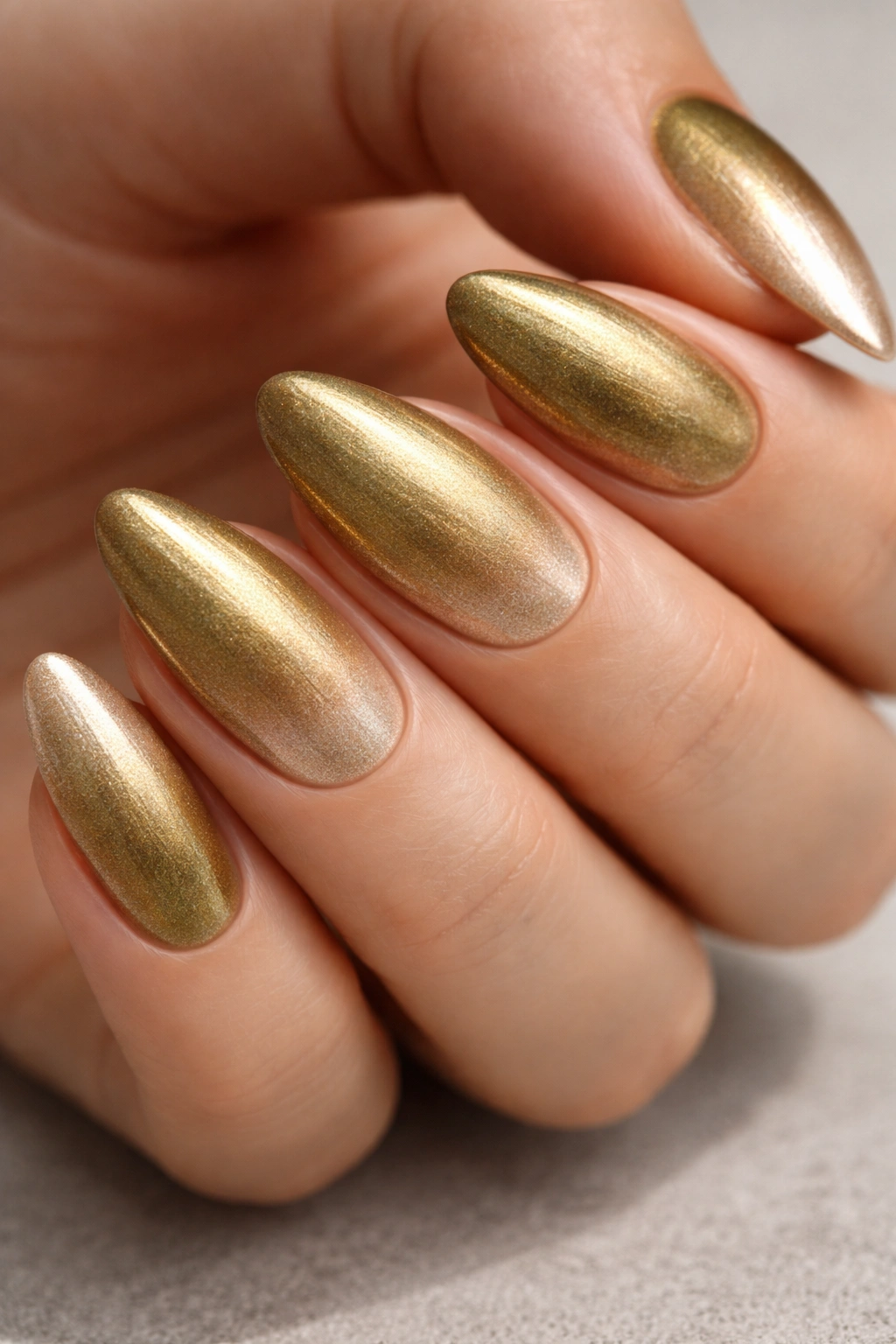
Olive-based polish formulas and golden-toned skin are a pairing the mainstream nail world has been slow to fully explore. Most palettes lean pink or neutral, which means the olive-gold range gets relatively little attention — and that’s a real gap, because on a warm or olive complexion, this gradient does something few other color combinations manage: it looks like it genuinely belongs.
The olive gold base is a warm, slightly muted green-gold — somewhere between old bronze and gold jewelry with a patina. It fades up to a clear champagne at the tip, which is a warm metallic ivory. The whole palette is warm, metallic, and earthy. On golden and warm-toned complexions, the olive base mirrors the skin’s golden undertone so closely that the nails appear deliberately coordinated with the hand rather than simply placed on it.
Finding the right formula takes some attention. Look for polishes labeled “khaki gold” or “bronze olive” rather than straight olive green — the metallic component in the formula is what keeps the color from reading as dull or flat. Hold the bottle at an angle toward a light source; you should see a shift between green and gold depending on the angle. No shift means no metallic, and without that metallic quality the gradient loses its warmth.
Sponge blending with champagne at the tip end of the sponge works well here. The metallic particles in both shades distribute evenly and create a metallic-to-metallic transition through the blend zone. Gel top coat is worth using if you have it — the metallic tip chips fastest at the very point of an almond nail, and gel top coat extends wear from about 3–4 days to 10–12 days at home.
14. Burgundy to Rose Gold
Burgundy earns its place on this list. It’s deep, rich, and slightly serious — and pairing it with rose gold creates a temperature contrast that makes this gradient more dynamic than most color-family-matching ombres. The two shades are fundamentally different in character: cool depth at the base, warm shimmer at the tip. That tension is what gives this combination its visual pull.
The Dynamic at Work
Burgundy sits in the wine-red zone with a blue or purple quality that pulls it away from orange-red. Rose gold is warm, metallic, and distinctly pink-tinged. On the nail plate, those two characteristics don’t fight each other; they create a gradient that reads as dimensional because it contains both coolness and warmth within a single fade. The eye has two different things to respond to — depth and glow — and it responds to both.
Medium and deep complexions with neutral-to-cool undertones carry this best. The burgundy base creates enough contrast to read as rich rather than flat, and the rose gold tip adds warmth that complements rather than clashes. On warm undertones, the cool burgundy base can feel slightly mismatched against a golden complexion. In that case, choose an oxblood or warm-burgundy with a brown-red quality as the base rather than a pure cool wine red.
Application Sequence
- Apply rose gold metallic as the full base coat across the entire nail, two full coats
- Sponge the burgundy in from the cuticle, covering roughly 55% of the nail plate
- Build through the center 30% with 5–6 thin sponge layers for full opacity in the darker zone
- Seal with two coats of gel top coat — the rose gold metallic tip picks up this finish particularly well
The payoff where burgundy dissolves into rose gold — where the metallic shimmer appears as the color lightens — is one of the more striking fades on this entire list. Worth the extra sponge layers.
15. Smoky Mauve to Dusty Pink
Smoky mauve occupies a color zone that most people can’t quite name when they see it. Not quite pink, not quite gray, not quite purple — it lives in that useful in-between space where everything feels muted and deliberate. Pair it with a dusty pink at the tip (lighter, with more pink showing through but still carrying that same gray quality), and the gradient reads as tonally consistent and quietly striking in a way that more saturated colors can’t replicate.
Cool and neutral undertones are the natural home for this combination. The gray component in both shades echoes the blue-pink cast of cooler skin, and the gradient ends up looking like it was specifically developed for that complexion type. On warm or olive undertones, the gray in both colors can make them read as slightly flat and cold against the warmth of the skin — not a disaster, but not the skin-flattering version of this design.
Key details:
- Base: look for “greige-pink,” “taupe mauve,” or “cool mauve” — if the label says “warm mauve” or “terracotta mauve,” the color carries too much warmth for this specific design
- Tip: same gray quality as the base, just lighter — more pink showing through but still distinctly muted
- Matte top coat, by a significant margin — the gray quality in both shades needs matte to express itself fully
- Keep the blend zone relatively narrow, about 25% of the nail plate, so each shade has enough territory to register clearly
This is a quiet combination that makes people look twice. The depth in the smoky mauve works from a distance; the dusty pink tip rewards closer attention.
16. Steel Blue to White
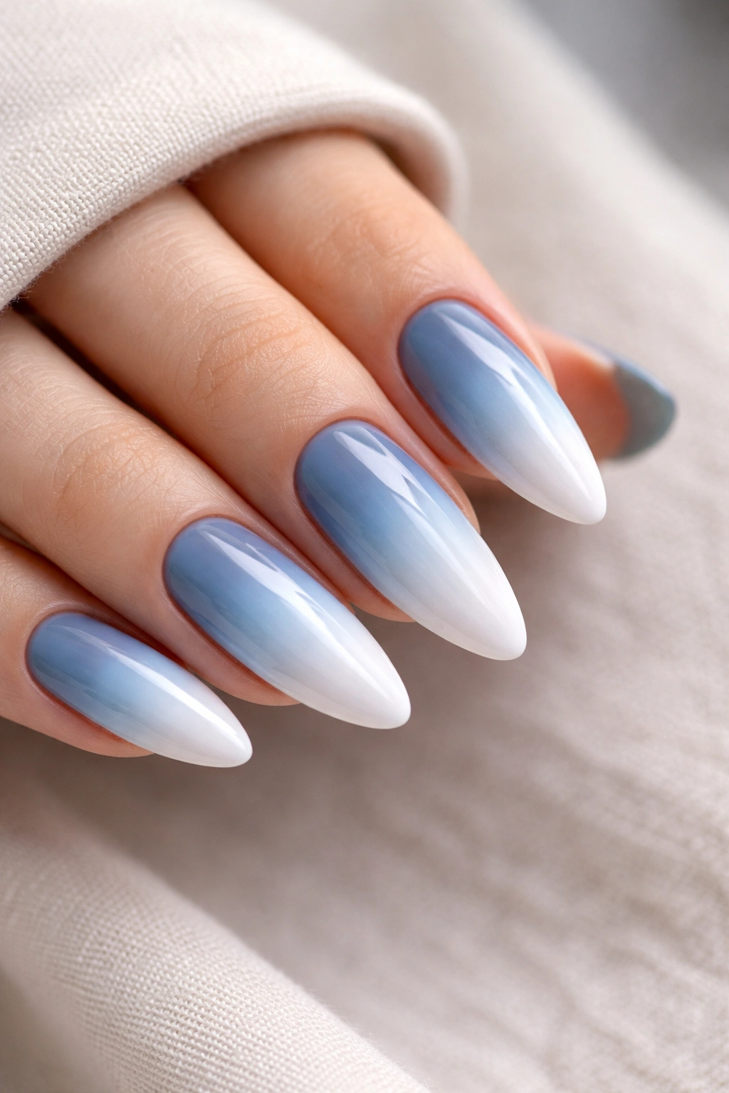
Is white the right tip color for an ombre? Not always — pure white can look stark and abrupt if the blend is even slightly uneven, and imperfections in the gradient layers show up mercilessly against a white background. But paired with the right base color and a deliberately wide blend zone, white tips are genuinely beautiful.
Steel blue is what makes white tips work here. It’s a cool, slightly muted blue-gray — dark enough to give the gradient real contrast without the heaviness of navy or the intensity of cobalt. The fade from steel blue to white travels through pale blue and then ice blue, and on an almond nail with a wide blend zone of 40–45% of the nail plate, the transition feels like the color is naturally evaporating rather than stopping.
Who This Suits
Cool-toned skin with fair to medium depth carries this most naturally. Steel blue echoes cool undertones in the complexion, and the white tip reads as crisp and clean against lighter skin rather than washed out. On medium skin tones with neutral undertones, an extra coat of the steel blue base builds enough contrast for the gradient to read clearly. Warm or deep skin tones may find the cool-gray quality of steel blue slightly at odds with their undertone — swapping in a teal-blue for the base keeps the same gradient direction with a slightly warmer temperature.
Building White Gradually
A direct two-color blend from steel blue to white creates a harsh edge. A five-step build — steel blue, medium blue, pale blue, ice blue, white — distributes the contrast gradually enough that the eye travels from base to tip without interruption. Apply each lighter shade over a progressively smaller section of the nail plate, starting from the tip end and working inward. Each step covers about 8–10mm less of the nail than the previous one.
17. Warm Taupe to Ivory Cream
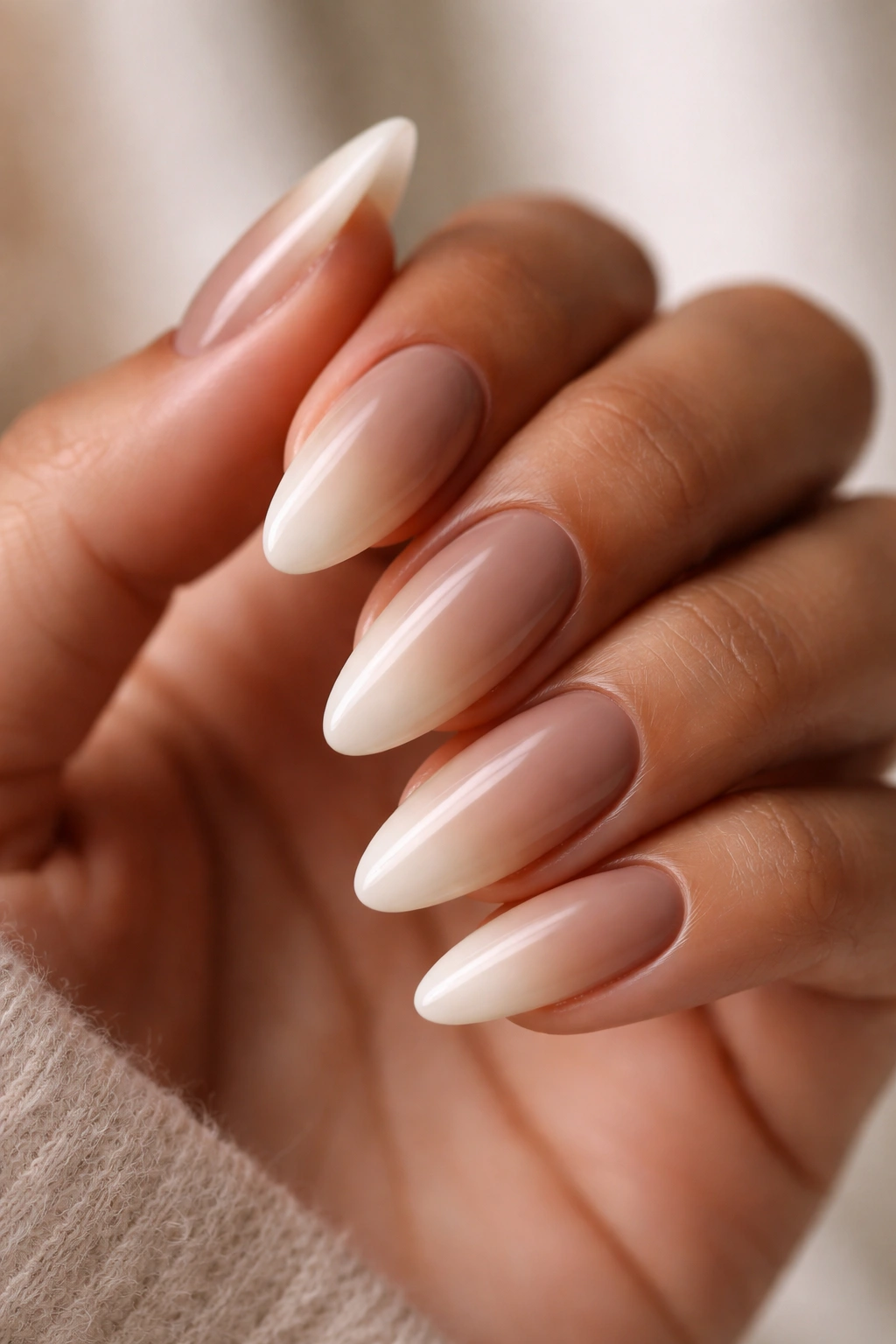
No drama here. That’s the point.
Warm taupe at the base, ivory cream at the tip. The taupe is a brown-gray with a clear warm cast — not the cool, slightly blue greige that appears in most “neutral” polishes, but a taupe that reads genuinely warm in every light. The ivory tip is off-white with a cream-yellow quality. Both colors occupy the same understated, warm-neutral territory, and the gradient between them is so smooth it can be difficult to find the transition line at all.
This is one of only two combinations on this list — alongside vanilla to champagne — that works across every skin tone without adjustment. Warm neutrals sit in a middle zone that doesn’t lean strongly toward any undertone and therefore doesn’t create conflict. Fair skin, medium skin, olive skin, deep skin — the gradient reads as clean and harmonious across the board. It’s also the right choice for professional or formal settings where a bolder gradient would feel out of place, not because it’s boring but because it reads as polished without demanding attention.
One detail that makes or breaks this design: the taupe and ivory must share the same warm undertone. If your taupe has even a slight cool or blue-gray quality in it, the warm ivory tip creates a subtle temperature mismatch in the blend zone that looks unintentional rather than deliberate. Test the two polishes side by side on a piece of white paper before committing — they should clearly feel like they belong to the same family.
One thin coat of glossy top coat. That’s all this needs.
18. Cherry Red to Hot Pink
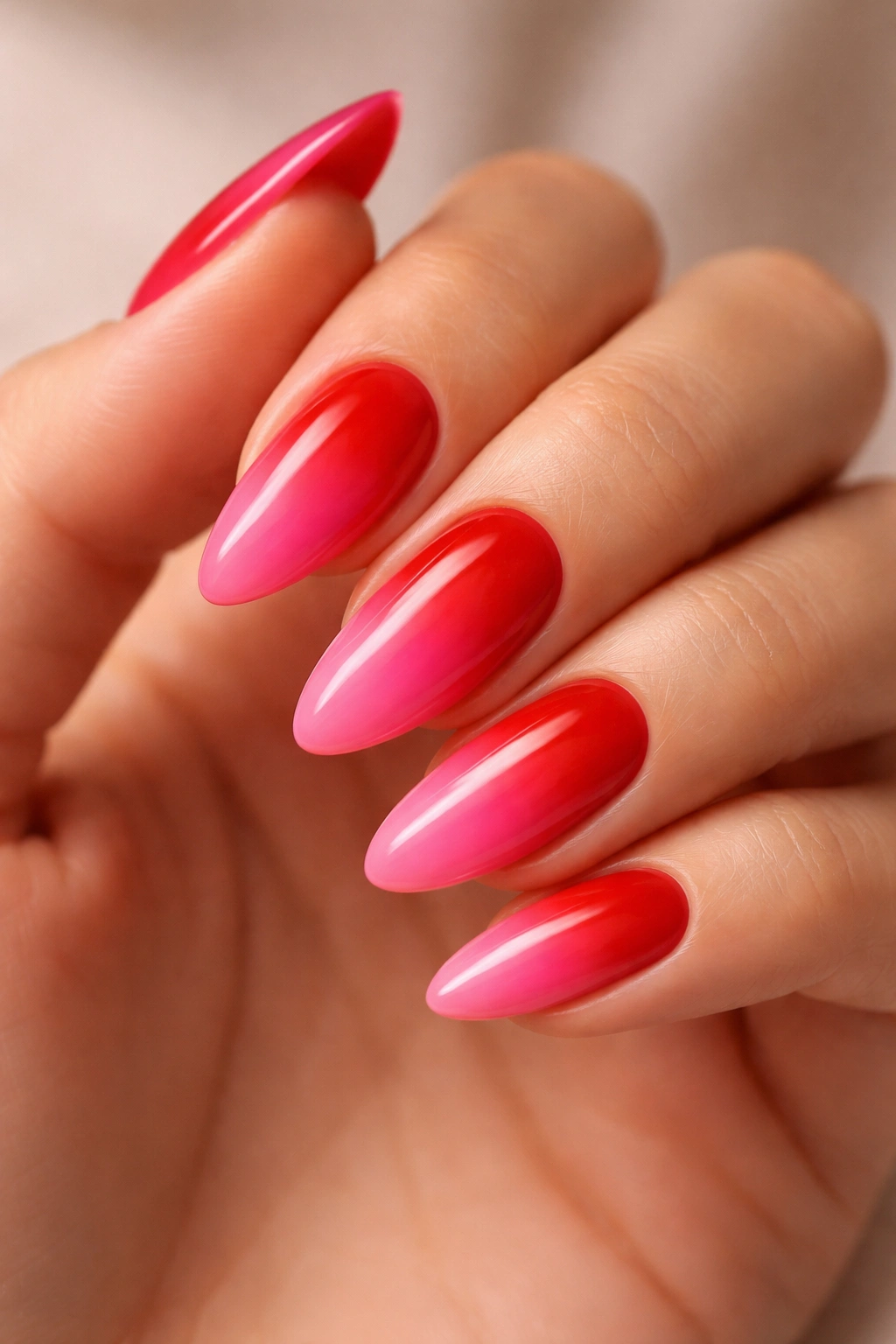
If warm taupe to ivory is the whisper, cherry red to hot pink is the shout — and that’s not a design flaw.
Cherry red is a true, saturated red: not orange-red, not burgundy, not raspberry. Traffic light red, fully pigmented. Hot pink at the tip is equally saturated — vivid and unapologetic. The gradient between them moves through a warm pink-red zone that has more intensity than a gradient has any right to carry. On an almond nail, the tapered tip delivers that hot pink to a sharp focal point, and the effect is confidently bold in a way that rewards wearing it.
Unlike most entries here, this one doesn’t favor one skin tone over another. Both colors are saturated enough to stand apart from any complexion. On deep skin tones, the cherry red base hits with full power and the pink tip at the pointed tip creates high-contrast color payoff that deeper skin tones are particularly well-suited to carry. On fair skin, the high saturation creates maximum contrast. On medium and olive complexions, the warm palette reads as vivid and energetic without feeling mismatched.
The thing that can go wrong: a gradient that drifts toward orange instead of staying in the warm red-pink zone. This happens when the cherry red formula carries too much orange bias. Look for polishes described as “true red” or “blue-red” — a red with a very slight cool cast. A cool-leaning red will read as pure red under most lighting and keep the hot pink tip fully pink rather than pulling it toward salmon.
High-shine gloss finish. No debate on this one — these colors were made for light.
The Bottom Line
Ombre on almond nails keeps rewarding you the more attention you pay to it. The shape is half the design — the tapered tip gives the gradient a clear destination, and the curved sides add depth to the base color in a way that flat nail shapes simply can’t replicate.
The single most practical principle from everything above: the base color at the cuticle is the shade doing the compatibility work with your skin. Get that one right — matching its warmth or coolness to your undertone — and the tip color has far more freedom. A harmonious base can support an adventurous tip. A mismatched base will make even a technically clean gradient look slightly off, regardless of how well you executed the blend.
Start with one of the universally flattering combinations (vanilla to champagne or warm taupe to ivory) if you want a guaranteed result while you’re still getting the sponge technique down. Once you understand how your undertone interacts with different base shades, the bolder combinations — deep plum to lilac, cobalt to periwinkle, cherry red to hot pink — become considerably more approachable. The technique doesn’t change between a soft gradient and a dramatic one. The commitment to the color does.
