

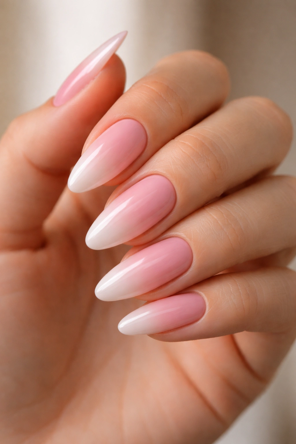
Pink ombre on almond nails is one of those combinations that just works — the tapered tip of an almond shape draws a gradient naturally from the base toward the point, creating a longer-looking finger even on shorter nail beds. And yet, for something so visually satisfying, the number of ways to approach it keeps most people stuck choosing between the same two or three looks they’ve seen on everyone else’s hands.
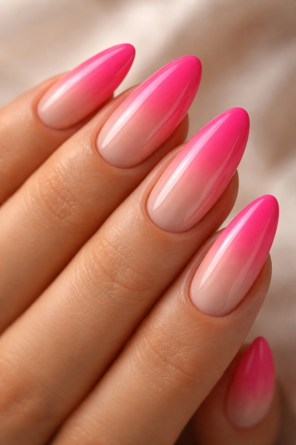
“Pink ombre” covers an enormous range. There are barely-there blush fades that make your nails look naturally perfect, and then there are bold magenta-to-nude contrasts that stop people mid-sentence. The shape stays constant. The pinks and the blending technique change absolutely everything about the result.
What separates a decent ombre from a truly seamless one comes down to color selection and method. Sponge ombre, brush-fade technique, sheer gel overlays — each one delivers a slightly different quality of blend. On almond nails specifically, the tips naturally narrow to a soft point, which means the gradient’s darkest (or lightest) shade concentrates at the widest part of the nail where there’s the most surface area to work with. That weight distribution is exactly why almond ombre reads as elegant rather than muddy.
Whether you’ve been rotating through the same baby pink fade on repeat or you’re looking for a design that moves well outside your comfort zone, these 18 looks cover the full range — from whisper-soft gradients to color-forward pairings that make your nails the first thing anyone notices.
Why the Almond Shape Makes Ombre Look Better Than Other Nail Shapes
The tapered tip of an almond nail creates a natural frame for gradient work. When you fade from a deeper color at the base to a lighter one at the tip — or reverse that direction — the narrowing of the nail toward the point pulls the eye upward along the finger. On square or coffin nails, ombre sits flat across the whole surface. On almonds, it flows.
This matters for pink ombre specifically because so many pink gradients rely on a soft, almost-imperceptible transition. Almond nails give you a defined endpoint that makes it easier to achieve a clean blend without the gradient disappearing into nothingness before it reaches the free edge.
There’s a practical reason too. The natural curve of the almond tip breaks up any remaining hard line between colors when the nail is viewed head-on. It’s not a technique shortcut — but it is a forgiving shape. Even a slightly imperfect blend reads as intentional when the silhouette carries that much elegance on its own.
Choosing Pink Shades That Actually Blend Well Together
Not all pinks blend cleanly. Some undertone combinations create a murky brownish zone right in the middle of the gradient — which defeats the entire point.
Warm pinks (coral, hot pink, peach) blend most naturally with other warm tones: nude beige, champagne, warm ivory. Cool pinks — lavender-rose, mauve, dusty rose — blend cleanly into cool nudes, soft lilac, and silver. When you cross warm and cool without a bridging shade, that middle zone goes muddy.
The fix is simple: if you want to blend a warm hot pink with a cooler baby pink, mix a 50/50 drop of both on a palette and use it as your transition color in the blending zone. Dab it on first, then blend into it from both sides. The eye reads it as seamless because it genuinely is.
For gel and polygel applications, medium-consistency products blend far more cleanly than runny ones. Thin gels move too freely and flood your transition zone before you can feather it out. If your gel feels like water, it’s not the right consistency for gradient work.
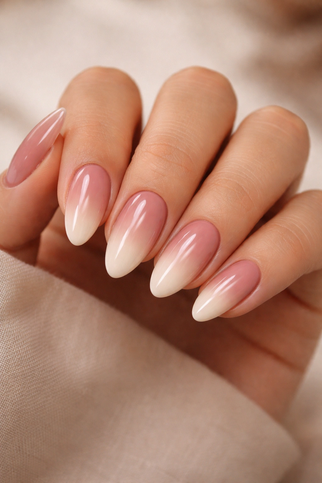
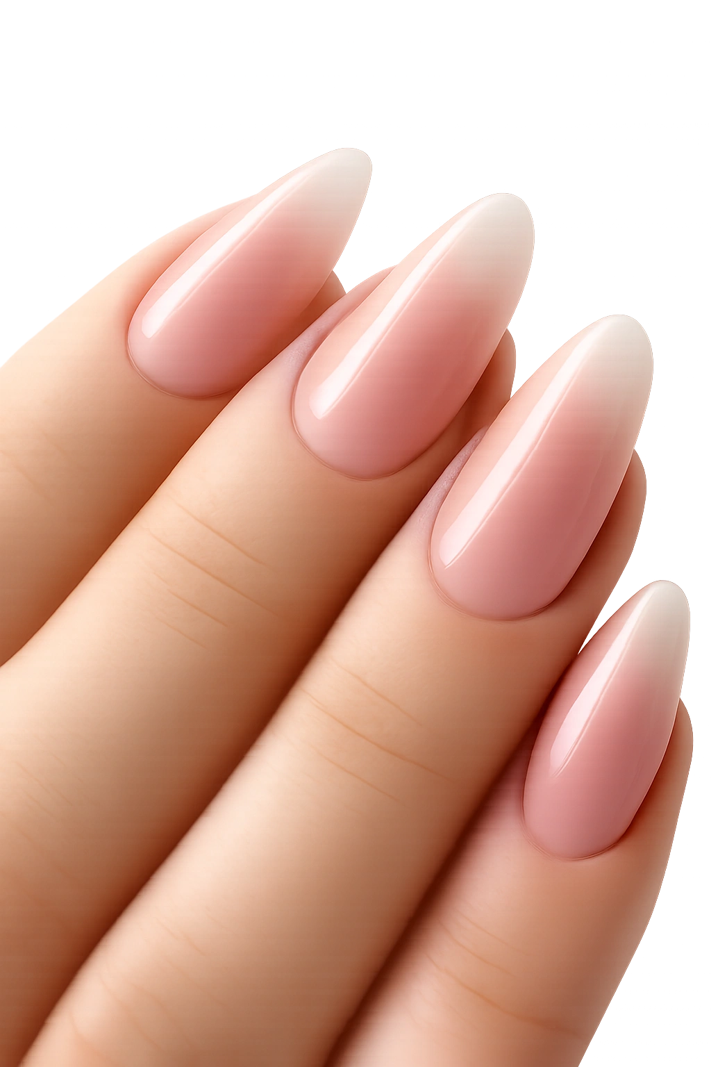
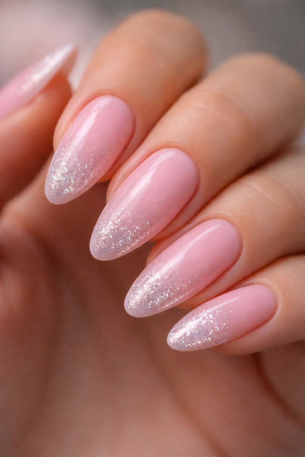
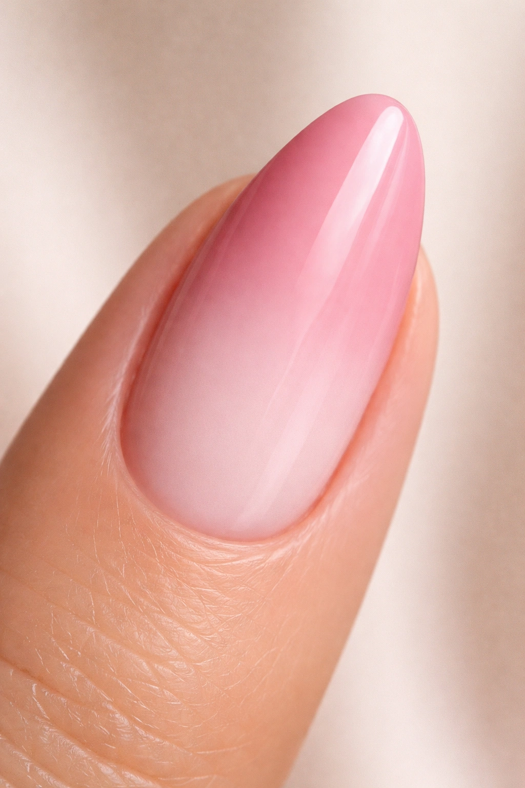
1. Baby Pink to White Fade
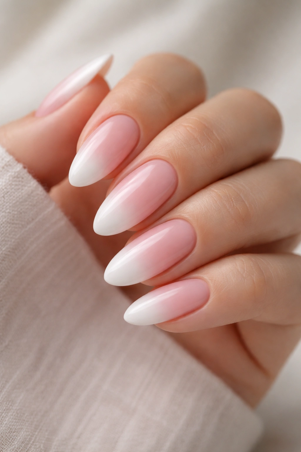
This is the look that launched the almond ombre trend — and it hasn’t lost any ground because it’s genuinely one of the most flattering combinations you can put on your hands. Baby pink at the base whispers away to a clean white at the tip, like a French manicure that softened around the edges and refused to stay within the lines.
Why It Works So Well on Almonds
The white tip on an almond nail follows the natural narrowing of the shape, so the fade reads as intentional rather than smudged. Your blending zone sits right at the widest point of the nail — exactly where you have the most surface area to work with, which means the most room to blend clean.
Quick Application Notes
- Apply a sheer baby pink as your base coat across all nails first and let it cure or dry fully
- Dab white gel or polish onto the top third of the nail using a small piece of sponge foam, not a brush — brush strokes will show through a white shade
- Blend the meeting zone in small circular motions while the product is still wet and workable
- Seal with a high-shine no-wipe top coat to keep the finish glass-smooth
Pro tip: If your white looks too stark against the pink, mix a single drop of white with your baby pink shade and apply that as an intermediate layer before your pure white. It closes the visual gap without requiring a third separate color.
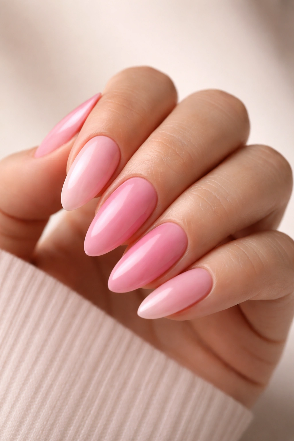
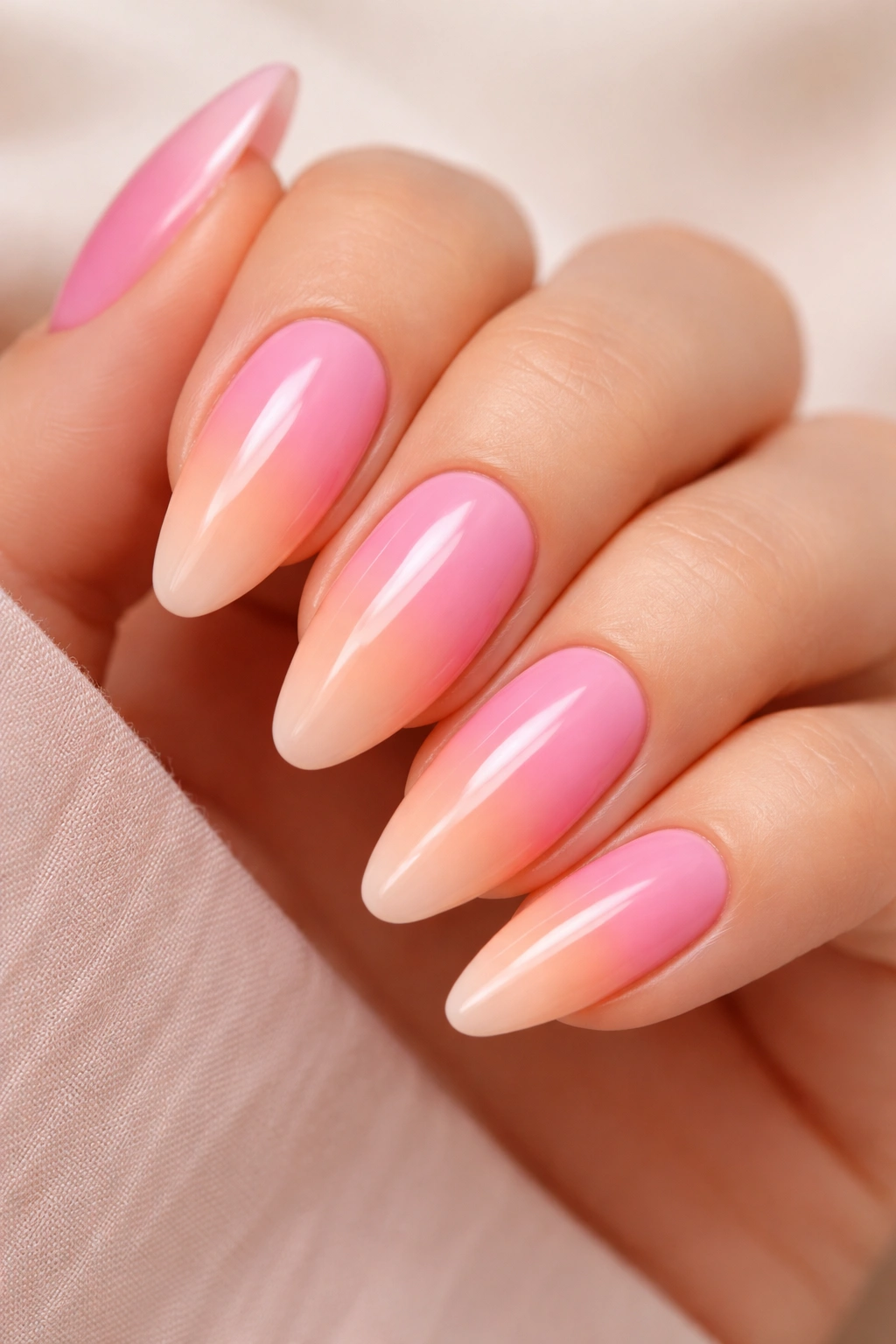
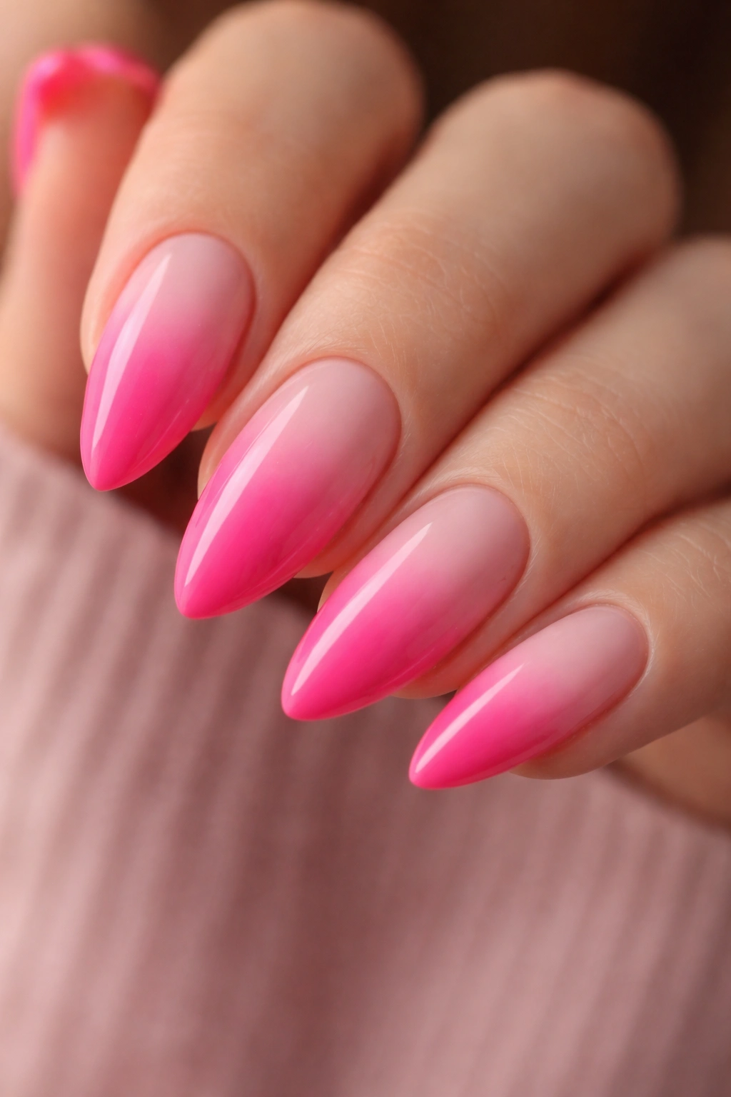
2. Hot Pink to Nude Ombre
Hot pink belongs on almond nails.
That might sound like a strong claim, but this combination — a saturated hot pink at the cuticle area blending into a skin-tone nude at the tip — does something that softer ombres simply can’t. The contrast is bold enough that you don’t need embellishments or nail art to make a statement. The gradient carries the whole design by itself.
The most common mistake with this look is choosing a generic nude instead of a shade that actually matches your skin. A too-light nude on deeper skin reads as white from across the room and kills the gradient effect entirely. A too-dark nude on fair skin pulls muddy. Hold the nude shade against the inside of your wrist before committing — if it nearly disappears against your skin, that’s your shade.
A flat fan brush works better than a sponge for this particular blend. Hot pink pigment is intense and tends to bleed into lighter shades when sponge-dabbed too aggressively. Load the brush lightly, feather it in short downward strokes from the hot pink zone toward the nude tip, and wipe the brush clean between passes to prevent the hot pink from transferring down into the nude end.
3. Blush to Champagne Gradient
Blush is a tricky color. It reads as pink in some lighting and as skin tone in others — which is precisely what makes it such a good starting point for an ombre. Paired with a warm champagne (pale gold, not yellow), the gradient sits somewhere between metallic and natural, like an elevated version of a bare nail that just happens to have an otherworldly finish.
The champagne shade is doing more work than it appears to. It has a subtle shimmer that handles the blending zone differently than a flat cream or ivory would. Where blush meets champagne, the shimmer particles scatter light and create a soft glow instead of a visible line between colors. You’re using physics to help disguise any imperfect blending.
This combination also sits in a color temperature range that’s highly flexible. It works on fair skin because the pink has warmth without going orange. It works on medium and deeper tones because the champagne reflects light rather than sitting flat.
One thing to avoid: chrome or mirror-finish top coats over this particular combination. The shimmer in the champagne is soft and diffused — a chrome finish flattens it out and turns the whole nail silver. A glassy high-shine top coat is the right call here.
4. Bubblegum Pink to Peach Blend
Why do bubblegum and peach work when so many other warm pink combinations look muddled?
They share the same temperature foundation. Both lean warm, both carry a slight orange undertone, and both fall within a close value range — neither is dramatically darker than the other. You can blend them directly without a bridging shade, and the transition zone takes care of itself. The result is unexpectedly fresh: warmer than a classic pink-to-white, more dynamic than a single color, with an almost tropical quality that wears well year-round.
How to Build This Gradient
Start with the peach shade across the full nail as your base — it’s the lighter of the two and gives you an even foundation. Then dab the bubblegum pink at the base and roughly halfway up the nail. Now blend the edge downward toward the cuticle rather than upward toward the tip. Pushing the darker shade away from the free edge makes the overall nail appear longer and more tapered.
Blend the meeting point in short crosshatch motions with a flat brush. Because the pigment gap between these two colors is narrow, two or three passes is usually enough before the line disappears. Cure, top coat, done.
5. Dusty Rose to Cream Ombre
Unlike most pink ombres, which lean soft and sweet, dusty rose has a slightly greyed, muted character that sits closer to terracotta than candy. Blended into a pale warm cream, it creates a gradient that feels deliberately considered — less “I painted my nails” and more “are my nails just like that?”
Where a typical baby pink fade scans as feminine in a straightforward way, dusty rose has an edge. The grey undertone prevents it from reading as purely pink, which makes this ombre work for anyone who loves the softness of a gradient but finds standard pink combinations a bit too sweet.
The cream end of the gradient matters — it should be genuine warm cream, not stark white, not ivory, and not a standard nude. Think full-fat milk: warm, slightly yellowish, soft. That warmth keeps the gradient cohesive. A cold white at the tip would create an undertone clash that reads as a mistake.
Best for: Warm and neutral skin tones, anyone whose wardrobe runs toward earth tones. If your closet has terracotta, camel, olive, and burnt orange in regular rotation, this gradient speaks the same visual language as your clothes.
6. Neon Pink to Soft Lilac Fade
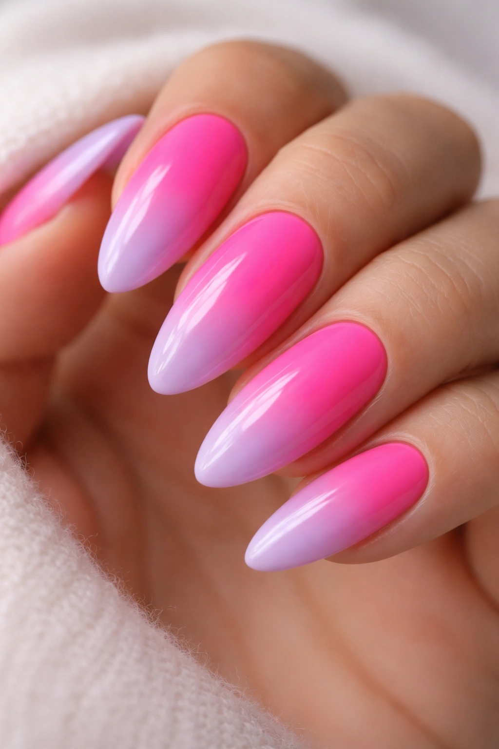
Picture your almond nails under overhead light — the base is electric, almost fluorescent pink, and it melts into a soft lavender-lilac toward the pointed tip. On paper it shouldn’t work. On nails, it’s one of the most interesting things you can do with pink ombre.
The reason it coheres is color temperature bridging. Neon pink is warm and saturated; soft lilac is cool and muted — but both share a red undertone, which gives them a common thread. The gradient passes through a pink-mauve zone at the blending point that neither clashes nor disappears. It reads as intentional because the transition shade is always available — it’s just where the two colors naturally meet.
What Makes This Blend Successful
- Use a true neon pink, not just a bright pink — neon has a slight fluorescence that regular vivid pinks don’t, and it reads differently under UV light
- Keep the lilac close to a near-white lavender rather than a deep purple — deep purple at the tip overwhelms the neon and kills the gradient balance
- Apply a white base coat under your neon shade before anything else — neon pigments are thin and need a white foundation to show full saturation
- Blend at the midpoint using a firm synthetic flat brush, not a sponge — neon colors are runny in consistency and need controlled application
This is a bolder choice than most designs on this list. The almond shape keeps it balanced because the narrowing tip reduces the visual weight of the lilac end, so the overall nail feels more proportionate than chaotic.
7. Coral Pink to Ivory Gradient
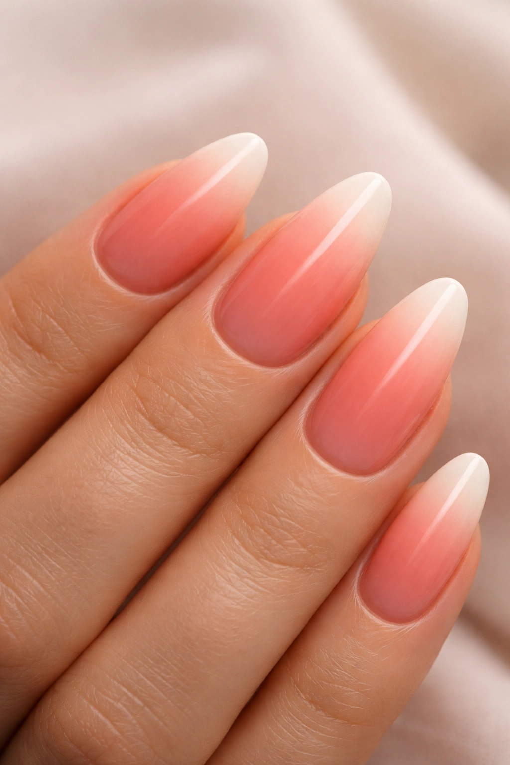
Coral is the most overlooked pink for ombre work.
Most people skip it in favor of hotter or blushier tones, but coral has an orange brightness that gives the gradient depth in a way pure pink can’t replicate. Against warm ivory — creamier and more golden than white — the coral-to-ivory fade looks almost tropical without going anywhere near garish.
What makes it so flattering is warmth consistency. Coral, ivory, and the skin tones they complement are all in the same warm temperature range. There’s no cold undertone in this combination at any point in the gradient, which means the nails visually blend into the hand rather than sitting on top of it like a layer of colored film.
Watch for this: Ivory and cream shades can look noticeably yellow under certain artificial lighting. Test the shade on a nail wheel (or the edge of your pinky) before committing. If it reads as yellow under the lights where you’ll be wearing these nails most, add a tiny drop of white to your ivory to cool it slightly — you’ll keep the warmth without the yellow cast.
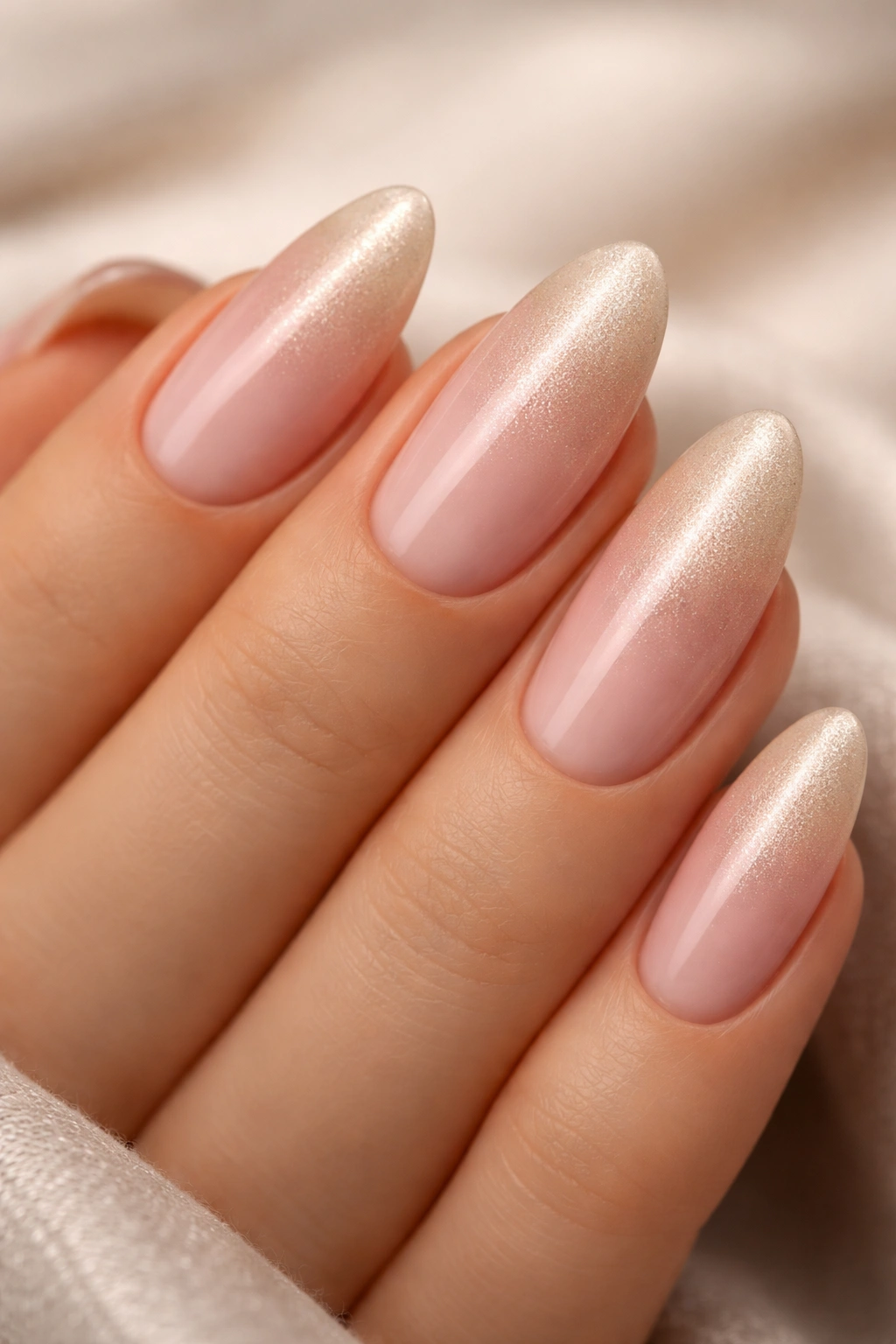
8. Rose Gold Shimmer Ombre
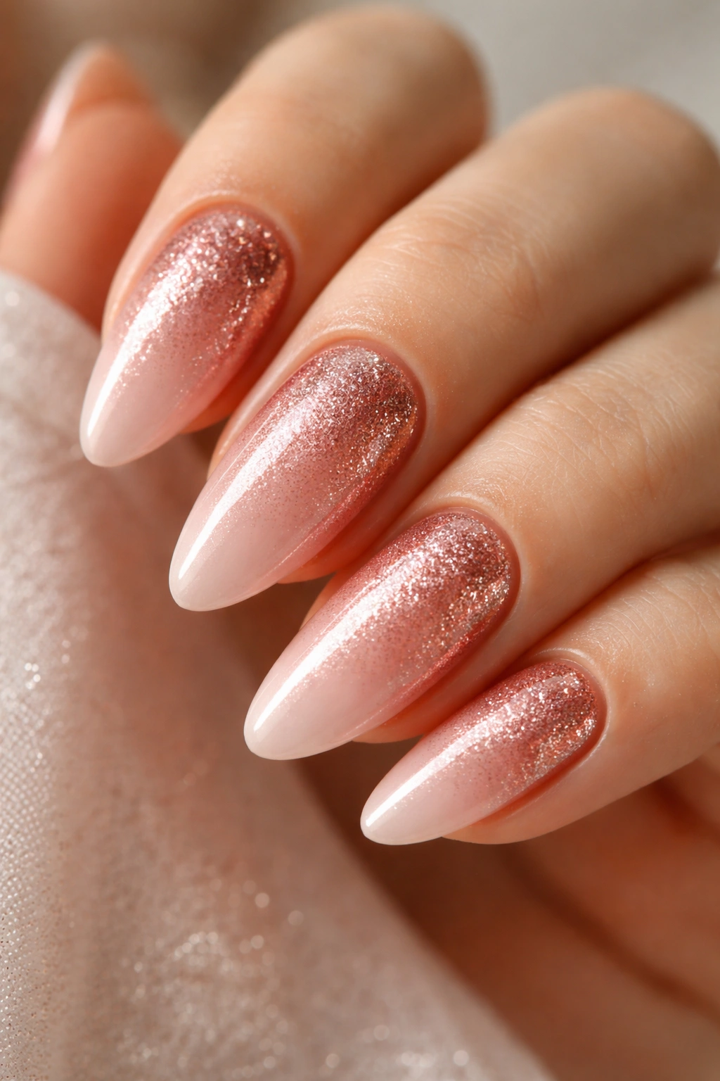
This one gets its depth from texture, not just color. A warm rose gold shade — pink with gold metallic shimmer — fades into a pale pink or nude, and the shimmer particles concentrate naturally at the deeper end of the gradient, catching and scattering light in a way that flat polish simply cannot.
What Makes Rose Gold Ombre Different from a Regular Pink One
The shimmer is doing two things at once. At the base where the color is deepest, the metallic particles make the shade feel dimensional and alive. At the blending zone where rose gold meets the pale pink, those scattered particles break up any visible edge between colors. A gradient that might look slightly patchy in matte form looks seamless with shimmer because the sparkle redirects the eye away from any imperfection in the blend.
The right rose gold matters here. Not all products read the same way — some lean copper, some lean pink, some lean yellow-gold. For this ombre, you want a pink-leaning rose gold. A copper-leaning shade creates an orange transition zone where it meets the pale pink, and that orange sits awkwardly in the middle of what should be a pink gradient.
What You’ll Need for This Look
- Fine-shimmer rose gold gel polish — chunky glitter won’t blend the same way and will create a textured edge at the blending zone
- A sheer or pale pink for the transition zone and tip
- High-shine top coat — this look depends on gloss to make the metallic qualities visible
- A 6mm flat synthetic brush for controlled blending at the midpoint
Pro tip: If your rose gold has an especially heavy shimmer load, dilute it slightly at the blending zone by mixing a small drop with clear gel. Full-concentration shimmer right at the fade point can read as abrupt rather than gradual.
9. Pink to Transparent Gradient
The most minimalist design on this list. Also one of the hardest to do well.
A transparent gradient starts with soft pink at the cuticle and fades into a completely clear tip — sometimes called a “glass” or “naked” ombre. On almond nails with a clean, natural finish, this reads as effortless in a way that even a simple single-color polish sometimes can’t achieve. It looks like your nails are just… like that.
The challenge is that transparency is merciless. A gradient into a solid color forgives minor blending inconsistencies because the color fills the visual space. A gradient into clear exposes the actual nail plate beneath, which means any ridges, blending streaks, or imperfections are visible. Your nail surface needs to be as smooth as possible before you begin — a thin base coat, fully cured, then light buffing if needed.
Use a sheer pink rather than an opaque one. A semi-transparent baby pink blends into clear far more naturally than a heavily pigmented opaque shade. Apply a thin layer, dab it with a small sponge piece, and work in short downward motions from the cuticle zone. Stop blending earlier than you think you need to. The pink should be concentrated close to the base, with the fade happening quickly rather than sprawling halfway up the nail.
For gel applications, a sheer overlay product — the kind marketed as “milk gel” or “barely there gel” — works better than a standard gel color for this technique. The inherent sheerness of those products means the gradient is built into the material itself.
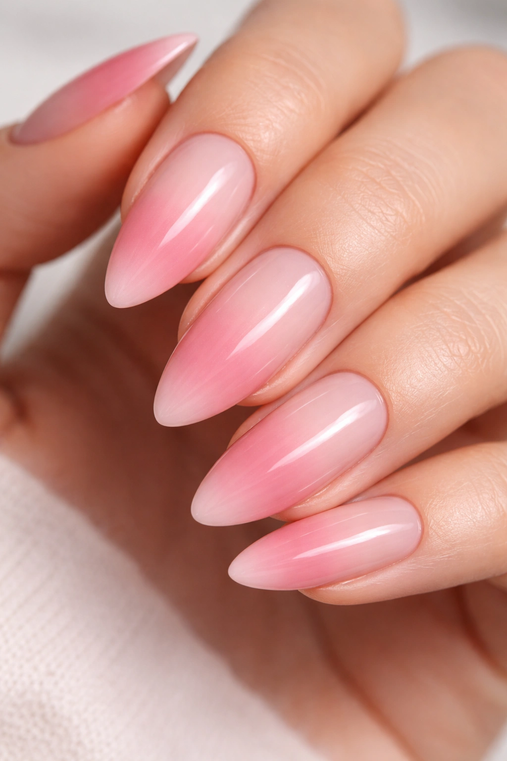
10. Mauve to Pale Pink Fade
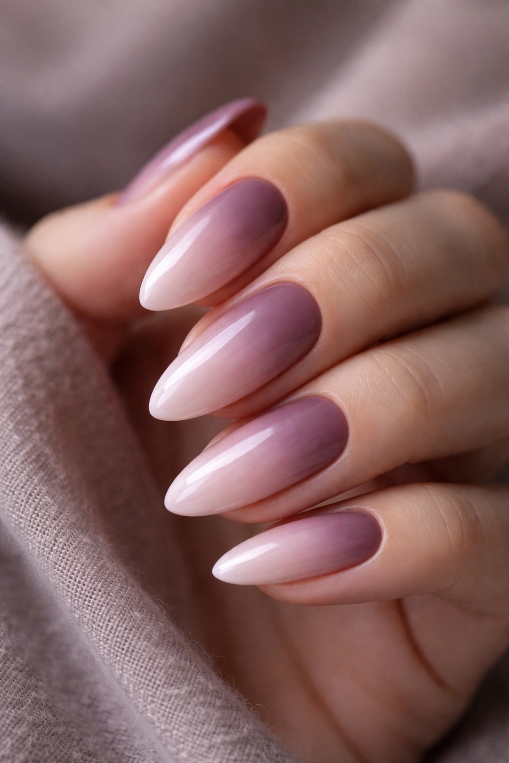
Does mauve count as pink?
Technically it sits at the border between pink and purple, with a greyed quality that makes it feel more considered than either one individually. But blended into a soft pale pink on an almond shape, the cool undertones in the mauve read as a natural part of a pink gradient rather than a separate color family intruding on the design.
The visual effect is moodier than most designs on this list. Where baby pink ombres are bright and fresh, mauve-to-pale-pink carries a slightly melancholy, vintage quality. It looks striking in lower-light settings and reads especially well in autumn-toned environments.
How to Choose Your Mauve Shade
There’s a wide range of what gets called “mauve” in nail product lines. For this gradient, you want a mauve that leans closer to dusty pink than to purple — think of it as a pink that’s lost some of its brightness. Avoid anything that reads visibly purple when held in natural light, because it’ll create a distinct purple zone at the base rather than a pink-toned gradient.
The compatibility test: hold your mauve and your pale pink side by side and squint at both. If your eye tracks a natural progression from one to the other, the undertones are compatible. If the colors look like they belong to different color systems entirely, one of them needs to change.
11. Deep Magenta to Blush Ombre
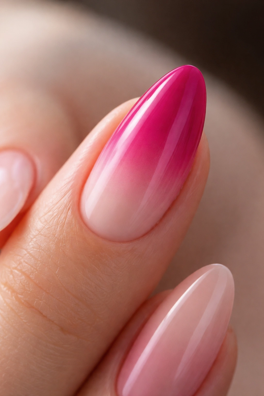
This is the highest-contrast gradient on the list. No other combination here puts this much distance between the two endpoint colors.
Magenta is intense — close to fuchsia, with a blue-red saturation that reads as genuinely bold. Blush, at the other end, is barely-there pink. The roughly 70% value difference between these two shades means the blending zone carries enormous visual weight. On an almond nail, that blending zone becomes the central feature of the design. Everything points toward it.
What keeps this from reading harsh is the shared undertone. Both magenta and blush lean warm-pink rather than cool-berry, which means they share enough color DNA to blend without a muddy middle. The key is using a true blush — not a nude, not a white-pink — something that reads unmistakably as “palest possible pink” even when held next to the magenta.
Plan on three or four sponge passes at the blending zone. The pigment density difference between these colors is high enough that a single pass will leave visible streaks. Work in thin layers and cure between passes if you’re using gel. The patience is worth it. When this gradient is clean and seamless, the dramatic contrast does something that softer ombres simply can’t.
12. Pastel Pink with Glitter Fade
Pastel pink on its own is quiet. Add a fine glitter fade at the tips — particularly holographic or iridescent glitter — and the same color becomes two different nails depending on the light.
The Layered Technique That Makes This Work
This isn’t a standard color ombre. The glitter doesn’t replace the color gradient — it layers over it. Start with your pastel pink ombre (pink at the base, lighter pink or sheer at the tip), cure or dry it fully, then apply a fine glitter gel or glitter polish at the tips using the same fading approach. Because fine glitter is semi-transparent, the pastel color underneath shows through the glitter layer. The two effects coexist.
From across the room: a soft pastel ombre. In direct light: the tip sparks with glitter. One design doing two things depending on the angle and lighting.
Glitter Types That Blend Best
- Fine holographic glitter — creates a rainbow effect that works in any lighting environment, warm or cool
- Iridescent micro-glitter — subtler, more pearl-like; better for daytime or professional settings
- Chunky glitter mixed lightly into a clear gel for visible texture and a more art-forward result
- Aurora or color-shifting glitter for a pink-to-purple shift as the nail catches different light angles
Pro tip: Apply your glitter layer over a matte top coat on the pastel base rather than a gloss coat. The slight texture gives the glitter particles more grip and prevents them from sliding before you can set them. Then seal with a glossy top coat to smooth everything down.
13. Hot Pink to Baby Pink Reverse Ombre
Most pink ombres go from a deeper base to a lighter tip. This one does the opposite — hot pink concentrated at the tips, melting back into soft baby pink at the cuticle.
It changes the visual entirely. When the darker shade sits at the tip, the nail appears to project forward. The standard ombre direction blends the nail into the finger. This reverse direction highlights the tip and draws attention to the natural point of the almond shape — which is exactly the part of the nail that makes almonds worth choosing in the first place.
Because both shades belong to the same color family (just different intensities of pink), the blend is technically simpler than combinations that cross color families. Your transition zone is just a medium pink — mix your hot pink and baby pink together on a palette, and you’ve made it without needing a third bottle.
Best for: Anyone who wants to make their almond tips feel more dramatic without introducing a different color. If you love the elongating effect of almonds and want to maximize it visually, reversing the ombre direction does more work than adding nail art.
14. Millennial Pink to Chrome Silver
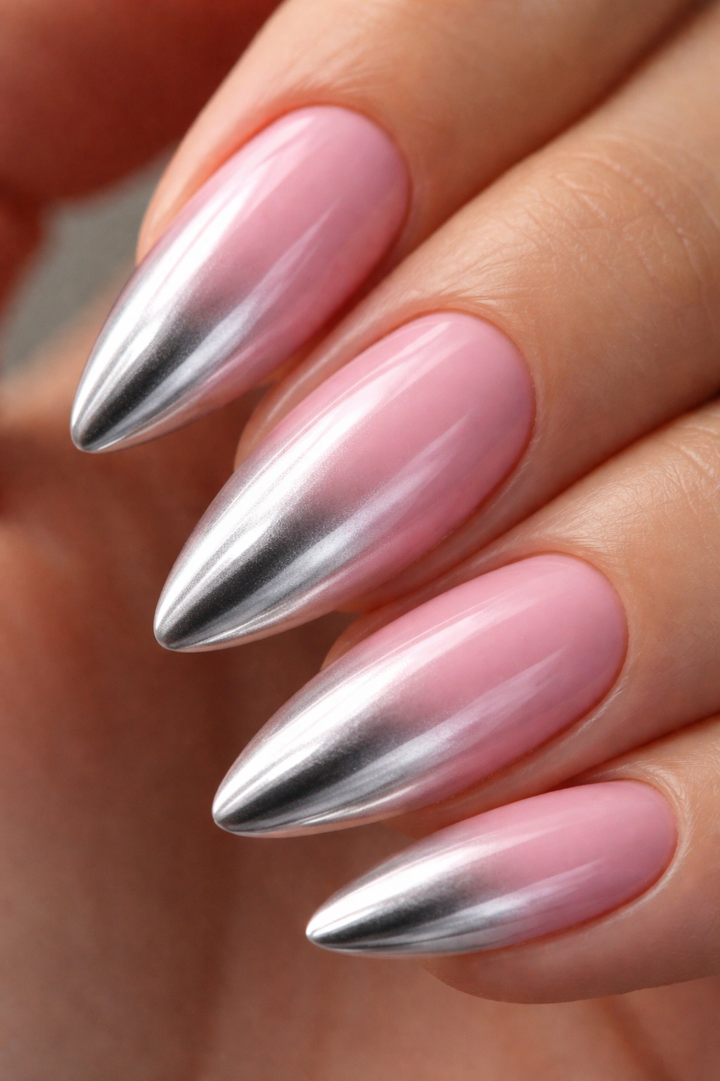
Walk into a room with this on your nails and someone will ask what color that is.
Millennial pink — that warm, slightly muted salmon-rose shade — to a chrome silver tip is a combination that shouldn’t cohesively work. The soft warmth of the pink and the cold reflectivity of the silver create a tension that’s difficult to categorize and hard to look away from. The almond shape carries it: the pink dominates the wide base, the chrome tip becomes a focal point at the narrowing point, and together they feel architectural rather than decorative.
Chrome effect requires a chrome powder applied after gel cure, not a chrome-effect polish. Burnished with a silicone sponge applicator over an un-wiped gel surface, the powder creates a genuinely mirror-like finish at the nail tip that no polish can replicate.
Key Technique Details
- The millennial pink base must be an opaque gel — the chrome needs a solid color surface to contrast against
- Blend the pink toward the midpoint with a brush before applying the chrome separately at the tip — these two elements don’t blend into each other; they meet at a defined gradient point
- Chrome powder goes on after the gel is cured but before the final top coat
- Use a non-wipe top coat to seal the chrome — a wipe-off gel will dull the mirror finish, which defeats the whole point
If you’re attempting this at home, practice the chrome powder application on a nail wheel first. Chrome is unforgiving under direct light — any fingerprint, smear, or brush stroke in the powder layer will show.
15. Pink French Ombre (Reverse French Tips)
The classic French manicure has a softer, more wearable version that’s been quietly replacing the original. Pink French ombre flips the conventional structure: soft pink begins at the smile line and deepens toward the free edge, while the base of the nail stays sheer or skin-toned. On an almond shape, the pointed tip gives the deepened pink a graphic quality that a square or round nail simply can’t replicate.
The pink used for the tip area usually sits one to two shades deeper than what you’d consider a base tone — medium blush, dusty rose, or a deeper mauve works well. The depth at the tip traces the silhouette of the nail point, and the gradient moving back toward the base gives it a painterly quality rather than the defined hard edge of a traditional French.
What makes this design feel fresh rather than dated is the ombre element. A sharp-edged French tip on an almond nail can look dated unless done with surgical precision. A faded tip, on the other hand, has a softness that reads as intentional and artistic. The two looks share the same basic structure — deeper color at the tip, lighter at the base — but they feel like completely different designs.
The most natural application method: build the pink gradually at the free edge using three or four thin coats of sheer pink, each extending slightly less far back from the tip than the previous coat. This creates a gentle darkening at the tip without a visible starting line. Slower than sponge technique — but for this particular design, the result looks more natural and less constructed.
16. Watercolor Wash Pink Ombre
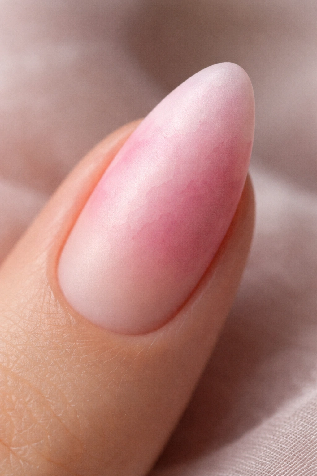
What separates a standard pink ombre from a watercolor ombre?
The finish and the edge quality. A standard ombre has a glassy surface and a clean blending zone. A watercolor ombre uses thinner layers, a softer blending approach, and a matte or satin finish — the edges between colors bleed into each other rather than meeting at a defined transition point. The effect looks less like nail polish and more like pigment that’s absorbed into the nail surface itself.
Getting this on real nails (rather than on a photographed press-on) requires a different approach to both product and application. Sheer gel washes applied in multiple overlapping thin layers create the transparency that defines watercolor work. Two or three pink shades — a deeper rose, a medium blush, and a pale blush-white — are applied in thin overlapping zones without a deliberate blending technique. The translucency of the layers handles the color transition on its own.
Getting the Finish Right
The top coat makes or breaks this design. A high-gloss finish collapses the painterly quality and turns it back into a standard ombre. A soft matte finish — slightly velvety to the touch, no shine — preserves the impression of paint on paper. If full matte feels too flat, a satin finish has just enough sheen to read as refined without erasing the watercolor effect.
17. Pink to Gold Foil Tips
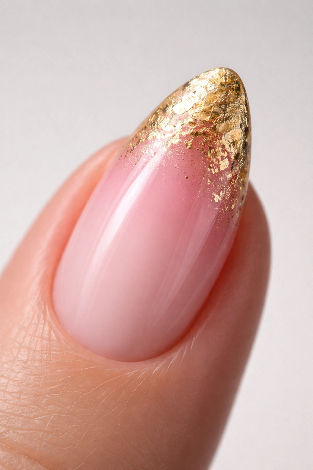
Gold foil changes the nature of a pink ombre entirely — you’re not blending two polish colors, you’re blending a painted surface with a physical texture. The contrast between the smooth painted nail and the crinkled, irregular surface of the foil at the tip creates a gradient that’s tactile as much as visual. It has weight. You can feel the difference between the nail zones when you run your thumb across it.
How Nail Foil Ombre Actually Works
Foil is not applied like polish. You press a foil sheet onto a tacky adhesive layer (a foil gel or transfer adhesive cured to a specific tackiness), then pull it back quickly to reveal the metallic pattern it leaves behind. The foil doesn’t lay flat — its crinkled texture scatters light irregularly, which gives it that organic, almost handmade character that mirror chrome can’t replicate.
For the gradient effect, foil is applied only at the almond tip, pressed and pulled back in small sections. Coverage at the very tip is dense; moving toward the midpoint, you apply smaller pieces with more spacing between them. The sparseness of the foil at the blending zone is the gradient — you’re reducing the density of one surface rather than blending two colors.
What You’ll Need
- Foil transfer adhesive or foil gel — not regular top coat, which won’t create the right tackiness
- Gold foil sheets in small rolls (sold specifically for nail use, not craft foil)
- A pink base that’s fully cured before foiling — deeper pinks show the most contrast against gold; pale pinks give a more delicate result
- A clean top coat sealed over the foil to prevent peeling at the edges
Pro tip: Apply foil in small pieces rather than one large sheet. Small pieces give you more control over the density gradient and prevent the foil from folding back on itself at the narrowing almond tip.
18. Tri-Tone Pink Gradient
Three colors in one gradient is harder to pull off than two. It’s also harder to find well-executed examples because most people don’t attempt it.
A tri-tone pink gradient uses three distinct pink shades spaced across the value range: a deep, saturated pink at the cuticle (something in the rose or magenta family), a medium blush at the midpoint, and a near-white pale pink at the tip. Each color occupies roughly one-third of the nail, with blending zones at both meeting points. On an almond nail with its elongated shape, there’s just enough length to see all three tones clearly without any one of them getting squeezed out of the design.
The technical challenge is managing two separate blend zones rather than one. Each zone requires its own dedicated blending pass, and all three colors must share the same undertone temperature — warm or cool across the board. Mixing undertones in a tri-tone gradient creates two muddy zones instead of two clean transitions. The fix: choose your middle blush shade first, then select your dark and light shades around it, making sure all three are consistent in undertone.
The payoff is real. When all three tones are clean and both blend zones are seamless, the gradient has a depth and richness that two-color ombres can’t replicate. The nail reads differently from every angle — closer to a gemstone than a manicure, layered and alive in changing light.
Pulling It All Together
The range across these 18 designs is wider than it might look at first glance. Technique matters as much as color — chrome powder, foil application, watercolor layering, and standard sponge ombre each require a different skill set and produce genuinely different results. Starting with a simpler blend like baby pink to white or blush to champagne gives you the chance to get your technique clean before moving toward higher-contrast combinations like deep magenta to blush or the tri-tone gradient.
Two things stay constant across all of them: the importance of undertone compatibility between your chosen shades, and the value of working in thin layers. A thick wet layer of any color floods and bleeds before you can shape it. Thin layers, patient curing, and multiple passes are what actually separate a clean professional result from something that looks rushed.
Almond nails reward the effort. The shape does enough visual work on its own that even a straightforward pink fade sits in a different league than the same gradient on a square or rounded nail. Pick your palette, match your undertones, and let the shape carry the rest.
