

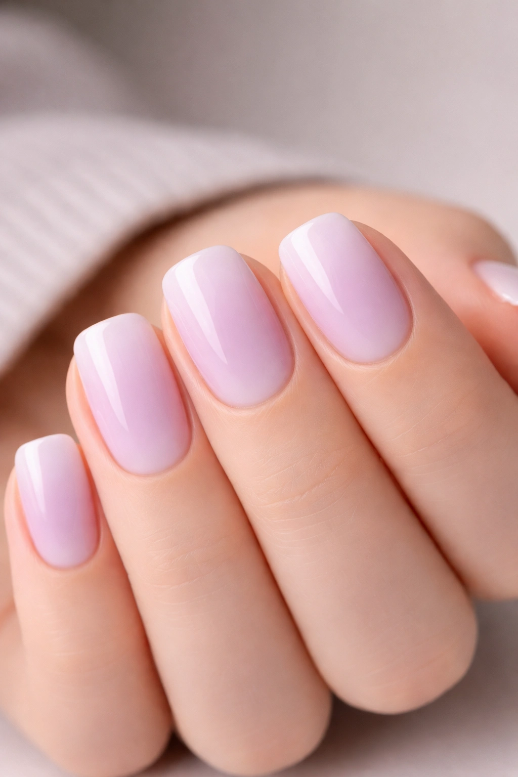
Short squoval nails have become the gold standard for professional workplaces everywhere. This nail shape—technically a hybrid between a square and an oval—offers the clean lines of a square with the softer, less sharp edges of an oval, making it naturally office-appropriate without sacrificing style or personality. The beauty of short squoval nails is that they work for nearly every job environment, from corporate boardrooms to healthcare settings to creative studios, and they’re durable enough to withstand a full day of typing, writing, and hands-on tasks without chipping or breaking.
The real advantage of work-friendly nail designs isn’t that they’re boring—it’s that they’re strategically styled to pass any dress code while still expressing your sense of taste and professionalism. The ideas below strike that perfect balance by using neutral base colors, sophisticated finishes, and subtle embellishments that catch light without drawing unwanted attention in a meeting. Each design works across every skin tone and nail texture, and most can be achieved with basic tools and materials you might already have at home.
Whether you’re refreshing your current manicure or saving inspiration for your next salon visit, these fifteen designs prove that professional nails don’t mean sacrificing elegance or creative flair.
1. Minimalist French with a Modern Twist
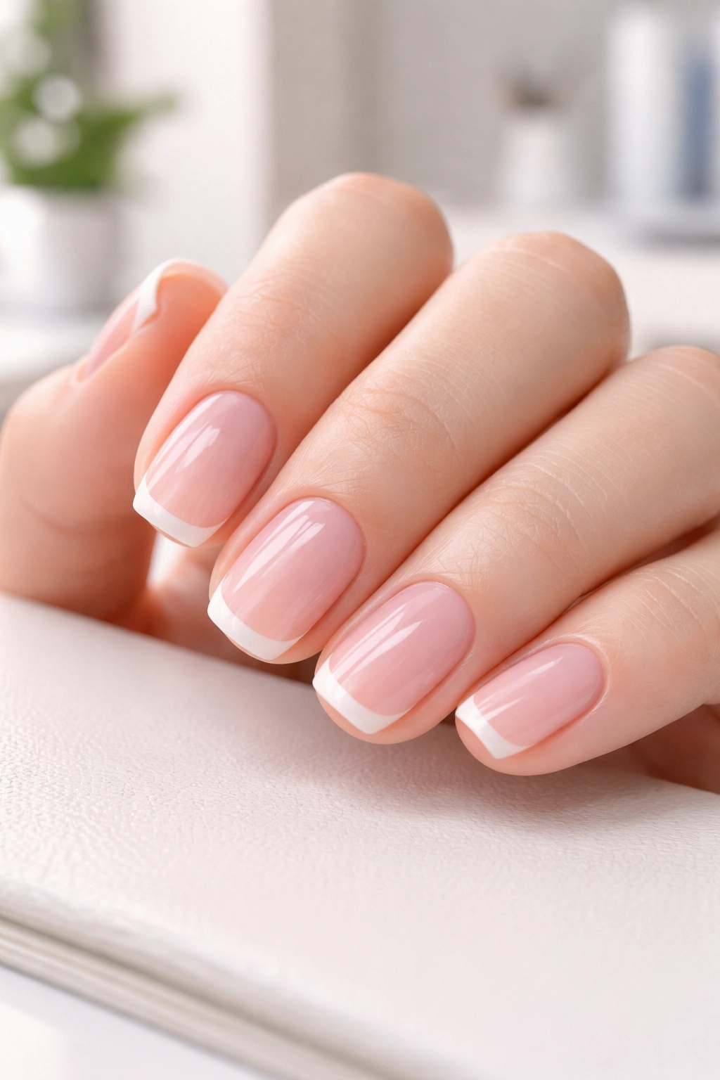
The updated French manicure has evolved far beyond the stark white tip of decades past. Today’s modern French features a thinner line at the tip—often just one-third the thickness of traditional French tips—paired with a translucent pink or nude base that makes the whole look appear more integrated and less graphic.
Why It Works for the Workplace
This design reads as inherently sophisticated because it references a classic technique everyone respects, but the refined execution shows restraint and current taste. The thin tip-to-base ratio means the nail doesn’t look heavy or dated, and the soft color palette won’t distract during client calls or presentations. You get a polished, intentional appearance without any risk of appearing overdone.
How to Achieve It
- Apply a sheer pink or nude base coat to all nails and let dry completely
- Use a thin striping brush or a nail art liner to create a hair-thin line across the tip in crisp white or soft champagne
- The line should sit about 1-2mm from the edge of your nail, not at the very tip—this creates the modern, refined look
- Seal everything with a glossy top coat for a smooth, professional finish
Pro tip: If your hand trembles when painting the tip line, place a thin piece of painter’s tape along your nail tip beforehand and paint the white color over it—when you peel away the tape, you’ll have a perfectly clean edge.
2. Classic Nude Elegance
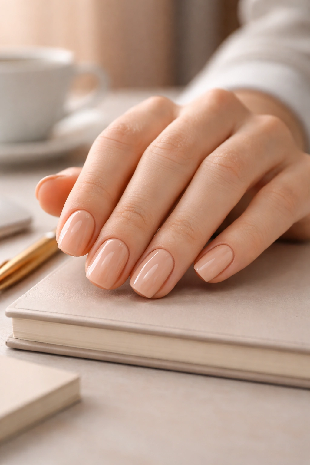
There’s a reason this is the nail color of choice in every legal office, hospital, and financial institution: nude sits right at the edge of invisible, making your hands look naturally elongated while keeping all attention on your actual work rather than your nails.
The Science Behind Nude for Work
A true nude should match your skin tone as closely as possible, creating an optical illusion that extends your nail beds. This matters for work because it reads as completely neutral—not trendy, not playful, not edgy—just clean and professional. The finish can make all the difference; a matte nude feels artistic and intentional, while a glossy nude feels more conventionally polished.
Shade Selection and Finish
- Choose a nude that genuinely matches your skin tone—test it on your inner wrist to ensure the match
- Undertones matter; warm skin usually needs peachy or golden nudes, while cool skin prefers pink or rosy nudes
- For a glossy finish, apply two coats of color and seal with a regular top coat
- For a matte finish, apply the same color but seal with a matte top coat instead
Worth knowing: Nude shades photograph very differently under office lighting, natural light, and artificial light. The slight variation actually works in your favor by keeping the look from feeling flat or one-dimensional.
3. Soft Blush and Champagne Gradient
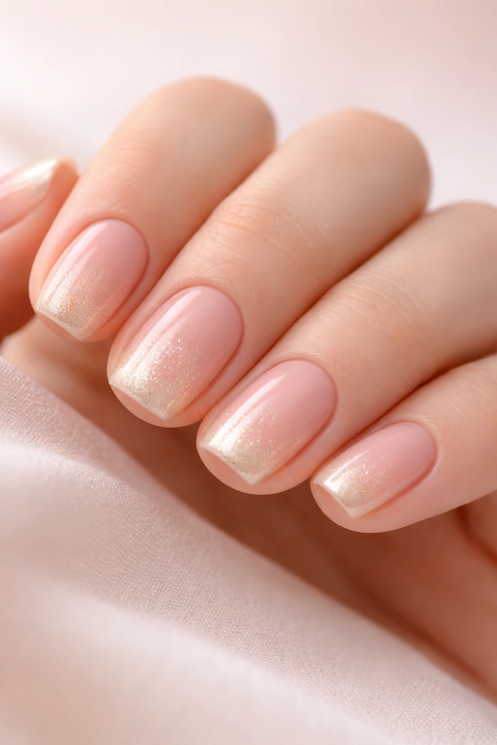
A gradient—where one color gradually transitions into another—creates visual depth and movement without any bold statements. A soft blush-to-champagne gradient uses colors so close in value that the effect is almost imperceptible until light hits the nail at an angle.
Why Gradients Read as Professional
Unlike ombré designs that are intentionally dramatic, a subtle gradient feels more like a lighting effect than actual nail art. It adds dimension and interest to short nails without looking playful or decorative, and the soft, warm color palette keeps everything in the neutral zone.
Creating the Effect
- Paint all nails with a soft blush pink base color and let dry
- Use a makeup sponge or a special gradient tool to blend champagne or pale gold from the tip area back toward the middle
- Blend gently—the transition should feel gradual enough that it’s hard to pinpoint exactly where one color becomes another
- Seal with a clear glossy top coat to smooth and protect
Insider note: The gradient looks most sophisticated when the champagne is slightly warmer than the blush—think peachy champagne rather than cool silver champagne.
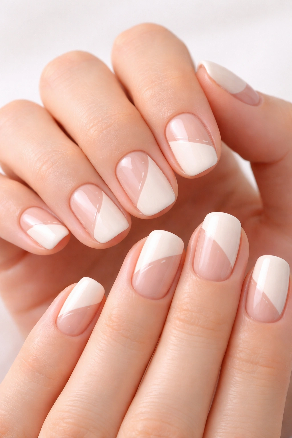
4. Crisp White Tips with Fine Details
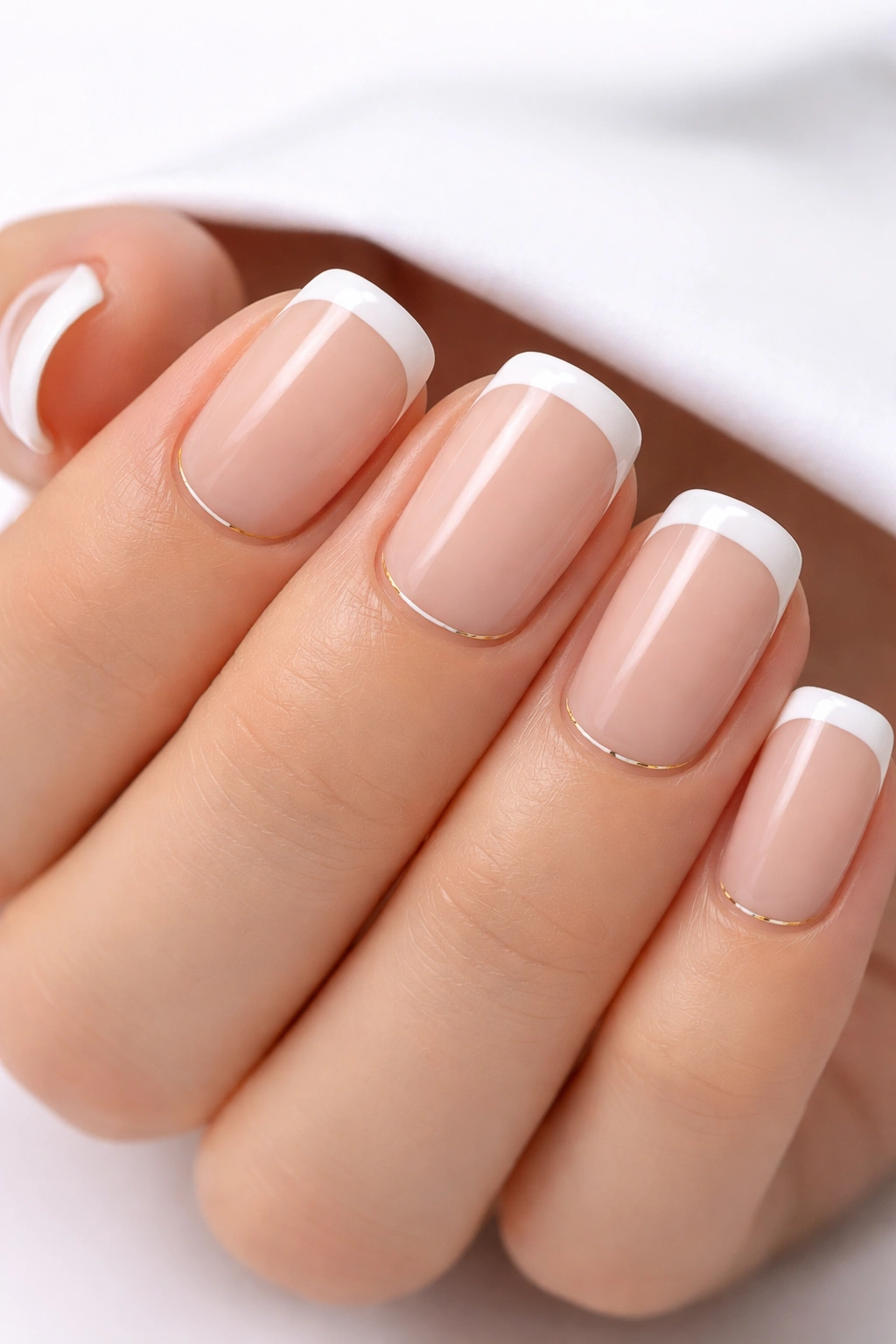
A minimalist take on the classic French mani that incorporates a tiny line or geometric detail in a neutral tone creates the impression of intentional design work without crossing into decorative territory.
The Details That Work
The key is restraint—think a single hair-thin gold line running horizontally just above the white tip, or a tiny dot of silver in one corner of the nail. The detail should be barely noticeable at arm’s length but satisfying when you look closely. This gives you something to appreciate without advertising it during a presentation.
Application Tips
- Paint your base color (nude or translucent pink) in two coats and let dry fully
- Create your white tips using a striping brush, keeping the line clean and even across all nails
- Once the white is completely dry, add your detail using a very fine liner brush or a dotting tool
- Seal everything with a shiny top coat
Real talk: This design requires a steady hand or some practice. If you’re not confident painting freehand, visit a salon where the technician specializes in nail art—they can execute the detail in under five minutes, and it’s worth the professional touch.
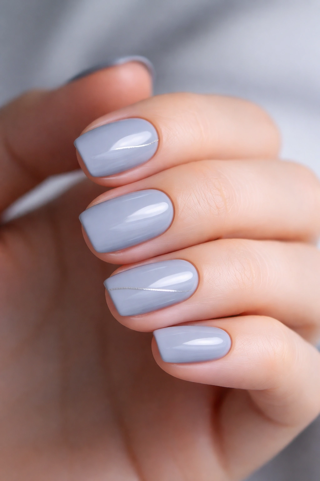
5. Subtle Gray Marble Effect
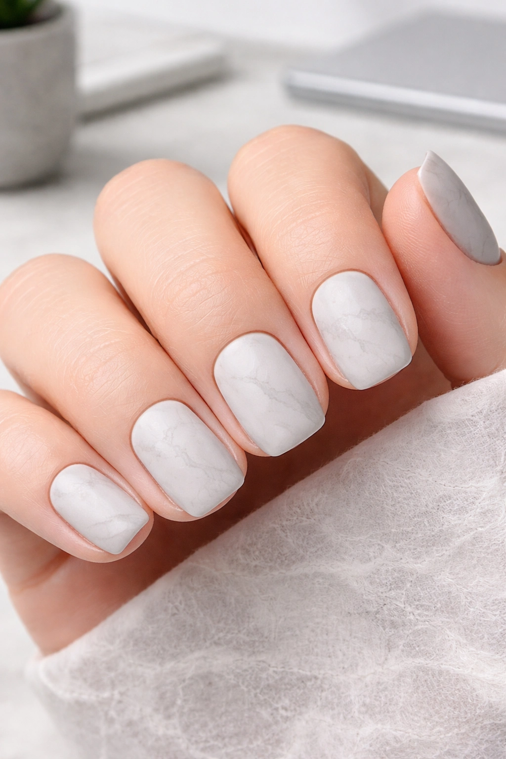
Marble designs often feel fancy and decorative, but a gray marble—using soft gray tones and keeping the veining very faint—creates an effect that reads more like a stone texture than intentional nail art.
Making Marble Work-Appropriate
The trick is avoiding high-contrast veining (which looks obviously applied) and instead using shades within the same color family. Soft gray with slightly darker gray veining looks naturally textured, almost like your nails are coated in fine stone. It’s the kind of design people notice and appreciate without ever quite pinpointing what’s different about your nails.
Technique for Soft Marble
- Apply a soft gray base color in two coats and let dry
- Using a thin striping brush and a slightly darker gray shade, paint very faint, organic lines across the nail
- Blend the lines slightly with a clean, damp brush to soften them and create a natural appearance
- Add one or two highlights in a pale gray or white for subtle dimension
- Seal with a matte top coat for authenticity (real stone isn’t shiny)
Worth knowing: The softer and more blended your lines, the more professional the effect. Sharp, distinct veining reads as obvious nail art rather than natural texture.
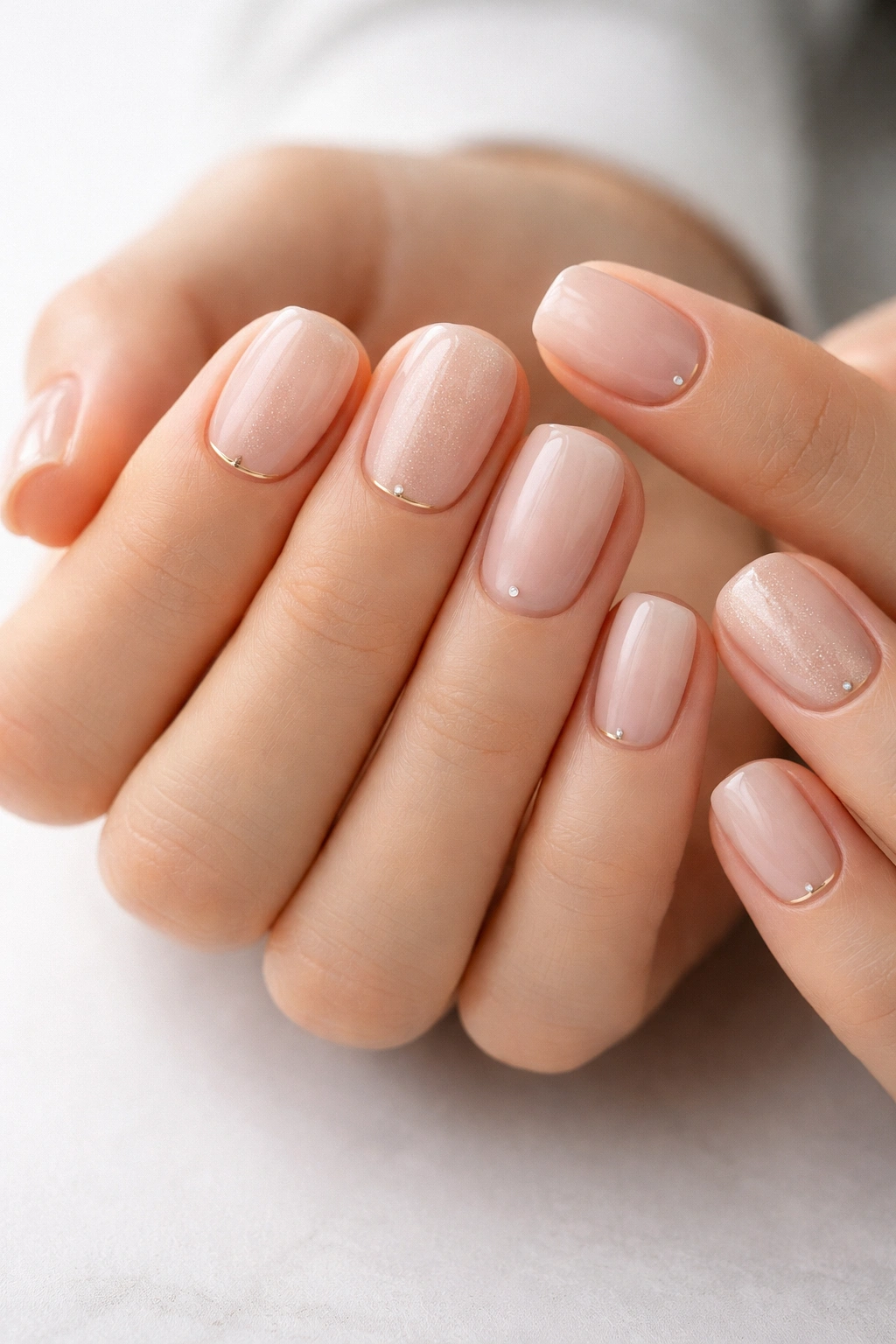
6. Pale Pink with Gold Accent Lines
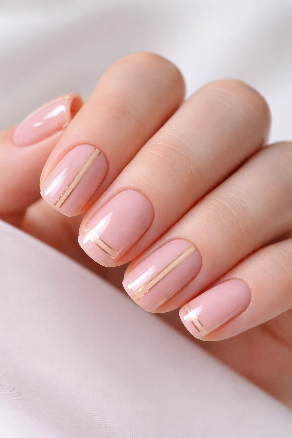
This design pairs a barely-there pale pink base with minimal gold geometric lines—usually just two or three very fine stripes running vertically or horizontally. The gold adds a touch of luxury without being flashy.
Why Gold Elevates Professional Manicures
Gold is perceived as more sophisticated and high-end than other metallic accents because it reads as elegant rather than trendy. A fine gold line feels intentional and refined, especially paired with a soft neutral base. This combination works in nearly every setting because the color palette is universally flattering and professional.
How to Execute It
- Paint two coats of pale pink (nearly flesh-toned) and let dry completely
- Using a very fine striping brush and a gold metallic polish or gold ink, paint 2-3 thin vertical or horizontal lines on each nail
- Space the lines evenly—often the most elegant placement is one thin line down the center and one near each edge
- Seal with a glossy top coat that won’t dull the gold
Pro tip: If you’re using metallic gold polish, make sure it’s an ultra-fine formula specifically designed for detail work. Thicker metallics won’t give you the clean, delicate lines this design needs.
7. Neutral Taupe with Matte Finish
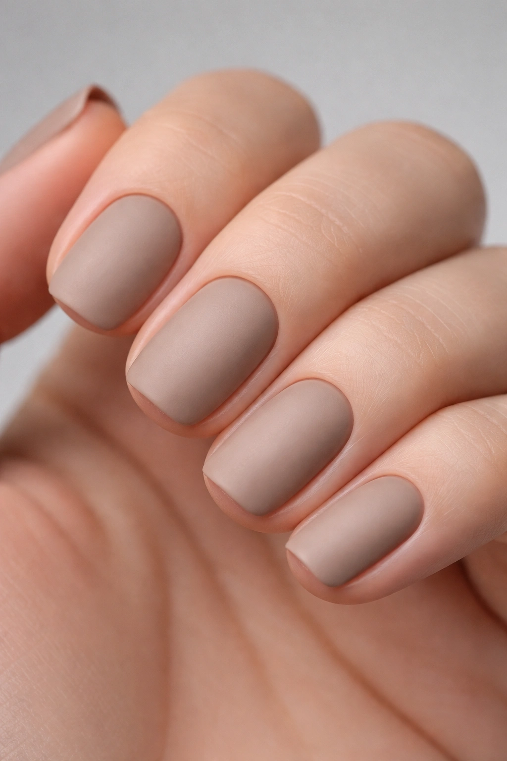
Taupe—that sophisticated gray-brown shade—in a matte finish creates a modern, intentionally artistic look that still reads as completely professional. Matte finishes have become mainstream enough that they’re no longer considered edgy or experimental.
The Matte Advantage for Work
A matte finish automatically signals intentional design choices, which elevates even a simple solid color from “basic” to “curated.” The texture-like appearance makes the nails feel more refined and less shiny-plastic-looking, which many professionals find more appealing than glossy nails.
Application and Maintenance
- Paint two to three coats of taupe to build full opacity, letting each coat dry between applications
- Instead of using a regular top coat, seal with a matte top coat designed for nails
- Matte finishes show dust and water spots more readily than glossy, so you may need to touch up the top coat more frequently
- If you want occasional shine, you can apply a glossy top coat over the matte for a matte-shimmer effect
Real talk: Matte finishes require slightly more careful daily care because they show smudging and wear more visibly. If you have very active hands or work in a wet environment, glossy might be more practical.
8. Baby Blue with Delicate Nail Art
A soft, pale blue base—think barely-tinted rather than true blue—provides a subtle color element while remaining completely work-appropriate. Pair it with delicate nail art: fine white lines, tiny dots, or minimal geometric shapes.
Why Pale Blue Works in Professional Settings
Blue is universally perceived as trustworthy, calm, and professional—it’s the color of business suits and corporate environments. A very pale blue version reads as sophisticated rather than playful, especially when paired with minimal, fine-lined details rather than bold graphics.
Design Ideas That Stay Professional
- Tiny white dots arranged in a minimalist pattern (think 2-3 dots per nail, not a scattered effect)
- One or two fine white lines creating a geometric frame or accent
- A single small detail on the accent nail only, leaving the other four nails solid
- Negative space where you remove color in clean geometric shapes
Worth knowing: The art should be detailed enough that you can see it up close, but subtle enough that it’s not immediately obvious from a normal conversational distance. That’s the sweet spot for work-appropriate nail designs.
9. Soft Lavender Ombre
An ombre that flows from pale lavender at the base to nearly white at the tips feels sophisticated and current without being trendy. The soft purple tones add personality while remaining work-appropriate.
The Ombre Technique for Subtlety
The key to a professional ombre is making sure the color graduation is so gradual that it reads as a natural light effect rather than an intentional color transition. The palest lavender at the base should be barely noticeable—almost indistinguishable from nude—while the white at the tips should be so pale it’s nearly translucent.
Step-by-Step Application
- Paint a very pale lavender base coat covering the full nail and let dry
- Using a makeup sponge or gradient sponge, dab a slightly deeper lavender (about midway up the nail) and blend the edges with gentle, feathering motions
- Continue layering slightly deeper shades toward the base if needed, always blending between shades
- Add white or near-white to the tips and blend carefully
- Seal with a glossy top coat to smooth the texture and add shine
Pro tip: The gentler your blending, the more sophisticated the effect. Harsh, obvious color blocks read as amateur, while seamless gradations look intentional and refined.
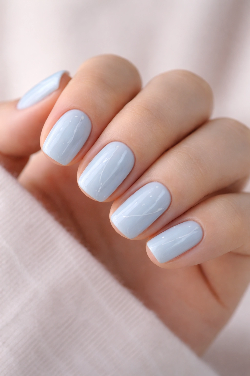
10. Nude Pink with Glossy Top Coat
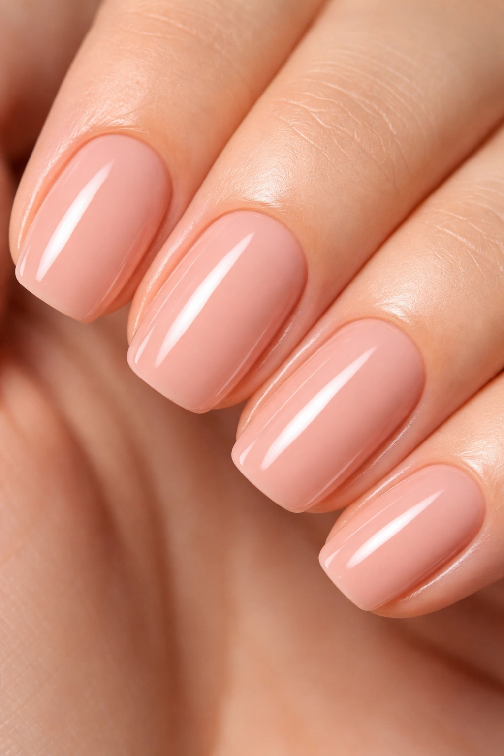
Sometimes the most professional choice is the simplest: a warm, universal nude pink in a high-shine glossy finish. This color is flattering on every skin tone and works in every professional environment.
Why Simplicity Is Professional
There’s nothing more elegant than impeccable execution of something simple. A single, flattering color with a pristine glossy finish reads as someone who takes care of their appearance and understands professional standards. It’s the equivalent of a white button-down shirt—timeless, appropriate everywhere, and never wrong.
Achieving Perfect Gloss
- Choose a nude pink that genuinely flatters your skin tone—test on your wrist under the lighting where you work most
- Apply two coats of color, letting the first coat dry before the second
- Use a high-quality glossy top coat and apply it in one smooth stroke without dragging
- Seal any visible seams along the nail edge with the top coat for a seamless appearance
Worth knowing: A glossy finish shows fingerprints and smudges more readily than other finishes. Keep a small cloth handy for quick polishing throughout the day if appearance is critical in your role.
11. Beige with Thin Black Striping
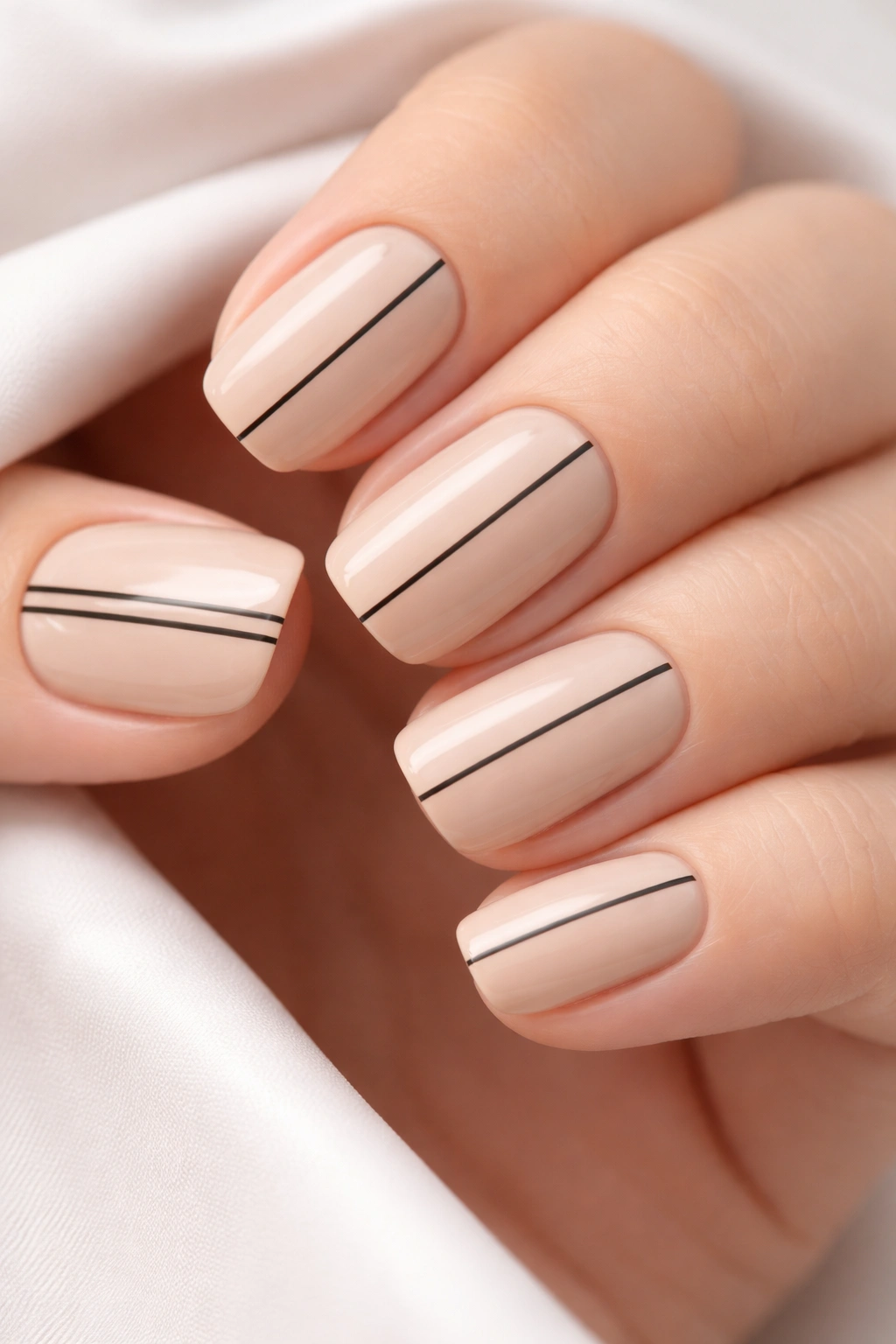
Black stripes on a neutral base creates an effect that feels modern and graphic without being bold or attention-grabbing. The thin line weight is crucial—thick stripes would read as decorative, while hair-thin stripes feel refined.
Why Black Works with Beige
Black provides maximum contrast to any neutral base, which means your lines will be crisp and clean even when painted with a very fine brush. The stark contrast also allows you to use thinner stripes than you might with a darker color combination, which automatically reads as more sophisticated.
Creating Clean Black Stripes
- Paint a warm beige or soft cream base in two coats and let dry fully
- Use a thin striping brush and pure black polish to paint very fine horizontal or vertical lines
- Keep the lines as thin as possible—they should be barely thicker than a single hair
- Space lines evenly across the nail, or create a minimalist pattern (e.g., one line down the center)
- Seal with a glossy top coat
Real talk: Black polish can sometimes seem stark against a beige base. If you find the effect too graphic, try a dark gray or charcoal instead for a slightly softer look that still provides excellent contrast.
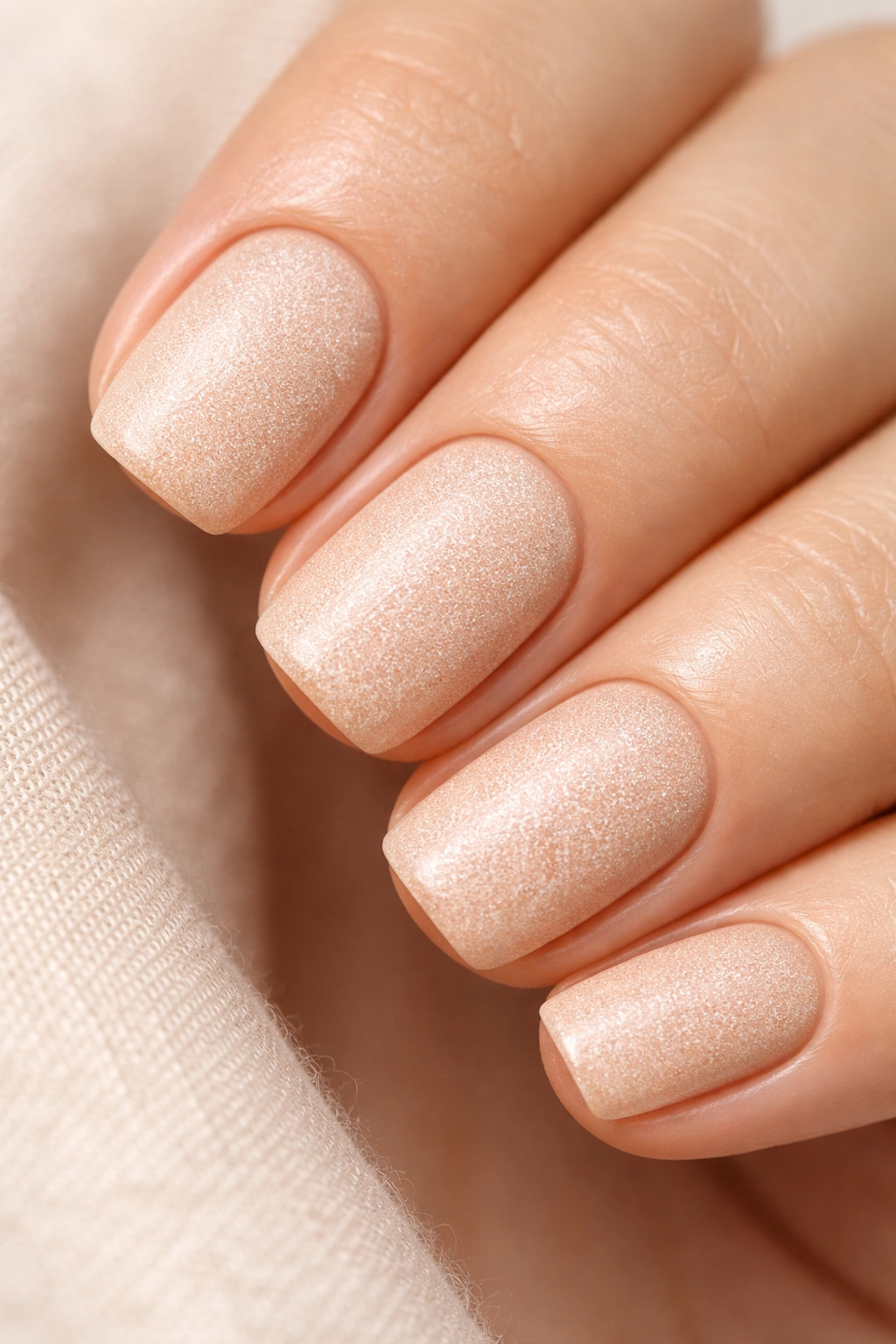
12. Pale Peach with Understated Shimmer
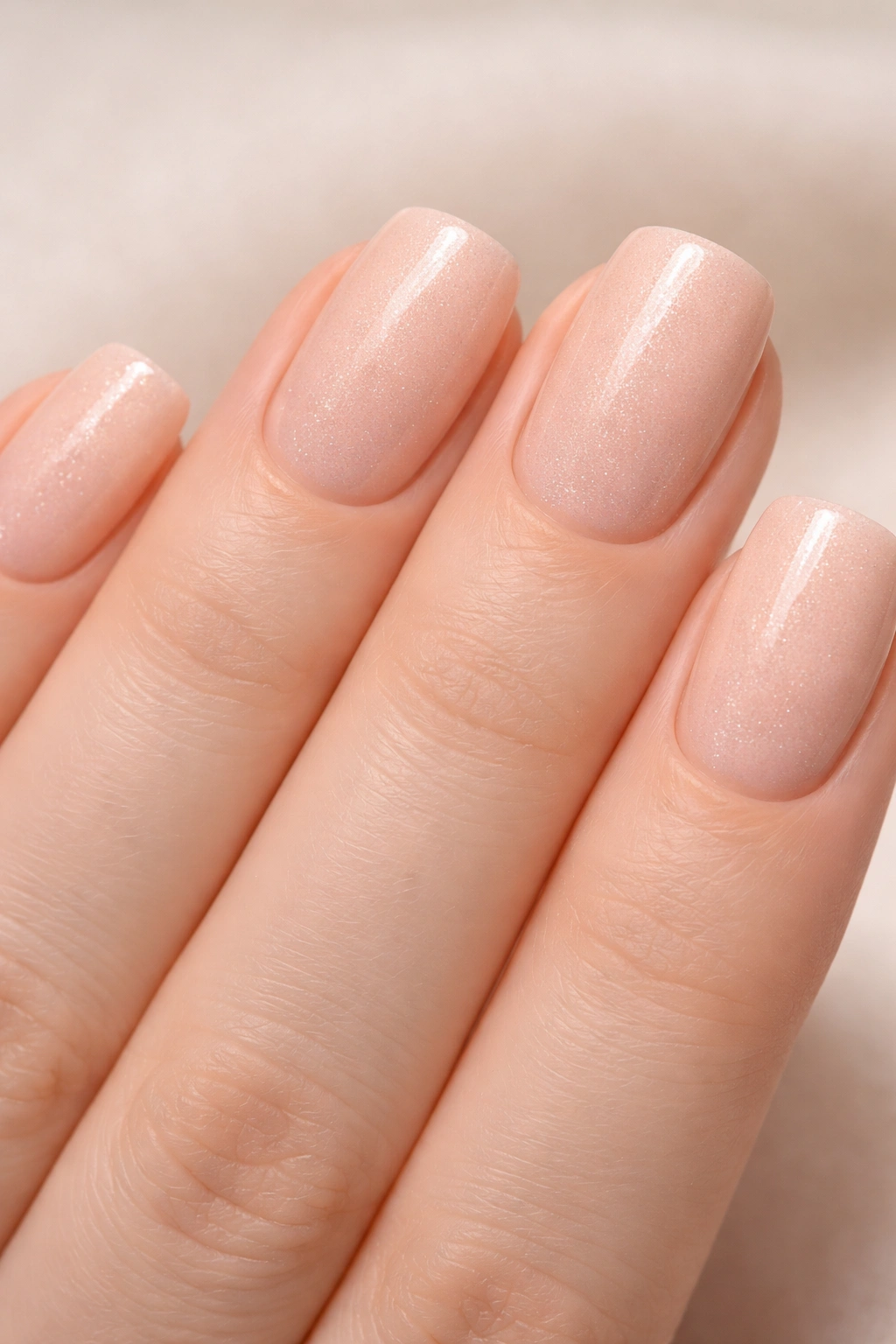
A soft, barely-peachy base paired with a subtle shimmer—not glitter, but a fine shimmer throughout the polish itself—adds dimension without being sparkly or decorative.
Shimmer vs. Glitter in the Workplace
Shimmer is a fine, sand-like sparkle that’s integrated into the polish formula, while glitter consists of larger, discrete particles. Shimmer reads as a sophisticated finish choice, while glitter reads as decorative nail art. For work, you want shimmer in a very fine, understated concentration.
Choosing and Applying Shimmer Polish
- Look for shimmer polishes described as “subtle,” “fine,” or “micro-shimmer” rather than “glittery” or “sparkly”
- Apply two coats of the peach shimmer polish for even coverage
- The shimmer should only be obvious when light hits the nail directly—it shouldn’t create a disco-ball effect in fluorescent office lighting
- Seal with a top coat to maintain the polish and add a smooth finish
Insider note: Some shimmer polishes work better over a solid base coat of the same color without shimmer, which intensifies the sparkle without making it overdone. Try painting one coat of solid peach, then layers of shimmer peach on top.
13. Cool-Toned Gray with Minimal Graphics
A sophisticated cool gray (with blue or purple undertones rather than warm brown undertones) paired with absolutely minimal graphic elements—perhaps a single thin line or a tiny geometric shape on only one accent nail.
Making Graphics Invisible to Casual Observation
The most professional nail art is the kind that’s barely noticeable unless someone is looking directly at your hands. A graphic element on just one nail (usually the ring finger or pinky) means it’s visible when you look at your hands but won’t be apparent during a handshake or when hands are resting on a table.
Minimal Graphic Ideas
- A single very fine line running horizontally or vertically
- A tiny triangle or geometric shape in one corner
- A single detail in a slightly darker shade of gray
- Negative space (color removed in a small geometric pattern)
Worth knowing: The cooler your gray base, the more modern and current the look. Warm grays can sometimes read as dated, so opt for grays with clear blue or purple undertones.
14. Ivory with Negative Space Design
Negative space nail design removes some of the polish to expose the natural nail underneath, creating a graphic effect without actual nail art. This technique is inherently sophisticated because it requires precision and planning.
Why Negative Space Works Professionally
The design reads as intentional and modern without being decorative. Because part of the graphic is literally your naked nail, it has an understated elegance that painted designs sometimes can’t achieve. It also keeps the overall look minimal—more nail is visible than covered.
Creating Negative Space
- Paint all nails with ivory or pale cream in two coats and let dry completely
- Using a thin striping brush and pure acetone or polish remover, carefully paint the negative space areas (where you want to remove color)
- Alternatively, use a fine art eraser or the tip of a toothpick to gently scrape away dried polish in your desired pattern
- Seal the remaining polish with a top coat, being careful not to get top coat in the negative space area
- Clean up any rough edges with a cotton swab
Real talk: The negative space concept requires a steady hand and some practice. If you’re not confident, ask a salon technician to execute this design—they’ll have specialized tools and experience.
15. Natural Beige with Subtle Texture
A warm, neutral beige paired with an actual textured top coat (not the appearance of texture, but real dimensional texture on the nail surface) creates a finish that’s interesting and sophisticated without being decorative.
Texture as a Professional Choice
Textured finishes have become mainstream enough to read as a deliberate choice rather than a trend. A fine, subtle texture adds visual interest and suggests you’re thoughtful about how your nails look—you’re not just painting them; you’re considering finish and dimension.
Applying Textured Top Coat
- Paint two coats of warm beige and let dry completely
- Apply a textured top coat (sometimes called “sugar coat” or “sandy finish”) according to the product instructions
- These specialized top coats should be applied in thin layers—one coat is usually enough
- Let cure according to the formula (some need UV light, some air-dry)
- The texture should be subtle enough that you can’t feel a dramatic difference running your hand across the nail
Pro tip: Textured finishes can catch on things and wear unevenly, so they’re best for people whose hands stay relatively dry and protected. If you have very active hands or frequently wash them, this might not be your best option.
Key Takeaways
Short squoval nails offer the perfect canvas for professional manicures because the shape itself communicates cleanliness, care, and intentionality. None of these fifteen designs requires exotic materials or advanced skills—most can be created with basic supplies or executed quickly at a salon appointment. The designs work across all industries and dress codes precisely because they respect the boundary between personal expression and professional appropriateness.
The real secret to work-friendly nail designs isn’t choosing bland colors or avoiding all embellishment. It’s understanding that sophistication lives in restraint, precision, and subtle detail. A hair-thin gold line reads differently than a bold geometric pattern. A nearly-invisible pale blue base reads differently than a saturated, obvious blue. These distinctions separate designs that feel polished and professional from those that feel playful or trendy.
Save the designs that call to you, experiment with different shapes and finishes until you find your personal baseline, and remember that the most professional manicure is the one that makes you feel confident and put-together when you walk into a meeting.
