

When you think of short nails, elegant doesn’t always come to mind. Most people imagine a serviceable manicure — something practical, quick to apply, and done. But here’s what actually happens when you pair short nails with soft pastels: you get sophistication. You get restraint. You get that rare combination of approachable and genuinely beautiful that makes people ask what you’re wearing on your nails without quite being able to put it into words.
The squoval shape — that perfect middle ground between the sharp geometry of a square and the rounded softness of an oval — is uniquely suited to pastel colors. There’s something about the slightly softer edges that lets pale shades shine without looking washed out or babyish. And when you keep the length short? You’re looking at a manicure that reads professional in a boardroom, effortless at brunch, and utterly intentional without trying too hard. It’s the nail equivalent of that outfit you didn’t overthink but somehow got exactly right.
What makes short squoval nails with soft pastels especially appealing is how forgiving they are. You’re not fighting delicate colors on a large canvas. Instead, the compact shape becomes a tiny showcase where every hint of shimmer, every micro-gradient, every thoughtful accent catches the light without overwhelming your hands. They work across seasons, flatter multiple skin tones, and most importantly, they look like something you actually chose rather than something you defaulted to.
The fifteen designs that follow aren’t meant to be prescriptive. They’re meant to be starting points — proof that short nails paired with soft pastels can be endlessly interesting, technically varied, and genuinely wearable.
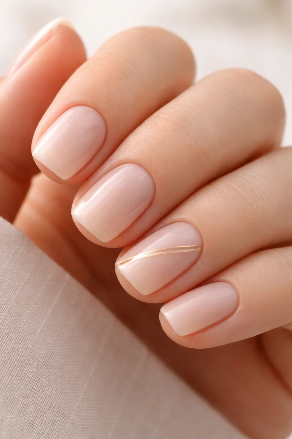
1. Barely-There Blush With Delicate Gold Striping
The most muted pastels sometimes make the biggest impact precisely because of their restraint. A barely-there blush pink — the kind that looks almost skin-tone until you tilt your hand under natural light — becomes architectural the moment you add geometric gold accents.
This design works best with ultra-thin gold striping tape applied at a slight diagonal across two or three nails. The nail polish itself should be so pale that it reads more like a canvas than a color. Think of it less as “wearing pink” and more as “creating dimension through metallics against a soft base.” The effect is sophisticated without being loud, and the gold catches light in subtle ways that keep the design interesting from every angle.
Application matters enormously here. Your base coat should be perfectly smooth — any bumps or dust particles will catch the light and disrupt the minimal aesthetic. Seal the striping tape down with a clear top coat immediately after application rather than waiting, and remove the tape while the top coat is still slightly tacky. The slight give of wet topcoat prevents the tape from peeling away bits of polish underneath.
The real trick: pair this with neutral clothing for maximum impact. Against a black blazer or white shirt, this design suddenly looks ten times more intentional. It’s the manicure equivalent of minimalist jewelry.
2. Lavender Haze With Matte Finish
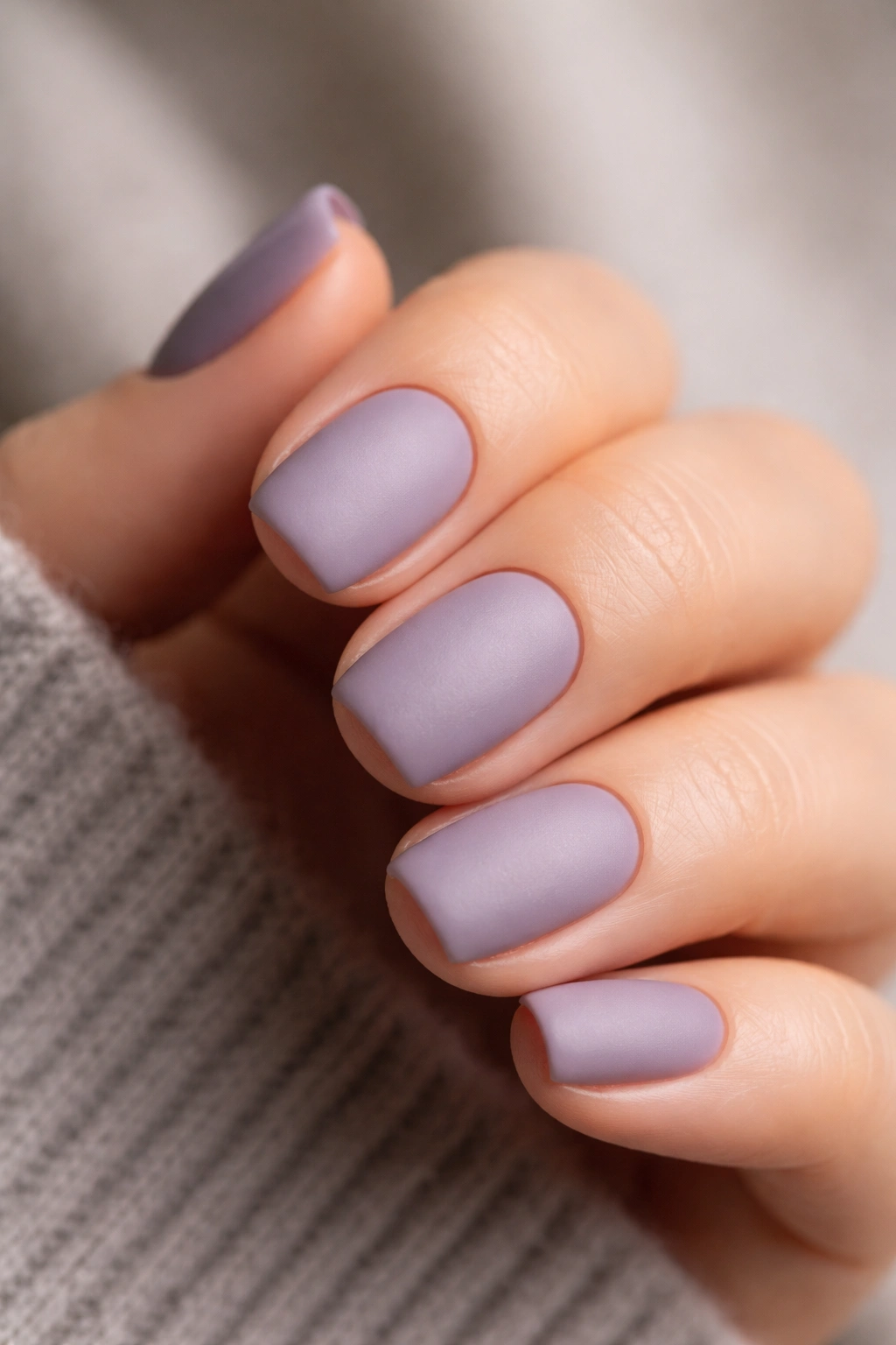
Soft lavender walks a narrow line — lean too cool and it reads pharmaceutical, lean too warm and it becomes too obviously pink. The version worth wearing sits somewhere between lilac and dusty purple, with just enough warmth to feel intentional.
Why Matte Transforms Lavender
Matte finishes are honestly underrated on short nails. A glossy soft lavender can feel a bit washed out, especially if you have fair skin. But matte? Matte makes the color look more complex, more dimensional, and somehow more curated. The lack of shine forces the eye to focus on color purity rather than reflection.
Application and Maintenance
The transition from glossy to matte is straightforward — apply your lavender polish as normal (two coats for full coverage), let it dry completely, then apply a matte topcoat over everything. The drying time is typically the same as regular topcoat, around two minutes. The thing to know about matte finishes is that they’re slightly more forgiving of minor nail ridges because they don’t reflect light in ways that emphasize imperfections.
One small caveat: matte topcoats can sometimes feel slightly tacky for the first few hours. If you find this bothers you, wait a full hour after application before doing anything requiring dexterity. By hour two, it settles into a comfortable feel.
3. Pistachio Dream With Understated Confetti
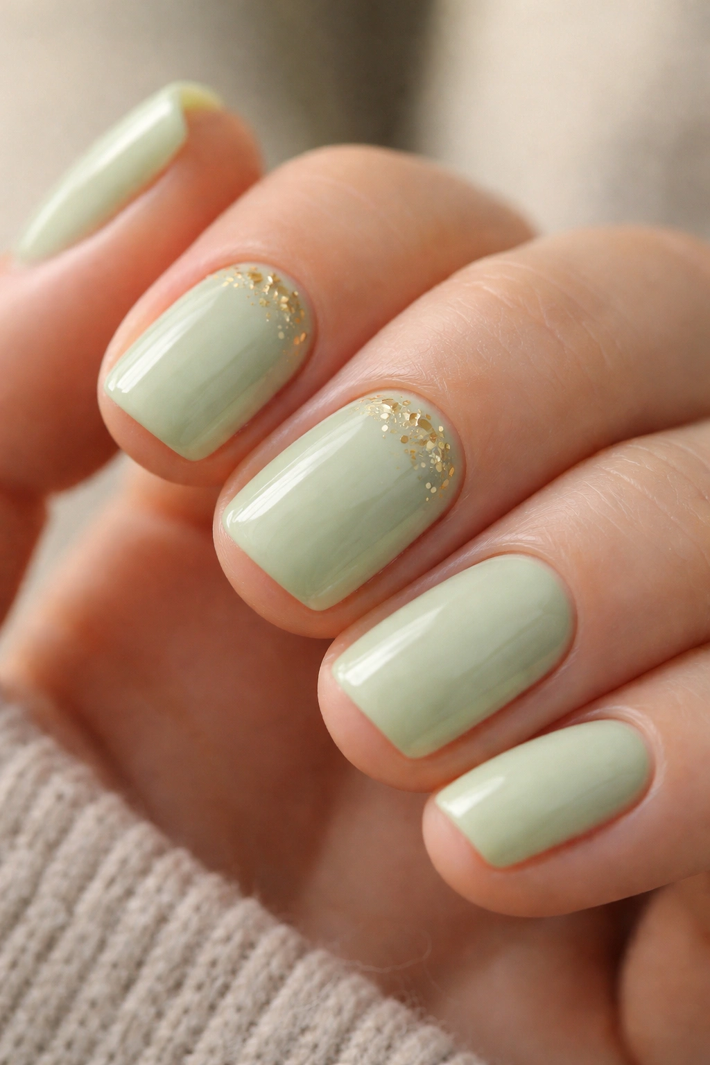
Pale green lives in an interesting space — it can read fresh and modern, or it can lean retro and whimsical depending on what you pair it with. Pistachio (that creamy, almost-gray-green that’s become surprisingly popular) pairs beautifully with tiny, intentional accent pieces rather than full coverage designs.
This particular combination uses a pistachio base with three or four tiny gold confetti flakes placed near the cuticle line on two nails. The gold should be small enough that it reads as “detail” rather than “feature,” and the placement near the nail base gives the design a grounded, elegant feel. It’s the kind of small deliberate choice that signals you didn’t rush through your manicure.
Application wise, you’ll want to use a thin art brush or a dotting tool for the confetti placement. A toothpick works in a pinch if you’re steady-handed. Place each fleck intentionally — any wobbling or hesitation shows immediately on these delicate designs. The base coat should dry completely before adding accent details to prevent the polish from moving when your brush touches down.
Pro insight: this design works especially well in natural light situations. In overhead fluorescent lighting, pistachio can look slightly washed, but in natural or warm tungsten light, it glows like something intentional.
4. Blush Pink Base With Hand-Painted Watercolor Wash
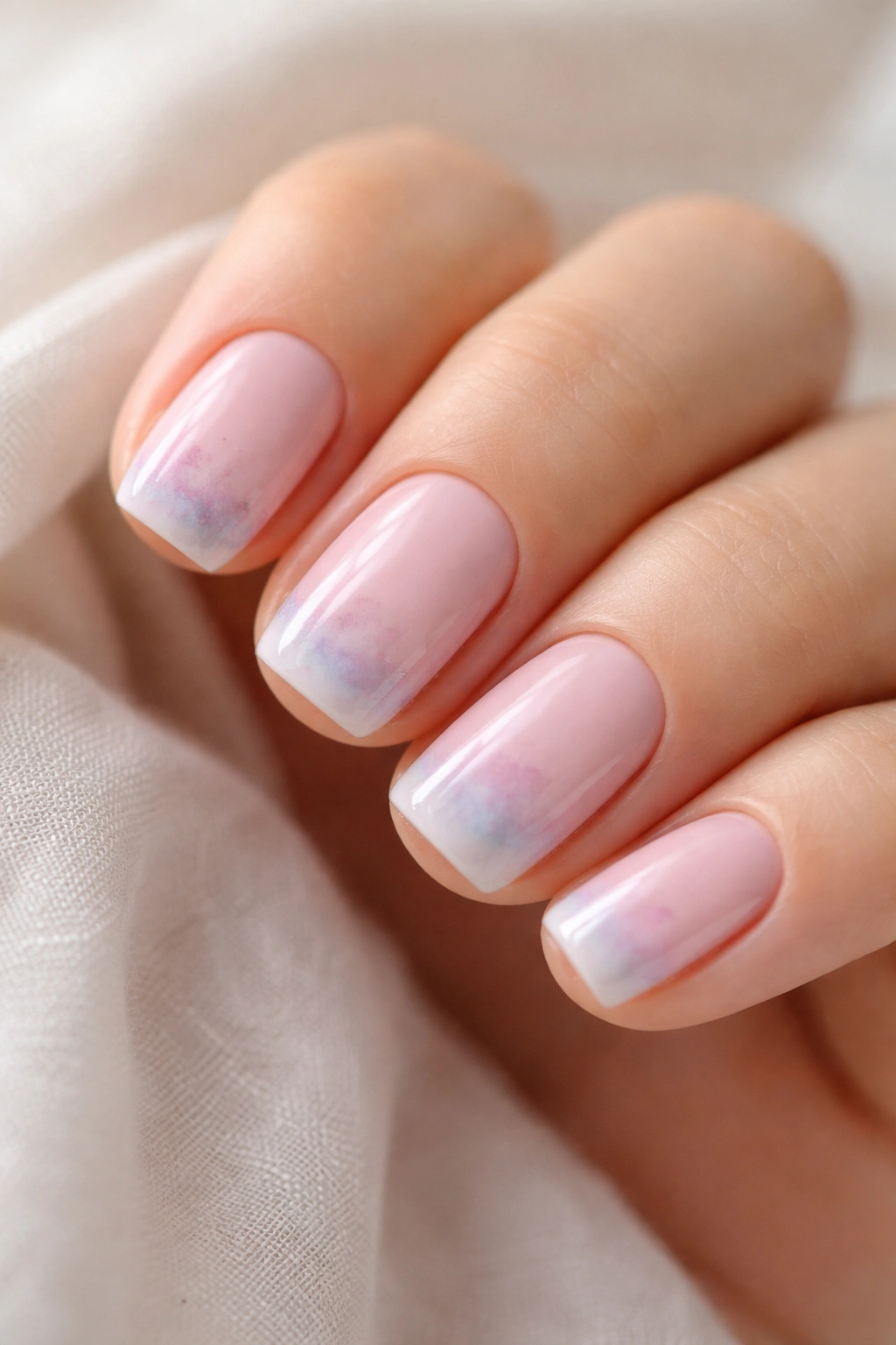
Hand-painted watercolor on nails doesn’t require steady hands — it requires patience and a willingness to let the polish do some of the work for you. A soft blush pink base topped with a diluted second color (even paler pink, or barely-there peach) creates a gradient effect that looks effortlessly artistic.
The technique is less precise than you might think. Paint your base blush color in two coats and let it dry completely. Then, using a slightly thinner brush or even a medium-thickness art brush, apply your second diluted color in loose, horizontal strokes near the tips of the nails. The colors don’t need to blend seamlessly — a slightly soft edge creates more visual interest than a perfect gradient. Top with a glossy topcoat and the slight haze created by the topcoat settling over the layered shades is part of what makes this design work.
The key variable is paint consistency. If your diluted polish is too runny, it’ll flow all the way down the nail in unpredictable patterns. If it’s too thick, the brush strokes become obvious and clunky. The sweet spot is something slightly more liquid than a regular polish consistency — this lets the color flow and create that watercolor effect without totally losing control.
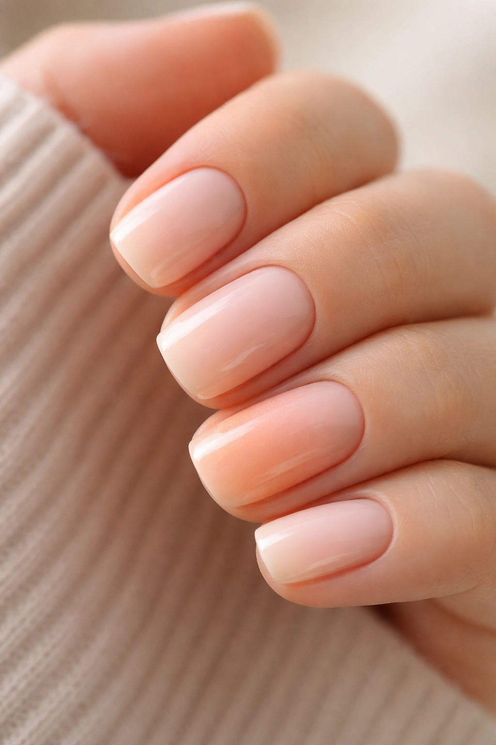
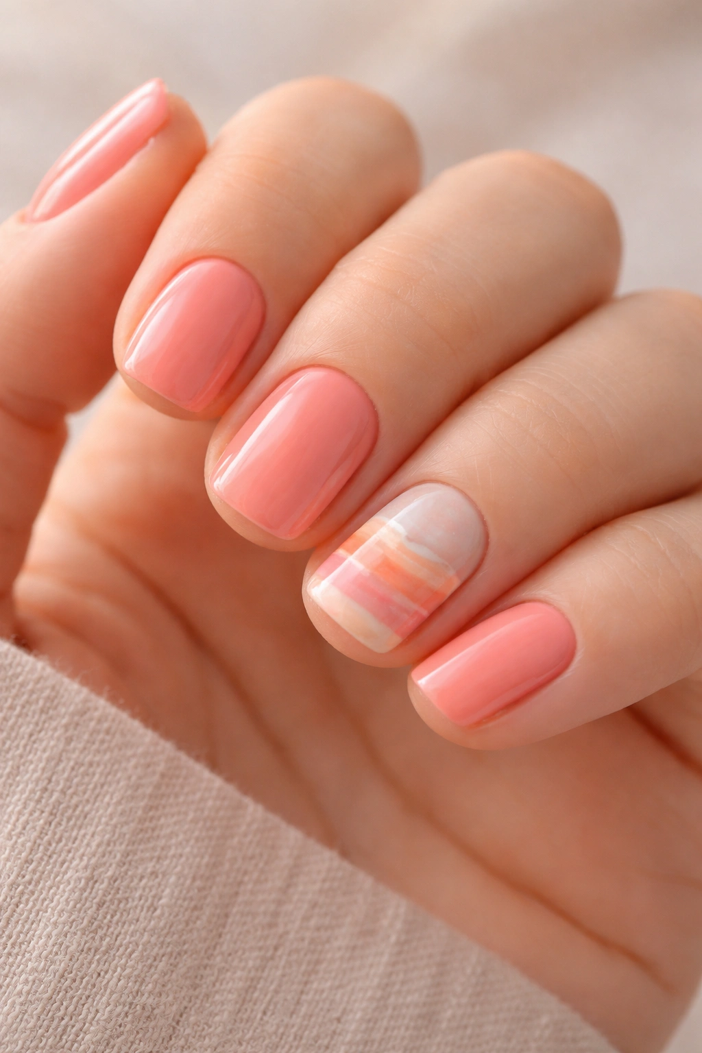
5. Peachy Cream With Negative Space Chevron
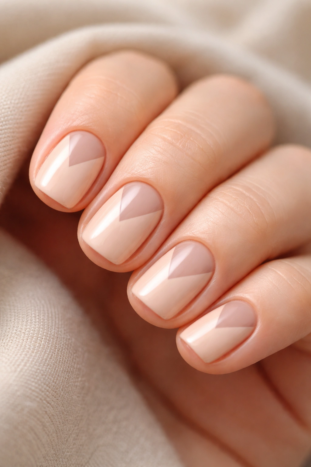
Peachy cream is one of those shades that flatters every skin tone because it’s not quite warm and not quite cool — it sits in that neutral territory where almost anything works. The magic of this design comes from what you’re not painting.
Apply your peachy cream base in two coats. Once completely dry, use painter’s tape to create two thin diagonal lines forming a chevron shape pointing downward, with the point landing roughly in the center of the nail. Paint over the rest of the nail (above and to the sides of the tape) with the same peachy cream. Let dry. Remove the tape, and you’ve created a negative space chevron where the natural nail shows through.
This design works because the contrast is subtle — you’re seeing peachy cream against the natural nail tone, which is usually slightly pinker or more golden depending on your complexion. The effect is more sophisticated than a full-color design because of that restraint. It’s geometric but not overly polished-looking. It requires less precision than you’d think because any slight imperfections in the tape placement just read as intentional hand-drawn lines.
The honest version: this design takes longer than it looks because you’re waiting for drying time between applications and being careful with tape placement. But the payoff is a design that actually reads as thoughtful rather than lucky.
6. Mint Cloud With Reverse Gradient
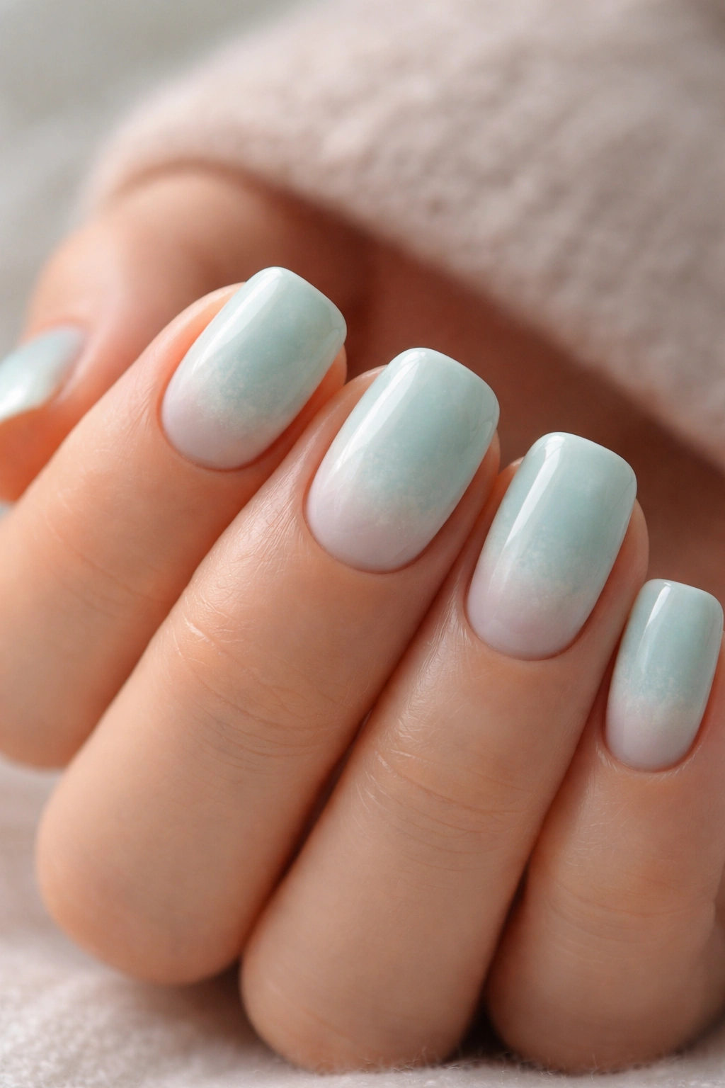
Most gradients go from dark to light. This one goes the other direction — creating a subtle effect where the color is slightly deeper at the cuticle and fades to nearly white at the tip.
This requires two very close shades in the mint family. Think mint and off-white mint. Or mint and the palest version of mint that barely qualifies as a color. Apply the darker mint in your usual way (two coats). Once dry, take a makeup sponge and dab it with the lighter shade of mint, then press it gently onto the tip section of the nail, then halfway across. The sponge texture creates a natural, cloud-like transition rather than a harsh line.
The difference between this and a regular gradient is the starting point. By beginning with a solid color base rather than a gradient from the start, you’re creating something with more depth and dimension. The lighter tips read as almost ethereal, while the solid base at the cuticle keeps the design grounded.
Reverse gradients can look washed out if your shade selection is too similar. The colors need to be noticeably different, even if only subtly so. Hold both bottles up to natural light before committing — what looks identical under indoor lighting might be visibly different in daylight.
7. Powder Blue With Geometric Gold Triangles
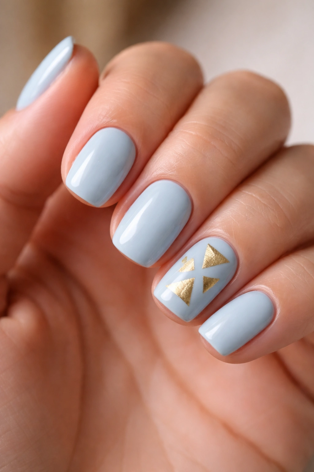
Powder blue — not quite periwinkle, not quite sky blue, but somewhere in that soft blue family that manages to be both cool and approachable — becomes distinctly modern when paired with geometric accent details.
This design uses precisely three gold triangles positioned on a single accent nail, each pointing in a different direction. The positioning matters. One pointing downward near the cuticle, one pointing sideways in the middle, one pointing upward near the tip. This asymmetrical arrangement is what prevents the design from looking too constructed or rigid.
You’ll need either a thin art brush or a thin striping brush for this level of precision. The triangles themselves should be small enough that they don’t dominate the nail, but large enough that the angles are clearly intentional. A common mistake is making the triangles too delicate — they disappear. Make them bold enough to read as design elements, not accidents.
The beauty of geometric designs on short squoval nails is that the shape itself complements the straight lines and angles you’re adding. A long round nail would fight with geometric accents. A short squoval makes them feel natural.
8. Sage Green With Embossed Texture Effect
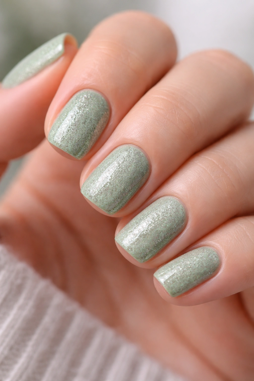
Textured nails are having a specific kind of moment — not fully glittery or sparkly, but with enough dimension that they catch light and create visual interest without screaming “decorated.”
Sage green is perfect for this because the muted tone won’t compete with texture. Apply a base coat, then your sage green in two coats. While the second coat is still slightly wet (not tacky, but not bone-dry either), sprinkle extremely fine clear or iridescent glitter over the wet surface. This will partially sink into the topcoat layer, creating an embedded effect rather than a surface texture.
Top with a glossy topcoat to seal everything and smooth the surface slightly. The result is a nail that has tactile interest without actually being textured to the touch. You can run your finger across it and it feels smooth, but visually it reads as dimensional and intentional.
The timing on this is crucial. Wait too long and the polish is dry — the glitter won’t embed and just sits on the surface. Apply your second coat, count slowly to 15-20, then add glitter. This gives you that sweet spot where the polish is still setting but not actively wet.
9. Blush Nude With Micro-Pearl Accent Line
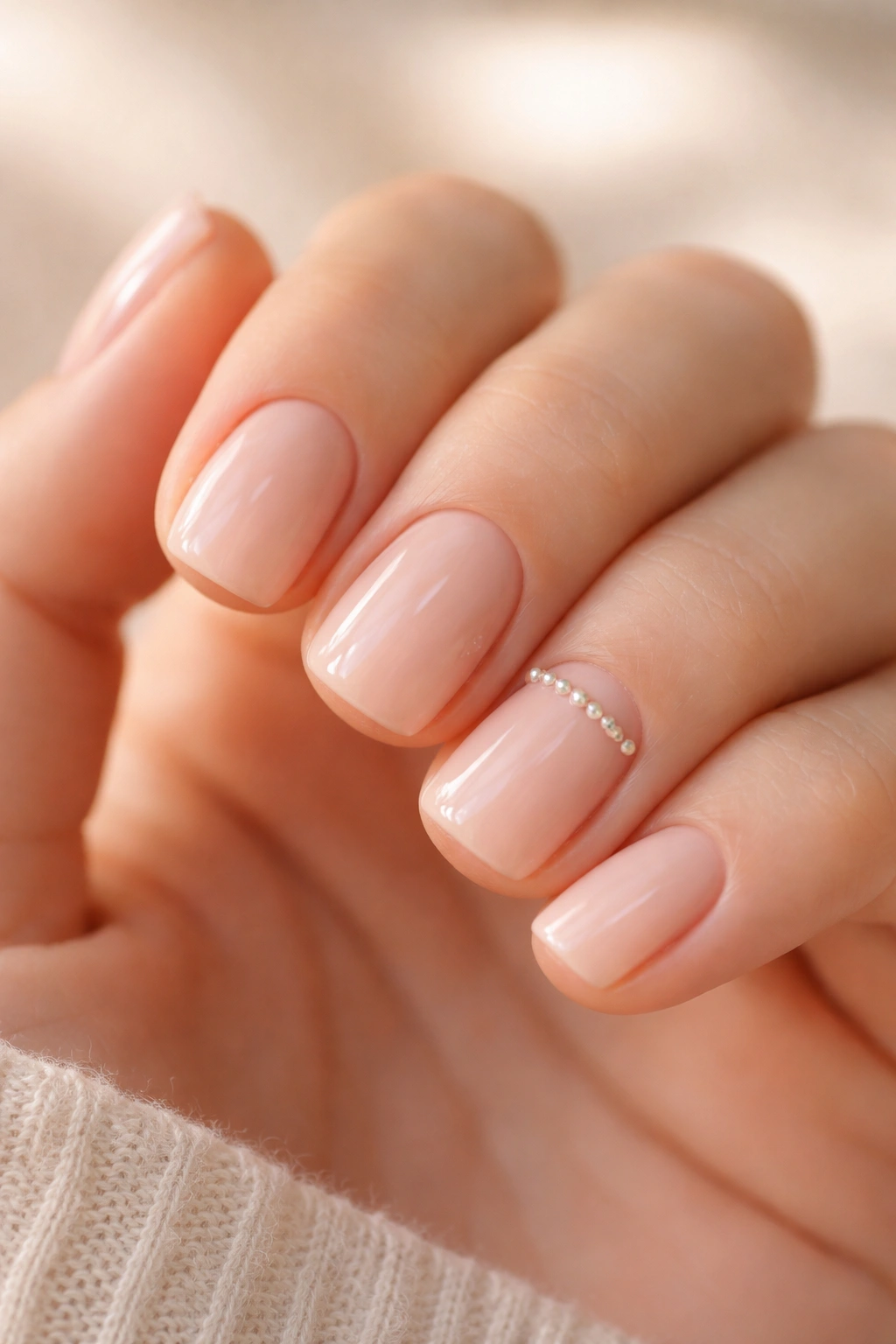
The difference between a good blush nude and a great one often comes down to subtle accent placement. A single line of micro-pearls creates luxury-looking complexity without requiring advanced nail art skills.
Choose a tiny striping brush and a nude-toned pearl or champagne metallic. Paint a single thin horizontal line roughly a third of the way down from the tip of the nail. The line itself should be thin enough that it reads as detail rather than feature, but visible enough that it’s clearly intentional.
Pearls and champagne tones work on blush nudes because they enhance without competing. You’re not introducing a contrasting color — you’re adding luminescence to an already warm, soft tone. The effect is subtle in most lighting but catches dramatically in direct or natural light.
This design is minimalist but never looks unfinished because that single accent line signals intentionality. It’s the design equivalent of a well-placed piece of jewelry — you notice it without being able to immediately articulate why the overall look works.
10. Pale Peach With Ombre Shadow on Single Nail
Ombre effects don’t require full gradient coverage to read as sophisticated. A single accent nail with peach fading to deeper peach creates focal interest while keeping the overall look minimal and wearable.
Paint four nails in pale peach. On your accent nail (typically the ring finger), apply pale peach as your base. Once dry, use a makeup sponge to blend a slightly deeper peach tone (maybe just one or two shades deeper) onto the outer third and tip of that single nail. The sponge texture creates a soft, diffused transition that reads as intentional gradient rather than uneven application.
The reason this works on short squoval nails is proportion. The ombre effect is contained to a smaller surface area, which means it feels refined rather than dramatic. You’re not attempting a full three-color gradient across multiple nails — you’re creating subtle dimension on a single nail.
The key to pulling this off is not overthinking the blend. Don’t try to create a perfectly smooth gradient line. Instead, let the sponge texture do the work. The slight variations in the transition are what make it look like a design choice rather than a makeup mishap.
11. Lavender With Minimalist Vine Detailing
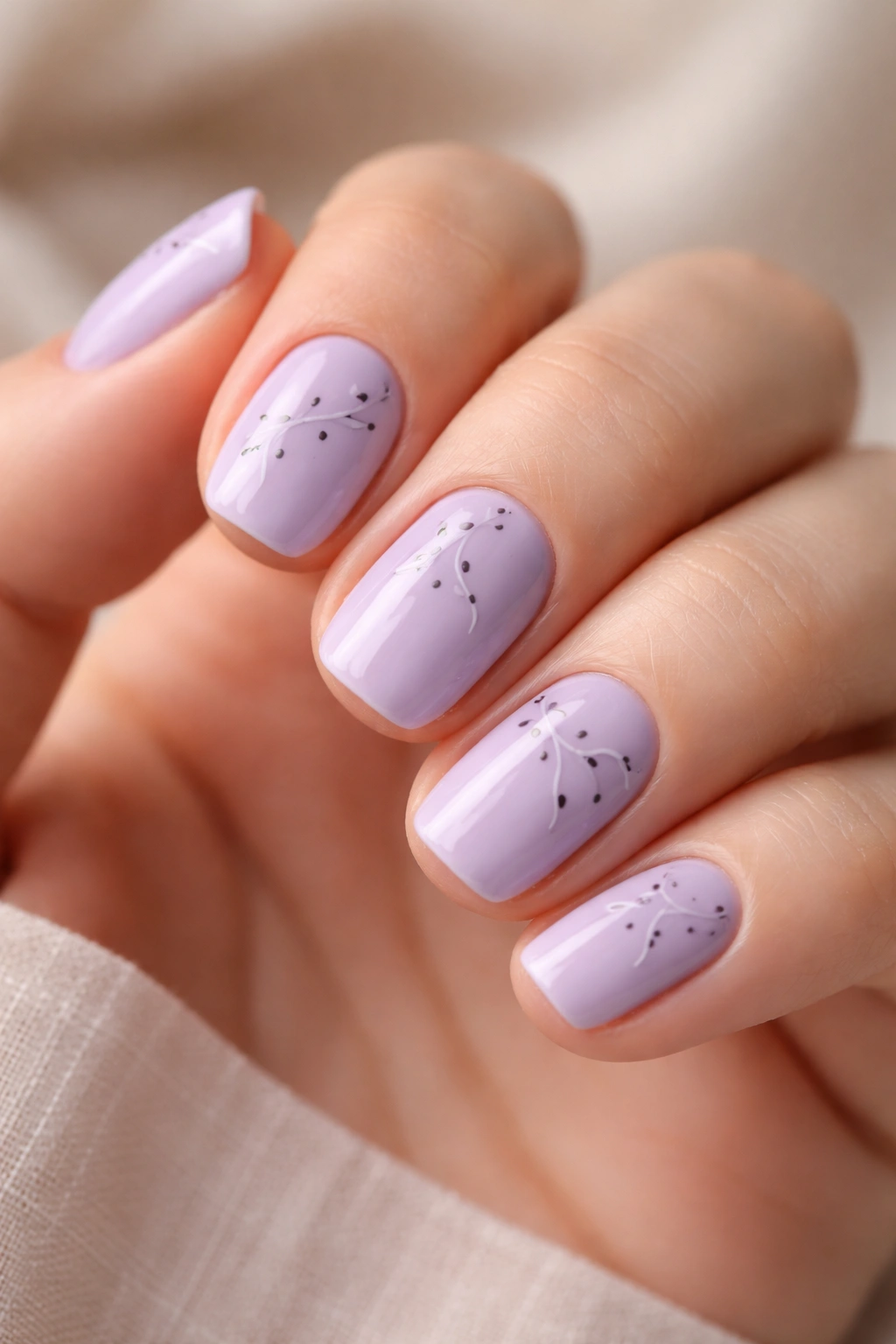
Hand-drawn botanicals on nails sound more complicated than they actually are, especially when you’re keeping them minimal and clean-lined.
Start with your lavender base in two coats. Once dry, use a very thin brush and a complementary color (sage green, muted taupe, or even pale gray) to paint two or three simple curved lines suggesting a vine. Add three to five tiny dots along each vine representing leaves or buds. The execution should feel loose and gestural rather than perfectly rendered — this isn’t botanical illustration, it’s suggestion.
The magic of minimalist botanicals is that less is more. A single vine with five leaves reads as elegant and intentional. Multiple overlapping vines start to feel busy. Keep it sparse. Let the lavender base remain the focus — the botanicals are accent details, not the whole story.
This style works because it speaks to a specific aesthetic without requiring technical skill. Anyone can draw a curved line and add small dots. The design reads as intentional because of the color choice and placement, not because of technical execution difficulty.
12. Pale Pink With Delicate Lace Stamp Design
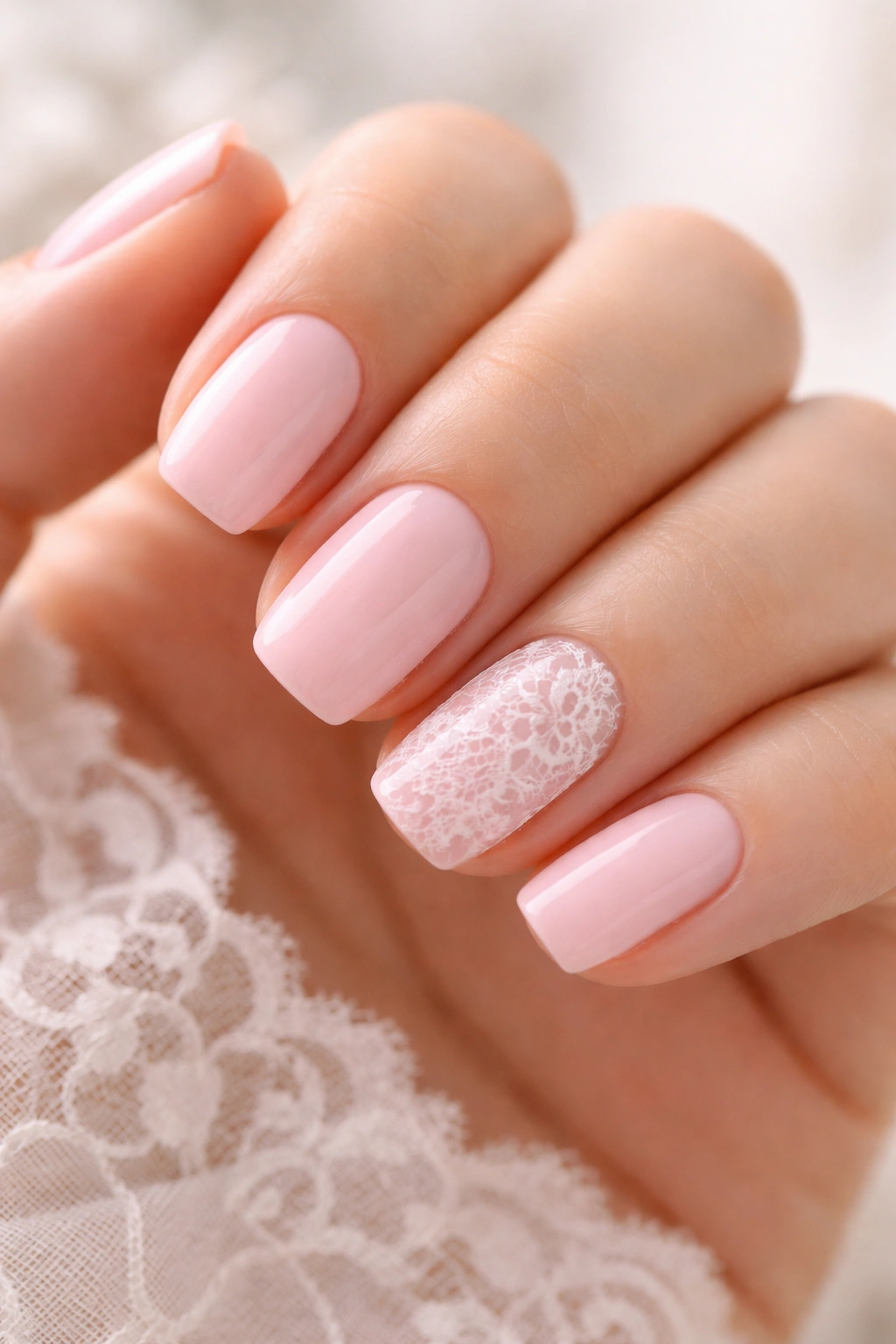
Stamping is genuinely one of the most underrated techniques for short nails. It allows you to create intricate designs with zero free-hand painting involved, which opens up possibilities that would take professional-level skill to hand-paint.
Choose a delicate lace stamp plate — the kind with fine, detailed patterns rather than bold geometric shapes. Using a stamper, create the image on one or two nails as accents while keeping the remaining nails solid pale pink. The stamp itself should be in white, pale gold, or even a slightly deeper shade of pink for subtle contrast.
The results look far more intricate and intentional than the minimal effort required to create them. The key is having a good quality stamp set and quality stamper — cheap tools create unclear impressions that look like smudges rather than designs.
Lace patterns on pale pink read as romantic but never over-the-top when you’re only stamping one or two accent nails. It’s the difference between delicate detail and maximalist design.
13. Buttery Yellow With Cream Polka Dot Precision
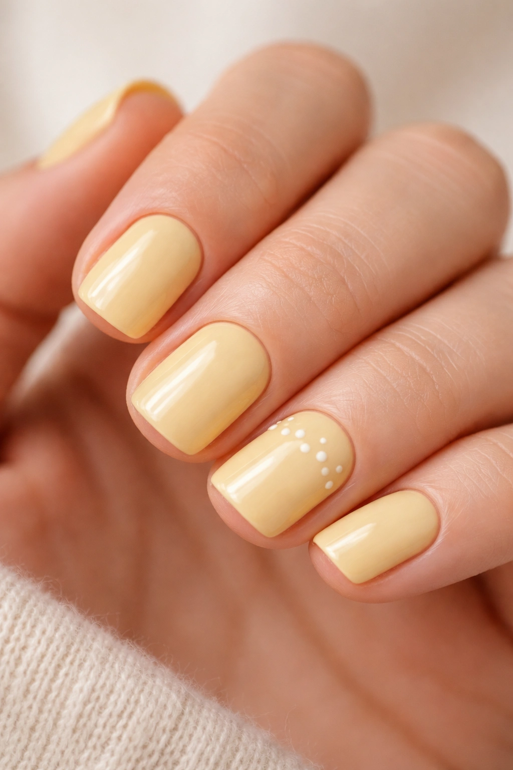
Yellow pastels are harder to find than you’d think. Most pale yellows lean either too warm (more orange) or too cool (more greenish). True buttery yellow sits right in the center and somehow flatters unexpected skin tones.
Using a dotting tool or even a toothpick, create a row of tiny cream-colored dots roughly one-third of the way up from the tip on two or three nails. Space them evenly — not so tight that they merge, not so far apart that they look accidental. The dots should be small enough that they read as detail rather than feature, but visible enough that they’re clearly deliberate.
The contrast between buttery yellow and cream isn’t high, which is exactly what you want. You’re not going for pop or drama. You’re going for a subtle pattern that adds visual interest without overwhelming the soft base color.
The difficulty here is consistency. Dots created with a dotting tool should be roughly the same size. If you find your dots are inconsistent, use the same end of the dotting tool for every dot — different ends can create slightly different sizes, which makes the final pattern look less intentional.
14. Soft Coral With Hand-Painted Watercolor Sunset
Coral pastels can read peachy or pinkish depending on the specific shade. The version that works best is one that’s slightly muted — coral that doesn’t vibrate but instead sits peacefully on your nails.
This design combines a soft coral base with hand-painted layers of deeper coral, pale pink, and barely-there yellow to create a sunset effect concentrated on one or two accent nails. The technique is similar to the watercolor wash mentioned earlier, but here you’re introducing three different colors that partially blend and partially sit separately.
Start with your soft coral base on all nails. Once dry, on your accent nail only, layer on your additional colors from tip toward the center using horizontal brush strokes. Let them partially blend where they overlap, but don’t try to create a perfectly smooth gradient. The slight variations where colors meet create more visual interest than a flawless blend would.
The reason this works is the limited color palette within a warm family. You’re essentially working in coral to pink to peach tones — colors that naturally harmonize. Even if the blending isn’t perfect, the colors work together by virtue of being in the same family.
15. Champagne Shimmer With Rose Gold Linear Accent
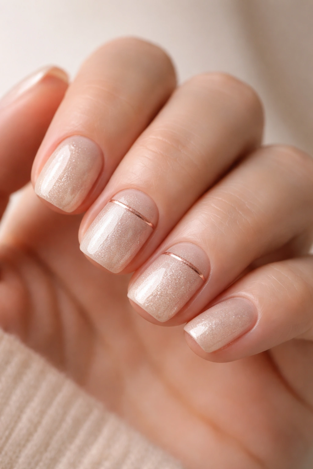
Sometimes the simplest designs read as the most intentional, especially when your base color does a lot of the work for you.
Champagne shimmer creates luminescence all on its own — the subtle shimmer shifts between gold and pink tones depending on the angle and lighting. Adding a single linear accent in rose gold draws that warmth even more deliberately.
Apply your champagne shimmer base in two coats. Once dry, use a thin striping brush to paint a single angled line in rose gold across two or three nails — it doesn’t need to be perfectly straight, in fact a slightly imperfect angle looks more intentional. The line itself should be thin enough to read as accent rather than stripe, and positioned on just the upper portion of the nail where it reads as a design element rather than running the full length of the nail.
The beauty of this design is restraint. You’ve introduced shimmer in two different metallic tones, created a linear accent element, and done it all in four or five minutes. The result feels sophisticated and intentional, partly because of the careful minimal approach and partly because the champagne shimmer does so much visual work on its own.
Bringing It All Together
The common thread across all fifteen of these designs isn’t just color or technique — it’s intention. Every choice, from the shade of pastel selected to the placement of accents, is deliberate. None of these designs happened by accident.
Short squoval nails with soft pastels live in that sweet spot where you can be experimental without being experimental in ways that read as unconfident. You can hand-paint botanicals or try geometric accents or play with textures because the conservative length and soft colors ground everything in sophistication. Even if the execution isn’t flawless, the overall effect reads as intentional curation.
The other advantage is versatility. These designs work across seasons, professions, and personal styles. A soft lavender with matte finish reads completely different depending on whether you’re wearing it to an office or to brunch. Peachy cream with negative space reads modern or minimal depending on your styling. Pastel designs adapt to how you present them rather than demanding a specific aesthetic.
The technical barrier to entry is lower than you might think too. Most of these designs require either no special tools (a makeup sponge works fine for gradients), or just the most basic nail art supplies (a thin brush, a dotting tool, some painter’s tape). None of them demand professional-level skill. What they demand is attention — choosing your shades carefully, taking time with placement, not rushing through application or removal.
The real truth about short squoval nails in soft pastels is that they prove restraint doesn’t equal boring. Some of the most visually interesting manicures are the ones that quietly ask for attention rather than demand it. These fifteen designs are proof that understatement can be just as striking as anything louder.
