

Short nails and French tips have a long, complicated history together. The classic French manicure was practically synonymous with length for a long time — that precise smile line made the most sense stretched across a wider, longer nail bed. Then the almond shape changed the equation. Its gently tapered silhouette creates the illusion of elongation even on short fingers, which is why French tips suddenly became viable for people who’d always assumed they needed extensions to pull the look off.
Purple brings something else entirely to the conversation. Where a white French tip feels traditional — almost retro at this point — a purple tip signals a deliberate design choice. The range across the purple family is enormous: soft lavender barely distinguishes itself from a sheer base; deep plum commands immediate attention; electric violet practically hums with energy. Each shade occupies a different visual territory, which is why “purple French tip” covers far more ground than most people expect.
On short almond nails specifically, the tip band is naturally narrower than it would be on longer extensions, which means every choice matters more. A 2-millimeter matte plum tip and a 2-millimeter glossy lavender tip share the same structural footprint but look nothing alike. Shade, finish, and the specific technique used for the tip line all carry more weight here than on nails where there’s more surface area to absorb variation.
The 15 designs below are genuinely distinct from one another — not 15 shades of lavender with a slight twist. Each one uses a different combination of technique, finish, and visual concept, with specific detail on how to achieve or request each one. A few are straightforward for home application; others are better handled by someone with gel experience. That’s flagged where it’s relevant.
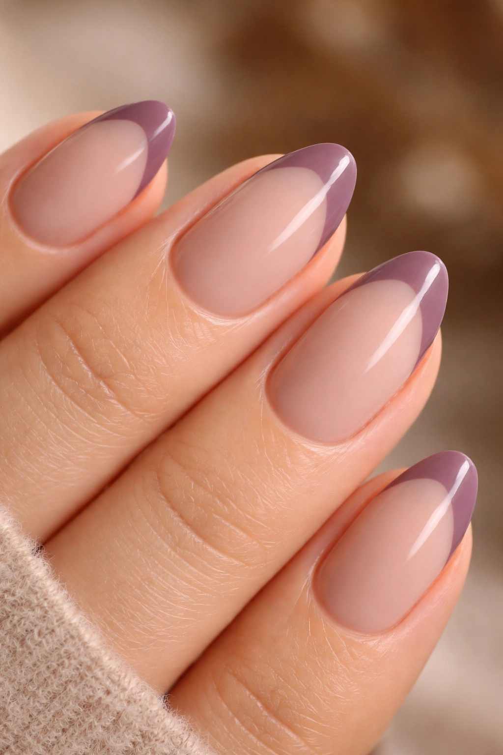
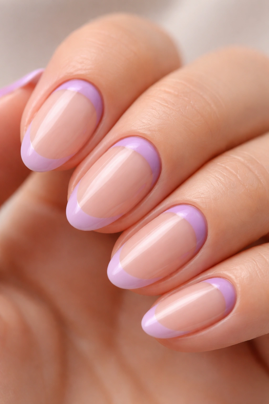
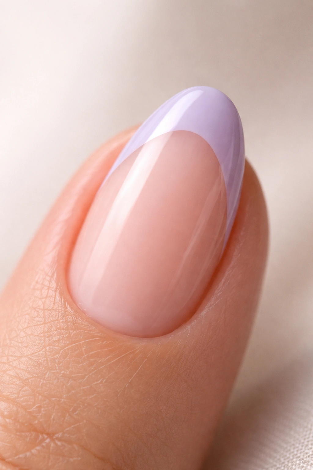
1. Classic Lavender French Tip
Sometimes the most effective approach is also the most precise.
A soft lavender tip on a short almond nail looks effortless, and getting it to actually look that way is more technical than most people expect. The shape of the smile line is everything here. Because the almond nail tapers to a gentle point, the French tip curve needs to follow that taper — angled slightly toward the center of the nail tip rather than running straight across. A curve that doesn’t track the nail shape looks stuck on. One that does looks like it grew there.
For the shade itself, lean toward a lavender with a cool, slightly grey cast rather than one with blue or pink warmth. Greyed lavender — closer to dusty lilac — looks more refined against a sheer pink or warm ivory base. A stark white base strips too much warmth from the design. A deeply nude base pushes the lavender too warm and muddies the relationship between the two tones.
Tip band width matters enormously on short nails. Keep it at about 2 millimeters or slightly under. Any thicker and the lavender starts to overwhelm the nail bed instead of framing it, which is the opposite of the effect you want.
This is the design for someone who needs a French manicure that functions everywhere — professional settings, special occasions, or a Tuesday where nothing in particular is happening. No embellishment, no complicated technique. The challenge is purely in the precision of that curved tip line, which is worth taking your time with.
2. Deep Plum French Tip with a Matte Finish
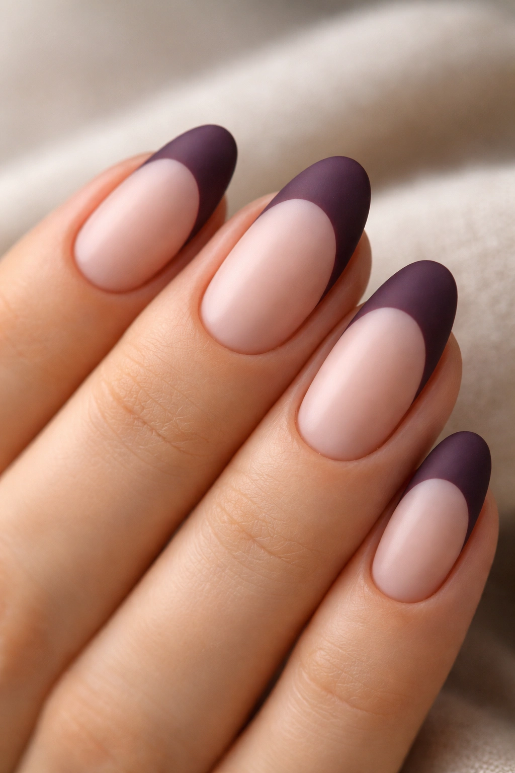
Most people pick lighter purples for French tips because they assume the tip needs to feel soft and delicate. Deep plum disagrees — and makes a compelling case.
A thick band of deep plum, a shade that sits somewhere between blackberry and dark burgundy depending on the formula, against a warm milky nude base creates something far more striking than soft. The contrast is bold. The color is confident. But the matte finish is what keeps it from tipping into melodrama. Glossy deep plum looks saturated and intense in a way that can feel heavy; matte deep plum looks like suede, sophisticated in a way gloss simply can’t produce.
Application technique matters significantly with dark, opaque colors. Plum is pigment-dense, so one careful coat at the tip line often covers more cleanly than two thin ones that move and blur the edge. A thin nail art liner brush produces a more precise smile line than a tip guide on darker shades because guides tend to drag the wet pigment when removed, softening the edge you want sharp.
Skin staining is real with plum formulas. Keep a small cleanup brush dipped in acetone nearby to trace the surrounding skin clean before the topcoat goes on. It takes an extra two minutes and makes a visible difference in the finished result.
Once the tip is set, apply matte topcoat over the full nail, then add a second thin matte layer just across the tip band itself. The tip edge is the most vulnerable point for chipping, and this double coat there adds meaningful protection without changing the visual finish anywhere else.
3. Purple-to-Clear Ombré French Tip
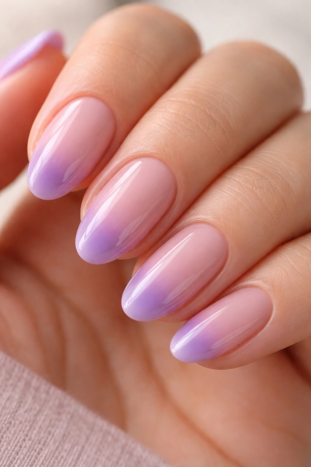
The gradient French tip sounds complicated until you understand that it’s essentially a sponge technique — and then it becomes one of the more forgiving nail designs you can execute at home.
The concept: instead of a hard edge between the base and the tip color, the purple fades softly into the sheer base. The color concentrates at the very tip of the nail and softens as it moves back toward the center, so the whole nail dissolves gradually into purple at the top.
The Sponge Method
You need a small, flat-cut makeup sponge — the dense rectangular kind from a beauty supply store, not a wedge sponge. Apply the purple polish directly to the sponge surface, then stipple it onto the upper third of the nail using short, light pressing motions. Three or four light passes build depth without creating patchiness. Seal with a glossy topcoat and the sponge texture disappears completely.
Getting the Shade Right
- A sheer or translucent lilac works far better than a fully opaque purple — the translucency is what produces the soft fade rather than a blotchy patch
- On short almond nails, keep the gradient to the upper third of the nail; going further down the nail bed makes it look like an accident rather than a design choice
- Allow each sponge pass to dry for 20–30 seconds before the next; building color on wet layers creates muddy spots rather than depth
- Clean the surrounding skin with an acetone brush before topcoat — sponge stippling almost always leaves color on the skin around the nail
Pro tip: If the transition line looks too defined after sponging, wait 30 seconds for the layer to partially set, then press a barely-loaded sponge over the mid-zone in small circular motions. That single step turns a visible line into an actual gradient.
4. Sheer Lilac with a Glitter-Packed French Tip
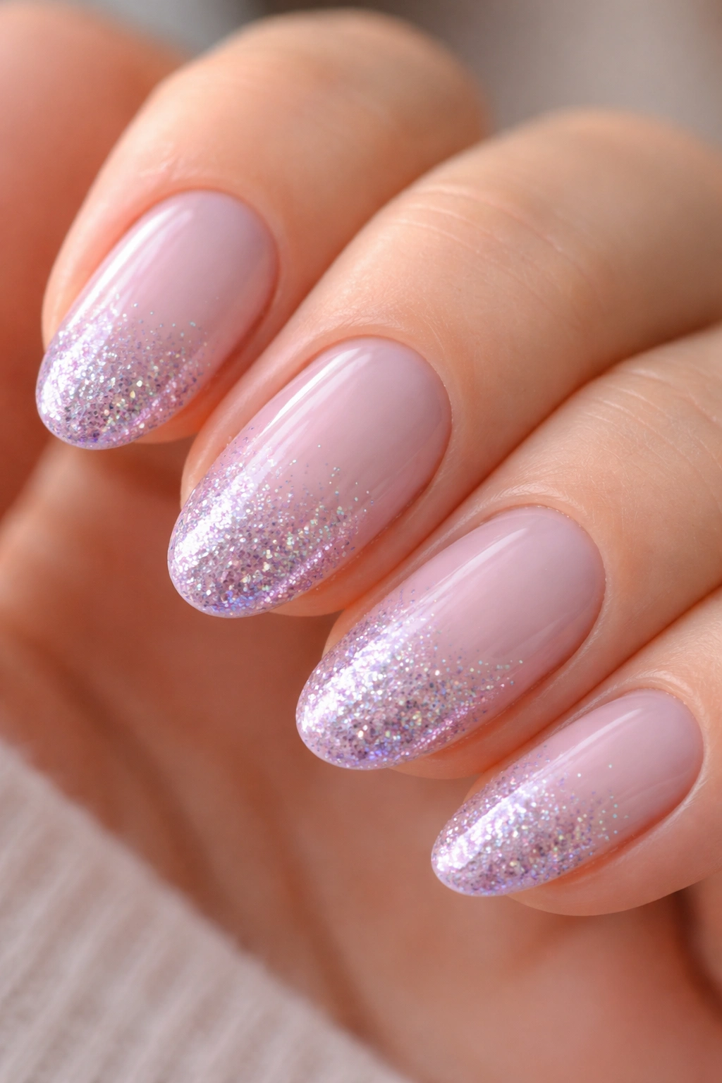
What makes a nail design feel festive without looking costumey? The answer almost always involves restraint in the right places.
A sheer lilac base — barely-there color, almost like tinted glass — paired with a dense, sparkle-loaded tip gets that balance exactly right. The base stays quiet. The tip does all the talking. And the contrast between the two is precisely what gives the design its energy.
Glitter nail formulas vary enough that the product choice genuinely affects the outcome. For short almond nails, a fine holographic particle glitter scales best — individual particles that shift between silver, pink, and purple in different lights. Chunky glitter, which looks beautiful on longer nails, fights for space on a compact nail bed and can look busy at this scale. Fine holographic particles provide sparkle without visual congestion.
Getting the Tip Dense and Even
Layer the glitter formula rather than applying one heavy coat. A thin first coat followed by a second coat with concentrated pressure at the very tip edge builds density where you want it — right at the smile line — while fading naturally back toward the center. That fade mirrors the ombré logic and looks deliberate rather than heavy.
Topcoat is non-negotiable here. Glitter particle texture creates microscopic peaks on the nail surface that catch on fabric and peel faster without full encapsulation. Two coats of topcoat, with the second coat run specifically over the free edge of the nail, adds at least two to three extra days of wear. A gel topcoat cured under a lamp holds even longer than an air-dry formula over glitter tips.
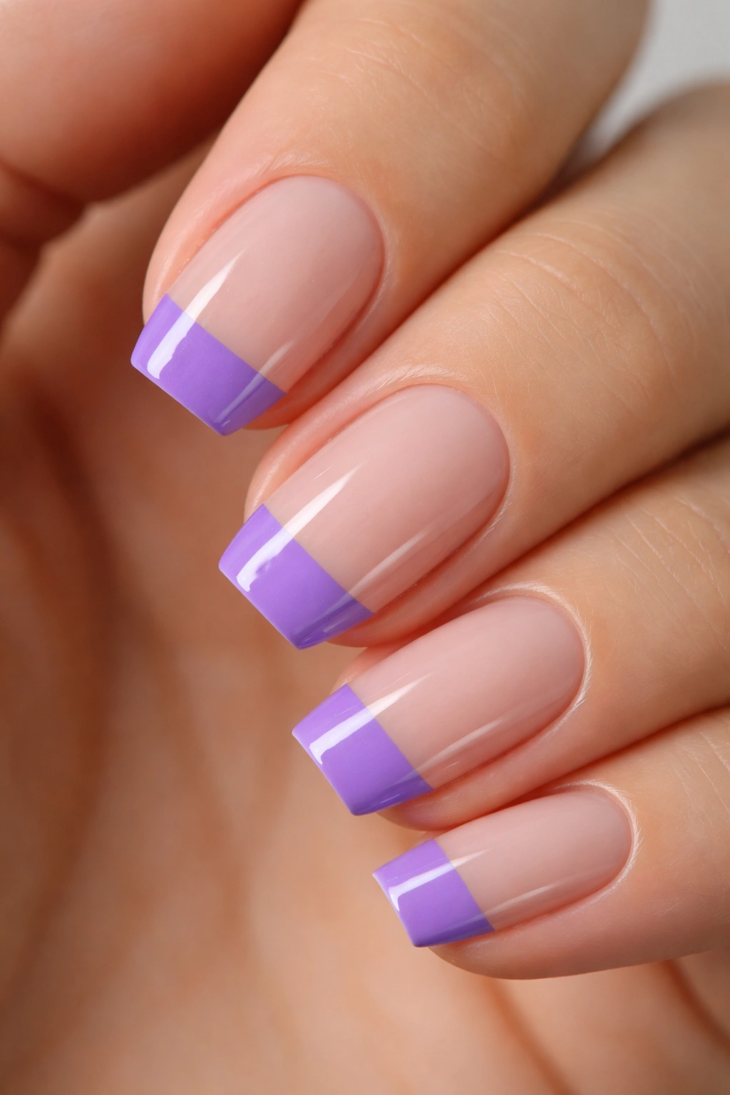
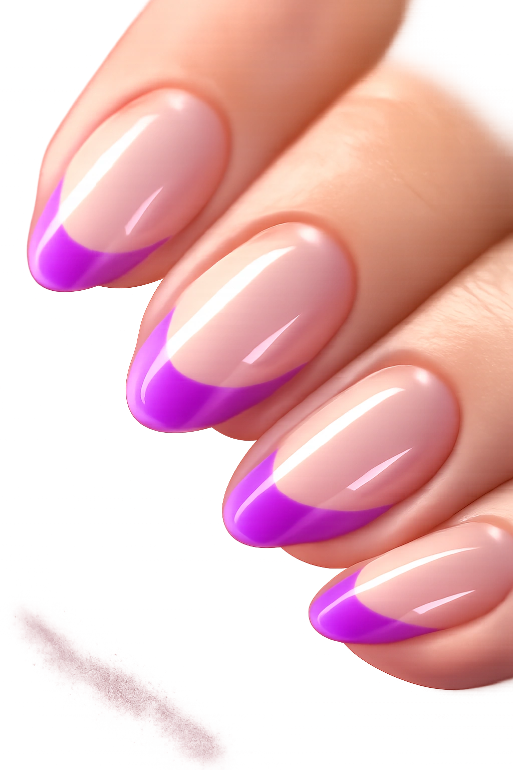
5. Two-Tone Purple French Tip
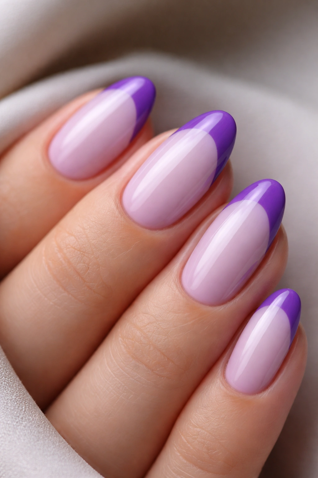
Picture sitting down for a nail appointment and saying “purple French tips, please” — and the tech reaches for exactly one shade that does both the base and the tip. That’s the one-dimensional version. This design does something considerably more interesting.
Two distinct purples, one for the base and one for the tip, create a layered depth that a single color can’t produce. The strongest pairing is a soft orchid or heather purple as the base — two sheer coats for opacity without heaviness — topped with a deep violet or grape-toned tip. The result is clearly purple-on-purple, but the value difference between the shades gives the nail dimension that feels designed rather than just painted.
The almond shape helps specifically because the tapering nail compresses the tip band. A darker tip on a narrowed section functions as a sharp accent rather than a heavy color block. On square or coffin shapes where the tip band is wider, the same dark shade would read heavier and less graceful. The almond taper is doing real work here.
- Choose shades at least two value steps apart — one clearly lighter, one clearly deeper; colors too close together blur into a muddy middle tone rather than a purposeful pairing
- Warm combinations (orchid + plum) feel romantic and soft; cool combinations (icy lavender + violet) feel more structural and precise
- A matte topcoat over the whole nail unifies both shades into one visual surface; gloss topcoat lets both layers register separately — either is valid depending on the effect you’re after
- Keep the darker tip band to 2–3 millimeters maximum; wider than that and the deep shade becomes the dominant element rather than the accent
Worth noting: the two-tone effect photographs noticeably better in natural daylight than under indoor lighting. Artificial light tends to flatten purple value differences. Not a problem for the design in person — just something to know before trying to photograph it in a fluorescent-lit office.
6. Purple Chrome French Tip
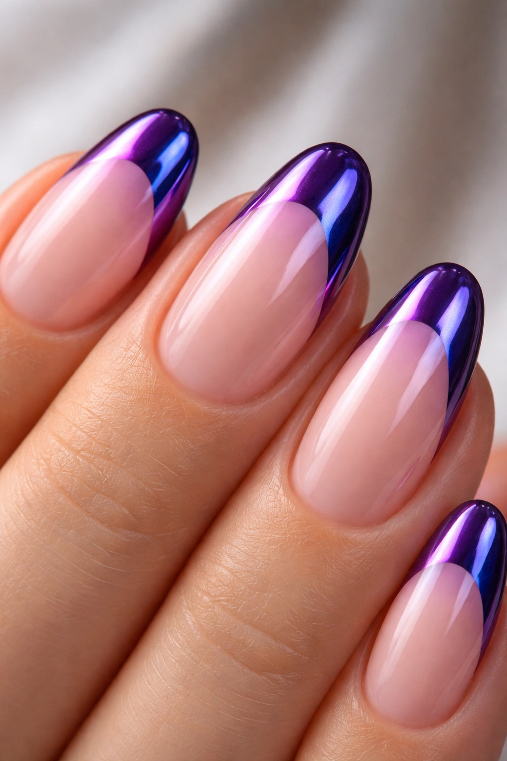
Unlike a standard lacquer tip, which reflects light in a flat, even way across its surface, a chrome tip is essentially a mirror — and it behaves differently at every viewing angle. Purple chrome shifts in a way that’s hard to describe until you see it: direct light produces bright metallic violet; viewed at an angle, the same surface slides toward deep navy or gunmetal. On a short almond nail where the curved tip naturally sits at multiple angles simultaneously, that color shift happens constantly as your hands move.
Chrome is a powder product, not a polish formula. The process: apply a gel base, add a layer of purple gel color and cure it fully under a lamp, then buff the chrome powder onto the tacky surface of a non-wipe gel topcoat using a silicone applicator in small, circular motions. The reflective intensity builds over about 60 seconds of firm buffing. Confining the chrome to the tip section requires either gel tape or an acetone cleanup brush to define the boundary before buffing begins — otherwise the powder drifts past the intended line.
This is not a beginner technique. Getting a crisp edge between the chrome tip and the bare nail takes patience and usually a second cleanup pass after buffing. But the result — a mirror-finish purple tip on a short almond nail — has a visual quality that no polish technique produces.
Chrome tips on short almond nails can go 10–14 days without significant degradation, which makes the extra setup effort easier to justify. Seal with a no-wipe gel topcoat specifically; standard gel topcoats can partially dull the chrome surface during curing and undermine the reflective payoff you built.
7. Purple French Tip with Micro Floral Art
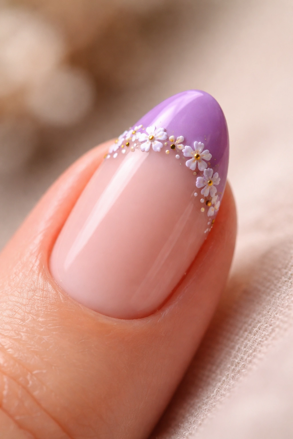
Floral nail art gets mishandled frequently, and the reason is almost always the same one: the flowers are too large for the nail they’re painted on.
Micro is doing real work in the name of this design. Flowers no bigger than 3–4 millimeters across, placed at one or two points along the tip line rather than scattered across the full edge, work on short almond nails. Larger flowers compete with the nail shape instead of decorating it — they read as clutter rather than art.
The simplest execution uses a dotting tool or thin nail art brush to press five small dots in a loose pentagon shape. That’s one flower. A sixth central dot in gold or yellow completes it. Done in white or pale pink against a deeper purple tip, the flowers register clearly without requiring fine art skills. Individual flowers take under 30 seconds once you have the scale right — getting the scale right is where the practice time goes.
Placement makes or breaks this design. Micro florals on the ring finger only, with the remaining nails left clean, gives the art room to breathe. Full floral detailing across all ten nails at this size looks cluttered at this scale. One accent nail, well-executed, does more than ten nails competed for attention.
8. Geometric Purple French Tip
The curved smile line is not a requirement.
A French tip is defined by the band, not by its shape. Swap the traditional arc for a ruler-straight line across the top of a short almond nail and you get something considerably more architectural — a flat-cut tip that feels like a graphic design choice rather than a manicure convention. In purple, that hard edge plays directly against the soft rounded almond shape, and the contrast between the curved nail and the straight color line is what generates the visual interest.
Tape is the right tool for this. Thin strips of painter’s tape pressed across the nail at the desired tip width, removed immediately after applying the purple while it’s still wet — before topcoat — produce an edge that freehand painting can’t reliably match. The angle of the tape determines the effect: perfectly horizontal gives a flat line; slightly angled following the nail’s natural taper gives a diagonal tip that points toward the center and looks noticeably sharper.
One thing to get right before taping: the base coat must be completely dry — not just surface-dry, but actually cured. A base coat that’s even slightly tacky will lift when the tape pulls away, tearing color with it and destroying the clean edge you’re working toward. Wait a minimum of 10 minutes after the base coat before any tape touches the nail. Fifteen minutes is better. The clean geometric edge is only possible on a fully set surface.
9. Violet French Tip with a Negative Space Design
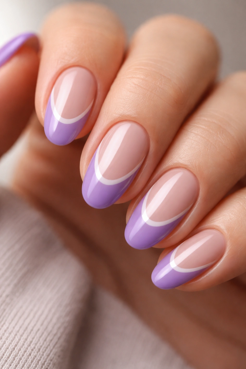
Why does negative space succeed on short nails when so many other complex designs don’t?
Visual weight. Short almond nails have a compact surface area, and designs that fill every millimeter feel busy and slightly claustrophobic at this scale. Negative space — areas of intentionally bare nail — gives the design somewhere to breathe. The exposed nail becomes part of the composition rather than the background for it, and the overall result feels lighter and more graphic than a fully colored nail.
For this design, a violet tip sits against a sheer-coated or completely bare nail. No base color fills the center of the nail. The purple tip defines the shape; the bare nail below it creates contrast through absence. A thin secondary line — about 2 millimeters below the tip band, applied with a nail art liner brush or thin tape — creates a double-line effect that looks structured and intentional.
The bare nail in the center needs to be in good condition for this to work. Peeling, dry, or visibly ridged nails make the negative space look accidental rather than chosen. A quick pass with a fine buffing block before starting smooths minor surface texture without compromising nail integrity.
Getting the Double Line Right
The gap between the purple tip and the parallel line below it should be no wider than 1.5 millimeters — ideally closer to 1mm. When the gap is too wide, the two lines stop registering as a pair and start looking unrelated. At the right measurement, they function as a structural unit and hold visual logic across the whole nail.
10. Dusty Mauve French Tip on a Warm Nude Base
Dusty mauve sits at the crossroads of purple, brown, and pink in a way that sounds uninteresting in the abstract and looks quietly distinguished in practice. It’s not quite pink, not quite purple, not quite taupe — and that ambiguity is exactly what makes it so wearable across settings and seasons.
On a short almond nail with a warm nude base, the dusty mauve tip feels like a whisper rather than a statement. The design looks pulled-together without being obviously done. The shared warm undertone between the nude base and the muted mauve tip is what makes them harmonize — both lean slightly toward brown-warmth, both have a subdued quality that places them in the same color family without being identical. Pair a dusty mauve with a cool, stark nude and the warmth in the mauve looks muddy by comparison.
Picking the Right Dusty Mauve
- Formulas described as “muted plum,” “antique rose,” or “dirty mauve” typically hit the right zone between purple and brown
- Avoid formulas with too much red in them — those tip into dusty rose and lose the purple family connection
- Cream finish is better than shimmer here; shimmer in muted tones tends to look flat rather than luminous in this specific color range
- Nail polishes described as “taupe-plum” or “greyed berry” are reliable descriptors for what you’re looking for
A Detail Worth Adding
A hair-thin strip of gold foil at the smile line — not over the entire tip, just the seam between base and tip — adds definition to dusty mauve without brightening the color. The foil strip catches light along the edge and creates a barely-visible gilded seam. It’s an optional step that photographs strikingly and is subtle enough not to shift the overall mood of the design.
11. Purple French Tip with Gold Foil Accents
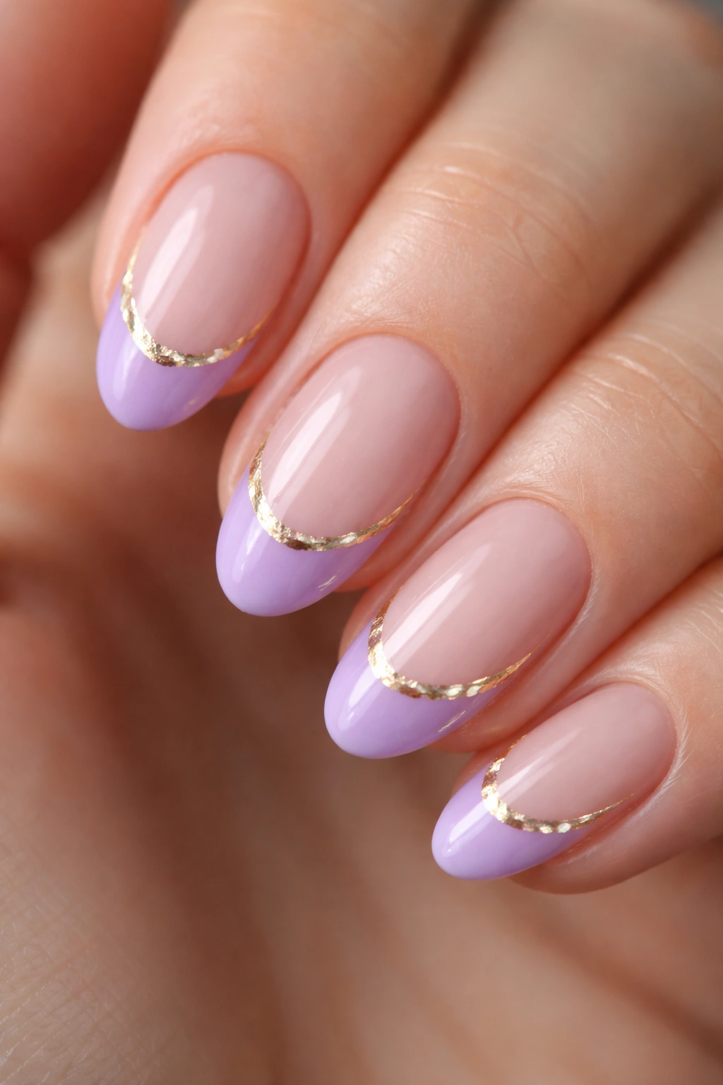
Gold foil nail art gets lumped into maximalist territory more often than it should. The difference between overdone foil work and refined foil work comes down entirely to placement and coverage. Too much foil looks like crumpled wrapping paper. A strategic strip at the French tip line looks like something else entirely.
For this design, the purple tip goes on first and cures or dries completely before any foil work begins. The transfer process uses a gel adhesive or foil glue applied along the tip line; once that glue has dried to tacky (about 60 to 90 seconds), a small piece of gold nail foil is pressed onto the surface using a silicone applicator and the backing paper is lifted away slowly. The foil adheres where the glue was applied and tears naturally at the edges, leaving an organic, slightly irregular gold strip that follows the curve of the smile line.
The irregularity isn’t a flaw.
Perfectly uniform foil strips can look like a sticker. The natural variation in the transfer — thicker in some spots, thinner in others, with occasional small breaks — is what makes it look like actual foil art rather than a decal. Using a silicone tool instead of a finger for pressing matters too; body heat softens foil and makes it spread beyond the intended line.
- Apply foil glue to a tacky surface, not a wet one — pressing foil onto wet glue causes bleed and uneven coverage
- Seal immediately with two topcoat layers; unsealed foil lifts and tarnishes within 24–48 hours
- Warm-toned gold sits harmoniously against most purples; silver or white-gold foil creates a cooler, higher-contrast look — choose based on whether you want warmth or sharpness
- For short almond nails, a foil strip following only the outer arc of the smile line (rather than extending fully to the side walls) keeps the detail proportional to the nail size
12. Neon Electric Purple French Tip on a Clear Base
Of every shade on this list, neon purple is the one with no interest whatsoever in subtlety. It’s a UV-reactive, saturated violet — the kind that registers as unusually bright even in natural daylight and takes on an almost luminous quality under fluorescent lighting. On a clear or near-invisible sheer base, the neon tip seems to float on the nail rather than sitting on top of it.
The clear base is doing important work here. Without a competing color between the nail bed and the tip, the neon reads at full saturation — nothing dilutes it. The almond shape softens the overall impression in a way that squarer nail shapes don’t. The tapered point takes some of the visual aggression out of the neon, and the result lands in the territory of vivid rather than harsh.
Neon polish formulas are almost always sheer. Three or four coats are typically needed to build even opacity — one or two coats of neon will look patchy and uneven regardless of technique. Apply thin coats, wait at least two full minutes between each, and build the color gradually. Thick neon coats bubble badly.
For lasting color, use a topcoat specifically labeled UV-resistant or non-yellowing. Standard topcoats can shift neon pigments toward a slightly warmer, orange-adjacent tone over time with sun exposure. UV-resistant formulas keep the electric tone truer across the full wear period. It’s worth seeking out rather than using whatever topcoat you have on hand.
13. Watercolor-Wash Purple French Tip
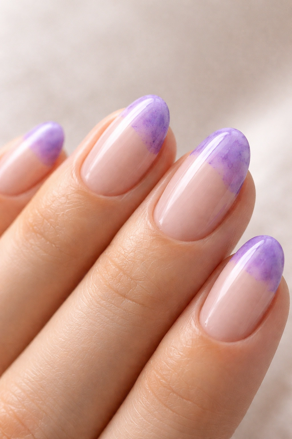
There’s a specific quality that some nail designs have where they look painted rather than polished — soft, slightly uneven, with color that pools in places and fades before reaching a clean edge. That’s the watercolor effect. On a short almond nail, it produces something that no sticker, stamp, or template can replicate, because the entire point is deliberate imprecision.
The technique requires thinned-down polish or a diluted nail art gel. For regular polish, add a few drops of clear nail polish thinner — not acetone remover, which breaks down polymer chains and makes the formula gummy — to bring the consistency down to a translucent wash. You want pigment to be present but the nail surface to show through beneath it. Load a flat fan brush or thin art brush very lightly, and drag it across the tip section without pressure.
The goal is not a clean line.
Color should settle unevenly — heavier on one side, fading before it reaches a defined edge, with slight texture variation across the tip zone. Two or three thin applications in slightly different directions build the wash without muddying into a solid coat. Each pass should cover a slightly different area of the tip section to create organic overlap.
The most common mistake: applying topcoat before the wash is fully dry. Thinned-down polish needs at least 5 full minutes to set before topcoat goes on. Applying it too early moves the still-wet pigment, breaking apart the soft edges you just built. When the topcoat does go on, use minimal brush pressure and apply in a single slow pass — that’s enough to seal without disturbing the surface.
Sealed correctly, the watercolor purple tip has a hand-painted quality that holds up through a full week of wear better than most people expect. The imprecision is the design. Embrace it.
14. Purple Reverse French on Short Almond Nails
Everything about the traditional French tip lives at the top of the nail. Flip the concept entirely and put the color at the base — following the curve of the cuticle line rather than the free edge — and you get the reverse French, which operates on completely different visual logic.
On short almond nails, a purple crescent at the nail base draws attention to the cuticle area and creates a perception of length in the nail bed above it. The bare nail between the purple base and the tip looks longer when there’s a defined arc below it. The standard French tip achieves a similar optical illusion from the top; the reverse French achieves it from the bottom, and in a way that’s far less expected.
Clean cuticle prep is not optional for this design. The purple crescent traces directly against the cuticle edge, and any roughness or irregularity in that line becomes visible in the finished design. Push cuticles back fully with a metal pusher, remove excess skin with a cuticle dissolver or careful nipping, and make sure the arc is clean and even before any color touches the nail.
Two approaches work for the crescent itself. A round nail art brush loaded with gel or polish traces the cuticle curve freehand with slow, controlled strokes — this method produces a slightly organic arc that suits the almond shape. A circular cuticle sticker guide pressed over the cuticle area lets you paint the crescent section and peel the sticker while the polish is still wet, leaving a mechanically precise edge. The freehand method is more graceful; the sticker method is more consistent for anyone newer to nail art.
Leave the rest of the nail in a sheer clear topcoat or completely bare — the visual contrast between the bare nail and the purple crescent is what gives the whole design its clarity.
15. Holographic Purple French Tip
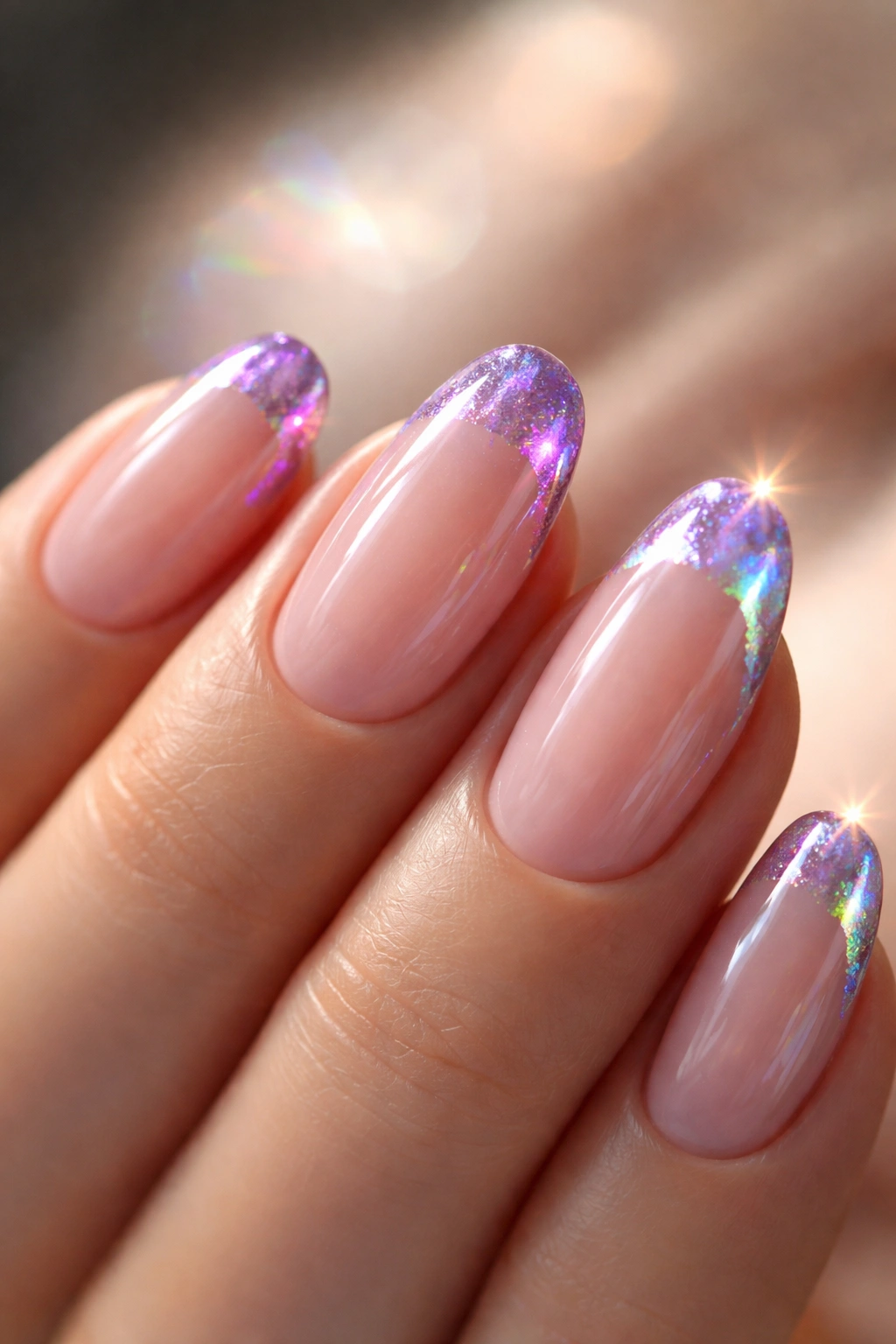
Holographic products are categorically different from shimmer and glitter, and understanding that difference is worth a moment before choosing this design. Standard shimmer reflects light diffusely in a general, scattered way. Holographic particles diffract white light and split it into a visible color spectrum — so the same nail flashes violet, then blue, then green, then gold as you move your hand. A holographic purple tip on a short almond nail creates a prism effect at the edge that’s genuinely hard to look away from.
Holographic Powder vs. Holographic Polish
These are two different products with meaningfully different results.
Holographic powder is buffed onto the tacky surface of a cured gel topcoat layer, the same mechanics as chrome powder but with more prismatic depth and a wider color-shift range. Apply with a small eyeshadow brush or silicone applicator in firm, circular motions, building the rainbow intensity over about 45–60 seconds of buffing. For the French tip application, the powder needs clean boundaries at the tip line — gel tape or an acetone cleanup brush before buffing controls where the effect lands.
Holographic polish has the holo particles suspended in a lacquer formula already, making it easier to apply precisely at the tip line without the powder process. It’s the better option for DIY work at home. The trade-off is a slightly flatter result compared to powder — more shimmer quality, less mirror depth.
Getting the Most From the Effect
- “Linear holographic” products align their particles into banded rainbow shifts in direct light — this is the most dramatic version and the one worth seeking specifically for a French tip application
- “Scattered holographic” produces a more diffuse all-over sparkle, closer to heavy shimmer; beautiful but less striking for a tip-only design
- Apply a layer of purple gel color beneath the holographic powder before curing and buffing — this anchors the finished tip in the purple family even as the holo shifts through other colors. Without that purple base, the tip can read as more silver than purple in most indoor lighting
- Seal powder applications with a no-wipe gel topcoat; standard gel topcoats partially dull the holographic surface during the curing process and undermine the reflective effect you spent time building
Pro tip: Holographic tips photograph best in direct natural light or near a bright window. Indirect indoor lighting flattens the spectrum shift, and the design looks similar to standard shimmer in those conditions. In actual sunlight, the full prism effect is obvious.
Final Thoughts
Short purple French tip almond nails cover more visual territory than most people expect before they start looking at the options properly. Classic lavender and neon electric purple are both technically purple French tips, and they have almost nothing else in common. The range within this one combination is genuinely wide.
Knowing what you actually want from a design matters as much as knowing the designs themselves. If quiet and long-wearing is the goal, dusty mauve or classic lavender get you there. Something graphic and sharp points toward the geometric tip or deep plum matte. A design with real technical complexity — something that earns a second look — lands closer to chrome, holographic, or gold foil.
One honest note before you book or start mixing your first polish: a simple design executed cleanly will consistently outperform a complicated one done imprecisely. A perfect classic lavender French tip is more impressive to look at than a watercolor wash with muddy edges or chrome powder that bled past the tip line. Whichever of these 15 you land on, match the choice to your actual skill level or your nail tech’s experience. That’s the only way to get the result that made you want it in the first place.
