

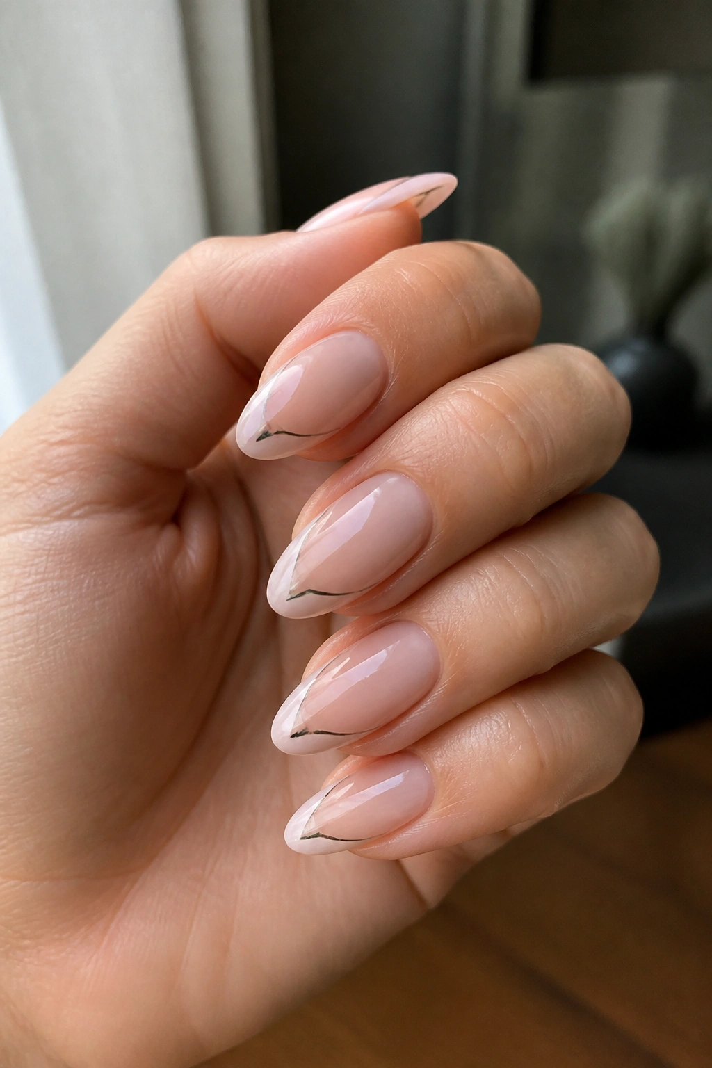
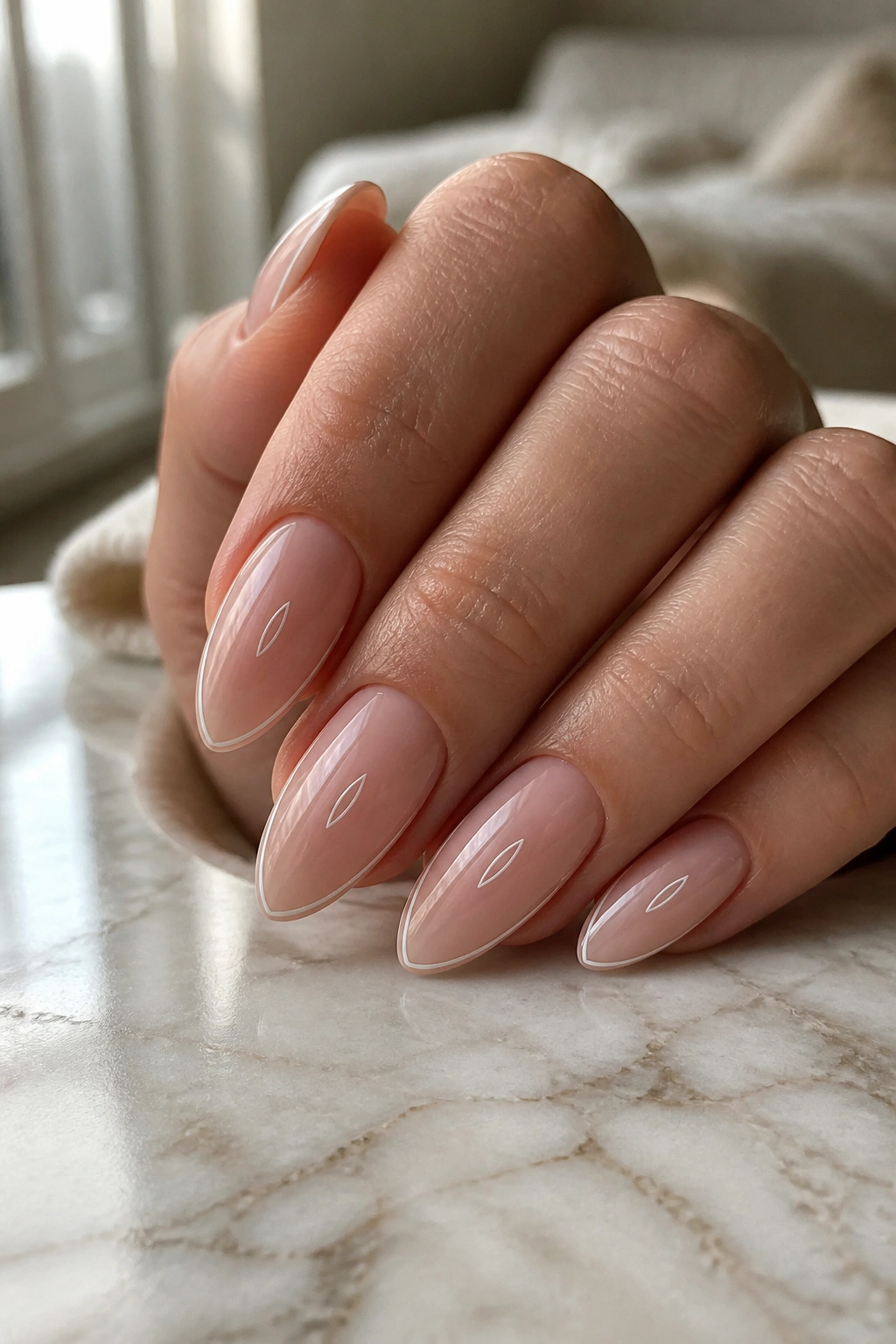
Some initial almond nail ideas look sweet for a day and forgettable the next. The good ones do something else: they make your hands look cleaner, longer, and a little more put together without shouting for attention.
That’s the magic of almond nails. The shape already gives you a built-in elegance because the tapered tip naturally draws the eye upward, so even a tiny letter can feel deliberate instead of cramped. A monogram on a square nail can sometimes look stiff. On almond nails, the same initial feels softer, cleaner, and a lot easier to wear with everything from a chunky knit to a blazer.
Placement matters more than people think. A letter that sits too low gets buried near the cuticle. One that’s too thick can make the nail look busy fast. The best initial almond nail ideas tend to use a fine line, a small accent, or a smart bit of negative space, which is why they hold up so well on short almond nails and medium-length sets alike.
And yes, initials can be personal without turning precious. Your own first letter, a partner’s initial, a last name monogram, even a child’s letter or a pet’s tiny nod — all of that can live on almond nails if the design has enough breathing room. The trick is choosing a style that suits the shape instead of fighting it.
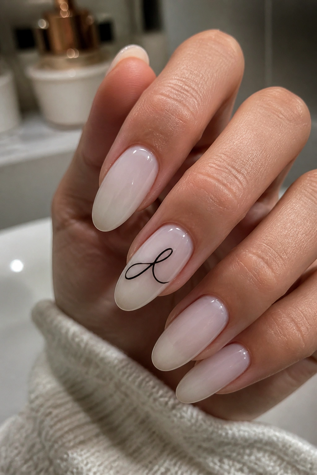
1. Barely-There Gold Monogram on Milky Nude
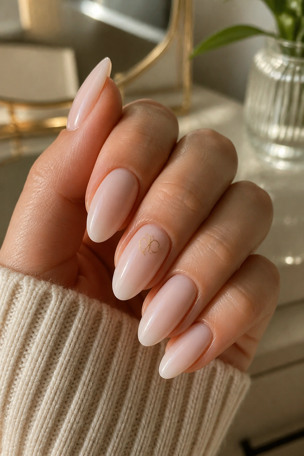
A thin gold initial on a milky nude base is the kind of manicure that people notice twice. First, because it looks clean from across the room. Then again, when they get close enough to see how little detail it actually uses.
The shape of almond nails helps here. Their tapered sides give the letter room to sit in the center without looking boxy, and a soft nude base keeps the gold from turning flashy. If you want something that works for everyday wear, this is one of the safest bets.
Why it works so well
The design depends on contrast, not clutter. A sheer beige, pink-nude, or milky ivory base gives the nail a smooth surface, and a fine metallic initial adds just enough shine to catch the eye.
- Best with short to medium almond nails
- Looks strongest when the letter is no thicker than a fine liner brush line
- Flat gold foil, gold gel paint, or a tiny gold decal all work
- A single accent nail can feel enough; all ten nails can still look calm if the letter size stays tiny
Pro tip: ask for the letter to sit slightly above center, not down by the cuticle. That little shift keeps the nail looking longer.
2. Deep Red Initial on Sheer Pink
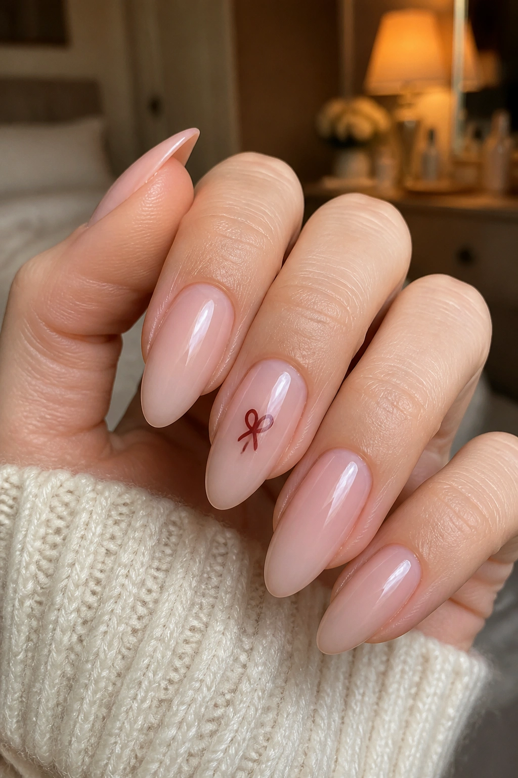
A deep red initial on a sheer pink base is sharper than people expect. It reads romantic, but not sugary, and the contrast has a little bite to it.
On almond nails, that contrast looks especially good because the shape already has a soft edge. Red against pink can go wrong if the red is too thick or the base is too opaque, so keep the line slim and let the negative space do some of the work. One accent nail with a single initial is usually enough. Five red initials across all five fingers can start to feel heavy unless the rest of the design stays very spare.
The easiest way to wear this is to keep the pink base sheer enough that your natural nail still peeks through, then place the initial in a deep cherry, oxblood, or brick red. That makes the letter feel intentional instead of sticker-like. If you want a little more polish, add a glossy top coat and leave the rest of the nail bare.
Use this when you want your manicure to say something without turning into a full design story. It’s a good date-night set, but it also works when you just want your hands to look done.
3. Chrome Outline Letter on French Almond
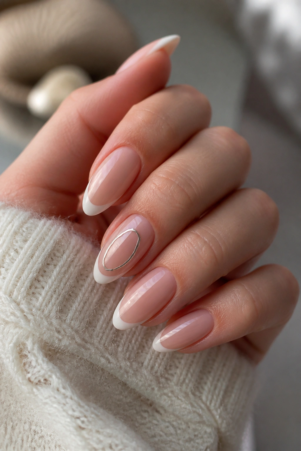
Can chrome look soft? On almond nails, yes — if you keep it as an outline instead of a solid block.
The trick is to treat the letter like jewelry, not wallpaper. A slim chrome outline in silver, rose gold, or pale gold gives the initial a reflective edge while letting the base color stay quiet. Paired with a French tip, it gets even better, because the white or neutral tip gives the letter a clean frame.
How to use it without making the nail busy
Start with a nude or blush base, then add a thin French tip that follows the almond curve. After that, place the chrome initial in the center of one or two nails, or tuck it just off-center for a more editorial feel.
- Silver chrome feels cooler and sharper
- Rose gold chrome softens the look
- Gold chrome is warmer and reads more classic
- Works best when the tip is thin, around 1 to 2 mm
A chrome outline catches the light differently from a painted letter. It flashes when you move your hand, which is a nice little detail without turning the whole manicure into a mirror. If you like clean, modern nail art, this one lands in a sweet spot.
4. Matte Taupe With White Script Initial
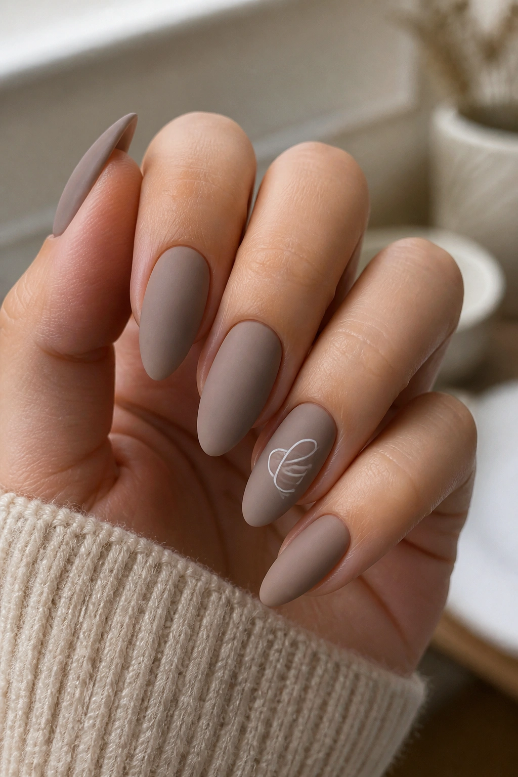
If you’ve ever wanted initials that look expensive without looking loud, matte taupe with a white script letter is a strong move. The finish is doing half the work here.
Matte polish flattens everything out, which makes the white initial stand out in a very calm way. Taupe, mushroom, and greige bases work especially well because they don’t compete with the letter. The result feels soft and a little architectural, which is a nice fit for the tapered almond shape.
What makes it different
This design lives on texture, not sparkle. A matte top coat gives the nail a velvety surface, and that changes how the letter reads. Instead of gleaming, it sits on top like a clean pencil mark.
- White gel paint gives the crispest script
- A thin serif letter feels more elegant than a bubble letter here
- Best on medium almond nails where the writing has room to breathe
- Avoid thick metallic outlines; they fight the matte finish
One practical note: matte top coats can show oil from your hands faster than glossy ones, so this set looks best when you keep cuticle oil handy and wipe fingerprints off gently. Not glamorous. Necessary.
5. Negative-Space Side Letter in Nude and Clear
A side-placed initial looks a little cooler than a centered one. It also makes the almond shape work harder, because the curve of the nail and the vertical line of the letter start talking to each other.
This is the design I’d point to if someone wanted initials but hated the idea of a centered monogram. The letter sits along the outer edge or slides down one side of the nail plate, leaving clear space around it. That negative space keeps everything airy. On almond nails, especially shorter ones, that matters a lot because there isn’t endless room to begin with.
The best version uses a nude or sheer pink base and a tiny black, white, or chocolate-brown initial placed close to the free edge. That position makes the nail look longer, not wider. A clear section near the cuticle can help too, especially if your natural nail has a nice shape underneath.
This style works well for people who want subtle personalization. It doesn’t read as “nail art first.” It reads as a manicure that happens to have a letter tucked into it. Different thing.
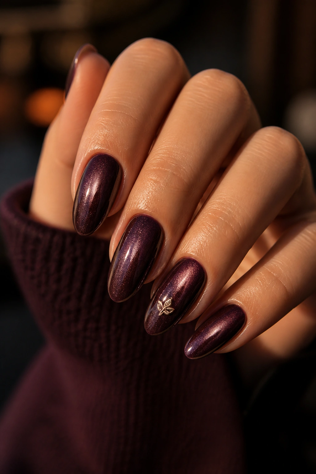
6. Gemstone Initial Accent Nail
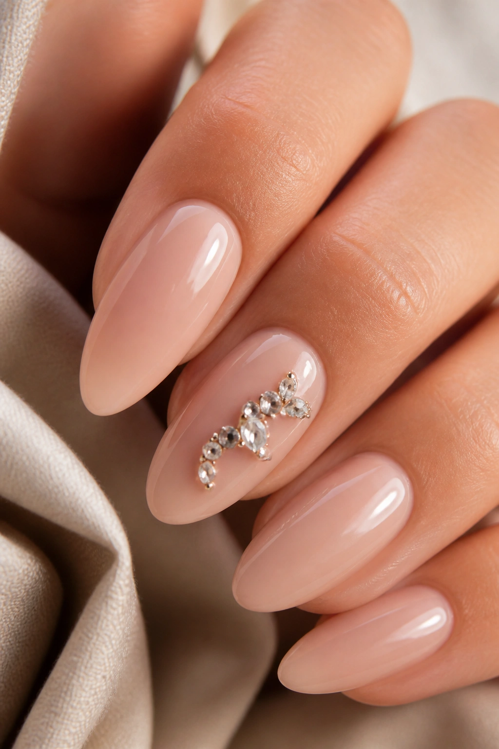
A single gemstone initial can look luxe fast, but only if you stop before it turns into a craft project. One accent nail. Maybe two. That’s the line.
What makes this idea work is the contrast between the smooth almond base and the tiny raised stones that shape the letter. The nail still feels elegant because the stones trace the initial instead of covering the whole surface. When the base stays nude, blush, or sheer ivory, the gems read as a detail, not a costume.
Where to place the stones
The cleanest placement usually follows the center of the nail, but there’s room to play.
- Tiny crystals can outline a single letter
- Pearls give a softer, bridal feel
- A mix of micro-studs and one larger stone can define the starting point of the letter
- Keep the stones under 2 mm if you want the nail to stay wearable
This style is best if you like a little sparkle and don’t mind a manicure that needs a gentler hand. Gems can snag on sweaters if they’re too tall, so ask for flat-back stones and a sturdy top coat around the edges. I like this one for special events, but it can still work day to day if the design stays restrained.
7. Tortoiseshell Letter Detail
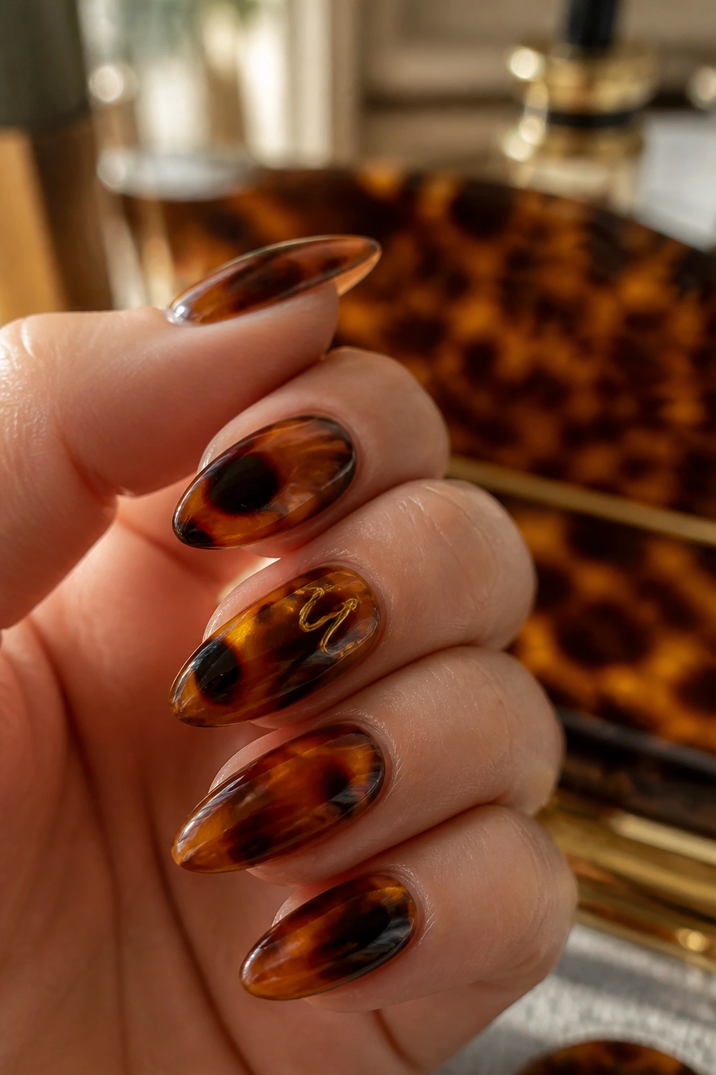
Tortoiseshell initial nails are a little bit vintage, a little bit chic, and way more interesting than plain brown polish. On almond nails, the look lands beautifully because the warm amber tones echo the softness of the shape.
A tortoiseshell background gives the letter texture before the letter even arrives. Then a fine black or caramel initial sits on top, usually in a small spot rather than dominating the whole nail. That tiny bit of pattern keeps the manicure from feeling flat.
A lot of people overdo tortoiseshell and end up with something muddy. Don’t. You want translucent layers — amber, honey, a bit of black, maybe one smoky brown wash — so the base still moves. Then place the initial where the lightest part of the pattern sits. The letter stays readable that way.
This design suits people who like warm neutrals but want something less plain than beige. It also plays nicely with gold rings and tortoiseshell accessories, which is handy if you tend to dress in earthy tones. The whole thing has a polished, slightly vintage energy without trying too hard.
8. Double-Letter Couple Monogram
Two initials can tell a better story than one, especially on almond nails where the shape gives the monogram room to stretch without looking crowded. A first-and-last initial, two partner initials, or even your own initials stacked together can feel personal in a clean way.
The key is spacing. If both letters are squeezed into the center, they fight. If one sits slightly higher or lower, they start to look designed instead of jammed together. That’s a small thing, but it changes the whole manicure.
Some people like one letter on each hand. That works too, and honestly, it’s a smart choice if the letters are long or ornate. A tall serif monogram can feel cramped on one nail, while two smaller initials split across the hands breathe much easier.
This idea is especially nice for matching manis, engagement sets, or just a self-referential look that doesn’t need explanation. Keep the base neutral and let the letters do the talking. If the monogram is the point, everything else should stay out of its way.
9. Black Ink Initial on Soap Nails
Black on a milky soap-nail base is sharper than people expect. It can look almost graphic, which is exactly why it works so well on almond nails.
The clean white-pink base softens the edge of the black letter, so the manicure doesn’t tip into harsh territory. Instead, it lands somewhere between editorial and minimal. One slim initial on an accent nail is enough. More than that and the contrast starts to feel repetitive.
What I like about this look is how it behaves with different outfits. It doesn’t clash with denim, it doesn’t get lost next to black clothing, and it still looks intentional with jewelry that’s a mix of silver and gold. That’s rare.
A lot depends on the finish. Glossy soap nails make the black initial feel crisp and bright. A satin top coat makes the whole thing calmer. Either way, keep the lettering narrow and leave a little blank space around it. The nail should feel like it has room to breathe, not like every inch got filled because there was space available.
10. Floral Initial With Pressed-Flower Look
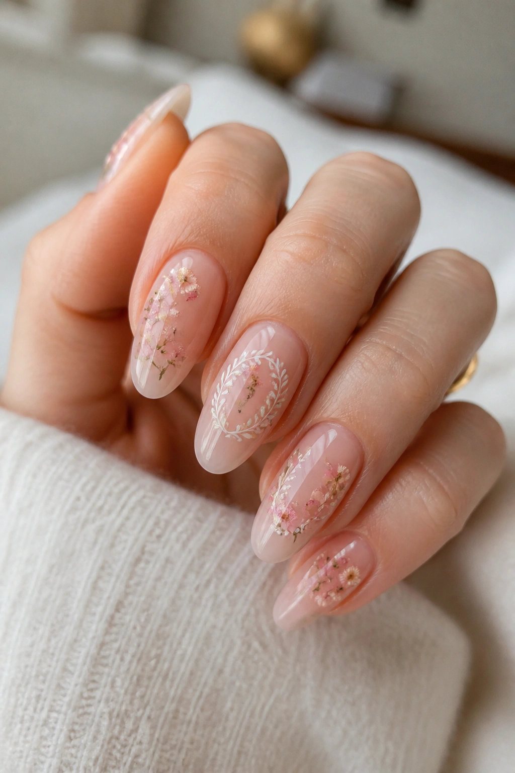
What happens when you mix an initial with tiny petals and soft color? You get a manicure that feels personal without turning fussy.
The floral version works best when the letter stays simple. A thin initial in white, sage, or soft brown can sit over or beside tiny painted blossoms, dried flower fragments, or petal-shaped accents. On almond nails, the curve keeps the design from feeling too flat, which matters because floral art can drift into very pretty, very forgettable territory if it isn’t anchored well.
How to keep it readable
Too many flowers will swallow the initial. That’s the whole trap.
- Keep the flowers tiny, around 1 to 3 mm
- Use one accent nail if you want the letter to stay the focus
- Choose a sheer pink or nude base so the floral shapes don’t turn muddy
- Add the initial last so it sits cleanly on top
A floral initial manicure works especially well when the letter is personal and the rest of the design is soft enough to feel relaxed. It’s one of those looks that can lean romantic without being sugary. That line matters.
11. Velvet Cat-Eye Base With Minimal Letter
Cat-eye polish already has movement built into it, so a tiny initial on top needs to stay quiet. That’s the whole game.
Unlike a plain shimmer polish, velvet cat-eye gives you a stripe of light that shifts as your hand moves. On almond nails, the effect looks especially smooth because the shape mirrors the soft glow of the magnetic finish. Add a small gold, silver, or black letter, and the manicure gets depth without chaos.
This is the one I’d choose if I wanted initials that still felt evening-friendly. Dark green, plum, charcoal, and deep navy all take cat-eye nicely, then a tiny monogram sits over the brightest band. If the base is too busy, the initial gets lost. If the letter is too thick, it fights the polish. Both mistakes are common.
The smart version keeps the letter narrow and either centered or slightly low on the nail. One accent nail can be enough. If all ten nails carry initials, the magnet shine should stay subtle or the whole set starts to feel busy. A little restraint goes a long way here.
12. Colored Tips and Tiny Center Initial
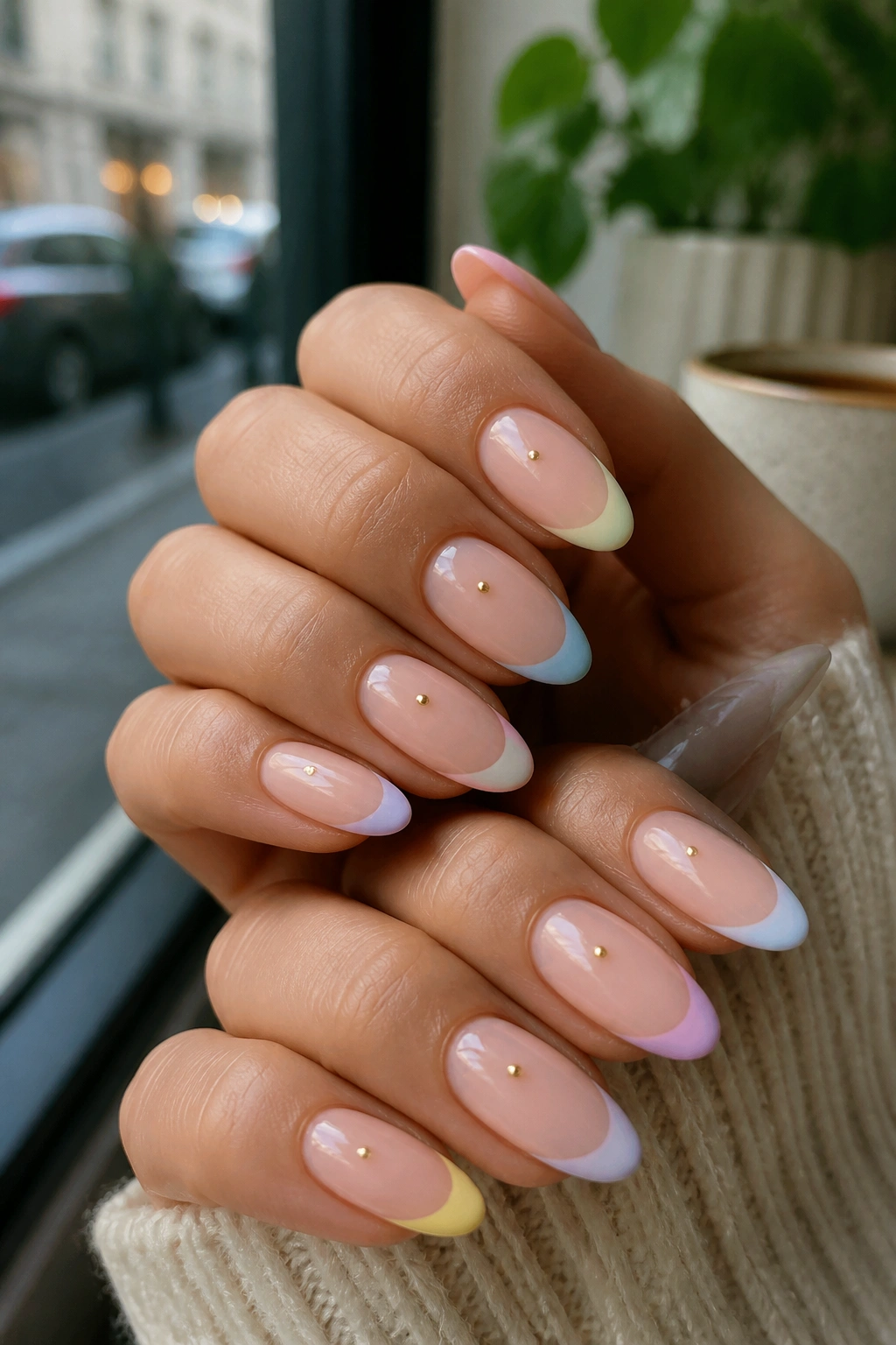
If you like French nails but want more personality, this is the move. Colored tips give you the structure, and the tiny initial gives you the story.
The almond shape is ideal for this because the tip can follow the nail’s natural taper instead of looking blunt. A soft blue tip, a cherry red line, or a moss green edge all work. Then, in the open center, place a very small initial in white, black, or metallic polish.
A centered letter can go wrong when it’s too large. The design starts looking crowded fast. Keep it tiny enough that the eye reads the tip first and the initial second. That order matters.
What pairs well with this style
- Soft blue tips with a silver initial
- Red tips with a thin white letter
- Forest green tips with gold lettering
- Brown tips with a cream monogram
This idea feels playful, but it still has a clean backbone. That’s why it works on almond nails and not just on shorter square shapes. The outline of the tip stays elegant, and the initial gives it a personal twist.
13. Outline Initial in a Micro French Frame
Can a letter feel framed without looking boxed in? Yes, and the almond shape is half the reason.
A micro French frame means the initial sits inside a thin border near the edge of the nail — not a full painted border, just enough of one to hint at shape. It’s a neat way to give the letter structure while still keeping the nail light. On almond nails, that tiny frame follows the curve in a way that square nails simply can’t match.
This design works especially well if you like tiny details that reward a close look. The letter can be plain black, white, or gold, and the frame can echo the same tone or switch to a soft contrast. Keep both elements thin. Thick lines collapse the whole effect.
What to ask your tech for
- A base in sheer nude, blush, or milky beige
- A frame line that stays under 1 mm
- A letter centered inside the open space
- Glossy top coat if you want it crisp, satin if you want it softer
The nice thing about this style is that it feels tailored. Not fancy. Tailored. That’s a better word for it.
14. Mixed Metals Initial Set
Mixing silver and gold on the same set is less chaotic than people think, especially when the base is calm and the letters stay small. On almond nails, the mixed-metal look reads intentional because the shape already gives the manicure a graceful line.
The best version uses one metal for the background accents and another for the letter. Maybe the outline is gold while the initial itself is silver. Maybe one hand gets a warm monogram and the other gets a cool one. Either way, the nail polish underneath should stay quiet — nude, blush, pale taupe, or soft ivory.
People often worry mixed metals will clash. They don’t, if the finish is consistent. Both should be glossy, or both should be soft. That consistency is what holds the set together.
This is a good choice when you wear both silver and gold jewelry and don’t want to pick a side. It also gives the manicure more flexibility with outfits. A single-tone manicure can sometimes lock you into one metal family. Mixed metals don’t care. They just sit there looking expensive and slightly clever.
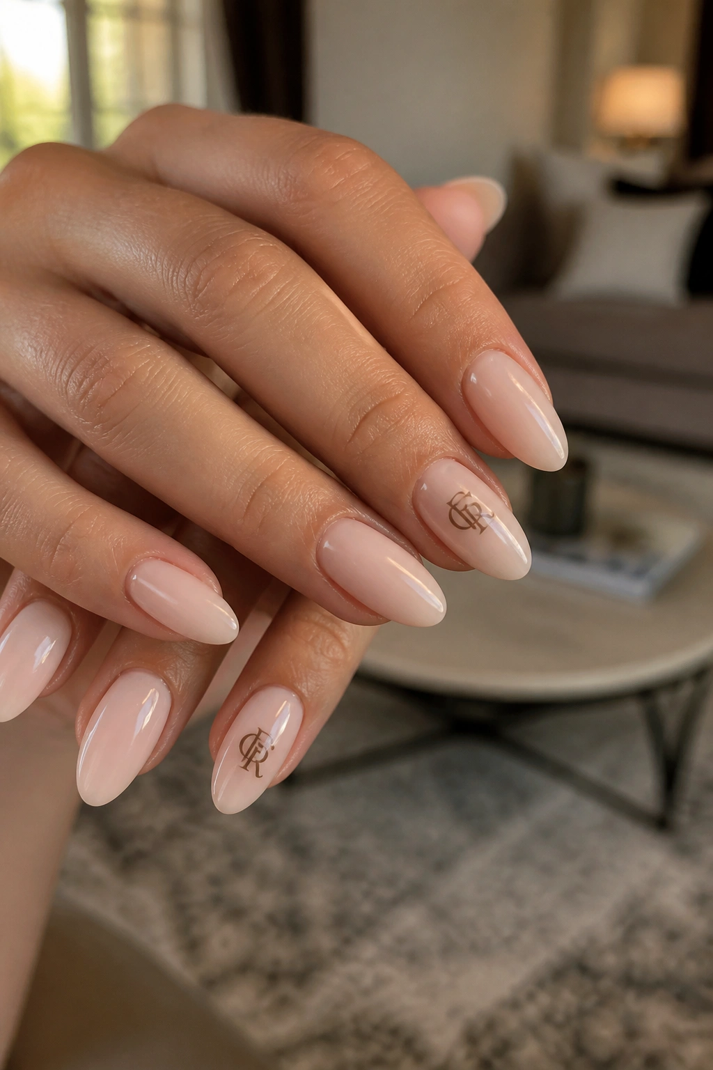
15. Classic Nude With Foil Monogram Seal
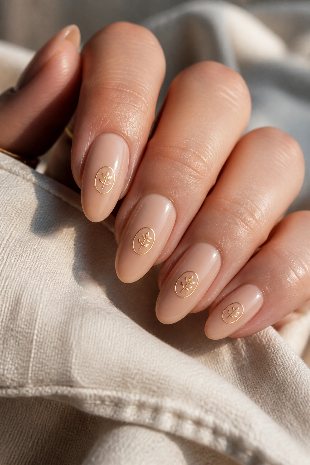
A nude base with a foil monogram seal is the safest design in this whole group, and I mean that in the best way. It’s steady. It works. It doesn’t ask for extra explanation.
The “seal” part comes from the way the initial is placed and finished. Instead of floating loosely, the letter feels pressed into the nail like a tiny mark of ownership. Foil in gold, silver, or champagne gives it a flat shine that looks cleaner than chunky glitter and less rigid than a painted block letter.
On almond nails, this idea lands especially well because the shape already does the elegant part for you. All the design has to do is stay neat. A soft nude base with a fine foil letter near the center or slightly above it keeps the manicure wearable for office days, weekends, weddings, and everything that sits between those things.
If you only want one initial manicure and you want it to work with almost anything you wear, this is the one I’d point to first. Keep the foil small, keep the base sheer, and let the shape do the rest. That combination never really goes out of style, partly because it doesn’t try so hard in the first place.
