

Almond nails and deep shades were practically made for each other. There’s something about the tapered, oval shape — that gentle point pulling the eye toward the tip — that makes a dark, saturated color look dramatically intentional instead of just heavy. The shape itself does half the work, creating a natural elongation of color that seems to intensify toward the end of each nail.
But not every deep tone behaves the same way on this shape. Burgundy looks rich and editorial. Forest green looks almost jewel-like. Charcoal can shift between moody and polished depending on finish alone. These aren’t interchangeable — the right shade choice comes down to your skin tone, the occasion, and, honestly, what kind of mood you’re trying to walk into a room with.
A lot of nail inspo roundups treat deep colors as a fall and winter category and leave it there. That’s a mistake. Deep-toned almond nails look sharp in any season — a dark espresso brown against sun-tanned skin is one of the most eye-catching combinations out there, and dark teal in warmer months reads almost tropical if you lean into the right finish.
Here are 15 deep-toned options worth painting your nails for — genuinely different from each other, each with a distinct character and a specific way of wearing well on the almond shape.
Why Almond Nails Make Deep Colors Look Better
This isn’t just aesthetics talking. The almond shape has a specific effect on how color reads on your hands. Because the nail tapers to a soft point rather than cutting straight across (like a square nail) or ending in a sharp tip (like a stiletto), it creates an elongating illusion that makes each finger look longer and leaner. That matters with deep colors because dark tones naturally draw the eye, and when the shape is also directing your gaze toward a point, the combined visual effect is striking without feeling harsh or blunt.
The curved sidewalls of the almond also mean there’s less flat surface area at the tip. On a wide square nail, a very dark color can look block-like. On the almond, the color narrows naturally and the result feels more fluid — like the shade was chosen for the shape, not just thrown onto it.
One more thing worth mentioning before the list: medium to long almond nails show off deep tones better than very short ones. You don’t need length you can’t manage in daily life — even a moderate almond with 3–4mm of free edge past the fingertip gives the shape room to do its thing. Super short almonds start to approach round territory and lose some of the dramatic effect that makes these shades worth the trouble.
Choosing a Deep Tone That Works for Your Skin
Undertones matter here. Not in a rigid, rules-based way — more in a “some combinations are going to make you look tired” kind of way.
Warm undertones (yellow, golden, peachy) tend to look best with deep colors that have warm leanings: burgundy, oxblood, terracotta, espresso, dark olive, and plums with red or brown in them. These shades play with the warmth in your skin rather than fighting it.
Cool undertones (pink, blue, ashy) do well with deep tones in the blue and purple spectrum — midnight navy, dark teal, aubergine, charcoal, and berry shades with a cool cast. Black cherry, which sits right on the line between deep red and near-black, is one of those rare shades that flatters both.
Neutral undertones can pull off almost anything in the deep tone category. If you’re neutral, dark cobalt and deep dusty mauve are two worth experimenting with first.
The other factor is the finish. Glossy finishes on deep colors tend to look bolder and more fashion-forward. Matte or satin finishes push the same shade toward something more editorial and subdued. That distinction will come up throughout the list — it’s not minor.
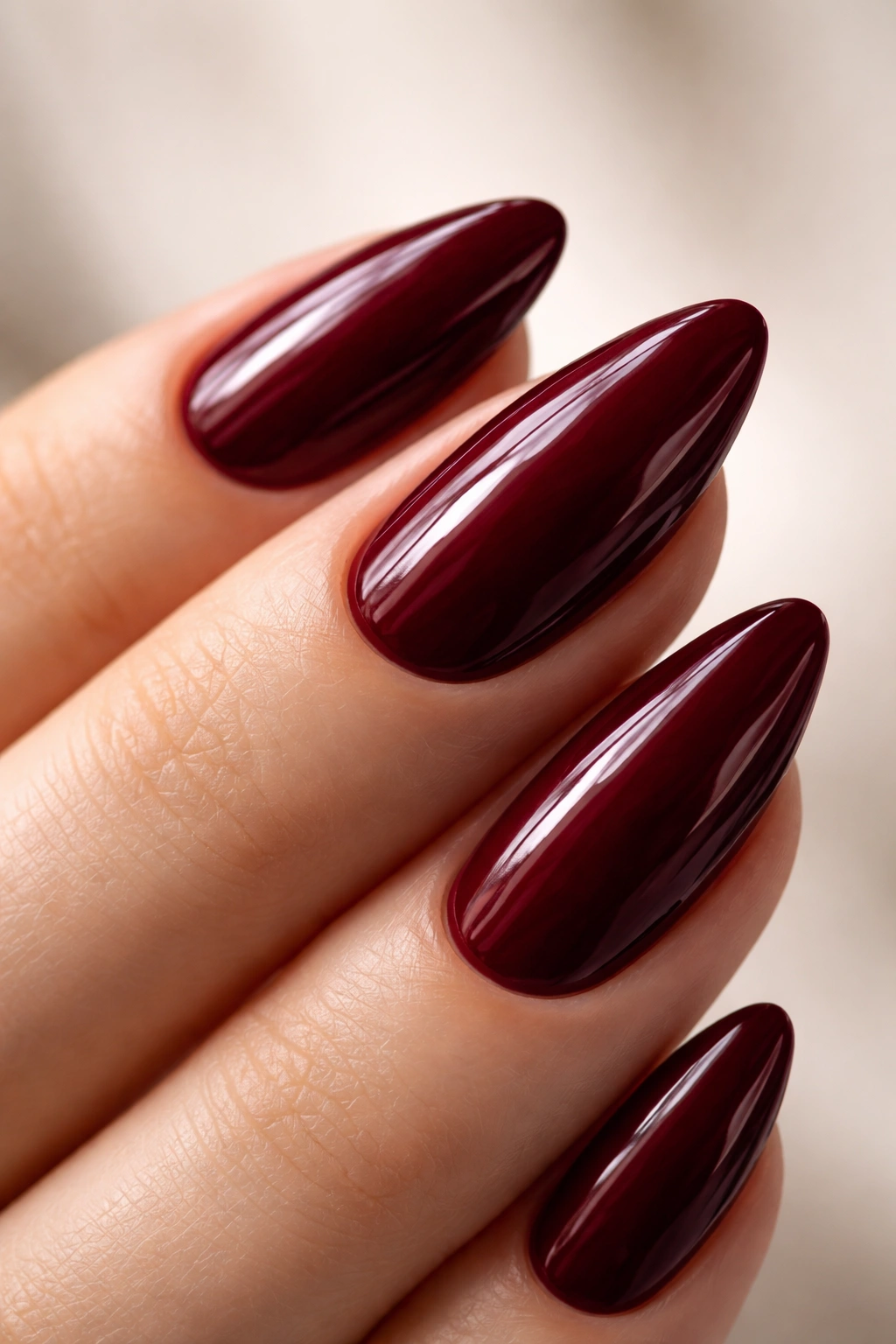
1. Burgundy Wine with High-Gloss Finish
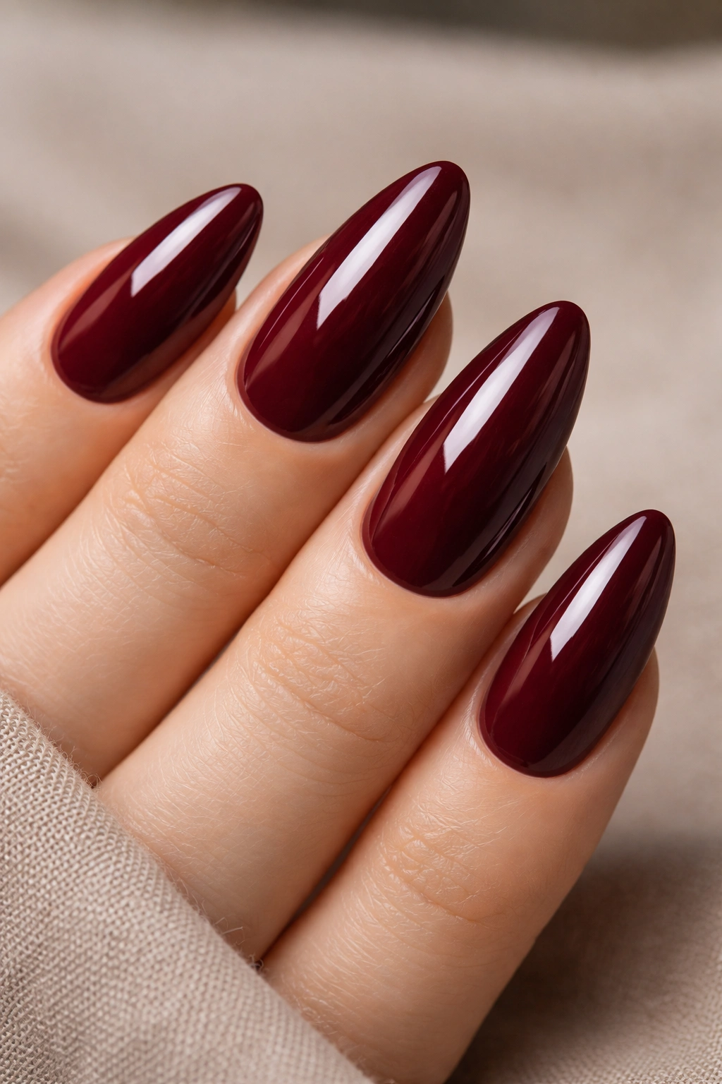
Burgundy is probably the most worn deep-toned almond nail color, and there’s a reason it hasn’t lost any ground. It’s the nail equivalent of a red lip — universally flattering, never too costume-y, and equally at home at a dinner reservation or a casual weekend.
What Makes the Specific Shade Choice Matter
The key detail with burgundy on almond nails is the red-to-purple ratio in the formula. Burgundies that lean red — think deep Merlot — read more romantic and classic. Burgundies that lean purple, closer to wine, read more directional and editorial. Neither is wrong, but knowing which direction your polish sits helps you pair it with outfits more intentionally.
A high-gloss top coat here is non-negotiable. Without it, burgundy can look slightly flat and even muddy on some skin tones. With a good glossy top coat, it takes on a depth that looks almost lacquered.
How to Get the Best Result
- Apply a thin coat of deep red-tinted base to prevent staining — burgundy is notorious for leaving ghostly pink residue in the nail
- Use two thin coats of pigment rather than one thick one; thick coats of dark crème polish pull away from the sidewalls as they dry
- Seal with a fast-dry high-shine top coat, brushing lengthwise along the nail to prevent streaking
- Reapply top coat every 48–72 hours to maintain that gloss intensity through the wear of the week
One thing most guides skip: if your natural nail beds have a pink tone, expect a slightly warmer, deeper result from the same polish formula than someone with pale or olive nail beds.
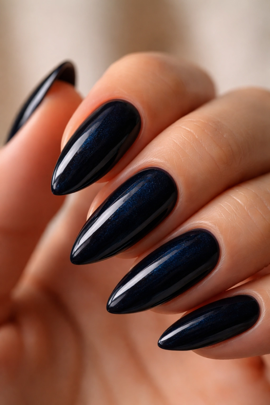
2. Midnight Navy Blue
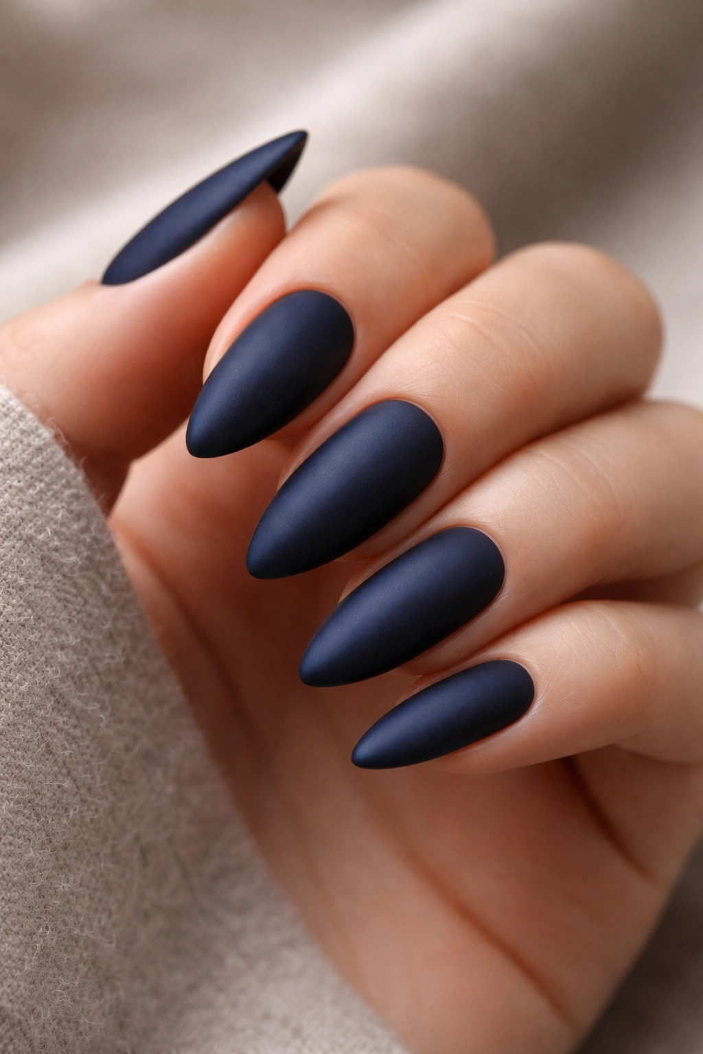
Navy on nails has had an on-and-off relationship with mainstream style over the years, but on almond nails specifically, it consistently looks better than people expect before they try it. A true midnight navy — dark enough to read almost black in low light but revealing its blue depth in direct sunlight — is one of the most quietly impressive things you can put on your hands.
The elongating effect of the almond shape pulls the color into something almost liquid-looking. It doesn’t sit on your nails so much as it seems to pool there.
The Finish Question
Matte navy has earned a long-standing reputation, and it’s the superior finish for this shade on almond nails. It removes the high-fashion gloss that some people find intimidating and replaces it with something more textured and wearable. That said, a chrome navy — applied over a blue-black base with chrome powder rubbed into the surface — looks like actual liquid metal and is worth attempting at least once if you have access to gel polish and an LED lamp.
For standard polish applications, two coats of a pigmented navy crème plus one coat of a slightly cooling, blue-tinted top coat will intensify the color and prevent the warm yellowing that some top coats create over dark blues.
Best skin tone pairing: medium to deep skin tones with cool or neutral undertones get the most color contrast from midnight navy. On very fair skin it can look stark — which some people love and others find too heavy, so worth testing on one nail before committing.
3. Forest Green Crème
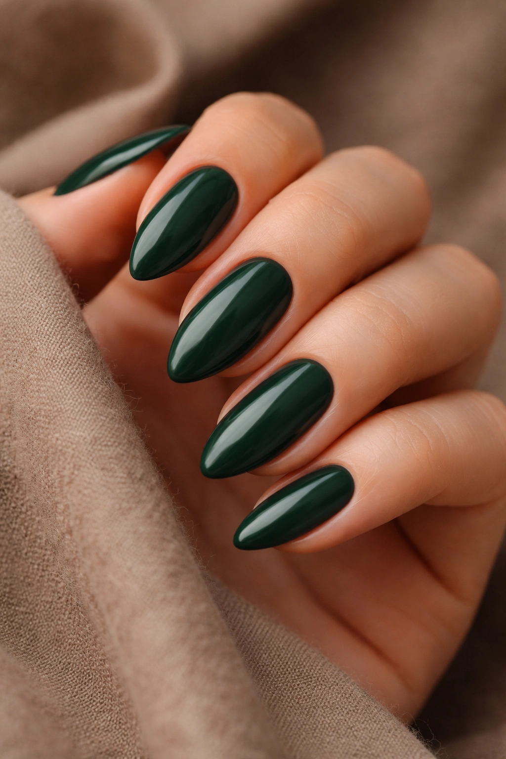
Forest green on almond nails is the move for anyone who wants to look like they thought harder about their nails than everyone else in the room. Not in a try-hard way — more in a “wait, what is that color?” way.
A true forest green sits between hunter green (bright, almost neon-adjacent in its warmth) and dark olive (warm and brown-shifted). The crème formula matters: a flat crème with no shimmer gives the richest, moodiest result. Glitters and metallic flecks pull forest green out of its deep, quiet lane and push it into something more festive, which undercuts the whole appeal.
How It Pairs With Your Wardrobe
Forest green nails sit beside neutral and earth-tone wardrobes naturally. Browns, creams, camel, and khaki all work alongside it without effort. It’s also one of the few deep nail shades that looks genuinely sharp against all-white or all-black clothing, where it reads as an unexpected but considered detail.
Skin tone-wise: forest green is most flattering on warm and neutral undertones. On very cool, pink-based skin, the green can pull slightly gray — a common issue. Look for forest greens described as “warm-toned” or with an “earthy” quality in reviews. That extra warmth in the base corrects the gray drift.
4. Aubergine — The Shade Between Purple and Black
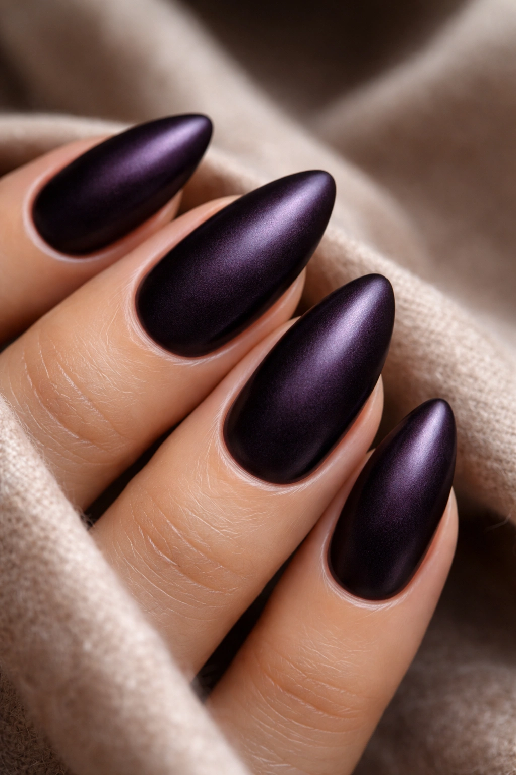
Aubergine is where deep purple starts flirting with black, and the result is one of the most sophisticated shades in the whole deep-tone category. It’s dark enough to look intentionally dramatic, but the purple base keeps it from being as stark as a true black.
On almond nails, aubergine has a moody, almost velvety quality when applied in crème form. Add a satin finish instead of a glossy one, and the effect becomes something closer to suede. That sounds like an odd thing to say about nail polish, but if you’ve seen it in person, you know exactly what I mean — there’s a surface quality to satin aubergine that seems almost tactile.
Why Satin Finish Changes Everything Here
A standard glossy top coat over aubergine creates a polished, high-fashion look. A satin or matte-satin hybrid top coat over the same color creates something that looks hand-dyed and artisanal. The slight texture of the satin finish tricks the eye into reading the color as richer and more dimensional than a flat surface would allow.
One practical note: matte and satin finishes chip faster than glossy ones, especially at the tips. If you go satin with aubergine, apply a thin refresh coat to the tip edge every 2–3 days to extend the full wear without redoing the whole manicure.
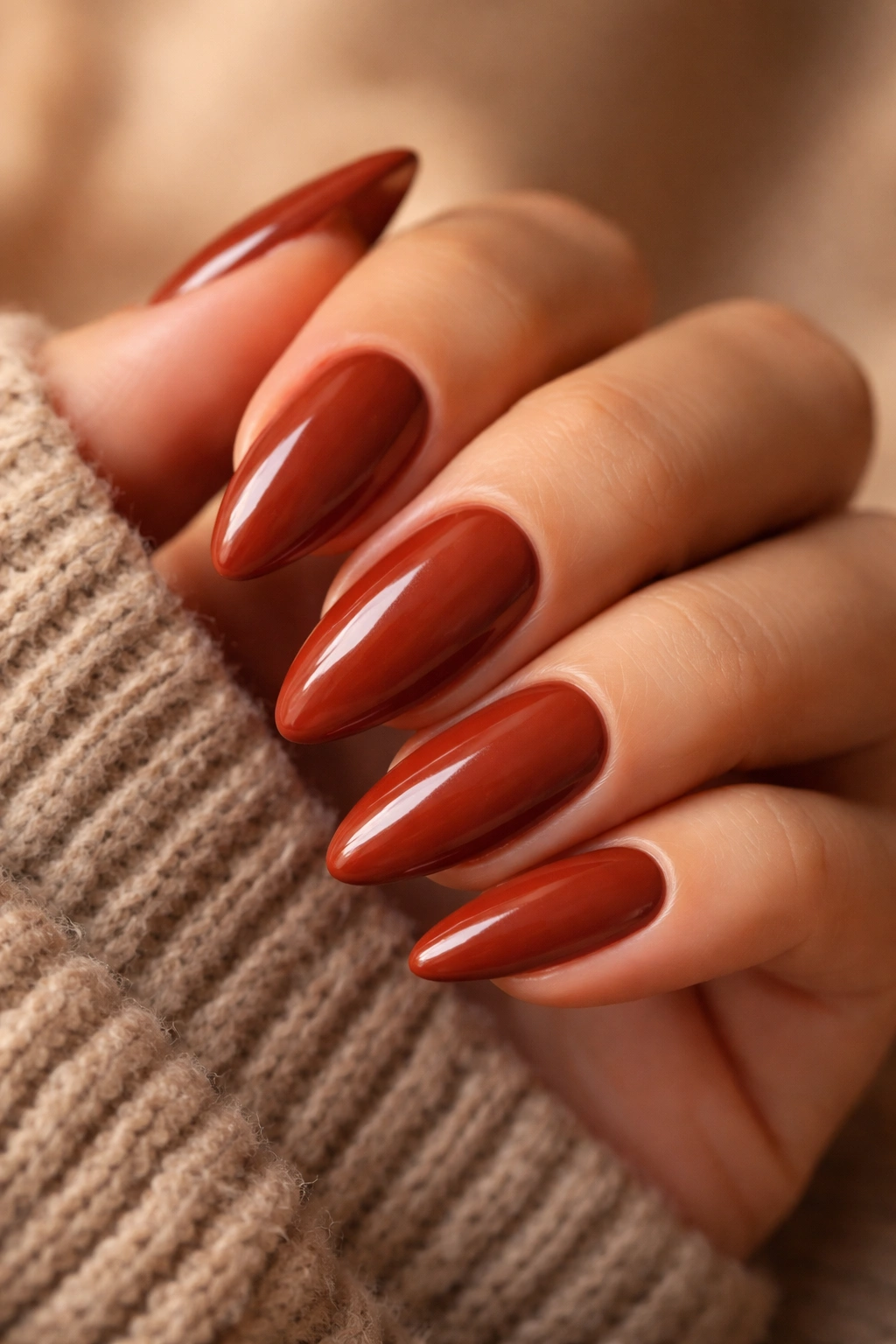
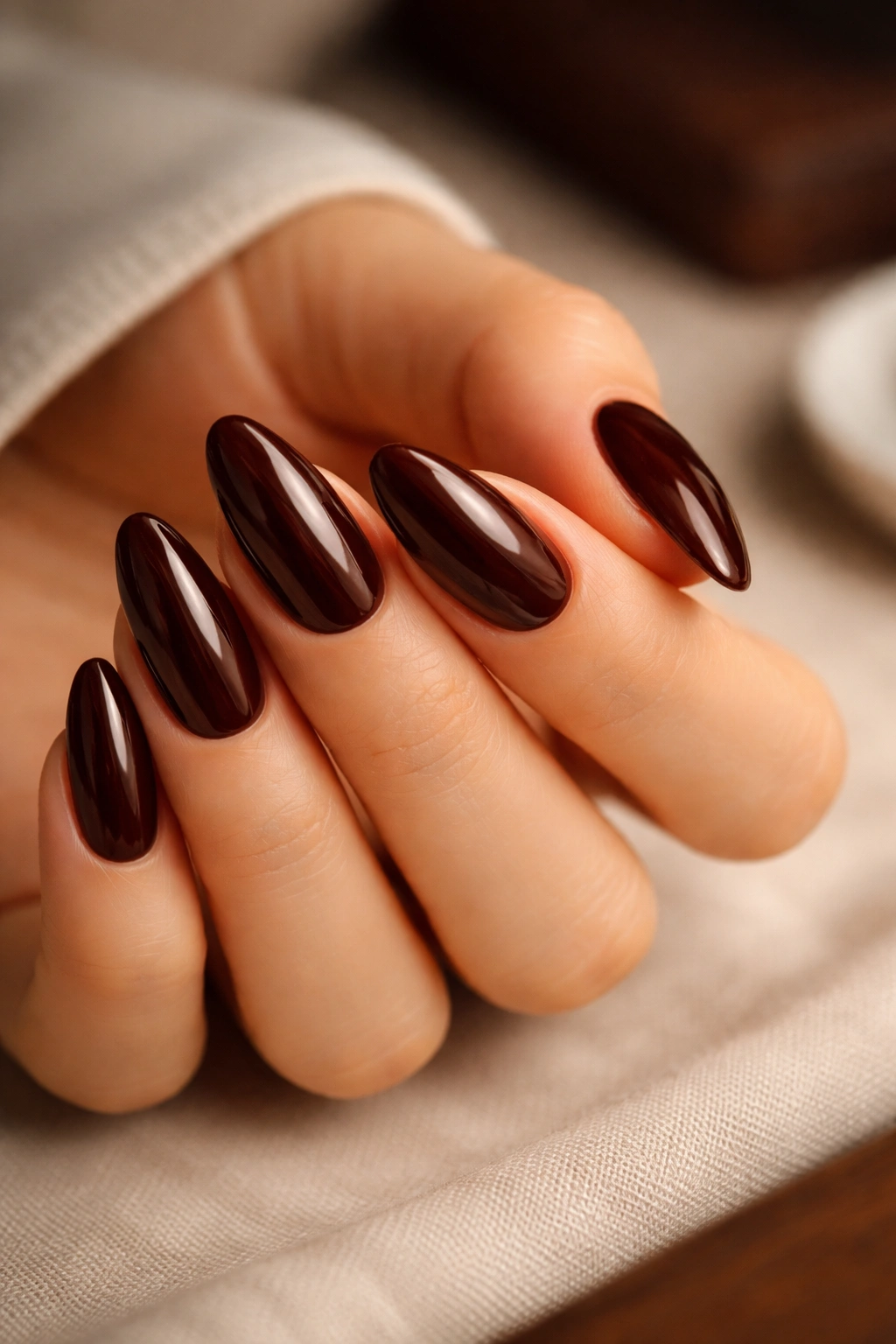
5. Espresso Brown — Warm, Wearable, and Underrated
Espresso brown is the deep-toned color that most people overlook, and that oversight is baffling once you actually see it on almond nails. It’s rich without being loud, deeply pigmented without looking heavy, and it has a warmth to it that makes hands look almost glowing rather than weighed down by a dark shade.
The best espresso browns for almond nails have a red undertone underneath the brown base — sometimes described as “brownie,” “chocolate cherry,” or “deep cognac” in shade names. That undertone keeps the color from reading gray or muddy, which is the main risk with straight cool-toned browns.
How It Performs Across Different Skin Tones
On deep brown skin, espresso nails create a tonal, monochromatic effect that looks clean and intentional — like the color was chosen with precision. On medium-warm skin, there’s more contrast and the red undertone in the polish really comes forward. On fair skin, espresso can wash out slightly. Look for formulas with a notably warmer, richer base to compensate.
Where it really shines:
- Office-appropriate deep color that won’t draw too much attention but still reads as polished and deliberate
- Warmer seasons, when it contrasts beautifully against tan or bronzed skin
- Pairing with earth tones, camel, rust, and burnt orange in your wardrobe
Worth knowing: one thin layer of espresso brown over a soft nude base creates a slightly sheer, more wearable version of the color — useful if you want the warmth without the full depth for a more everyday look.
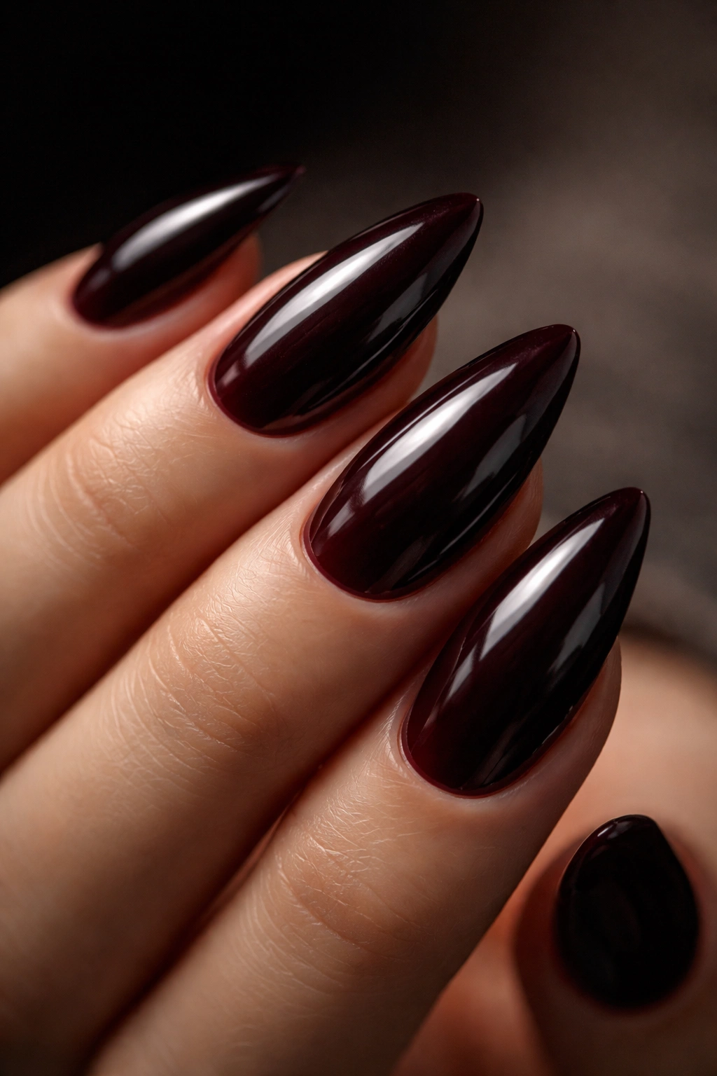
6. Oxblood Red
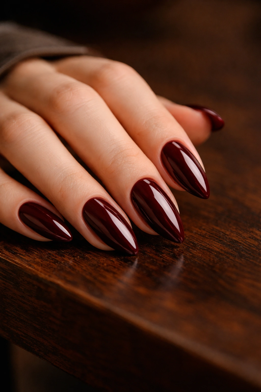
Unlike a classic red, oxblood sits in a darker, more complex register. It’s the color of dried roses, aged bricks, and worn leather — there’s nothing candy-bright about it. On almond nails, it reads as the kind of red you choose when you’re past needing a color to make a loud announcement. It just is.
The formula that does oxblood best is a deep crème with a very slight brown pull — not brown enough to read as brown, but enough that the red has weight to it. Fully saturated, pure reds in this depth range start to look theatrical on almond nails. That tiny shift toward brown is what keeps oxblood grounded and stops it from sliding into classic-red territory.
Oxblood vs. Burgundy: The Real Difference in Practice
Both shades look dark. Both read as sophisticated. Both perform well on almond nails — so why does it matter which you choose? Burgundy has more purple in it, which gives it a cooler, wine-toned quality. Oxblood skews warmer with more of a brick-red character. In artificial light, the difference is subtle. In daylight, they read quite differently.
If your wardrobe runs warm — lots of camel, rust, cognac leather, warm browns — oxblood will feel like it belongs. If you wear more purples, cool-toned grays, and dusty pinks, burgundy will feel more cohesive. Knowing which one actually complements your closet is the smarter way to choose than just going with whichever sounds more interesting on paper.
7. Dark Teal with Chrome Powder
Here’s a combination that doesn’t get nearly enough attention: a deep teal base with chrome powder applied over the top. The result sits somewhere between a deep ocean and liquid glass. It shifts from a dark teal-green to a blue-black depending on the light, and on the tapered almond shape, the color moves as your hand moves in a way that feels almost three-dimensional.
The technique is more involved than standard polish, but it’s not difficult with the right products.
How to Apply Chrome Powder Over a Gel Base
- Apply two thin coats of a deep teal gel polish and cure fully under an LED lamp — 60 seconds per coat at standard wattage
- Apply a no-wipe gel top coat and cure for 30 seconds; do not wipe the inhibition layer off — that tacky surface is what makes the chrome adhere
- Using a silicone chrome applicator or a firm eyeshadow brush, rub chrome powder directly onto the tacky surface in small circular motions until the mirror effect builds (about 20–30 seconds per nail)
- Seal with a second thin coat of no-wipe top coat and cure again fully for complete adhesion
The teal chrome finish is more delicate than a standard crème with top coat, so wearing a fresh layer of gel top coat every 3–4 days protects the chrome from dulling at the edges.
8. Charcoal Gray with Micro-Shimmer
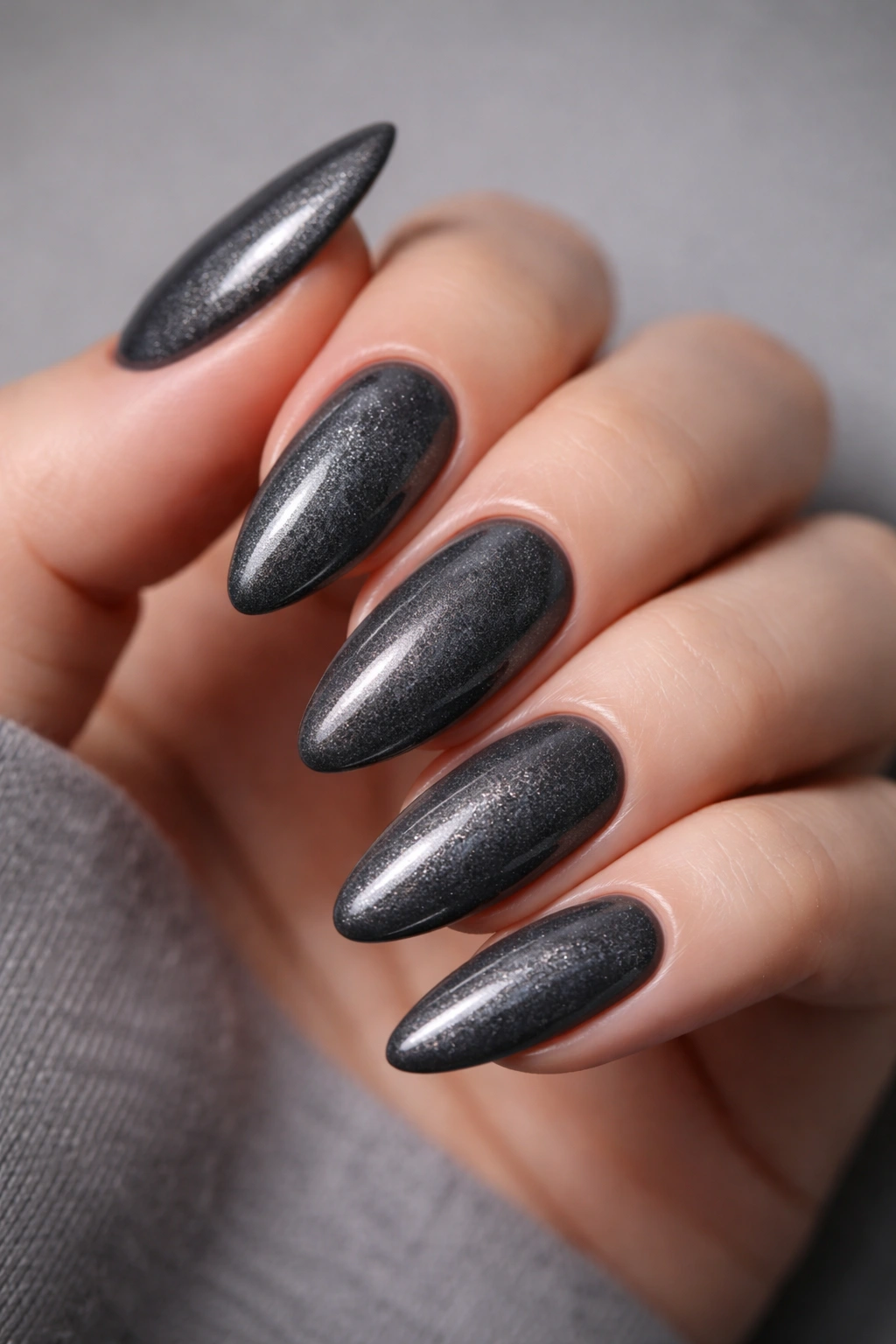
Charcoal is one of those deep tones that sounds boring until you see it done right.
Done right means a charcoal-gray base with micro-shimmer — not chunky glitter, not holographic sparkle, just a fine, almost invisible shimmer that picks up light subtly without announcing itself. The micro-shimmer changes the visual texture of the charcoal in a way that a flat formula can’t. A matte charcoal looks chalky. A crème charcoal looks solid. Charcoal with micro-shimmer looks almost like brushed steel — there’s dimension and depth with zero sparkle that reads as festive.
On almond nails, the reflective particles in the shimmer activate most at the tapered tip, creating a natural gradient where the base of the nail reads deeper and the tip slightly brighter. The shape and the formula work together to produce that effect without any extra steps on your part.
Charcoal with micro-shimmer also has unusually broad skin tone appeal. The cool, neutral gray sits between warm and cool undertone territory in a way that most deep shades simply don’t, which makes it a more forgiving choice than something like dark teal or forest green when you’re buying a polish without testing it first.
9. Black Cherry
Black cherry is the color that made people realize deep nail shades didn’t have to be just one thing. It’s dark — dark enough that in certain lighting it reads nearly black — but the reddish-purple depth underneath that near-black surface is what makes it different from every other dark shade on this list.
What’s worth understanding about black cherry is that it shifts dramatically depending on finish. In glossy form, it looks like a dark, polished garnet. In matte form, it looks almost purple-black with a dusty, almost bruised quality. Same formula. Two completely different personalities. Most people who wear it glossy have never tried it matte, and most who wear it matte have never tried it glossy — worth experimenting with both before deciding which version belongs in your rotation.
For the Best Application Result
Apply three thin coats rather than two. Black cherry formulas tend to be slightly sheer in the first coat and benefit from the extra layer to achieve full opacity. The third coat fills in any patchiness at the edges and creates the depth that makes this shade as striking as it is. Almond nails at medium to long length show black cherry off best — on very short nails the color can read stark. Not necessarily wrong, just worth knowing before you go in.
10. Deep Dusty Mauve
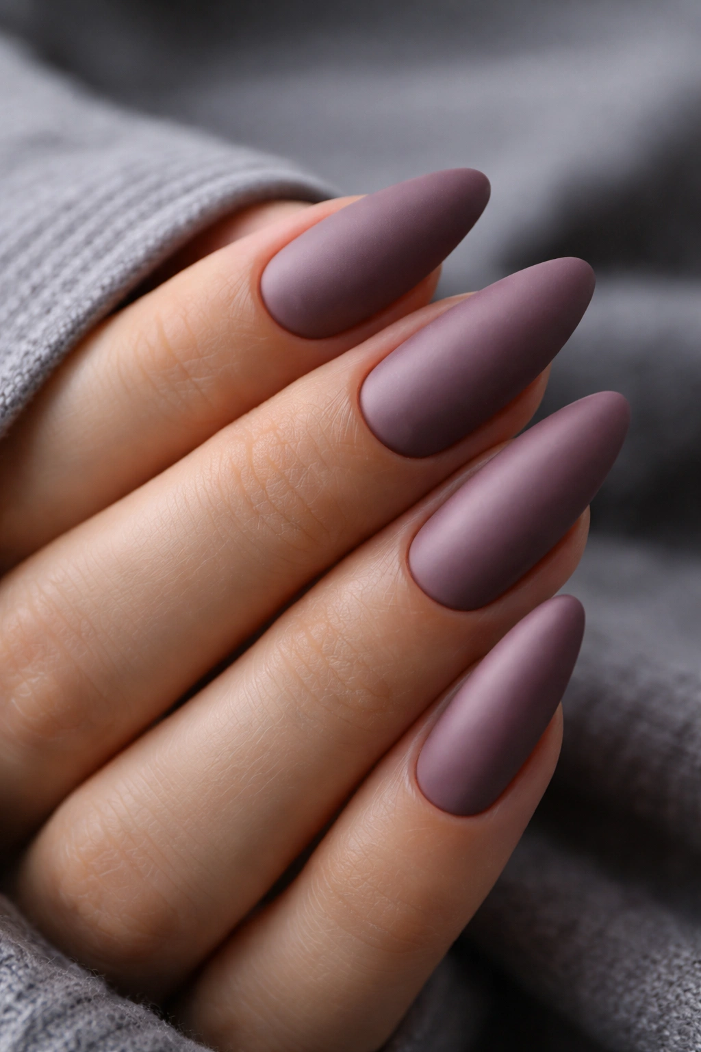
Mauve is deceptively deep. It lives in a strange, beautiful zone between pink, purple, and gray — and in its darkest form, it has the kind of quiet intensity that makes people glance twice at your hands without being able to immediately name the color. That ambiguity is the whole point.
Unlike most other shades on this list, deep dusty mauve doesn’t feel heavy or dramatic on the hand. It’s still clearly a saturated, dark color, but the dusty gray undertone keeps it from demanding attention. Reach for it when you want depth and a polished look without anything that screams “statement.”
Works most naturally on cool and neutral undertones. On warm skin, look for a version with slightly more purple and less gray in the formula to prevent it from washing out toward a pale lavender.
Finish note: deep dusty mauve looks better matte or satin than glossy. The gloss pushes the pink tones forward and makes it read more lavender than mauve. The satin finish preserves the moody, dusty character that makes this shade interesting in the first place.
11. Dark Cobalt Blue with Gold Foil Accents
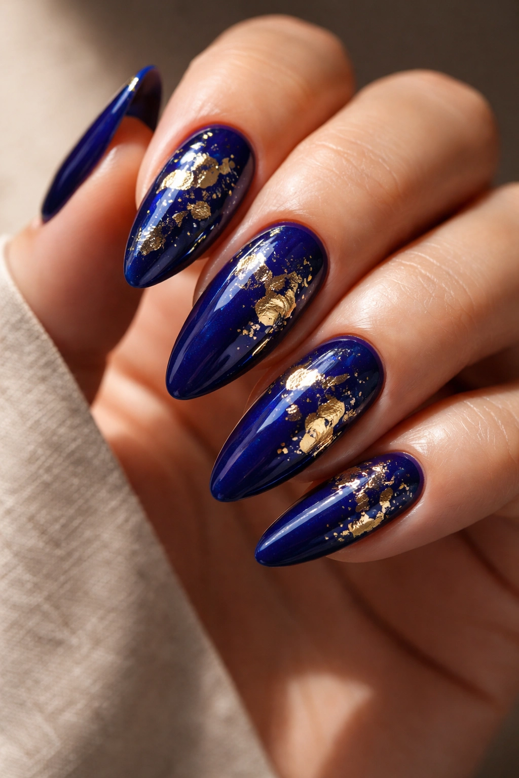
Standard cobalt blue reads bright and saturated — which is fine, but that’s not where the interest is. The version that belongs on this list is a very deep, almost ink-dark cobalt that sits one shade removed from navy while still reading unmistakably blue in good light. Think the color of the sky about 20 minutes after sunset on a clear night.
The addition of gold foil accents — literal pieces of gold foil pressed into wet gel or applied over a tacky top coat — pushes this combination into editorial territory. The contrast between the deep cobalt and the warm, irregular patches of gold is sharp without looking garish. It lands in a specific spot between maximalist and considered.
How to Apply Gold Foil Without It Looking Chaotic
Gold foil is easier to control than most people expect. Use fine tweezers or a silicone foil applicator to press small, irregular pieces onto a slightly tacky top coat surface. Don’t aim for full coverage or a precise pattern — random placement with varying piece sizes looks more intentional than trying to make it uniform, because the imperfection signals a human hand.
After placing, press down firmly with a dry fingertip to flatten the foil and remove air pockets. Seal with a full layer of gel or regular top coat to lock the foil in place. The tapered almond tip draws attention to the foil pieces, which scatter and reflect light differently from the deep cobalt base beneath them — the result is genuinely striking.
12. Deep Rust and Terracotta
Rust and terracotta in their deepest form — not the bright orange-adjacent shades, but the dark, brick-brown versions — are among the best deep tones for warm undertones. They’re earthy without being muddy, warm without being loud, and they have a richness that makes hands look striking in a low-key, organic way.
The best version for almond nails sits right at the point where dark orange becomes dark brown — often described as “dark terracotta,” “deep rust,” or “antique copper” in shade names. You want enough orange to keep it out of pure brown territory, but enough brown to take the brightness down.
Styling and Application Notes
Deep rust on almond nails looks strong alongside warm neutrals, but it also pairs unexpectedly well with deep olive green, cream, and white. Against darker clothing it reads warm and grounding. Against lighter clothing it becomes a genuine focal point — one of those shades people ask about.
This is one of the few deep tones that consistently looks great in warmer seasons rather than feeling out of place when the temperature rises. Tan skin plus deep terracotta nails is a combination that turns heads.
- Use a warm-toned, orange-based under layer to prevent any cool shift in the final color during the cure or dry process
- Two coats plus a glossy top coat gives the richest, most saturated result
- A gold chrome accent nail — same formula with chrome powder rubbed over the surface — takes the look further without adding visual complexity
13. Dark Olive Green
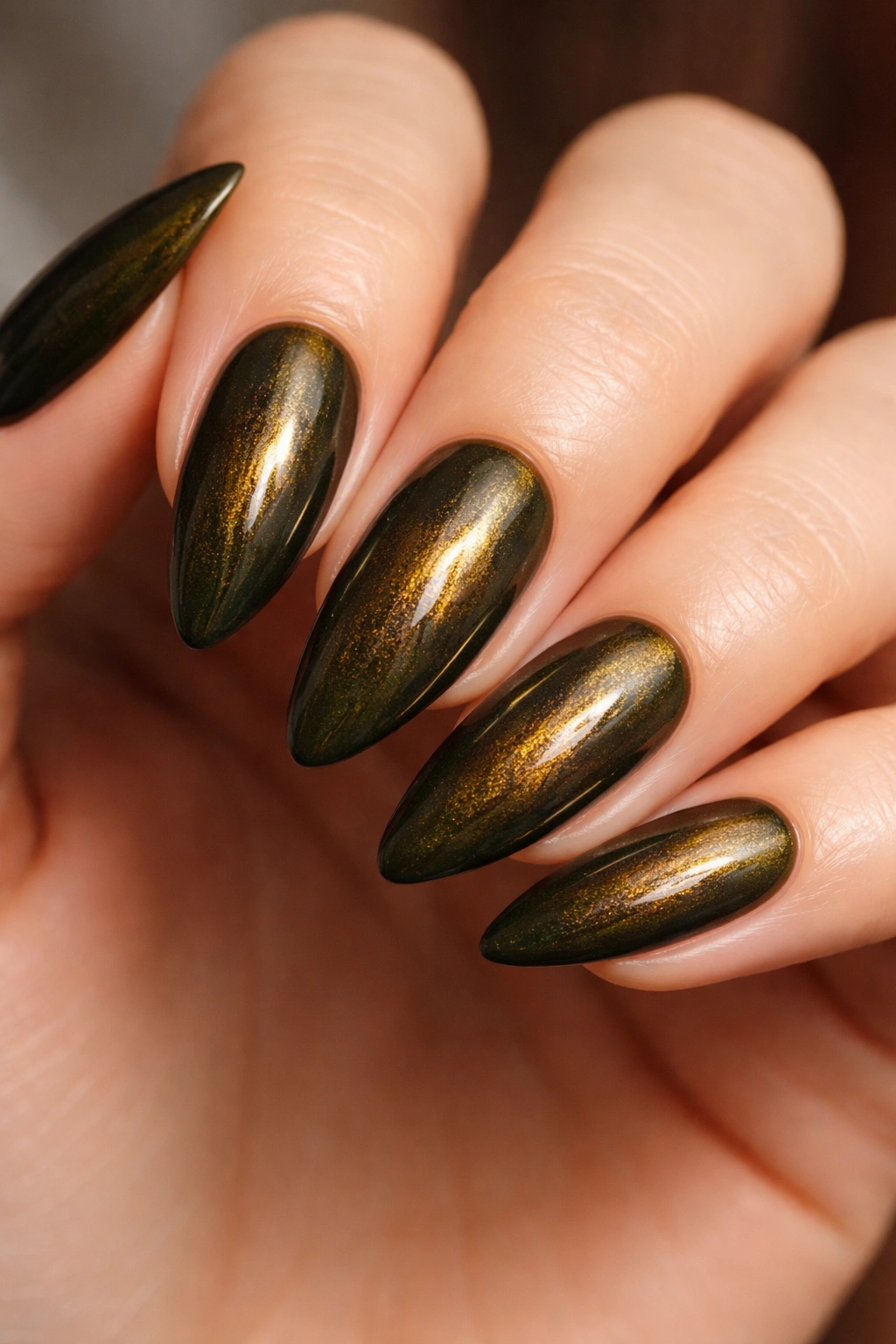
Dark olive is the deep-toned shade for anyone who’s gotten bored of forest green but still wants that earthy, botanical quality. Where forest green reads lush and cool, dark olive reads warm and dusty — the extra brown and yellow in its base give it a completely different character.
On almond nails, dark olive sits somewhere between sophisticated and unexpected. People who don’t typically notice nail color notice dark olive. There’s something about it that reads as considered without being flashy.
A crème formula works well, but a burnt-glass shimmer version — a dark olive base with fine warm gold shimmer throughout — creates a color that shifts between green, gold, and brown depending on the angle of light. That kind of shift on the tapered almond is worth seeking out specifically.
One specific pairing worth trying: dark olive nails with a warm coral or pink on one accent nail. The contrast is sharp enough to be interesting without looking disjointed, especially if you keep it to a single accent rather than alternating. And if you’re someone who avoids accent nails entirely — dark olive as a solid across all ten fingers holds its ground completely on its own.
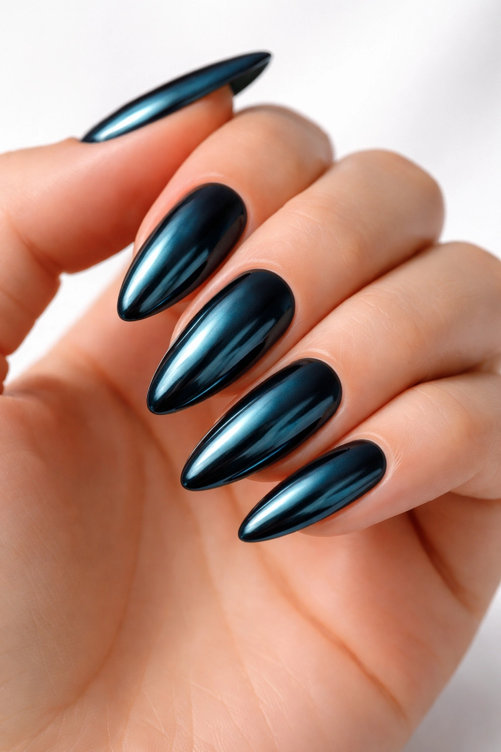
14. Ink Blue-Black
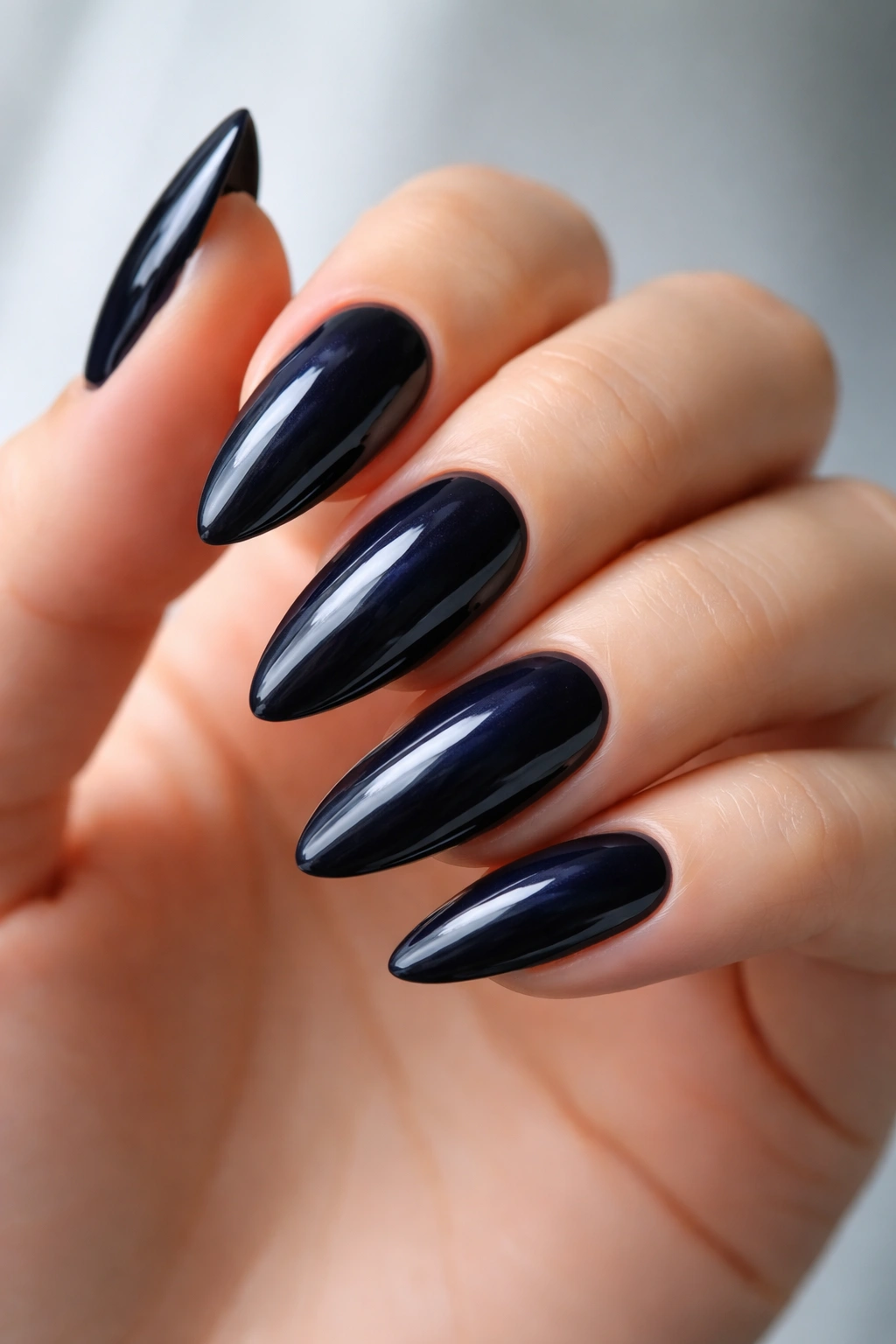
This shade walks the line between the two darkest territories in the deep tone category — a color that reads black in dim light and reveals a deep, inky blue in bright light or direct sun. If you’ve ever looked at true navy and true black side by side and thought they looked the same until the sun hit them — that’s exactly the visual effect an ink blue-black nail produces in reverse.
What it does on almond nails is create a kind of graphic precision. The tapered shape becomes almost architectural. No shimmer, no glitter, no foil — just a very dark, very deep color on a shape that handles it cleanly.
Who This Actually Suits
Bold claim: ink blue-black is the most broadly flattering deep shade on this entire list. The blue-black combination doesn’t lean purely warm or purely cool — it sits right between the two, which means it works across undertones more broadly than straight navy (too cool for some) or straight black (too stark for some).
The only real consideration is nail length. Below a certain threshold, ink blue-black can feel severe. Give the almond shape at least 3–4mm of free edge past the fingertip for this shade to breathe and for the shape to do what it’s supposed to do with that depth of color.
15. Deep Mulberry with Dried Flower Embellishments
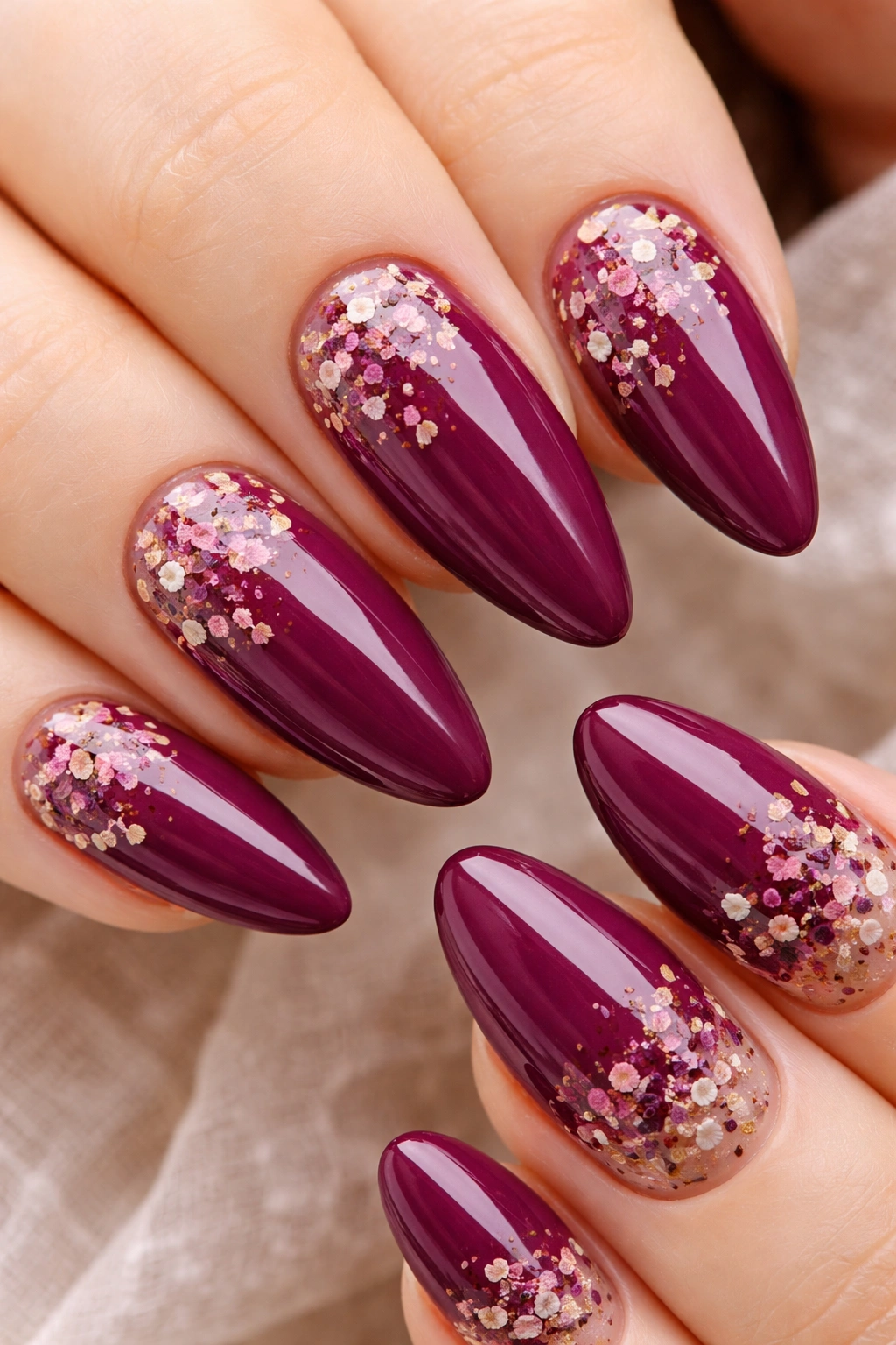
Mulberry sits somewhere between plum, burgundy, and a deep raspberry — one of those colors nobody can quite name, which makes it one of the most compelling options in the deep tone category. Add dried flower embellishments embedded in a gel top coat, and the result lands somewhere between high-end nail art and botanical illustration.
The combination works because the deep mulberry base is saturated enough to make delicate dried flower petals read against it. The contrast between the heavy, pigmented color and the thin, semi-translucent petals creates a layered depth that looks different in person than in photographs — in person the texture is the story; in photographs the colors in the petals become more visible.
How to Embed Dried Flowers in Gel Nails
- Complete your standard mulberry gel manicure — two thin coats, each cured fully under LED
- Apply a thick layer of clear gel top coat and do not cure it — you need it wet and workable for the next step
- Use fine tweezers to place dried flower pieces or small whole petals directly onto the wet gel, pressing them lightly flat with a dry fingertip
- Cure for 30 seconds under LED to partially set the gel without fully hardening the surface
- Apply a final thick layer of clear gel top coat over the flowers to fully encapsulate them and cure for a full 60 seconds
- Run a fine-grit buffer gently over any raised edges to smooth the surface, then apply one final sealing layer and cure again
Dried flowers in gel typically last the full length of a standard gel manicure — two to three weeks — without lifting or discoloring noticeably. The encapsulation protects the petals, but avoid extended soaking since prolonged water exposure can cause the gel to lift at the edges and allow moisture to reach the flowers underneath.
Final Thoughts
Deep-toned almond nails work because the shape and the color are doing complementary things — the almond tapers and elongates while the dark shade adds weight and presence, and together they create something that reads as intentional without requiring any particular effort to pull off.
The 15 shades here span the full range of what “deep” can mean: warm and earthy (espresso, rust, dark olive), cool and graphic (midnight navy, ink blue-black, teal chrome), and the genuinely complex in-betweens (black cherry, mulberry, aubergine) that don’t fit neatly into either camp. If you’re not sure where to start, burgundy wine and black cherry are the easiest entry points — high-impact but familiar enough not to feel like a risk.
The one thing worth carrying away from all of this: finish matters as much as shade choice. The same deep color in glossy, satin, and matte form reads like three different manicures. When uncertain, a satin finish splits the difference between the polish of gloss and the depth of matte — and on almond nails with a deep tone, it consistently delivers.
