

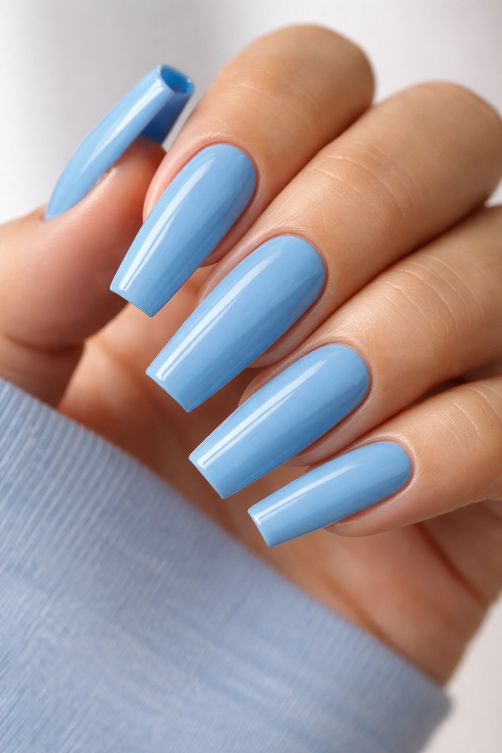
Blue coffin nails are one of those manicure ideas people talk themselves out of far too early. They hear blue and picture something harsh, cartoonish, or hard to wear, when the real problem is usually the wrong shade on the wrong shape. Get the color balance right, taper the sidewalls properly, keep the tip crisp, and blue stops looking risky fast.
I’ve seen this happen in salon chairs more times than I can count. A swatch ring makes a polish look icy and clean under cool LED lights, then it lands on the nail and suddenly reads chalky, flat, or wider than it should. Blue is honest like that. It shows every shaping mistake, every bulky topcoat, every French line that sits 2 millimeters too thick.
That’s also why blue coffin nails can look so good when they’re done well. The coffin shape brings structure. Blue brings mood. Mix in a sheer base, a dusty finish, a soft chrome, or a deeper fade, and you get nail designs that flatter pale skin, olive skin, deep skin, short fingers, long fingers—different hands, same strong result.
No nail look suits every person in the exact same way, and I do not think pretending otherwise helps anyone. Still, the sets below come close because each one leaves room for skin tone, nail bed shape, and personal style instead of fighting them.
Why Blue Coffin Nails Flatter More Hands Than People Expect
The shade isn’t the whole story.
What makes blue coffin nails so wearable is the mix of contrast, opacity, and shape. A soft milky blue blurs into the nail the way a sheer pink does, only cooler. A navy fade gives you definition at the tip while leaving warmth near the cuticle. A marbled or chrome finish shifts the color across the surface, so no single flat block of blue has to carry the whole look.
A lot of people overfocus on warm versus cool undertones and miss the more useful question: how solid is the color, and where is it sitting on the nail? That matters more. A chalky pastel painted wall-to-wall can make the nail plate look wider. The same pastel, softened with milkiness or paired with negative space, suddenly feels lighter and more flattering.
Opacity Changes Everything
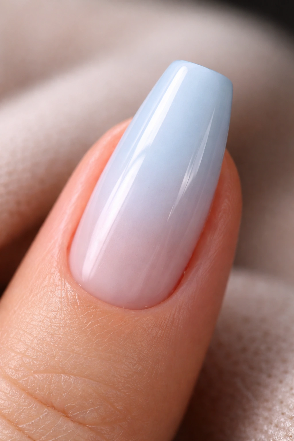
If you only take one thing from this article, take this: sheer or layered blue is easier to wear than flat opaque blue. That doesn’t mean every design needs to be translucent. It means a little depth, blur, or variation usually helps the color sit better against skin.
Here’s the quick version:
- Milky blues soften redness and make the manicure look cleaner.
- Dusty blues act almost like denim, which is why they work across so many wardrobes and skin tones.
- Deep navies and indigos create sharp contrast that can make fingers look longer.
- Blue paired with nude or pink bases keeps the hand from looking cold.
- Mixed finishes—chrome, cat-eye, marble, jelly—break up the color so it feels more natural on the nail.
Shape does the rest.
A proper coffin nail narrows after the stress point and ends with a flat tip. That straight-edged taper lengthens the hand, which is part of why blue reads so well here. On a round or squoval shape, some of these same shades lose a bit of that sharpness and start feeling softer, even sleepy. Coffin keeps them awake.
Salon Details That Make a Blue Coffin Set Look Expensive
Nothing exposes bad shaping faster than dark blue polish.
Black can hide bulk. Nude can blur it. Blue—especially navy, cobalt, slate, and icy chrome—puts every flaw under a spotlight. If the sidewalls flare, the nails look heavy. If the apex is too flat, the set can read wide and cheap. If the topcoat pools near the cuticle, a pale blue goes from clean to clumsy in one pass.
This is the part most inspiration photos skip, and it matters more than the art.
When I want a blue coffin set that looks sharp in daylight, not only under salon lamps, these are the details I ask for:
- Straight sidewalls with a gentle taper, not a sharp triangle
- A flat, even tip with no rounded corners unless the design calls for softness
- A balanced apex placed near the stress area so the nail doesn’t look pancake-flat
- Thin cuticle application so the color looks tucked in, not swollen
- One shade test against the skin, held near a window if possible
- A medium length first, usually 8 to 12 millimeters past the fingertip, unless I know the design needs more space
Press-ons need the same care, maybe more. Size them a hair smaller than you think, then file the side edges so they sit flush. Blue on an oversized press-on is unforgiving.
Photos lie, too. A polish that looks like soft periwinkle on a phone screen can turn neon under a flash, and a jelly aqua set can look clearer in person than it does in a close-up. If you’re choosing from screenshots, pick the idea, not the exact color code.
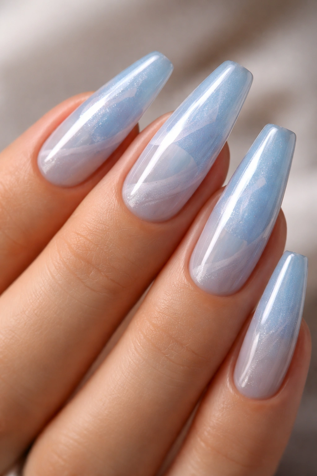
1. Milky Baby Blue Gloss
Want the safest entry point into blue coffin nails? Start here.
Milky baby blue gloss is the manicure I point people toward when they say they want something blue but are scared of looking washed out. The milkiness matters. It softens the color, lets a bit of light move through the polish, and gives the nail that clean, creamy finish that looks polished on almost any hand.
I’m picky about baby blue because it goes wrong fast. If it leans too white, it can make the whole set look chalky. If it goes too bright, it slips into toy-store territory. The sweet spot sits in the middle: a sky blue mixed with enough white or sheer gel to make it look clouded, not flat.
Why It Works So Well
This shade flatters because it doesn’t fight the natural tone of the hand. Instead of laying down a hard block of color, it blurs the edge between polish and skin. On shorter fingers, that softer edge helps the coffin shape feel longer. On deeper skin tones, the contrast looks crisp and fresh. On lighter skin tones, the milkiness keeps the blue from turning stark.
What to Ask for at the Salon
- Ask for two thin coats over a sheer builder base, not three thick coats of opaque pastel.
- Keep the length short to medium coffin if you want an easy everyday set.
- Choose a gloss topcoat, because matte can make pale blue look dusty.
- If the swatch looks almost white, go one shade deeper.
Best move: ask your tech to hold the bottle or swatch against your hand before painting all ten nails. Baby blue is one of those shades where half a tone makes a huge difference.
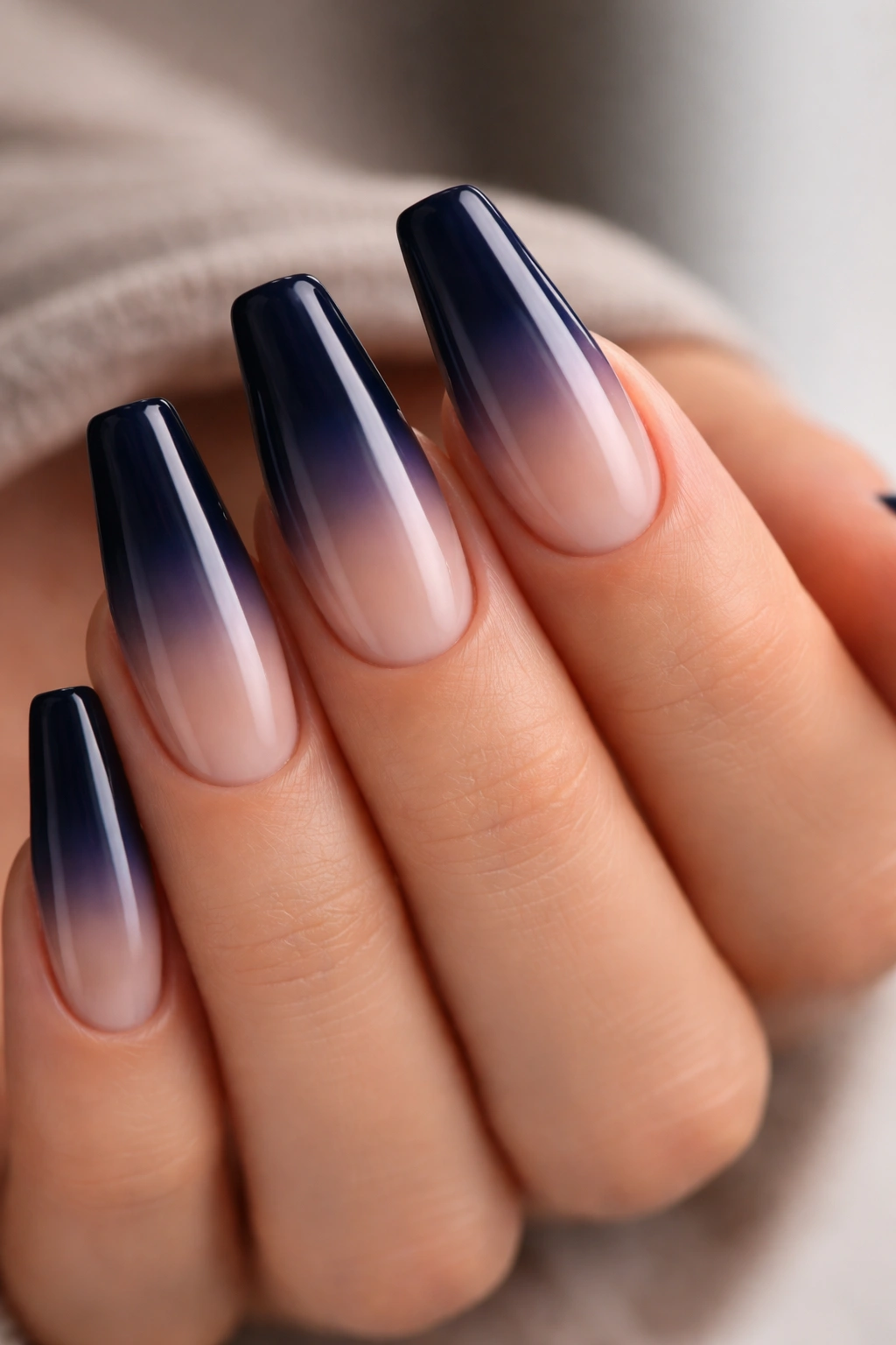
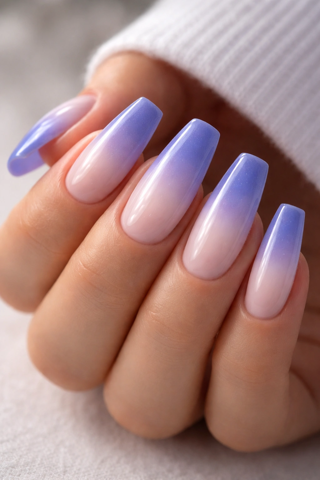
2. Navy Ombre from Cuticle to Tip
A full navy manicure can look severe on some hands. A navy ombre almost never does.
That fade is the whole trick. When the deepest color sits at the tip and melts into a sheer or nude base near the cuticle, you keep the drama of dark blue without boxing in the entire nail. The eye follows the gradient outward, which makes fingers look longer and the shape look cleaner.
Navy also has an odd advantage over brighter blues: it reads familiar. People wear dark denim, ink blue, and midnight tones all the time, so the color feels grounded even when the nail shape is sharp. On medium and deep skin tones, the contrast looks smooth and rich. On fair skin, the fade keeps the set from going too hard around the cuticle.
Application matters here more than people think. A sponged gradient can work, though I prefer an airbrushed fade or a gel blend with a soft liner brush because the transition looks finer. If the ombre line is obvious, the whole set loses that expensive look and starts reading home-done.
Keep the deepest navy on the last third to half of the nail. More than that and the color starts to swallow the shape. Less than that and you lose the drama that makes this design worth picking in the first place.
3. Periwinkle Micro-French Coffin Tips
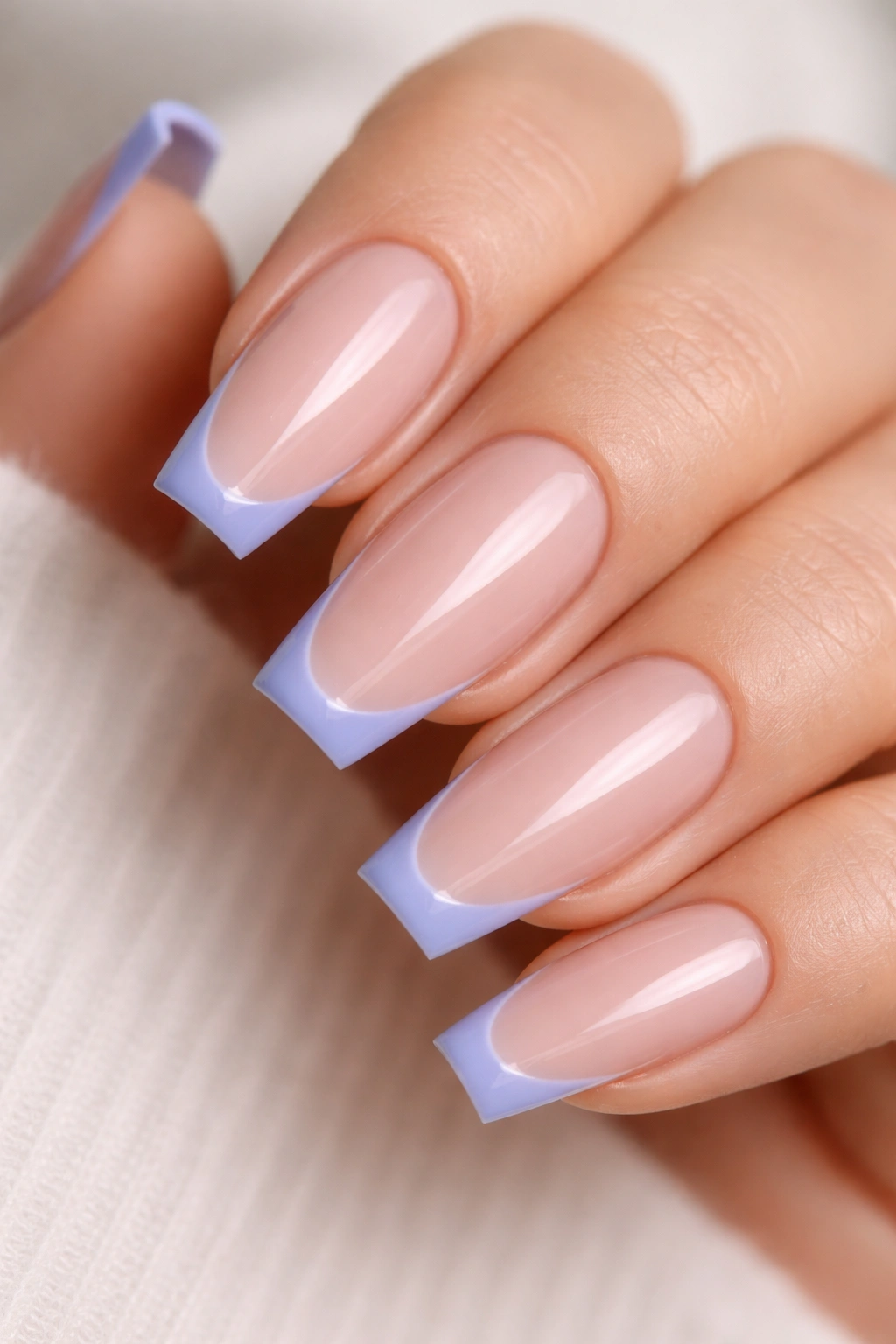
Why does a tiny strip of periwinkle look smarter than a full coat on some hands? Scale.
A micro-French leaves most of the nail bare or softly nude, then uses blue as a crisp accent at the edge. That tiny hit of color gives you the mood of blue coffin nails without the commitment of ten fully painted nails. If you work in a place where cobalt glitter would raise eyebrows, this is the compromise that still feels intentional.
Periwinkle is the right shade for this style because it sits between blue and violet. That small dose of purple warmth makes it easier to wear than a hard primary blue. It also brightens the tip without making it look cold.
How to Ask for It
Ask for a 1 to 2 millimeter French line in periwinkle over a sheer nude, pink-beige, or milky base. On a medium coffin, I like a slightly curved smile line rather than a dead-straight strip across the edge. It follows the nail shape better and keeps the design from looking blocky.
If your nail beds are shorter, keep the line razor-thin. If they’re longer, you can push it a touch thicker, though I still would not go past 3 millimeters for this look. The whole charm of a micro-French is restraint.
4. Dusty Denim Matte Coffin Nails
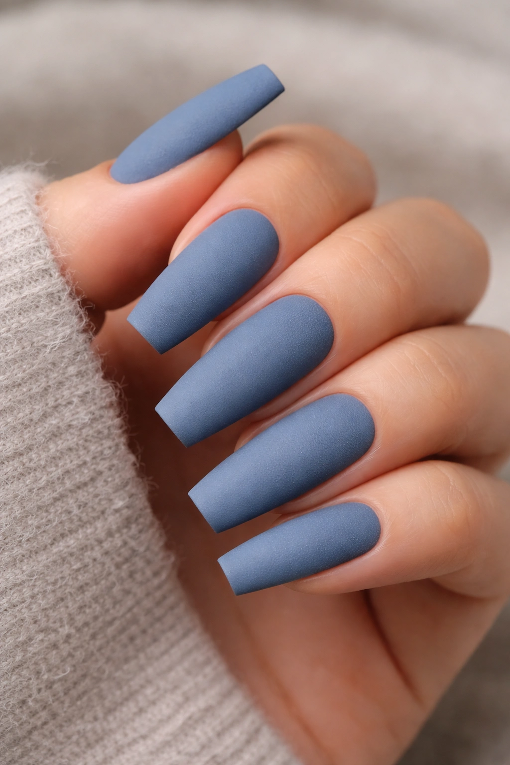
I keep a mental file of nail colors that look even better on day four than they did on day one. Dusty denim blue lives in that file.
There’s a reason it works: denim is already part of how people see blue in everyday life. A muted blue with a gray cast feels familiar, easy, and grounded. Put that on a coffin shape and you get a manicure that has edge without shouting. Matte helps too. It turns the polish into something that looks almost suede-like, especially on longer nails.
This is one of my favorite choices for anyone who thinks bright blue feels like too much. It’s softer than cobalt, more interesting than gray, and kinder to warmer undertones than icy pastel shades.
Quick details that make it look right:
- Choose a blue with gray in it, not a pastel with white in it.
- Keep the coffin shape clean and straight, because matte shows every bump.
- Add a glossy topcoat only on one accent nail if you want contrast without adding art.
- Ask for a velvet-smooth matte topcoat, not a chalky one that grabs lint.
There’s one downside. Matte chips at the tip show faster than gloss, so this set looks best when the free edge is capped carefully and the length stays moderate.
5. Ice Blue Chrome over a Sheer Pink Base
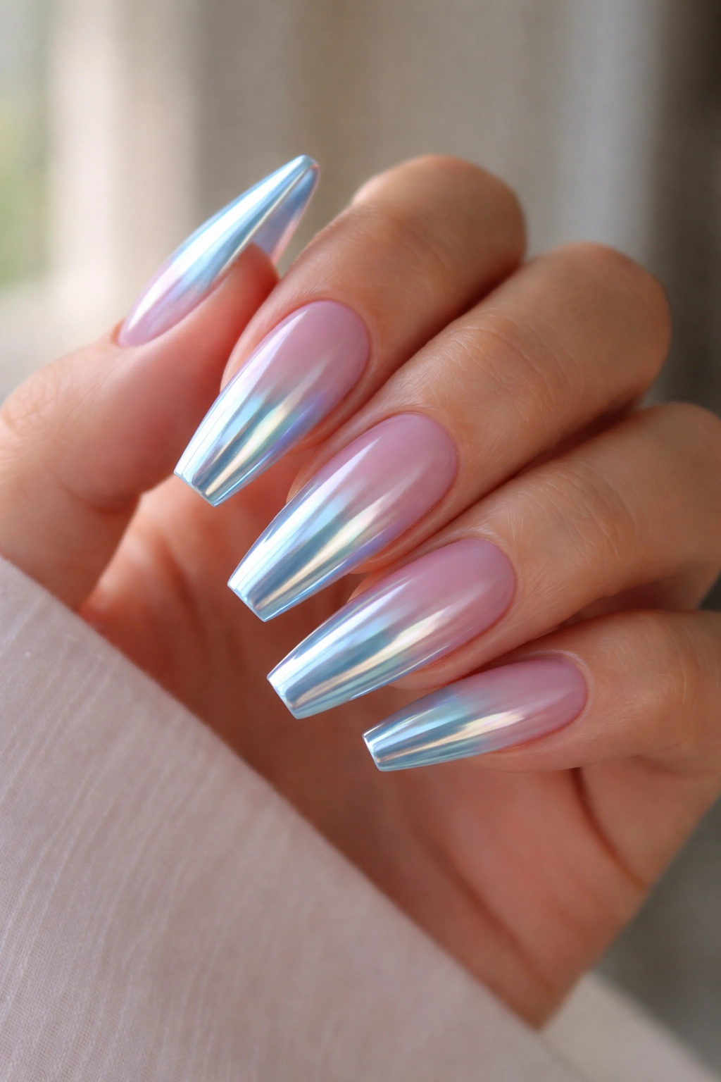
Chrome can go wrong fast.
When it’s too mirror-bright, it starts looking like costume metal. When the base underneath is stark white, the blue reflection can make hands look cold. The version that works on almost everyone uses ice blue chrome over a sheer pink or beige-pink base, which gives the manicure warmth under the shimmer.
That base color is doing half the work. You still get that flash of pale blue when you turn your hand, though the nail never loses the skin-friendly tone underneath. Under window light, it throws a silver-blue glow. Under indoor lamps, it looks smoother and softer than a full metallic polish.
I like this design best on medium coffin nails with a crisp flat tip and no extra art. The surface already has movement. Piling rhinestones or stickers on top usually muddies it. A clean chrome set feels sharper.
Application should be thin. First comes the sheer builder or gel base, then color if needed, then a no-wipe topcoat cured smooth, then the chrome powder rubbed in evenly, then another topcoat. If the powder catches in ridges or the base has bumps, the whole manicure starts looking patchy.
One more thing: pale chrome shows growth less harshly than solid pastel blue. That alone makes it a smart pick if you like a manicure that still looks decent at the 10-day mark.
6. Blue-Gray Marble with Fine White Veining
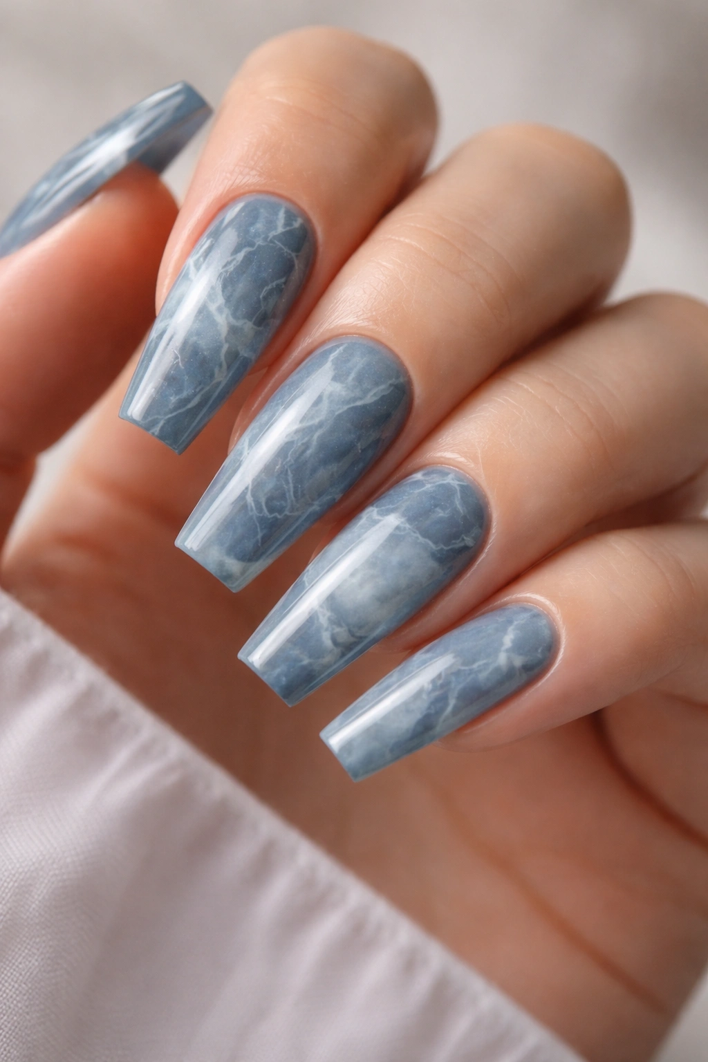
Unlike a flat solid manicure, blue-gray marble doesn’t ask one shade to do all the work. That’s why it flatters so many different hands.
Marble mixes tones—slate, milky white, a whisper of navy, maybe a touch of translucent smoke—so your eye reads texture before it reads one hard color block. That softens the effect. If a single solid blue feels too stark on your skin, marble often fixes the issue by breaking the color apart.
This design also has more forgiveness built in. Tiny shifts in tone hide minor imperfections better than opaque cream polish does. And because no two nails match perfectly, the set feels more custom and less like it came off a generic sample wheel.
Who benefits most from this one? People who like nail art but hate anything overly cute. Blue-gray marble is adult, clean, and slightly moody. It sits well with gold rings, silver rings, office clothes, denim, black knits, white shirts—the whole boring list of things we actually wear.
My recommendation is a mostly blue-gray marble on two to four nails, with the rest painted in a matching solid slate or sheer milky blue. A full ten-finger marble set can work, though it needs a steady hand and restraint. Too many dark lines and the design starts looking busy.
7. Cornflower Blue Side-French Coffin Nails
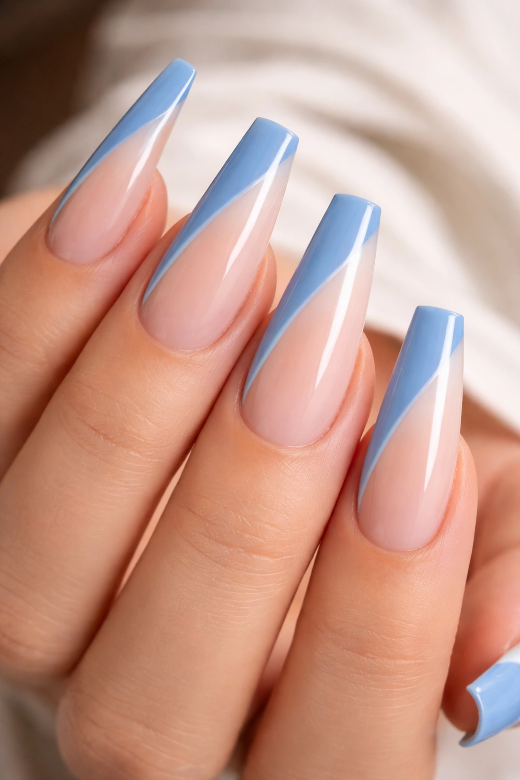
Picture a cornflower blue line sweeping diagonally from one sidewall toward the tip. That single move changes the whole hand.
A side-French has more motion than a classic French tip. Instead of cutting straight across the nail, it pulls the eye up and across, which can make fingers look longer and slimmer. Cornflower blue is the right shade here because it’s bright enough to stand out, though soft enough to stay wearable.
I like this design on people who want something graphic without going full cobalt. It has personality. It also leaves enough negative space that the nails still feel airy.
What Makes It Different
The diagonal line creates built-in lift. A straight French emphasizes width if the line sits too thick. A side-French redirects that attention and makes the coffin shape look cleaner.
Best Ways to Wear It
- Use a milky nude or sheer pink base so the blue line pops without hard contrast.
- Keep the side-French thin near the cuticle side and slightly wider at the tip.
- Match all ten nails for a clean look, or flip the angle on alternating hands for a subtle custom touch.
- Stick to gloss, because matte can flatten the diagonal effect.
Salon wording that helps: ask for a “cornflower diagonal side-French on a sheer nude coffin base with a fine line, not a thick block tip.”
8. Midnight Blue Cat-Eye with a Velvet Pull
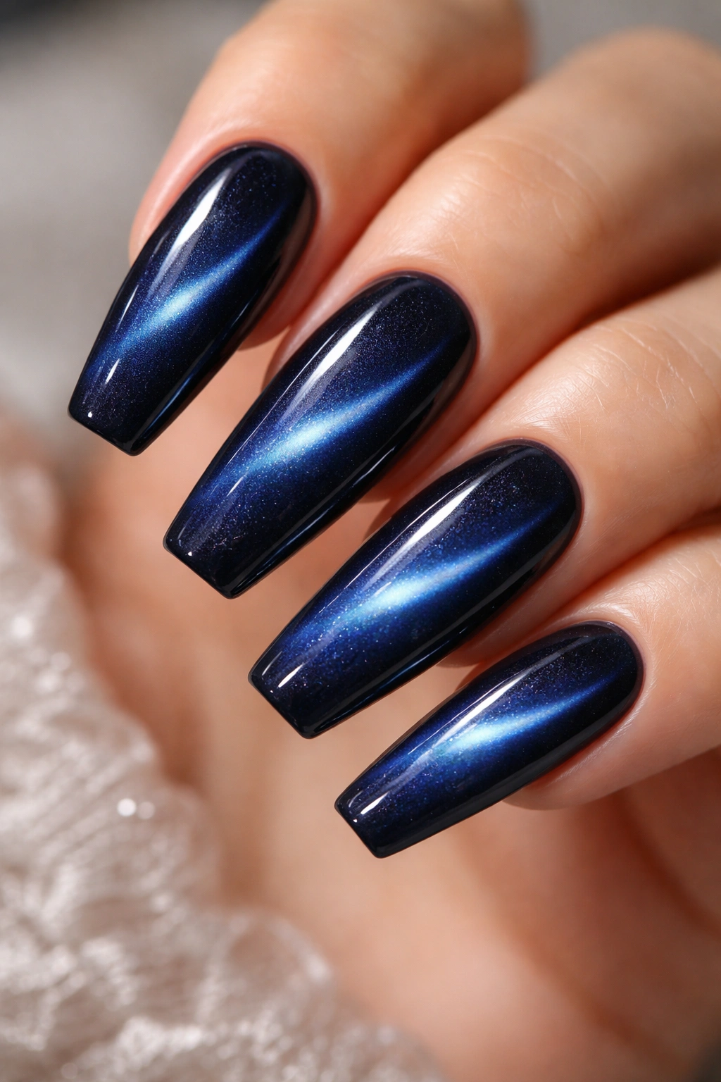
Midnight blue is the grown-up answer to glittery black.
A cat-eye polish uses magnetic particles that shift under a magnet before curing. Done well, it creates a soft band or velvet bloom inside the color, almost like light moving through fabric. In midnight blue, that effect gives the nail depth without resorting to chunky glitter, and that difference matters more than most people realize.
The flattering part comes from movement. A flat dark shade can make the nail plate look dense. A magnetic finish creates a lighter strip or bloom inside the blue, so the color feels dimensional instead of heavy. That moving highlight also makes the coffin shape look sharper because the center of the nail draws the eye inward.
I’d skip rainbow magnets and loud galaxy effects here. They can be fun, though they’re harder to wear day after day. The version that looks good on nearly everyone is a deep blue cat-eye pulled into a soft velvet pattern across the center of each nail. Think moody silk, not outer space.
Tell your tech you want the magnet held steady for a few seconds per nail before curing. Rushed cat-eye application gives you a muddy shimmer with no clear pattern, and once that happens, there is no saving it with topcoat.
9. Soft Aqua Jelly Coffin Nails
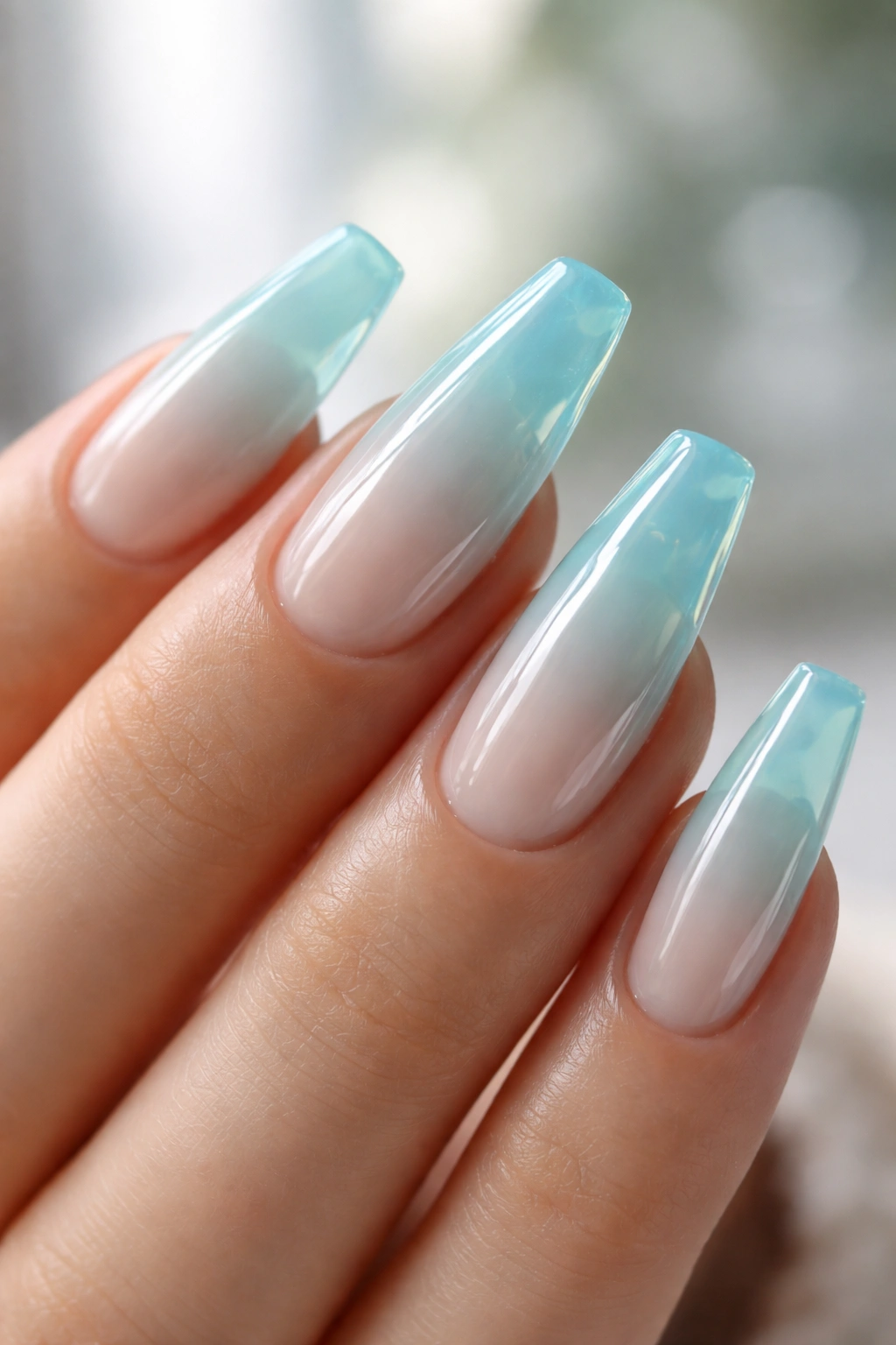
Do jelly nails look unfinished? Only when the color is wrong or the layers are too thin.
A soft aqua jelly works because it lets light travel through the color. That transparency gives the manicure a glassy, juicy look that opaque polish cannot fake. On a coffin shape, that little bit of see-through depth keeps blue from feeling hard-edged.
Aqua is one of those shades that can turn loud fast, so I prefer it softened. You want clear blue-green water, not neon pool float. Two to three jelly layers usually does the trick. The nail still reads blue, though the natural depth underneath keeps the shade from sitting flat on the skin.
How to Wear It So It Looks Intentional
Start with a smooth clear or milky base, then build the aqua in thin layers until the color looks like tinted glass. If your natural nails have ridges, use a builder or smoothing base first. Jelly polish magnifies bumps.
This design looks best when the shape is clean and the free edge matches across both hands. Because the finish is translucent, uneven lengths show more. Keep the art minimal—maybe none at all. The surface already has enough interest.
10. Sapphire Glitter Fade at the Tips
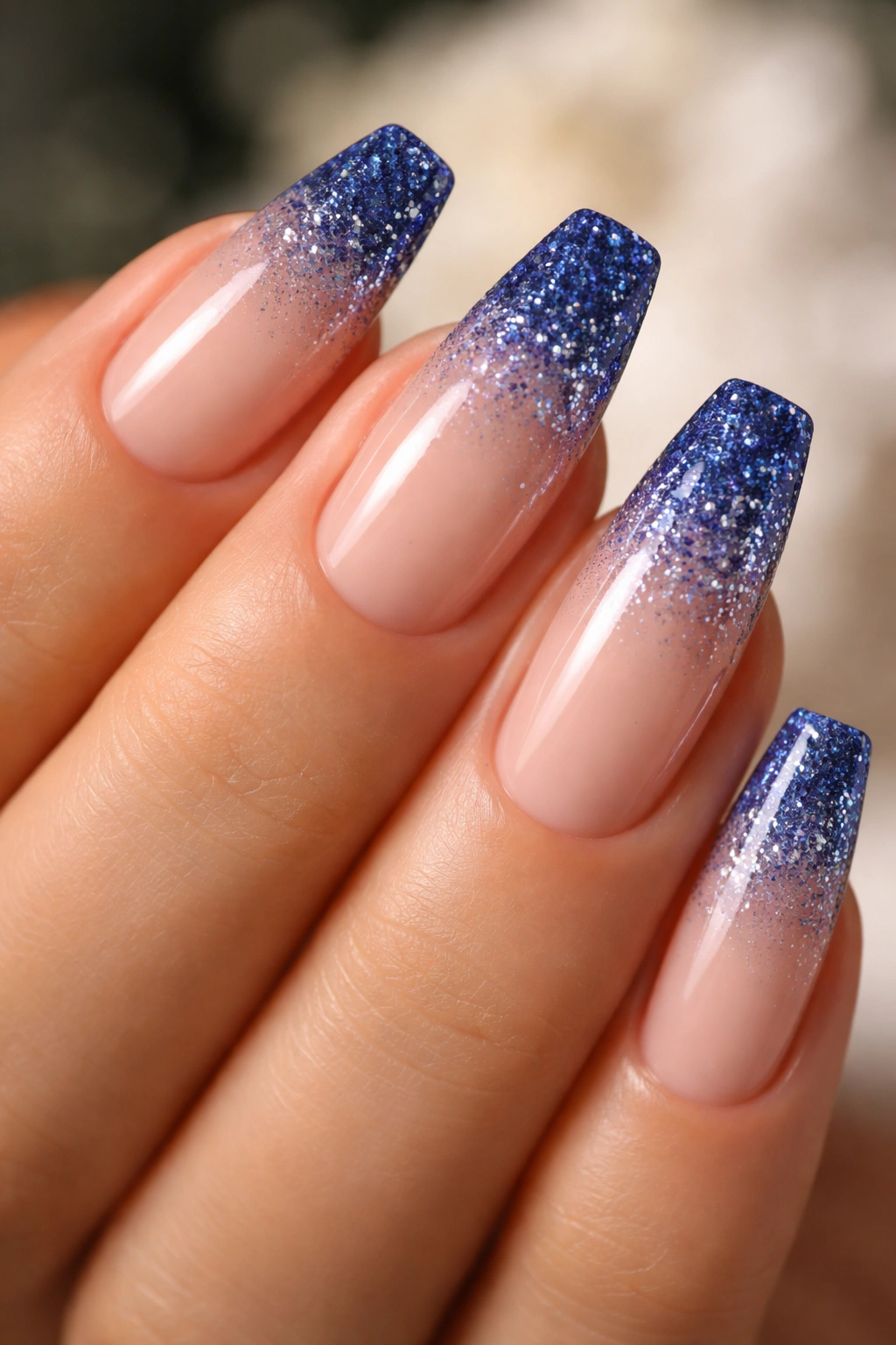
I’ve seen too many glitter blue manicures buried under a full coat of sparkle from cuticle to tip. They look busy on day one and messy by the time the nails grow a bit.
A sapphire glitter fade avoids that problem by keeping the shine where it earns its place: at the ends. Concentrating the sparkle on the tips lets the cuticle area stay soft and clean, which makes grow-out less obvious and the whole set easier to wear.
This one shines at parties, dinners, wedding guest weekends, and all the other moments when you want a little extra light on your hands without reaching for rhinestones. Sapphire is better than pale blue glitter here because the deeper tone has more contrast and doesn’t disappear the second you step away from a lamp.
A few details make the difference:
- Use a fine or mixed-size glitter, not chunky craft-sized pieces.
- Fade the sparkle from the last third of the nail upward, not halfway down from the cuticle.
- Pair it with a nude, sheer pink, or milky base.
- Seal it with one leveling topcoat and one glossy finish coat if the glitter texture needs smoothing.
The best version looks like the blue is dissolving into light at the tip, not like someone dumped sparkle on wet gel and hoped for the best.
11. Powder Blue Cloud Art on a Milky Nude Base
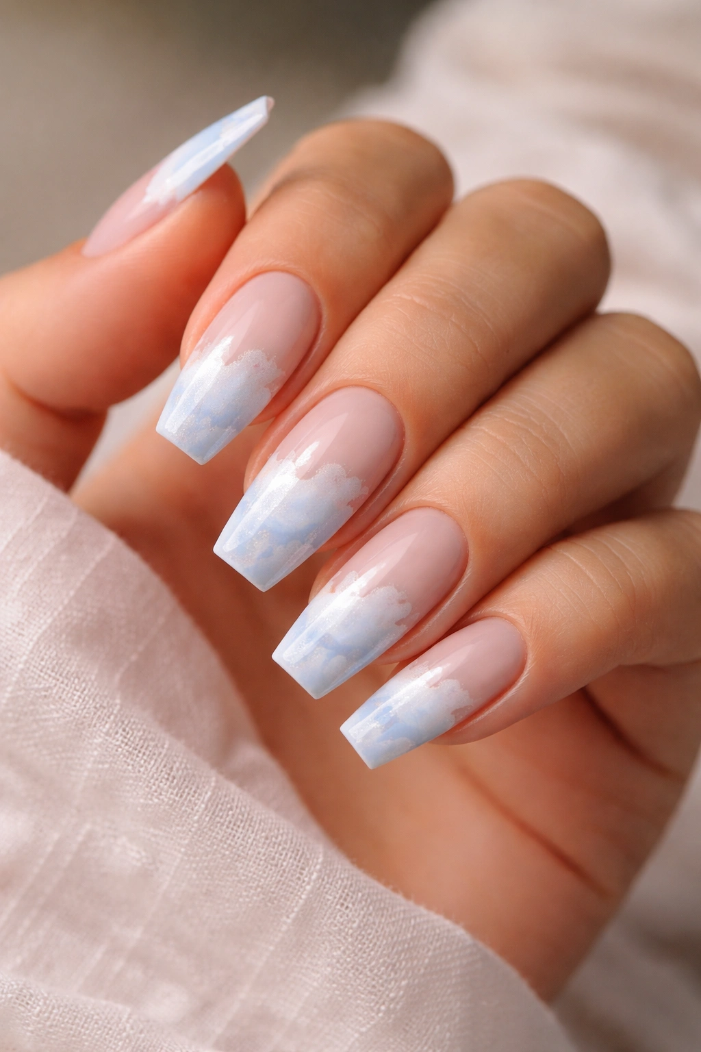
Cloud nails can look cheesy.
The fix is scale, spacing, and background color. Put oversized white clouds on a bright blue base and the whole thing can drift into cartoon territory. Put small, wispy clouds over a milky nude or soft powder blue base, and suddenly the design feels airy, clean, and far more wearable.
This style works on a wide range of hands because it keeps the base light and skin-friendly. The clouds add shape without laying down a hard border across the entire nail. I like that on coffin nails, where too much full-coverage art can make the shape feel bulky.
You do not need clouds on every nail, either. Two or three accent nails mixed with solid powder blue or sheer milky nails often looks better than a full illustrated set. The hand gets room to breathe. The design still reads clearly.
Ask for soft edges, not sticker-sharp outlines. A liner brush and a little white blooming gel or softly blurred gel paint gives the clouds a feathered look that feels more polished. Tiny stars or silver dots can work, though I would stop there. Once moons, glitter, gems, and glitter stars all show up together, the design loses its restraint.
Done with a light hand, this one looks playful in the best way.
12. Royal Blue Diagonal French with Negative Space
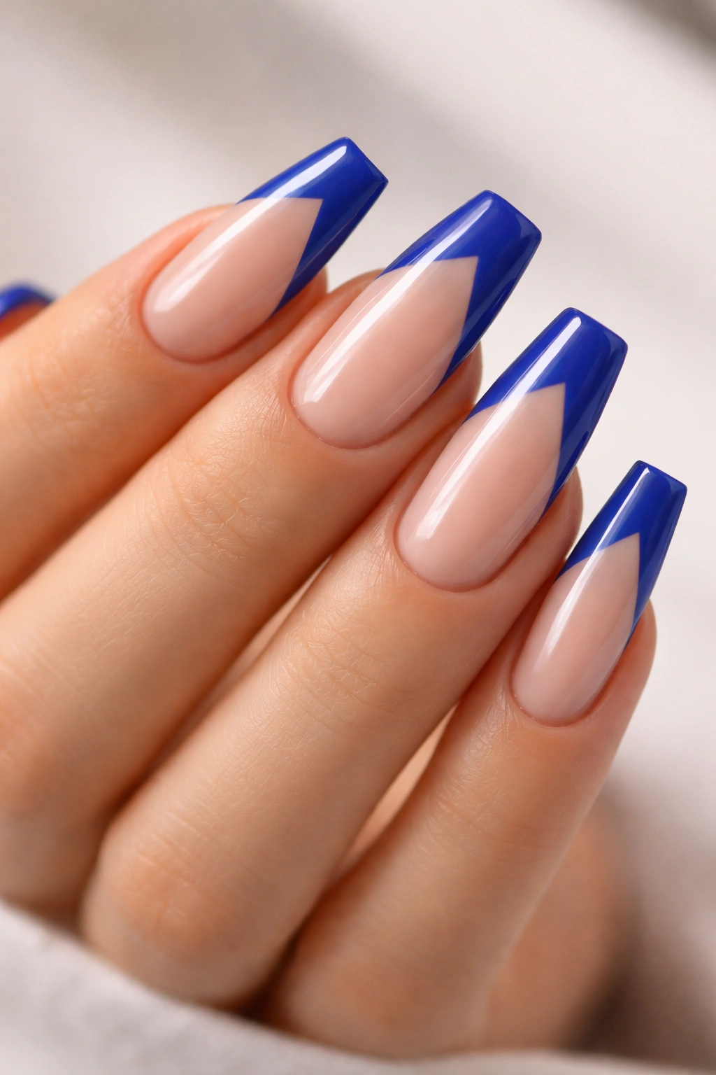
Compared with a standard French tip, a royal blue diagonal French has more lift and less width. That makes it one of the strongest picks for shorter or broader nail beds.
The shape of the tip matters as much as the color here. A diagonal block of royal blue slices across the nail instead of capping it straight on, so the eye follows the angle and reads length. Leave some negative space near the opposite side or cuticle area and the hand keeps that airy feel that full-coverage bold polish can lose.
Royal blue is brighter than cornflower and cleaner than denim, so it has more punch. That’s why negative space is useful. It gives the shade room to hit hard without taking over the whole manicure.
Who should try this first? Anyone who likes bold color but gets bored with full solid sets after three days. This design scratches that itch and still leaves enough neutral space to work with rings, everyday clothes, and whatever lipstick or makeup mood you’re in.
If you book this at a salon, ask for clean geometric diagonals with matching angles across the set. Sloppy symmetry ruins the look. On coffin nails, I also like the diagonal tip to stop short of the sidewalls by a hair, which keeps the design feeling lighter.
13. Indigo Aura Fade with a Soft Center Glow
Soft focus.
That’s the whole appeal of indigo aura nails on a coffin shape. Instead of hard lines or obvious French edges, the color blooms in a diffused halo—often deeper around the outside or the center, depending on the version you choose. The blur makes blue feel less rigid and more skin-friendly.
I prefer aura nails in indigo rather than neon blue because indigo carries depth without screaming. It gives you that moody color story people love in blue nails, though the soft fade keeps the manicure from feeling severe. On deeper skin tones, the contrast looks rich. On lighter skin, the smoky edge adds definition.
The Soft-Edge Effect
What makes this flattering is the lack of a hard stopping point. Blurred color transitions are forgiving. They soften the hand, soften grow-out, and soften the coffin shape without erasing it.
Best Details for This Look
- Use a milky nude or sheer lavender-blue base under the aura.
- Keep the indigo diffused, not opaque and ring-shaped.
- Medium coffin length gives the glow enough room to show.
- Skip extra stickers or stones unless it’s one tiny accent.
My take: aura nails look best when the airbrushing or sponge blend stays subtle. The second the center glow turns neon, the manicure loses the elegance that makes this design work so well.
14. Robin’s Egg Blue with Tiny Gold Foil Flecks
Robin’s egg blue gets boxed into one narrow mood, which is a mistake. Add tiny gold foil flecks, and the shade warms up in a way that makes it far easier to wear across different skin tones.
The gold is doing quiet work here. Blue on its own can lean cool. Scatter a few fine pieces of gold foil through the manicure and suddenly the color has a warmer counterpoint. Olive skin picks that up. Deep skin picks it up. Fair skin does too, because the foil breaks the coolness before it settles into anything icy.
Scale matters. You want foil that looks like small torn leaf or fine metallic fragments, not giant flakes sitting on top of the nail like confetti. Press them into the color or encapsulate them under gel so the surface stays smooth. On a robin’s egg base, less is the whole point. A few pieces near the center or cuticle area is enough.
I also like this design because it pairs easily with jewelry. Gold rings make sense with it. Silver still works because the blue holds its own. The set feels bright and clean, though not sterile, and that balance is harder to get than people think.
15. Smoky Slate Blue with One Thin Silver Stripe
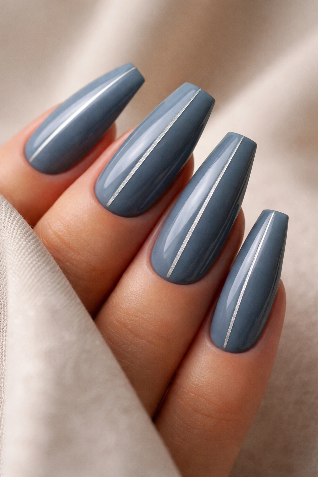
One thin silver line can change the whole set.
If you love blue coffin nails but lean minimalist, smoky slate blue with a single vertical or slightly off-center silver stripe is one of the smartest ways to wear the color. Slate is muted enough to act almost neutral. The silver gives it structure and a bit of light.
A vertical line elongates. That’s why this design flatters so many hand shapes. It pulls the eye from cuticle to tip instead of side to side, which helps the coffin shape look longer and cleaner. The effect is subtle, though it’s there.
Placement is everything. A stripe dead-center looks formal and balanced. Shift it a millimeter to one side and the set gets a sharper, more editorial feel. I tend to prefer the off-center version because it feels less stiff, though both work. Keep the line fine—around 0.5 to 1 millimeter. Thick metallic striping turns clunky fast.
This manicure also wears well over time because the base shade is forgiving. Tiny flaws don’t shout the way they do on pale chrome or bright cobalt. If you want a blue set that still feels calm, grown, and easy to live with, this is a strong place to land.
Final Thoughts
The blue coffin nail designs that hold up best all share one trait: they give the eye somewhere to rest. Sometimes that’s a sheer base near the cuticle. Sometimes it’s a fade, a marble swirl, a jelly layer, or a fine silver line. Hard wall-to-wall color can work, though the sets people keep coming back to usually have a little softness built in.
If you’re choosing from a salon chair and the swatches all start blurring together, I’d start with milky baby blue, navy ombré, or ice blue chrome over pink. Those three cover the widest range of skin tones and style moods, and they’re hard to make look bad when the shape is right.
Shape first. Color second.
Get the taper clean, keep the tip flat, and pick a blue with some depth or movement in it. Once those pieces line up, blue stops feeling like a gamble and starts feeling like one of the best colors you can put on a coffin nail.
